Yesterday I visited the exhibition “Between Worlds” by British painter Rebecca Fontaine Wolf in the Espacoexhibitionista Gallery in Lisbon.
I already loved the diversity of formats, surfaces and shapes that the artist used- smaller works behind perplex glass, ovals, large format linen canvases or very small canvases.
It was also a combination of figurative works and some abstract. I feel how I immediately relate to these works with the female figure. The title “Between worlds” relates to the artist being between different stages of her life, and also to being a woman and experiencing different cycles of life.
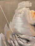
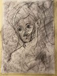
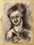
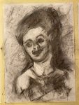
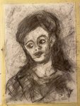
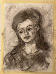
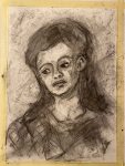
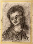
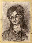
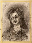
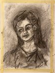
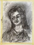
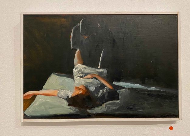
Several of the paintings contained self portraits of the artist, like here “Blood Moon”, combined with an abstract painting, which also had some triangles symbolizing womanhood.
The second self portrait ” Milk Moon” was hanging on the opposite wall.
Together these two portraits captured two different sides of the artist, two different phases or moods.
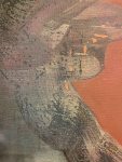
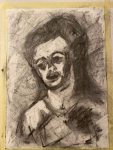
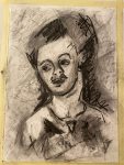
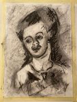
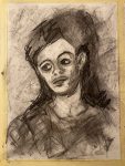
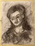
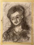
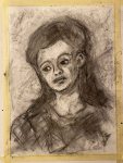
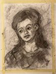
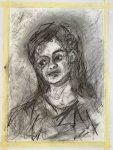
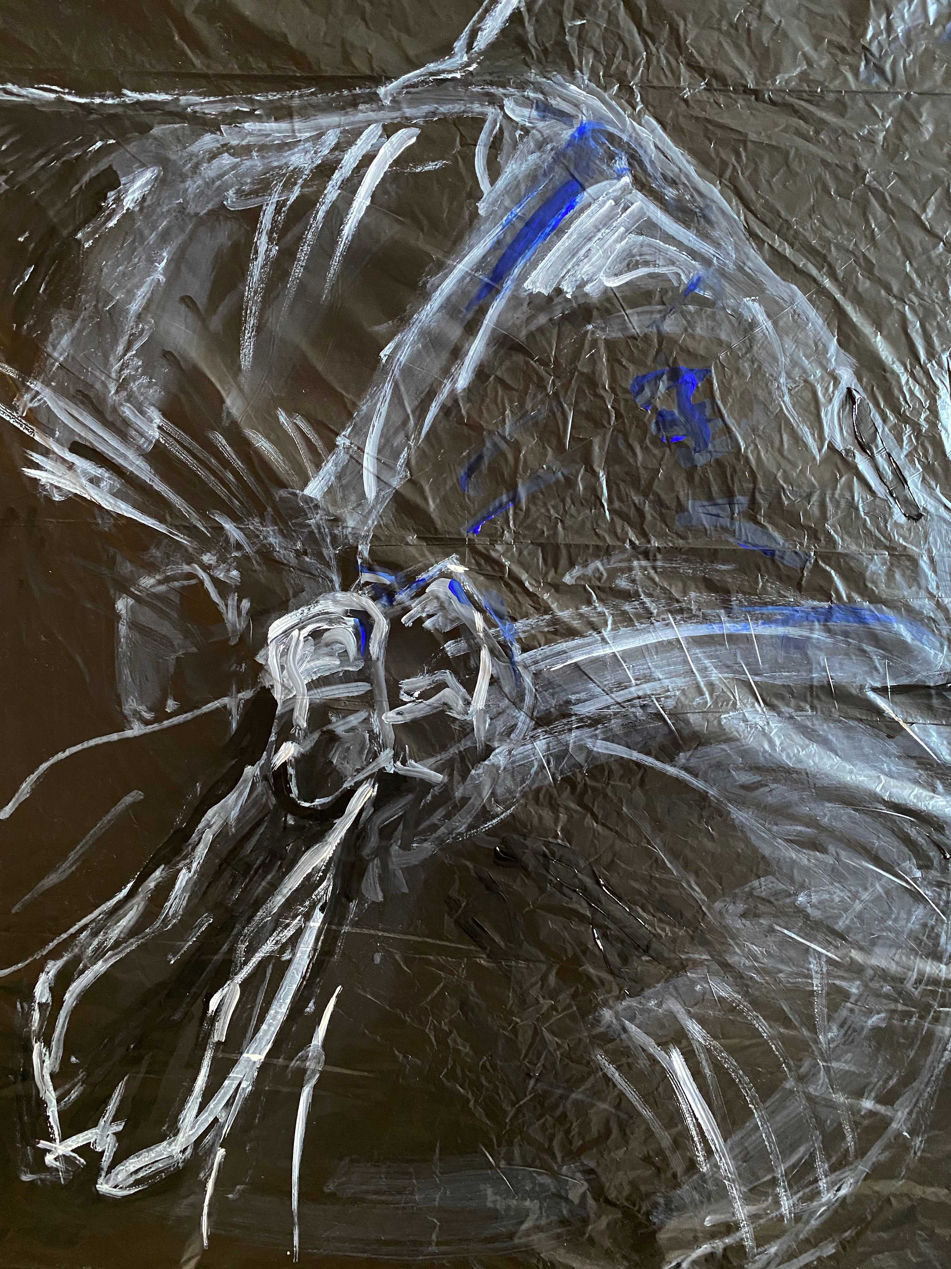
Another portrait that spoke to me strongly had a smear over the eyes that pulled in my attention. A quick effect, but I felt how it really worked here, in combination with the squares and lines behind the head.
I am quite fascinated by this combination recurring in all the paintings, of figure and some abstract colour fields and lines. I especially like how the artist knows exactly when to stop- and leave parts of the linen canvas untouched.
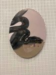
The oval painting of a serpent seems a little more illustrative and different from the rest, but the title ” Moon Serpent” ties it to the other “Moon Paintings”.
The largest and more monochrome painting contained several female figures, intertwined into impossible postures.
There is a lot of confusion and pain in this painting, some anxiety in the hands grabbing or even digging into the flesh. I can relate to the feelings that this painting expresses for me.
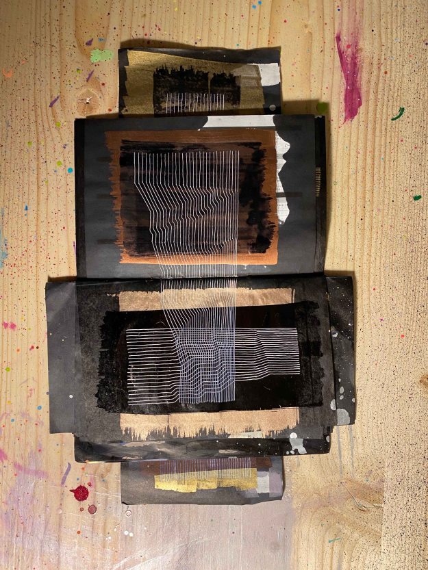
I also really liked this little series of close ups of the expressions in the faces painted on wood and then covered by a dark sheet of perplex- a technical idea to remember!
The artist used wood and perplex for some other smaller paintings too, in interesting different shapes, like the oval eye beside her name on the top image by the entrance, or like here in a hexagonal.
I am definitely fascinated by the way Rebecca Fontaine Wolf applies paint. First thing to remember is to leave parts uncovered. Then she combines acrylics with oil paints and boldly leaves parts in charcoal drawings:
I am intrigued by the way the paint pearls- is she applying acrylics on top of oil paints or what is happening here? Something to explore…
This was a wonderful art visit for me- I felt inspired by the subject and by the many technical new ideas I carried away. I heard that the artist is staying in Portugal for art residencies and hope to catch more of her work soon.
Last week, I visited the opening of Teresa Murta’s individual exhibition “Absurdo” at the NAVE Gallery, Lisbon.
Teresa Murta paints in acrylics on canvas and the motives are absurd, almost abstract but with some elements that are seemingly recognizable.
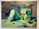
The shapes seem organic, or some sorts of containers, and sometimes look like some species of creatures.
The painting below looks like some sort of box, but becomes absurd melting as well upon closer inspection and it remains unclear what it really is:
I found myself trying to make out shapes and put some sense to them, rather than just enjoying the forms.
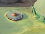
Some elements, like the egg, keeps recurring like a surrealist symbol in several of the paintings.
There is a feeling of being in a world after some catastrophe in several of the paintings, like surreal abandoned machines scattered.
I have difficulty relating to these absurd machine or organic worlds, except maybe with a certain unease.
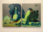
The paintings below, especially the one on the right were probably my favorites because they felt more like imaginary creatures with a certain expression on them, that could spark my imagination.
According to the exhibition catalogue, the paintings “go beyond reality and caress our sensitivity”. “Facing Teresa Murta’s work is a plunge into a world where the reality of simple and pure things is contaminated by the though that lives in our eyes.” (exhibition catalogue)
I had a conversation with the artist, asking her if the recurring elements, like the egg or sponge, have a specific meaning. She replied that the works are all totally process based. She never has an idea or sketch before she starts, she just starts with abstract shapes and colours, and then sees if her brain can recognize some of the forms, that she then develops into something more readable.
I am not very attracted to this type of absurd art, but had a wonderful evening and learned a lot just from talking to a passionate artist who works in a very different way.
Lifedrawing in ArCo- Centro de Arte e Comunicacao , Lisbon 7th of March
After a longer break, I am back to Lifedrawingclasses at ArCo in Lisbon. Today’s class was student led, meaning that we could all use the materials we wanted and decide together on the time of the poses. We started with a whole range of 5 minute and 10 minute poses. I started using Indian ink applied with a small stick, all drawings on A2 format:
And one drawing with water and dripping the ink onto wet parts:
I continued using oil pastels with this same method of applying ink:
I really like the looseness of using ink. When I tried combining it with a neater pencildrawing, I got stiff and uninteresting immediately:
For the last pose, we had 20 minutes:
I felt happier with the quicker poses, and feel how I prefer applying ink loosely with a stick or using water. On the whole, I felt really happy to be back to lifedrawing. It was a fun and cooperative atmosphere between the students and the model and I found the poses challenging and interesting.
D2 manual: “Aim: A significant period of western art history has been dominated by the attempt to create a believable illusion of space and depth in two dimensions. The idea of the picture frame as a window onto a simulated vista has long been regarded as just one of many possible interesting routes but the relationship between drawings on surfaces and drawings of surfaces is still absolutely vital and many artists make use of that interplay.
The description of space, depth and volume relies on depicting the way in which light operates on objects and the change in tonality that this produces. In the pitch dark, we see nothing. Natural light tends to fall on an object from one side and the sense that we make of the shadows it casts is how we judge three dimensions. The human mind is sophisticated at reading tone, which makes it hard for an aspiring artist to create a convincing visual illusion – the viewer is not easily fooled.The first step for any student is to correct any over-reliance on outline. What we translate as an outline is actually just the moment that something disappears from view – either because something has come in front of it or because its surface has changed direction and slipped from view to reveal what is behind. Either way, being able to sit the two planes next to each other without ringing one of them with a black outline will immediately give a sense of volume and space. An outline pulls us back to the picture plane. This is not a problem in itself but, as it is so often used by students, use this project to try not doing it.
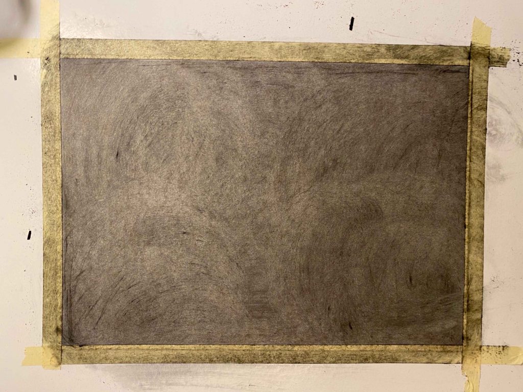
Method: Cover a whole sheet of paper with charcoal so that you have a blank black rectangle. Make a drawing from a subject of your choice by drawing into the charcoal using a rubber or selection of rubbers. When you’ve worked into the charcoal for about an hour using just a rubber (depending on how fast you work), go back to your charcoal and begin to redraw in darker tones using the side of the charcoal. Continue in this way using the rubber as a white to the charcoal’s black and develop the drawing until you’re happy with it. Try to avoid using outlines – instead, use sweeps of the rubber or the side of the charcoal to build up patches of tone. If you do use an outline, look at the two neighbouring tones, decide which is the darker and then blend the outline into that one. Bear in mind that as you move along the object’s silhouette, the relationships might change and the outline might switch allegiance.
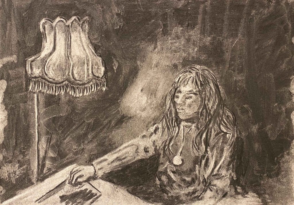
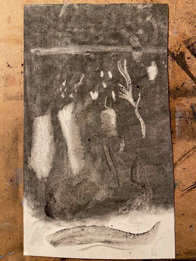
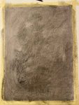
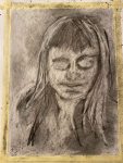
I am approaching this project while visiting my artist friend Constanca in her studio and we use this method to draw a portrait of each other while drawing.
We only have medium size willow sticks of charcoal and a simple eraser available
This is my final portrait of Constanca, and a big lampshade behind her, after much rubbing and filling in.
I am not happy with this drawing, it was hard to capture any likeness while she was moving and this drawing does really not make her beauty any justice. I am also annoyed at myself for enjoying working in shade only, and then still having the impulse to add line at the very end.
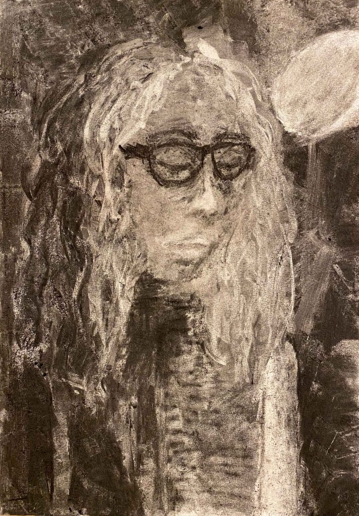
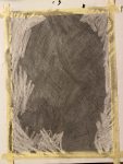
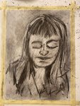
This is Constancas portrait of me:
I felt very happy at “rediscovering” charcoal through this project, and it was wonderful and playful to share the experience. We will definitely draw more together in the future!
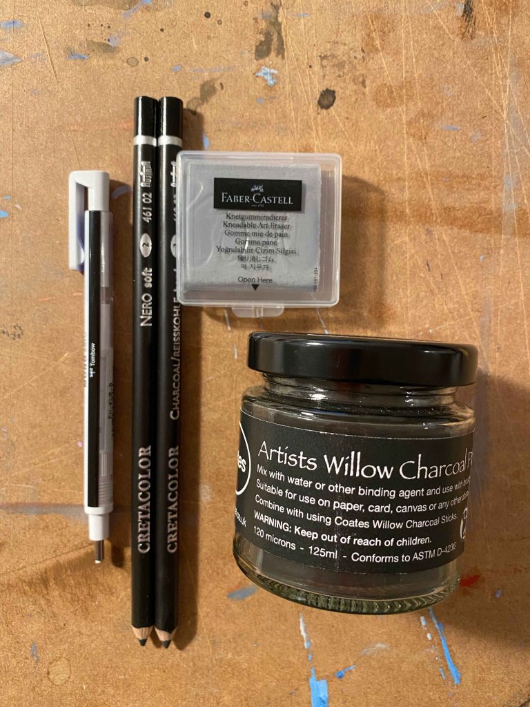
I aquire a few more specific tools for this kind of drawing for my second attempt in my own studio:
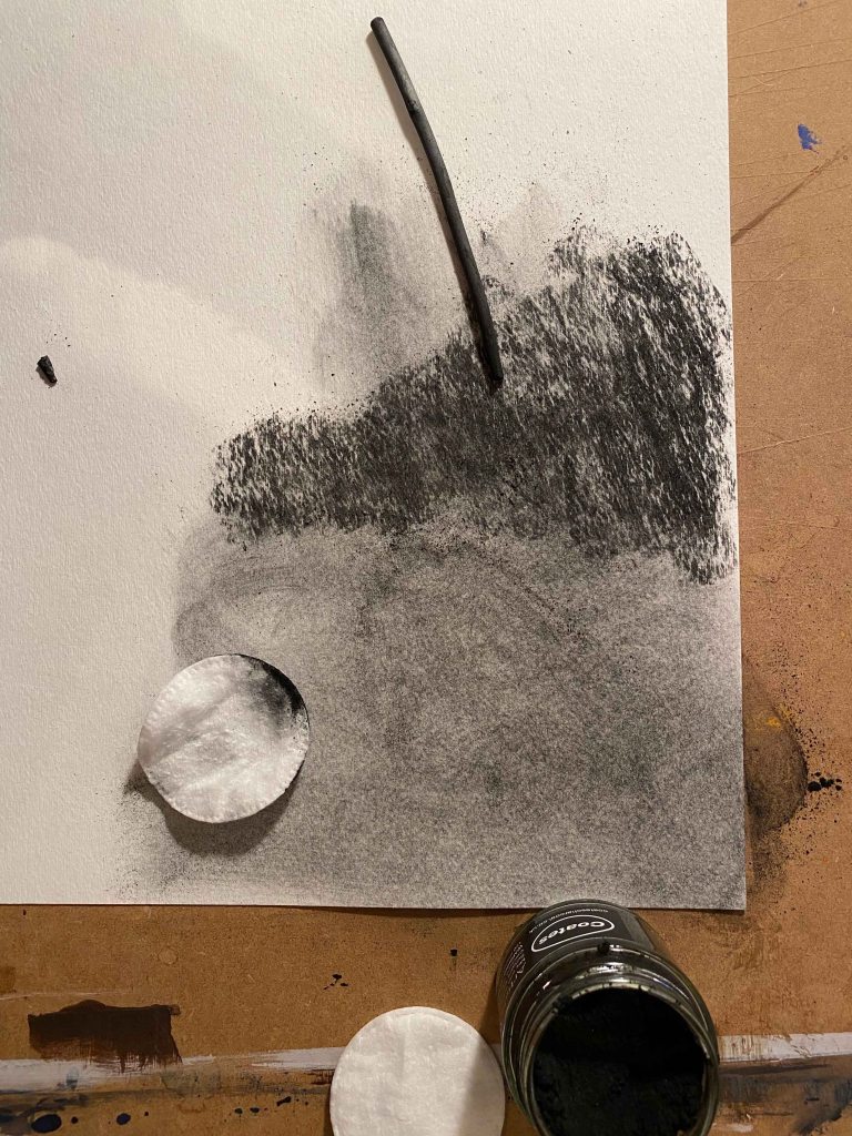
I was excited to try the willow charcoal powder, but find that when using it dry, I can not reach the depth of dark as I can with using the sticks- even if applying many layers:
I am reading the book “that which is not drawn” with conversations between William Kentridge and Rosalind C. Morris. (Kentridge, W & Morris, R.C (2014). That which is not drawn. India: Seagull Books.)
William Kentridge works in large charcoal drawings which he erases and transforms constantly, taking photos to document each step and then creating stop motion animated films. He is depicting transformation.
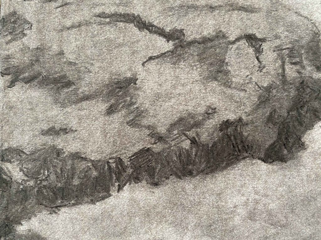
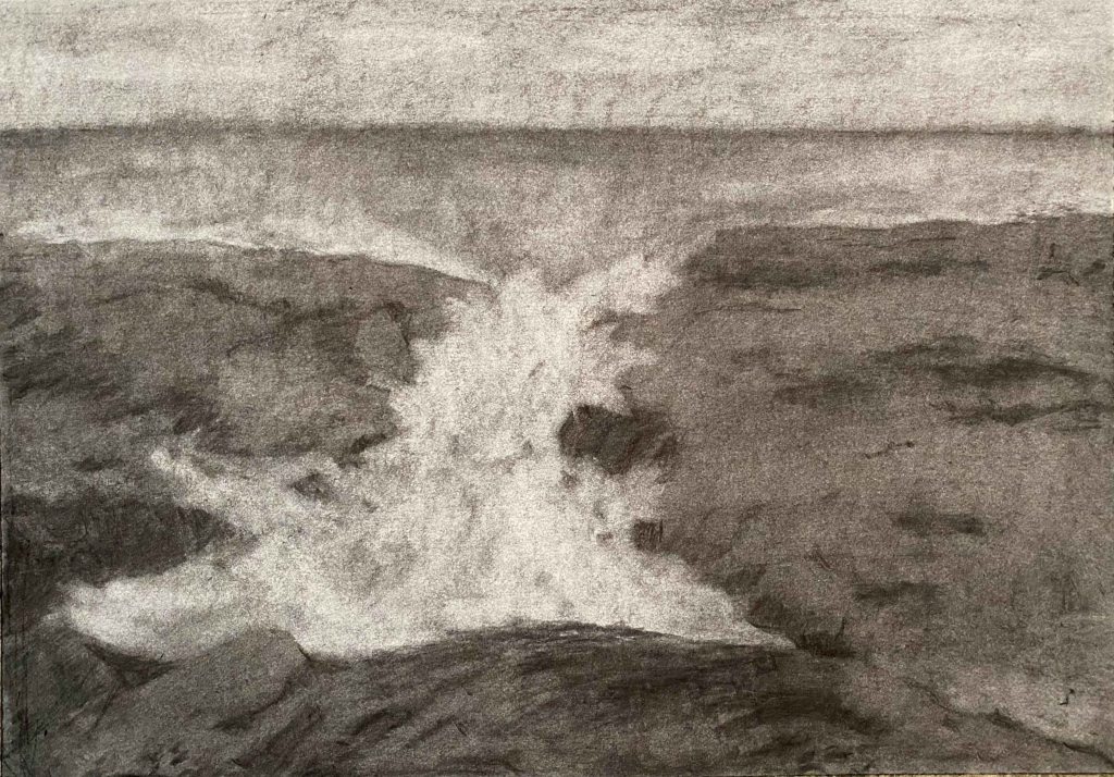
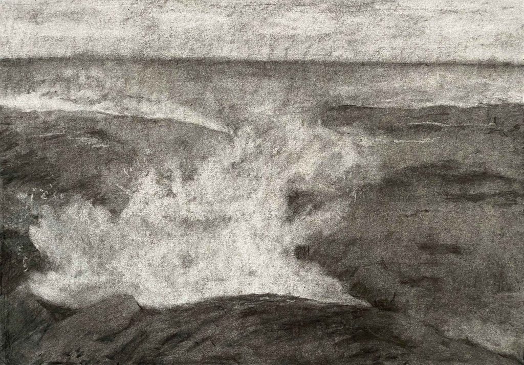
I am really excited to try this out with this project. I am going to use a moving ,crashing wave as my subject, to play with the eraser to create more or less foam on the crest of the wave, without it being a form that has to be too precise to feel right.
I start by trying out different papers:
Canson recycle, Strathmore watercolour 300g and Smooth surface cartridge paper. I had the idea that a rougher paper would give a better tooth and result, but actually the smooth cartridge paper allows for whiter erasing which is a main advantage.
I also try out the different marks my new eraser tools can achieve:
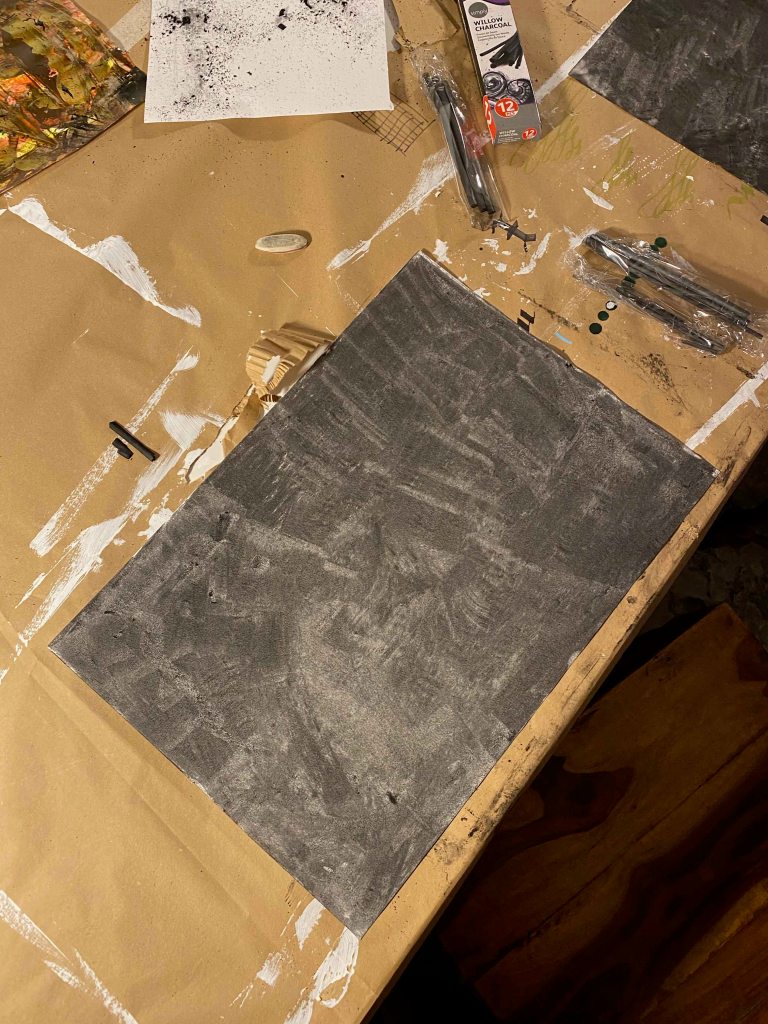
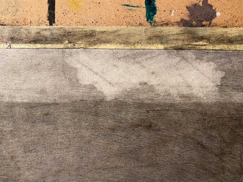
Preparing my smooth cartridge paper A3 with a layer of charcoal and starting to erase the sky:
Here I encounter the problem, that my board under the paper has lines from previous painting that show up as marks through the pressure, that are then not possible to erase- as seen above.
New start on a smooth board:
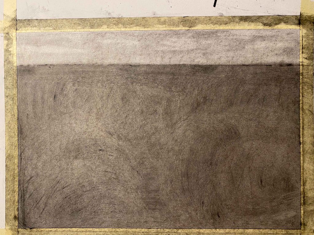
I continue erasing and smudging and filling in til I have a sea landscape as a starting point:
By now it is night and as photography is a main part of this project, I decide to leave the drawing til daylight:
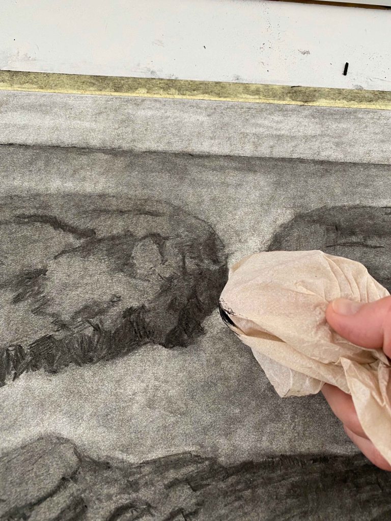
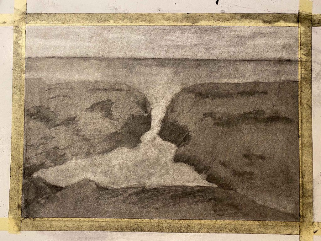
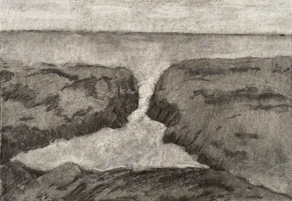
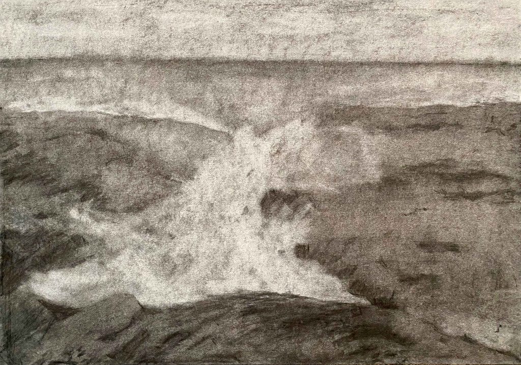
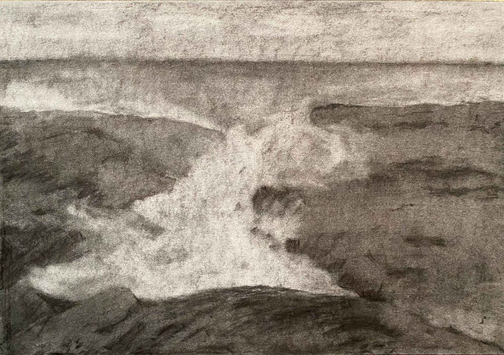
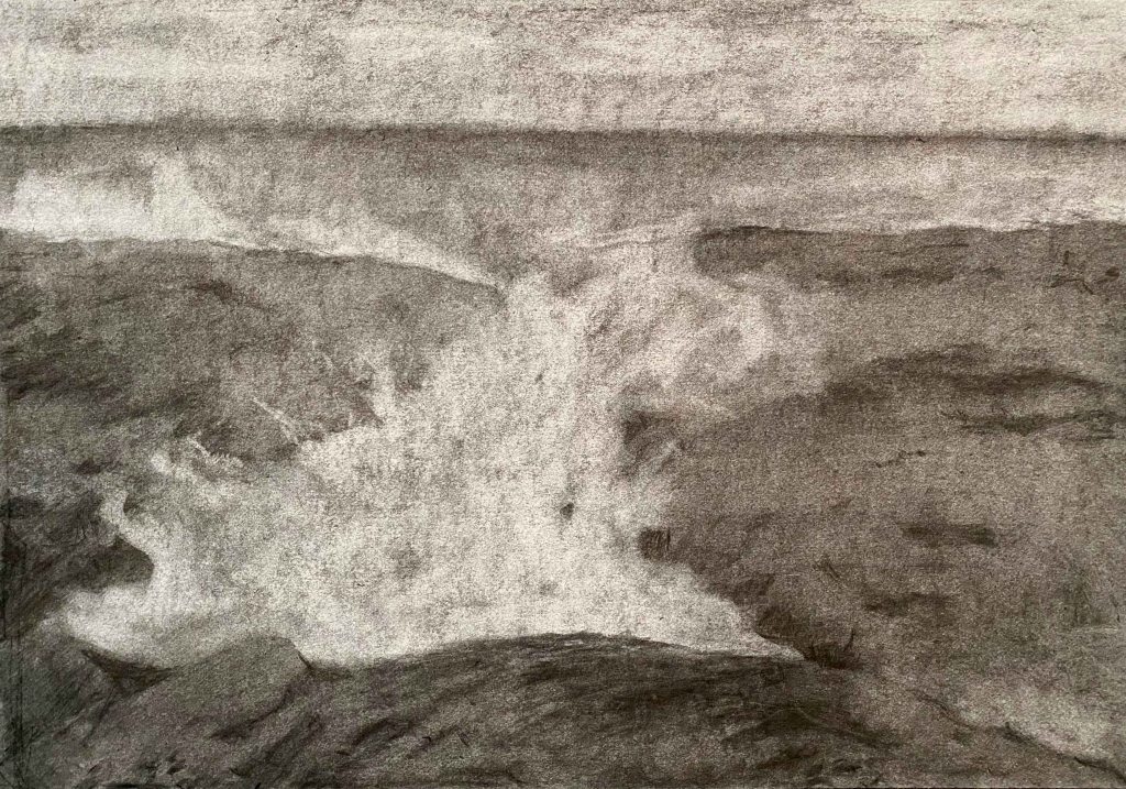
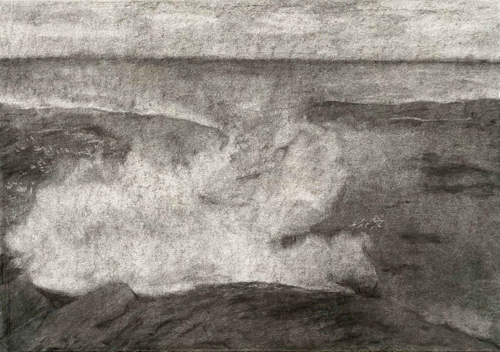
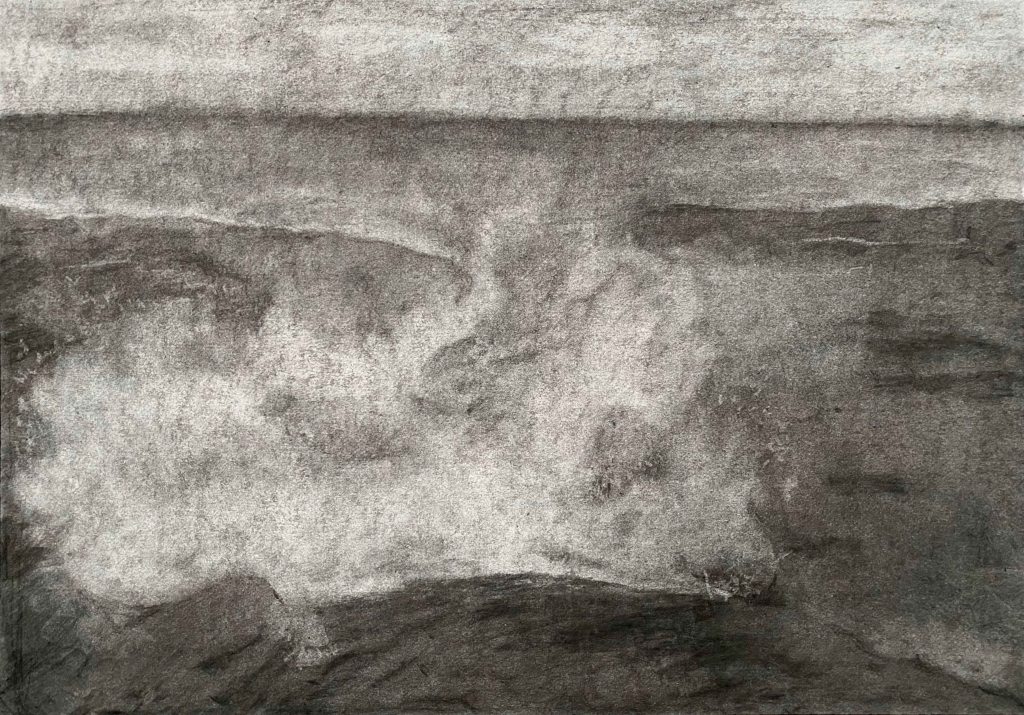
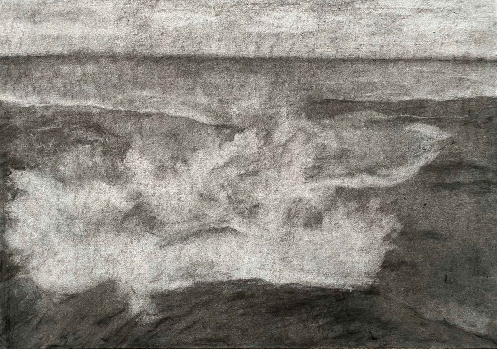
With good light, I start the process of transforming the wave, while taking a total of 27 photos of the change:
Now it is time to use Imovie to try and string these photos together to a stop motion film. I have never done this before and encounter all kinds of technical little hurdles, like a default zoom action between the images. Finally I have a small movie.
For the sound, I am in the city, not at the sea, and this is more a symbolical wave of feeling crushed. I record the sound of the trashtruck coming to pick up the recycled glass, and also the unbearable acoustics of the cafeteria where I often have lunch. I add both soundtracks and play them louder and louder to the increasing of the wave, and finally the silence at the last overwhelming image.
This free WordPress version does not support video, so please follow this link to You tube to see the video:
I am not overly happy with the final result- but I feel thrilled at having rediscovered the pleasure of using charcoal and having tried something very different with this stop motion video. Next time, I definitely need to fix the camera at one place instead of holding it in my hand as to avoid the jumping motions between images.
I think this series of drawings give a good illusion of space and depth, and the stop motion video adds the dimension of time as well.
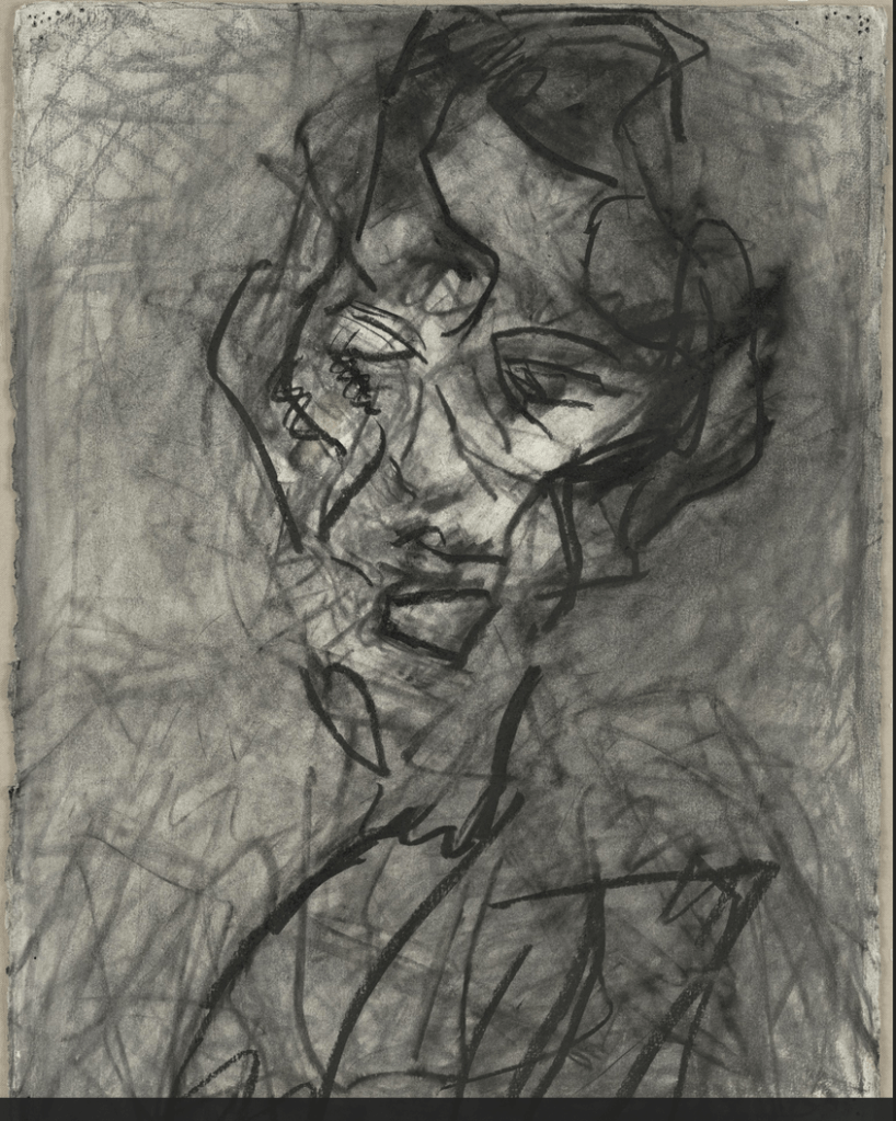
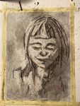
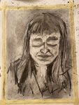
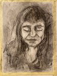
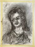
By now, I have come across the charcoal portraits by Frank Auerbach and am absolutely in awe. He documents the many changes and the quest for the perfect form and all the movement in between in one single drawing, sometimes so intensely that the paper rubs off.
I am particularly fascinated by this portrait of Catherine Lampert with its free squiggles and lines. It conveys a restlessness in capturing the features that I can feel.
I definitely want to try to draw a portrait inspired by this drawing.
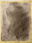
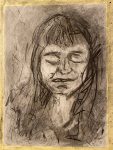
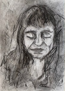
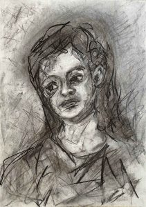
I start by covering the Winsor&Newton Smooth Surface Cartridge Paper in A3 size with a layer of charcoal, and then follow a long process of adding and erasing. I am drawing an imaginary portrait with closed eyes .
This is the final portrait in daylight:
This portrait still lacks some depth, but I am happy with the free marks inspired by Auerbach. I need to try this once more though, with a head turned to the side.
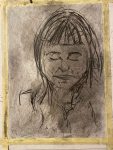
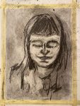
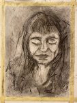
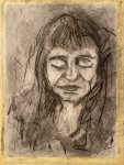
This is the process this time:
This is the final drawing “Beatrice”A3:
This time, there is a better sense of depth and I like the expression and tilt of the head and how the shape sits in the surrounding space. It is still very controlled and boring compared to Auerbachs portraits. It has helped me take one more small step towards loosening up the markmaking though.
Using charcoal in this way has helped me overcoming relying on outline instead of tone and has helped me rediscover this beautiful, versatile medium.
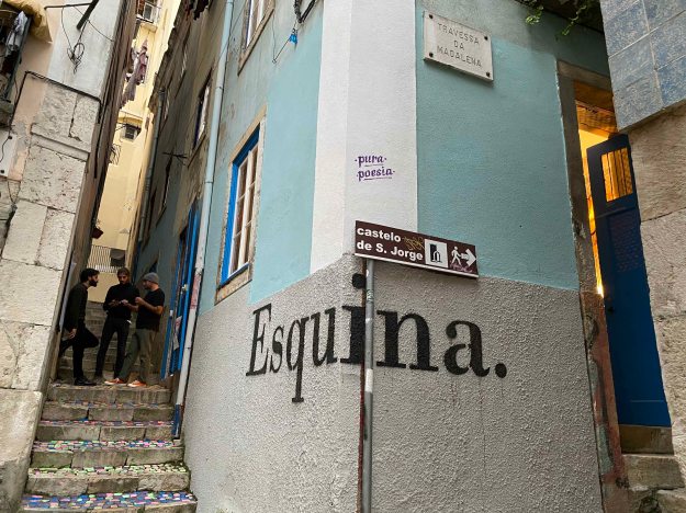
Esquina Atelier is a small artist driven artist residency and gallery space in Lisbon. February 6-8 they created an event called ” Come exhibit with me” where all four residents decided on artist friends to create a group exhibition. I was lucky enough to be invited to show some paintings here in this small, cozy and fun event.
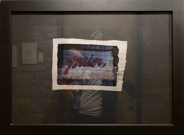
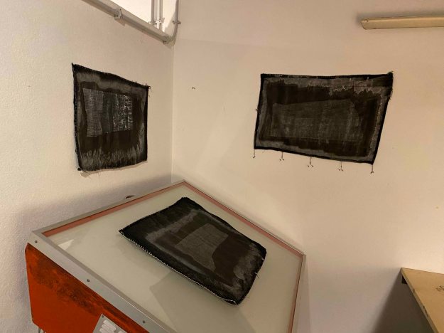
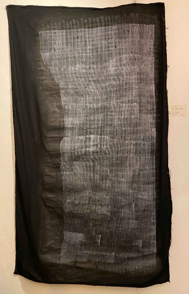
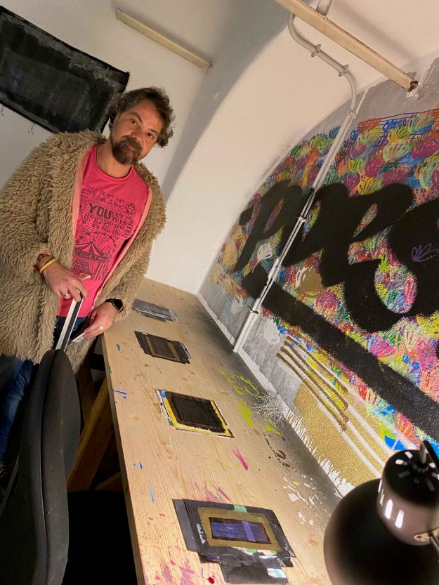
Felipe Fernandes is a graffiti artist whose name “Pura poesia” is to be seen all over Lisbon. Because of this, he is the most well known artist of the group. In this exhibition, he showed “visual poetry” which is always consisting of lines or words on dark backgrounds.
“Pain” and “poesia” are the most recurring words. I enjoyed the versatility of the supports Filipe used and the different ways he exposed the pieces- some on paper, some on textiles, some large and some very small strung together in series.
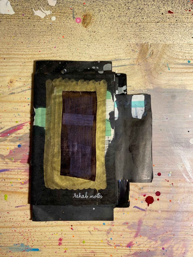
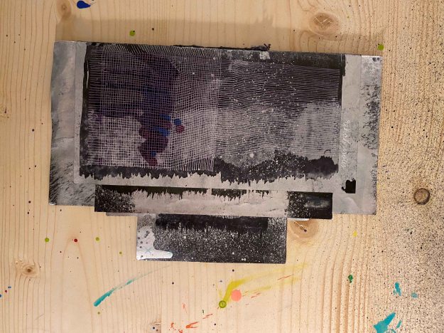
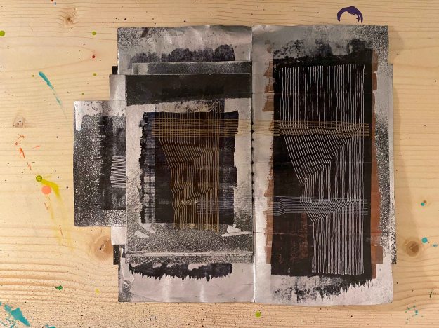
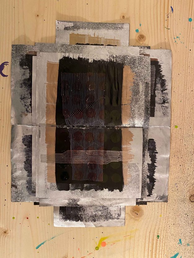
Most of all, I liked one corner where he displayed a row of artists books:
The books are made out of drawings in different sizes and papers and although the motive of the lines and words on dark were quite similar, the juxtaposition of the different papers and textures and slight variation in lines made the subtle differences clear.
The lines themselves become a coded language and the few words we can read, like “rehab notes” or “pain” sets the context. I found this an exciting inspiration for the format of the artists book I will make later in the course. It was interesting to note how important the tactile experience became with the different qualities of paper.
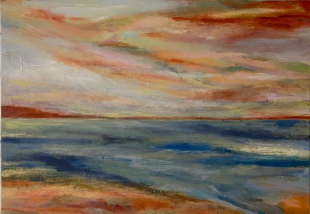
Marta Simoes showed some colourful landscapes in oil:
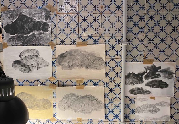
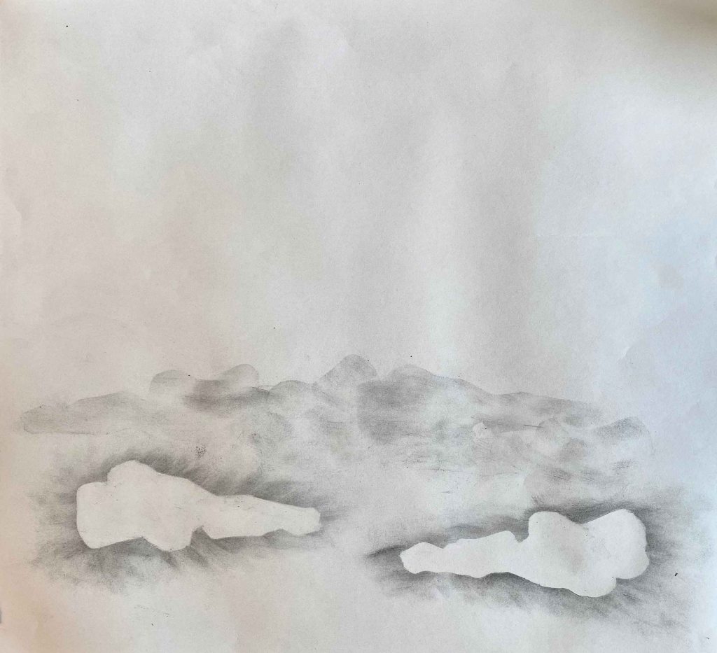
More interesting were her drawings of clouds in liquid graphite:
I believe these rather quick works could have benefited from a more careful presentation maybe.
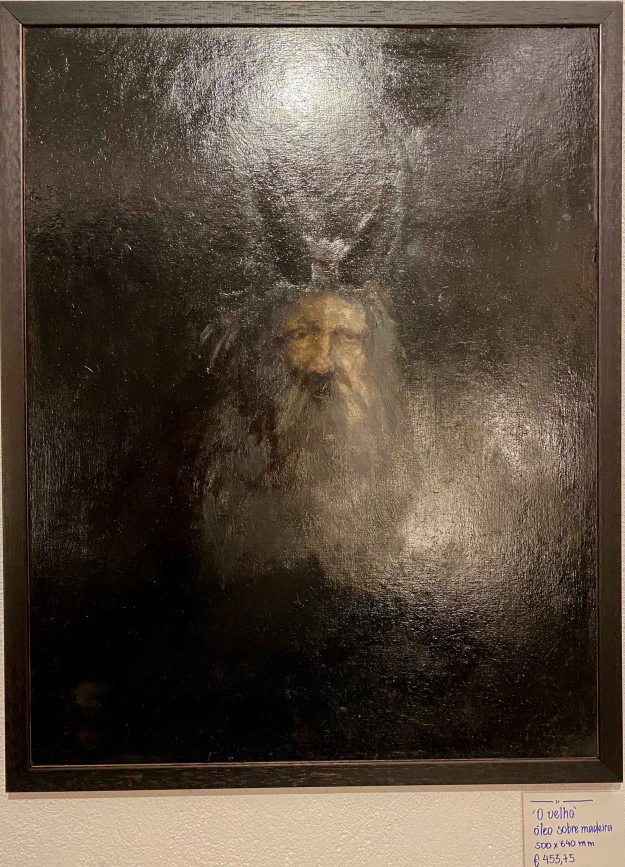
Fransisco Marques is a more classical painter. I really loved his very dark portrait “The Old man” (with horns) painted in many layers of oil over a long period of time:
This photo really does not do the painting justice. It is alive from the incredibly richness of different tones of black.
His graphite drawing also has an incredible amount of small detail and different layers of narrative:
I was surprised by the very different feel of Francisco’s other oil painting of a sort of clay figure with a crudely drawn face:
I really liked the body of work of Constanca Sardinha, which is very different from any of my own drawings. She sits on various buses through the city of Lisbon with a pen poised over a piece of paper and lets the movements of the bus create a random drawing. I was quite captivated by the method and the delicate drawings that resulted from it. Back in the studio, Constanca interprets what she sees and feels when looking at the drawing and collages fitting words that she cuts out from old magazines or school books.
It was interesting to discover how different I felt about the drawings before and after knowing about her method. The fact of the marks being random increased their attractiveness with a strange fascination. They also had a very different impact depending on the size and the presentation alone or in small groups.
The next artist wanted to remain anonymous and presented only as “the friend of Francisco”. Apparently he always exposes his work without revealing his name to avoid being caught up in becoming popular. Possibly he is also a graffiti artist. I am not even sure he was present at the opening.
I enjoyed his rather delicate ink drawings, mainly of patterns that looked like shavings of wood in different shapes. I also really liked the way they were framed behind glass without any background.
I also really liked this portrait in subtle tones that looked like done with rubbing of charcoal, a way of drawing that I am exploring right now for part 2 of the course.
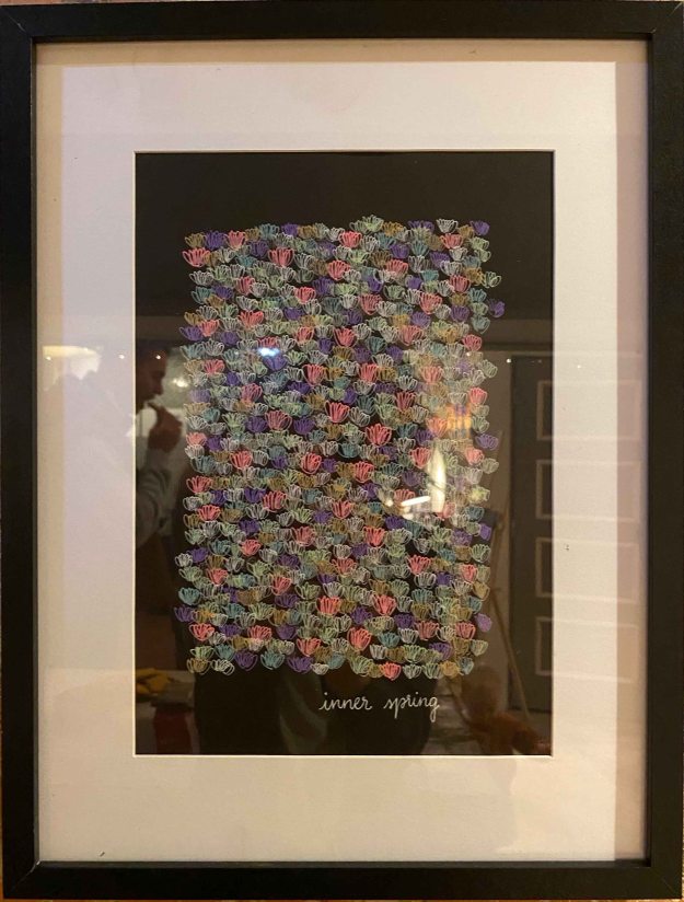
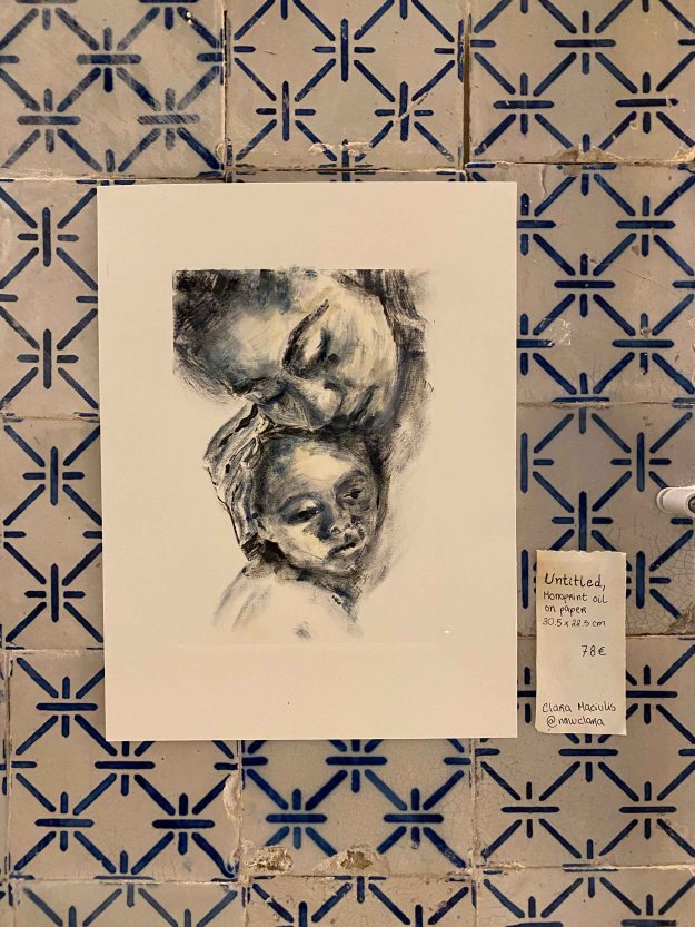
I showed some mono prints in oil that looked very different on the patterned tiles of the room:
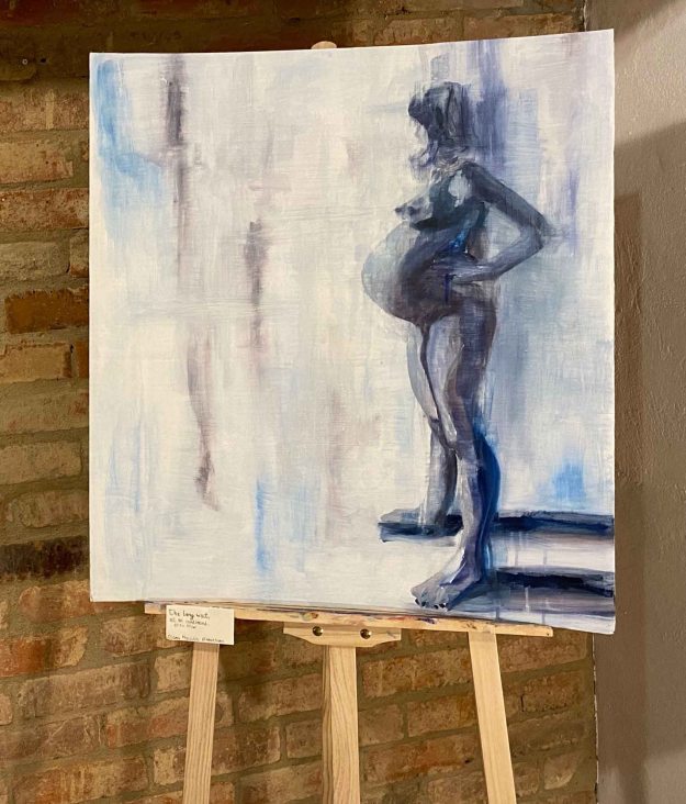
I also showed an oilpainting of my pregnant daughter on cardboard presented on an easel:
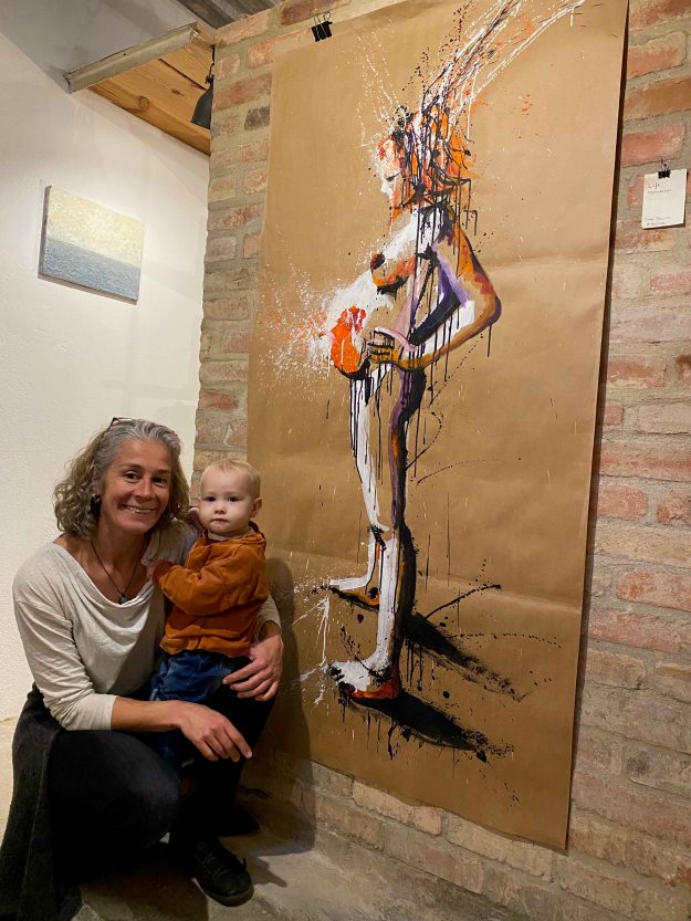
Here I am posing with my granddaughter in front of a painting in acrylics on paper:
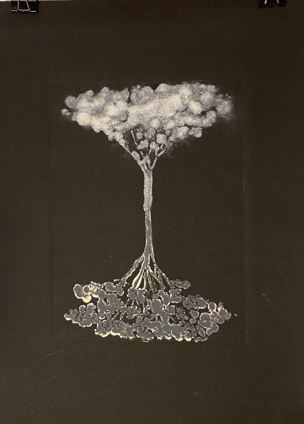
And at last a small painting in oil on aluminium:
It was a very fun evening and we all received so much encouraging, positive feedback. It felt really good to co-create a small event like this with other artists. This is all very, very new for me. It was only three months ago that I dared upload some of my paintings on Instagram and to actually show something live felt like a leap. This first experience was so positive though, it is definitely worth to dare and to invest some time and energy in communicating and connecting.
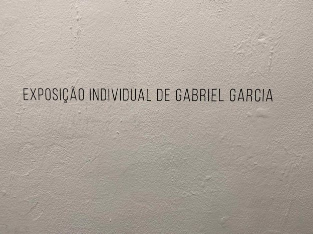
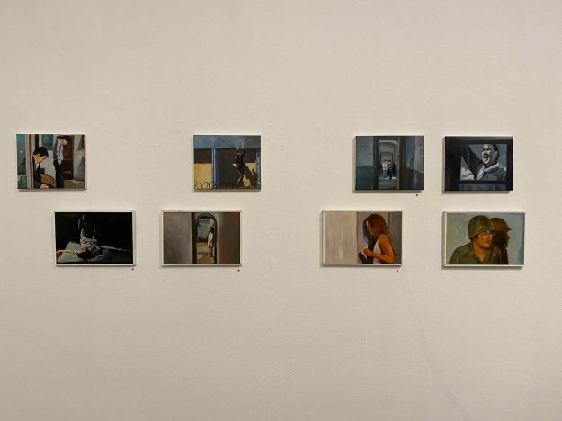
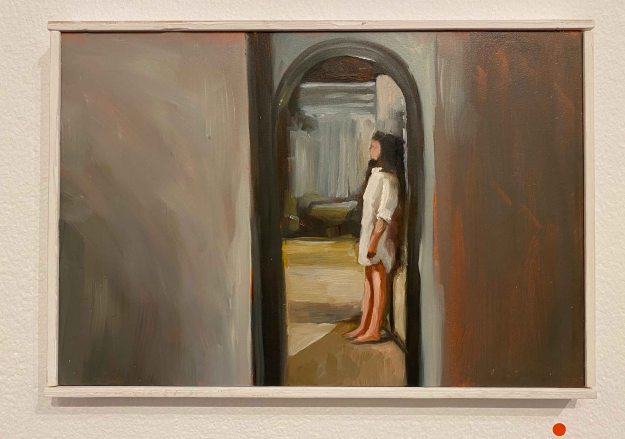
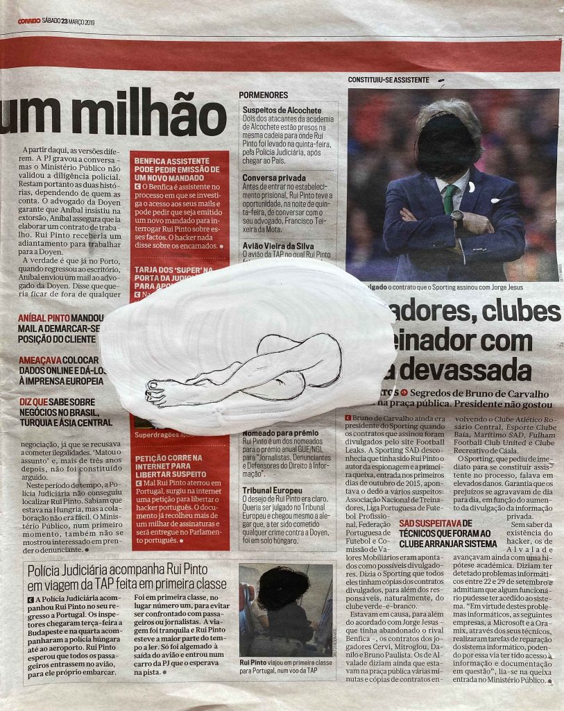
I recently visited the beautiful exhibition of Portuguese painter Gabriel Garcia in the Espaco Exhibitionista gallery in Lisbon.
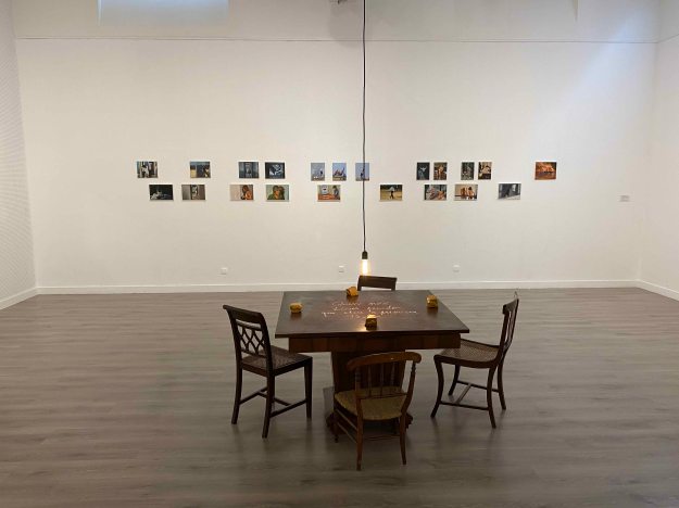
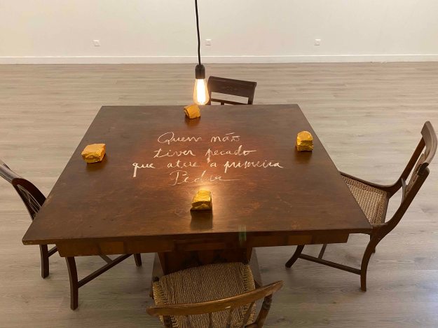
The title of the exhibition is “Who throws the First Rock”, which was presented in golden letters on a wooden table, with stones around- a beautiful moment in itself. I liked how this added a three-dimensional piece to the exhibition who was otherwise only paintings on the walls.
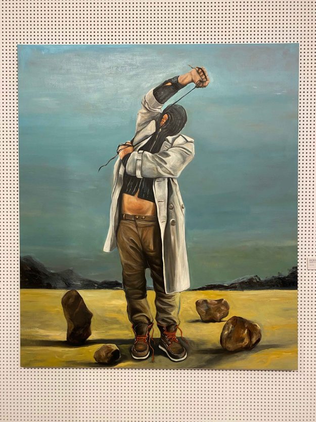
Two walls presented really large paintings of men hiding their faces in hoodies or ties in a rather desperate move, hiding or maybe punishing themselves in some ways.
The stones were present on the ground of the paintings.
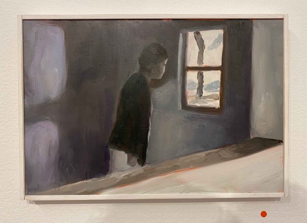
I was even more affected by another series of mid size paintings showing a disrupted narrative, hands washing themselves in a sink for example. A very simple gesture, but given the title of the exhibition and the dark tone of the paintings, they seem to be washing off a sin.
The whole back wall was occupied by a double row of very small oil paintings.
They seemed to be painted from very different snapshots, of domestic scenes, of terrorist attacks, of someone longingly looking through a window. At first glance they were rather usual scenes from images I would feel frequently confronted with. Looking longer, I was taken by a very dark feeling though. All the paintings have a heavy, desperate, given up or aggressive tone.
I liked that the stories here remain so unclear, that we as viewers have to add our own imagination to complete the narrative. There is a certain despair in the paintings that I felt uncomfortable feeling, at the same time as I admire how Garcia manages to make me feel so strongly.
As an artist I was pleased to see the red dots of “sold” on almost all the paintings, which felt encouraging.
I am most interested in painting and drawing stories.
For POP 1 , I accompanied the emotional and physical changes of my daughter when she went through the different stages of an unplanned teenage pregnancy.
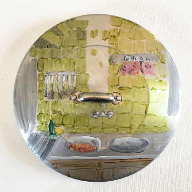
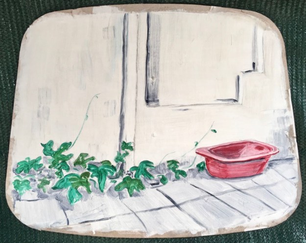
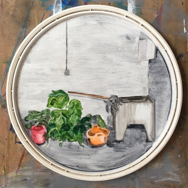
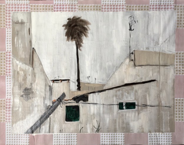
For UPM, I portrayed the village in the South of Portugal where we spent a few months per year, using locally found materials as my supports.
And presented it in the backyard:
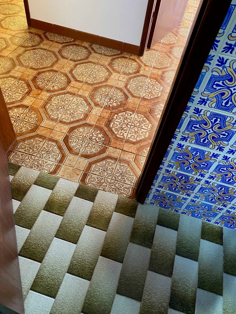
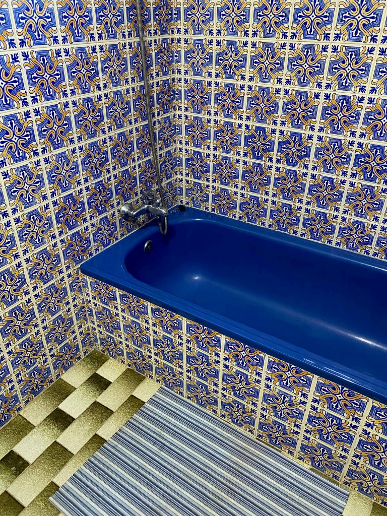
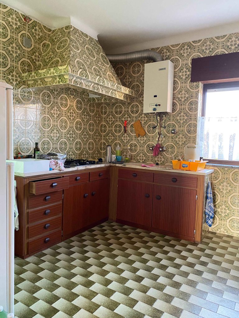
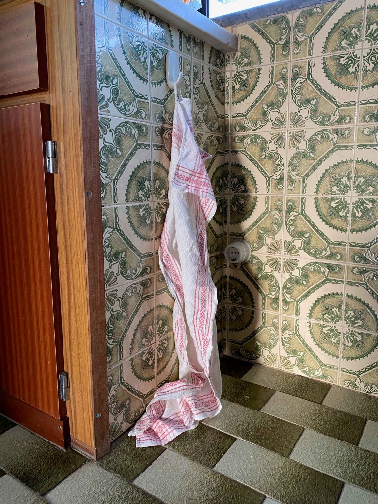
We have just bought a house in this same village and are in the process of renovating it totally. This house is so terribly ugly that it becomes quite fascinating- with an excessive use of tiles in various patterns contrasting with stark whitewashed walls and strange details.
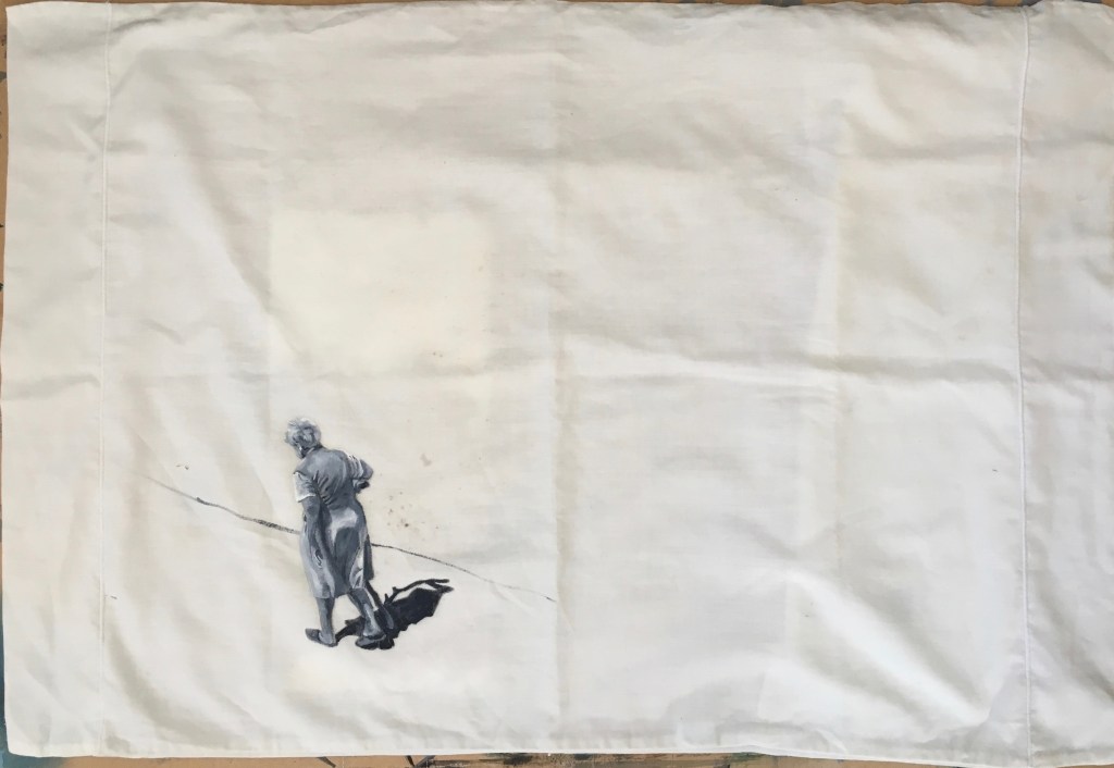
Our neighbour- Dona Maria Jose that I also painted on a pillow cover for UPM, is a well of information and stories about the village and its quirky inhabitants.
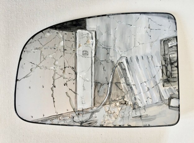
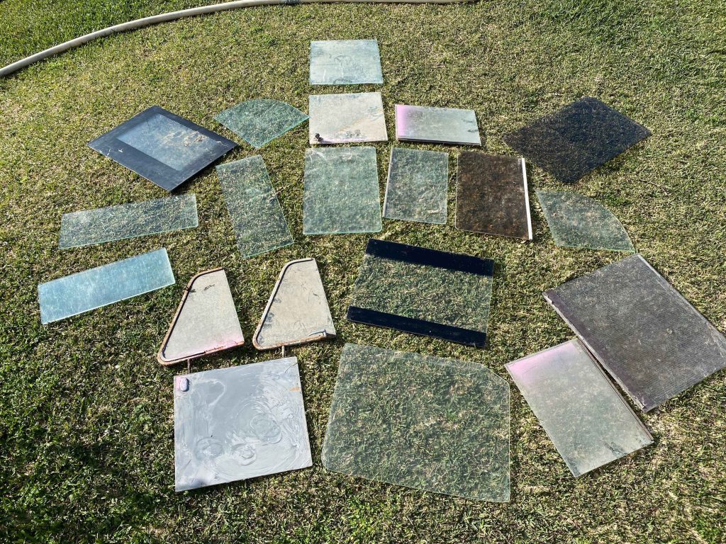
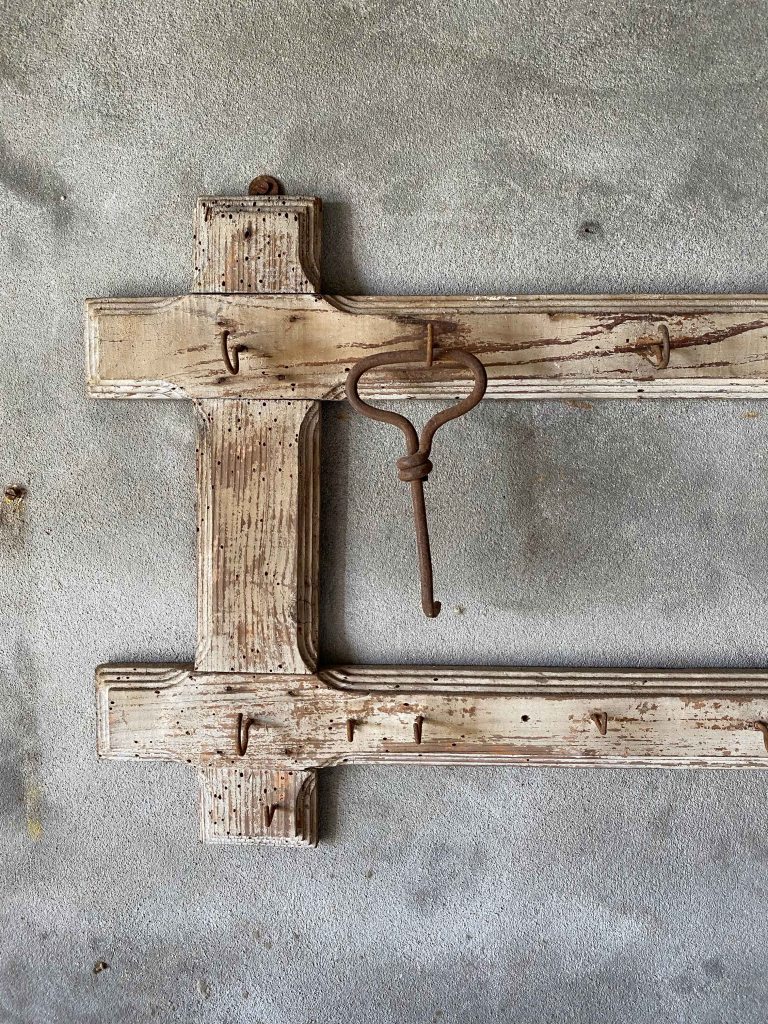
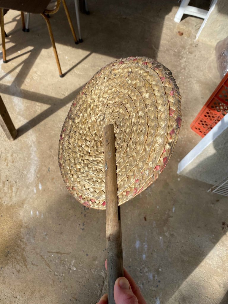
I would like to paint some glimpses of these sometimes tragic, sometimes surreal stories. I would like to use various strange objects that have been left here in the house and around as supports- like lace curtains or vases or lamp shades. I also found an incredible collection of various glass and would like to experiment with painting on them.
Some items might be too heavy or bulky to send and could maybe be included as photos?
I am not sure how yet, but it would be interesting to pick up the patterns of all the tiles used here too, before they will be changed with the renovation. For this project, I would focus more on the figures and their emotions than on things, but use the objects to express the stories.
I am curious what my tutor Emma Drye thinks of these first ideas for a parallel project and how this can develop.
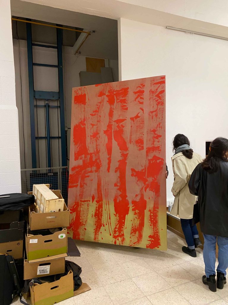
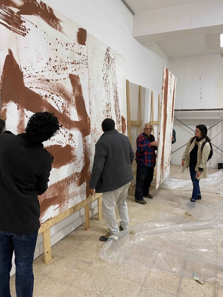
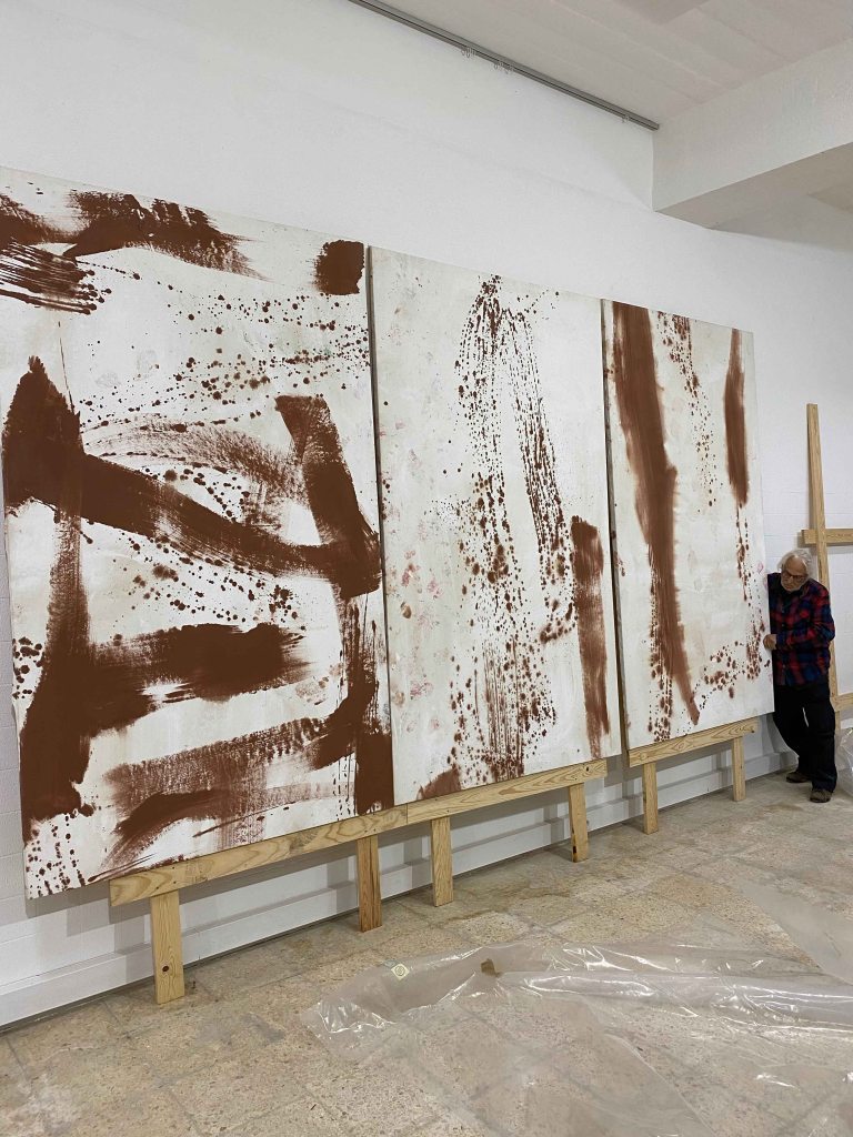
Today I went for a visit organized by ArCo, Centro de Arte e Comunicacao Visual to the Lisbon studio of the famous abstract artist Vitor Pomar.
It was the first time I went for this type of a visit and it was just beautiful to see the working space and works in process by an artist whose paintings I had previously seen in museums, mainly in Fundacao Gulbenkian.
Vitor took advantage of the many strong arms available to move around paintings between the studio and the storage.
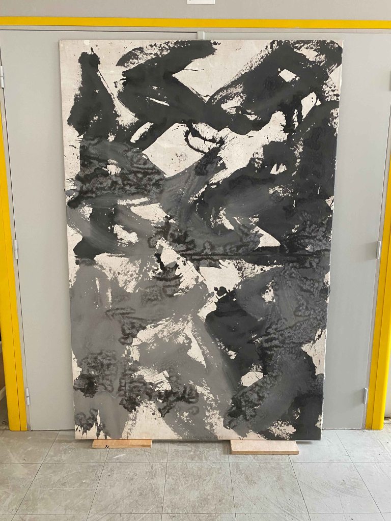
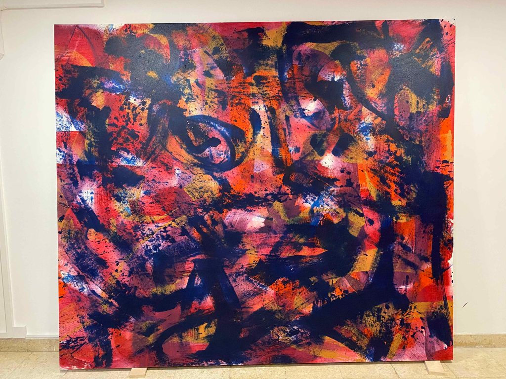
His paintings are huge, all in acrylics and very colourful after a brief black and white period in the 60/70’s.
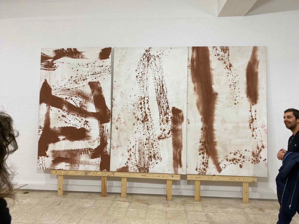
Generally, I have difficulty engaging with abstract art, and so also with Vitor Pomars oevre, especially the very colourful ones with very varied marks. I felt more attracted to the newer works with fewer marks and mainly one colour of marks on one colour of background, like the ones being moved above.
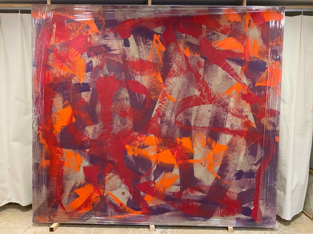
He works on linen, and on this particular one on the floor that looked very different from most other works, he used a transparent gesso to let the linen shine through, an idea that I really liked and will use:
It was interesting to feel how my perception shifted when Vitor described the work and the titles. This last series is the one I could engage most with- titled 9/11 about the falling twin towers:
It was an exciting and inspiring visit and I would love to move around paint on huge canvases in a huge space like Vitors 🙂
For your first assignment, review your sketchbooks and project work so far. Think about all you’ve learned about scale, cropping, selection, flexibility and judgment and make a decision about which area you’d like to develop for your assignment piece. This could result in one drawing or a series of drawings. Your subject can be anything you like but, whatever you choose, the relationships within your drawing(s) should set up an intriguing and engaging composition.
I start by reviewing some drawings from the projects of this chapter.
1.1 Observational drawing
1.2 Using space
1.3 Changing the scale
1.4 The human form
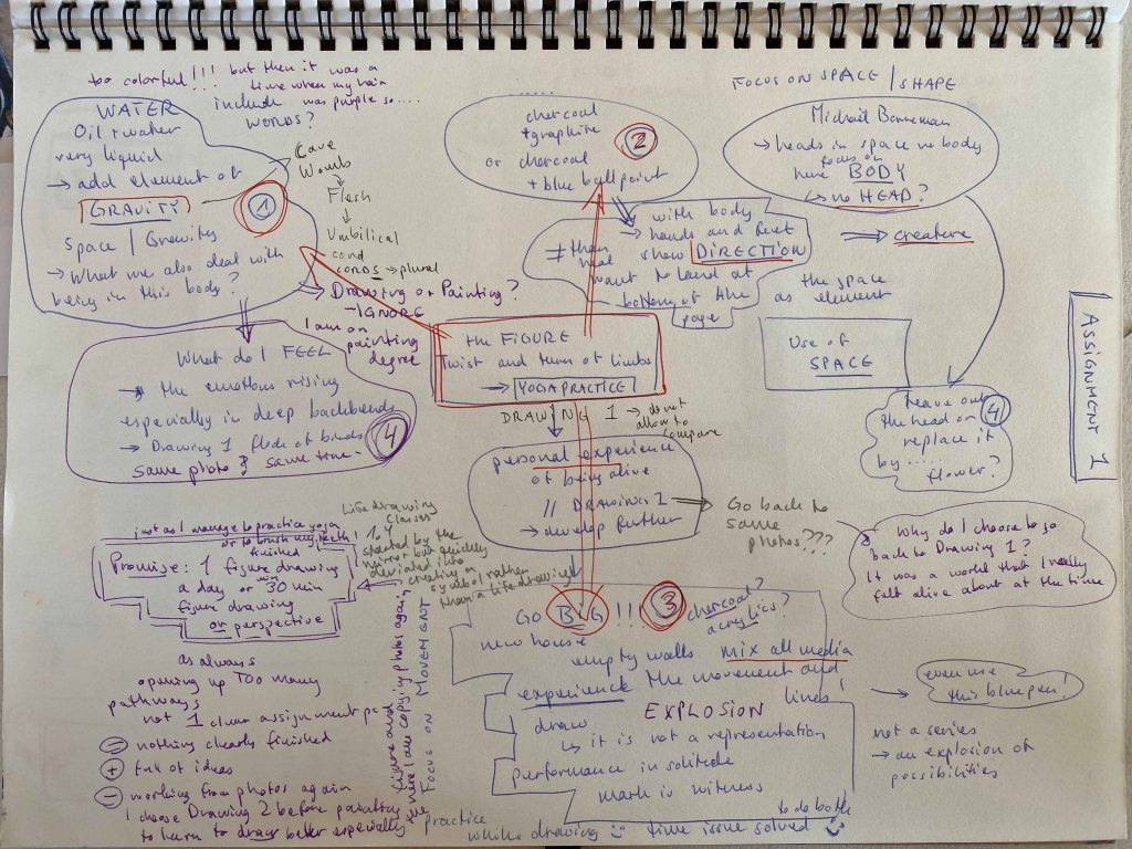
I am very interested in learning to draw and paint the human form and choose to continue exploring this for the first assignment. I am immediately exploding with ideas about where this could go:
For Part 5 of Drawing 1, I explored figure drawing through yoga poses, focusing on how the poses feel while practicing. I produced some mixed media drawings through painting my hands and feet while moving on yogamat sized paper and a concertina book and still remember this as a work I really felt alive about at the time. I practice yoga (almost) daily and have so for the last 15 years, so it is very linked to my experience of the body. For this first assignment of Drawing 2, I want to reconnect to that last of Drawing 1 and bring it further ( and will not even allow my mind to compare or tell me that what I did years ago was better).
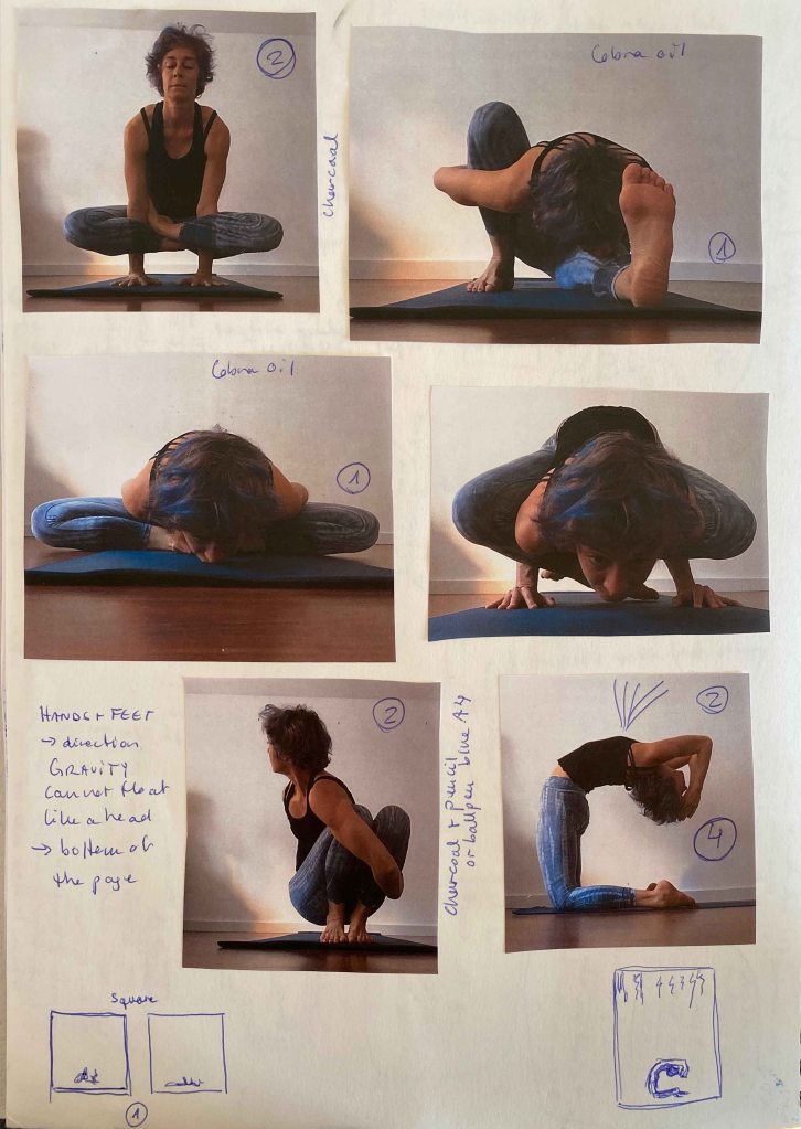
I start by looking for photos of myself practicing and although they are a few years old, they are the best clear photos I will use:
In several of the ideas I have on the Assignment map, I see these figures surrounded by a lot of space. I am thinking of the work by Matthew Carr that I saw during a visit to the National Portrait Gallery in London in 2017:
I really like the very special composition, with the tiny heads detached from any body or surrounding, floating on the grey page.
(Visit National portrait Gallery August 2017 , my photo)
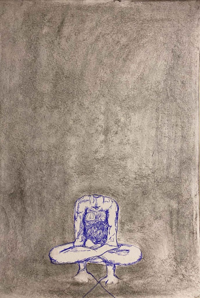
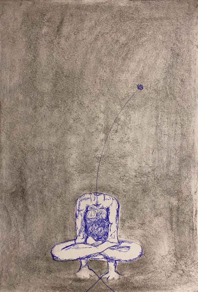
A body, hands and feet connected in a pose, contrary to a head, immediately show direction though and want to land at the bottom of the page. I reverse the idea of Matthew Carr by drawing three bodies without heads. I start with a smeared charcoal background:
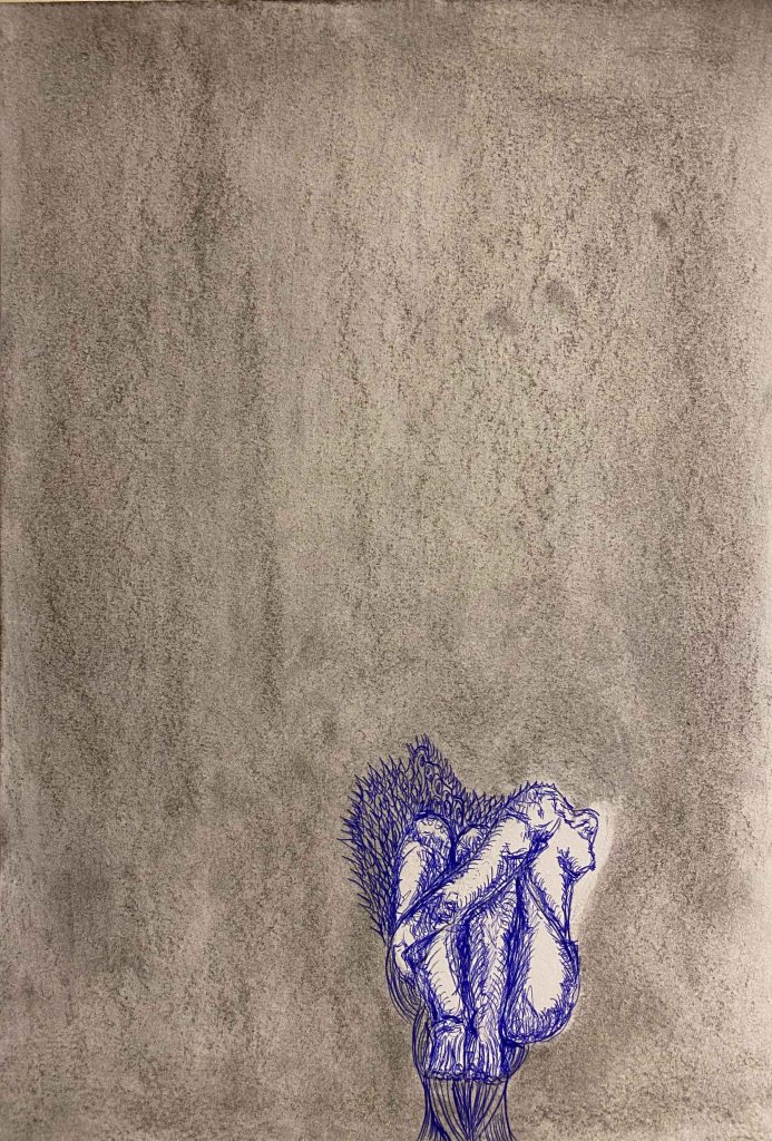
I will admit that I had the idea to draw the figures in a detailed realistic graphite drawing but after much erasing switched to a blue ballpoint pen and a free doodle drawing:
And then of course I couldn’t resist to add a flower poking out :
I was aiming for surreal and strange, expressing the mix of deep and weird feelings arising, but I don’t feel these drawings work yet.
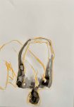
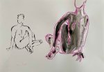
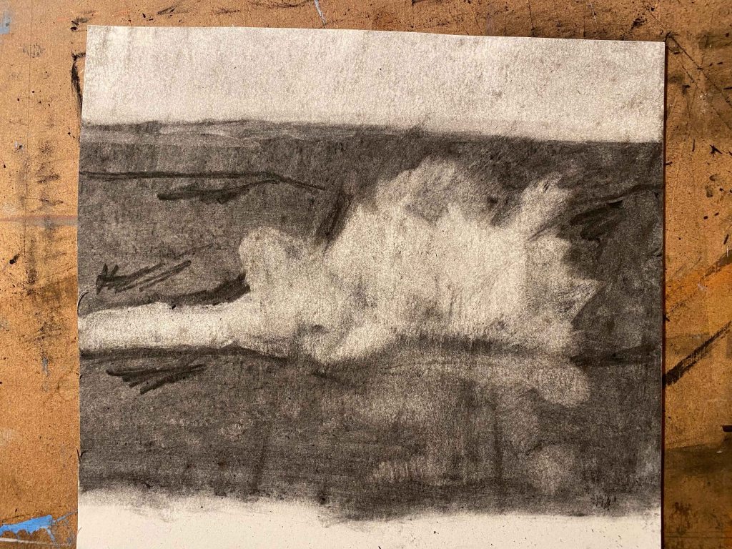
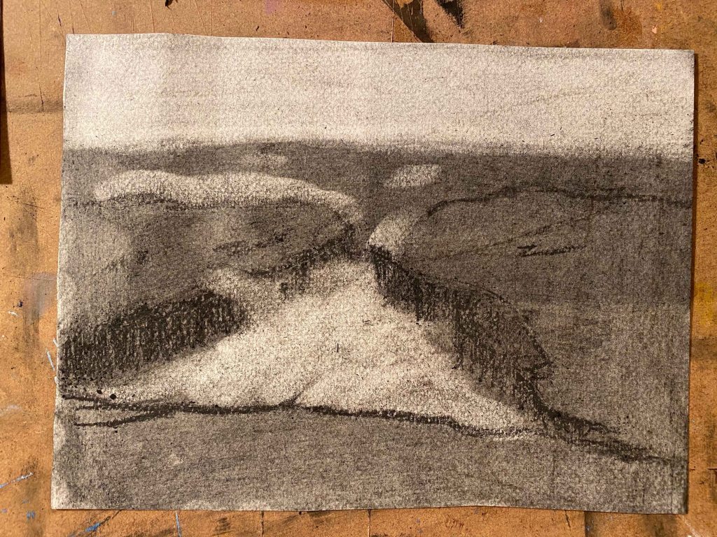
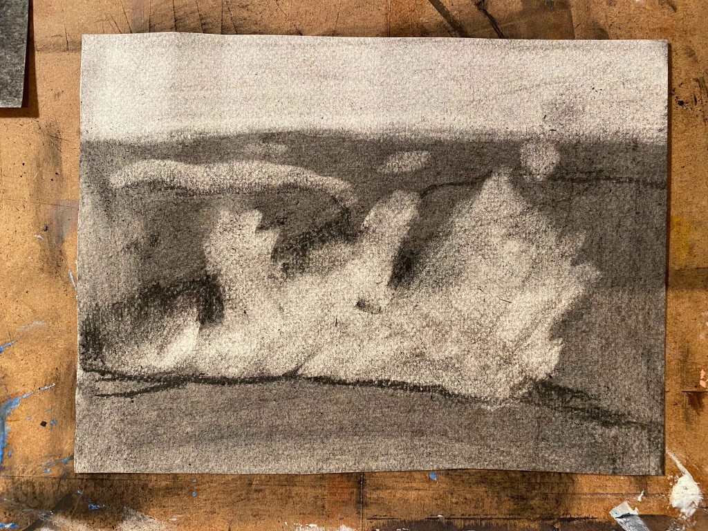
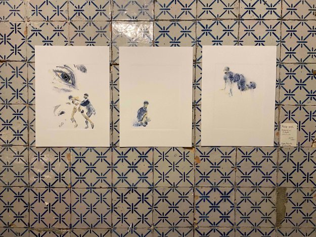
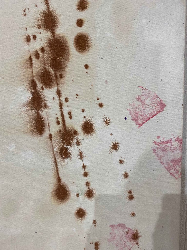
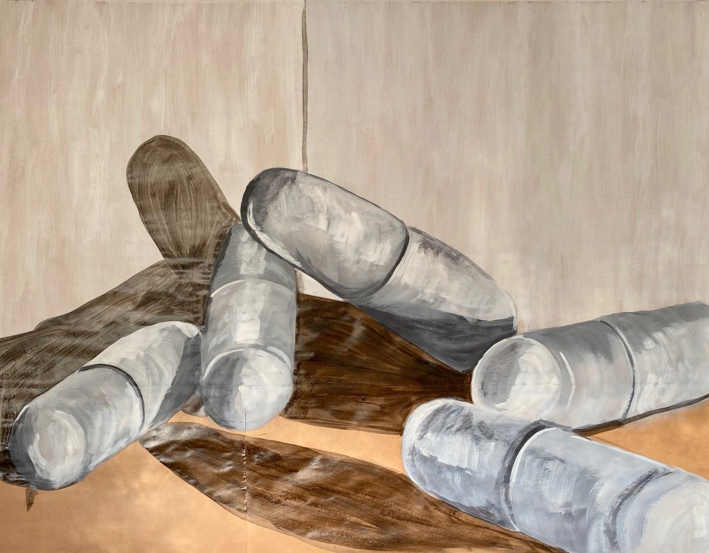
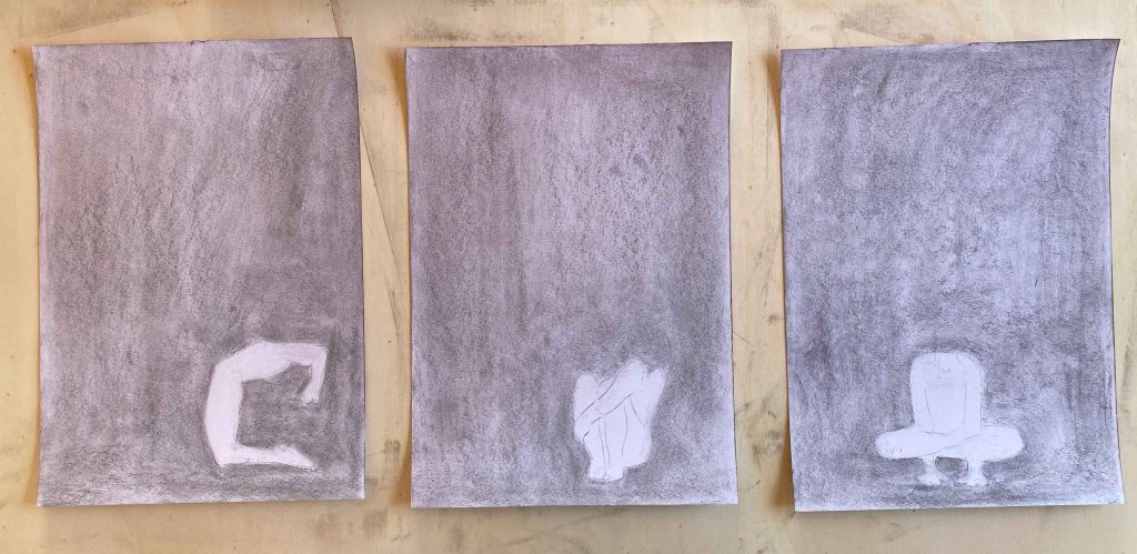
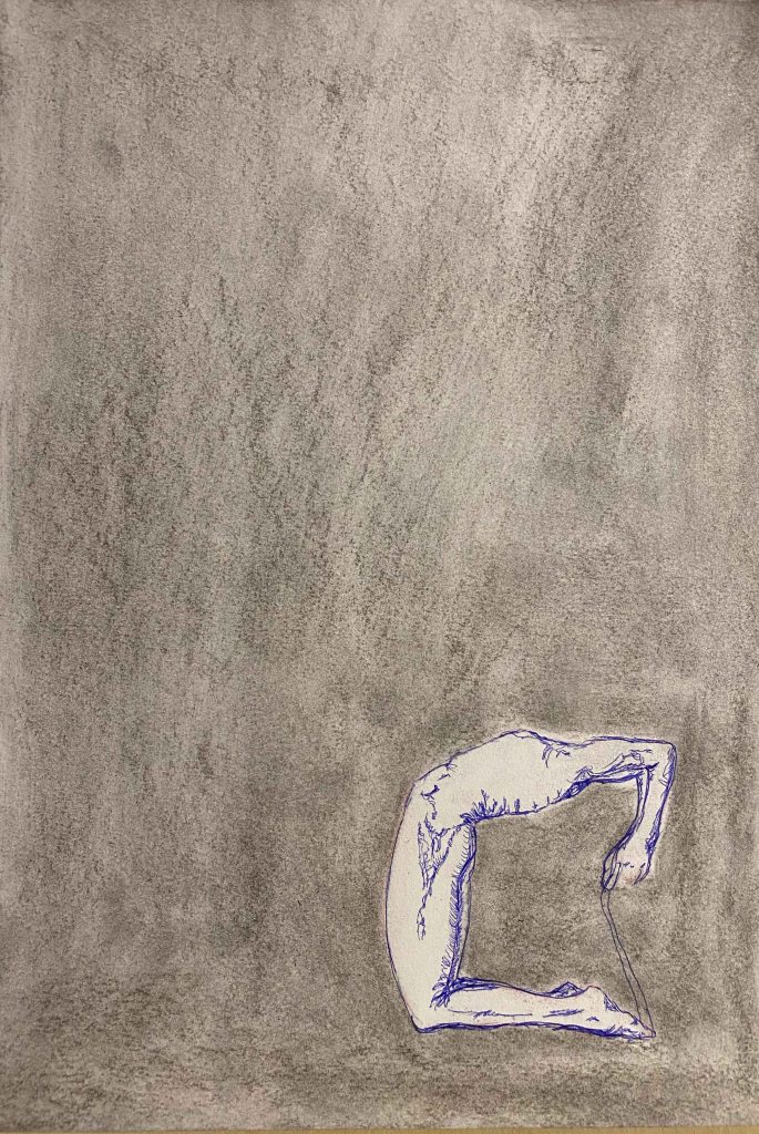
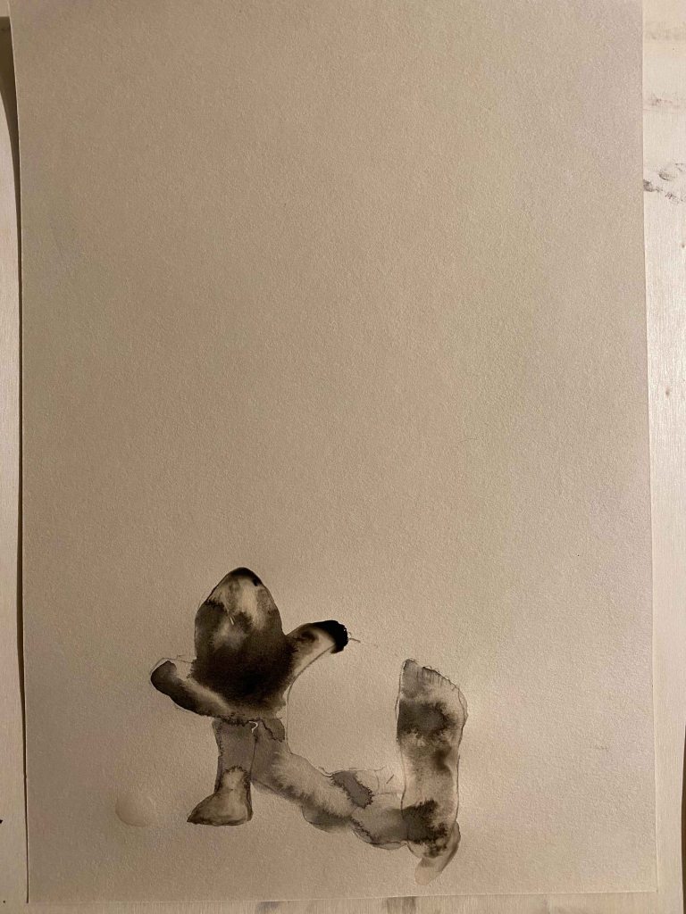
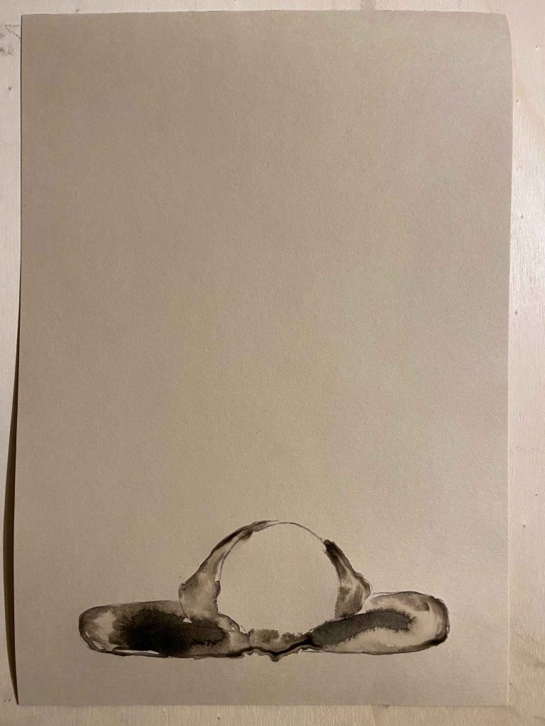
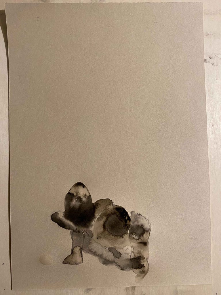
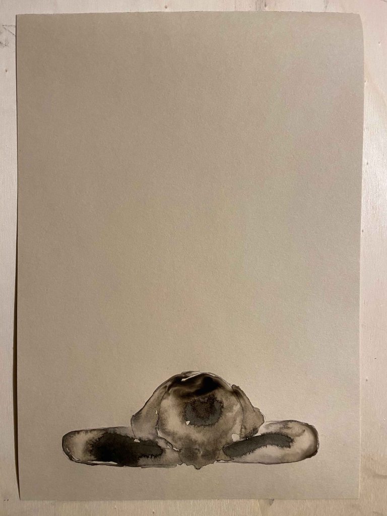
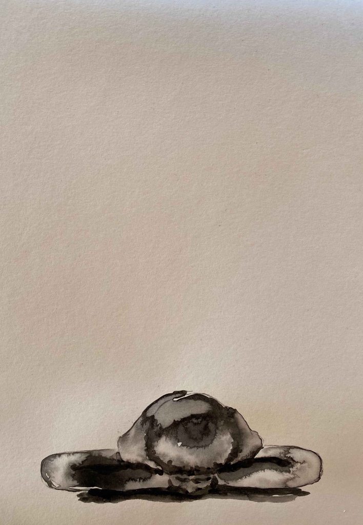
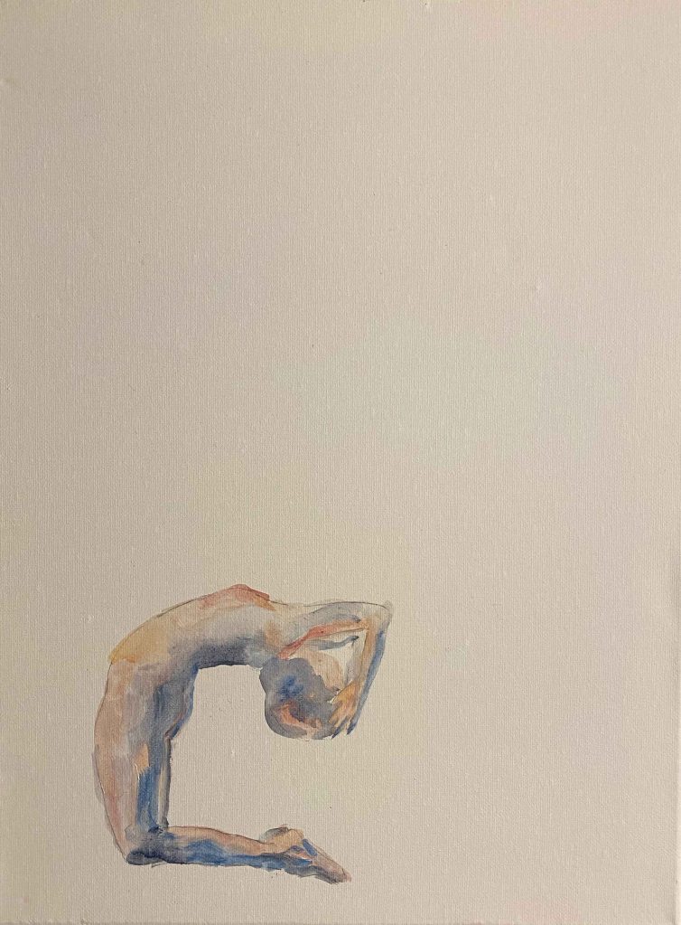
I choose two other poses that are even more anchored to the ground with a heavy sense of gravity from my photos and explore them in a similar composition on the page but with a different media- Indian ink. I am using a nature beige coloured A4 paper. I first draw the figures in water only with a large brush and then add small dots of ink:
I need to add some dark lines to make the drawings more readable:
Within the figure, I like the contradiction between the complexity of the tones and shapes that form in the puddles with the simplicity of the whole. I also like the contrasts here of the dark, heavy figure and the vast emptiness of the surrounding that form an interesting tension. I think using a white paper would have added a sense of void around the figure, while the beige tone is “something” and reminiscent of skin. I am unsure through if you can see what is drawn here if you are not as familiar with the figure as I am.
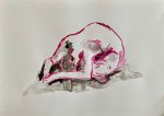
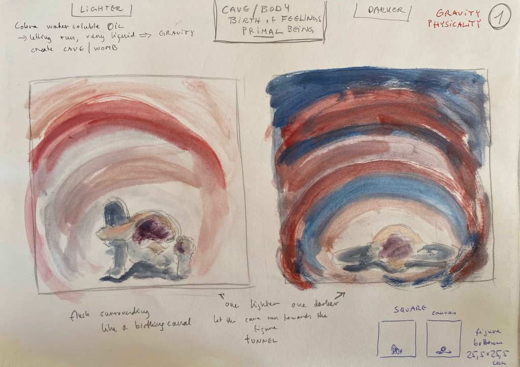
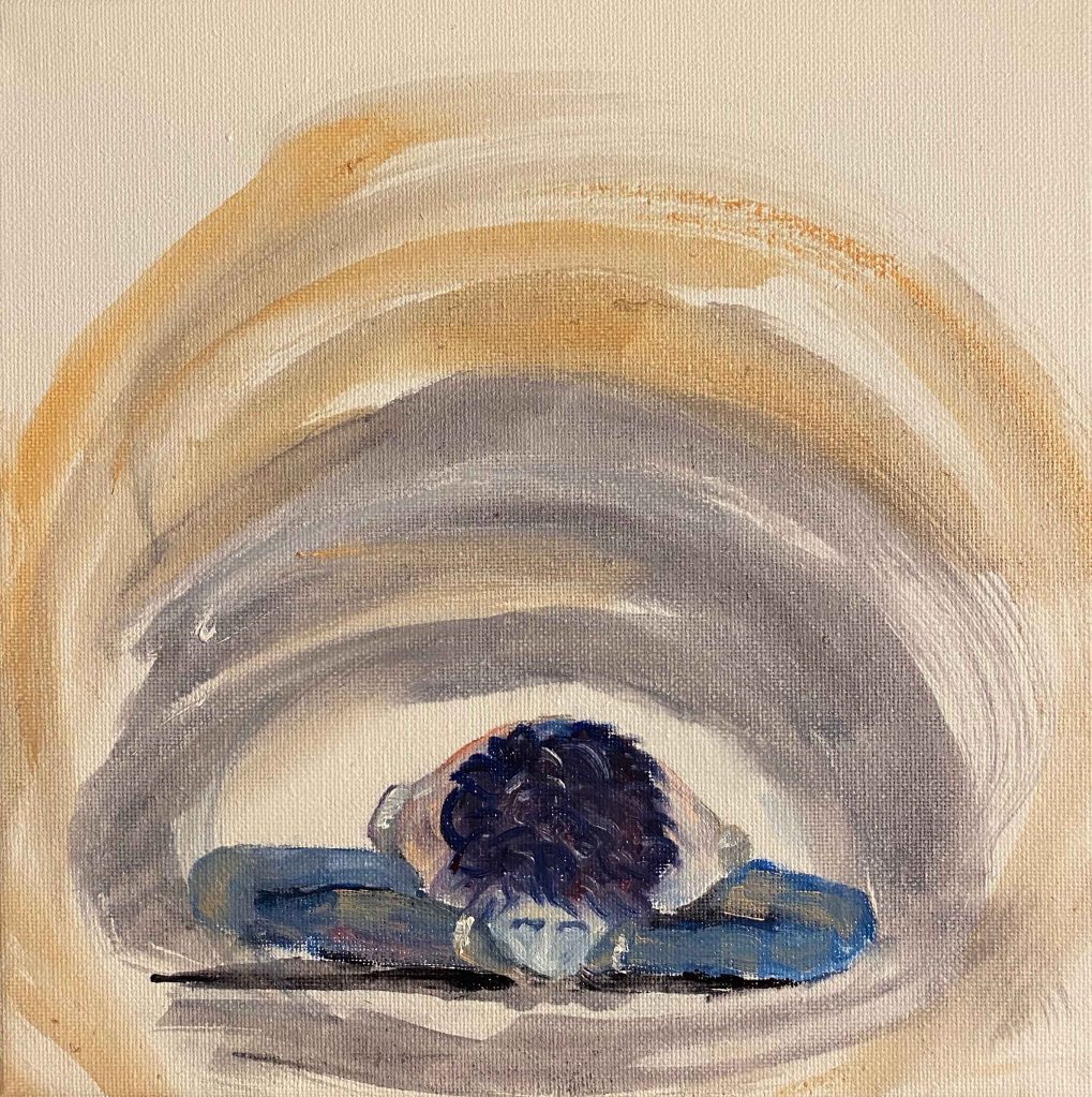
Both postures is a merging in towards my own center, and I want to draw this by placing the figures in a cave, or a womb (a birthing canal) and use flesh colours . After some experimenting in my A4 sketchbook, I decide to use a square format:
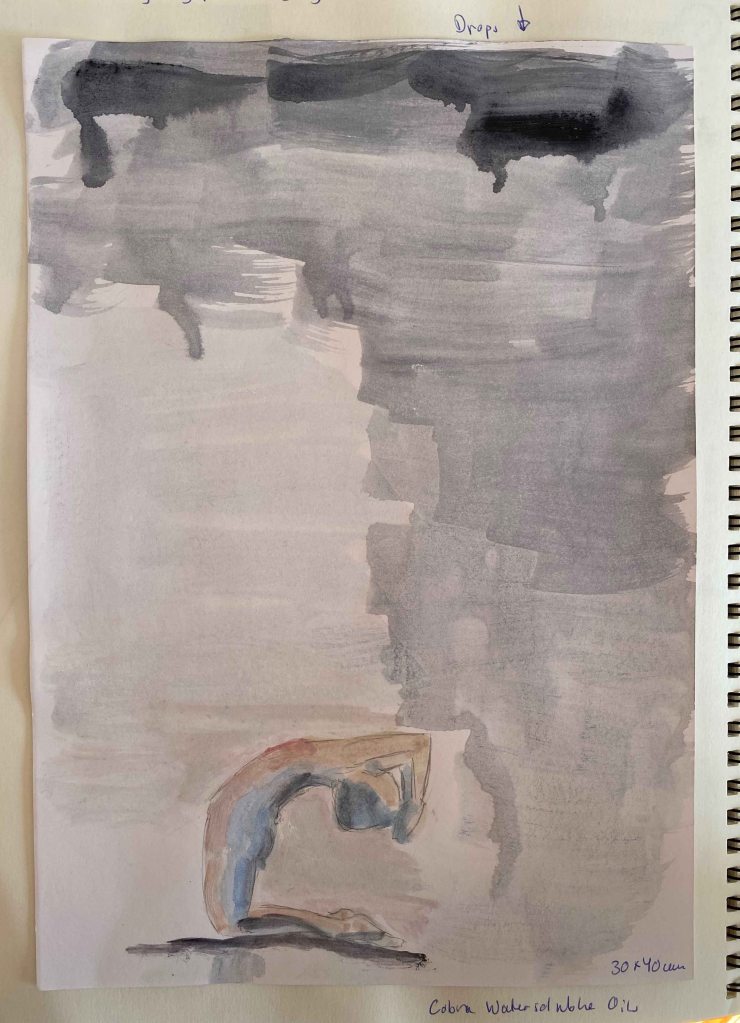
I have been experimenting with Cobra watersoluble oilpaints lately, diluting them too much and letting drops flow and will try this here – letting the element of the drops become one more element of gravity.
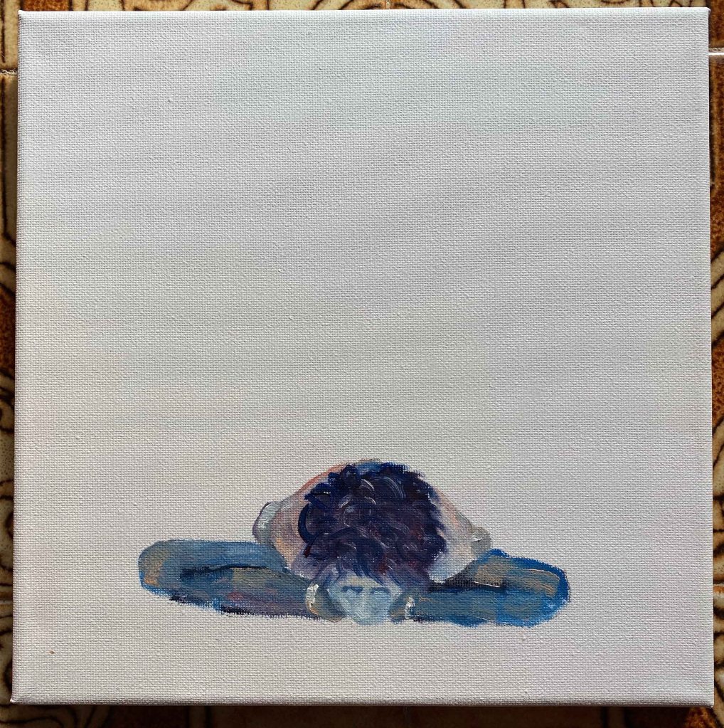
I start by painting the figures on a small square canvas 25,5×25,5 cm:
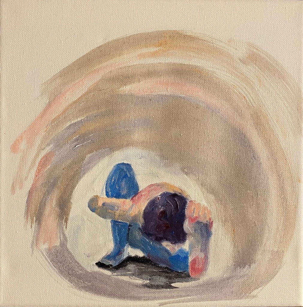
Then develop the cave/flesh/womb around, diluting the oil paints strongly and using a larger brush in large motions.
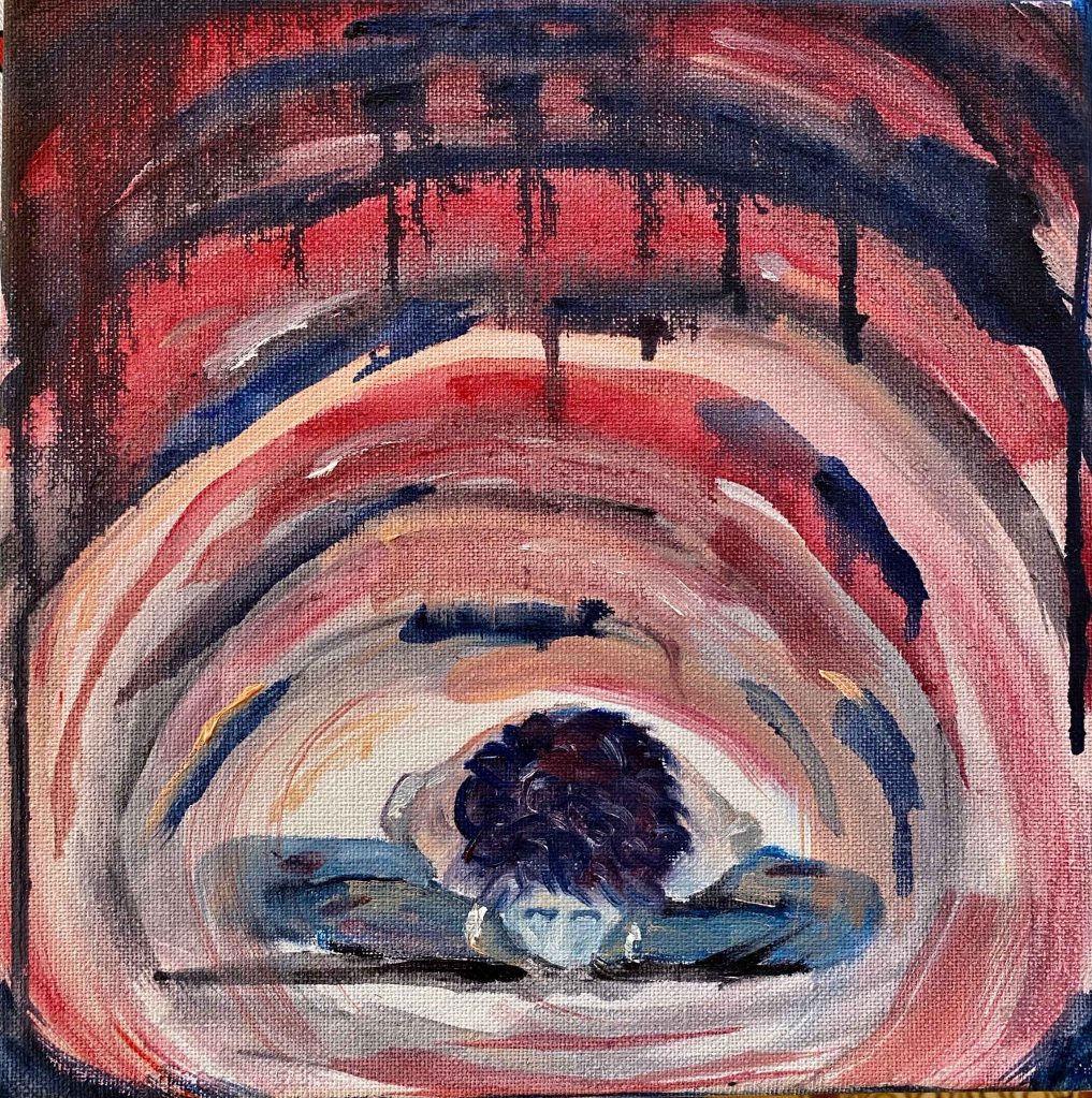
These are the final paintings with the paint dripping, emphasizing gravity:
I was aiming for fleshcolours and the sense of inner organs, but this got more colourful than I intended. I am using photos from a time when my hair was purple though!
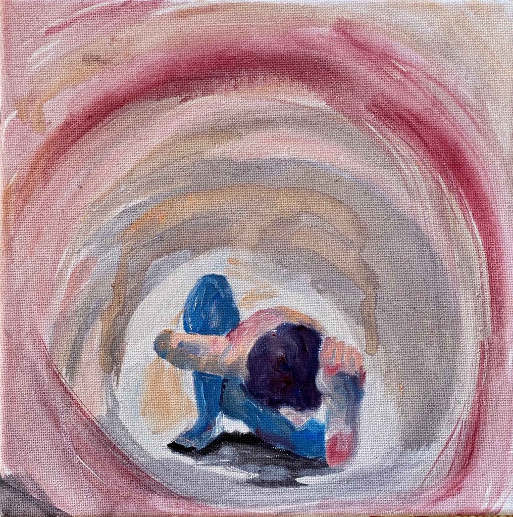
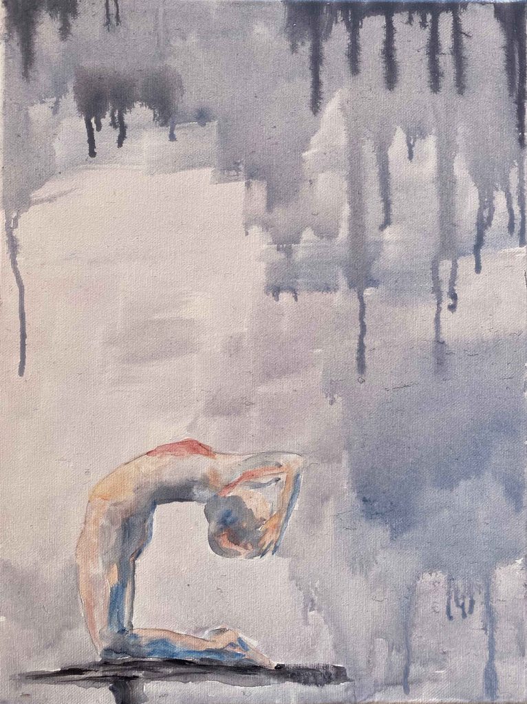
I want to try using the same paints in softer colours for another pose- a deep backbend. Deep backbends are the poses that bring up the strongest floods of emotions, especially fear, during the practice. I decide to come back to the vertical format and already know the title of this panting: Facing those fears.
A quick coloursketch on A4:
I choose a canvas of 30×40 cm and am careful not to overdo the colours this time. The paints are really strongly diluted with water. ( I need to ask my tutor if she has any experience with this and if there is an issue of fading with time.)
Again I start with the figure in the white space:
Then I add the background and let the strong, dark drops represent the fear:
I am surprised how much I like this little painting. Sometimes I spend days and days on a painting. This was such a light and quick sketch/painting and it already feels finished. It really captures my feeling in this pose, such a vulnerable surrender.
I agree that these last three works are rather paintings than drawings, but I have decided to not let that stop me from exploring. I am on the painting pathway after all.
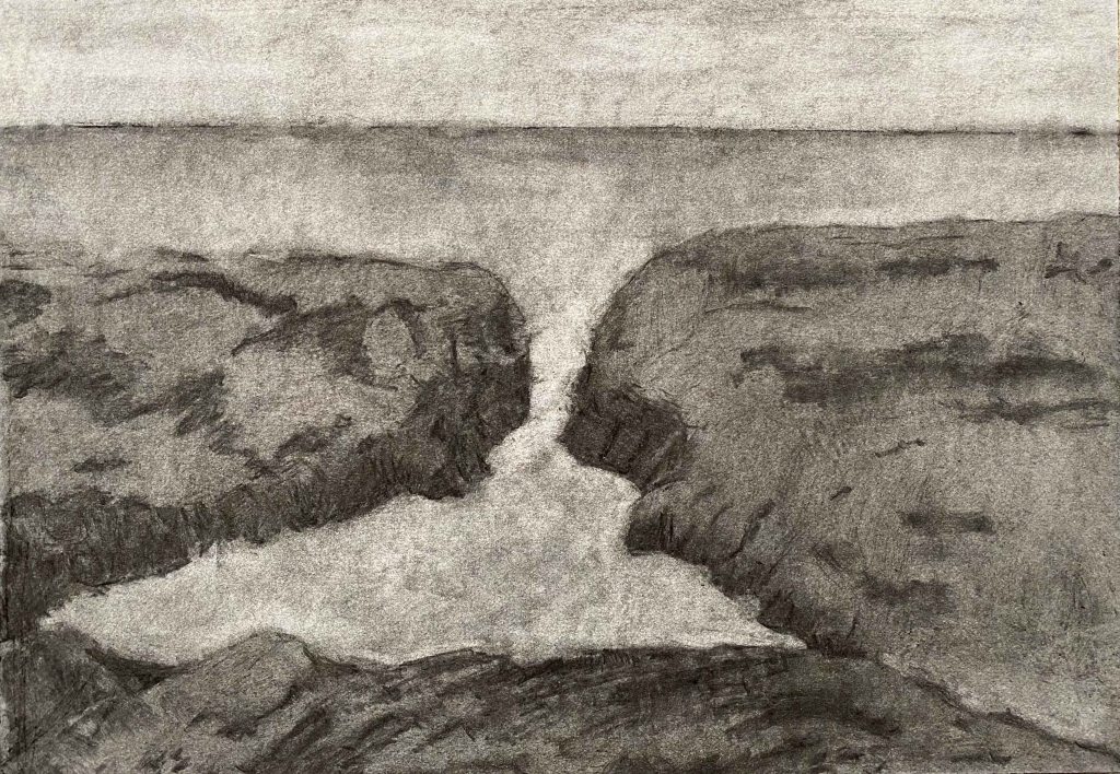
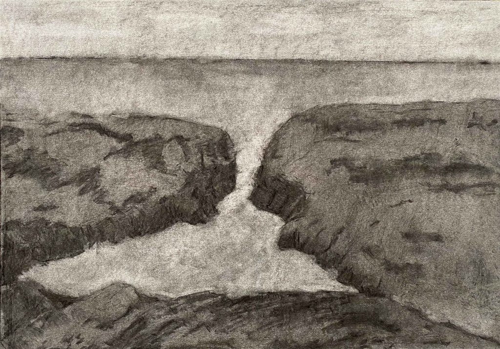
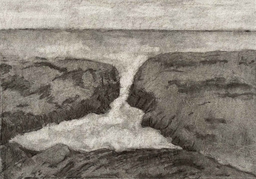
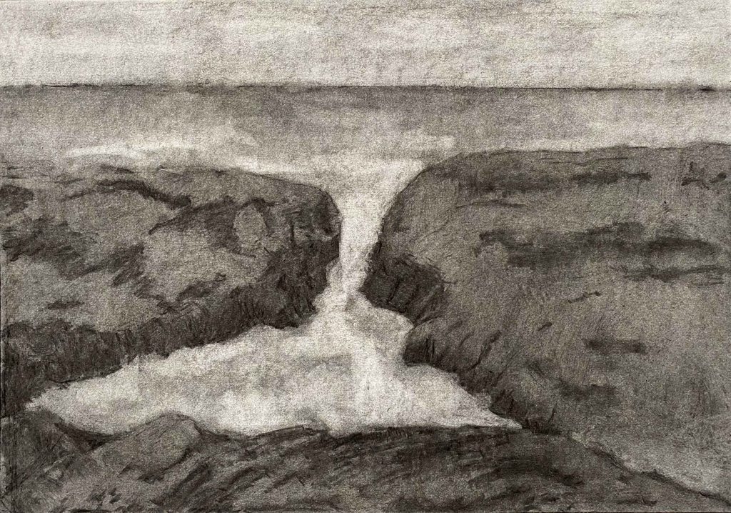
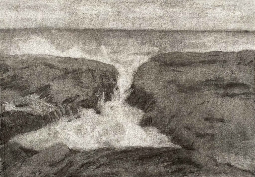
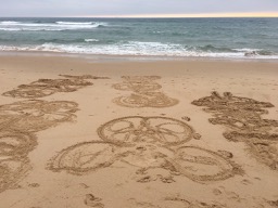
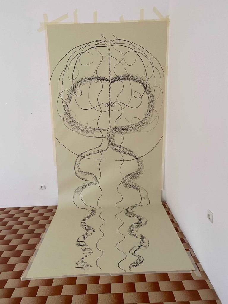
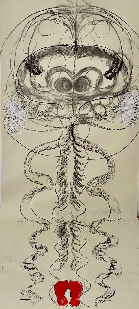
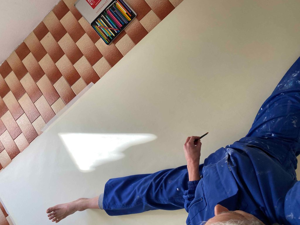
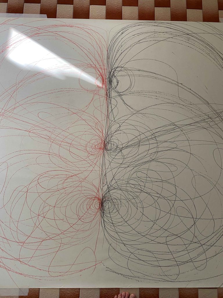
Finally, finally I have arrived at going BIG! I have had this dream of having a huge space where I can move around huge canvases and be messy for around 20 years I think, long before I even started to paint again. Until now I am still painting in our shared livingroom/studio with items from every familymember to watch out for. But NOW! We have just moved into a huge empty house that will be completely renovated- so this is my chance! I buy a big roll of whitish paper and prepare one larger than me canvas on the wall and another on the floor. Last summer I was doing many drawings in the sand by sitting or lying in different poses and moving my arms and legs symmetrically. Since then, I have been wanting to do this on paper.
I am prepared:
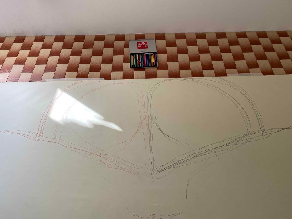
I am listening to loud music in my headphones and standing in front of the vertical paper with a charcoal stick in each hand. I have promised myself not to be attached to the outcome, but just live the feeling in a sort of solitary performance and raise my arms wide- inhale.
I still tricked myself into seeing something kind of figurative drawing instead of leaving it as an abstract pattern like in the sand. I decide to paint the feet red.
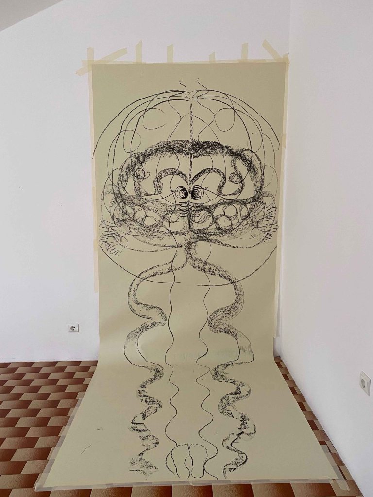
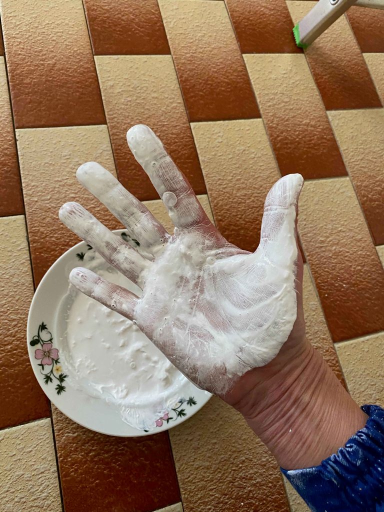
And getting into the paint with my hands..
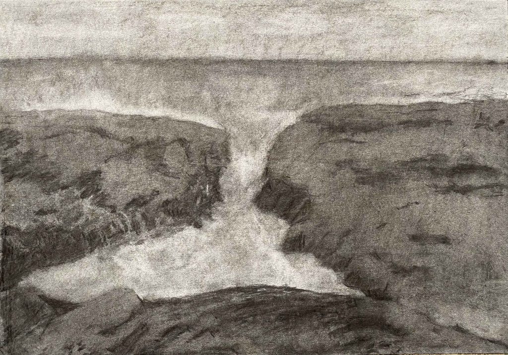
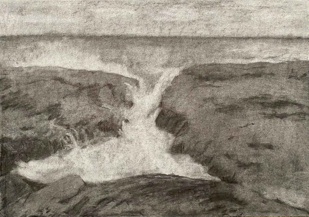
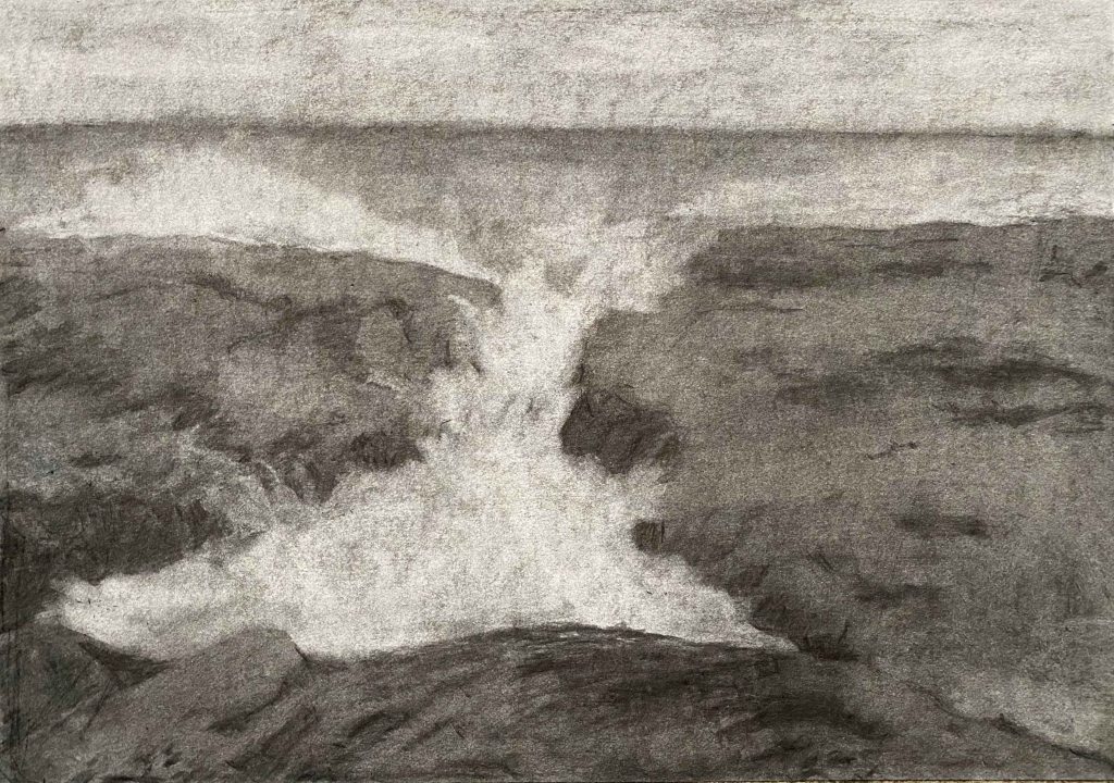
If I crop the drawing it has more or less the shape of a yogamat and is some snakelike Kundalini energy rising:
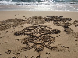
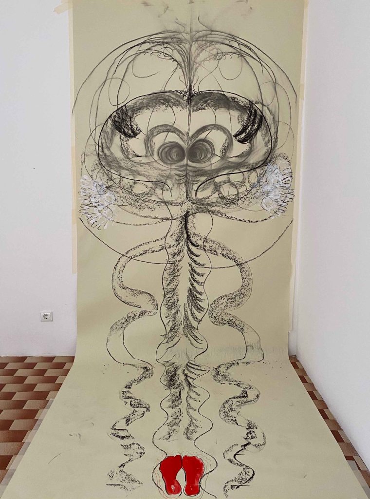
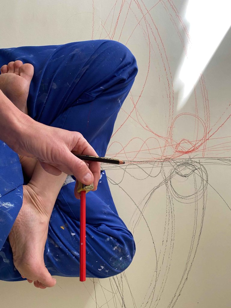
I move on to the paper on the floor and first sit in a center split. I am listening to a Shiva/Shakti song and will draw with a black coloured pencil in one hand and a red in the other.
I try to draw my own shape but am annoyed by my thick coveralls ( it is freezing cold up here in the attic) and my lines are too rugged:
I shift to a lotus posture and draw in various symmetrical shapes as long as my arms can reach. This time I am slightly held back by having to use the sharpener all the time!
I am quite happy with the shapes produced:
But I haven’t gotten this far to draw carefully in coloured pencils! I unpack my acrylic paints and realize that all my materials are for smaller formats- these are my largest brushes!
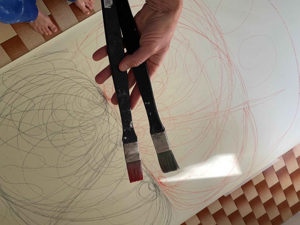
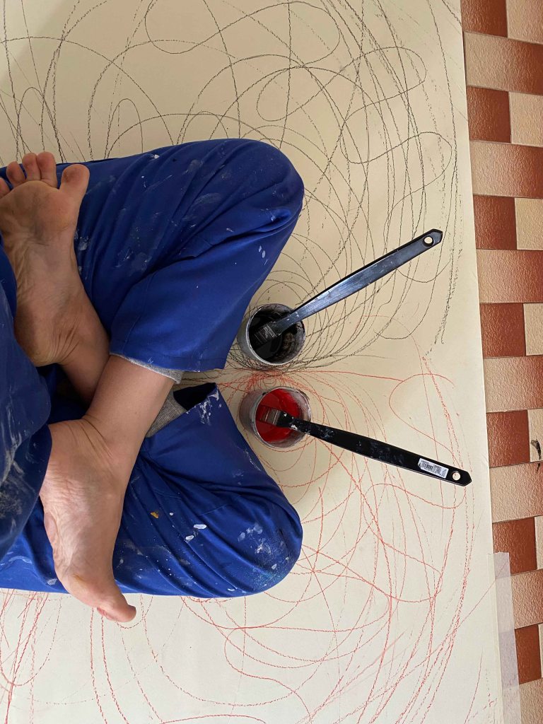
In position again, with one pot of red and one of black acrylics:
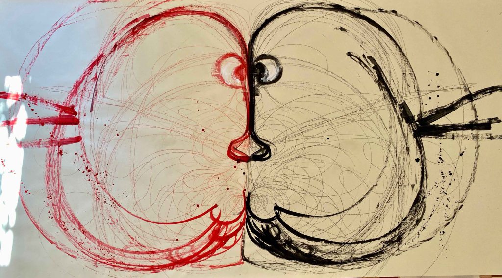
And this is where I should have stopped painting! At this stage, I find the drawing successful:
But I did not stop here… As always, I tried to discover a face or something recognizable, so this is the final drawing:
I am not particularly satisfied with these large drawings as results, but it has been an incredible experience of figure drawing in the sense that I have used my whole body in the expression. It has been an absolutely incredibly liberating experience and I definitely want to continue drawing HUGE and using all of my range of motion.
REFLECTION ON ASSIGNMENT 1:
For this Assignment I have neither produced a finished drawing , nor a series, or maybe I have produced several. I have allowed myself to open up lots of different pathways to continue exploring. So as a minus, nothing is clearly finished. On the plus side- I am full of ideas!
I will give myself a big minus for working too closely from photos though for all of the first drawings. During the contextual research about Prunella Clough, I admired the way she used her own photographs and let shapes and elements reappear in her paintings, rather than reproducing them and thought that I would love to work like that. And then, immediately after, I fall into the trap of using all the photos way too closely.The last paintings in huge formats were liberating as I did not have any reference other than my own joy of movement.
I chose to study Drawing 2 before Painting 2 with the precise wish to practice my drawing skills, especially the figure and perspective drawing which are my weakest points. This is definitely something I want to develop through this course, rather than relying too closely on photographs.
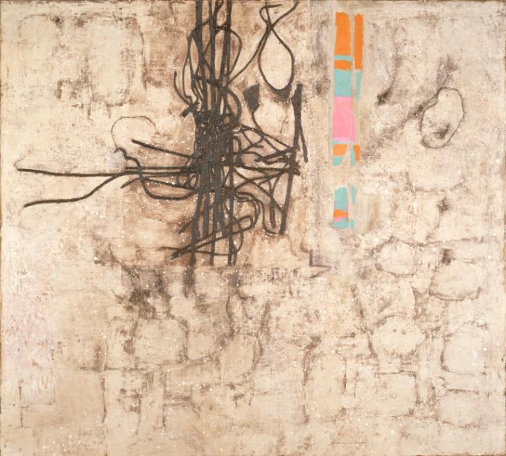
Course manual: “The Tate has been bequeathed the Prunella Clough archive and has made some of it available on the internet. Prunella Clough began her artistic career in 1937 and, apart from a brief gap during the war, continued working until her death in 1999. She won the prestigious Jerwood prize for drawing just months before her death. Prunella Clough lived a full creative life and the subtleties and sheer celebratory joy in the way she used everyday objects in her compositions is inspirational. Look at her painting entitled Wire Tangle (at the start of Part One). Note how she developed her original visual source material into a sophisticated painting, changing the scale and making decisions about the composition to create an image that is much more than a simple natural still life.“
I am delighted to discover this British artist that I was not very familiar with and am especially attracted to her work from the 1970’s onwards, where the whole focus seems to be on form and composition. I found it very interesting to discover through the film, how the artist builds up an extensive library of reference photos, but never reproduces a photo in her paintings. She collects shapes that then reappear in paintings. This is valuable information, as I have a tendency of using reference photos too literally.
I also found it very interesting, that Prunella Clough uses many words in her sketchbooks, she does a “language sketch”, describing what she sees and beyond that, what other sensations come up around the object that she is looking at.
I also really like her choice of subject – the overlooked or forgotten, something others would walk past. This connects to our first project of this course- to paint something unpromising, that then through careful composition gets elevated to something beautiful. The paintings also show the impact of man made objects upon the land- a subject that is very important in todays’ world of environmental concern.
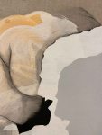
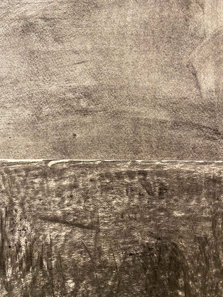
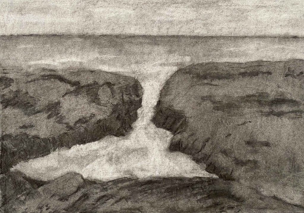
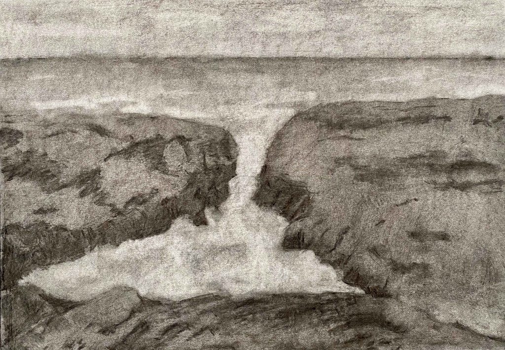
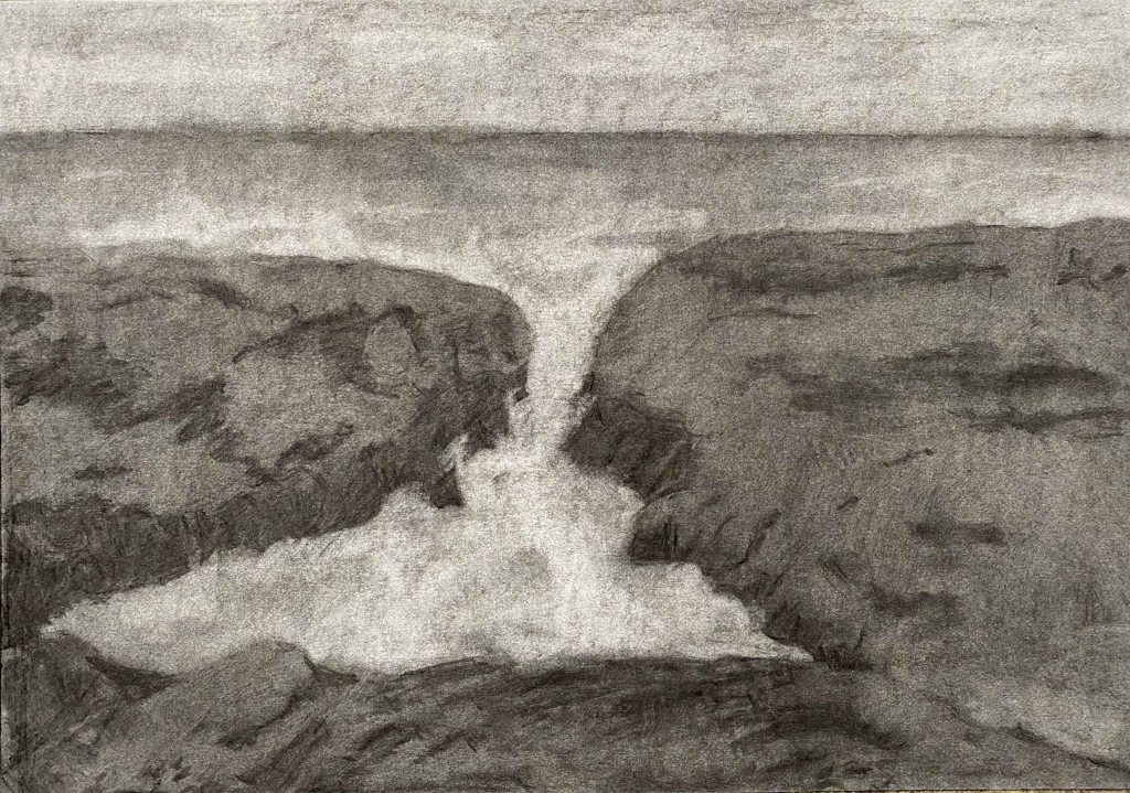
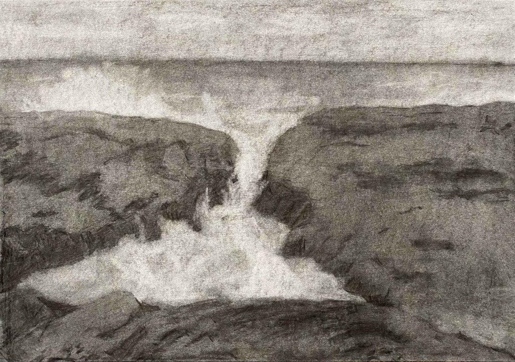
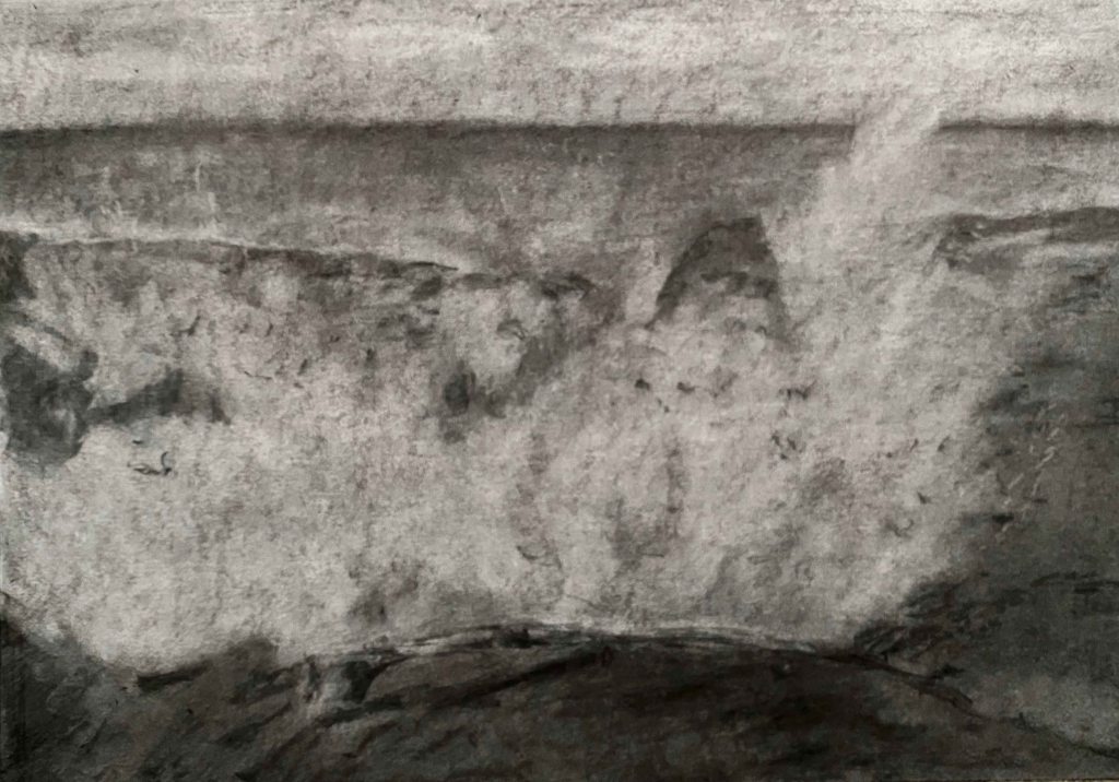
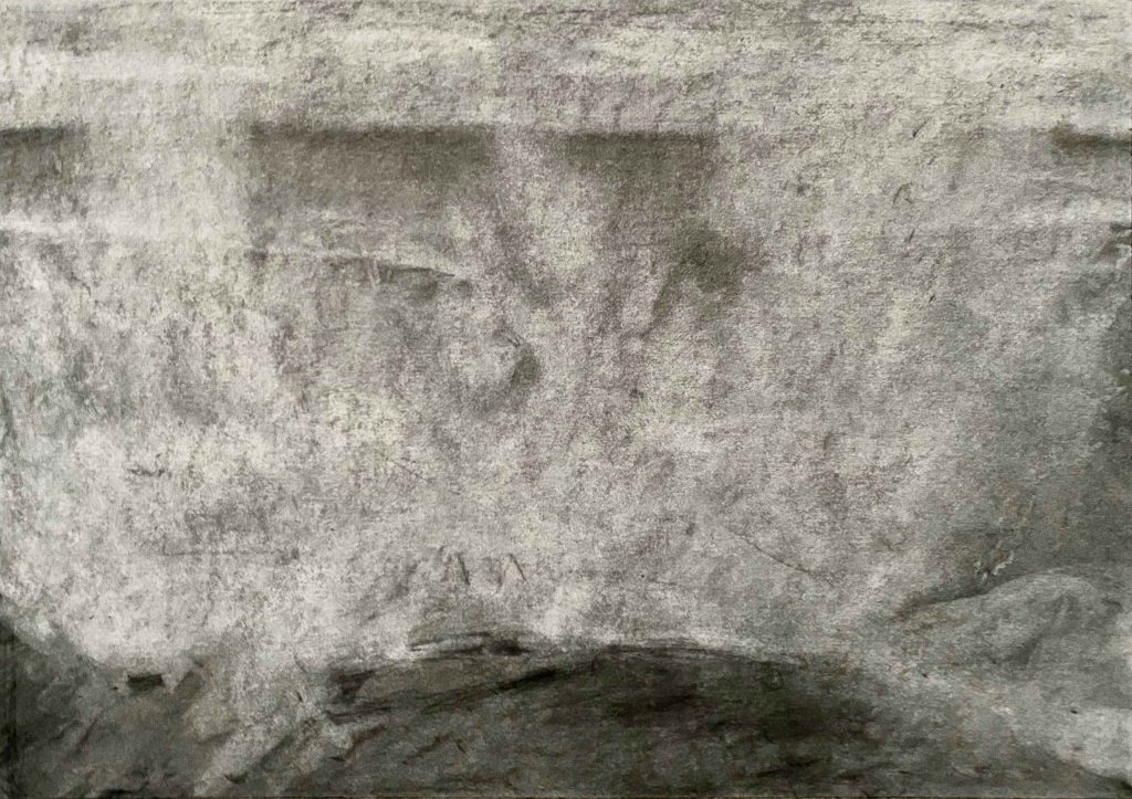
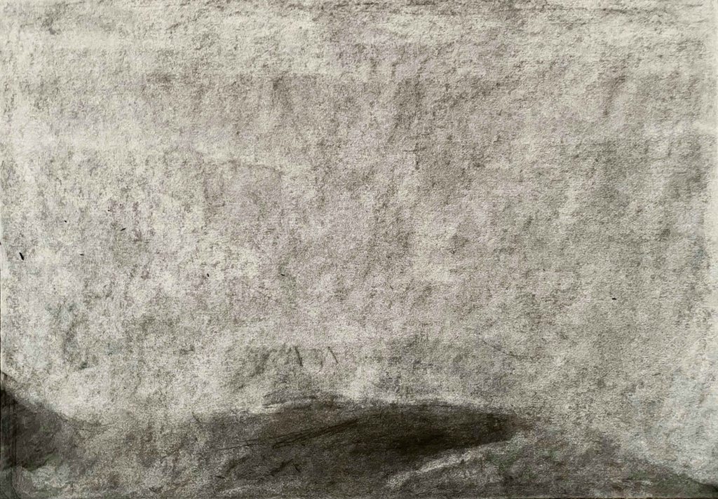
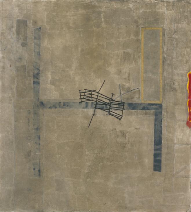
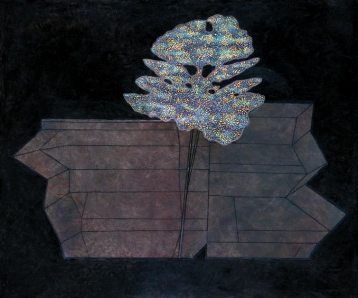
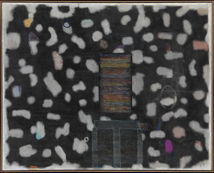
I am reproducing four of my favourite paintings by Prunella Clough from the Tate website.
Broken Gates 1982
False Flower 1993
Stack 1993
Wire and Demolition 1982
I like that there is a seemingly simple and clear composition, and only looking more attentively do I become aware of the many layers the paintings contain.
When I heard that before studying art, Prunella Clough made maps for the office of war, I can feel how that carries forward in her compositions as territories and borders.
Her palette is mainly earthtones from light browns and beige to dark colours, but then with some small, bright elements standing out, in balance to the larger more subdued areas.
All that we have been looking at through this chapter- unpromising subjects, the relationship between the object and the background and the notion of scale, come together in Prunella Cloughs work.