I found myself debating whether I should dedicate the little spare time I had to art or to doing my Portuguese grammar homework, when the solution became obvious, “Grammart”. I have already used a lot of the odd leftover objects in this house for the parallel project. This time a lampshade and a pitcher stood out as perfect supports for my grammar homework. The idea is to merge old items from the house with something personal and present, like my struggle with Portuguese grammar.
This is the result after some hours of homework, enhanced by some scribbles by my granddaughter.
This piece can be strategically placed as a flower vase and allow me to cast quick secret glimpses on the rules during a conversation in Portuguese.
It was an obvious and simple idea, but I am happy with the result. I think the scribbles add a clearly contemporary style to the object, whereas the shape and the rusty signs of ageing are clearly from another time, so the merging of different stories work well here.
For the lampshade, I try my hand at embroidering.
I am a beginner at embroidering, but instead of trying to be neat and look more expert, I am exaggerating my clumsiness. I want the beginners look of the embroidery to reflect my beginners mind with the Portuguese language. Also the lampshade already has machine made embroidered flowers and I want the handmade imperfections to contrast with the machine made and uniform shapes.
The very useful phrase “O gate tem uma chave”, meaning “the cat has a key” was automatically created by the language learning platform, and I just love the absurdity of it.
I chose to keep the piece monochrome and rather spacious and believe the balance between the existing pattern and the embroidered words work well. Also it is again a very clear contrast between different worlds that reflect the gap between the history of the house and what we bring to it.
Assignment 5: “Review the project work that you’ve completed for this part of the course and then produce a drawing that needs a period of time to elapse during its production.”
Since I started my studies with the OCA several years ago, I have had the plan to start drawing a drawing a day as a diary, but til now I have not implemented it.
I have just discovered OCA student led initiative “OCAtober” which gives a word day as a prompt for a drawing that is then posted on Instagram. I will participate in this to start my drawing diary and also to overcome my shyness of publishing works that don’t feel “good enough”. Combining these small drawings into a larger work will then produce the drawing that has needed a period of time to elapse during its production.
During a visit to “Trema” contemporary art gallery in Lisbon last year, I discovered the Portuguese artist Carlos Barão. He paints or draws a small painting a day and then combines them into series on larger canvases. His art is quite dark and contains much text, an intriguing mix of drawing, painting and text always in black, red or earth tones.
The first thing I notice, is that the drawings are different in size and support, but proportional, and it can be quite tricky to combine them in the end. I counted that the larger panels contain respectively 67 and 80 small drawings. The newer framed works contained 20 drawings.
In a series of older works (2010-14), Barão combined same sized drawings, 35 pieces per panel, and he still used different papers. I would guess they are 30x30cm. I will choose to start with this as it will make combining the final drawings much easier. ( I might change and include other formats after the first month of OCAtober is over).
I am often attracted to works that contain an obscure or incomplete narrative, and this is what I find in the work of Carlos Barão and what I hope to create in my own drawing diary.
About Carlos Barão: “the artist seems to want to tell a tale – perhaps a fairy tale – that transcends his own life. As a result the on-looker is invited to complement the story-in-suspension with his own references and memories. The gap between the image and its meaning seems to reside in the personal and non-transmittable ambit of each of us. (…)
The paintings of Carlos Barao speak an apparently inaccessible language, like the feeling of something intimate and strange – Das Unheimliche according to Freud. “
Hugo Dinis, in “Something Strangely Familiar II“, in Cat. Galley Pedro Serrenho, Lisbon. 2009
I decide to use the format 20x20cm to keep the final panel manageable in size when combining many of the drawings. I prepare papers in various qualities and shades of that size.
Day 1: Imposter
I had to start by looking up what imposter means, and then thought of how many faces/ roles/ masks we are wearing, and how not all of them feel true.
Ink and acrylics on white paper
Day 2: Dark
Ink on paper. I chose this one:
Day 3: Cutting
Cobra watersoluble oil on oilprepared paper:
I am planning to keep to monochrome images or use quite dull colours, like here Payne’s grey, maybe adding some earth tones or green where needed.
Day 4:Twin
Inkdrawings, the duplicated by folding the paper in half
Day 5: Shed
Watercolour and acrylic on brown wrapping paper
Day 6: Lake
Today I experimented with QoRwatercolour on aluminium foil, to create that reflective quality of the watersurface.
Day 7:Toast
A very full day in the city, so today I did a quick drawing in a cafe, specially ordering toast to draw in on newsprint and photographing it on the spot. I think this image reflects the morning cafe mood well.
Day 8: Hook
A very full day , so I am grateful for this challenge or I would definitely not have drawn anything today, now I make it a late night. I have been wearing a mask all day in the city today, and am appalled by the amount of discarded masks I see everywhere. Acrylics on grey paper.
Day 9: Acid
As a photographer, I visited forests destroyed by acid rain a few years ago, a sight that I will never forget. Ink on paper.
I then sprayed bleach on the drawing, filming the slow deterioration, melting of the trees. The very short film impression can be seen under the #OCAtober Instagram or @nowclara, link https://www.instagram.com/p/CGHr9KtgoJI/
Day 10: Mail
Todays’ prompt brought me back to my overflowing Inbox
Pencildrawing on paper
Day 11: Sacrifice
Todays prompt was a tricky one, my imagination went from rituals of sacrifice, to the sacrifices of a mother for her children, and finally landed with how we are all sacrificing our planets natural resources for our lifestyle. Acrylics on newsprint of an article about forests disappearing.
I am not happy with the final result here, but this type of challenge is also about learning to let go of everything having to be satisfying.
Day 12: Sharp
Today is a “cheatday” with really too little time. I use a quick trick, cutting a sharp line in paper.
I like the simplicity of this, and realize that I have to include more simple, graphical elements in the series.
Day 13: Throne
Another tricky prompt. My result is too illustrative .
Ink and acrylics on paper.
Day 14: Spoon
I am immediately thinking of a couple spooning, and decide to use monoprinting, oil on glass and acrylic paper
This is the one I choose:, I added a cloud of ink on the back to add some depth.
Day 15: Hair
Hair in the sink! We have the perfect 70’s sink in the house. Cobra oil on oilprepared paper:
This little painting got a little too colourful for the series, but I think the mood of the scene fits in. It will be interesting to see when trying to puzzle the pieces together.
Day 16: Fire
I decide to make a pencildrawing of some industrial scene that I literally set on fire. This drawing will not be on the final panel as it is now a pile of ashes…
Day 17: Riser
Inkpen on wet paper. I really like this simple, spontaneous figure.
Day 18: Depart
Three monoprints on different papers of the same motive.
Day 19: Pocket
I have been thinking all day of todays’ prompt, and after all ideas with someone stuck in a pocket, or a mask in the suitpocket, I landed on a quick and simple abstract “pocket of light”, acrylics on paper.
Day 20: Tree
Another monoprint of a “tree of life” with white oilcolour on black paper
Day 21: Match
I decide to use todays’ prompt as a drawing tool instead of the subject- drawing by holding a match to the paper:
And the final little drawing:
Day 22: Kitchen
This was the one day I skipped..
Day 23: Rotten
I found a genuinely rotten small pumpkin in the garden just in time for this prompt- Watercolour and Indian ink.
Day 24: Party
White gel pen and watercolour on black paper
Day 25: Moon
I started with a whole series of monorpints that were very boring
So instead I decided to paint the memory of the moonlanding on an oldfashioned TV in watersoluble oils.
I also posted two photos that I took for project 5.2 An artists book:
Day 26: Cellar
Indian ink on wet paper
Day 27: Feline
Again, I am experimenting with “happy accidents” with Indian ink on wet paper
Day 28: Tie
Here I start by a series of monoprints of various knots to a not very satisfactory result
Finally I choose a much simpler, very graphic version:
Day 29: Trick
Halloween is coming up, and on top of that we all are wearing masks already, so a masquerade pumpkin head seemed appropriate. Oil and ink on oilpaper.
Day 30: Flowerbed
It is autumn and the flowerbeds are dry and dull- oil on paper
Day 31: Blue
Here I have two ideas, and time to realize them both: diving into the deep blue ocean, and feeling blue. The first one is oil on paper:
The second one is mixed media (pencil, ink, watercolour) on black paper
FINALLY, I have arrived to the end of the month. This was a very useful exercise in just doing, no matter the circumstances, and also in just posting/showing, even when I am not satisfied. It has pushed me into a productive flow. It has also taught me to look more lightly at Instagram and earned me several new followers. It has produced a small body of work that needed a period of time to elapse during its production- responding to the Assignment 5 brief. I am more happy with certain pieces than others naturally.
One problem that I see in combining them into the planned panels, is that they are partly too illustrative and standing too well alone. This is probably the result of over thinking the prompts and also a side effect of showing them daily on Instagram- which called for a more “finished” piece.
I will continue this drawings on squares for 21 more days, without prompts and without showing them individually, to hopefully allow some more “connective”, spontaneous pieces to happen that can work as a final panel.
These are the following pieces:
I will not post them all individually, but here are some that I find special.
I particularly like the pieces where I used found paper, an old map and a very old magazine found in our house. I added to them very sparingly:
I have a pregnant friend, and am sketching her as another possibility for a painting that would fit in with the subject of Assignment 5. These are just some first sketches to remember the pregnant body.
I finally have small paintings/drawings from 52 days- it is an impressive little stack!
When I am holding them all together , I realize that this too, would have been a nice artist’s book bound together.
But it seems like I am all for puzzles this time, so here is the development of the panel:
I try a square version:
I try another version starting from the very first drawing from October 1: Imposter:
Another version containing my favorites:
And here, the final panel- where I had to let go of some of those favorites in favor of a more coherent whole:
I am happy with the different mix of techniques and papers used, and how they still flow together as one work, balancing between rather complex full drawings and more empty, clear ones. I believe these drawings have a certain value in themselves but noticed how I had to let go of several of my preferred ones for the whole to be stronger- with clearer and not so detailed drawings working better in context with others.
It has been a very useful project for me to let this develop slowly over 52 days, to really come into the routine of drawing everyday- and hope that this is just the beginning!
Aim: Gwen Hardie is an artist who makes careful drawings and paintings of small areas of her own skin. Richard Wright is a former sign writer turned Turner Prize winner who makes intricate wall drawings. Grayson Perry is a ceramic artist who makes detailed extended doodles. Jim Shaw combines exquisite naturalistic detail with complex cartoon imagery. Do some research into artists who work in a similarly painstaking or meticulous way, something which arguably has become one of the most significant features of contemporary drawing. By making a drawing of your own which involves focused effort you’ll be in a position to reflect on how this affects your relationship with the subject and the process and what it communicates to the viewer.
Method: Choose a subject which has a substantial number of detailed parts. Think about whether these parts will be repeated (a plate of baked beans, for example) or all different (a hyper-realist drawing of pins and nails). Consider also whether the parts will be drawn from observation or invented (as in the work of Paul Noble). Remember that the original subject may not be primarily visual (in extended doodling, for example); you may be using drawing to describe a narrative or even musical score, so that the imagery is secondary to the relationships between the elements.
RESEARCH
TERESA ESGAIO
I was lucky to visit the exhibition opening of young contemporary Portuguese artist Teresa Esgaio (b. 1985) at the Underdogs Gallery in Lisbon last year. She draws very detailed, photo realistic drawings in dry pastel and graphite.
The title of the exhibition is “Take a number” and upon entering the gallery space there were two very long, low benches with a total of 100 small drawings of queue numbers, along with the dispenser on the wall, as if entering an institutional space for a long wait.
Each and every one was very detailed, with creases and spots or ripped corners.
I asked the artist how long these drawings would take her, and Teresa explained that she spends around three weeks drawing full time on the larger works, like this bed:
This was my favorite work of the exhibition. It felt like the most personal and vulnerable maybe- giving a glimpse of something possibly very intimate.
Although I greatly admire the quality of detail and focus here, this is not a way I am aspiring to draw myself.
(photos my own from the exhibition)
MARC FAIRNINGTON
Marc Fairnington paints with intense detail- humans, animals, and plants.
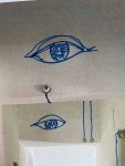
I am quite fascinated by his long series of eyes, both human and animal, in tondo formats, they look spectacular. I often draw eyes and want to learn how to draw them better, so this is a wonderful example to look at.
But if his paintings look like from a natural history collection at a first glimpse- they are much more interesting than that. It is “unnatural history”- invented creatures, plants with more than one species on the same branch and beasts.
I definitely admire this extremely detailed and meticulous painting, the seemingly natural, but then with an added layer of mystery.
(Images from: Underwood, S. 2020. Marc Fairnington painter. [Online]. [13 November 2020]. Available from: https://markfairnington.com/)
A FINER FOCUS ON TILES
I have just spent days looking at the patterns of the wild tiles in our odd house, for the artist’s book.
For this project, I want to continue scrutinizing the patterns closely and recombining them into a new imagined world.
I will use a fine liner pen working from an easel. I prepare a larger square of 36×36 cm white 300gr watercolour paper to mimic a clean, white tile, large enough to develop different patterns. This is a combination between close observation of the existing patterns and allowing myself the freedom to continue into extended doodling.
I noticed in the previous project of the artists book, what a very different feeling a lifesized (180×200 cm) drawing on the wall had, compared to the small printed version of the same drawing that I could hold in my hand.
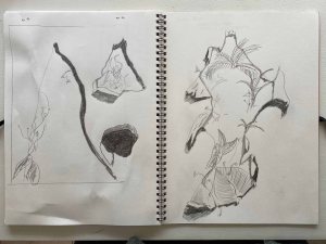
This is a sequence of the process combining the different patterns and free drawing:
I am definitely not an abstract artist- even when I am planning to focus on patterns, I start finding form.
This is the final drawing:
This drawing gave me the experience of working painstakingly and meticulously, it required a finer focus. I think that is possible to feel for the viewer. I am not overly enthusiastic with the result, but greatly enjoyed the meditative aspect of the project, and also developed yet another level of knowledge about the weird tiles in this house. I was quite surprised to notice how imperfect their patterns actually are, something I had not noticed when seeing them on the wall.
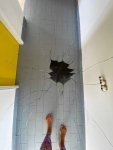
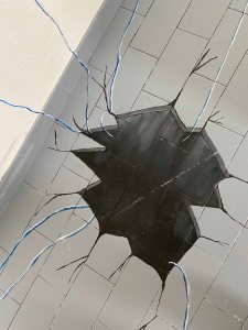
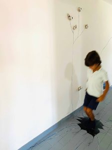
In several of the rooms, a lampshade is left dangling from the ceiling and some curtains left on the window. In a way, these lonely left over objects just emphasize the emptiness of the room.
This room is to the North and always cold and dark. It has a weird shape and really low ceiling to one side. When I first saw it, it had very much very dark, heavy furniture in it and I can still feel the energy of this dark heaviness lingering. It took me a good while to even clean it out and it is definitely the space I have spent less minutes in.
I will change this by making “an empty room” one of the objects for the parallel project and by using this whole room as my sketchbook to record many of the stories I hear about the village.
Hera I am, ready to start. A whole white room as my white page. And now I need to decide where to put down the tip of my pen.
The dangling lampshade seems to be the center around which the space moves and I climb the ladder to start there.
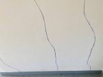
I start with my neighbor Donna Maria’s account of her first memory from when she was 3 or 4 years old and still little enough to be carried by her mother.
When I switch on the light, I am so happy I chose to start at this point in the room:
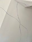
I start another story on the wall to the East, about Maria Jose walking to school with her little brother, the 4 km to the nearest primary school.
On the back wall, her granddaughter has a dog called Boss.
I realize that all three stories start with relationships- to the mother, to the dog, to the brother. I decide to leave the Western wall to a lonely figure- Donna Laura from the house on the other side of ours.
Her story is very sad. I will let it evolve around the figure in time.
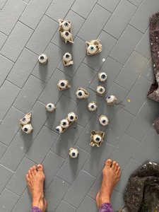
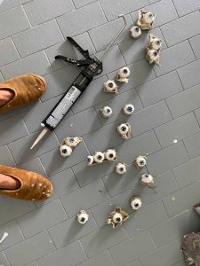
I have written another blogpost about all the glass I have found, and some of the pieces are clearly from a car. I decide to let other parts of the walls start with stories about the cars from which these glasses came- using this room as a sketchbook:
I prepared several different pens, with the idea of letting fainter drawings lie further back in time than thicker, clearer drawings. I will let go of this though, as I will use the walls more freely and allow myself to grab whatever pen is at hand at the moment.
This is a short video of the current situation:
I am planning to continue filling the walls here with snippets of narratives from the house and the village, until they connect in a web of stories. When the walls are full, I might use a torch to film it in the dark, with just the lit up parts flaring up to be visible- again making the connection to the cave painting. Possibly, I use an IPhone torch, as this is a modern cave painting.
When the walls are filled and filmed, I will probably paint it all white again.
Course manual: “Aim: Make a drawing which forces the viewer to use time differently. This may mean a drawing which takes time to make sense of, or a drawing that creates a feeling of a certain pace. The drawing may need an investment of time by the viewer in some way. A drawing is a record of the time you spent making it, but the viewer also spends time looking at it, perhaps seeking meaning, enjoying its beauty or marvelling at the artist’s skill.
Reflection: Reflect on the time spent by the viewer and how it relates to what you do as an artist.”
Inspired by Giacometti or Frank Auerbach’s portraits, where a multitude of repeated lines and erased parts corrected over and over, show a long process of searching for the right line, I have the idea to use one canvas or one piece of paper to draw a a timeline of self-portraits. Looking at photographs of myself from different ages, I will start with a baby portrait and then erase or change the lines til I arrive at a portrait of my current age- 50 years old.
I have never before felt drawn to draw self-portraits, but firstly I am the person to whom I will have the most easy access to photos of all ages, and I am as well drawn to the self- inquiry of a timeline.
I am very much hoping that the last portrait of the 50 year old, will still show traces of the first baby one, but am not yet sure how this will work out technically.
Having attended Keith Ashcroft’s workshop “from dark to light”, I am very much tempted to try this in oilpaints, starting from a dark ground. I choose two small canvases 30x40cm, and coat one in Payne’s Grey and the other in Raw Umber oil paint, as I want to experiment with a warmer and colder background.
I intend to choose one, and then sketch all of the photos one after the other on the same canvas, hoping that it will show remnants of the laborious process as well as a record of many years of transformation.
On my palette, I only have raw umber, Payne’s grey, Titanium White and Zink White. I am aiming for a monochrome effect playing with warm/cold tones.
After way too many hours of trials, I end up with this series of photographs from my two canvases:
I am getting a little desperate here for two reasons- in order to see anything, I wipe off too much of the previous image and you can not tell if it was painted on top of another portrait, as was the whole point. Secondly, I will be 70 years old before finishing this series at this pace.
I decide to start over again with charcoal instead, spending less time on each of the drawings and trying to wipe off less in between.
I choose a sturdy 300gr Canson watercolor paper to be able to erase and correct a lot without too much damage to the paper.
I end up with this series of drawings, all in charcoal:
This is how the drawings look strung together in a time-lapse video:
If I only look at the last drawing- I do see traces of the many previous layers:
Like an erased De Kooning by Rauschenberg, this drawing requires some context to be understood, as it is the process that is the response to the project here.
This drawing requires more time than a casual glimpse and more engagement from the viewer to understand. It was very time-consuming to produce and when knowing the subject and the process, this will be felt by the viewer.
“Aim: Artists’ books can be anything from a concertina fold to a professionally bound volume or an old textbook with sheets stuck in.
Research artists’ books as a form of artistic practice. Hans Peter Feldmann, Wolfgang Tillmans, Sol de Witt, Eileen Hogan and Arnaud Desjardin are just some of the artists who have worked in this way. The Chelsea School of Art has a collection of about 3,500 artists’ books established by Clive Philpott, an expert on the subject. The collection includes concrete poetry, European and American conceptual works and contemporary British artists.
Review your research and, perhaps taking an idea from your existing sketchbook work, create an artist’s book about something which elapses over time.“
RESEARCH: Artist’s books as a form of artistic practice
Hans Peter Feldmann
Hans- Peter Feldmann descibes himself as a compulsive collector of images and everyday objects, rather than an artist. As a collector of images- the bookform lends itself to cataloguing and viewing the pieces. He started presenting series of images in self-made books from 1968. He collects photographs or found images of a seemingly banal subject- like all the clothes of one woman or the views from hotel rooms, which he then elevates into a new experience.
His work “100 years” which is a series of portraits of people from 8 months to 100 years old is one of many works dealing with time. Another is a photoseries of a medal taken with different shutter times.
I like the simplicity of his photobooks. He deliberately chooses a very cheap and “self made” technique and look and then simply fotocopied them to make more copies. This simplicity lends itself to the subjects, which are also “simple” things, everyday objects that receive a new value and quality by being looked at differently, even when the format is so unpretentious.
Wolfgang Tillmanns
Wolfgang Tillmanns is most renowned as a photographer, and came to fame with pictures documenting different social aspects of society, as well as enlarged scenes that become abstract. He was the first photographer to win the Turner prize in 2000. Since then, he also works with rap music, video and performance.
Tillmann often groups his series into artist’s books.
His latest book is “Today is the first day, a 512pages artist’s book published this year.
(Images from: Tillmans, W. 2020. Wolfgang Tillmanns. [Online]. [11 November 2020]. Available from: https://tillmans.co.uk/)
On Tillmanns website http://www.tillmanns.co.uk, many of his books are available to leaf through, which also gives good insights to the layout. The images are accompanied by various texts, and exhibition texts from different authors. His images are often very direct and striking and condensed into a book they show an overwhelming variety of scenes and angles. Leafing through them has made me appreciate Tillmann’s work much better. Sometimes seeing the same photo blown up to a huge format in an exhibition produces a quick effect, but it can stay at the level of a quick shock. The book form shows more of a genuine research quality and I would almost say tenderness for the subjects explored.
SOL LE WITT
The American artist Sol LeWitt worked in sculptures and massive wall drawings, but his interest in series also brought him to produce more than 50 artist’s books. He was one of the innovators of developing the artist’s book as an art form and was a co founder of Printed Matter- one of the first organizations dedicated to creating and distributing artists’ books.
His first books, contained explorations of geometrical forms, then appeared colour and finally photography, like for example in “Brick wall” from 1977, where he photographed various wall surfaces.
Researching Sol Le Witts books, lead me to a fantastic website dedicated to artists books: http://www.artistsbooks.info
DIETER ROTH
The work of Swiss artist Dieter Roth is also very centered around the book form. The two following books were published in a few hundred copies and handsigned. I like their very spontaneous and unpretentious nature, like the below book of “1234 most speedy drawings”:
This is a little book of 246 clouds. The books exist as works in themselves, not as preparatory sketchbooks for other works.
Roth then went on to produce books with loose papers presented in different forms.
The books consisted of loose sheets, leaving the viewer the freedom to shuffle the pages in any order. This is an idea I am quite attracted to trying out.
The bookform took an extreme form in Roths work “Litteratur wurst” (Litterature sausage) where he minced magazine pages and drawings and stuffed them into a sausage skin. This is just to show how incredibly versatile and artist’s book can be!
TILETASTIC
For my parallel project, I am studying the deconstruction and narratives in our old house here in Portugal. One absolutely fantastic element here, is the incredible amount of different tiles used. They are not the beautiful, antique white and blue Portuguese azulejos you may think of . This house was built 35 years ago, with very peculiar taste.
An artist’s book seems the perfect format to catalogue the many tiles , before we cover them up with calming paint or change them altogether.
Then, I will use the many patterns of the tiles for new drawings, as well as backgrounds for projections with dance and performance. I am overflowing with ideas of how to project the most fantastic tiles onto my body and create shapes with movement.
The format of an artists book can serve both the purpose of cataloguing the tiles for memory, and to place them in relationship to the new drawings and photos of a more performative character.
THE TILES
I start by photographing and editing the impressive amount of different tiles in the house.
The most impressive is the bathroom:
I took a precious picture of my daughter the first time she saw it:
Next must be the kitchen:
The rest of the tiles are not as spectacular per se, but fabulous in the sheer amount of them:
The effect is especially amplified by the creative combinations:
We have started to cover some areas with grey tile paint to be able to think clearly in some spaces.:
A TILE PERFORMANCE
With this catalogue of photographs as a base, I take the tiles into my creative world. I invite my friend Rita again, who is an aerial dancer and create a scene with the tiles being projected at my studio wall. I want to include myself and my own body in some of the pieces, but also be able to be behind the camera while Rita is performing.
We start with the mesmerizing bathroom tiles:
I am projecting photographs with the tiles in different sizes and capture the shadows of our moving bodies under a cloth:
Rita performs wearing a yellow dress:
Next , we are drawing the patterns of the tiles on very big paper on the studio wall.
This is the first drawing (approximately 180x200cm)
Here I photograph the drawing with an arm for a sense of scale:
For a second drawing, we use 3 projected photos of the same bathroom tiles in different perspectives and add the pattern from another tile as a frame.
This becomes the background for the following:
And in combination with yet another tiles photo and my shadow:
We also project the tiles on our bodies
I am using the same bathroom tiles for yet another drawing in acrylics:
A last bathroom tile picture with the shadow of my legs
Now we continue dancing on the pattern of a blue floor tile, trying the yellow dress again.
It works much better here , with the pattern that is not so intricate.
The kitchen floor has the same tiles in green, that I photograph in a different direction:
It becomes really effective in the place where the floor meets the wall:
The kitchen tiles open up a whole new universe of possibilities!
We return to drawing on a new big paper on the wall. I start by capturing Rita’s dance, an eternal movement in the imaginary kitchen, then add the patterns of the kitchen tiles, and finally some splashes of red
This is the background for the next performance
I am fascinated by the patterns of the tiles on the body
We return to drawing again, this time the floor tiles of the original hall and living room, including our feet
Adding acrylics
Finally, I project the tiles on the drawing with Rita moving her legs
This is more impressive in a short video:
We put up yet another paper, and return to the most simple tile.
We have been going for two fun, creative, intense days here, and I have material that will take at least a week to edit!
THE BOOK-DIGITAL
I decide to create a “photobook ” format, as a way to preserve the history of the tiles found in the house in combination with our creative transformation of them. In this video, you can follow the flicking through the digital version of the book:
I am really happy with where the tile story took me, but I feel like I still need to explore the potential of the artist’s book more hands on.
THE BOOK-
I am preparing the photos in square formats to print them and use them as “tiles” for a new mosaic. I will experiment with attaching them and folding them together into a map/ book.
As a trial, I have taped the tile photos together into a mosaic. You can move the whole piece around like a blanket or a carpet that can of course be continued to any size.
And then folded together into a map like book:
I decide that the piece can become much more interesting if leaving it more open. Inspired by “Volume 8 ” by Dieter Roth, I print out a new set of tile shaped photos and will keep them as a set of cards, in a crafted folder, leaving the possibility of a new combination for the tiletastic mosaic every time you open it.
It feels really good to hold the stack of images in my hand, the thickness of the pile corresponding to a tile more or less.
And then the puzzle can begin:
This is just one of the infinite possibilities:
I realize that this result is at least as “noisy” as the original tiles and combinations!
I am happy though with where this project has taken me- to examine our many tiles and to play with them into creating new versions.
I will continue this exploration into the next project: A finer focus
“Aim: Drawing moving figures or a changing scene can be extremely challenging. A large part of that challenge, however, is your own conception of the purpose. By taking a step back from trying to pin the action down to a static conclusion, and instead making a drawing which is a record of the movement and action itself, we can begin to reflect on how to balance movement and form to create a dynamic image.“
“Method: Find a fairly busy scene, with plenty of movement. Sit somewhere comfortable and out of the way and start making a drawing. As something catches your eye, capture it as best you can. Keep responding to movements as they happen so you build up a drawing full of dynamic energy. Depending on how fast you can capture form or how much repetition your view has, you may be able to build up a convincing representation of the scene. Whatever happens, you should be able to make a drawing which captures a sense of time elapsed, rather like a photographic long exposure. Don’t lose focus; make each mark as accurately as you can. Even if you just get a small mark representing the back of someone’s head before you lose them, make sure that mark is as accurately shaped and placed as you can get it.“
I am far from a busy scene here in my Portuguese village, but have my friend Ellen visiting who is up for drawing together. We decide to project busy scenes from You tube clips on the wall and draw them, which is a lot of fun!
We start with the trailer of the movie “Dune”, which is full of very quick fighting scenes- very tricky to capture! I choose Indian ink and a fine brush as my medium to avoid trying to be too precise on A3 paper.
I think these drawings capture that there is movement and many figures, but it is really not clear what is happening.
We decide to change for Ingmar Bergman’s movie “The seventh sail” instead, as it is black and white and moves much slower, even freezes at times on a scene.
I mix pencil drawings with Indian ink with a brush to use different strength of line. Knowing the movie, you can pick out some of the themes of it in the drawing, but it is still quite disappointing as a result.
Some days later, I invite my friend and aerial dancer Rita to participate in a performance we create for the Artists’ book (blog post coming up).
She loves to dance, and I roll out a long piece of a paper roll on the floor (approx 90×300 cm) to capture her movements.
I start with black Indian ink and a thin brush. The Indian ink allows me to make very quick and fluid marks, it feels ideal for this type of very quick drawing.
It must be many an artists dream to have a model as perfect as Rita dancing for the drawing and I am frustrated at not being able to capture this better.
For a second round, I decide to try with red Carmin acrylics, and a thin brush.
The acrylics are more resistant, even well diluted and I find I have to dip my brush much more often. Ink is more suitable for these very quick movements.
This is the final drawing:
I think you can definitely feel movement and dance and it is a very dynamic drawing. It would require a lot more of practice to capture the beauty of the movements more precisely though. I am glad that I worked on such a big paper as it made my own movements more free. Ideally I should have worked on a vertical paper though (easel) and not on the ground, to avoid looking up and down all the time.
Drawing the moving figure is definitely something I would like to learn better, so: to be continued.
This blogpost is a summary of a tutorial with my tutor Emma Drye that focused on the parallel project and critical review, as well as a beginning research into some of the artists and aspects that came up during our video call.
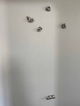
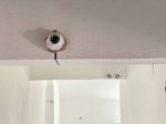
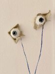
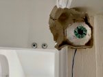
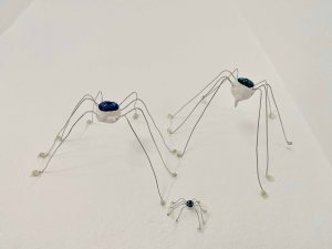
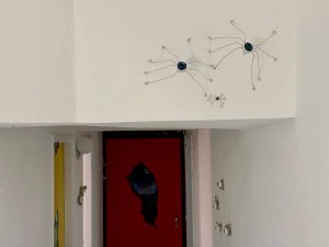
My parallell project is centered around the changes that we are making in an odd, old house, including many peculiar objects left behind by the former owners. I am using this house as a nexus of narratives about the village and its inhabitants and relationships. As a family, we had originally planned on renovating the house while living in Lisbon- instead we suddenly moved here full time overnight at the beginning of lockdown due to the Covid 19 outbreak and so merged our own story as a family with the place at this peculiar time. While deconstructing the home it is a dissonant place with too many influences. On one hand I am trying to listen to the crazy patterns and angles, on another I am wanting to strip everything down to calm and quiet Scandinavian views, and on yet another impulse, I am gluing eyes and spiders to the walls for the site specific installation.
I was concerned with my parallel project taking off in too many directions and becoming too diverse and becoming difficult to coalescence into one body of work. My tutor encouraged me though to embrace the multiple , versatile aspect of it. She compared it to a family or the movements of a symphony- both images that really resonate with me. The notion of having to achieve something coherent and beautiful is not contemporary any more. Instead I can allow all the different aspects to come forth, it could for example be seen as a series of rooms , one more emotional, the other more rational, the family room and so on and let the artworks speak to each other. So for example an empty room with chairs and cast shadows speak about tension and loneliness, a much more private work . (Shortlink:https://wp.me/pbt6jU-tD) On the other hand, the project took a social turn in a video that I did with my partners family, using many left over items from the house to build a symbolical “home” as a team/familybuilding activity. Emma Drye found the video caring and responsible while still leaving space around what was said in the interviews.
In many of the works, especially the intuitive painting pieces, for example on stripped down wallpaper (Shortlink https://wp.me/pbt6jU-tg) or on showercurtains (Shortlink https://wp.me/pbt6jU-sH) I suddenly see eyes appear. Emma Drye commented on a missing piece from the intuitive markmaking to suddenly eyes or a face. How and why am I including faces? As eyes appear frequently, she encouraged me to look closer at how to draw eyes- looking at Rembrandts etchings for example.
We continued speaking about the Critical Review. Home and belonging are two ideas which overlap and are my first key words that keep coming up. I will start my research around these and look for a question emerging that can become the red thread of the Critical review. We discussed exclusion and inclusion. Emma suggested that the globalization of the internet and modern life might cause an anxiety or sense of threat in some which may make nostalgia and things like nationalism or the local feel safe and attractive. That may or may not relate to the theme, but she pointed out how belonging always is a two sided coin and often has winners and losers.
So far, I have looked at 5 different approaches to Home and Belonging :
1. Landart – directly using the the elements available to address universal, general themes , the immediacy creates a sense of belonging. Artists like Richard Long and Andy Goldsworthy stand out here, working directly with the land that is familiar and home for them.
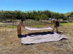
I feel very touched by the art of Ana Mendieta who is often using her own body, and the elements of earth, water, air and fire to connect to nature. She left her native Cuba very young to come to the USA and said “I was torn away from the Motherland- one of the reasons I have gone back to work with nature”. During this course, my own practice has been pushed further away from traditional drawing and painting on paper or canvas. I started using my own body for full body prints and created a Landart installation with sticks as a nest, where I then lie down naked for a photo session, also with my daughter and granddaughter. (Shortlink https://wp.me/pbt6jU-qD) It was a beautiful and highly symbolical act for me to painstakingly build the nest with sticks from the surrounding fruit trees that we had been pruning- connecting drawing in space with this land that has welcomed us, with the fruits of earth, to create a symbol of our staying and feeling safe and welcome- a nest.
There is a quality of touch, a sensual quality to the work, when being covered in paint, or in sand or when scratching the hands on the many twigs of the nest, that becomes an important part of the experience. When looking at the photos of Ana Mendieta’s series “Silueta”, I can feel that same visceral, tactile quality of the work. There is a quest here for a sense of home in nature and in her own body. I would be curious to explore Ana Mendieta’s work in more detail.
2. Home as a subject- when a specific place is recurrent and the main subject of the work, like for example Georges Shaw’s paintings from scenes of the council estate where he grew up or Andrew Wyeth.
3. Home as the place of the work, like for example Jeremy Deller creating an exhibition in his own house . This is in a sense what I am creating here at the moment with my parallel project- transforming the house itself , so it becomes both the place and the subject of the artwork.
4. Artists dealing with the lack of home and belonging, like for example a huge amount of refugee artists. Here I can for example mention Anahita Razvani Rad who came to Britain 15 years ago and is painting war scenes from Iran.
I am also thinking of the three dimensional work “On longing” by Melanie Walker that I saw in an exhibition in “the Carpintarias St Lazaro” in Lisbon earlier this year and that left a lasting impression on me. In this work she has combined textiles with photography so that the images are hanging and the viewer can walk through them.
Walker is using the image of a house as a metaphor addressing themes of longing for belonging, a home, homelessness on the search for a safe home. Her figures are all carrying this metaphorical home on/in their heads.
(my photos from the visit)
5. Excluded even when you are included, here I mentioned my own experience at always being the foreigner, no matter how many fruit trees I plant here and in a wider sense- how modern life and increased use of the internet leads to a general feeling of alienation and isolation.
Emma Drye also sent me a long list of interesting articles, podcasts and writers that could be starting points for wider research. I am starting here to take a look at some of the suggested.
In the article “Art and belonging ; On Place, displacement and placelessness, Alsion Young takes a look at the role of street art in connection to these themes.
These are some sentences I found most interesting as starting points:
“the work of artists such as Ian Strange, Francis Alÿs, and Stanislava Pinchuk, who make art located in displacement, dislocation, and dispossession. How can art respond to the now widespread phenomenon of displacement and disconnection from place? How can street art engage with placelessness? What can placelessness and displacement teach us that we might use to resist the co-optation of street art from place-making to place selling?To pose some possible answers, or to begin a conversation around these questions, I consider here work by three artists. Two have been known in the past as street artists or graffiti writers; one has always been considered a fine artist. All three combine multiple practices in their work. All work in and away from their ‘home’ location; all of them seek to problematise ideas of place, home, and the inhabitation of space In Ian Strange’s work, the home itself becomes a vacant site of trauma and loss; in Alys’s work the mundane acts of urban life such as walking, freighted with uncertainty of meaning, show how we require fences and borders for meaning and order; and in Pinchuk’s work, we see how the places that we take for granted are always about to be overwhelmed by a wave or to collapse into an earthquake or to be destroyed by war or radiation – the things we hold on to are always on the point of being lost. Despite what developers seek to communicate to us about art in urban space as a guarantor of the value of property, these artworks of displacement tell us that in every place we are on the verge of placelessness; in each of our possessions lies the moment of our future dispossession.”
The TATE has a podcast on Art and Belonging that brought many interesting definitions and voices of different artists.
In this podcast, they explore what it means to belong. How can art make us feel part of something, how can it help us to connect with ourselves and others? Here artists, an author and a poet reflect on their experiences of art and belonging:Tracey Chevalier, Lubaina Himid, Andrew Mashigo, Anahita Razvani-Rad, John Hegley, and Corey Samuel.
To belong- to feel an affinity with something
I think I belong in the person I ve become
Belonging- a sense of being at home, of being a part of a place
Lubaina Himid: I came to Britain when I was 4 months old ,(…) and in those 60 odd years in between, I have negotiated ways of how to feel part of this place. But if you are a person who has come from somewhere else, and everyday people ask you where you are from, you develop a script. Of course my script reads that I am from Zanzibar, and it sounds like a movie, it sounds exotic, and other, and then it becomes more important than anything else
Anahita Razvani Rad: Since 14 years in the UK, I paint Homesickness, immigration, identity, memory, dealing with all of that, in order to explain that to myself I started painting from photos what you get in the media here, war, soldiers, women in black tchador. I was living during the war for 8 years in Iran and my paintings still keep me part of it, they keep me grounded, its a kind of homesickness, trying to still be part of the life, the country I left 15 years ago.
To belong, to feel connected and content in the moment. I started looking at my life as the small things that make it all together, like noticing the light in the summer mornings in the north of England Noticing the details, not as much belonging in a bigger political sense, but I think I belong in the person I have become
To belong- to feel a sense of recognition
So in this podcast, several definitions of belonging stand out:
To belong- to feel an affinity with something
To belong, to feel connected and content in the moment
Belonging- a sense of being at home, of being a part of a place
To belong- to feel a sense of recognition
This is a quote found by Emma Drye, (from BEGINNING WITH BELONGING AND NONBELONGING IN DERRIDA’S THOUGHT: A Therapeutic Reflection Author(s): Charles E. Scott Source: Soundings: An Interdisciplinary Journal , Fall/Winter 1991, Vol. 74, No. 3/4 (Fall/Winter 1991), pp. 399-409 Published by: Penn State University Press Stable URL: http://www.jstor.com/stable/41178547)
“The thought I want to pursue is that in belonging together as we do we are also in a situation that I shall call nonbelonging. I mean that there is something about language and tradition to which we cannot belong”
The Cambridge dictionary defines the meaning of belonging:
the feeling of being comfortable and happy in a particular situation or with a particular group of people. to feel a sense of belonging
I am really quite surprised by the “happy” and “comfortable” that seems to be associated with belonging in the more common defintions, as I am sure you can feel belonging to a very ugly and uncomfortable place for example and not be happy about it. Also, I believe a catastrophe or an extreme and terrible situation like a war would bring people together with a sense of belonging that is neither happy nor comfortable.
I continue my research with an exhibition about Psycho buildings at the Southbank centre that Emma Drye recommended, and which luckily, The Guardian did an “in pictures” for:
This exhibition brought together the work of artists who create habitat-like structures and architectural environments that are perceptual and physical spaces as much as psychological ones. Visitors were invited to immerse themselves in ten atmospheric and unsettling installations that explored and questioned the way we relate to our surroundings.
Artists included: Atelier Bow-Wow (Japan), Michael Beutler (Germany), Los Carpinteros (Cuba), Gelitin (Austria), Mike Nelson (UK), Ernesto Neto (Brazil), Tobias Putrih (Slovenia), Tomas Saraceno (Argentina), Do-Ho Suh (Korea) and Rachel Whiteread (UK).
Ernesto Neto
Neto’s installations are large, soft, biomorphic sculptures that fill an exhibition space that viewers can touch, poke, and walk on or through. They are made of white, stretchy material—amorphous forms stuffed with Styrofoam pellets or aromatic spices. The shapes and the sheer scale of Netos work is really impressive. There is something very organic to them, a little like walking inside a living organism.
Michael Beutler
Beutler takes existing architectural elements and transforms them into constructions that evolve into installations. These compositions, in turn, inherently unite a dual function that is both architecture and sculpture.
For the above exhibition he arrived with a huge amount of tissue paper that he then installed directly on site.
Los Carpinteros
“Show Room” by Los Carpinteros was made from Ikea and B&Q furniture, painstakingly taken apart in a mock-explosion and hung from thin steel wires. It looked like a massive and impactful installation, like stepping into the midst of an explosion.
It reminded me of Cornelia Parkers “Exploded shed”, which I found more subtle , also in the way it worked with light, and in a way more effective as it touched something more personal.
(Belonging through recognition)
Another work by Los Carpinteiros that I found interesting is a shelf of drawers in the shape of a hand grenade, also in between the familiar and homey and the dangerous.
Gelitin
An artists group from Austria, they are known for creating sensational art events in the tradition of Relational Aesthetics, often with a lively sense of humor.
For this exhibition, they created a boating lake complete with dock and three small wooden boats, installed on one of the Hayward’s sculpture terraces, where visitors could row around.
Rachel Whiteread
Rachel Whiteread’s installation for this exhibition was made up of 200 doll’s houses from her personal collection, assembled over the last 20 years.
In Tate shots; I wanted to preserve the everyday, I wanted to give authority to some of the more forgotten things, stopping it in time and casting it in something solid
A thoughtprocess that has been illustrated by sculpture
Looking at the domestic in terms of realtionships with people and the relationship that people have with their homes, relationships people have with their furniture and trying to bring all those things together ( see Daniel Miller, the Comfort of things)
and quietly talk about some of the darker things
cast from the space under the bed (shallow breath) in plaster, later in Amber in rubber
House 1993, I am very proud of it, its a real sense of achievement
quite extraordinary sculpture that touched people in many different ways
mummify the air in a room, solidify
Mike Nelson
contemporary British installation artist. He represented Britain at the Venice Biennale in 2011
Nelson’s installations always only exist for the time period of the exhibition which they were made for. They are extended labyrinths, which the viewer is free to find their own way through, and in which the locations of the exit and entrance are often difficult to determine.
His major installation The Coral Reef (2000), was on display at Tate Britain until the end of 2011. It consists of fifteen rooms and a warren of corridors. In 2019, from March to October, he transformed the Duveen Galleries in Tate Britain with his new installation called ‘The Asset Strippers’, a collection of objects from post-war Britain that framed his childhood.
Emma Drye also provided a lot of possible background philosophy etc if I want to look deeper into the ideas that we discussed. Here I am doing a quick search, which is not an in- depth referenced research, just an overview to choose what to research further:
“So far as the United States seems to be concerned, it is only a slight overstatement to say that Moslems and Arabs are essentially seen as either oil suppliers or potential terrorists. Very little of the detail, the human density, the passion of Arab–Moslem life has entered the awareness of even those people whose profession it is to report the Arab world. What we have, instead, is a series of crude, essentialized caricatures of the Islamic world, presented in such a way as to make that world vulnerable to military aggression.
— “Islam through Western Eyes” (1980) The Nation.[43]”
The person who loves his home is immature
Jacques Derrida on being alone and knowing other people
deconstruction
“there is no out-of-context” (il n’y a pas de hors-texte).
relational aestetics, we do not belong to anyone
Judith Butler on being more than one thing at a time
who you are is fluid, it is not a rigid notion
Stuart Hall on the diaspora and being away from home
Community/ cultural cultural entanglement hybridity
Miwon Kwonon place and site
a Korean curator and art history educator. Her work focuses on contemporary art, land art and site-specific art. She is the author of One Place After Another: Site Specific Art and Locational Identity,
Daniel Miller on making a home
A set of portraits through collected objects- essays , see Sarah Sze collecting household objects for her installations
I am currently reading the book “The Comfort of things” which makes very poignant and interesting connections between things and relationships to people
Portait 1 “empty” , p. 8 “There is a violence to such emptiness (…) There is a loss of shape, discernment and integrity”
Portrait 2 “full” p.31″from this family one learns the artisanal form of love, care and devotion, performed with such subtle grace, creativity and imagination thatbthe ways persons become objects of care and objects become subjects of relationship blend imperceptibly with each other in the overall fullness and artistry of these lives.
In art :
Nicolas Bourriaud – relational aesthetics
seeks to offer different criteria by which to analyse the often opaque and open-ended works of art of the 1990s. To achieve this, Bourriaud imports the language of the 1990s internet boom, using terminology such as user-friendliness, interactivity and DIY (do-it-yourself).[12] In his 2002 book Postproduction: Culture as Screenplay: How Art Reprograms the World, Bourriaud describes Relational Aesthetics as works that take as their point of departure the changing mental space opened by the internet
Bourriaud explores the notion of relational aesthetics through examples of what he calls relational art. According to Bourriaud, relational art encompasses “a set of artistic practices which take as their theoretical and practical point of departure the whole of human relations and their social context, rather than an independent and private space.” The artwork creates a social environment in which people come together to participate in a shared activity. Bourriaud claims “the role of artworks is no longer to form imaginary and utopian realities, but to actually be ways of living and models of action within the existing real, whatever scale chosen by the artist
Clare Bishop – participatory hells
Artificial Hells: Participatory Art and the Politics of Spectatorship (2012) is the first historical and theoretical overview of socially engaged participatory art, best known in the U.S. as “social practice.” In it, Bishop follows the trajectory of twentieth-century art and examines key moments in the development of a participatory aesthetic.
Her 2004 essay titled “Antagonism and Relational Aesthetics,” which was published in October, remains an influential critique of relational aesthetics
Artists mentioned:
Nicole Wermers
Wermers creates sculptures, collages and installations which explore the appropriation of art and design within consumer culture. She lets objects speak hinting at personalities.
She is interested in how physical infrastructure determines social infrastructure.
Infrastruktur 2015- a series of chrome chairs with fur coats. The coats have an extra new lining, incorporating the chair into the jacket.
Very fleeting, temporary observation you can make in a cafe or restaurant when somebody puts their jacket on the back of a chair in order to claim that little bit of public space, they can privatize it for themselves.
Ceramic tear off notes, heavy , at the same time white- devoid of content. oldfashioned way of communicating
private space vs public space
These are ideas I would also like to look further into.
the materiality is a major part of the work, the materials used and the process become the work
documenting overlooked objects from famous places
the exploded shed
Cindy Sherman
Literally changing identity when acting out different characters in her self portraits
inclusion-exclusion
Jeremy Deller
Here we spoke about the “the Battle of Orgreaves”, reenactment of the minors strike- lead to international fame and later the Turner prize. Public involvment, performance
“social cartographer, psychogeographer, catalyst and Turner Prize winning artist, participatory projects “We are here because we are here”… a real personal impact on the viewer
Graffitti from the mens toilet in the British Library exhibited on the walls of the toilet etc, it spread around the house
from 1996 working with the public, getting a brass band playing acid /house works together with other directors
Strong and stable my arse
reenactment of the battle at Somme
No object left after the event, but it is documented by the public and spread through social media. Deller is not actively partaking on social media, but is very aware of the use of it and how the public will spread awareness of the work through social media. Also the work exists in peoples memories
Social surrealism, Social movements and music and how they relate
the play between the public and the work
Sarah Sze
creates large scale installations with a wide array of objects, she explores the edge between life and art, how something very familiar becomes unfamiliar. the viewer sees every day objects with a sense of dicovery
In the Venice Biennale – US Pavillion 2013- household objects, scale in relationship to my body
Paint- how paint behaves in the space
Improvisation is key
Andrew Cranston
I really enjoyed discovering the paintings of Andrew Cranston. I am always drawn to works that contain a narrative, especially when it is quite subtle like here and remains a little mysterious or dream like. I also liked that he uses old hard cover books as supports- the painting becoming an object and is more intimate, you can imagine holding it in your hands.
the whole family of the artist participate in a sort of soap opera filmed in various IKEA showrooms- it looks like home but is a simulacrum, a false version of something that is supposed to be important, consumerism
I find really interesting in this work, that Guy Ben Ner manages to tick all of the 5 points that I listed as different approaches above- 1.he is using the objects around him directly (Land/Houseart), 2.the subject is the home, and it is 3.made at site, but then it is also a 4.non-place and a simulacrum so 5. all the feeling of belonging falls away and we are just waiting for the security guard to appear.
It is quite hilarious, to see the action among the furniture with dangling price tags, and passers by entering the scene unknowingly. At one point, the son asks the father what private property is. ” It means that this house belongs to us. We are the only ones who have the right to use it. And most important- we have the right to exclude others from using it. -Exclude? – Exactly so, you can claim something as yours the moment you kick others out of it. Private property creates borders, son. The conversation then goes backwards from one owner to the oprevious until the daughter adds, that it started with hunter and gatherers, and suddenly someone claimed land and the others had to pay rent. Strange, as she sais. Further the father explains inheritance and how it holds the property from leaking out. Love is the only thing in the world that does not have a price tag. we can not buy or sell love. Love is what holds the family together. And we hold the property together avoiding it from leaking out, concludes the daughter What about sharing? asks the daughter Father: Sharing is so primitive honey. Animals share.We evolved, do you want to live in a herd? We evolved and rose on our two feet so we can free our hands and point on objects and say- this is mine, we freed our fingers so that we can count Time is a way to calculate an objects value Daughter Children of the future release yourselves from the shackles of the past
In the tutorial, Emma Drye also reminded me that I can centre the Critical Review around my own work. “Remember you can use your own work and circumstances. For example, “a family arrives: notions of belonging and home in my practice” is an open question which you could then support with case studies of other artists you could compare your own experience to. You would need to define hone and belonging, describe and evaluate your practice and make a case for the various elements of your definitions of the two terms in your work. “
Here I take a look on how my own work fits into the different approaches I defined at the start of this post:
1. Landart
The Nest, using raw materials directly from the land // Ana Mendieta
2. The home as a subject- my whole // project centered around the house and the different narratives connected to it- also through the left over objects
the social aspect (the video)
3. Home- a site-specific artwork, A modern cavepainting- the sketchbooks on the walls, site specific art work, merging 2-3
4. Non place, sense of isolation or non belonging
the chairs as a symbol of loneliness
5. excluded even if you are included, expressing the lack of felt sense of belonging
What does home and belonging mean to me?
I believe that after a long detour looking at artists working specifically with ideas of the home/house or homesickness or belonging in a clearer sense, I have come to realize that what I am most interested in exploring is the felt sense of it. What art does strike that feeling of recognition with me? I had looked more deeply into Rachel Whiteheads art and am blown away by the genius of casting the space under the bed in “Shallow Breath” or the massive and ingenius project of “House”, which raise many questions around the everyday, the overlooked, the home, but it does not feel like the questions I am asking myself.
So I started out with focusing on the parallel project and this definition:
Belonging- a sense of being at home, of being a part of a place
But I have arrived at being more curios at looking at
To belong- to feel a sense of recognition
There is a sense of recognition when I look at the work of Ana Mendieta. A search for belonging that I can understand. Where home and belonging would be coming home to my body and feel the elements around me, rather than identifying belonging to a house, or a country.
When I look at the paintings by Karin Mamma Andersson, there s a different sense of recognition. There is something deeply Swedish, resonating with the dark deep forests of my Northern childhood memories, even if the narratives of the paintings are obscure. There is a certain darkness there that also feels like home. I have watched several documentary movies around the work of Karin Mamma Andersson, and it would not be possible to pin down her narratives to any specific subject, she seems to be very intuitive in her choice of very different imagery that inspire her, and has collected an impressive image bank to work with. Despite that there is a note in her work that sounds like a distant home for me.
I just watched an interview with Karen Mamma Andersson on American television Twilight talks. The interviewer also points out that the paintings are very Swedish, to which Andersson just laughs. But she goes on to explain how the surrounding dark, with the long winters that you start feeling in your body even at the end of June when the days get shorter, of course influences you to the very core.
A very different artist: I have recently discovered the work of Nijdeka Akunyili Crosby and find it fascinating how the layers of how she identifies herself flow into her work. She uses her family album, her own experience, plants from Nigeria and plants from America and wants to talk about that space between being a Nigerian artist in America. I come from a very, very different background, but there is again a sense of recognition in the multilayered complexity of being . The artist creates individuals that are multifacetted, like a woman with an oldfashioned hairstyle from the countryside but a high fashion dress that speaks to cosmopolitan life in Lagos and the setting might be modern architecture in New York, but with a TV set from the 80’s, so it is impossible to put either the character nor the setting in a clearly defined box- because it doesn’t exist. What you see makes sense but you don’t know what you are looking at because it doesn’t exist.
There are more and more people who for various reasons live in many spaces simultaneously at the same time and this is where Nijdeka Akunyili Crosby wants to get with her work, to these multilayered spaces where you slip in and out.
Maybe being Swedish- German with a half Lithuanian daughter and half British- half Swedish/German/ Lithuanian granddaughter and Portuguese partner and having lived in at least 30-40 places all over Europe, Australia and Asia before quite suddenly arriving and trying to settle in this very odd and also multifacetted house in the Portuguese countryside, there is a confusion in the narrative that I recognize as home.
So where does this leave the question for the critical review?
I believe i have lost the key word “home” as it has become less relevant than the felt sense of belonging. The “home” is still very present in my practice as the work that I am doing is happening around the narratives connected to a specific house. But it is really this deeper recognition that is interesting here, and how someone else can sense it from a very different place or being.
Becoming part of a narrative- Notions of belonging in my own practice and looking at other artists.
Belonging as a sense of recognition in my own practice and that of other artists
Five aspects of belonging with examples from my own practice and looking at other artists
(coming back to the list at the top of this post)
The deconstruction of a house- exploring a sense of belonging
How can I express a sense of belonging in my work?
How can my work make me feel part of something, how can it help me to connect with ourselves and others? Connect with a place?
In many of my works for the parallel project, I have looked at how our history in the house, which started when we moved here abruptly on the day the Covid 19 lockdown started, intertwines with the story of the house or the objects in it.
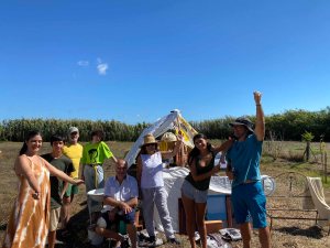
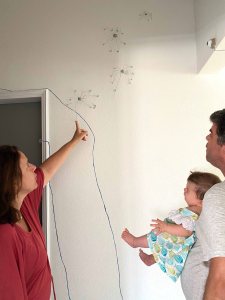
We ended up spending 3.5 months in the house with my partner, daughter and granddaughter and our friend Tom.
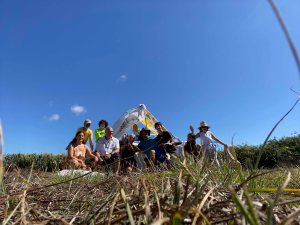
My partners parents and sister with family were now coming to visit us and see the house . This was the first time that we all met after the long isolation brought by the pandemic.
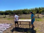
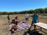
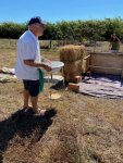
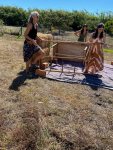
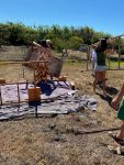
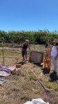
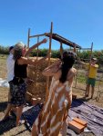
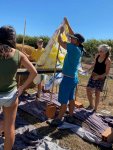
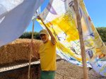
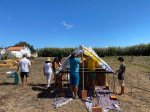
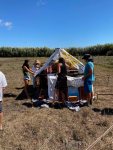
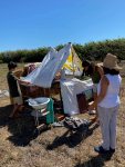
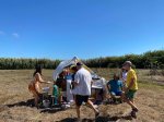
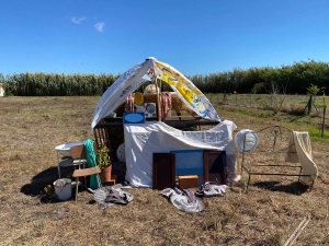
I wanted to include them all, and connect them to the story of this house that I am exploring through various artistic projects. I initiated a “performance” or “happening” where I invited everyone to collect various bits and pieces of left over objects from the former owners, to collectively build a symbolical house. I was aiming at deepening the conversation around what home and belonging means to us- a subject I am exploring for the Critical Review. After having spent weeks confined to our respective homes, these feel like very relevant questions. Also what it would mean to NOT have a home, as a homeless person or a refugee.
It was an extremely hot, windy and dusty day and I was truly amazed at how enthusiastically all of them joined in and played along!
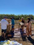
This is our final “home”:
And here we are proudly posing for the groupphoto:
It is harder than it looks to build something as simple as this shelter!
After the action, I did a small interview with every member of the family separately and created the below 5 minute video:
My main objective here, was to include this side of the family who were new to this part of our story with this peculiar house. This worked wonderfully- everyone participated eagerly and all mentioned how they had felt the team spirit while building.
The film got very “nice” and positive and everyone had nice things to say about family and being together. In this sense, I believe the action was a success. In truth, like most families today, this is a patchwork modern family, with many differences and the harmony we felt on this day, was quite exceptional. It was not the aim of this action, nor of the movie, but I would be curious to also explore how we all, despite having homes and families, struggle to feel belonging.
Course manual: “Find a place of significance to you to create a site-specific artwork. Responding to features of the site, add a drawn element or select a found drawn element which you’ll extend to express something you find interesting about the site. Relate your art work to your research in your log and synthesise what you’ve learned about installative and environmental art with your own interests.
For this assignment, you may have to submit a photograph of your final piece. If so, make sure that this is of an adequate scale and quality for your tutor to gain a true impression of your work.”
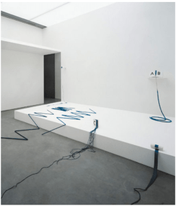
For the project 4.3 Installation, I researched the MoMa exhibition On Line from 2010-2011( see blogpost https://clarasdrawing2.design.blog/2020/06/08/research-point-on-line-pierrette-bloch-and-installation/). It opens a fascinating world of new possibilities when drawing moves off the page and into space and time. For the project 4.3 of Installation, I chose to focus on Landart when building a nest. Now I will come back to some of the ideas seen in the “On Line” exhibition for this assignment of a site-specific artwork.
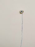
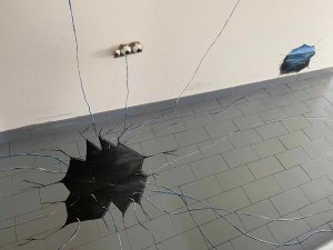
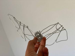
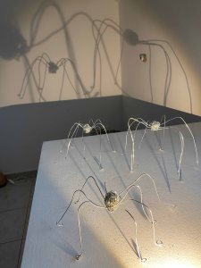
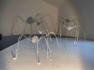
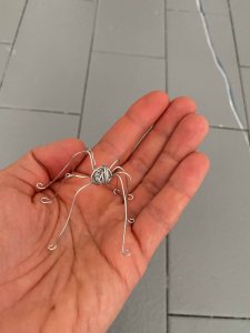
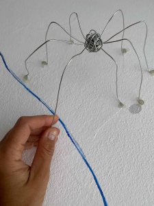
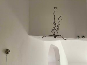
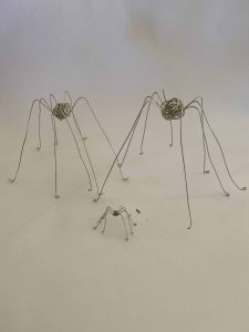
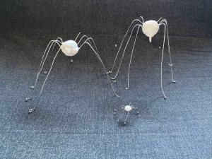
I am very curious to try out drawing in space with wire, inspired by Czech artist Karel Malich, which also will allow me to draw with shadow and light.
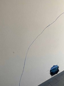
Edward Krasinski ‘s use of blue tape to connect the various elements of an installation also really appealed to me. I am planning to use a line to connect the various parts of the work, to create a sense of whole while allowing much space between the objects. I would choose a rugged, hand drawn line though.
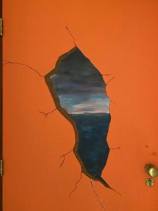
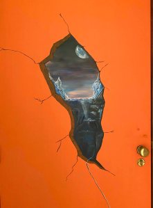
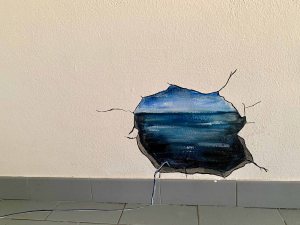
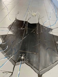
Another element that has appeared through this chapter of the course and that I want to include here is painting in “Trompe l’Oeil”.
So I aim at combining trompe l’Oeil painted elements, with elements drawn in wire and light, as well as connecting lines.
My first general impression of the exhibition, was that the works that I was attracted to, are clear, simple and not overloaded. I have a tendency of painting overloaded fairy tale settings on doors and chairs… For this assignment, I will have the challenge to find a harmonious middle way, remembering that sometimes less is more, while still wanting to include all of the above that I want to try out.
MoMa’s website has an incredible treasure of photos of installation work. I am drawn first to the title “Shared Eye” and then to the visual of an installation by Sadie Benning 2016. The first impression is a lot of white walls left between her very small works hung in small groups. Her work consists of these small panels with mixed media, drawings, found images or printed photographs layered. These small works together then evolve into something like a sculptural wall work.
This Installation would be too “clean” and too white for my project, but it is soothing and refreshing to see , and will help me moderate the urge to do too much, too full. I am taking from this to keep the separate elements rather small.
In this sentence from the catalogue of the same exhibition showed in Basel in 2017, two key words stand out, that I realize are very important for any site specific project- rhythm and narrative:
“The rhythm of the installation mimics the cuts, pans, pauses, and transitions of time-based media. Each of the panels, and the installation as a whole, suggests parts of a narrative, broken sentences—poems—where space is held for the viewer to make their own connections, seek their own questions, or leave things unresolved.”
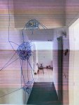
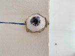
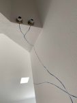
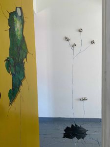
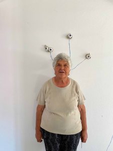
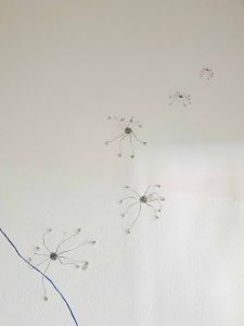
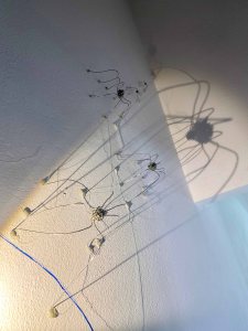
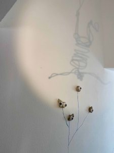
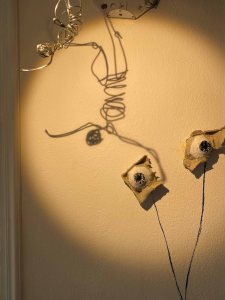
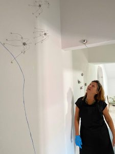
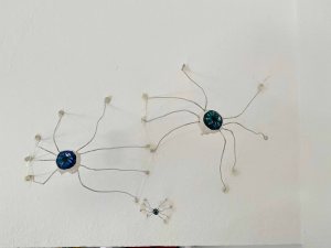
Many of the site specific installations in the MoMa collection rely a lot on large objects, like sofas or large cut outs in the space. In my narrow hallway, I will need to have a clear passage, but still want to include some 3Dobjects to give the installation a more tactile character. I do have a lot of space vertically, and can hang (small) objects from the ceiling. In any case, the work should direct the viewers gaze upwards.
I watched the process of Susan Szu’s installation through different You tube clips. She displays a wide variety of objects together , so that they create a new reality hovering somewhere between the familiar and the imagined. What struck me was the spontaneity with which she reacted to the space- so that an installation always evolved responding to the space. That is a quality I want to carry forward in this project.
So: Rythm, Narrative and spontaneity are my key words.
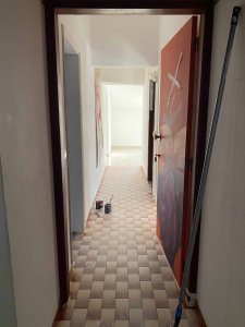
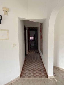
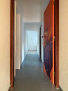
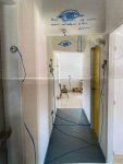
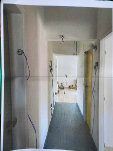
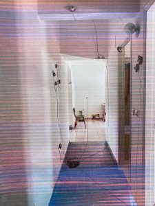
I am very lucky, for this assignment ties in with my parallel project where I explore the whole house as a nexus of narratives and in a permanent state of transformation. In this special place of significance, my studio is the most special place, as its transformation does not need to be negotiated with anyone else. For this Assignment, I will focus on the long, narrow corridor leading into the studio, where I feel free to play. (I prefer to keep some fresh, white walls in the studio itself after just having quieted the many wild colours and tiles left by the previous owners).
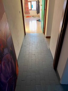
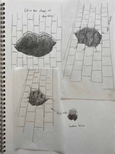
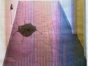
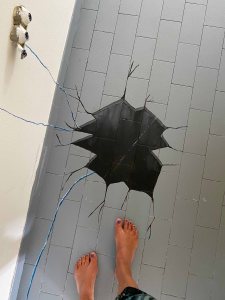
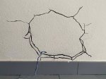
The space
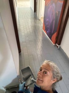
The space is a long, narrow corridor with strange angles and different heights of the ceiling. I have previously painted all the walls white. I will start this project by also covering the rather disturbing tiles. They are not strange enough to be interesting, but are very distracting.
I cover the tiles in a neutral grey (special tile paint), so as to produce a clean canvas to start on.
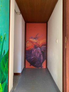
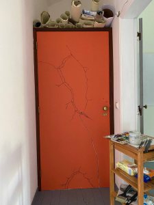
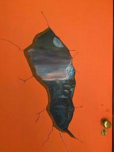
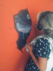
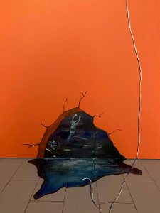
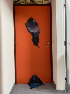
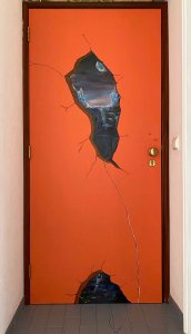
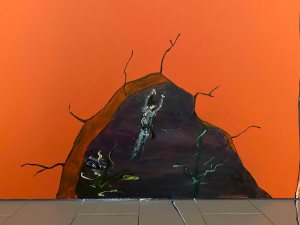
I had already painted the door that leads in to the corridor orange with a wild pink and purple jungle, but this will stay on the outside of the project. The inside of the door is plain orange.
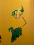
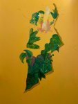
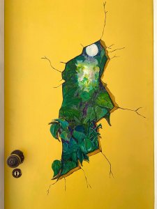
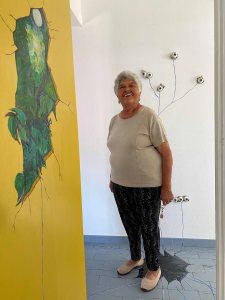
I paint the first door to the left in neutral grey too and the one to the right in a bright yellow. I am planning to create trompe l’ oeils on these doors leading in to different worlds, and the background colour is already setting the tone.
I think this space is really interesting , because it is impossible to comprehend in one glimpse. You have to walk through it and look around in order to see it, so the shape and format of the work already makes it into an immersive experience.
The narrative
This hallway is a transition from one space to another, and connecting it to my parallel project telling the narratives of this house, I want to find a transition between the story of the house and my own story.
One piece of the story of the house that I have not yet explored is the presence of religion. The former owners were very religious and active in their church, and the reason a 90m2 area is divided into nine very small and strangely shaped bedrooms, is that it was always full with visiting members of the congregation. This space has seen a lot of prayer! My prayer is gardening, painting, the ocean and practicing yoga everyday. I am curious how the possible symbolism of these different parts of the story can flow into this project.
The shape of the space- long and narrow- also makes me think of a tunnel, or maybe a birthcanal, a transition, connecting different worlds.
The eyes
The eye is a symbol of higher consciousness, clairvoyance and also religion- the ever seeing eye of God. It is used in many religions or belief systems as the symbol of connection to spirituality, a gateway into the soul.
I am fascinated by eyes and seeing them everywhere at the moment.
We have just poured concrete for our front porch , and as little pieces to keep the distances, concrete with wire into eggcartons. Suddenly I look at these little scattered pieces and see perfect eyes for this project! My small 3D object has been found.
I paint the little egg carton shaped pieces with eyes.
Just your average Sunday morning here in the village…
Next, I load a concrete glue gun..
I want to glue the eyes on the walls of the corridor. Seated in the end of the corridor working, I will feel looked after, guarded by a myriad of eyes watching anyone approach. If you are arriving as a viewer, you will be observed, all these eyes are watching you.
What emotions does this evoke in the viewer?
This is how it looks walking in:
The lines
I explore several patterns or kinds of line to connect the various elements by drawing on prints from the site with the glued eyes:
I will opt for the simplest version though, an Ultramarine line with a white lining, drawn by hand freestyle. Using a very controlled precise line or tape does not appeal to me.
This is how it looks on site:
A visit by my friend Jamie:
Trompe l’ Oeils
The main painted elements of the installation, will be trompe l’oeils, as openings to other worlds, to other dimensions in a religious or spiritual context.
I start with a black hole in the floor- leading to a dark unknown, maybe the subconscious.
First some pencil drawings in my sketchbook.
I try it out on a printed photo of the site:
I am using acrylic paints and this is the result on the floor:
This hole is great fun for some visitors 🙂
I then continue with planning the trompe l’oeil openings on two of the doors.
Doors are symbols of transition, between one place and the next or between life and death. The Japanese artist Chiharu Shiota for example, has done some wonderful installations including doors with this strong symbolical connotation of passage from life to death.
On the yellow door, the hole will open up to wonderfully lush nature, Paradise, or fairy land. The orange, second door will crack open to darkness and chaos, maybe Hell. Thus between the two, there will be balance again.
This is the development of the painting on the door:
This is the final painting of a trompe l’oeil opening on the yellow door:
Finally, I connect it to the hole in the ground with the same blue thread that connects the eyes. It is unclear if an eye is attached and has crawled into the opening.
I love the reactions of my curious neighbours
A few days later, I move on to the orange door- creating two cracks towards the darkness.
I go through an intermediary phase where I think the dark waters on the bottom can spill out on the floor:
But it takes away from the depth of the 3D effect, so I erase it again.
This is the final trompe l’oeil painting on the orange door:
I add one more crack in the wall on the furthest point from the orange door for balance.
This is the final little painting:
All of the trompe l’oeils have the same string “crawling into them” so they are connected in that way.
Spiders in wire
The idea to use spiders in this installation came from the research into Louise Bourgeois sculpture “Spider” and defining it as a drawing. Also, I am keen to use wire in this installation and a spider seems an easy shape to start with.
Symbolically, the spiders represents creativity because of its incessant weaving of their own artistic worlds. It is also a symbol of mystery or mystic power and spiritual growth, so very fitting for this piece.
The spider also has 8 legs- like the eight limbs of yoga, ashtanga , and was an ancient symbol of infinity.
I am using a 1.5mm metal wire and some simple tools.
This is a little more challenging than it seems, but finally: here is my first spider:
over the next days, the family of spiders grows:
I decide to challenge myself with a human figure:
I had the idea of possibly having a large number of small humans falling down as an element, but seeing how much time I am spending creating one of these, I shift that thought.
I also passed by the idea of including a number of bats. The bat is a symbol of transition, from death to rebirth, from the darkness to the light. It also seemed fitting to have bats in my “creative cave”.
I am not happy with the shape though and decide to focus on spiders and on the beautiful and huge shadows they can cast.
I create five spiders because the number five in numerology symbolizes the link between material and spiritual aspects of our life. We have 5 fingers, 5 toes, 5 senses and 5 sense organs. The Biblical meaning of 5 is God’s grace.
In my family of five spiders, there is a rather clear difference in size between the biggest and the smallest one, and I place them vertically on the wall with the smallest the furthest away, to increase a feeling of perspective looking up.
This is the largest and the smallest (on the floor):
And with my hand to see the difference in size:
I changed for a thinner wire for the two smallest.
I use a glue gun to mount them on the wall. The spiders are very light and stick easily.
This is how they look looking up:
It looks quite amazing with the large shadows on the walls a single light bulb can produce:
In the end of this post, there is the link to a movie, where this play of shadows is clearer and also shows how the element of movement and sound come in.
I attach the little human with a fishing line, so it looks like it is falling:
Here too, I can achieve interesting shadows:
When someone walks into the space, the spiders definitely attract the most attention:
Looking from the eyes to the spiders, I obviously imagine spiders with eyes.
As another religious symbol, I am thinking of the Holy family, with little spider in his eggcarton crib. I start by creating mother, father and baby spider.
To be able to paint on the eyes, I cover the wire of the bodies with clay and let dry. I add a little penis to the masculine spider and breasts to the female 🙂
I then paint eyes on the spiders.
Little spider has eyes on both sides, so that you can see it even if he is lying down in a crib, but finally, I decide to keep it clean and simple and attach all three directly to the wall.
This is how they look on the wall:
I believe it is difficult to get a sense of this installation from photographs only, so I have created a 4 minutes long video here, taking you through the installation with music and light:
Video editing is a new art for me, so it was a steep learning curve and I am aware that this is a little heavy on the special effects as I wanted to try out everything .
Conclusion
For this site-specific installation, I set the objective to create work with a rhythm, a narrative and elements of spontaneity. I am happy that I managed to not overcrowd the space and I do believe the different elements , the spaces in between and the swinging lines that connect them create a harmonious rhythm. I also stayed within a narrative- connecting symbolical elements of spirituality and religion. Spontaneity was definitely a big part of the work- one element led to the next and they were all conditioned by the peculiar shape of the space of this installation.
The result became a little too creepy for comfort.
If I am not so happy with the result though, I am very happy with the process. I was thrilled to try out so many different aspects that I got curious about during this part of the course. I loved bringing the line away from the 2D surface by incorporating little objects, using the wire and also light, that added movement to the “drawing”. Even the painted elements of the trompe l’oeil gave an added sense of 3D. I also learned a lot about video editing, which feels like an extremely useful tool, and there is a lot more to learn and explore there too.
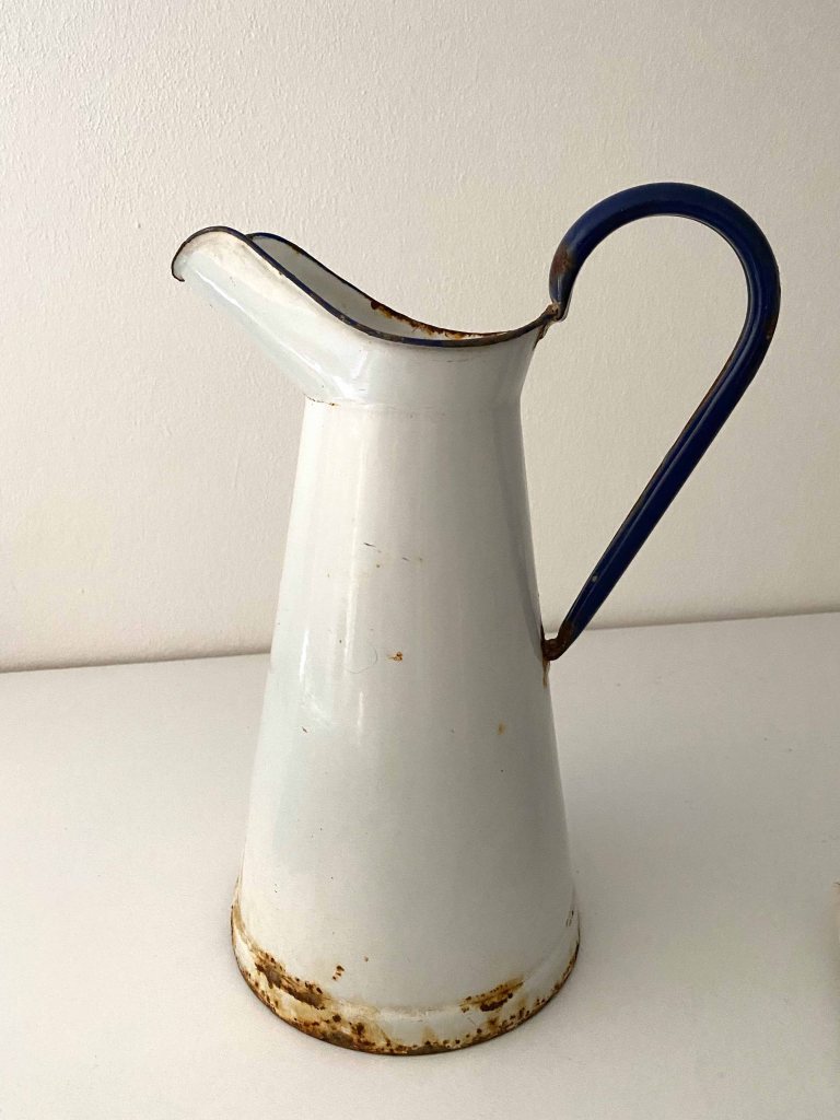
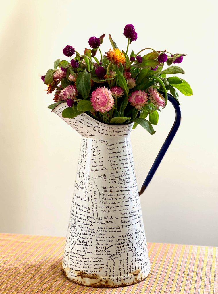
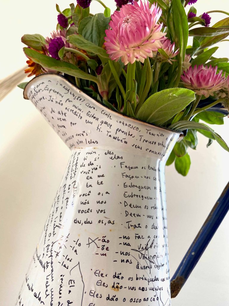
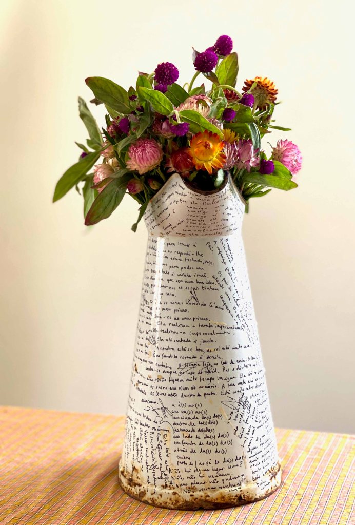
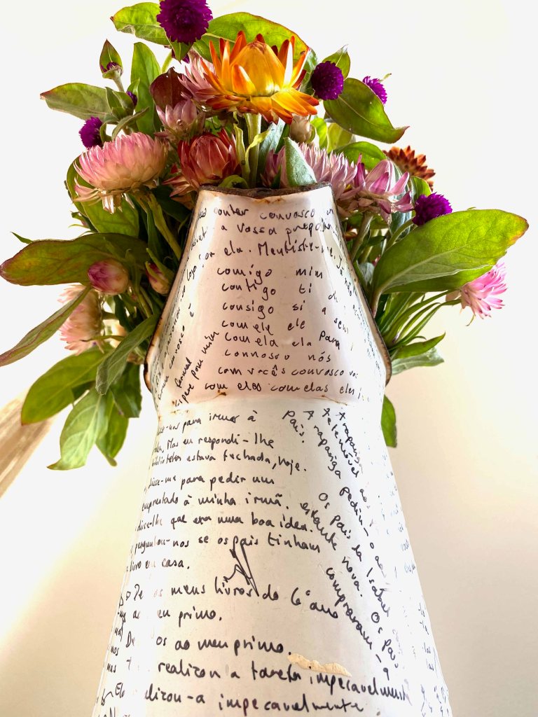
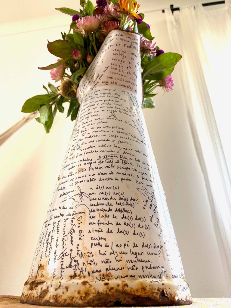
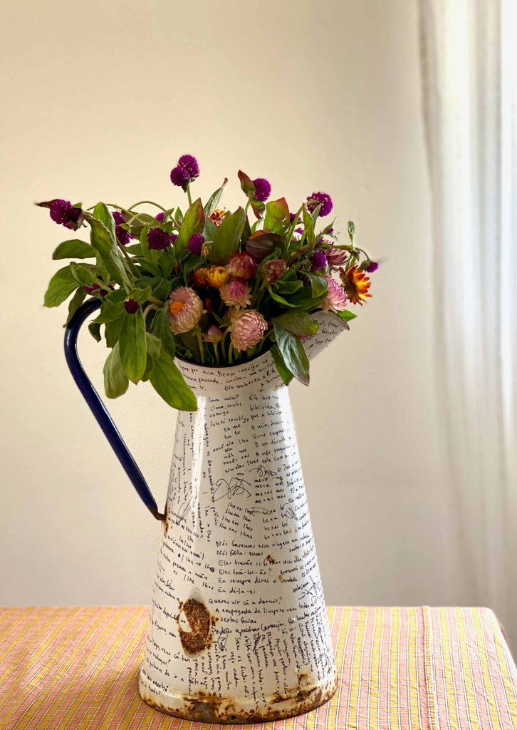
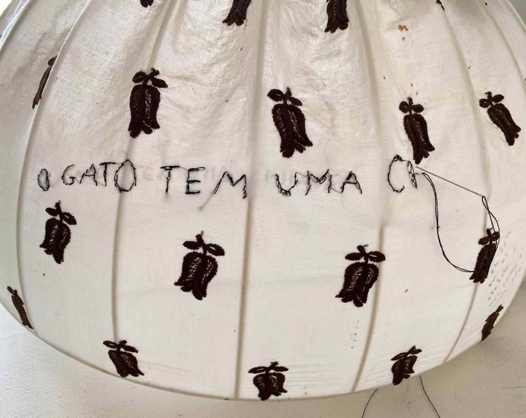
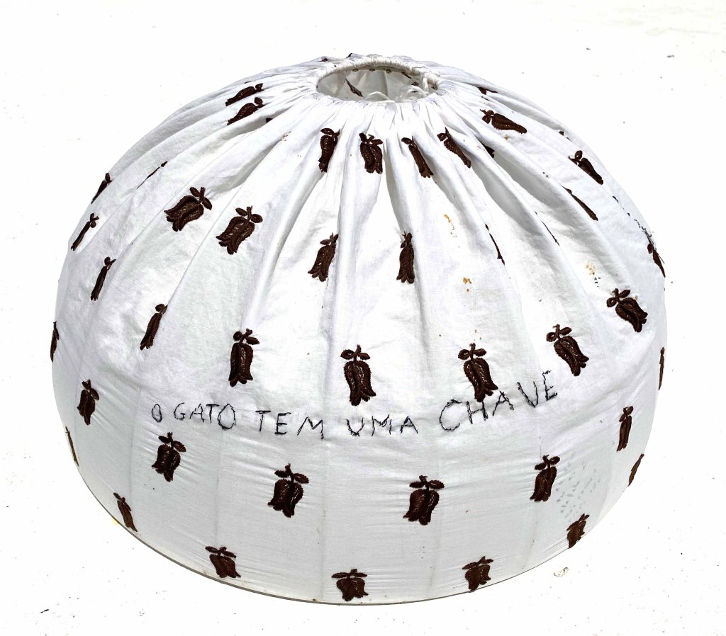
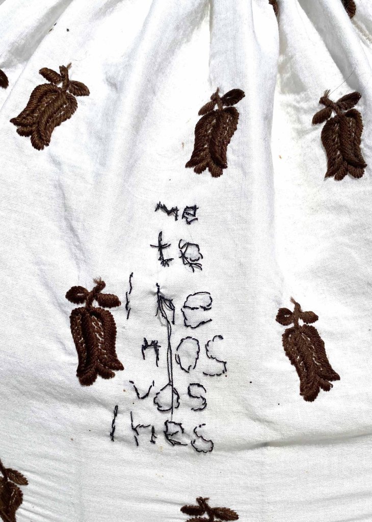
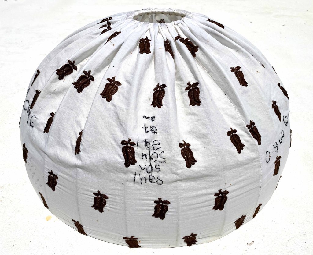
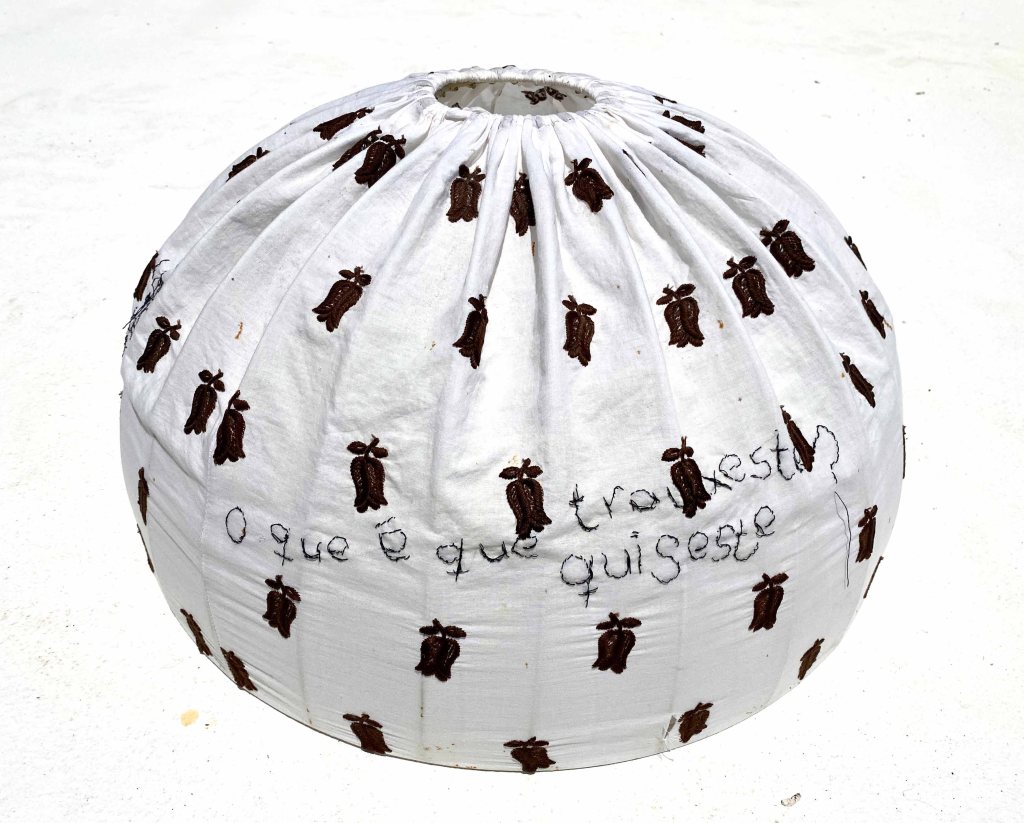
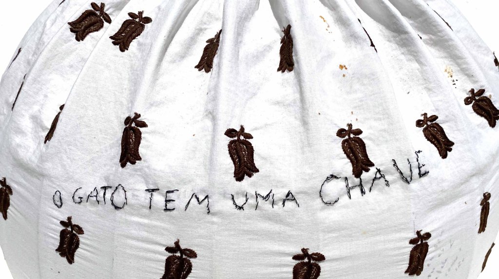


")

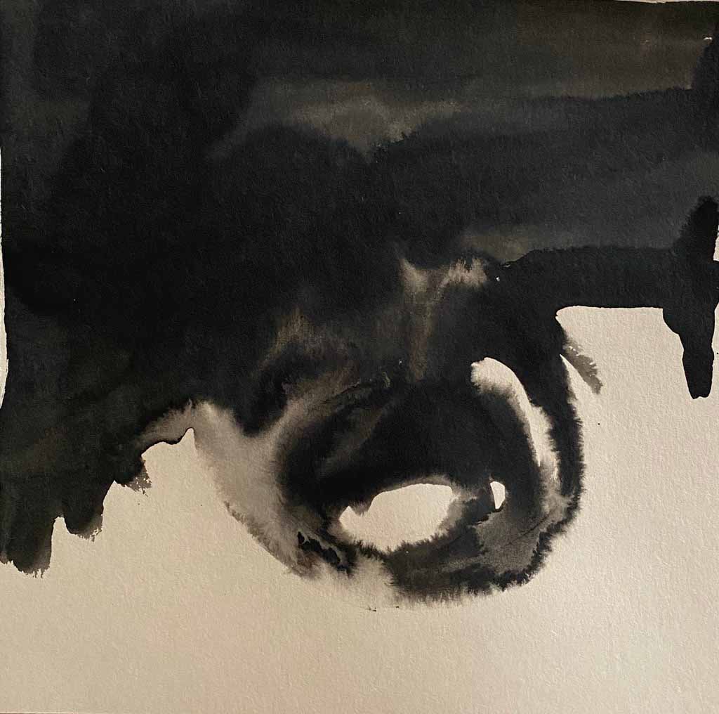
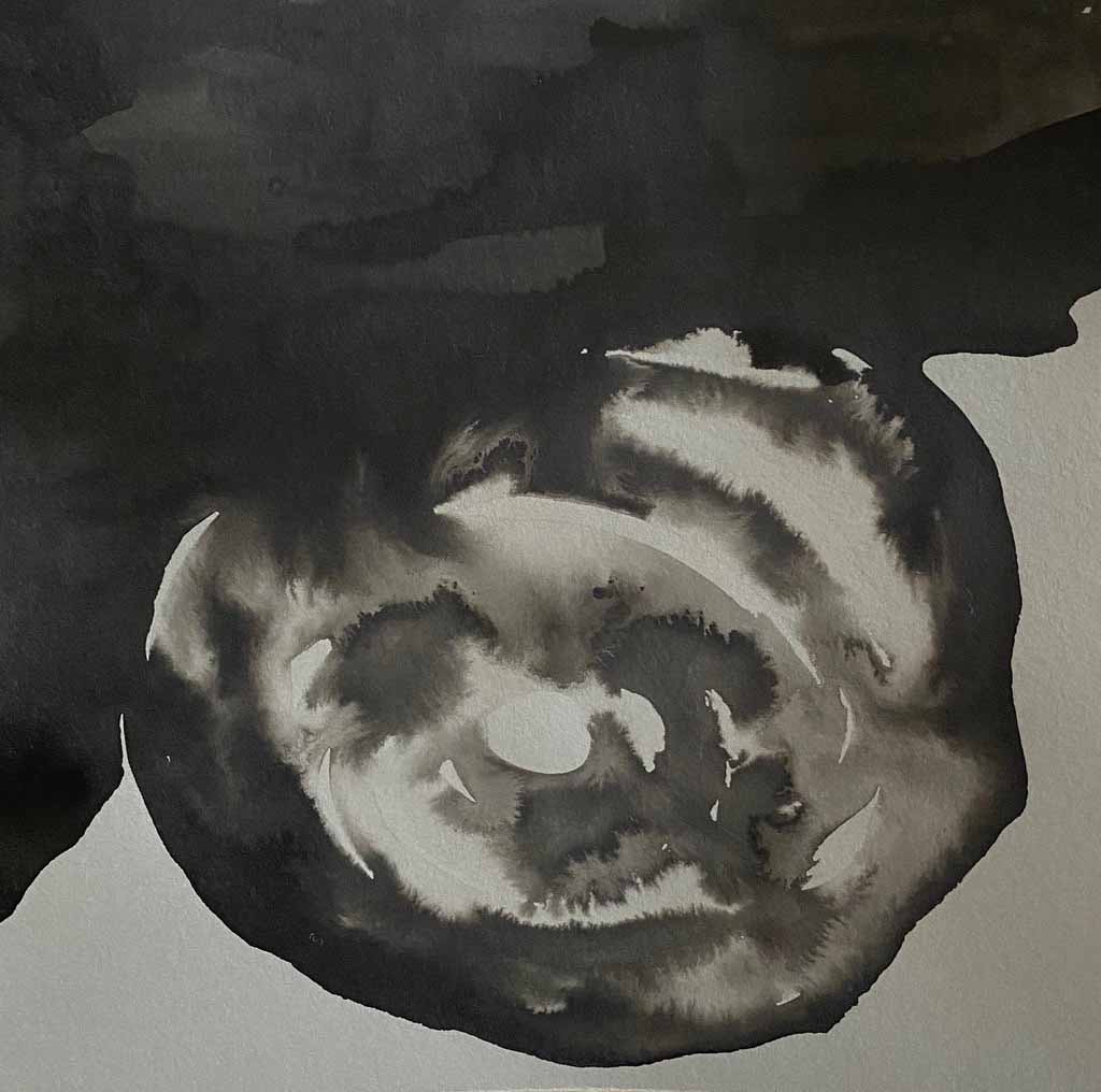
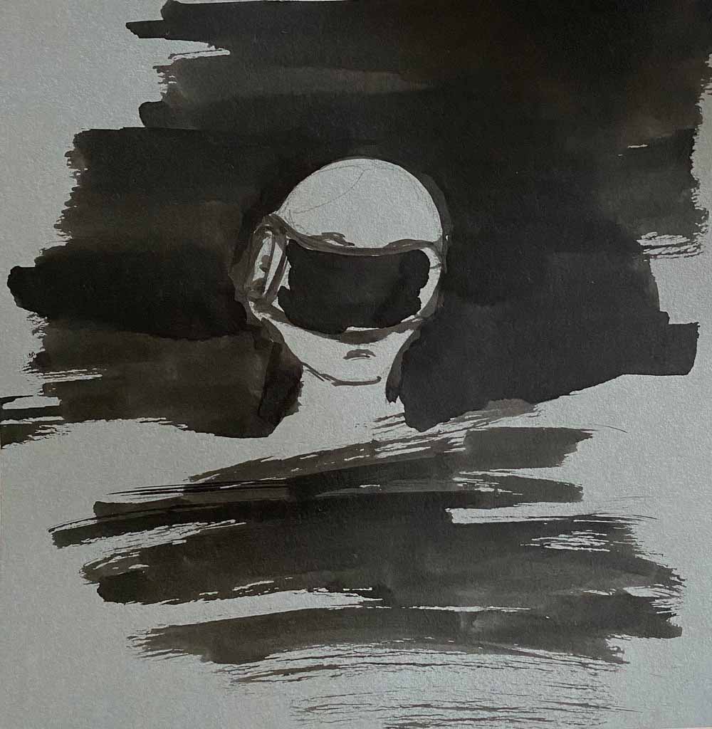
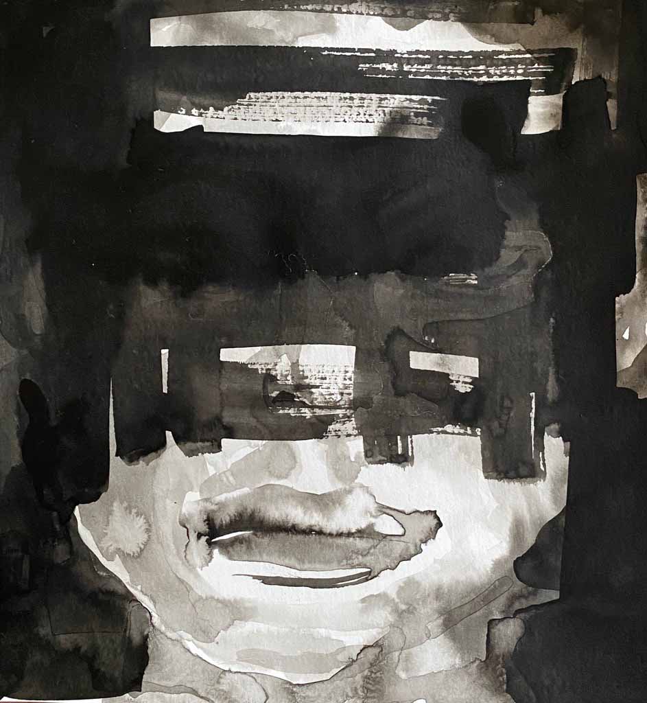
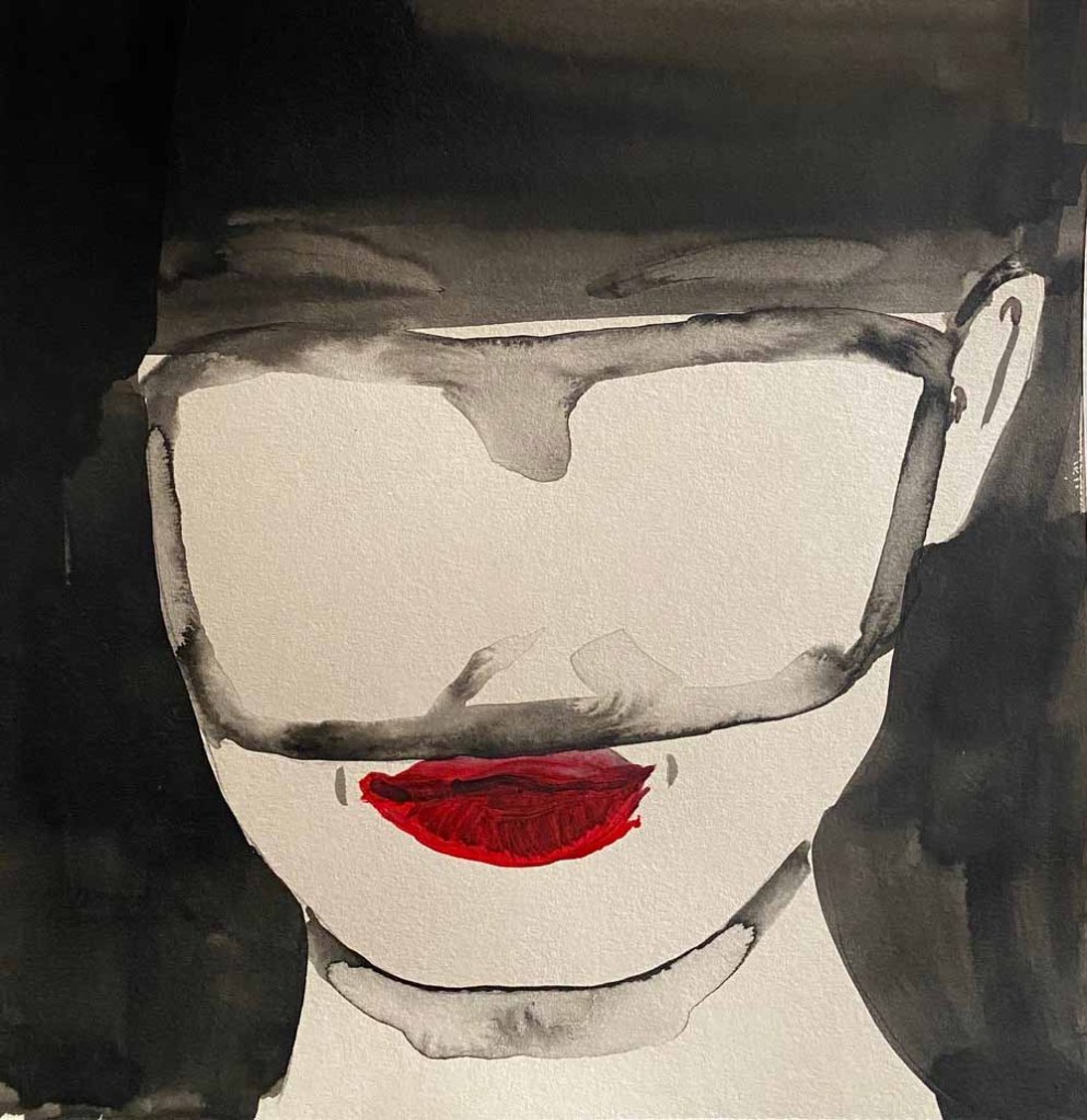

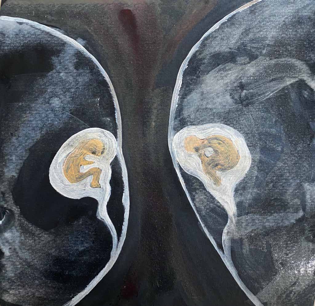
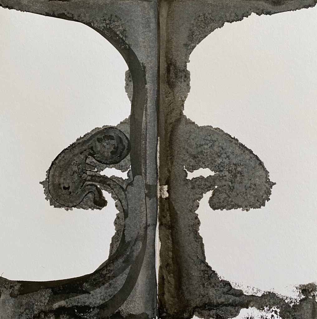
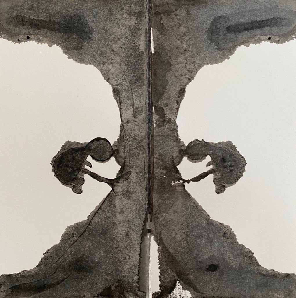
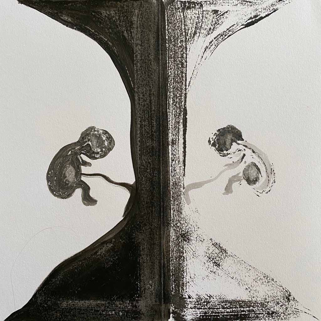

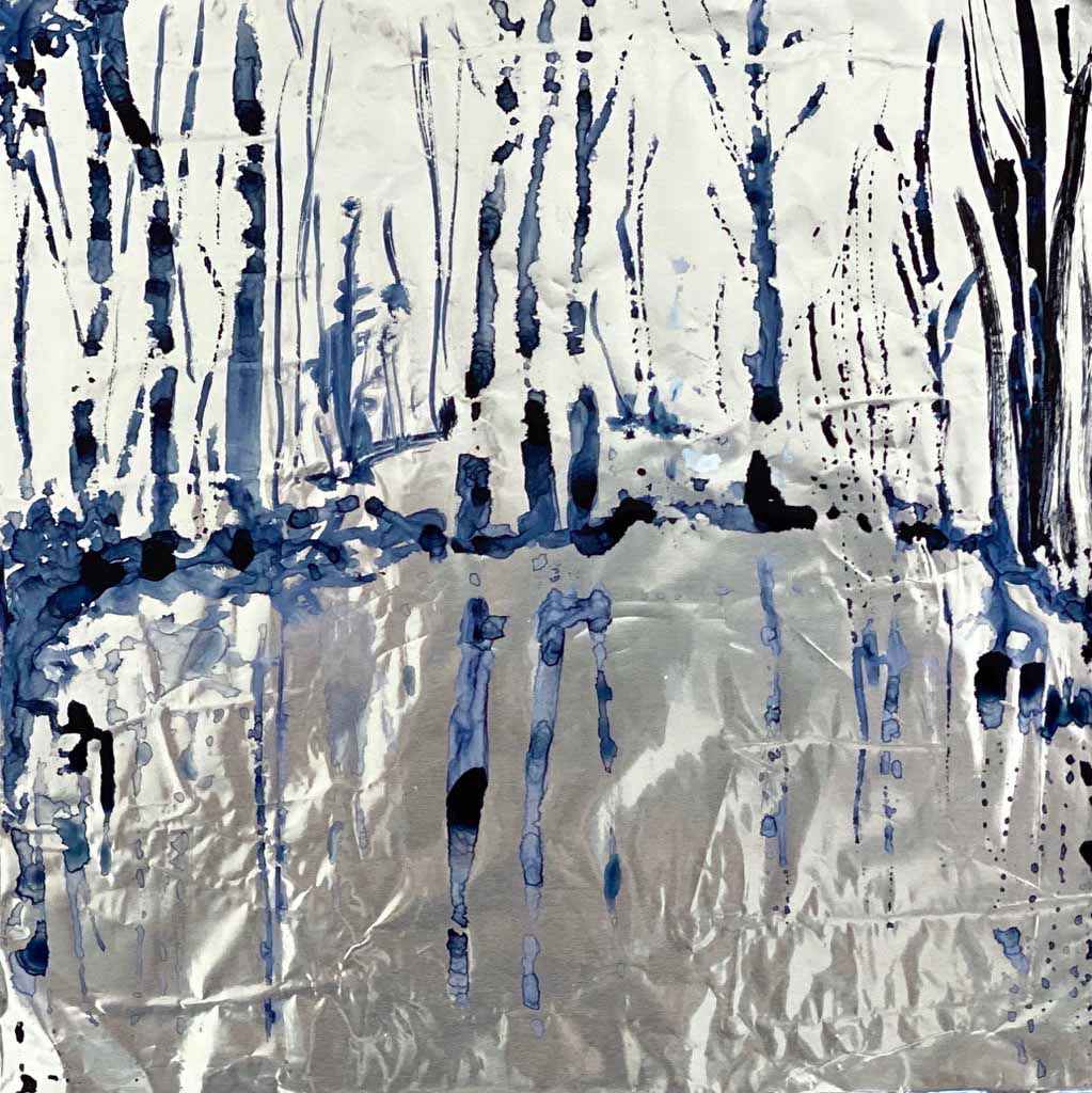
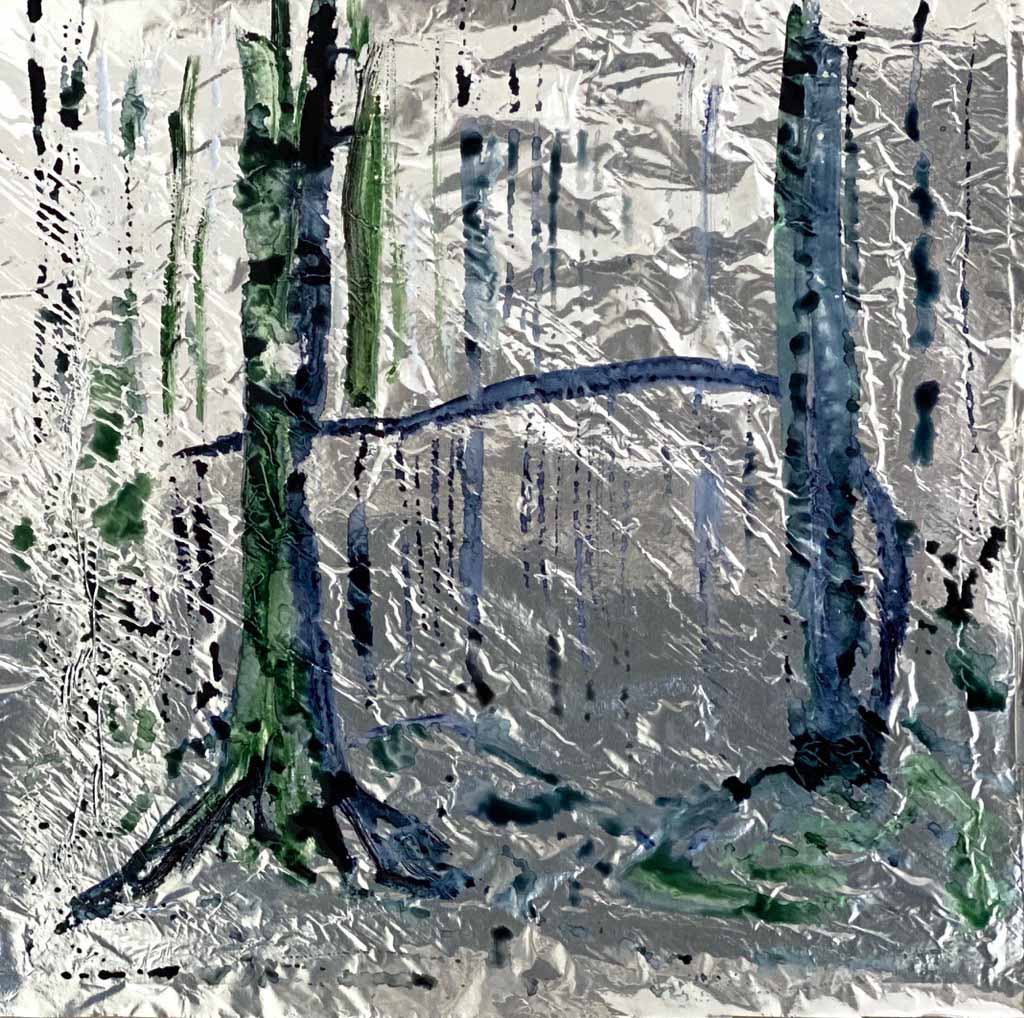

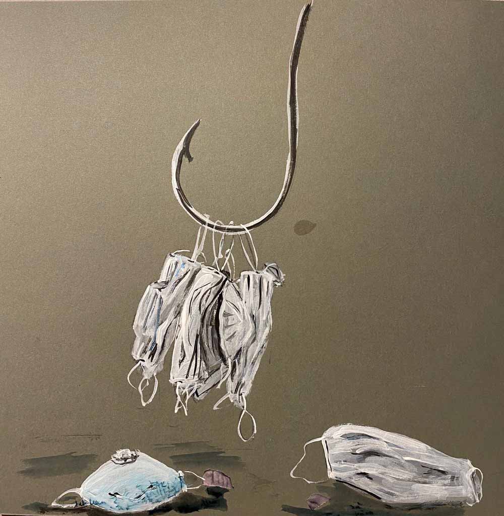
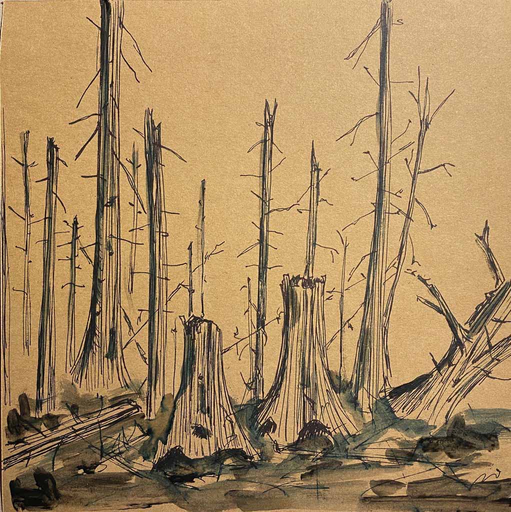
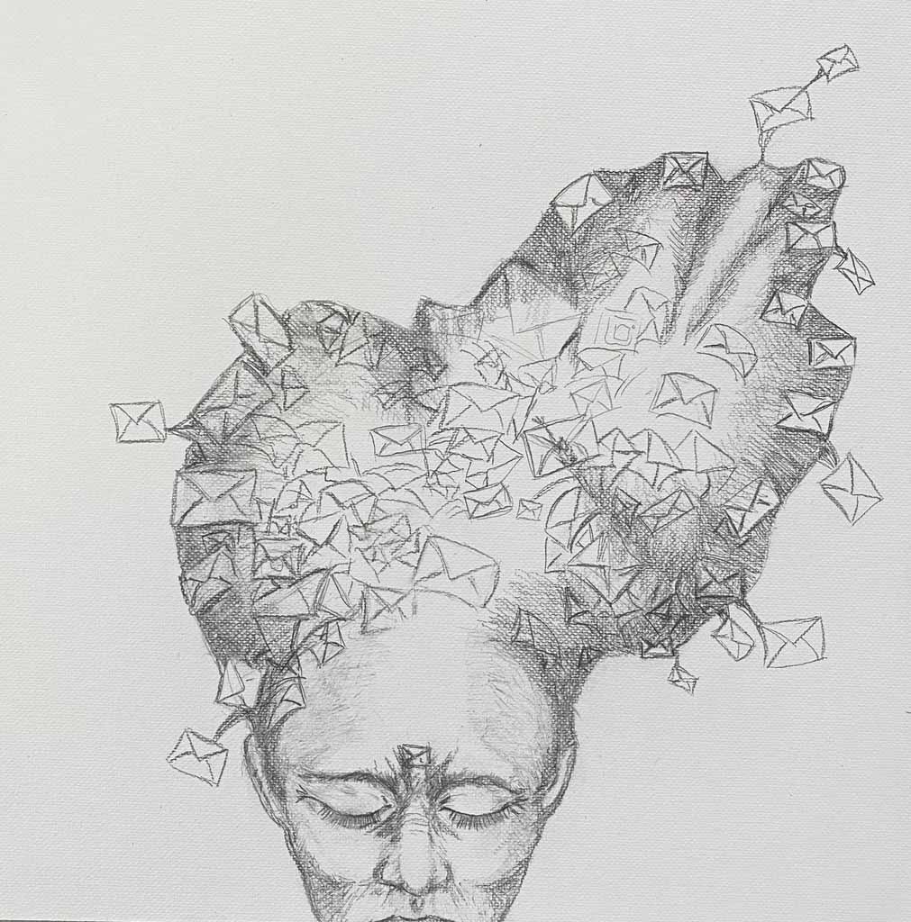
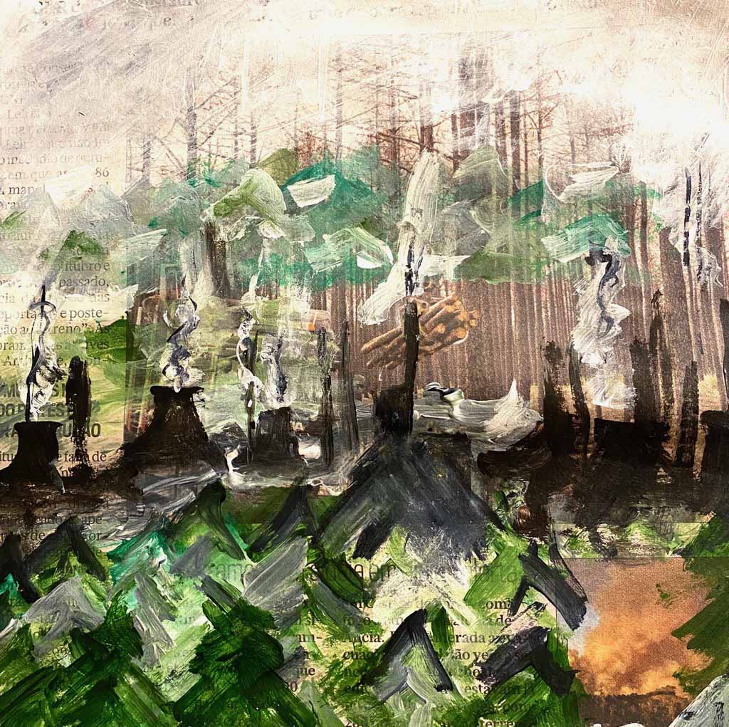


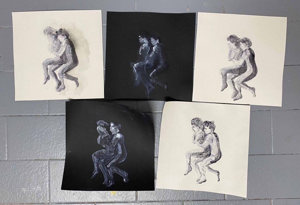
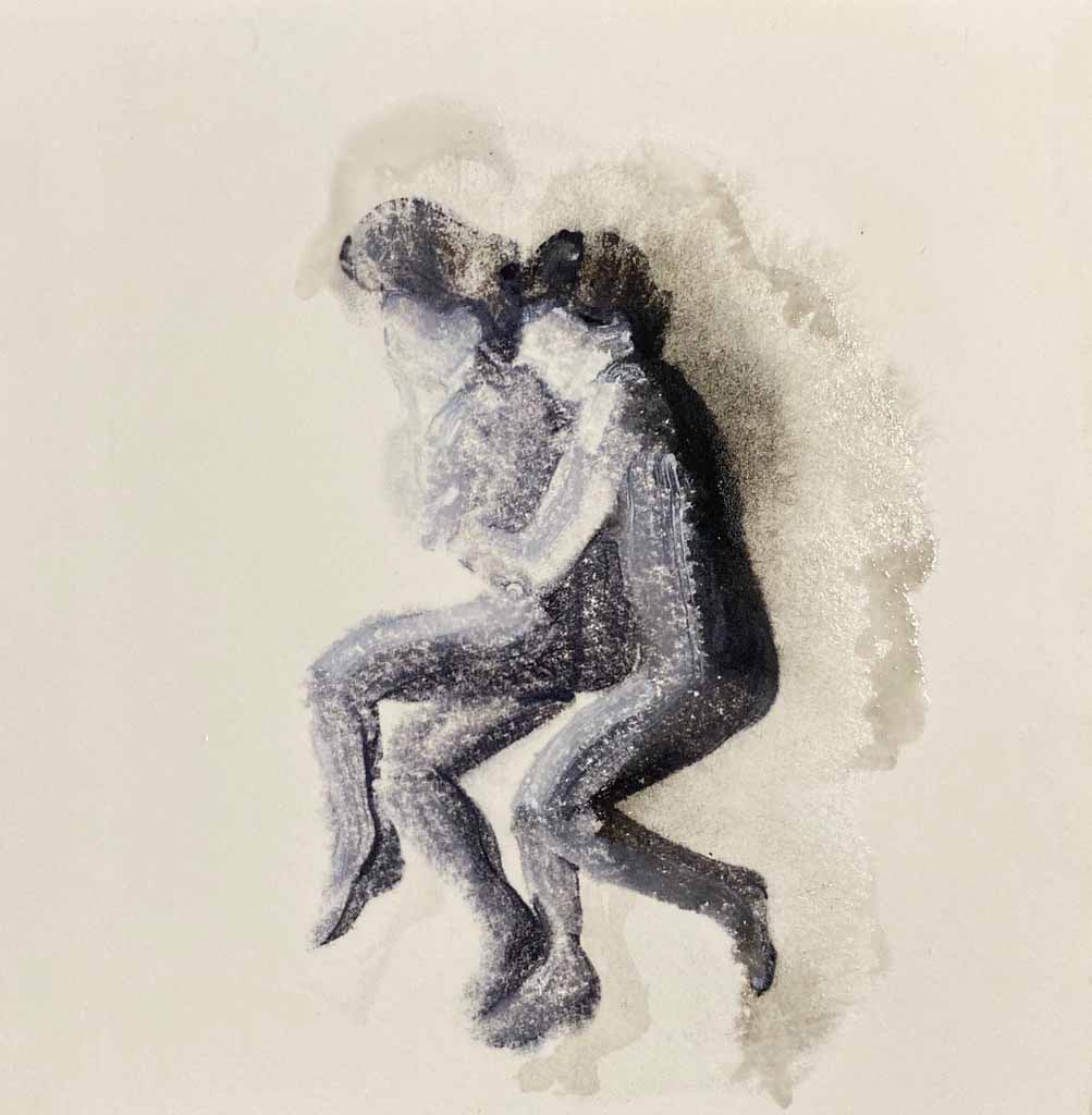

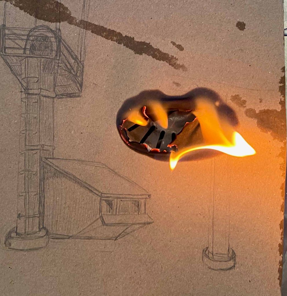
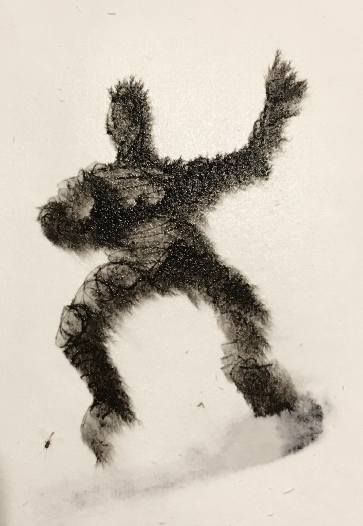
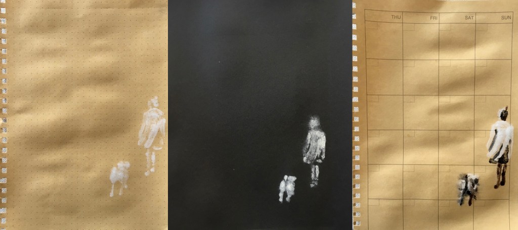
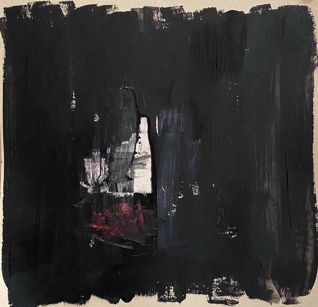
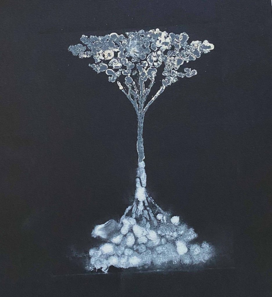
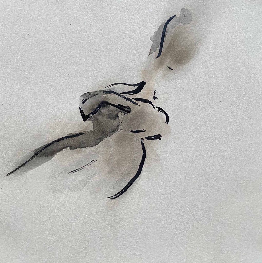
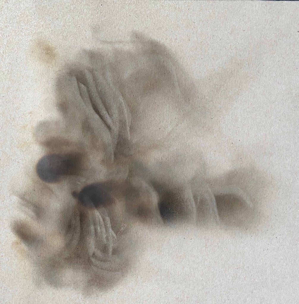


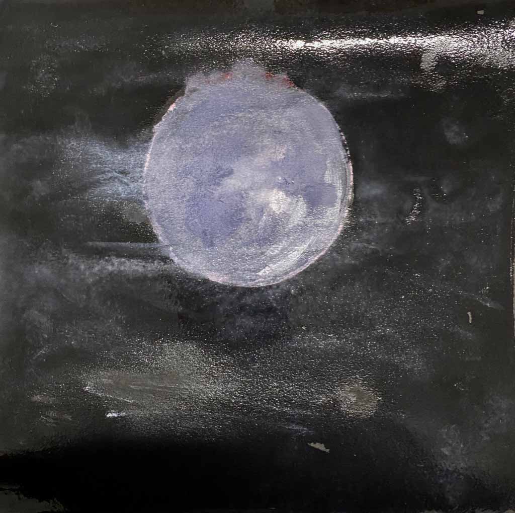
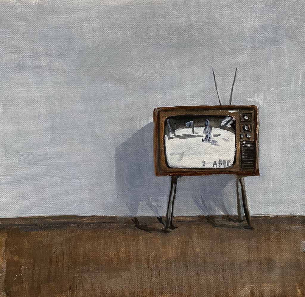
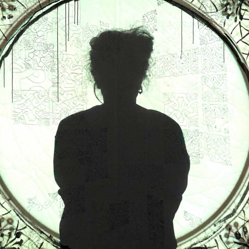
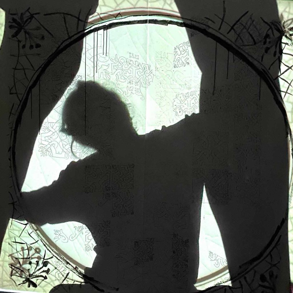
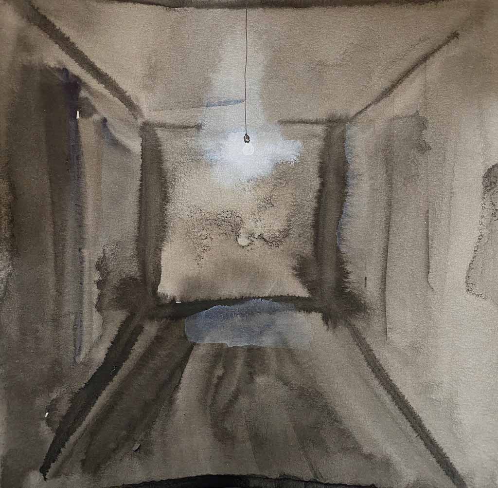
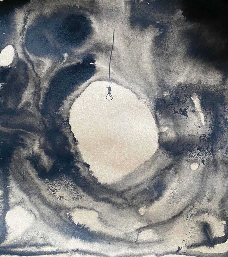

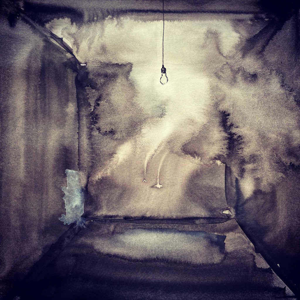

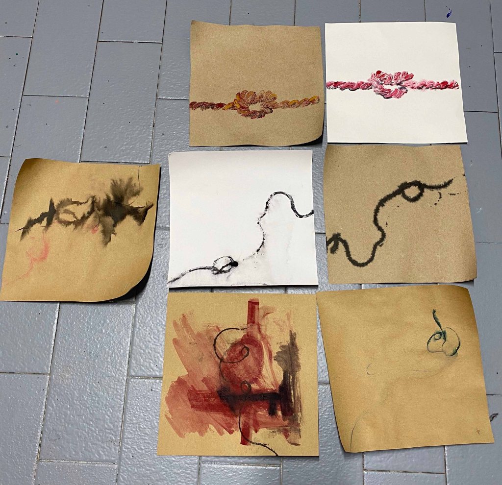
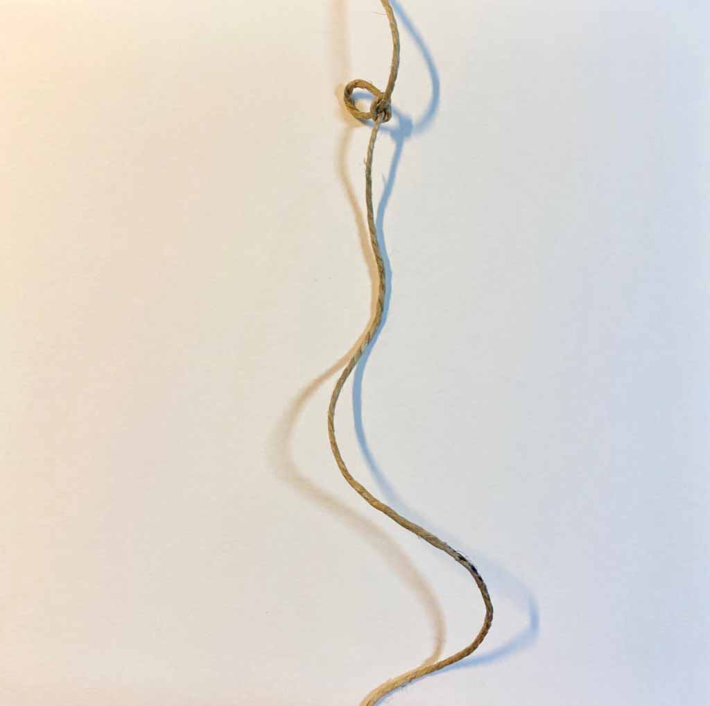
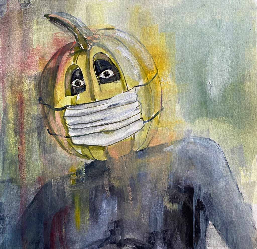
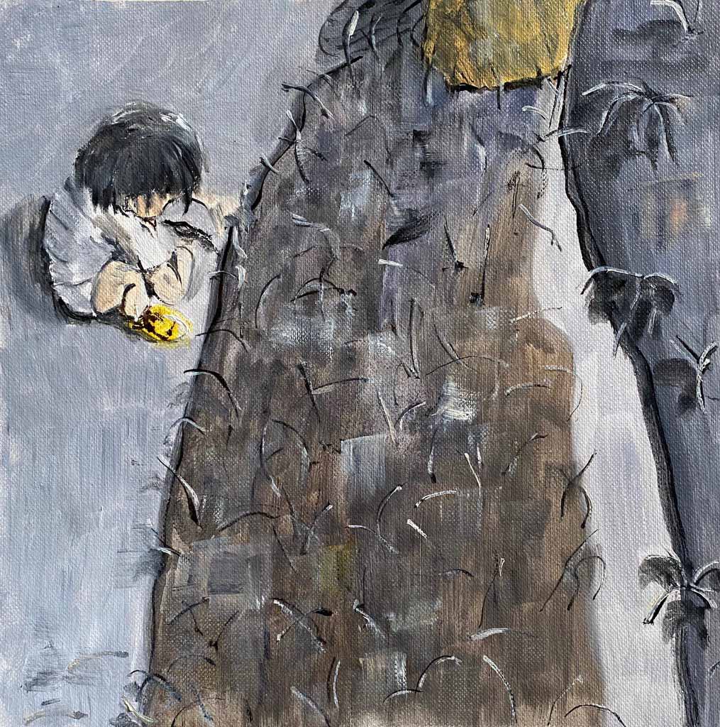
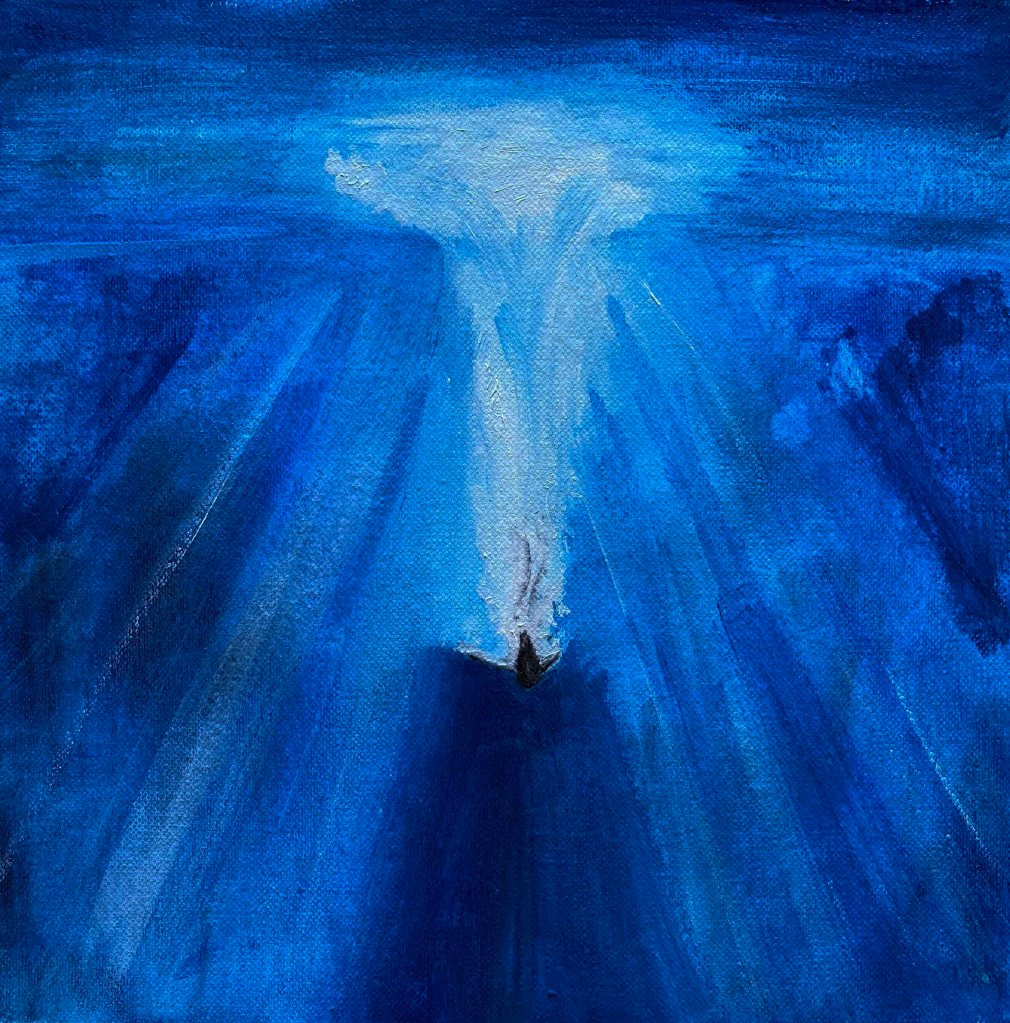
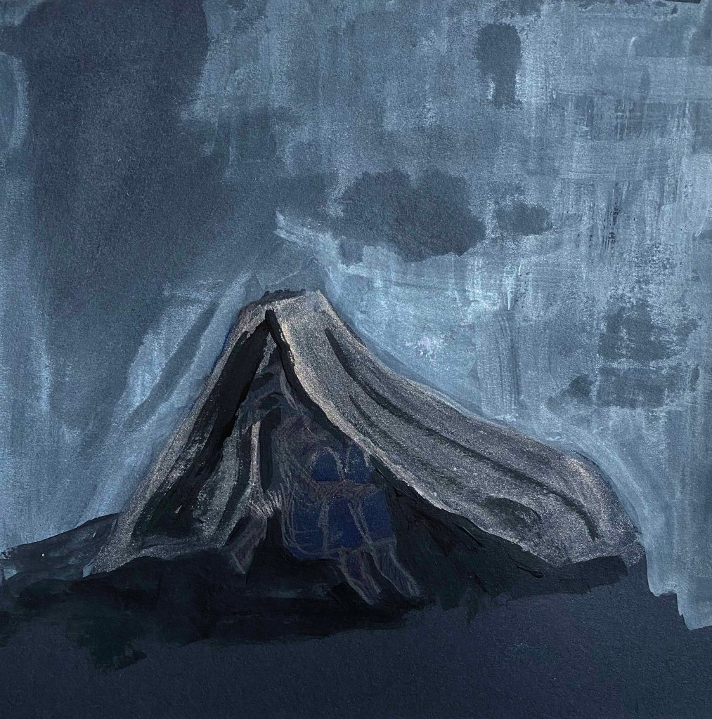
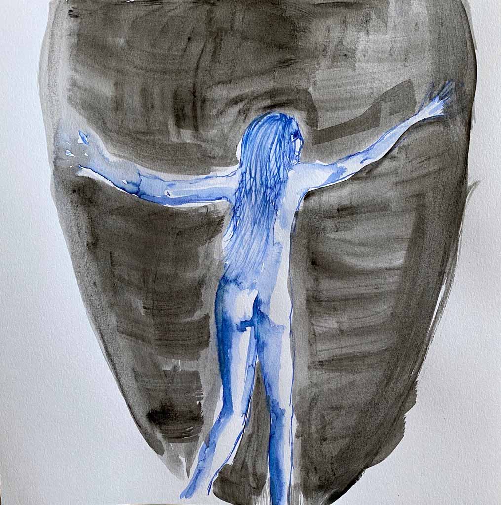
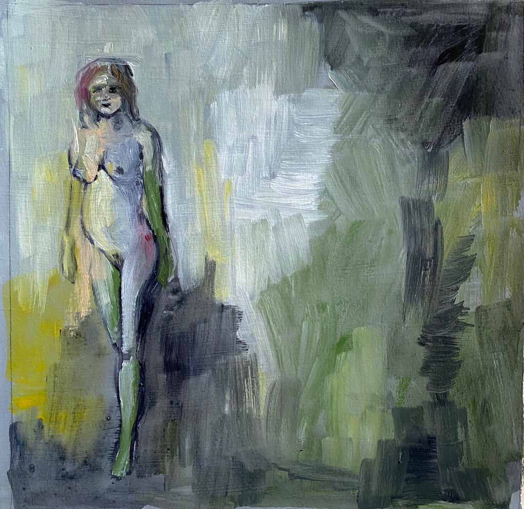
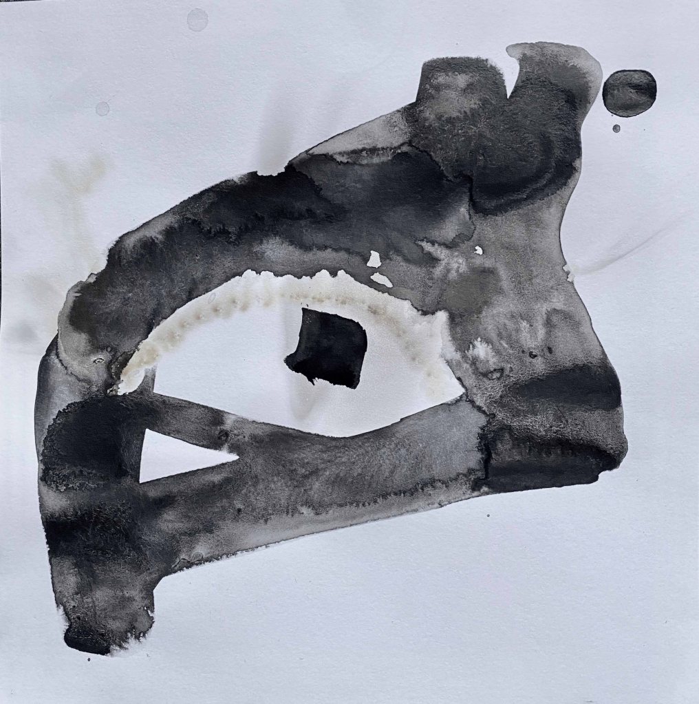

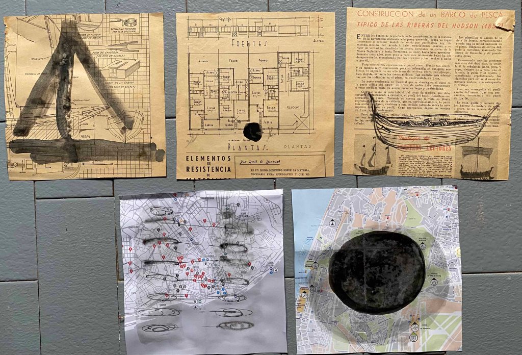
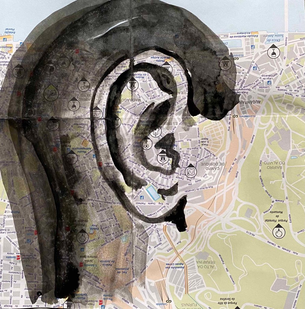

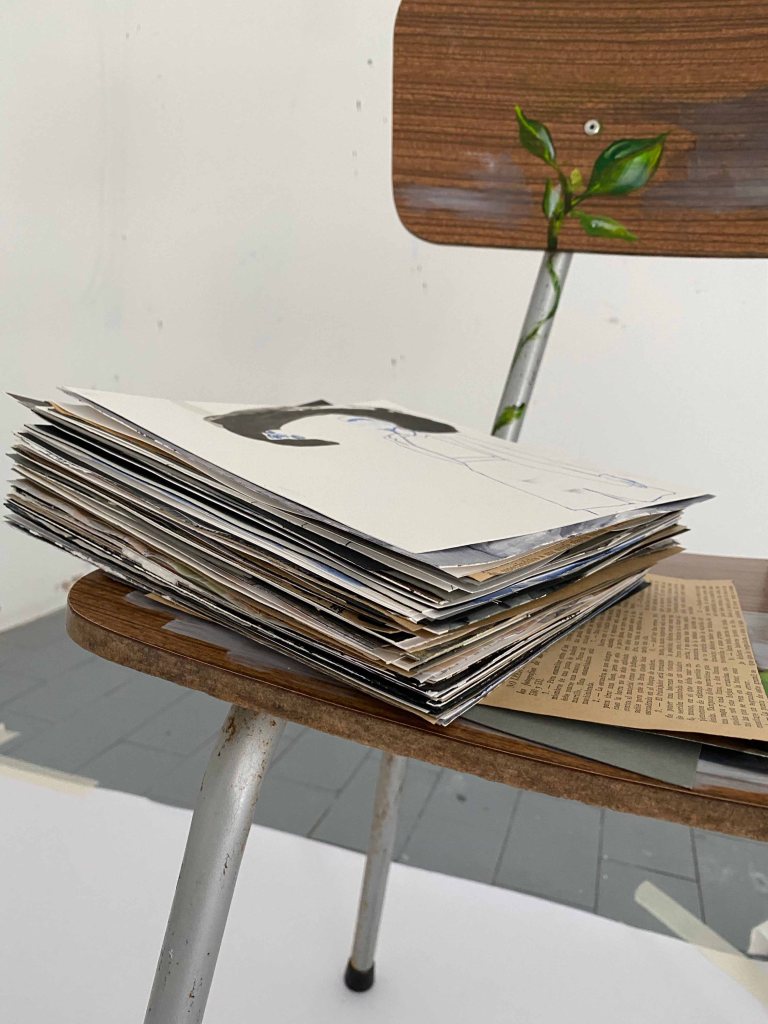
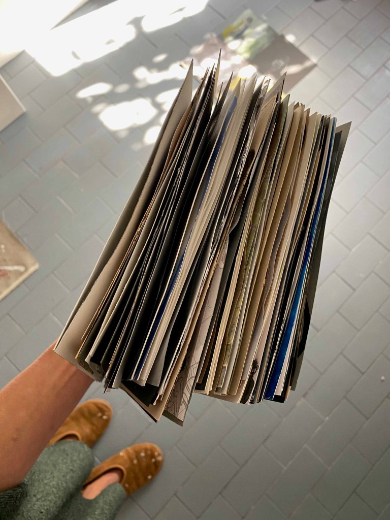
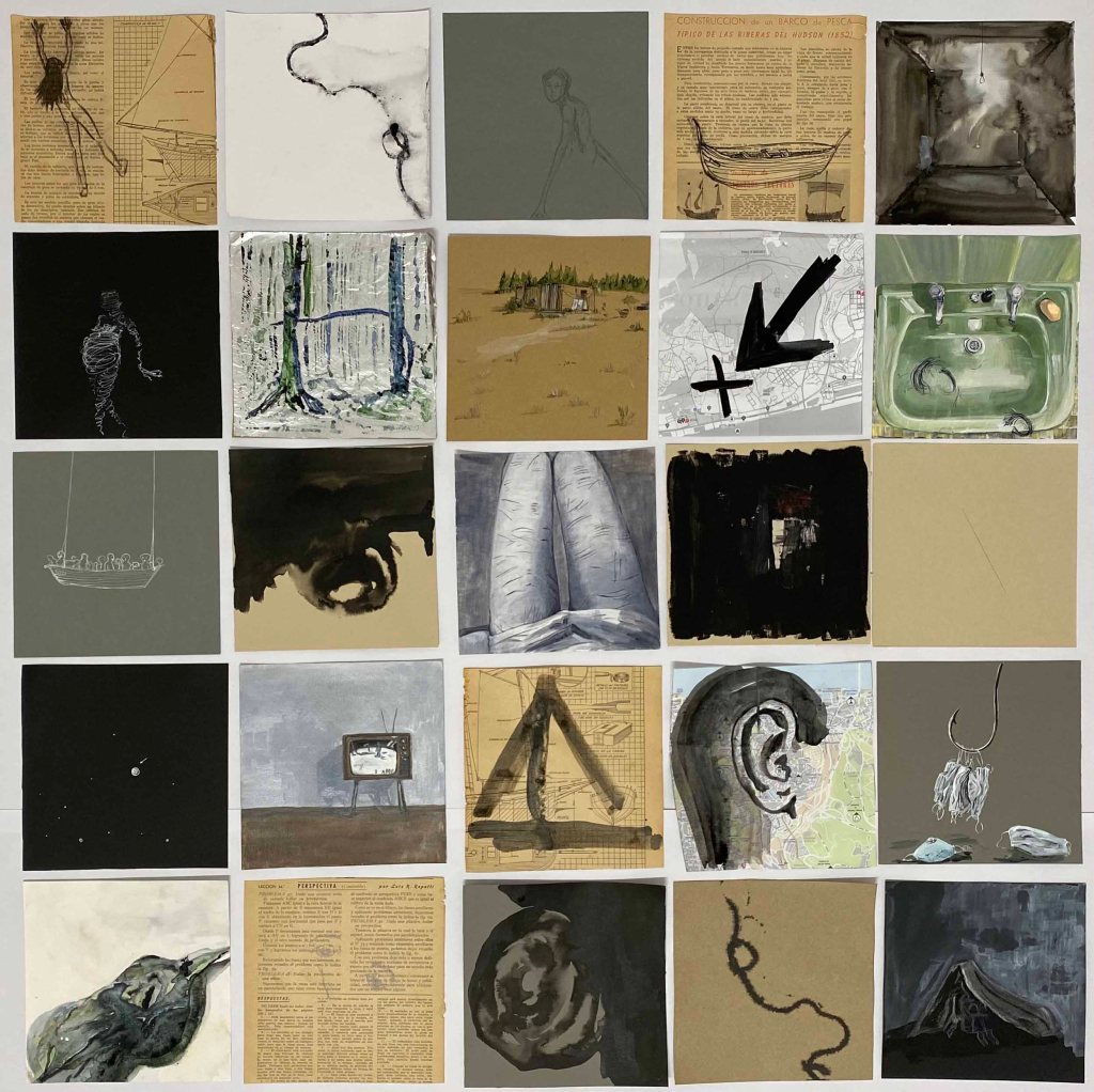
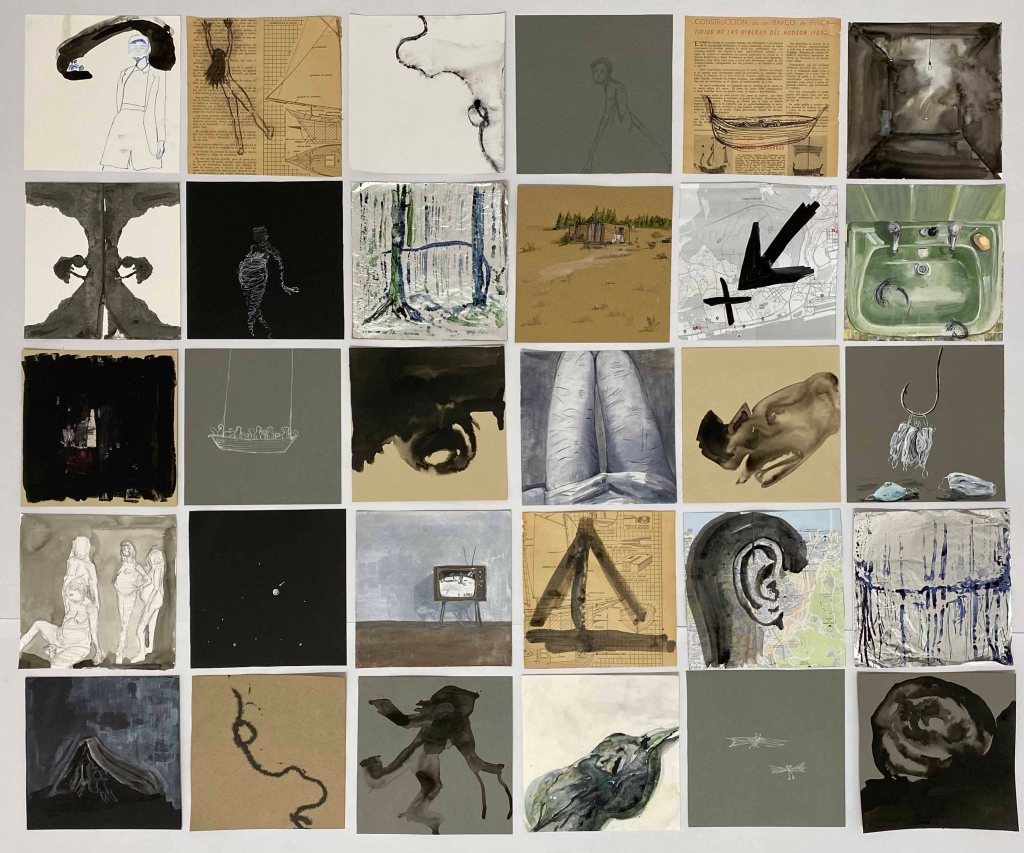
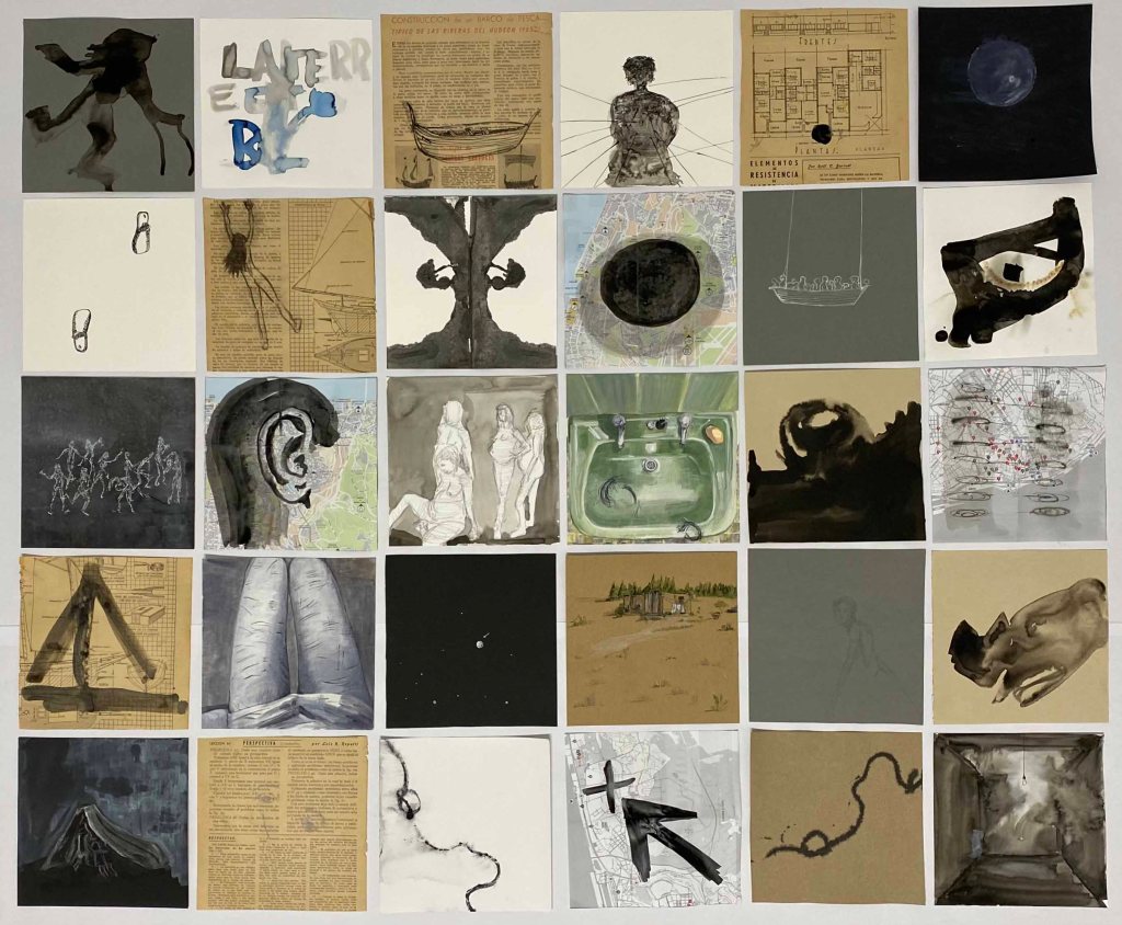
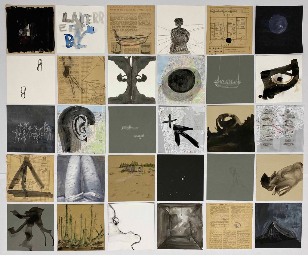


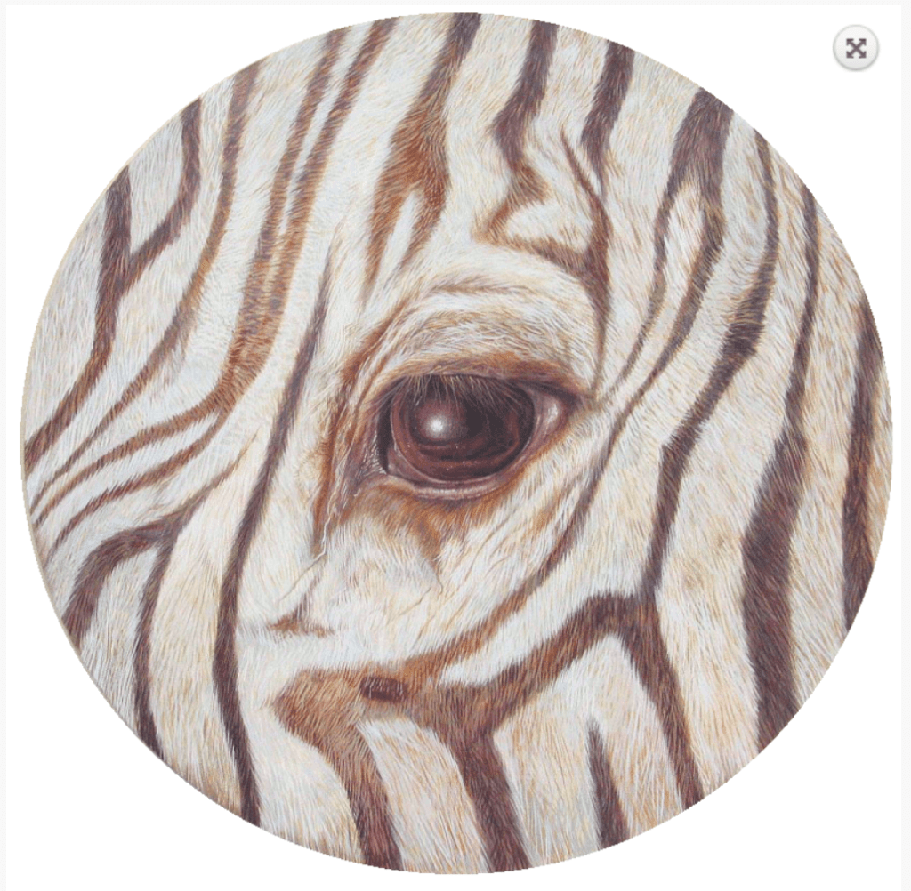
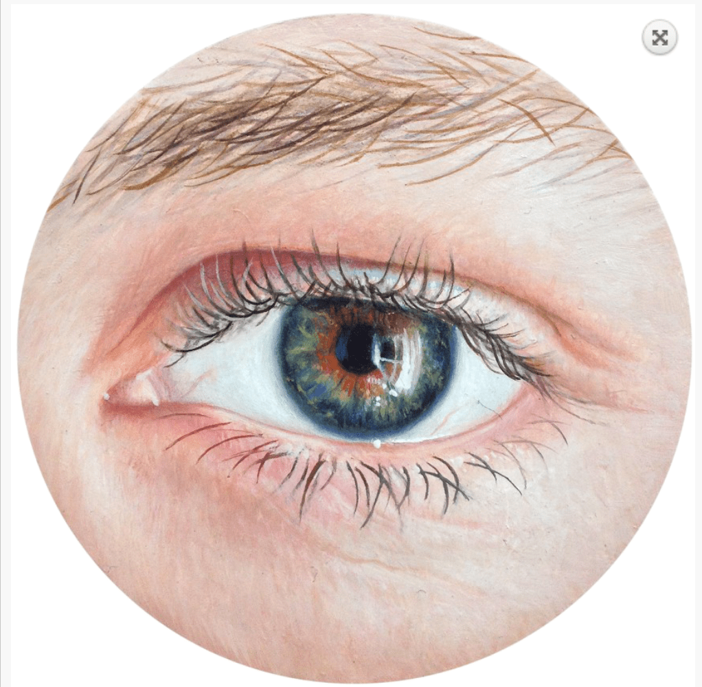
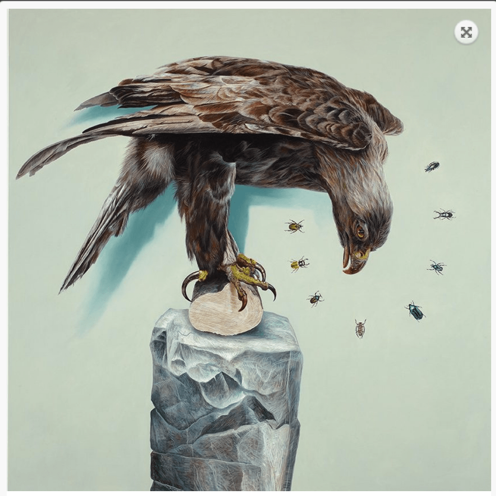

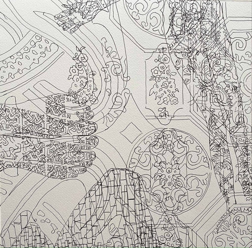
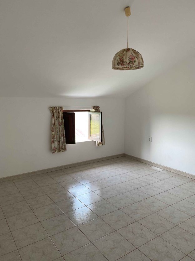
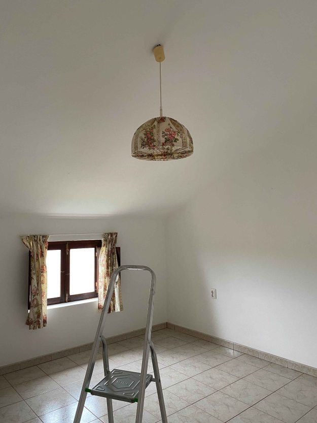

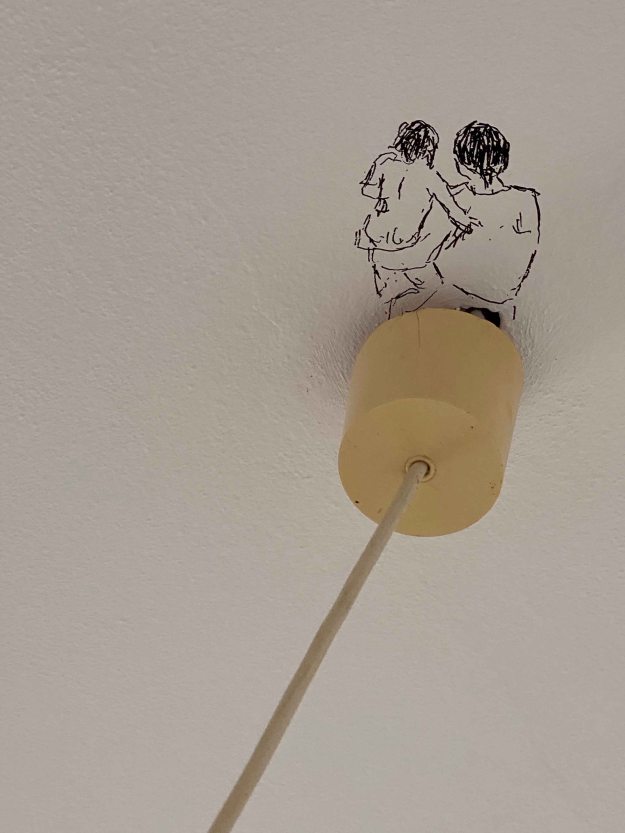
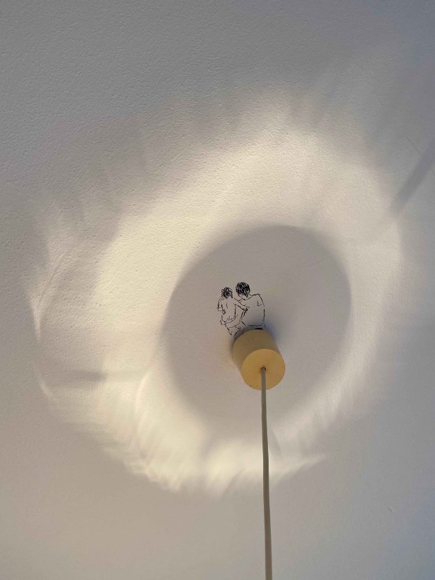
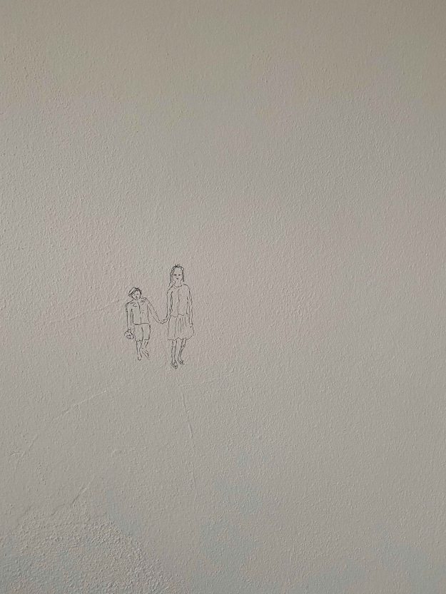
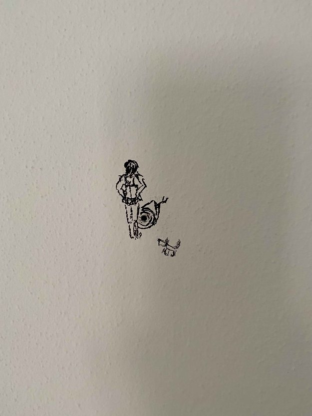
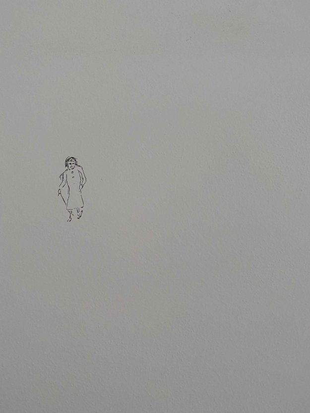
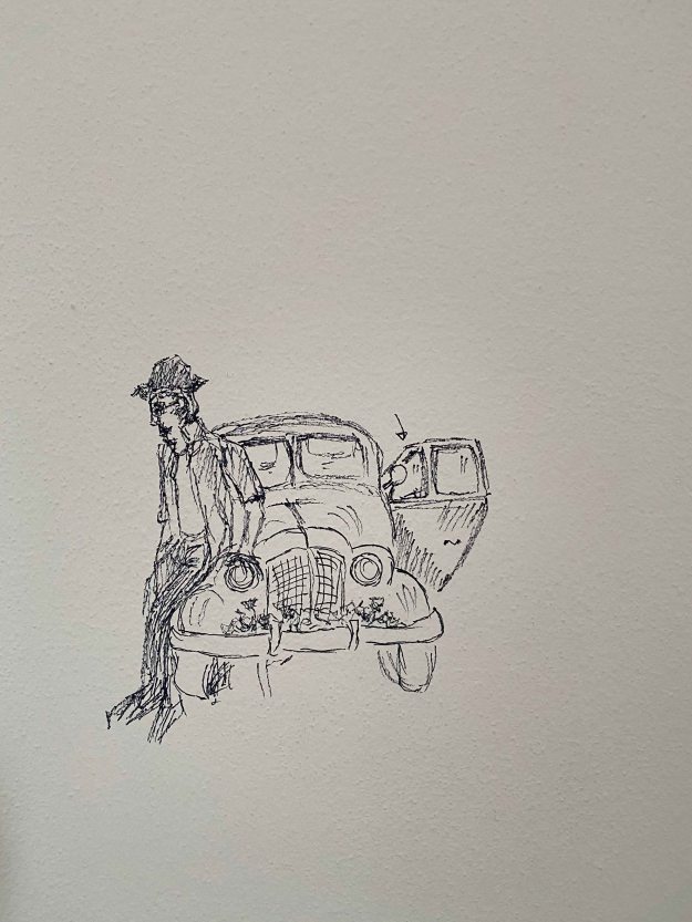
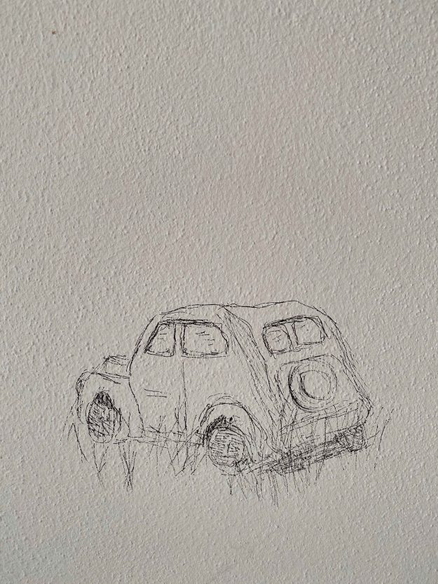
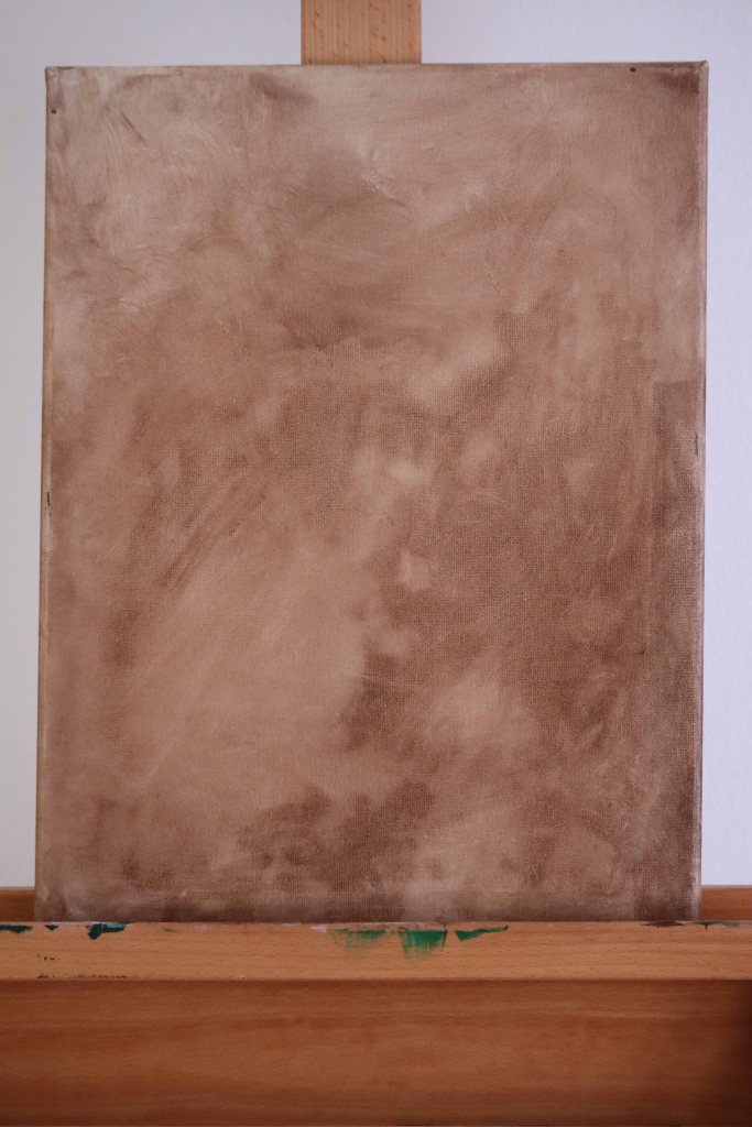
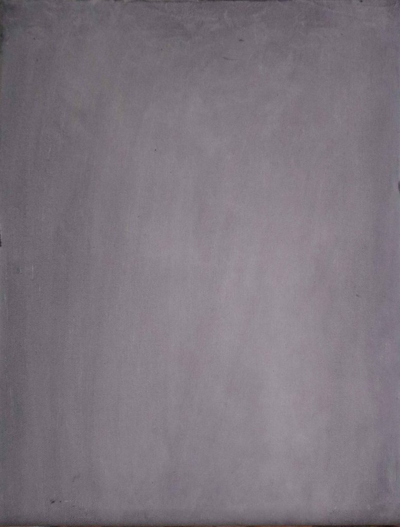
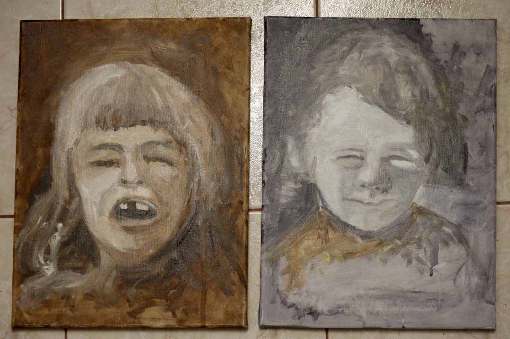
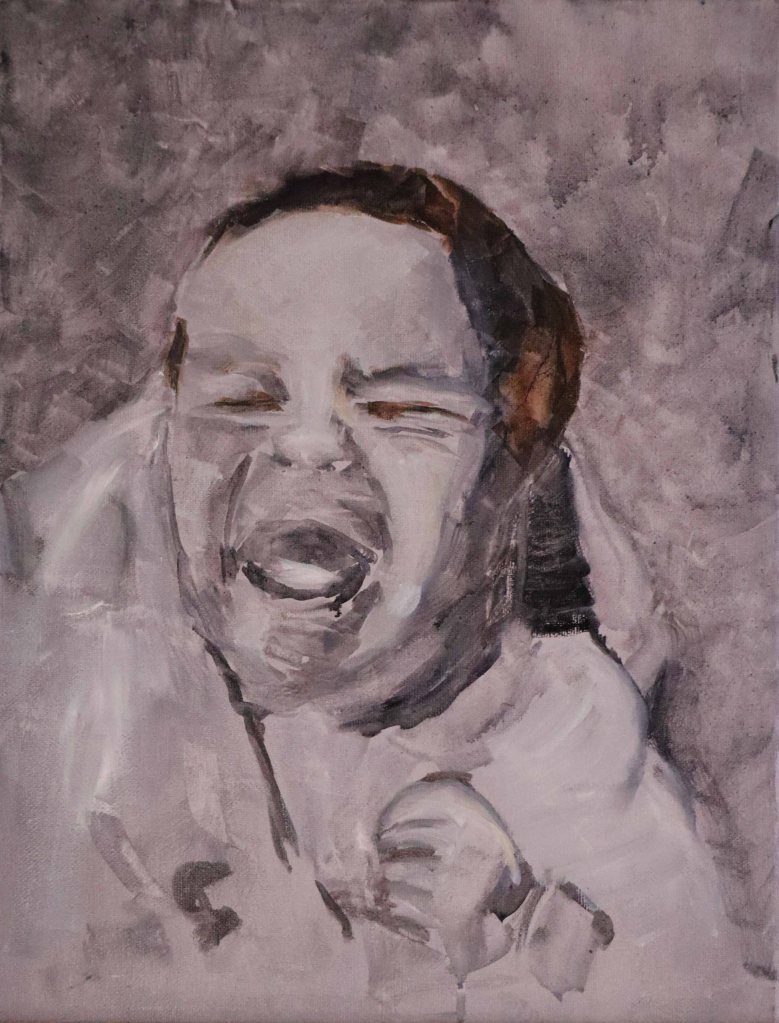

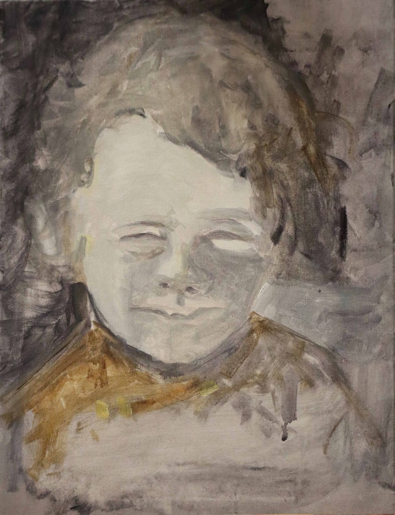
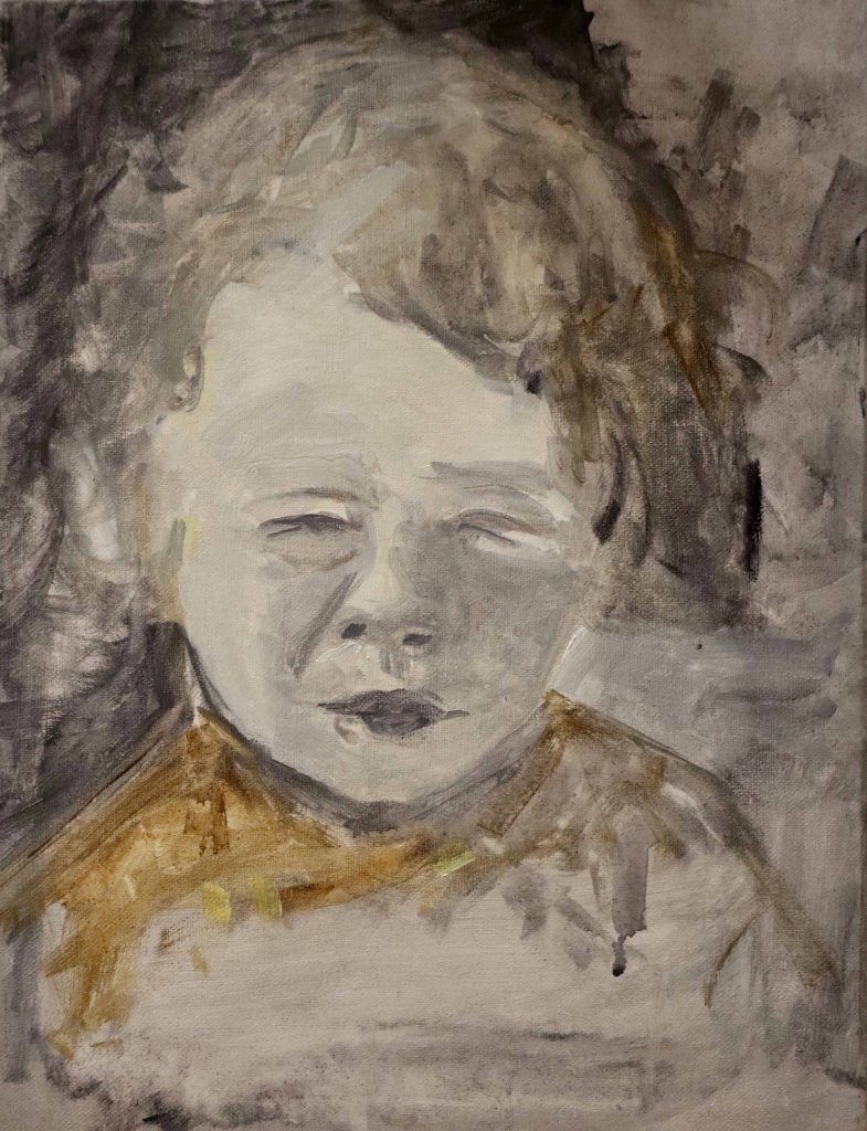
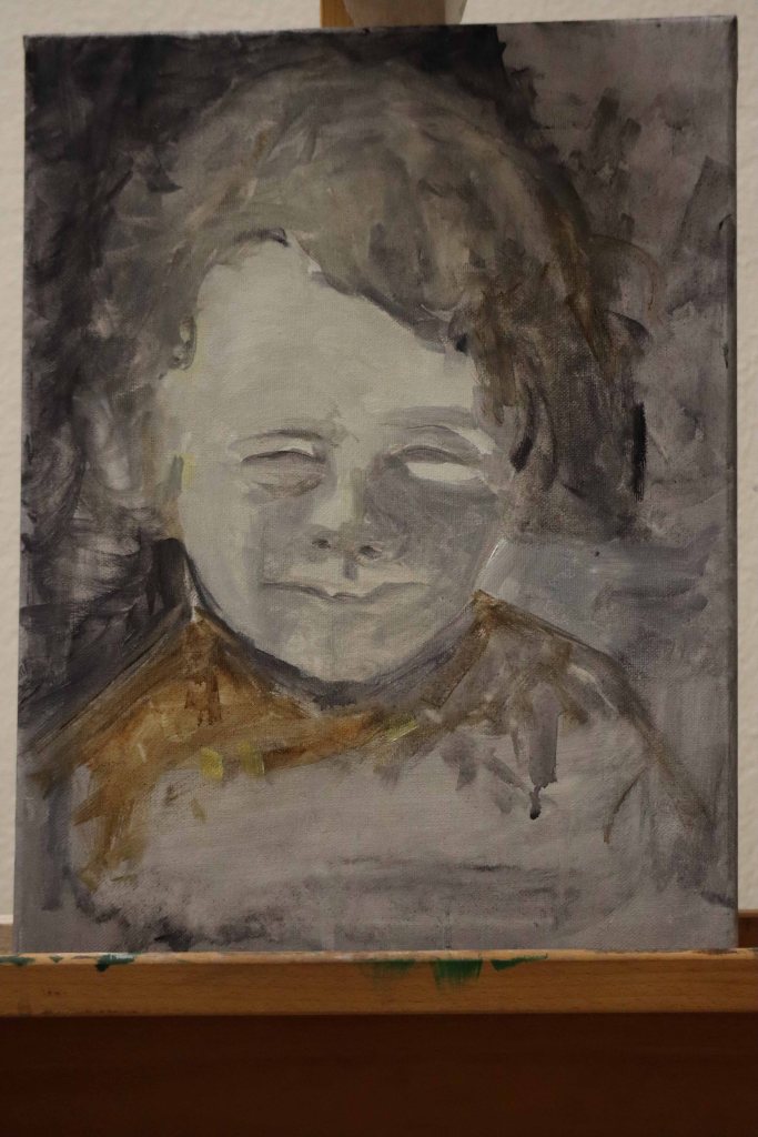
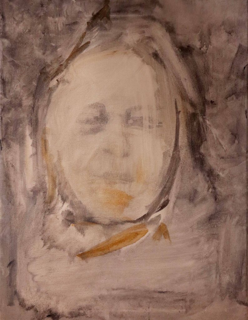
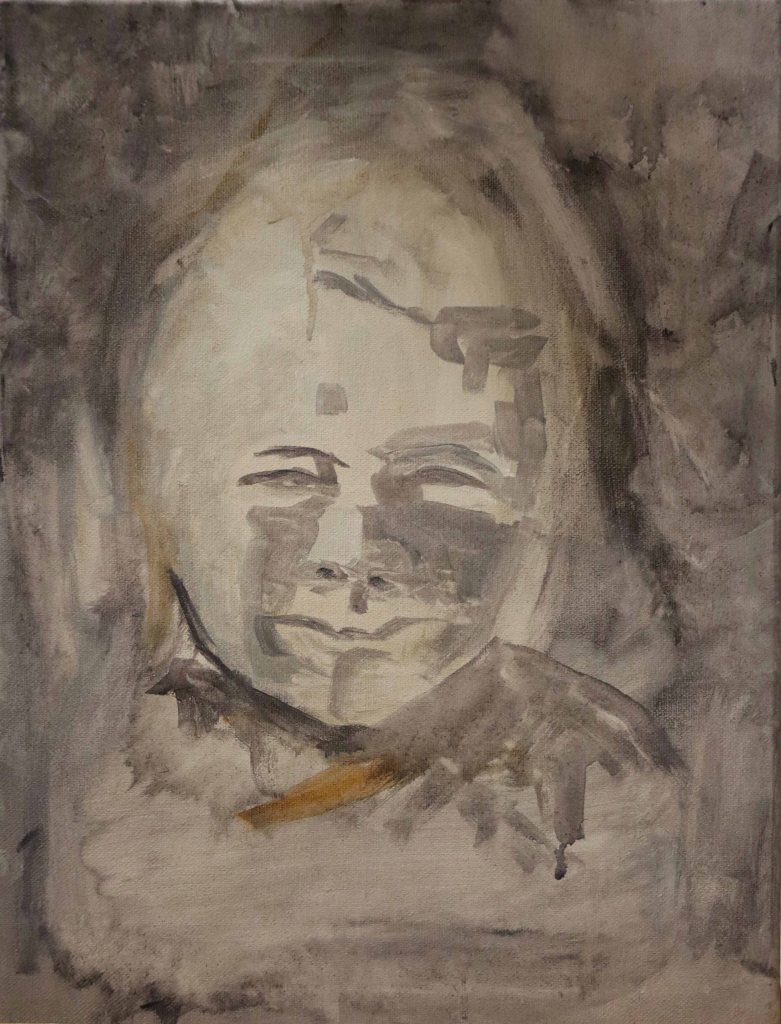
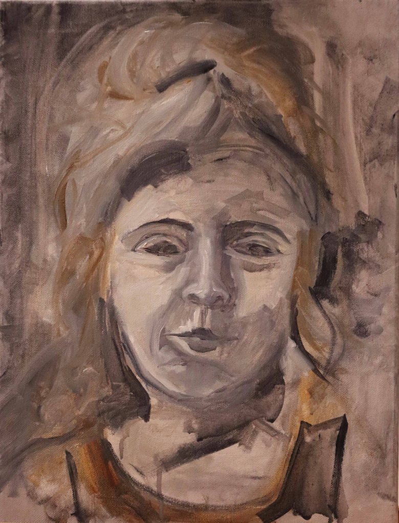
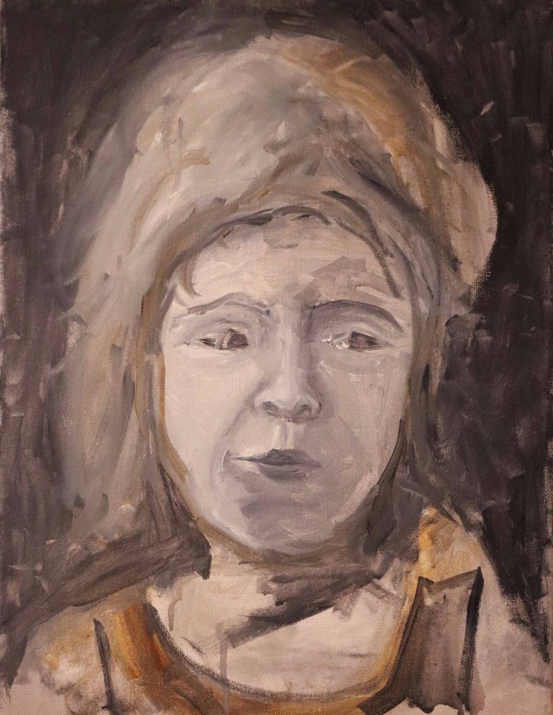
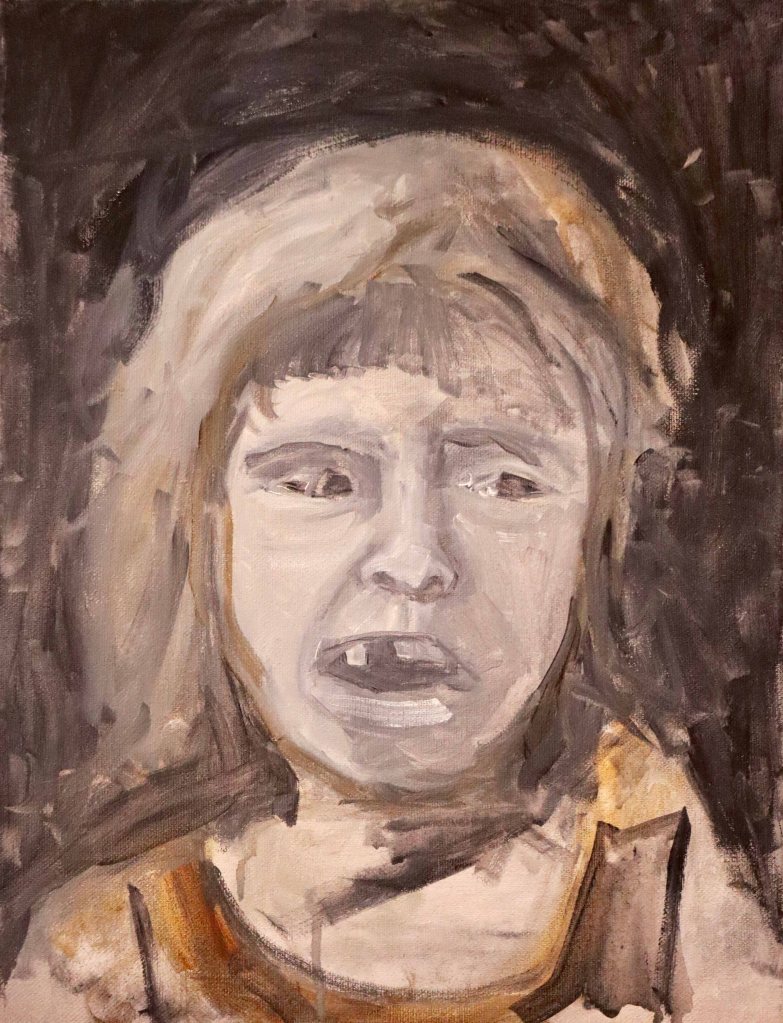
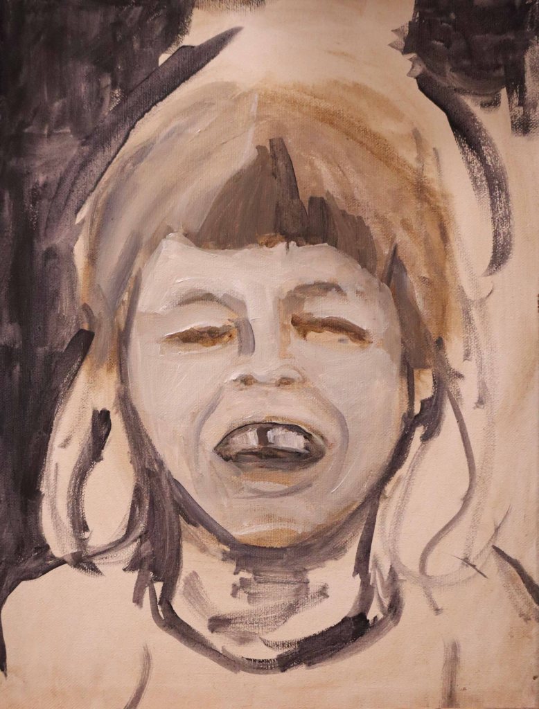
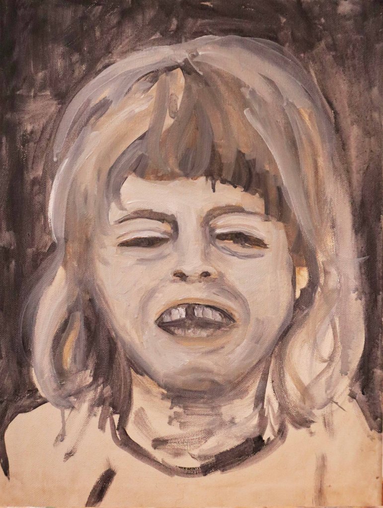

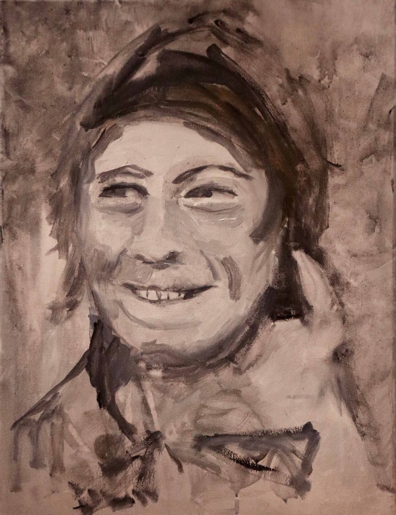
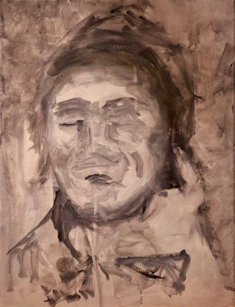
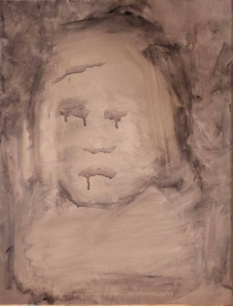
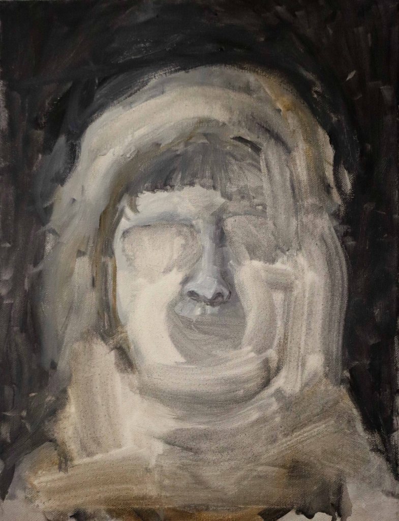
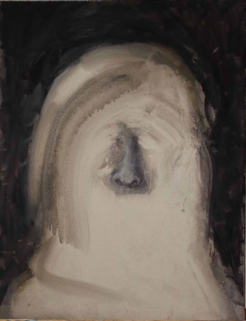
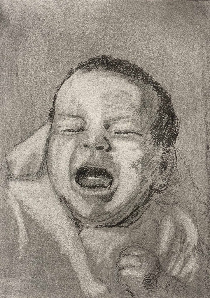

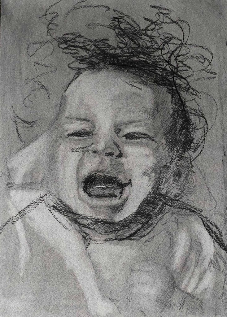
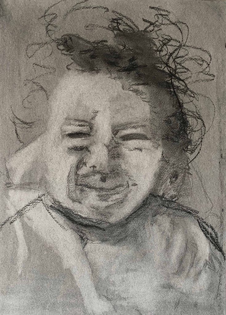
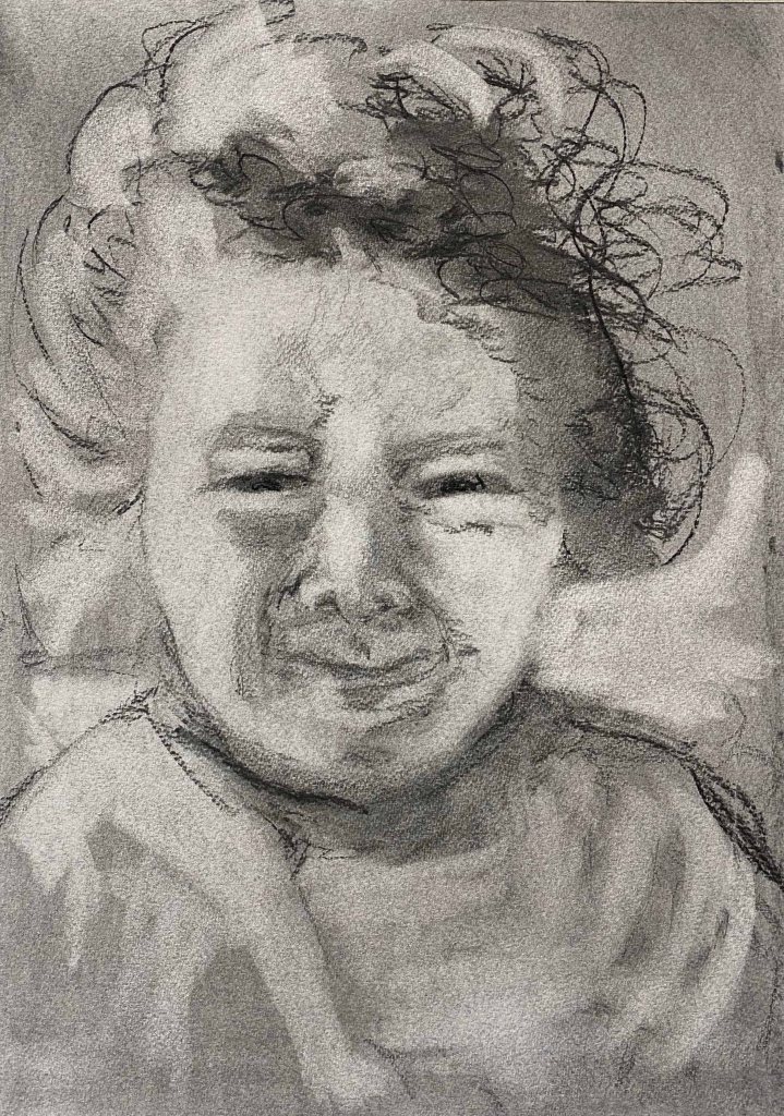
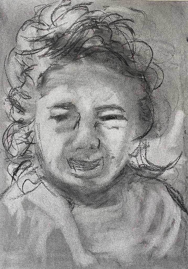
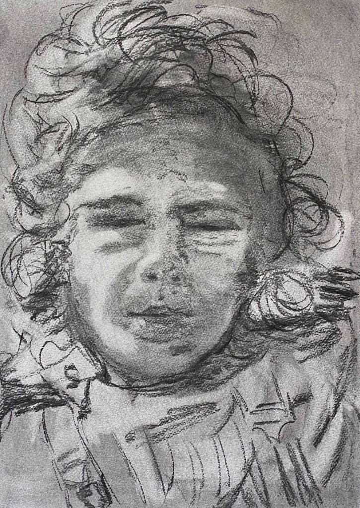
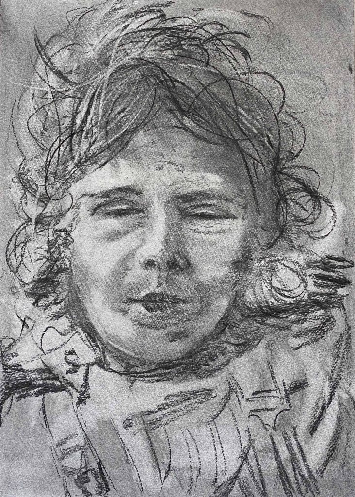
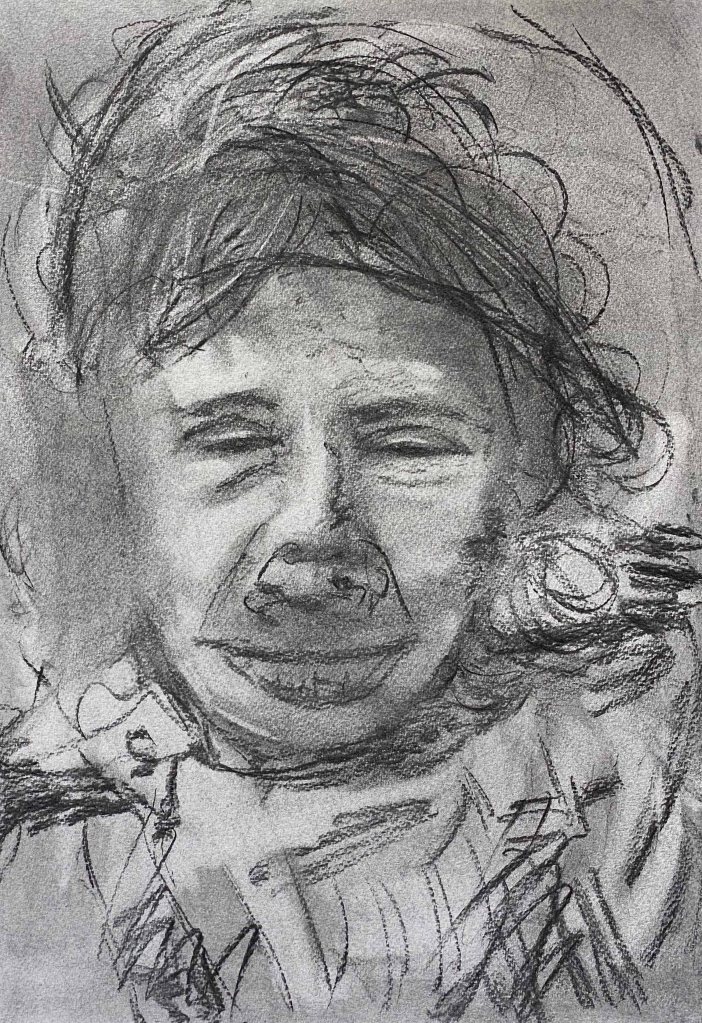
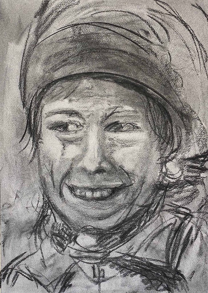
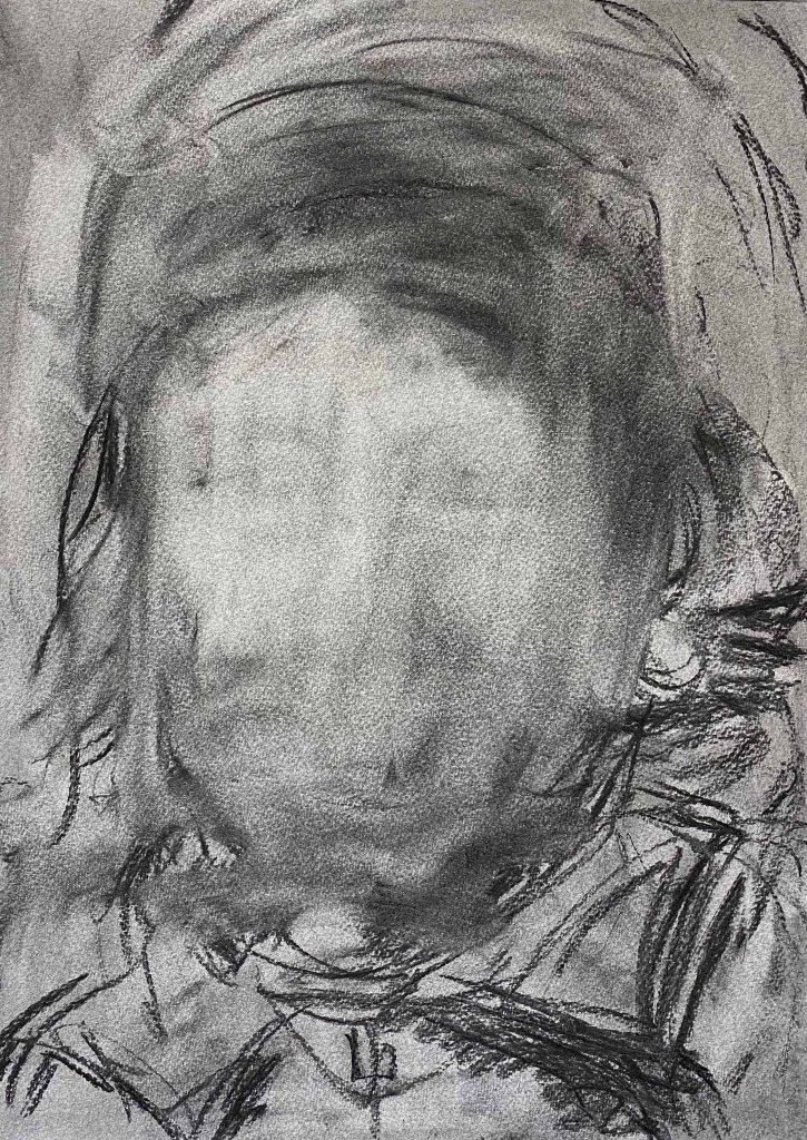
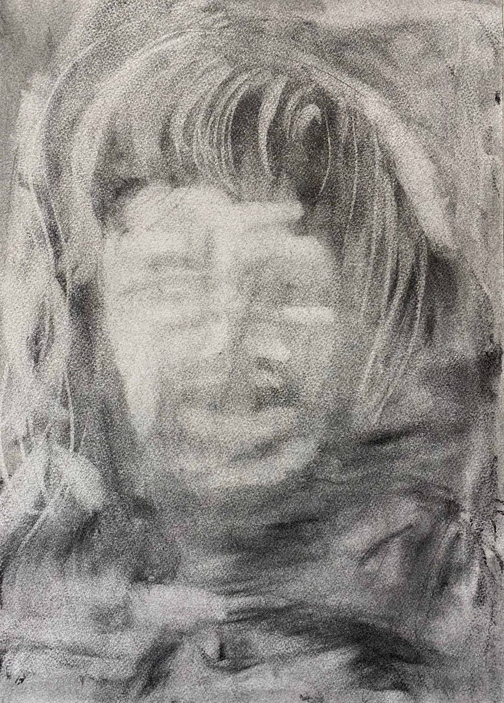
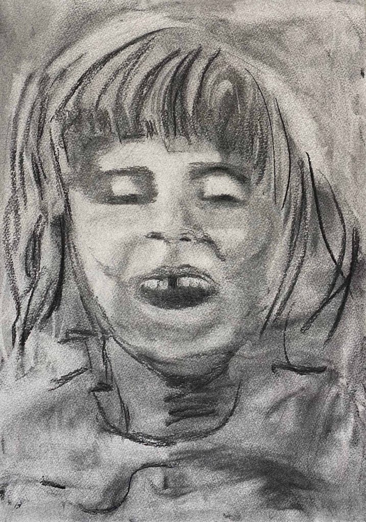

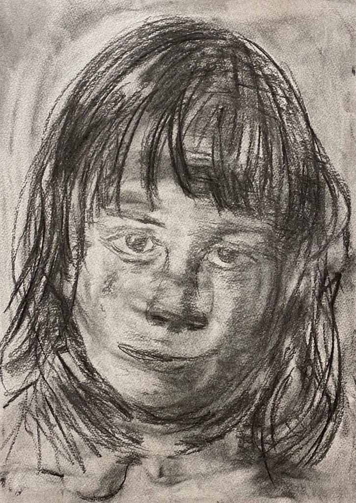
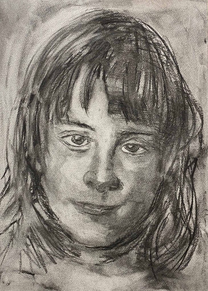
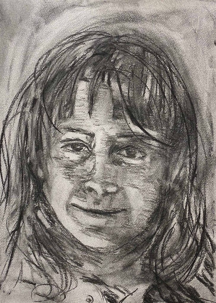
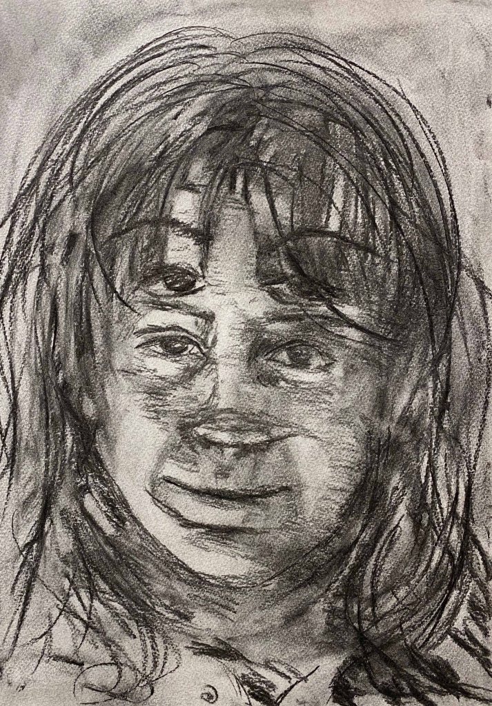

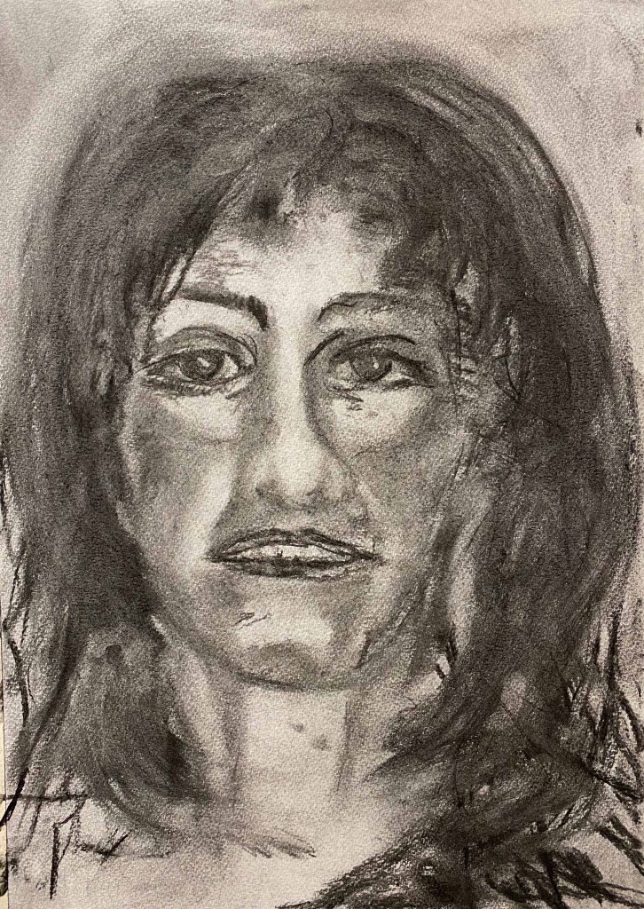
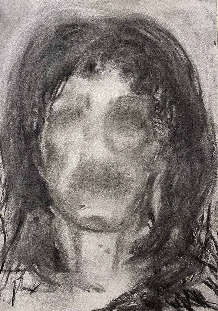
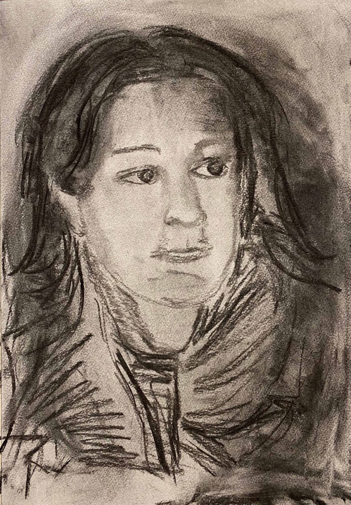
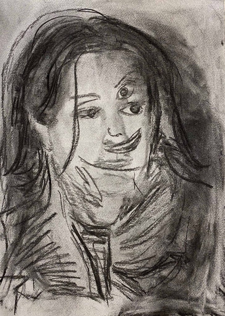
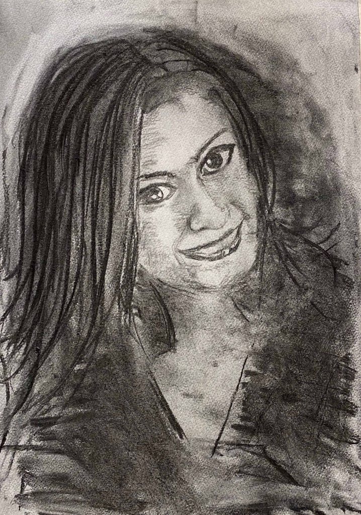
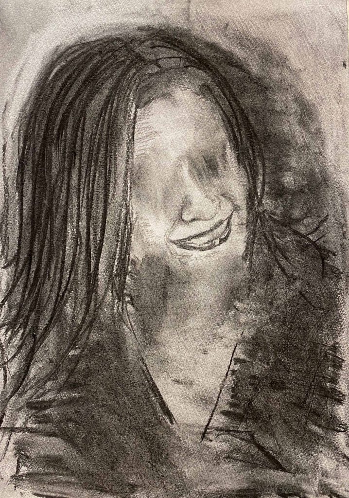
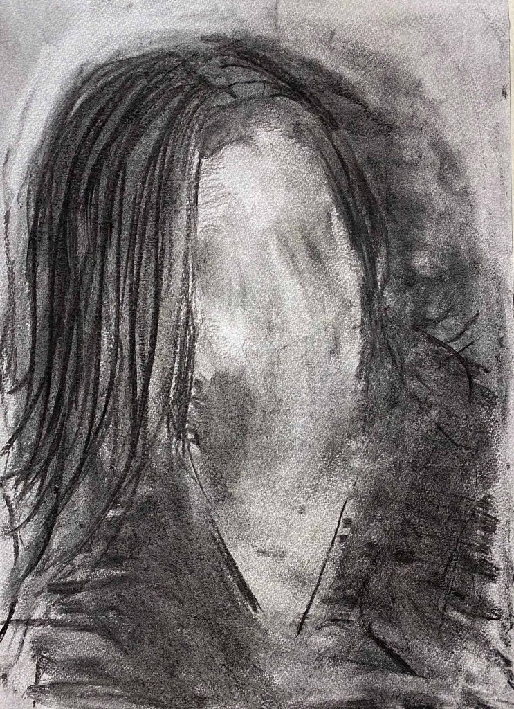
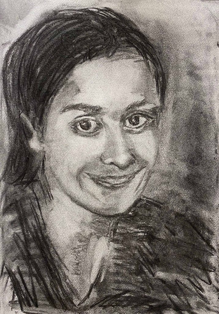
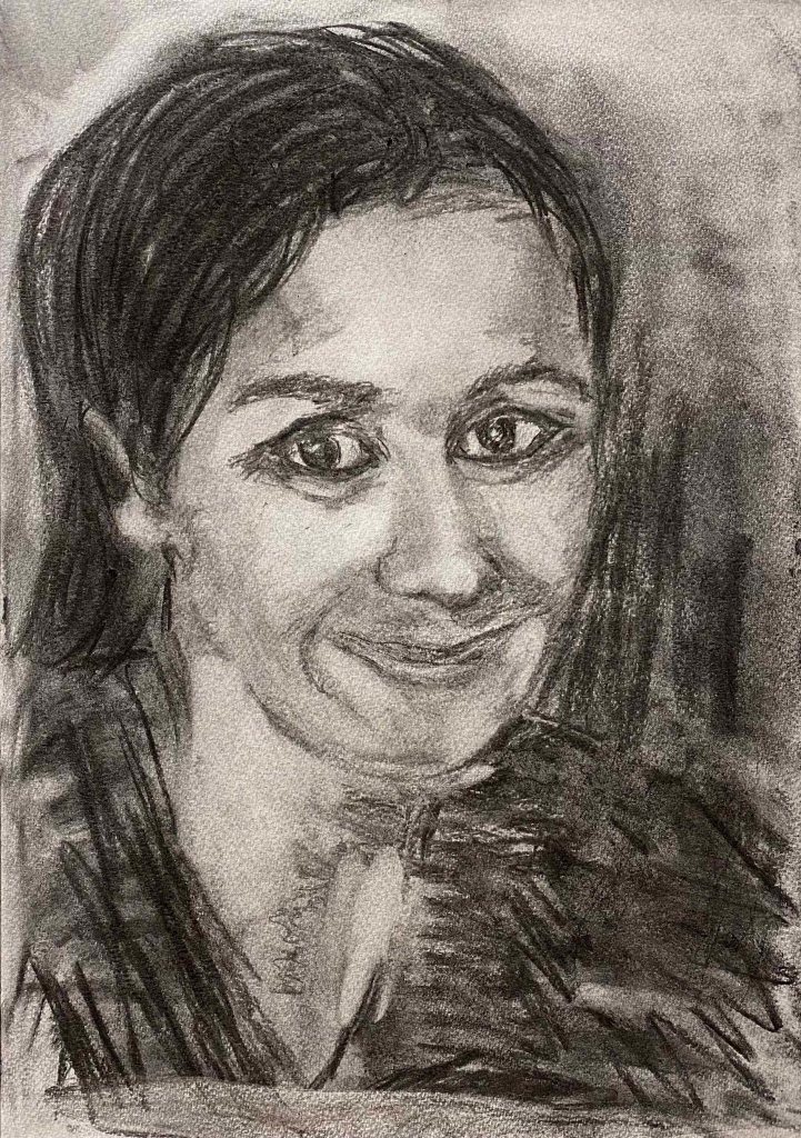
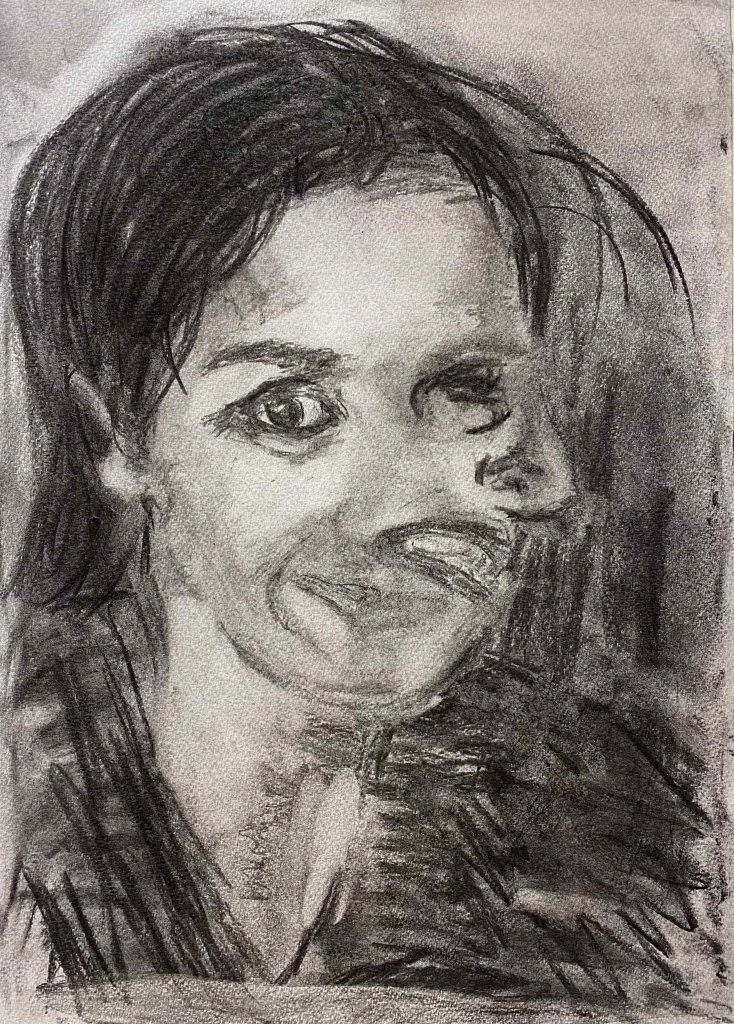
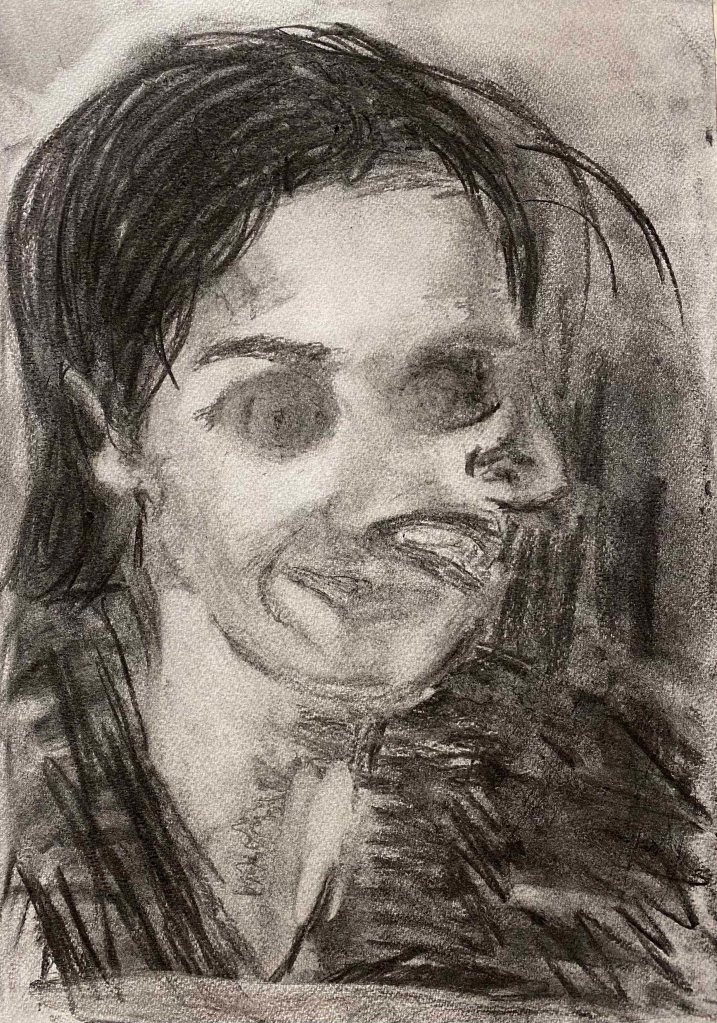
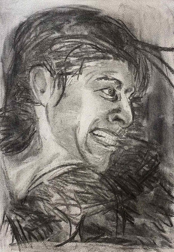
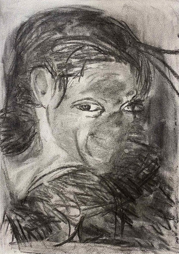

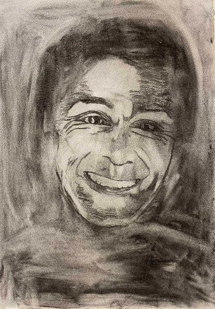
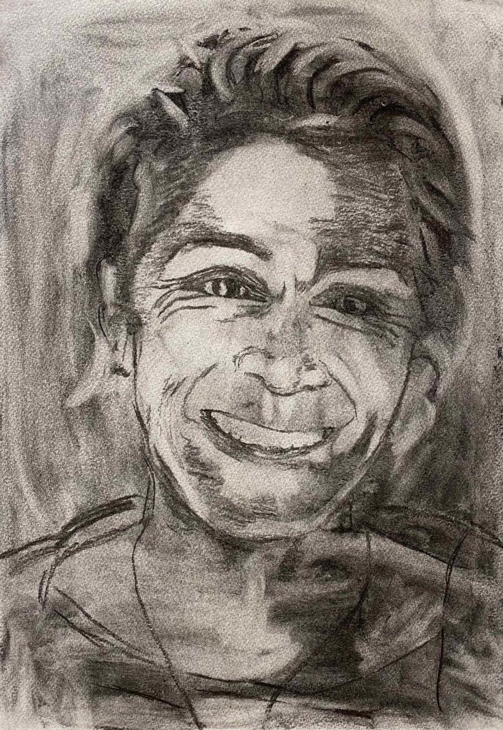
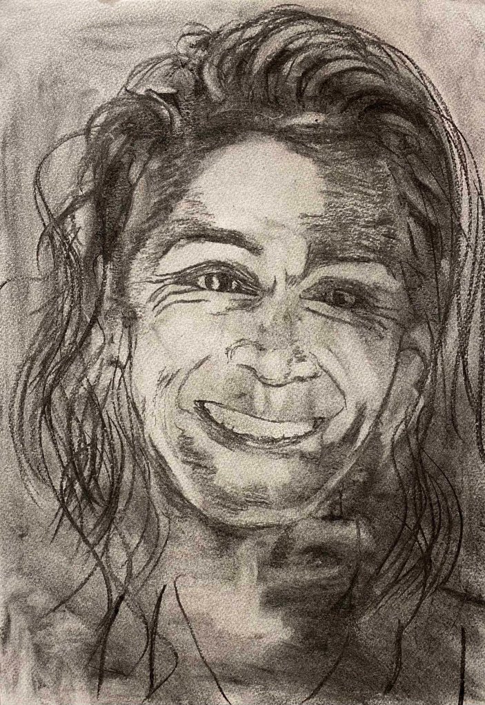
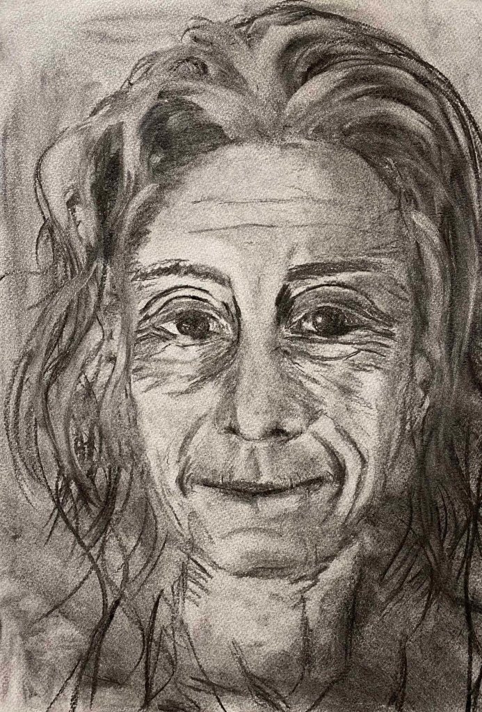
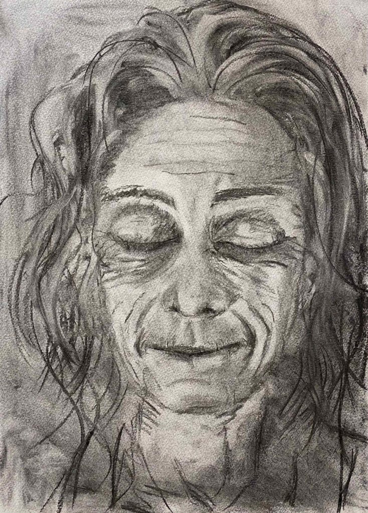
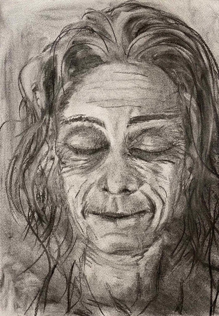

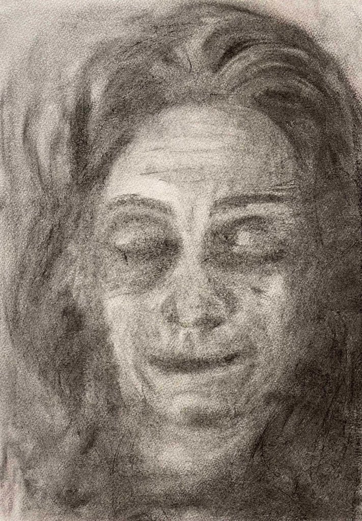
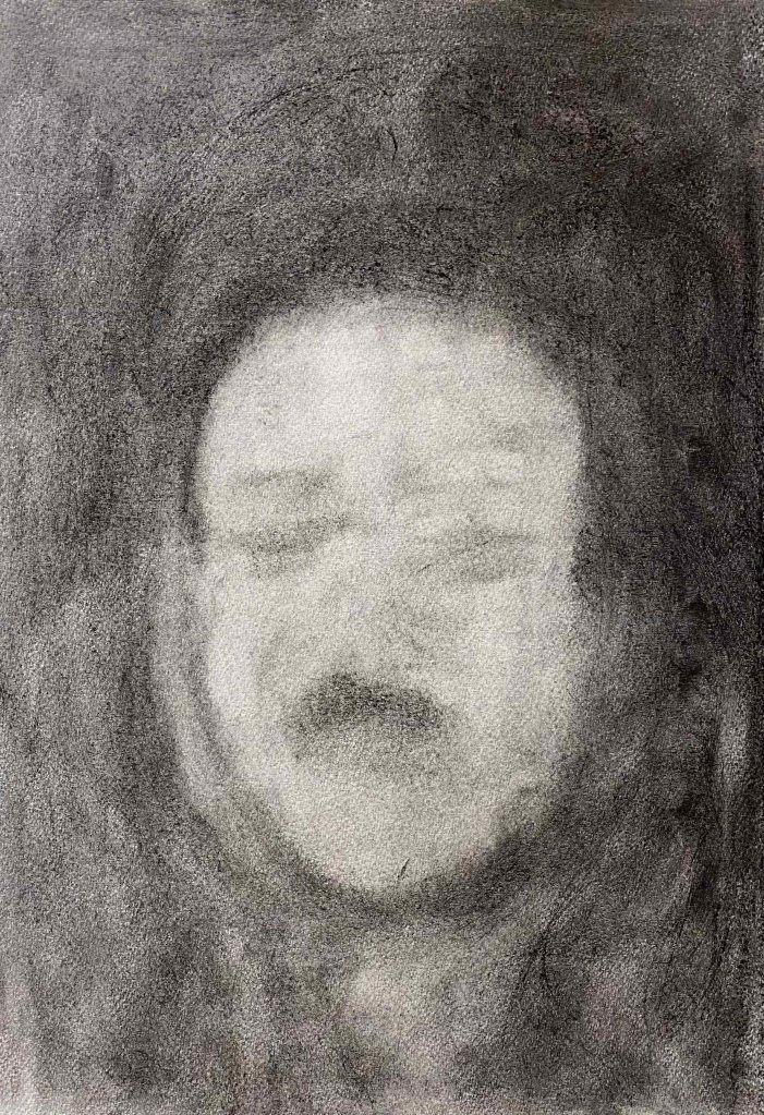
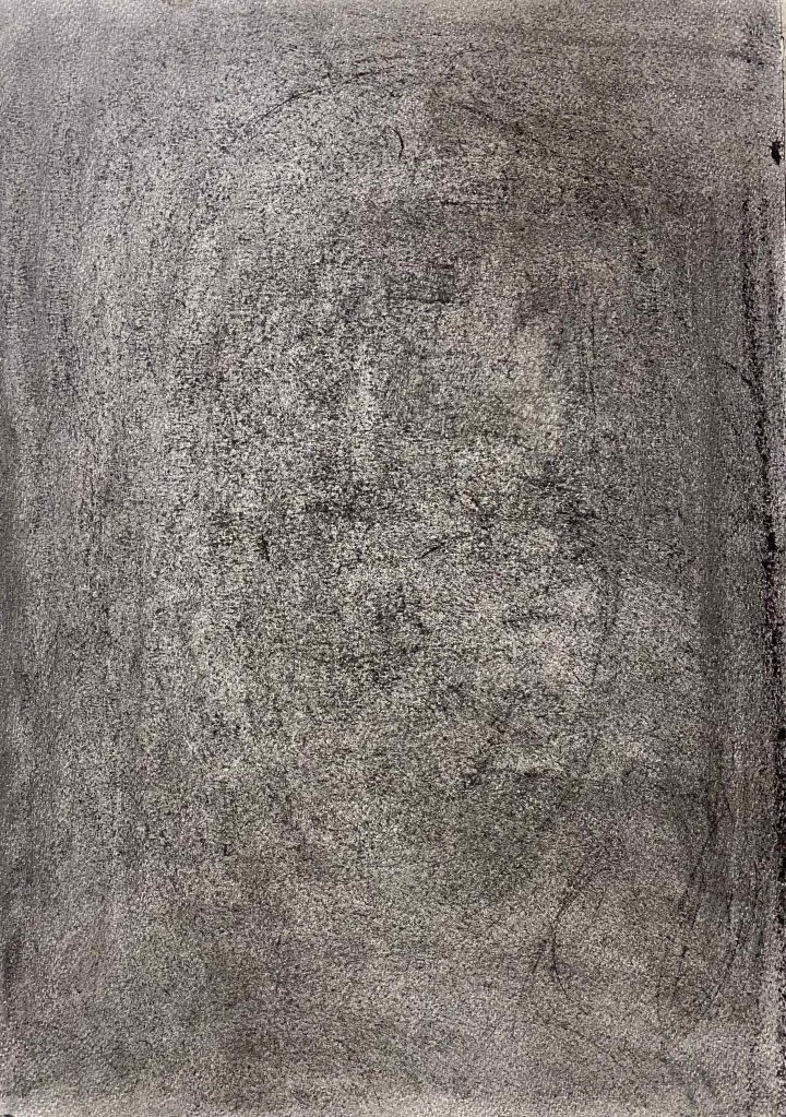
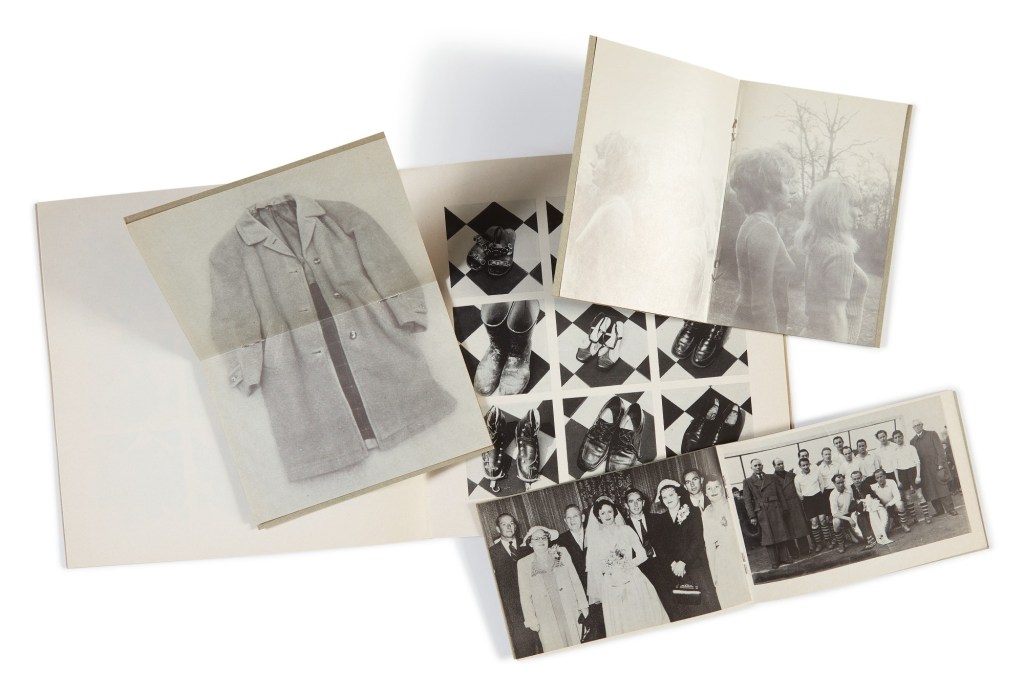
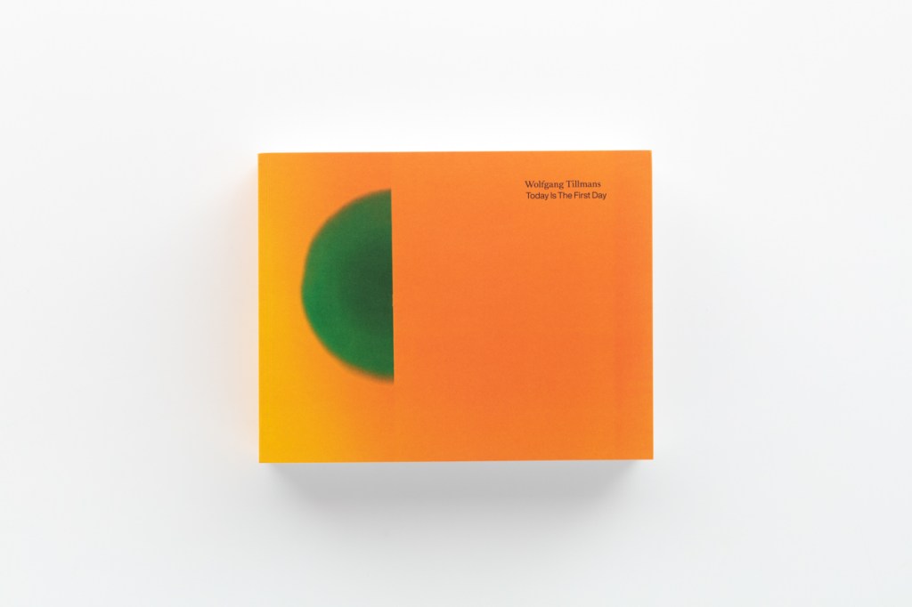
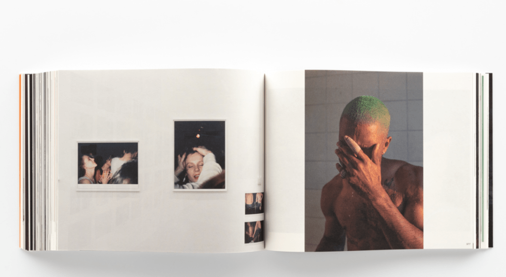
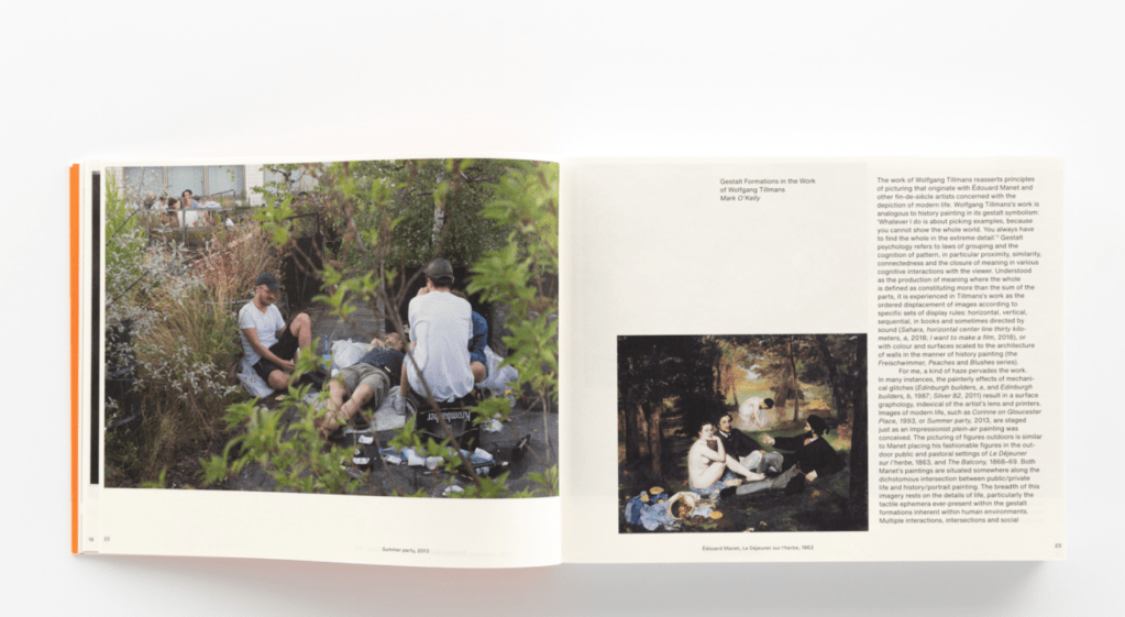


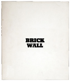
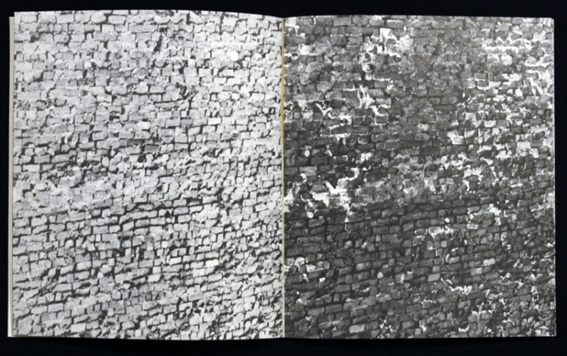

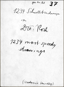
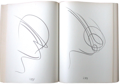
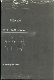
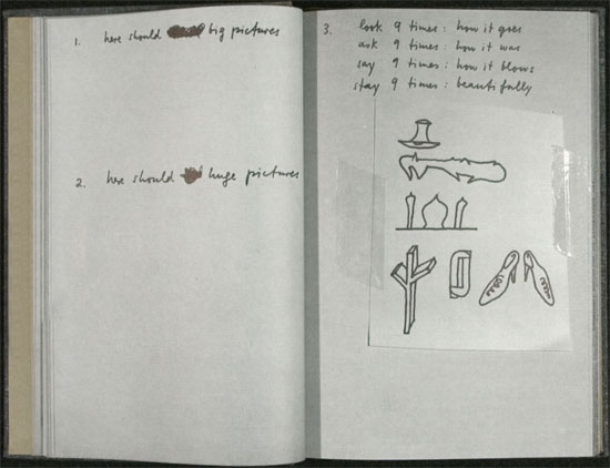
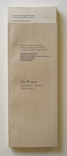
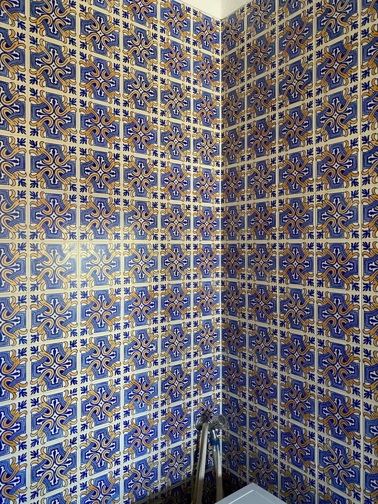
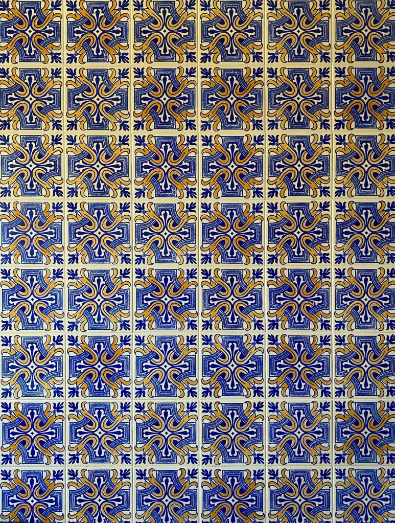
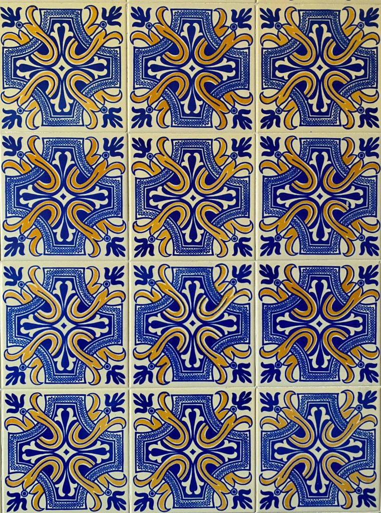
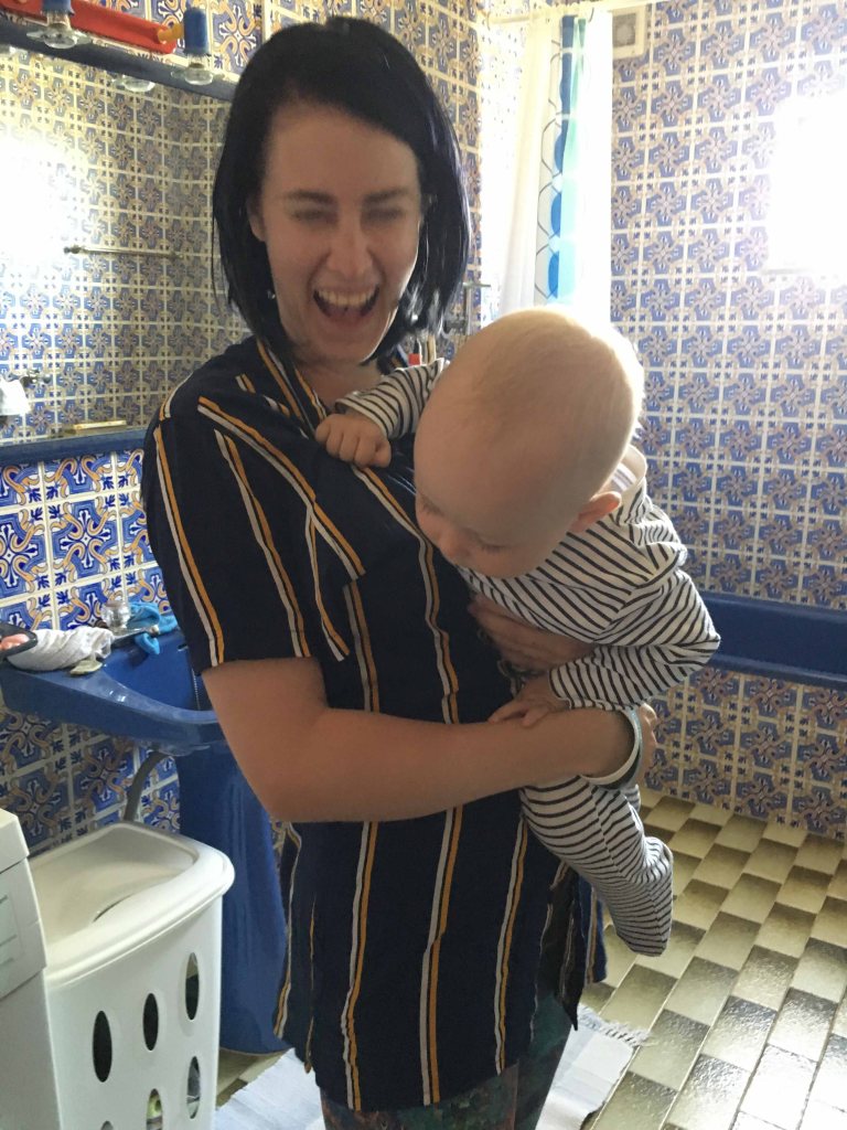
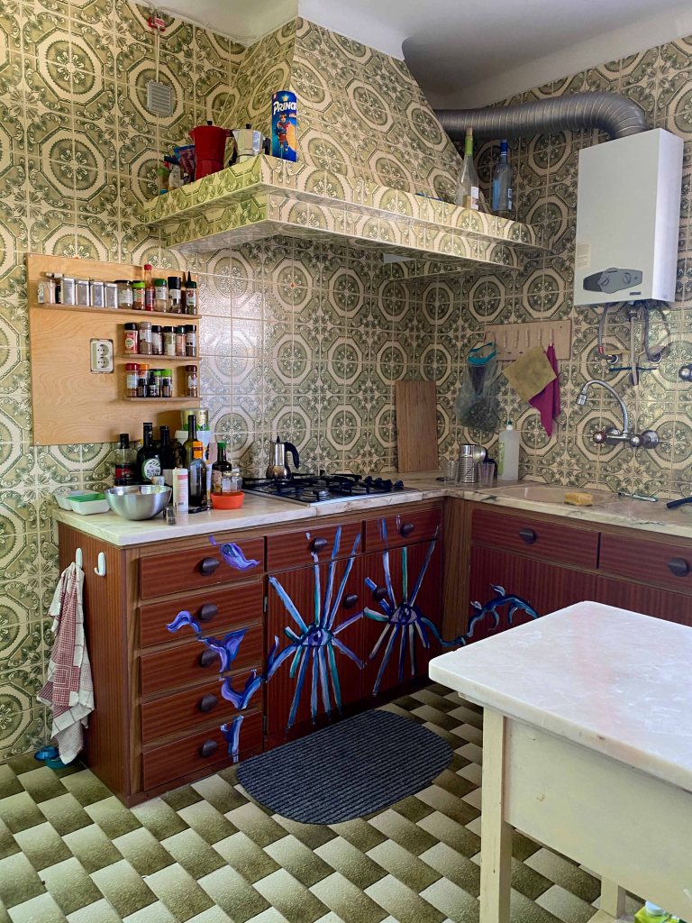
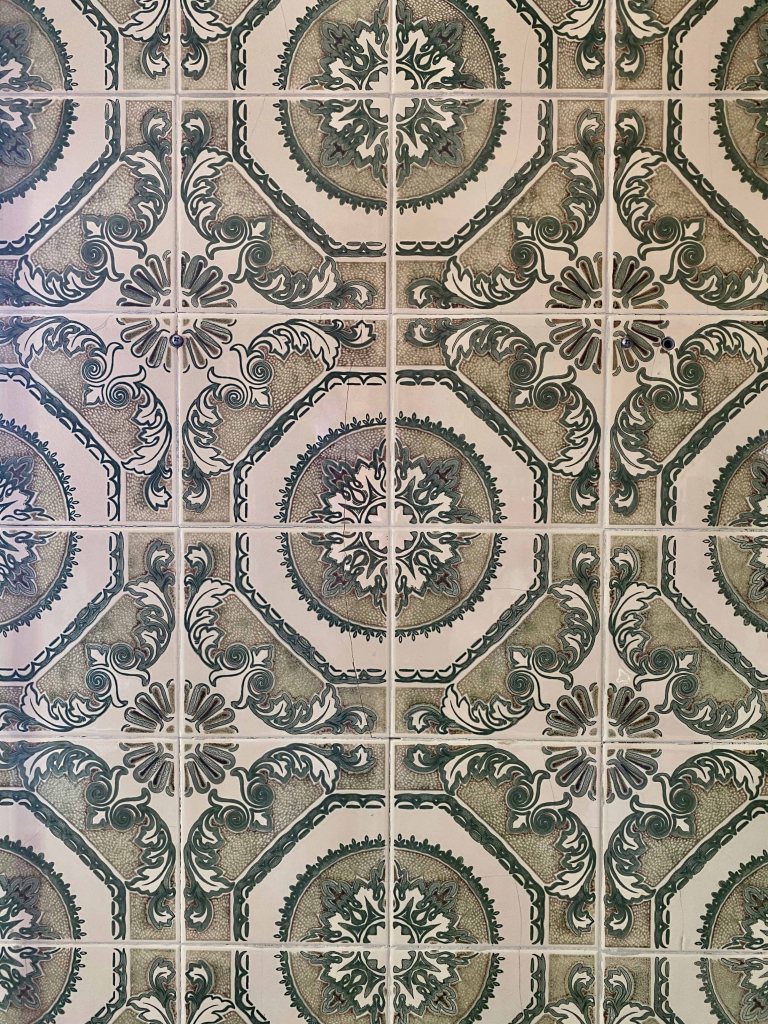
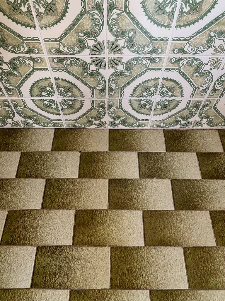
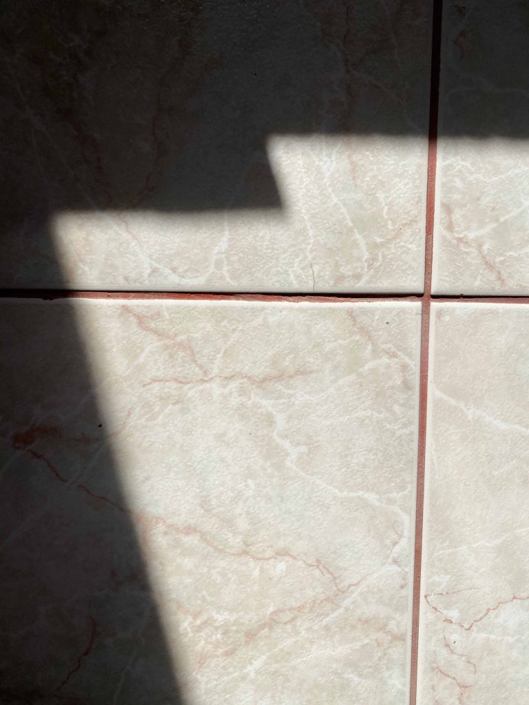
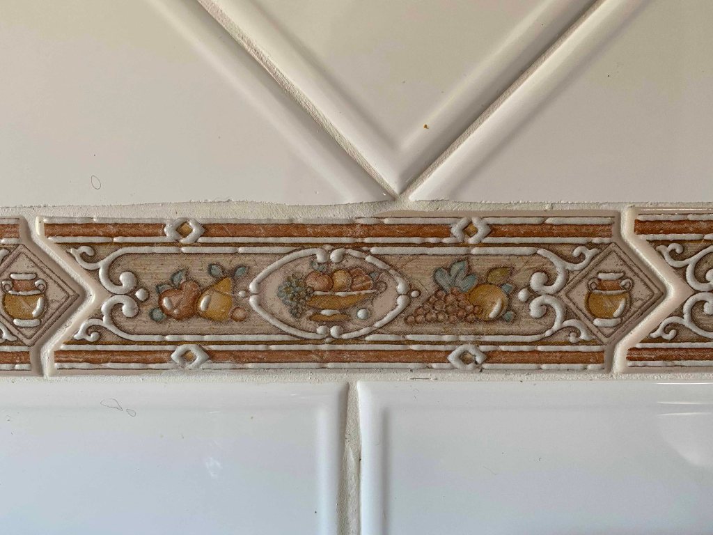
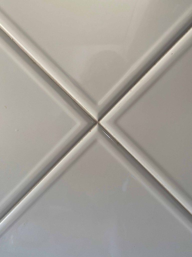
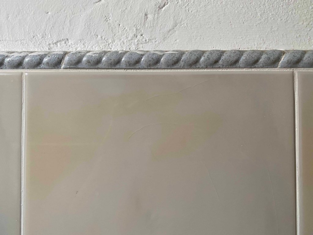

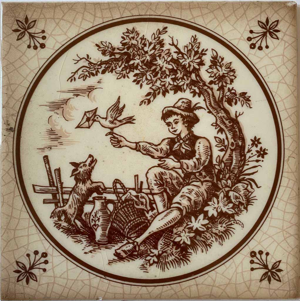
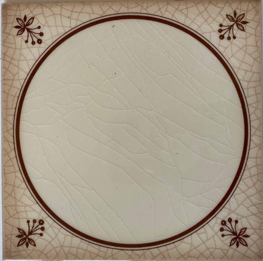
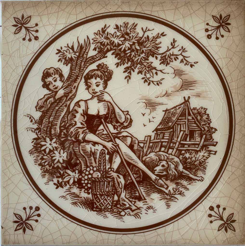
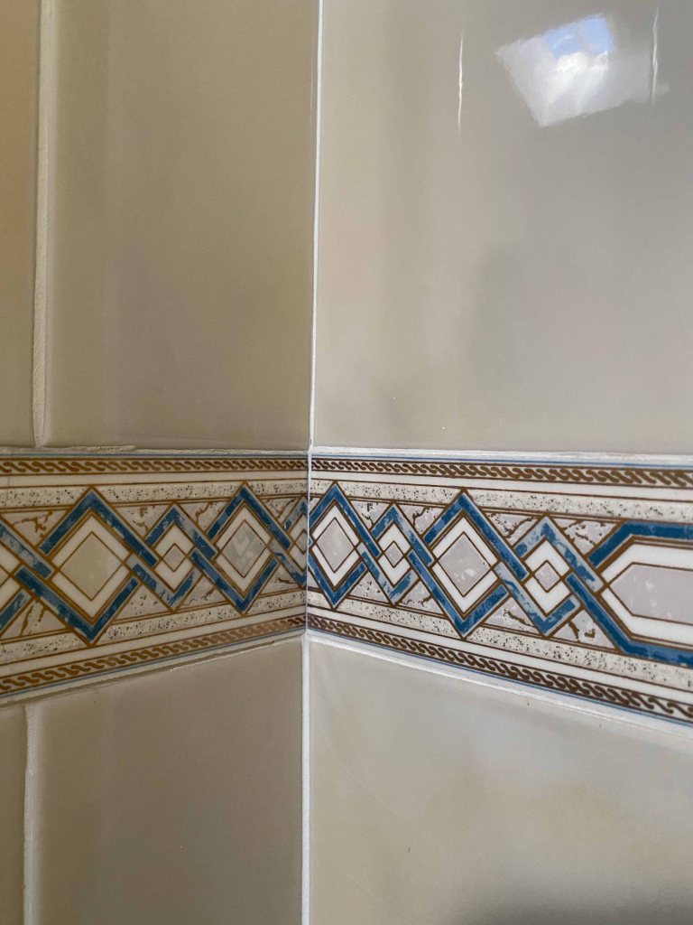
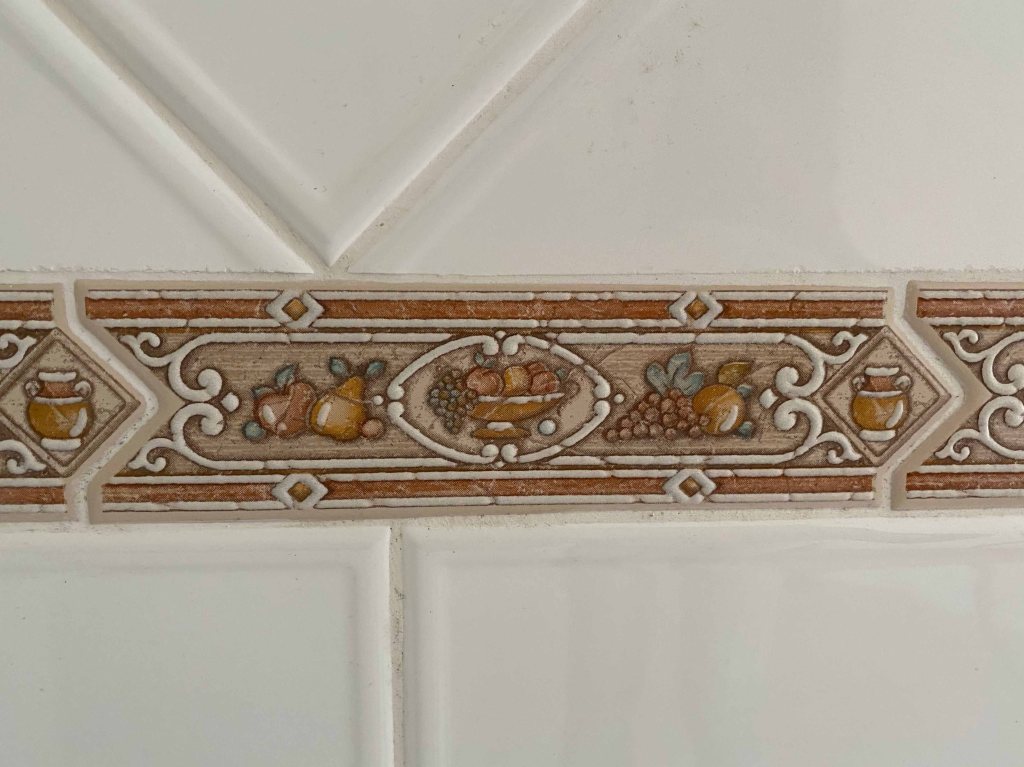
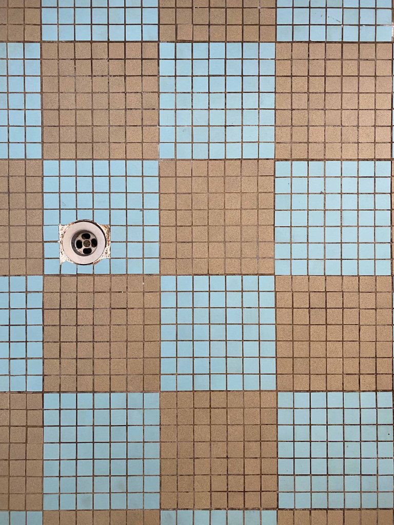
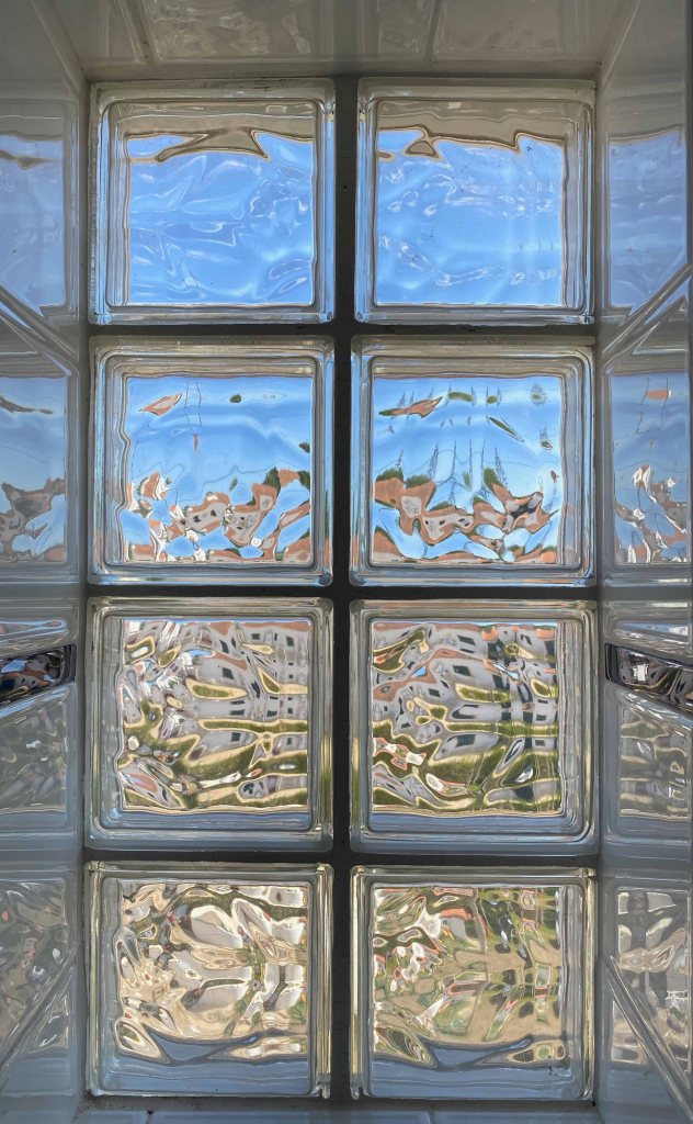
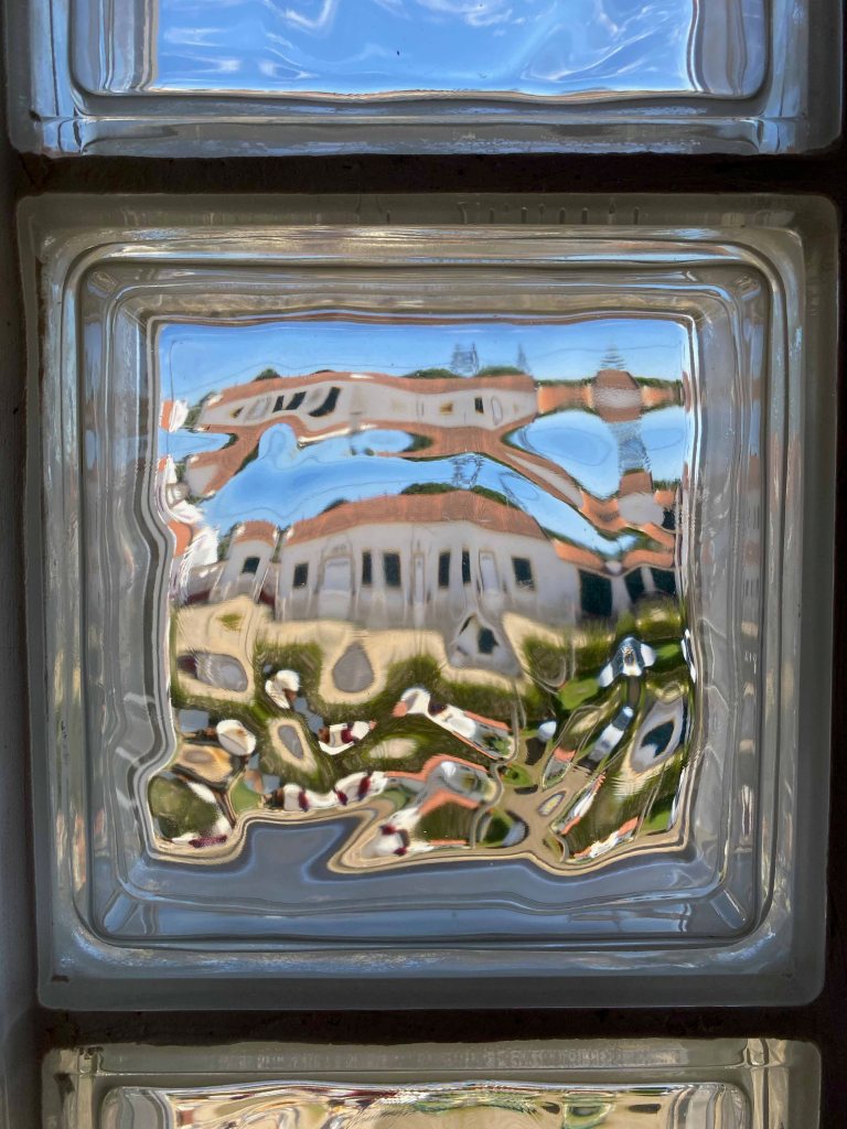

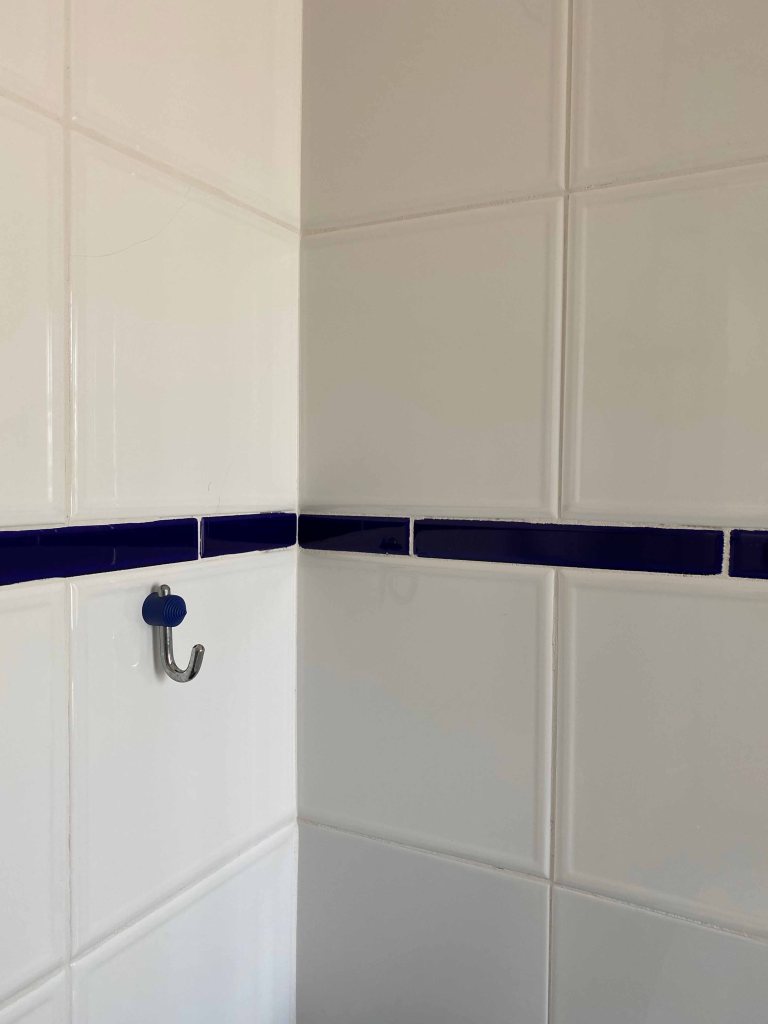
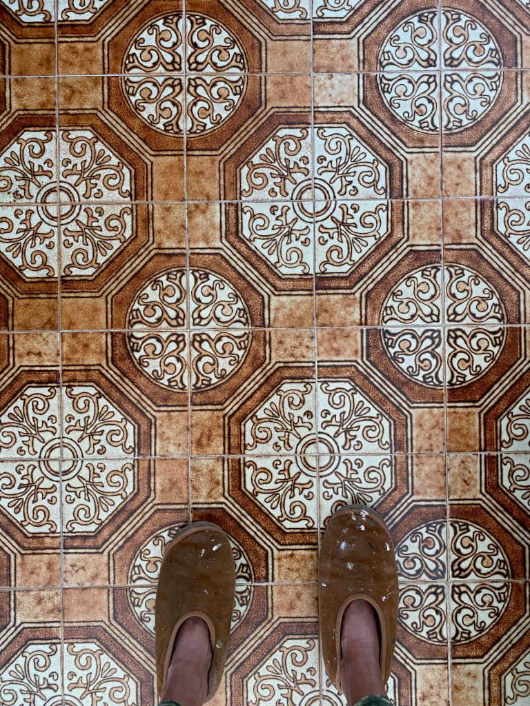
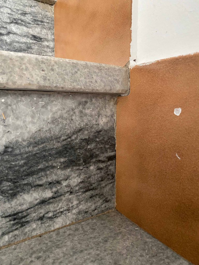
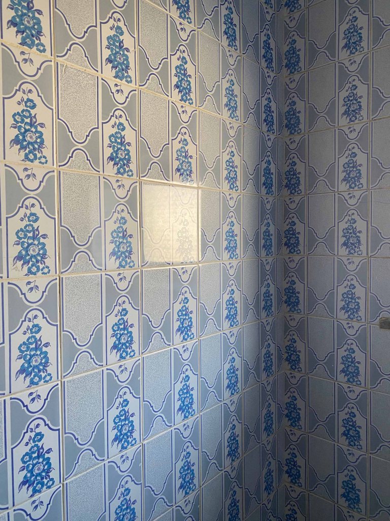
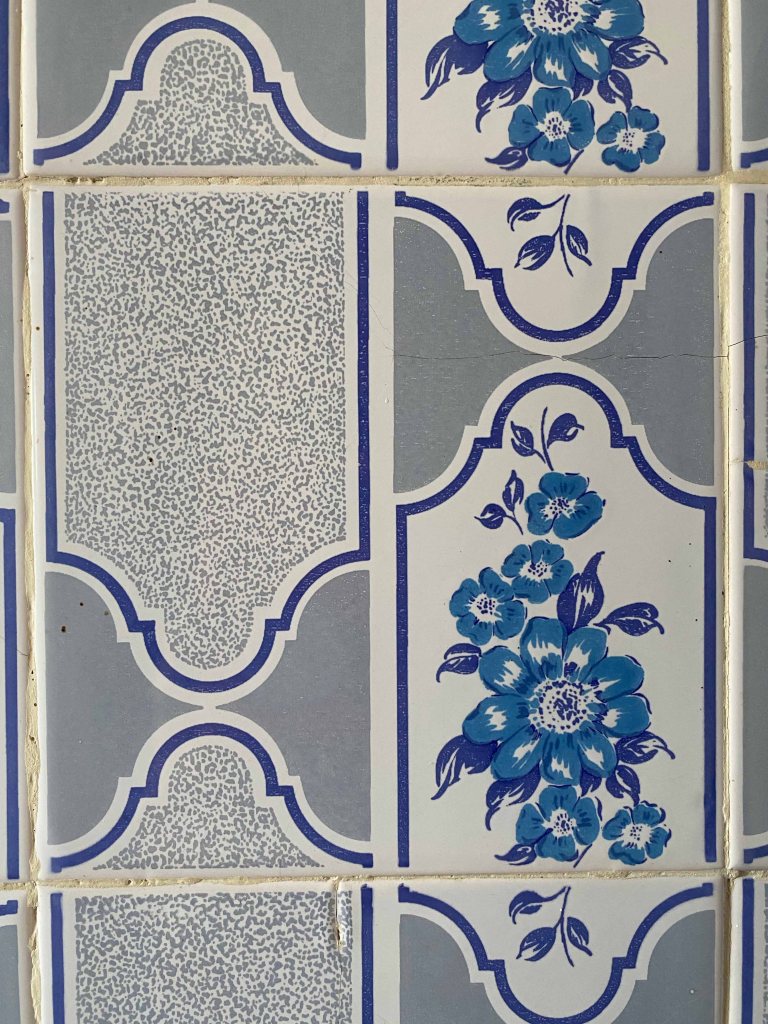
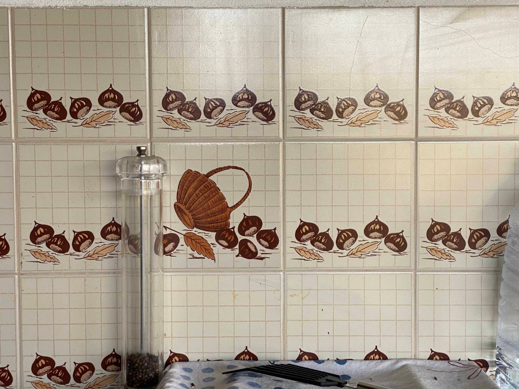

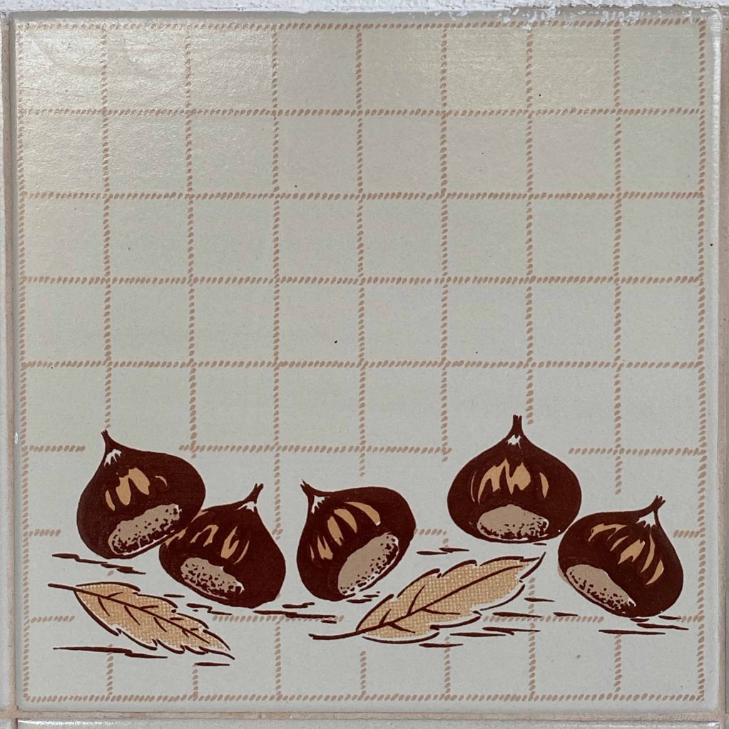
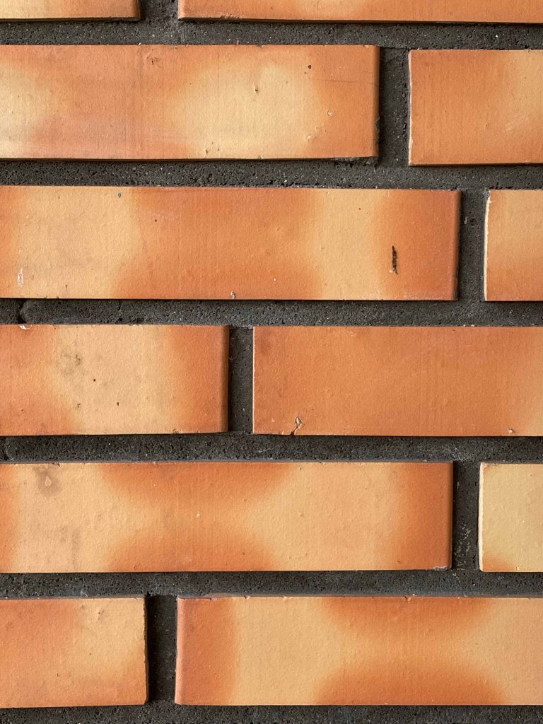
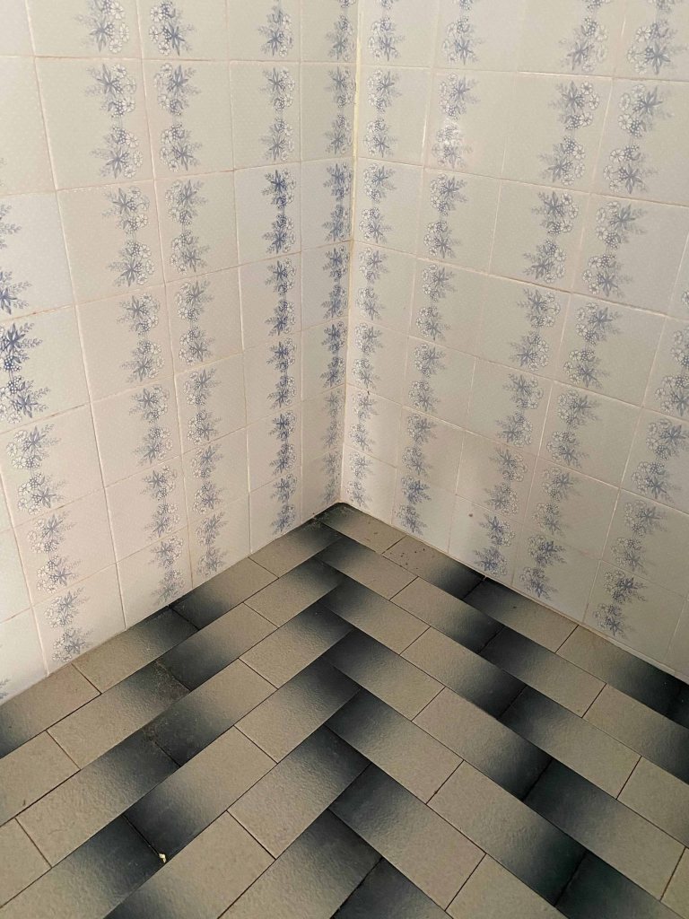
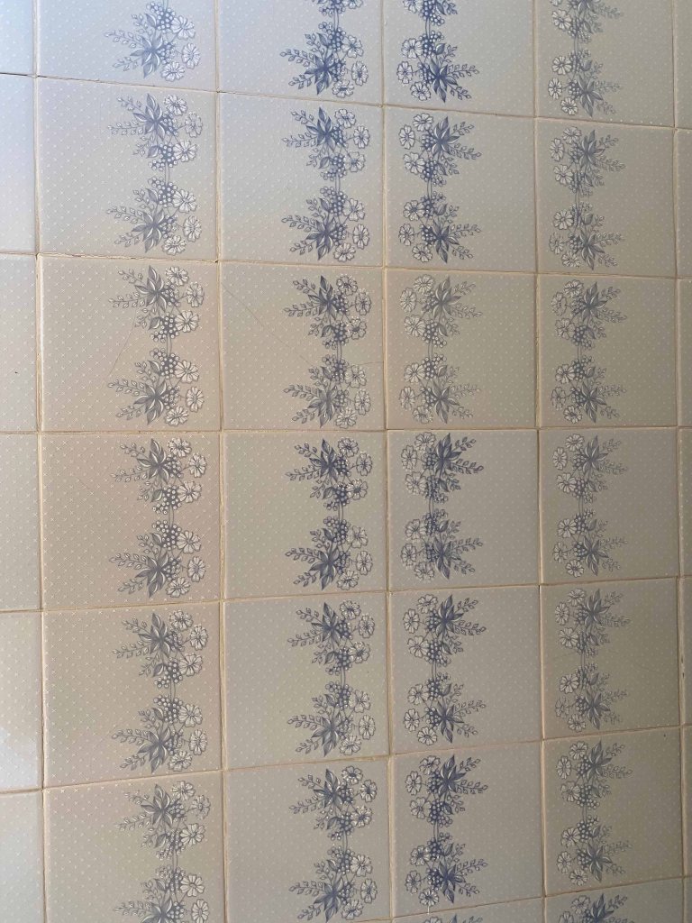
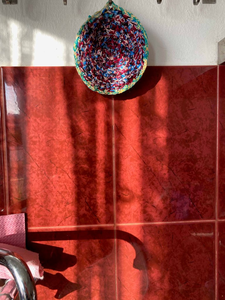
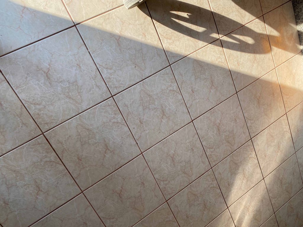
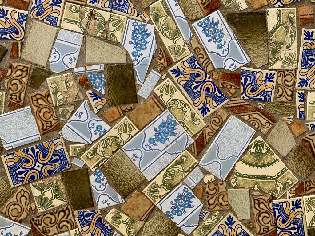
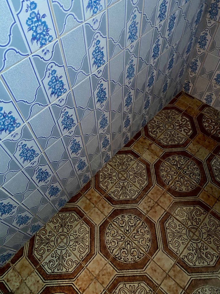
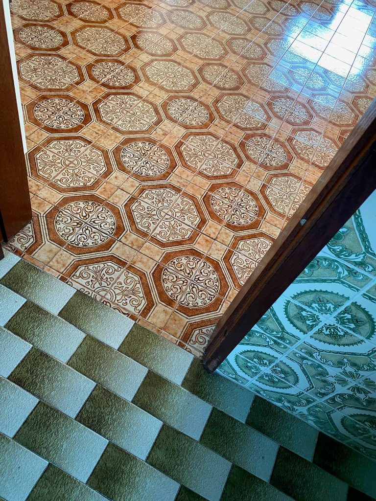
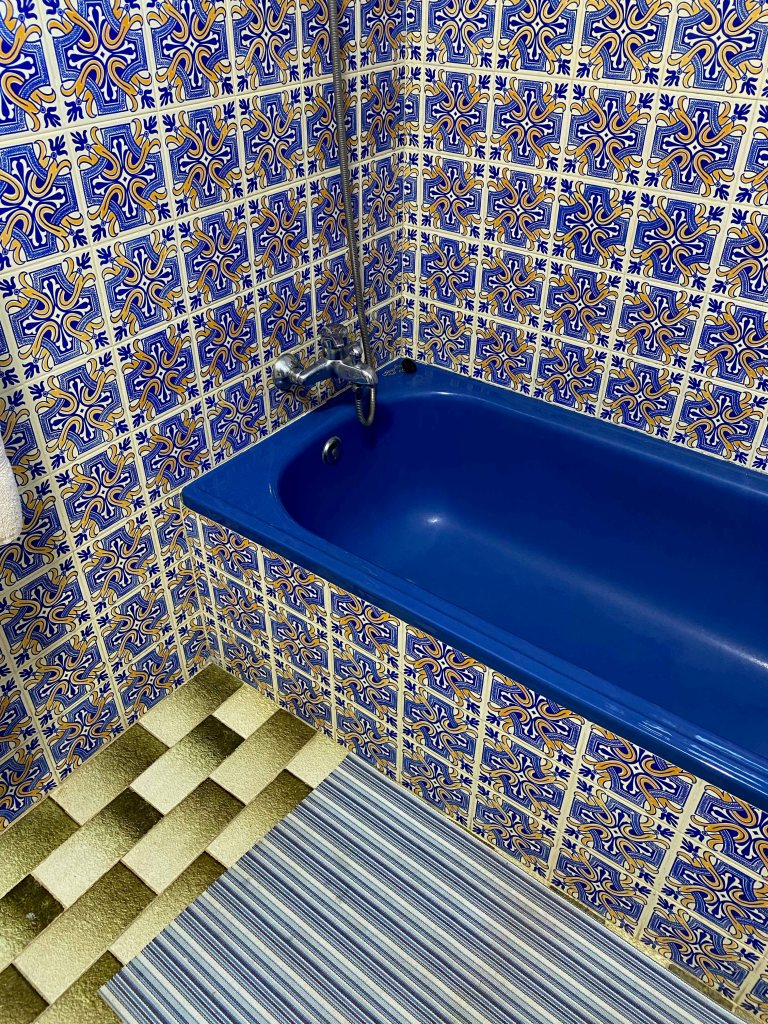

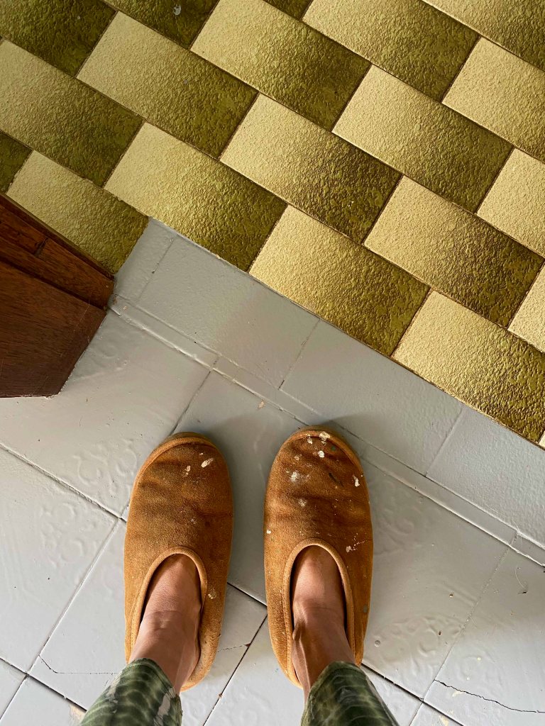
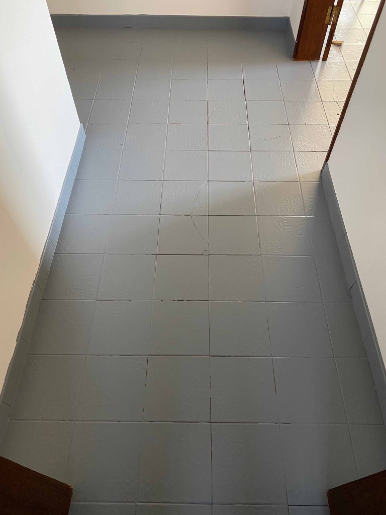
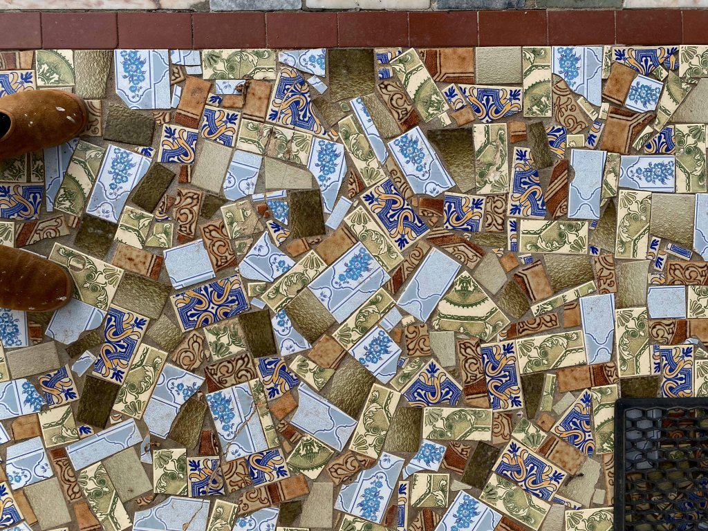
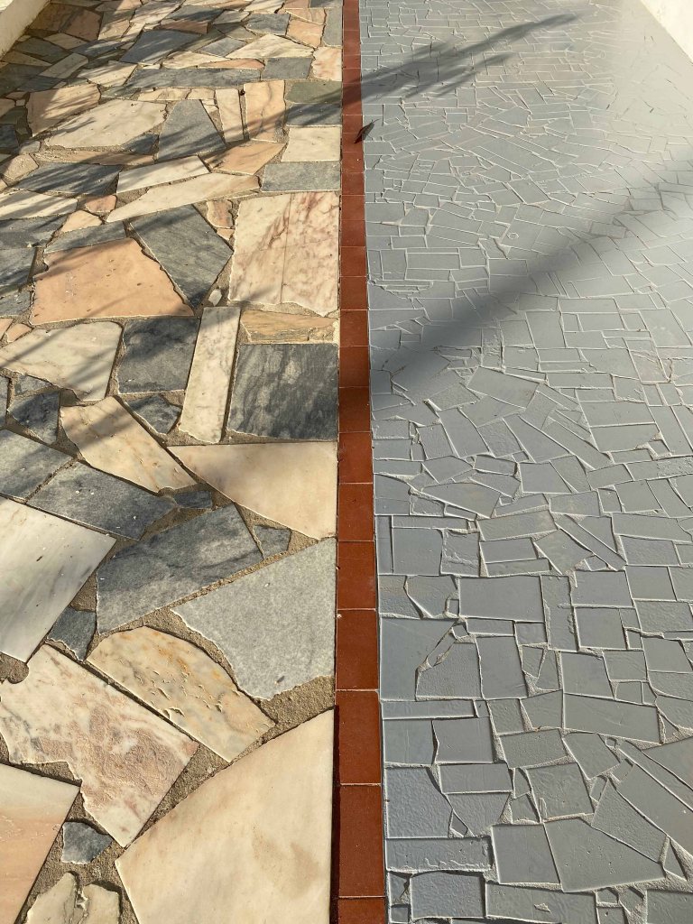
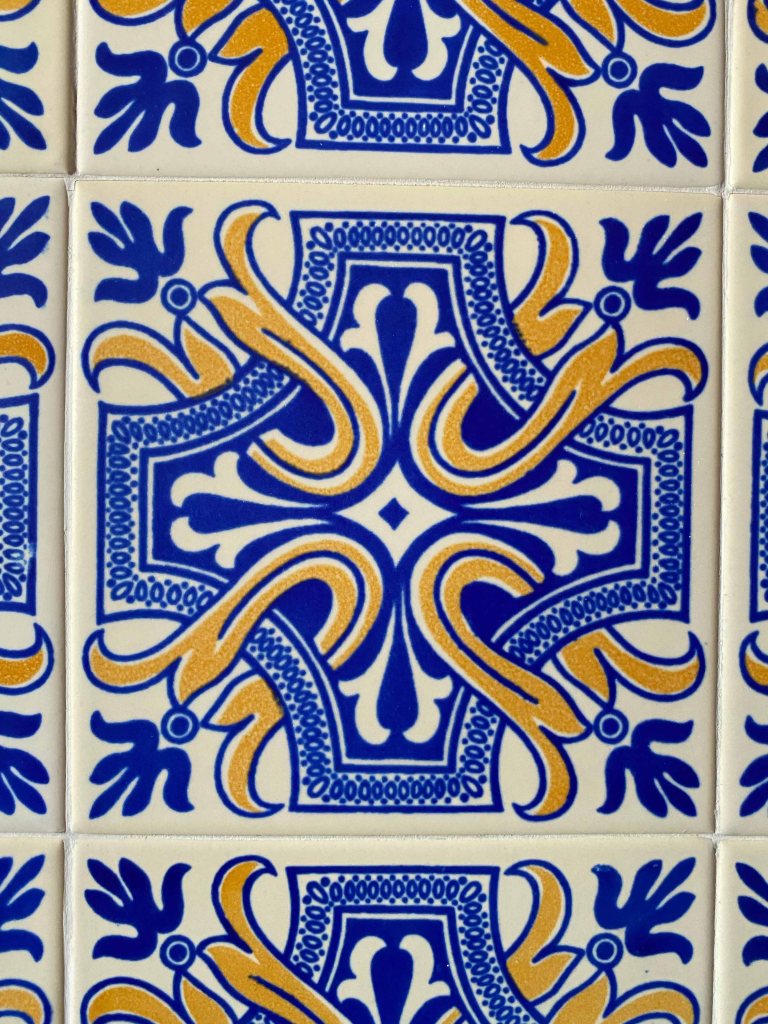


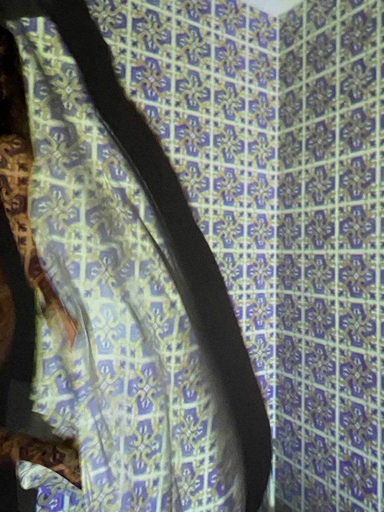

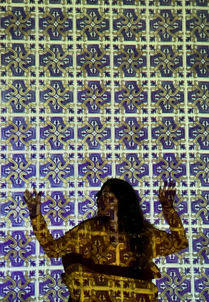
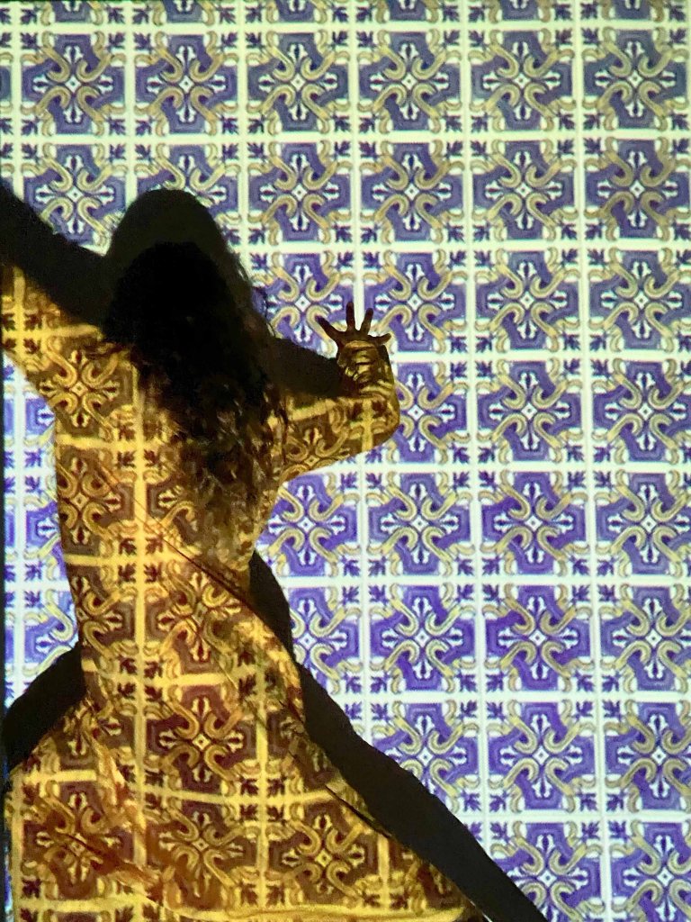
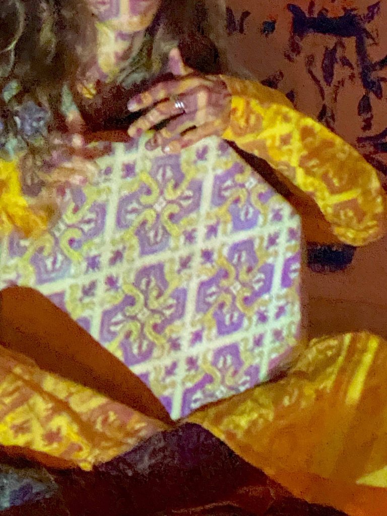


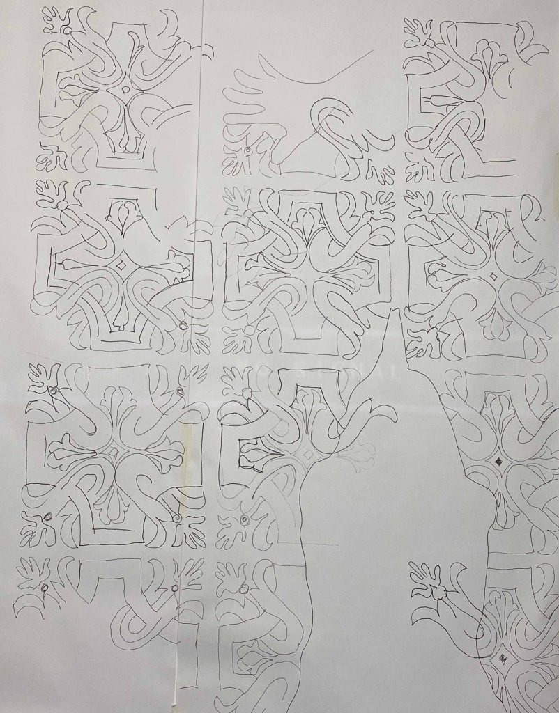

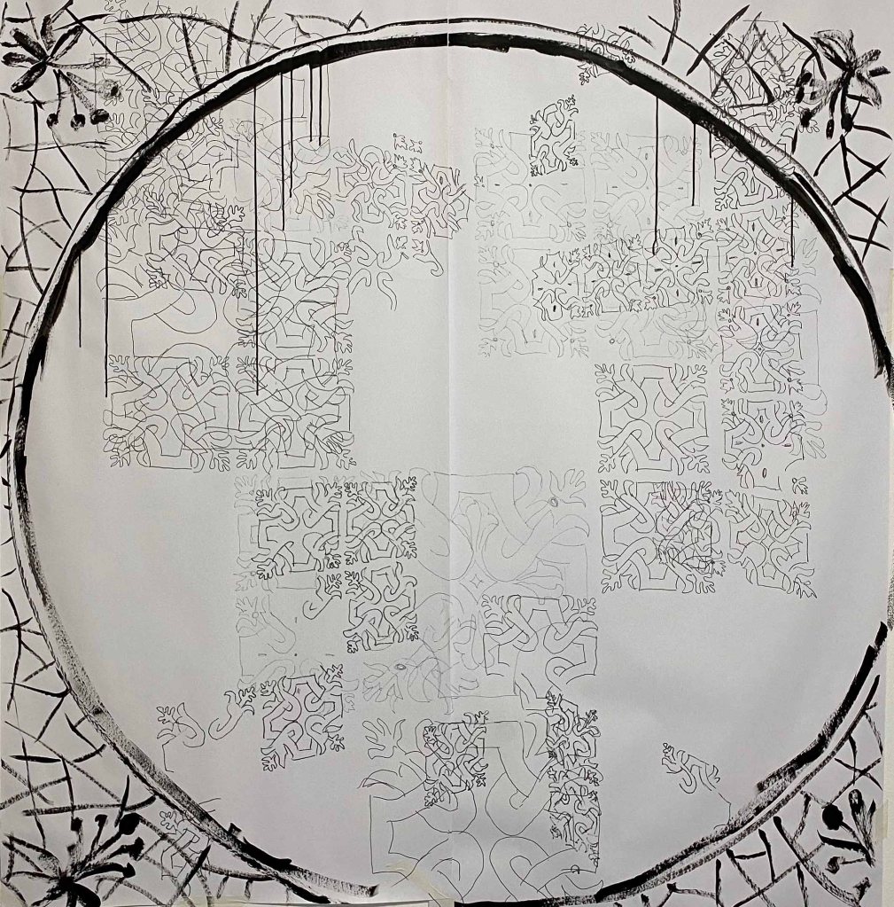
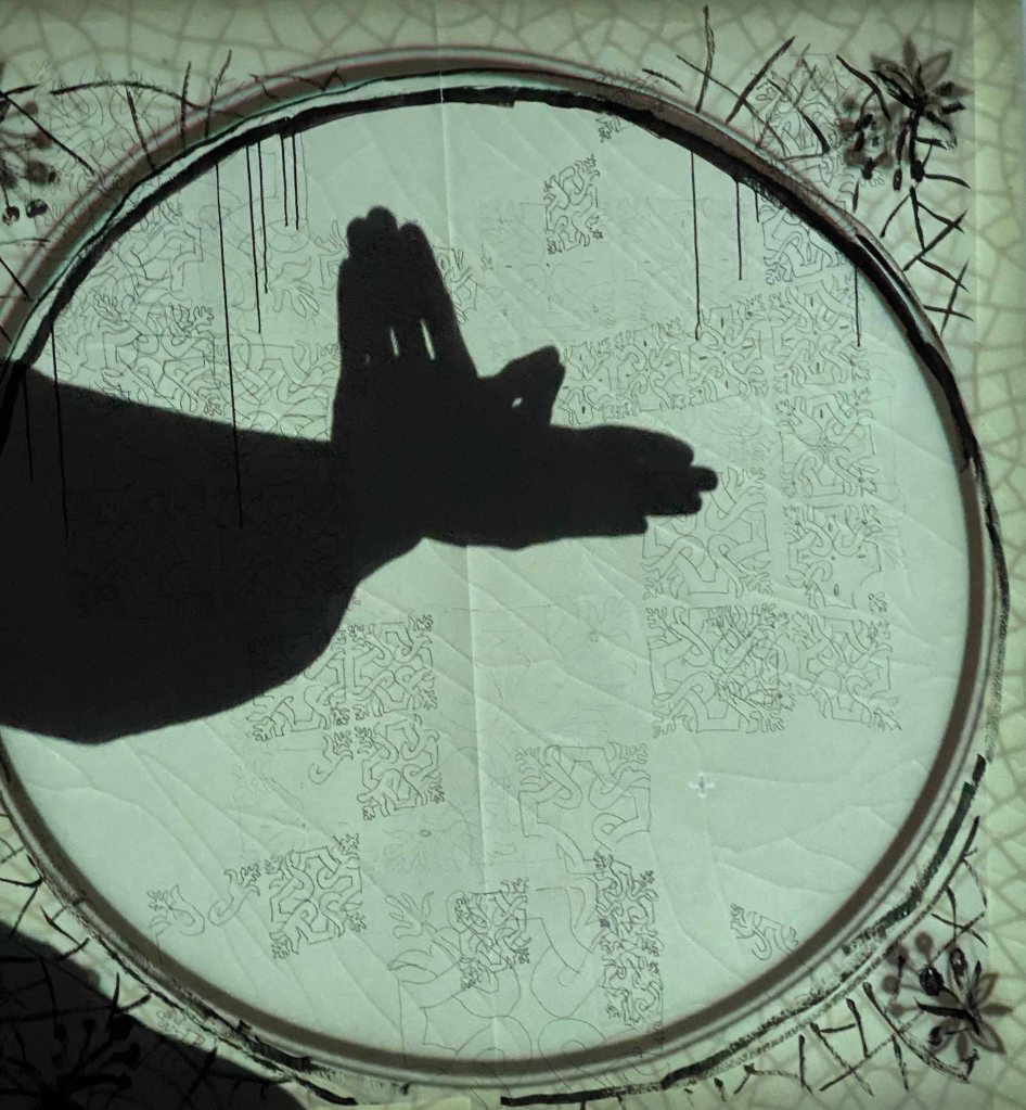
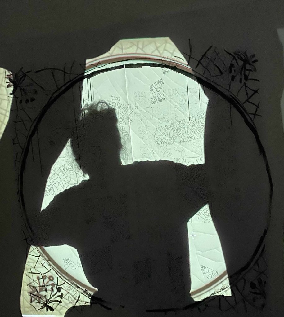

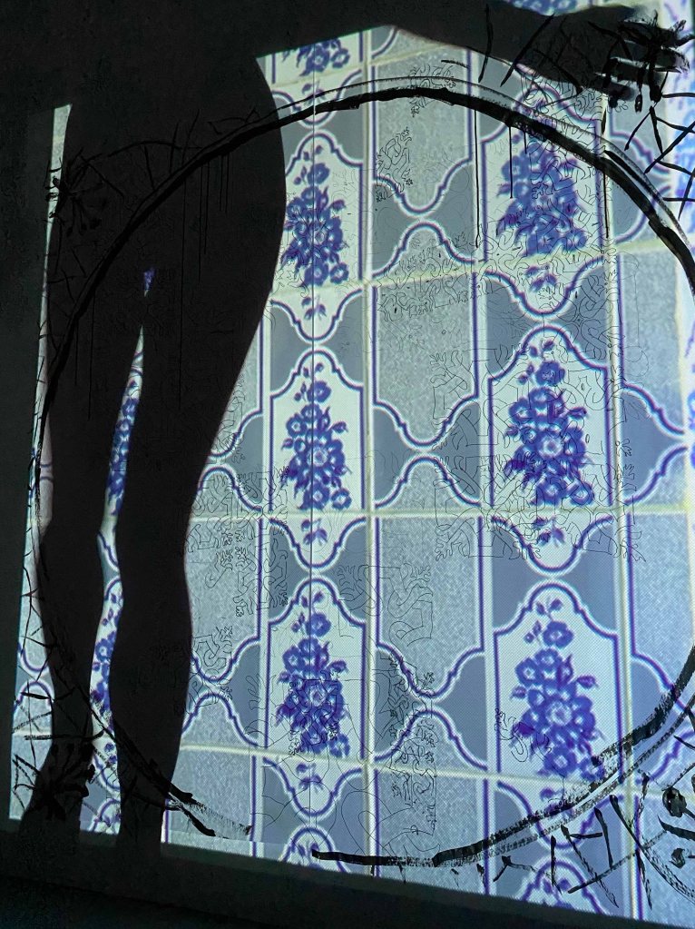
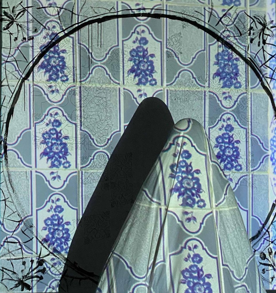
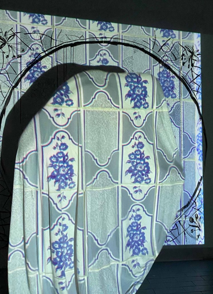
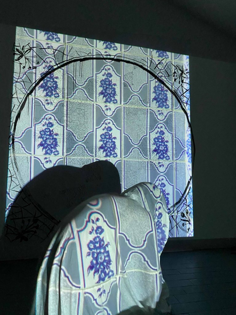

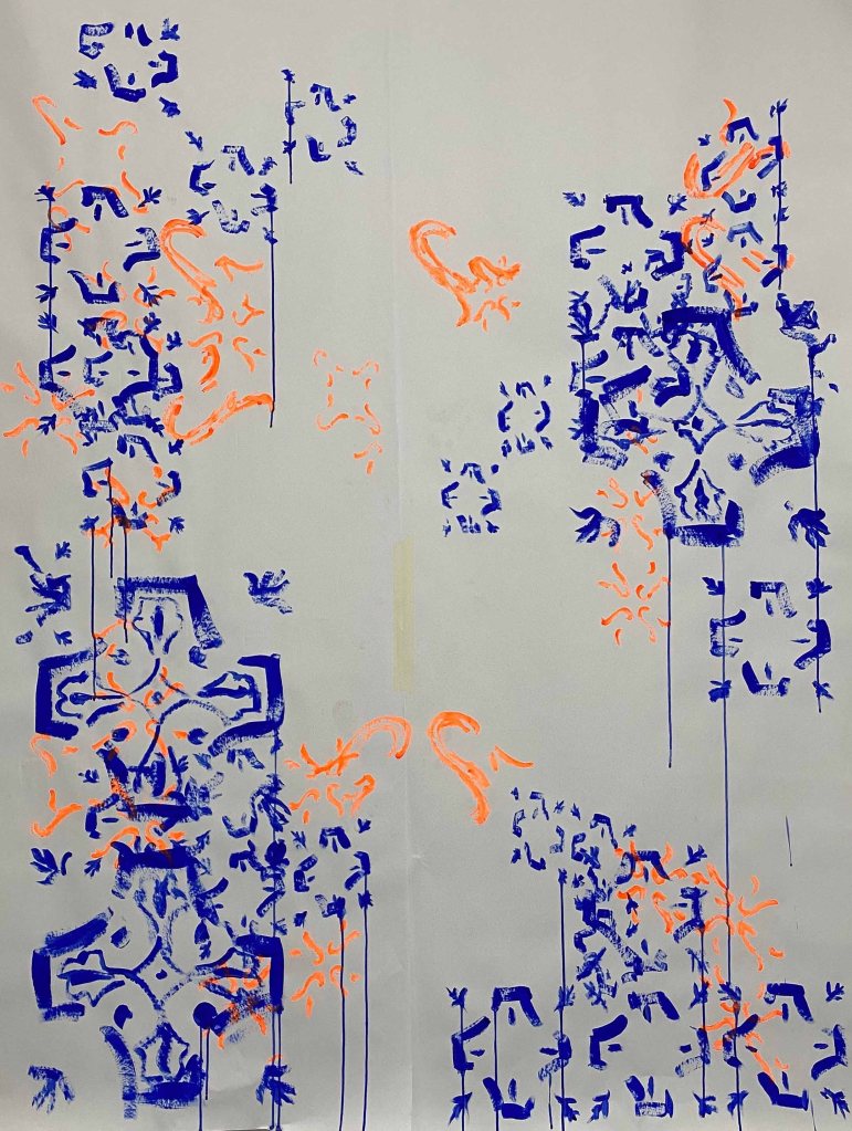
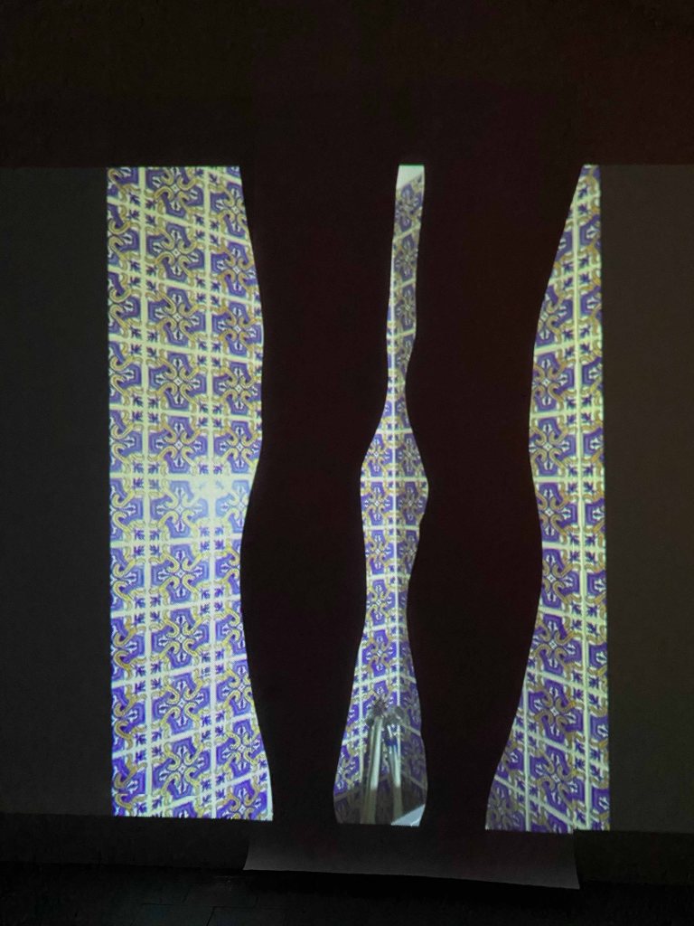
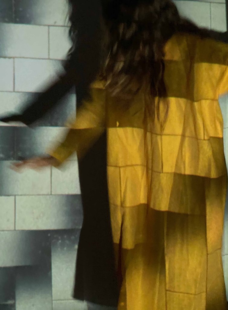
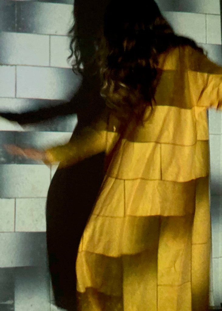
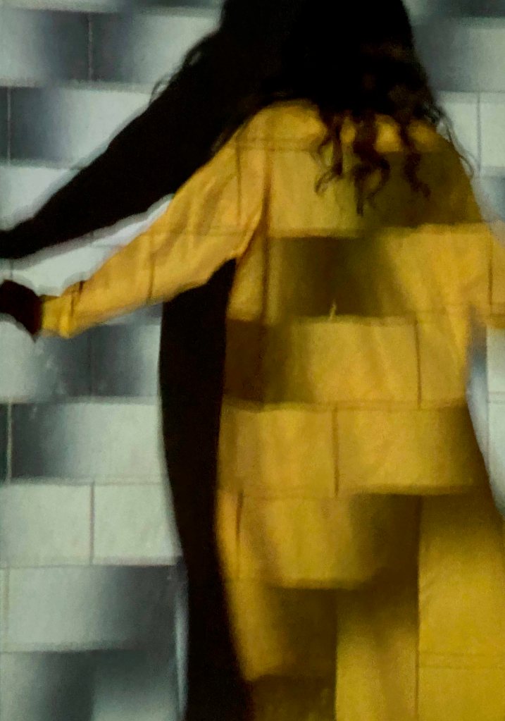
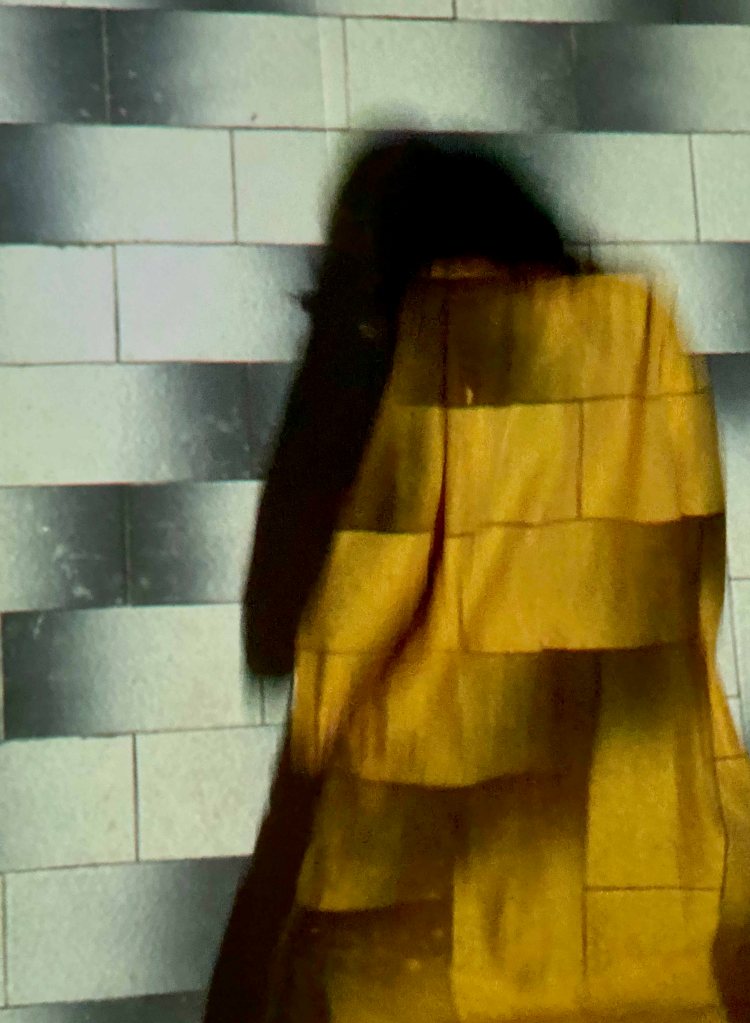
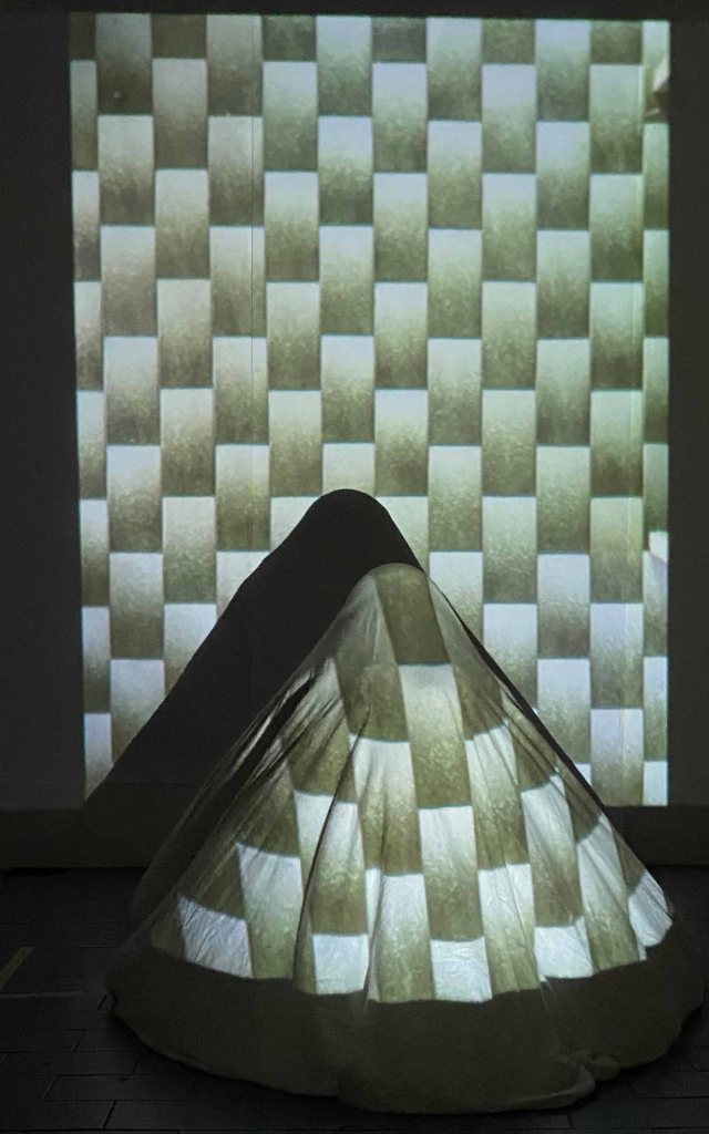
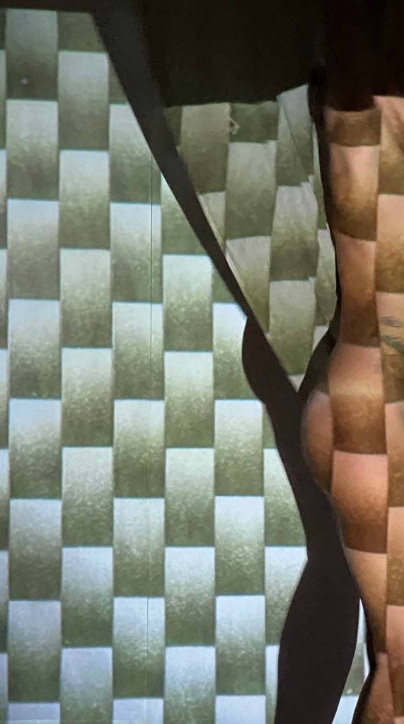


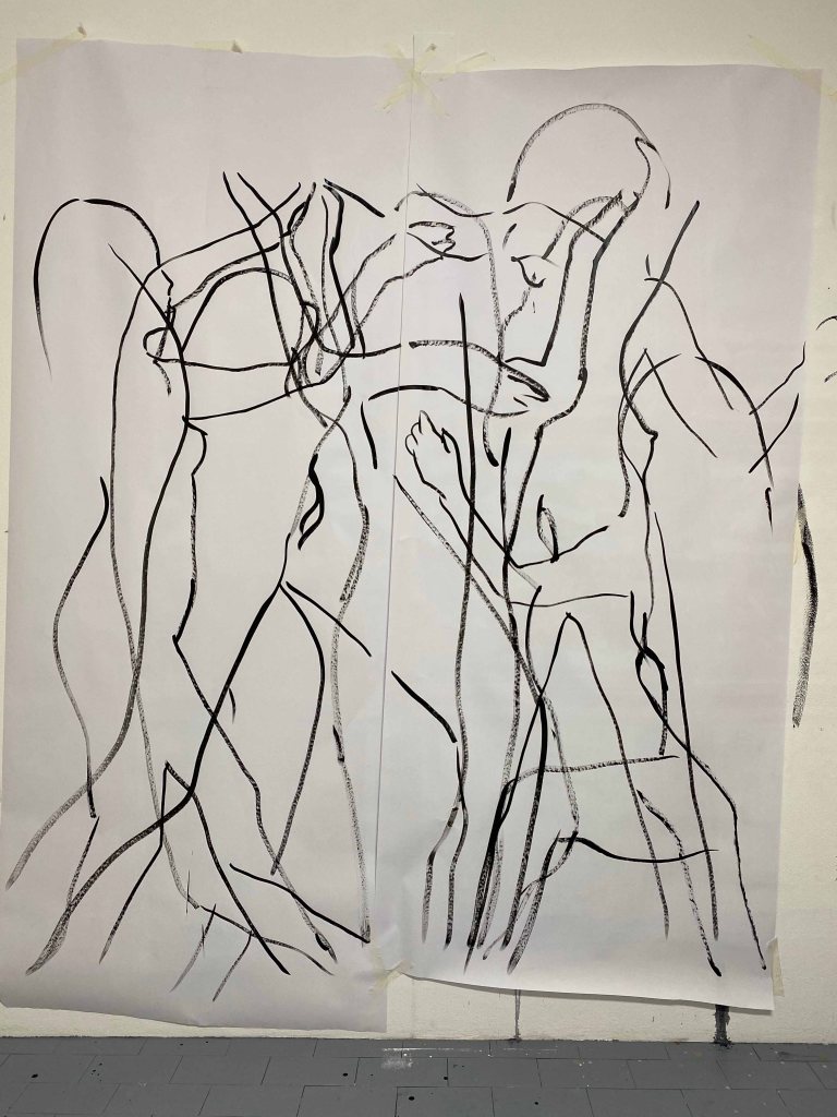
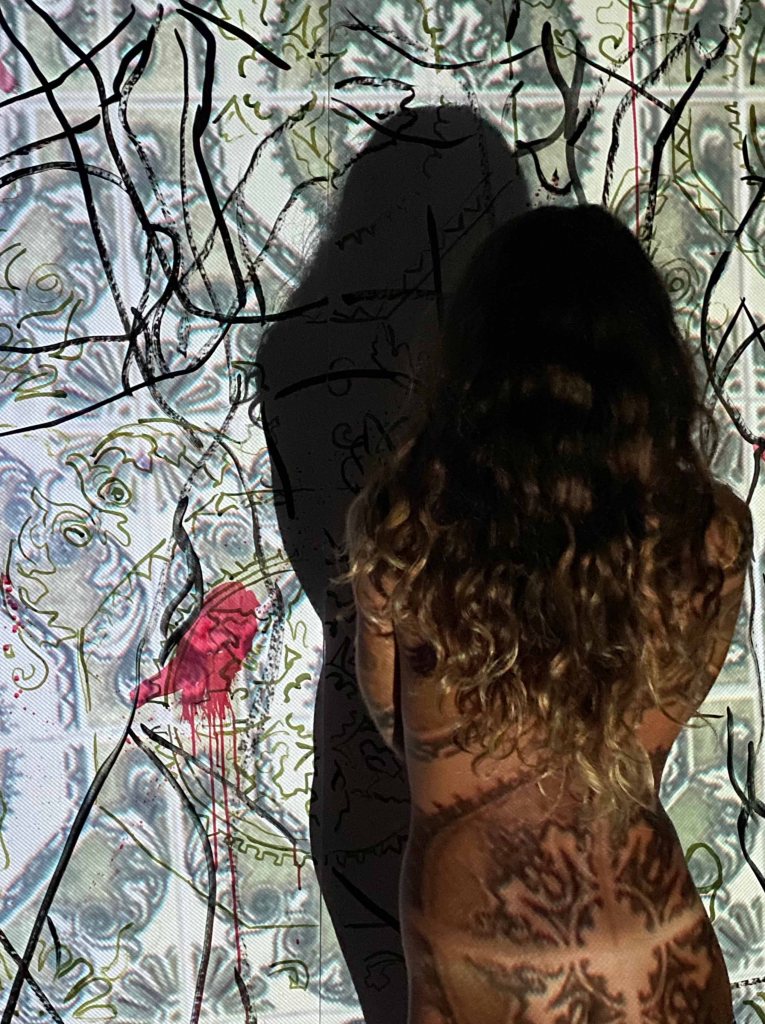
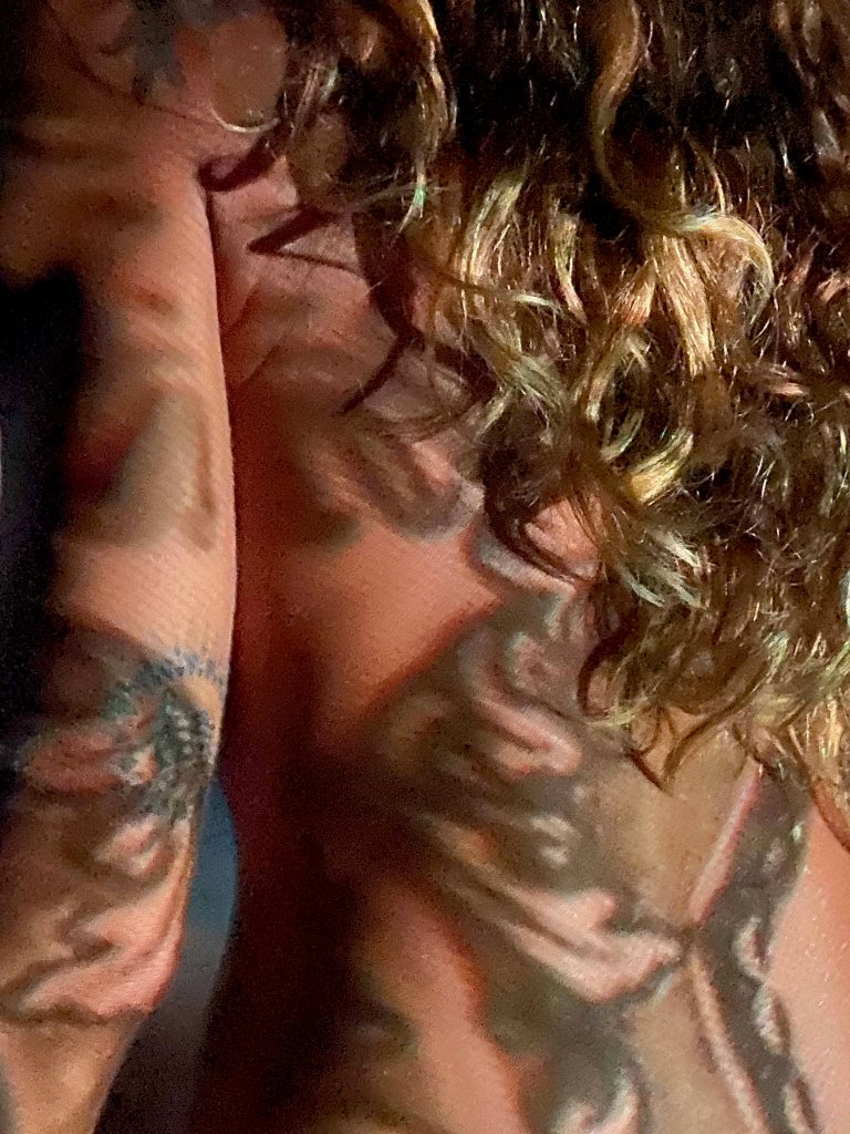


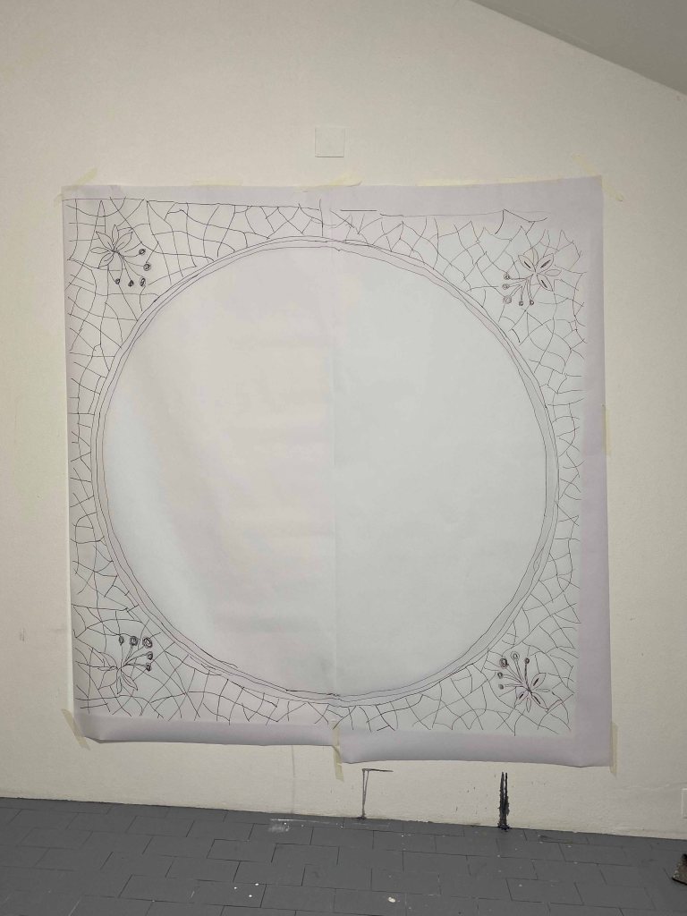

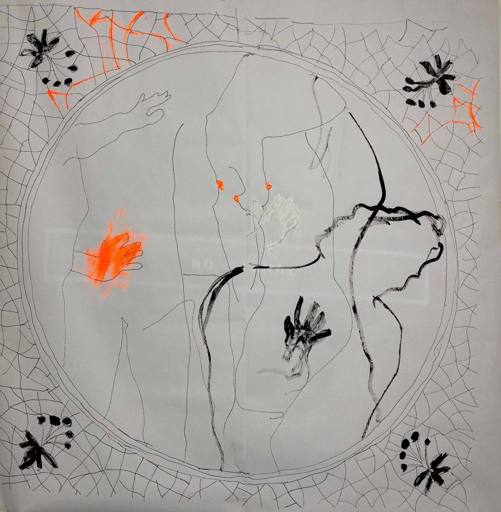
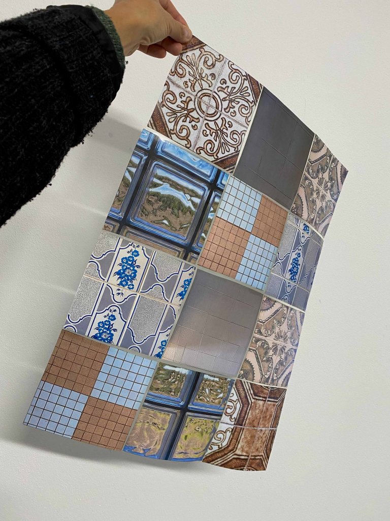

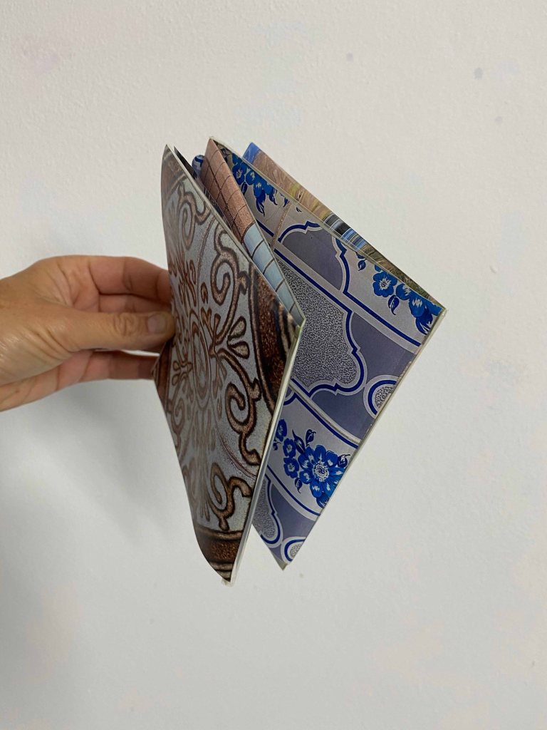

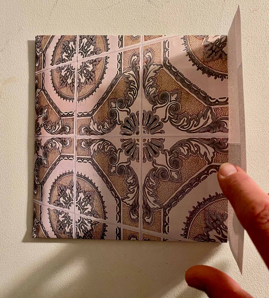

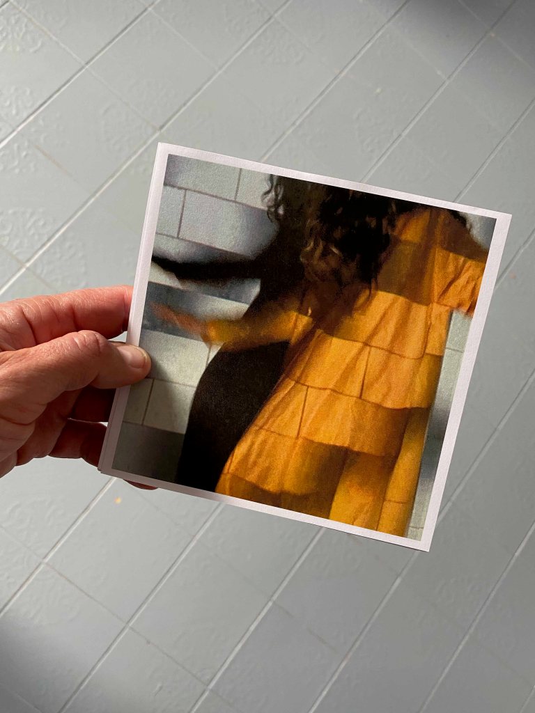
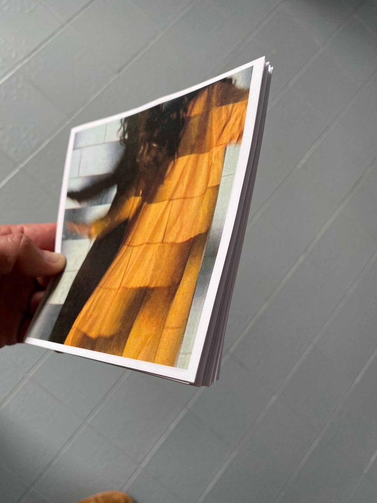
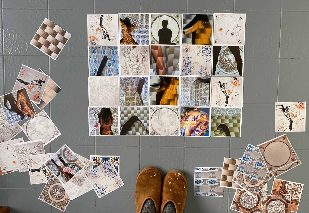
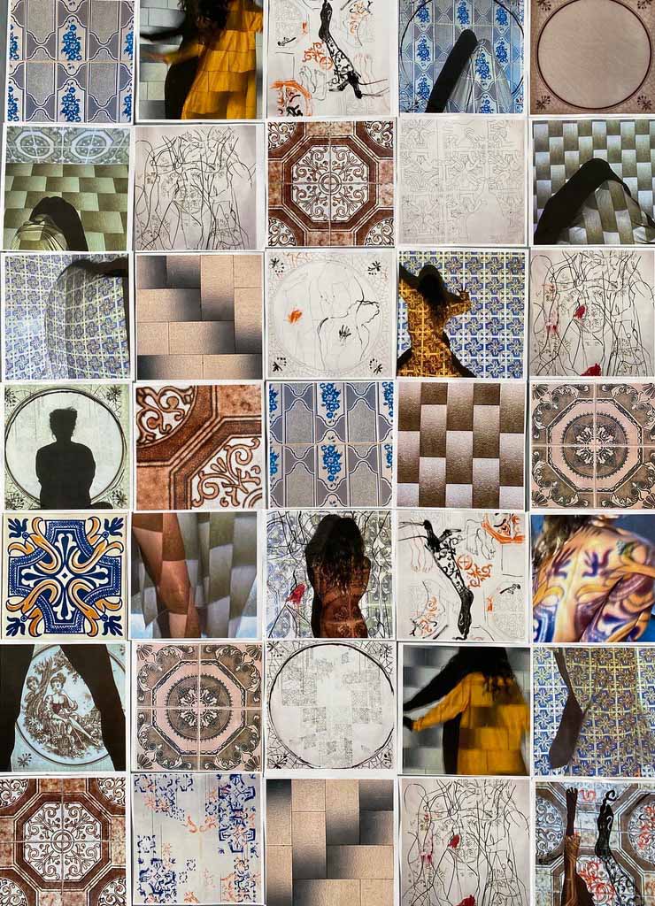
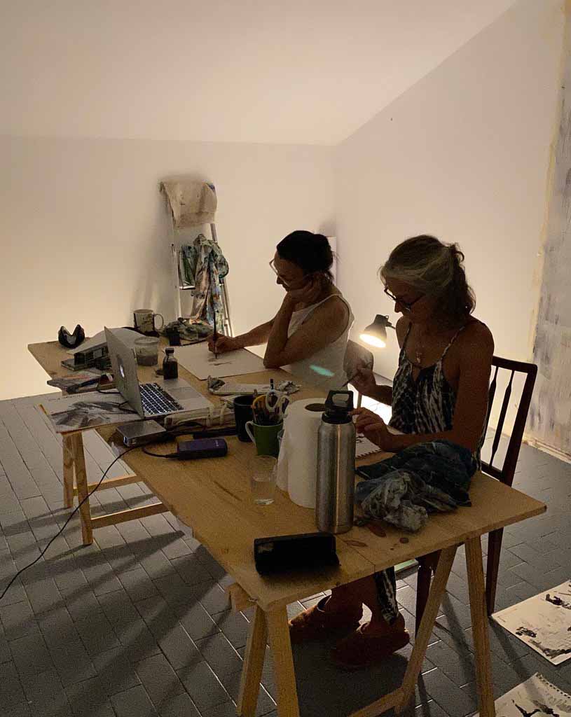
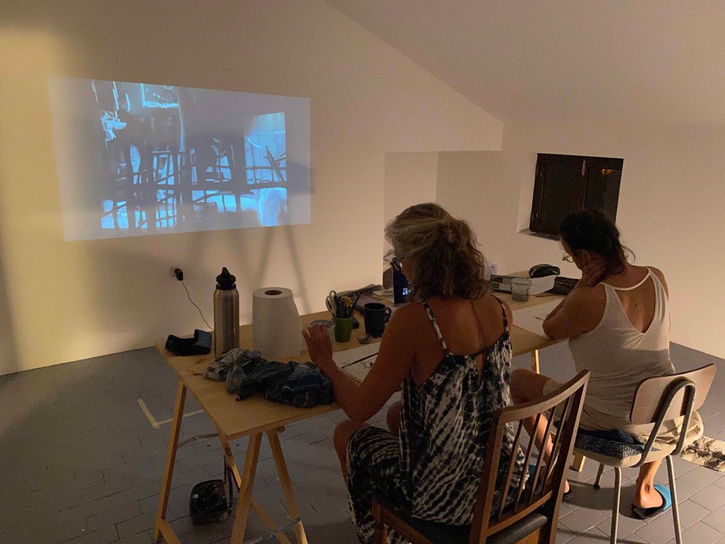

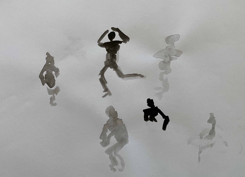
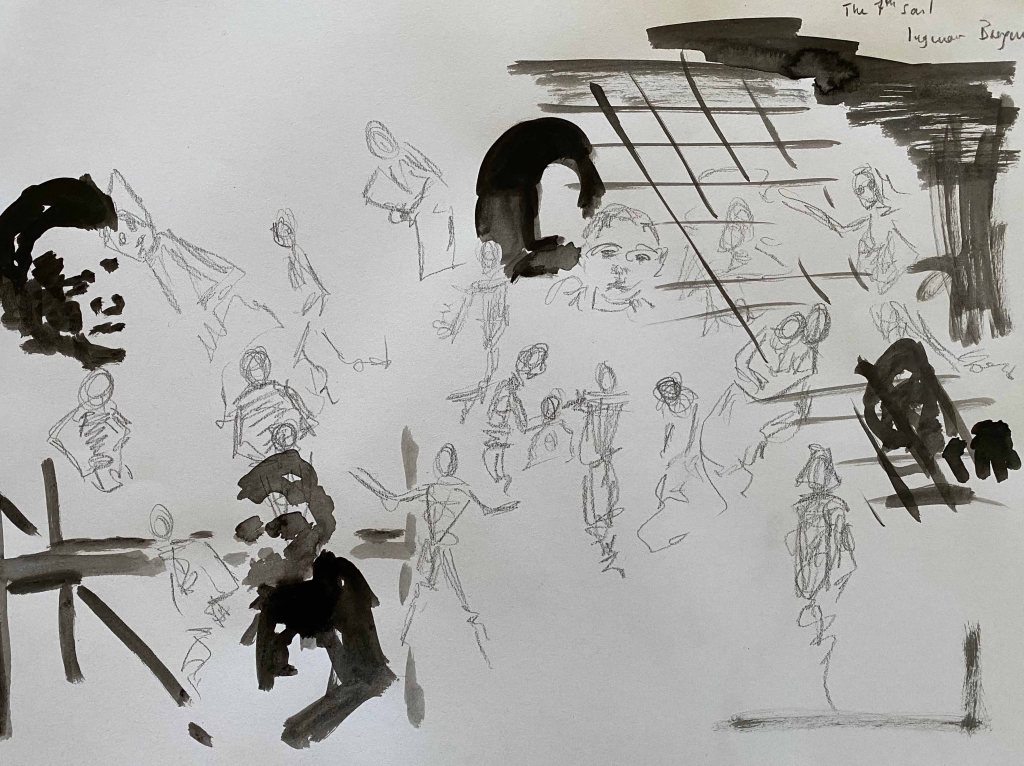

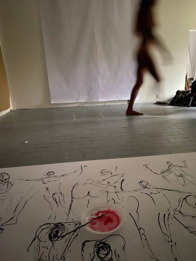
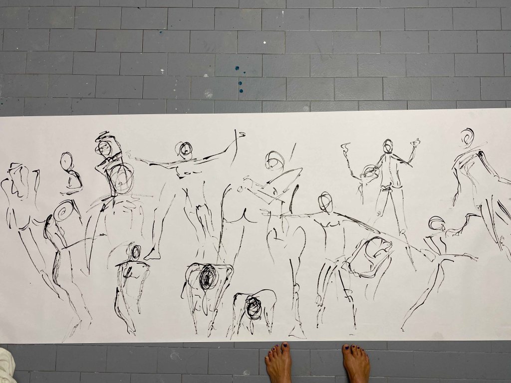
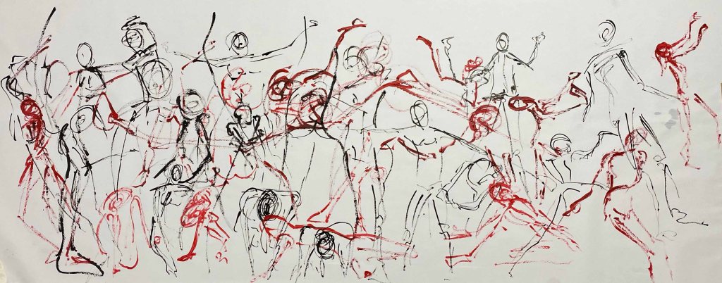
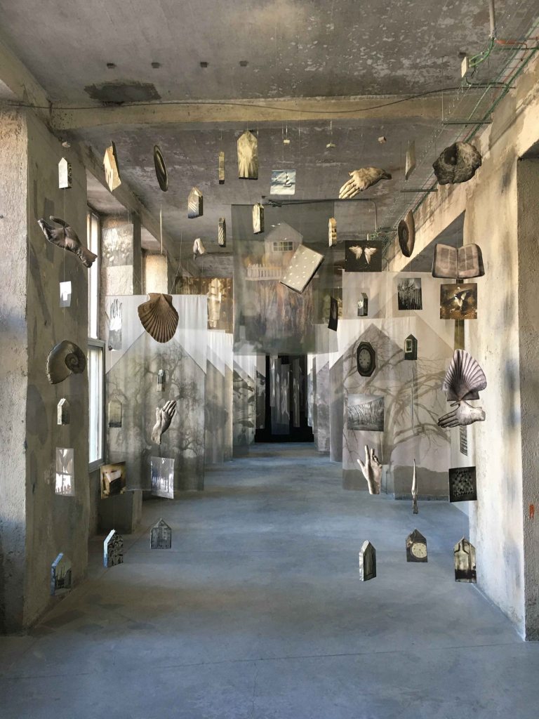
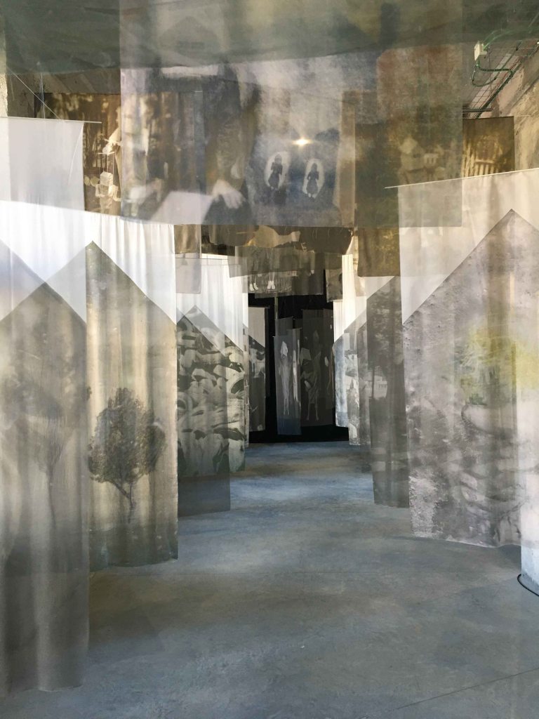
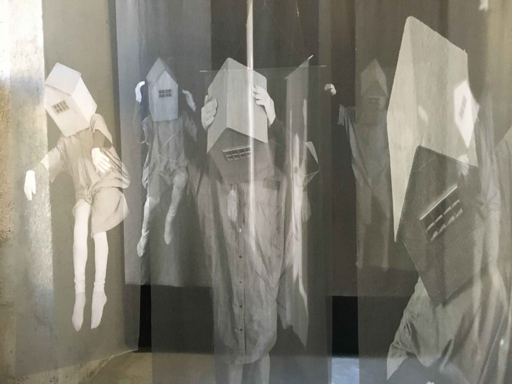 (my photos from the visit)