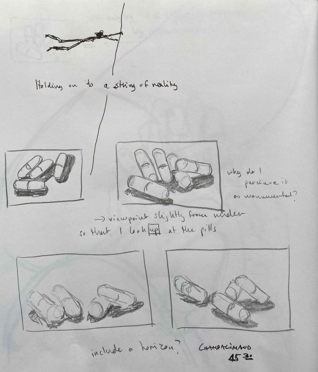
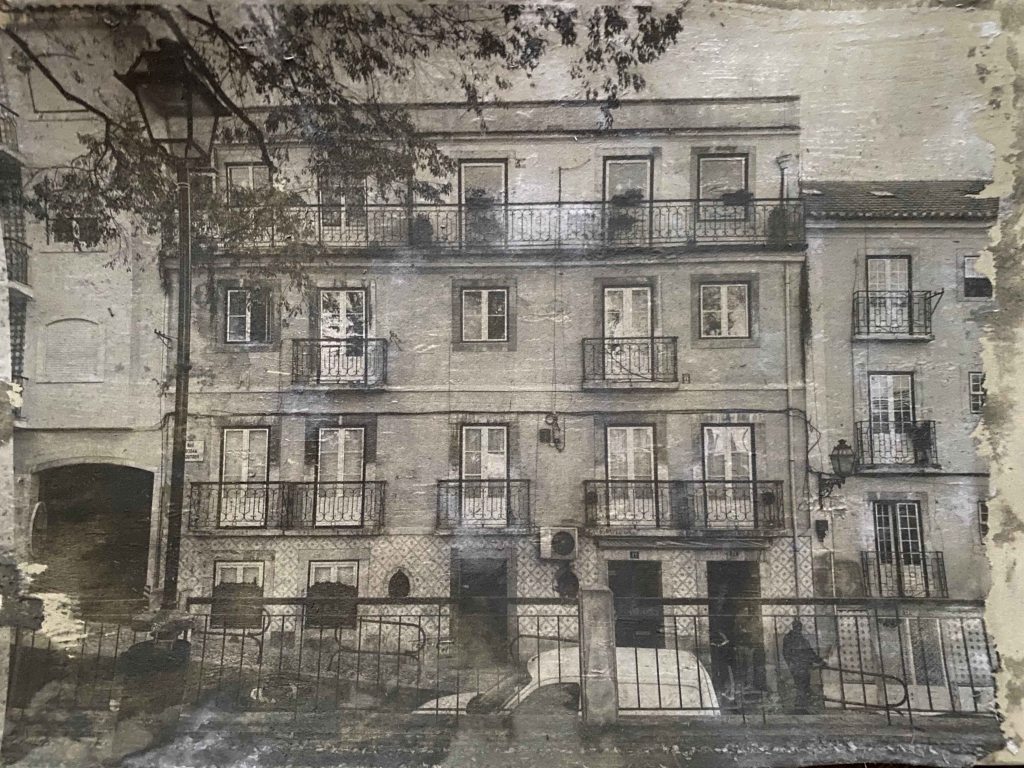
1.4 The human form

Coursemanual:

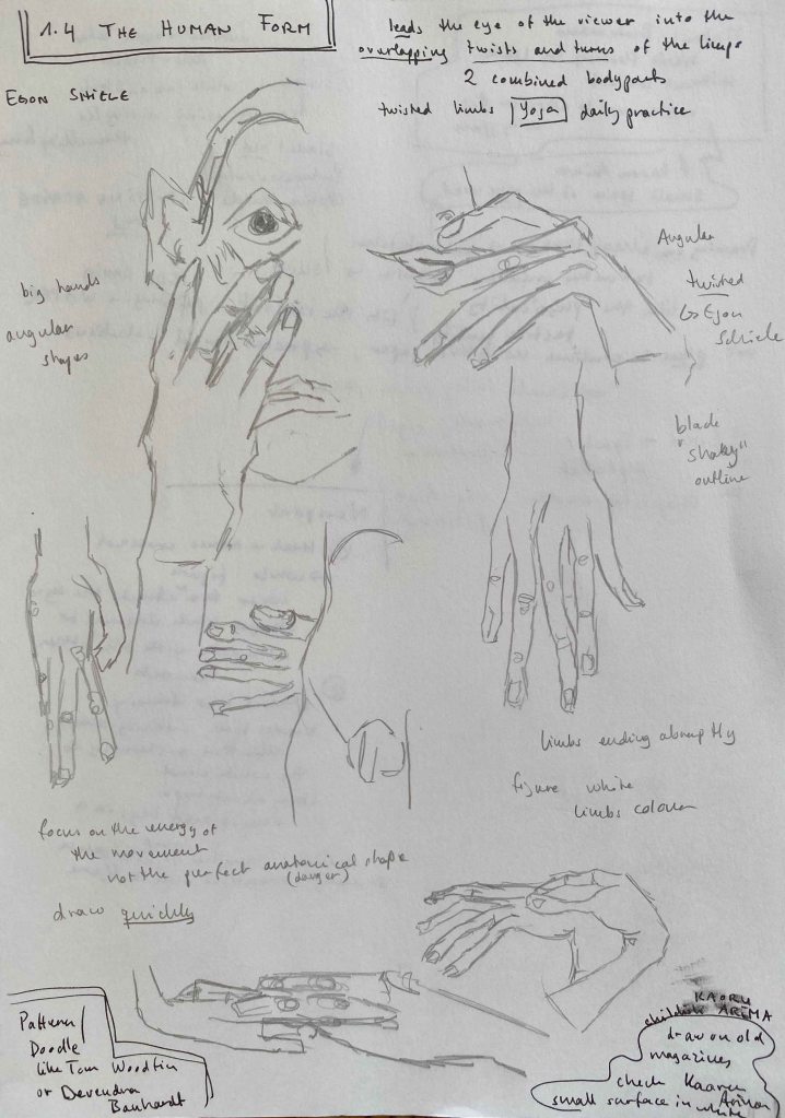
Aim: Drawing the human figure allows you to develop skills in observing underlying structure – the ‘engineering’ of the figure – combined with the natural grace and flow of an organic form. The effects of the way weight is distributed and light falls to reveal volume are hard to pin down but hard to fudge; figure drawing is like a workout for the eyes. By drawing parts of the figure, you can develop your skills in managing several inter-related elements within a drawing – rhythm, weight, volume, structure. The object of this exercise is to create a drawing which leads the eye of the viewer into the overlapping twists and turns of the limbs. Use your judgment to make the most powerful statement you can.

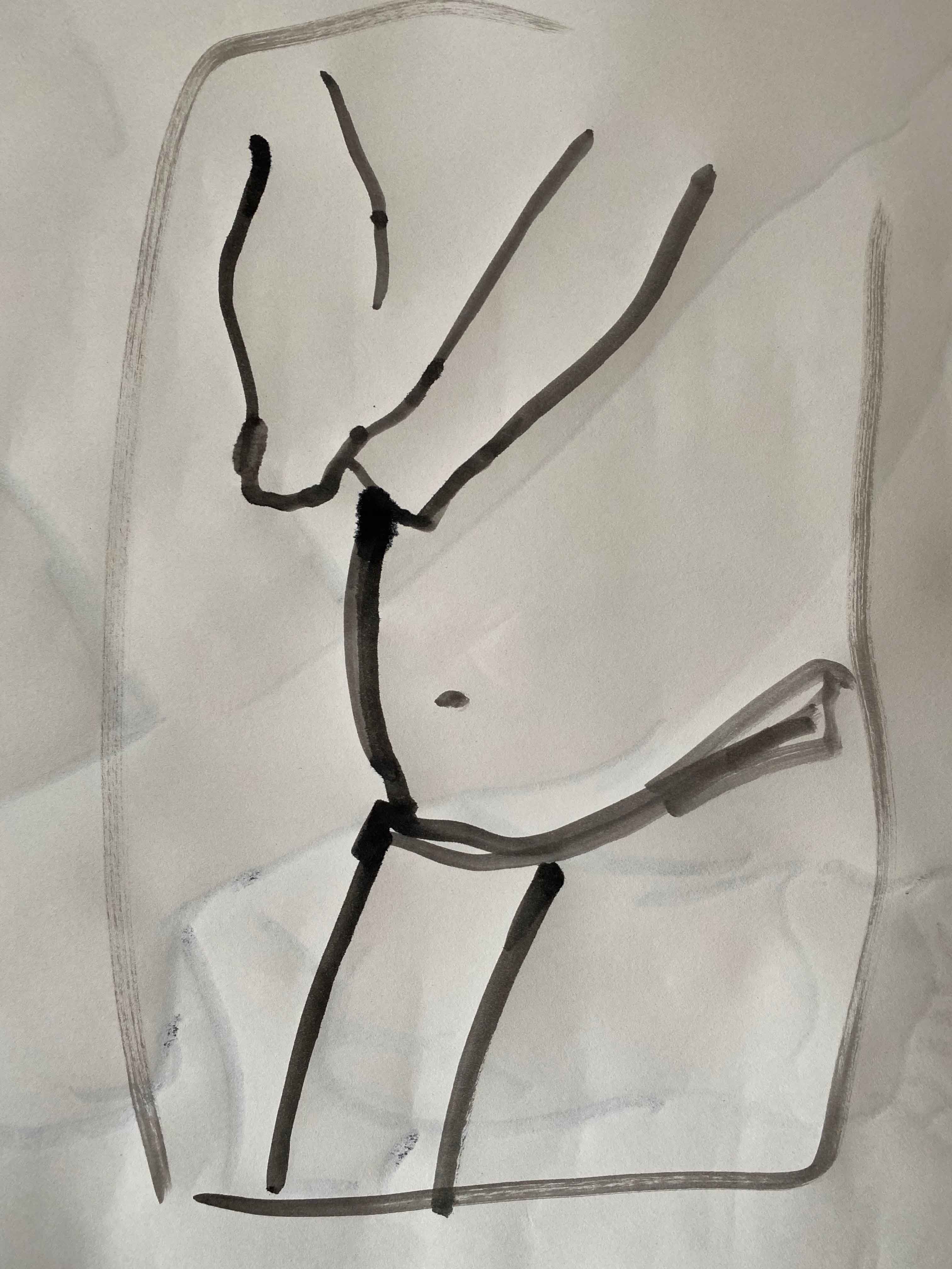
Method: Make a drawing of two combined body parts. This might be two feet crossed over, folded arms or a hand resting on a waist. Look at the curves and the rhythms set up by those curves. Look at the muscles and bones under the skin and the tension and energy they give. Make a drawing which has a curving or sinuous composition using parts of the human figure. If necessary, consider lighting the limbs with an Anglepoise lamp or similar to give yourself more dramatic tones in the manner of chiaroscuro. Don’t leave the limbs to taper off into nothing, even if that means cropping. Don’t be more tentative because you’re working from the figure; redraw and correct vigorously to achieve the most accurate drawing you can.

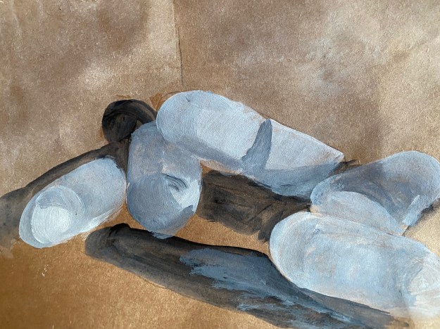
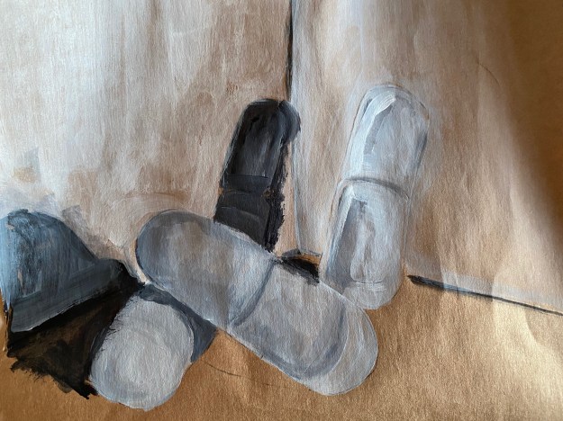
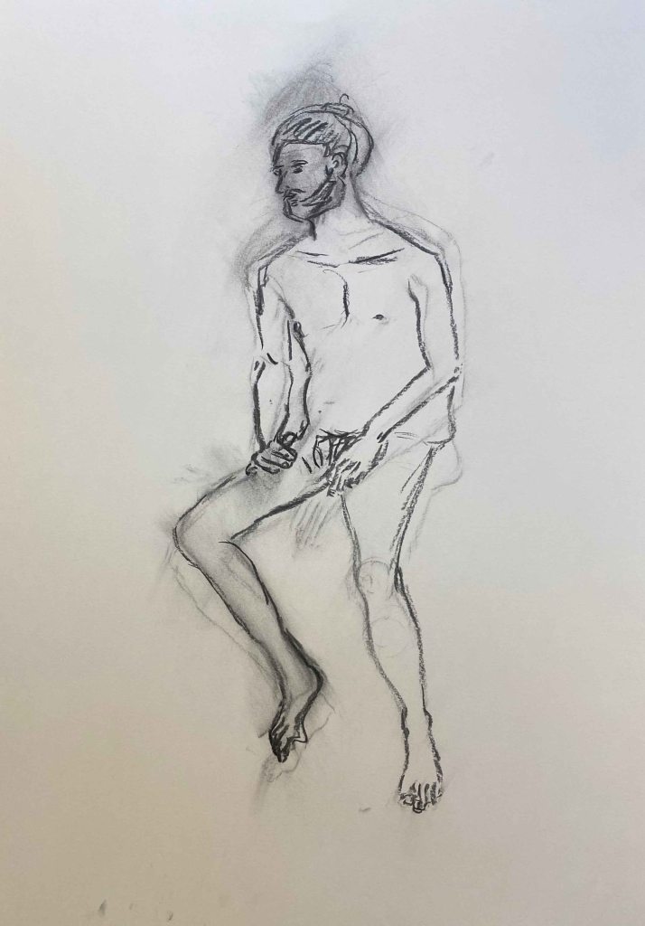
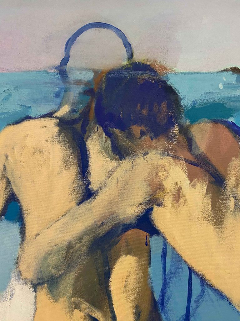
I am starting this exercise by looking for a pose with two limbs overlapping that creates interesting forms, drawing the eye of the viewer in.

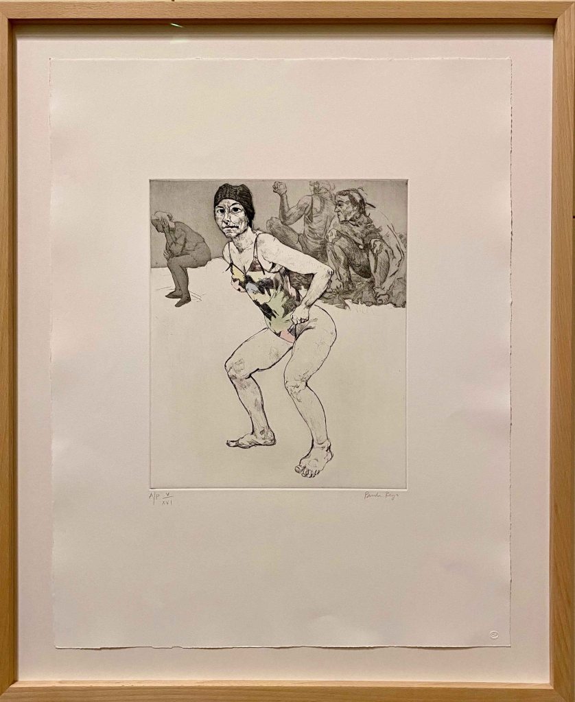
I think it is the wording “twists and turns of the limbs” that immediately guide my thoughts to Egon Schiele’s selfportraits, where there is often a twisted, tense quality of the limbs. He often emphasizes the hands in angular, twisted shapes and is not afraid of letting limbs taper into nothing. There has been quite a heated discussion on the OCA email group about Schiele’s work, but despite his questionable morale, I am still a great admirer of his art.

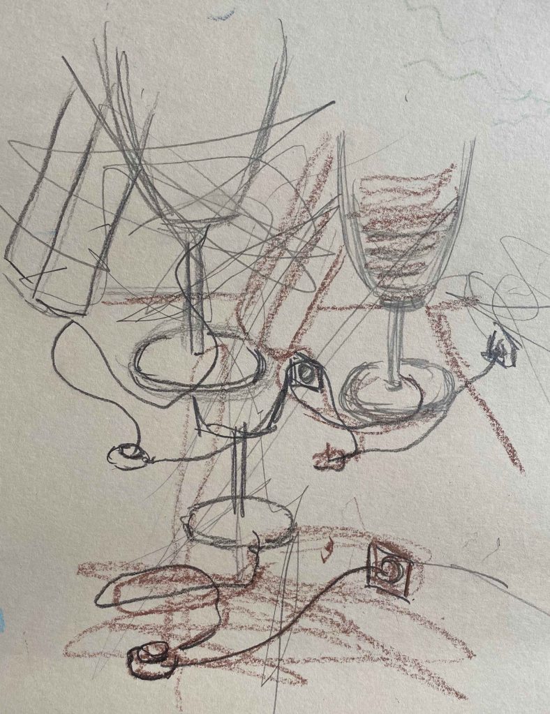
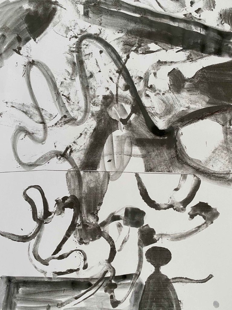
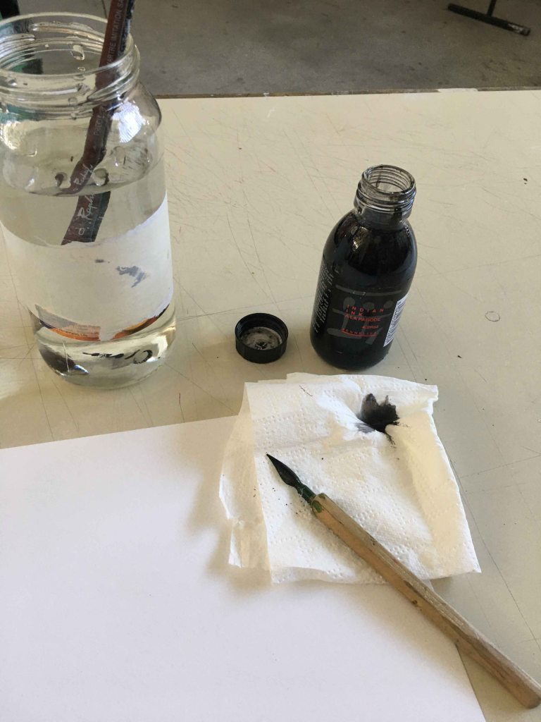
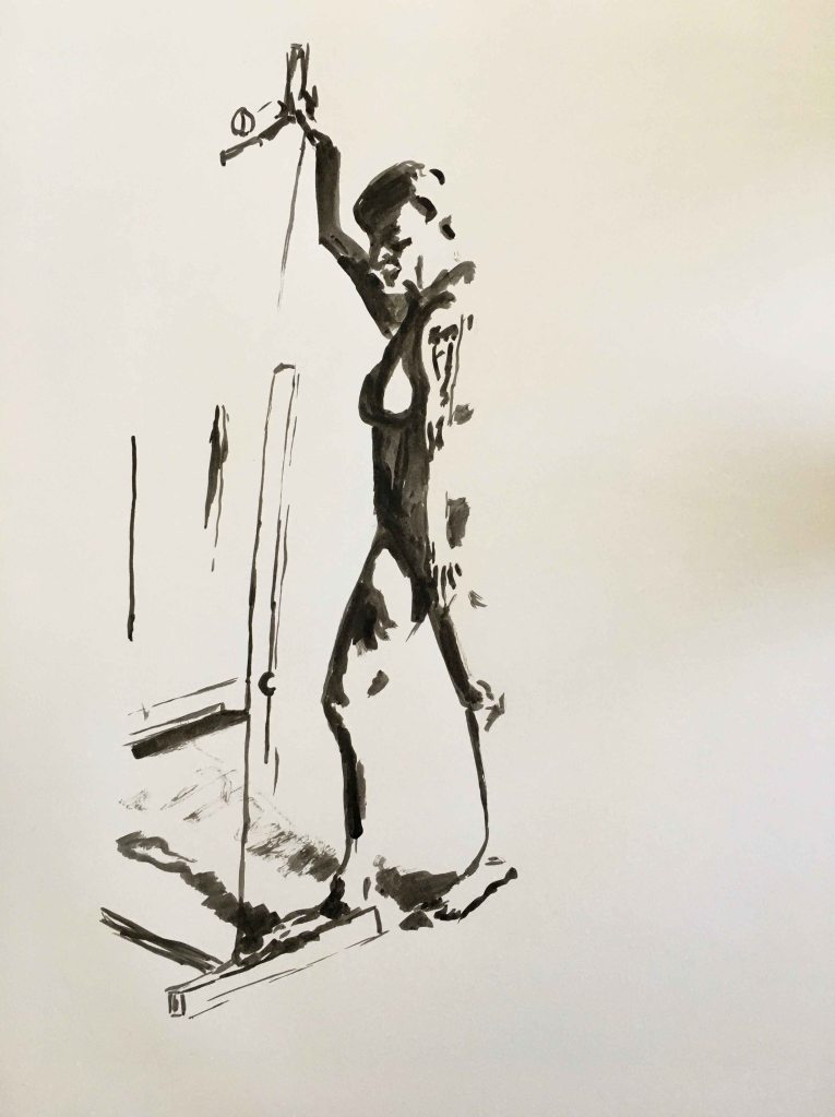
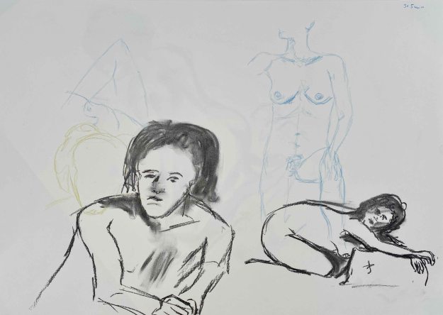
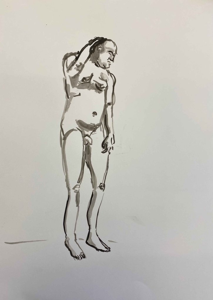
I want to draw a quick series of poses , focusing on the dynamic of the poses more than catching the perfect anatomical shapes. I prepare a long roll of cheap paper from IKEA and place myself in front of the mirror with Indian ink and brushes at the ready.

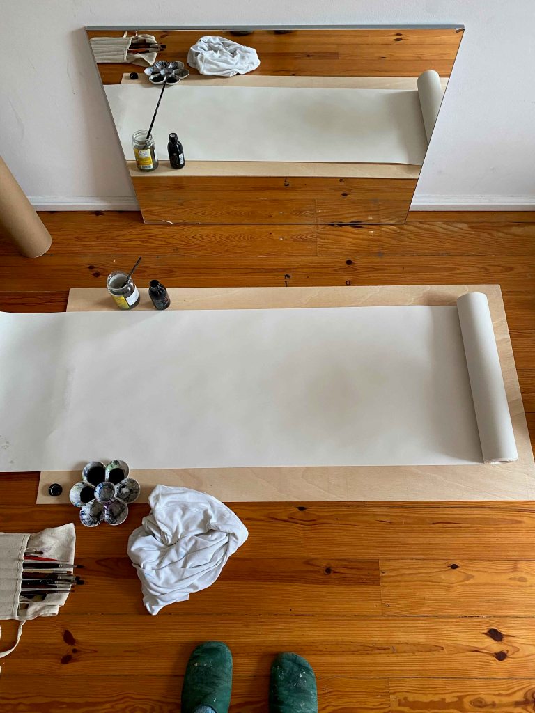
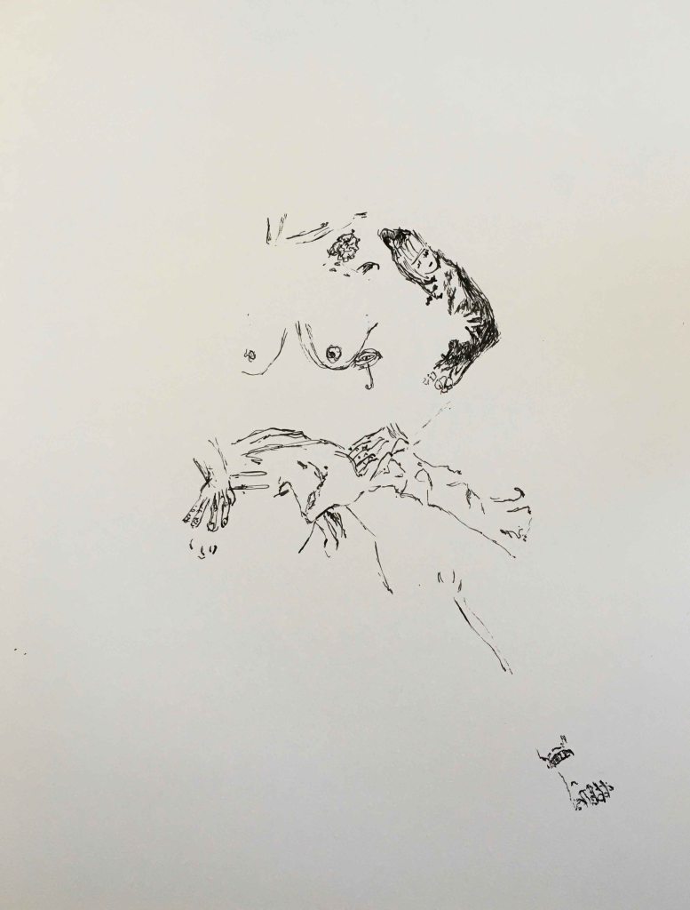
It is quite confusing at first to draw from the mirror, but I soon get into the flow :

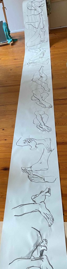
Although the thin paper gets quite wobbly from the ink, I decide to turn it over and continue sketching on the reverse:

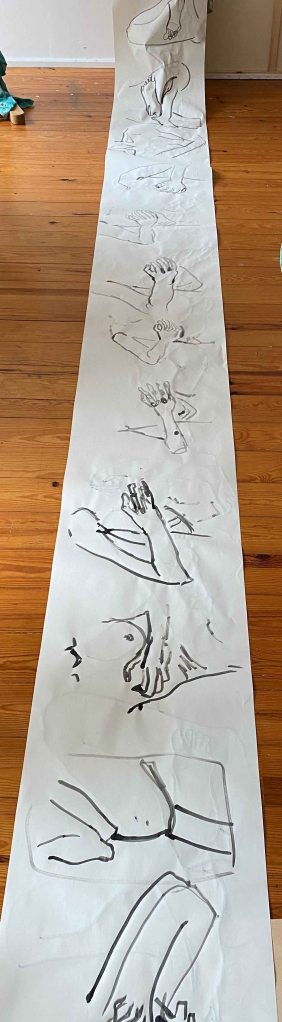
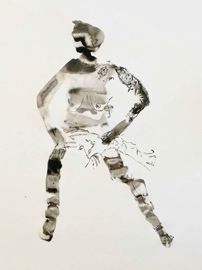
I pick out a few poses that I find most interesting:

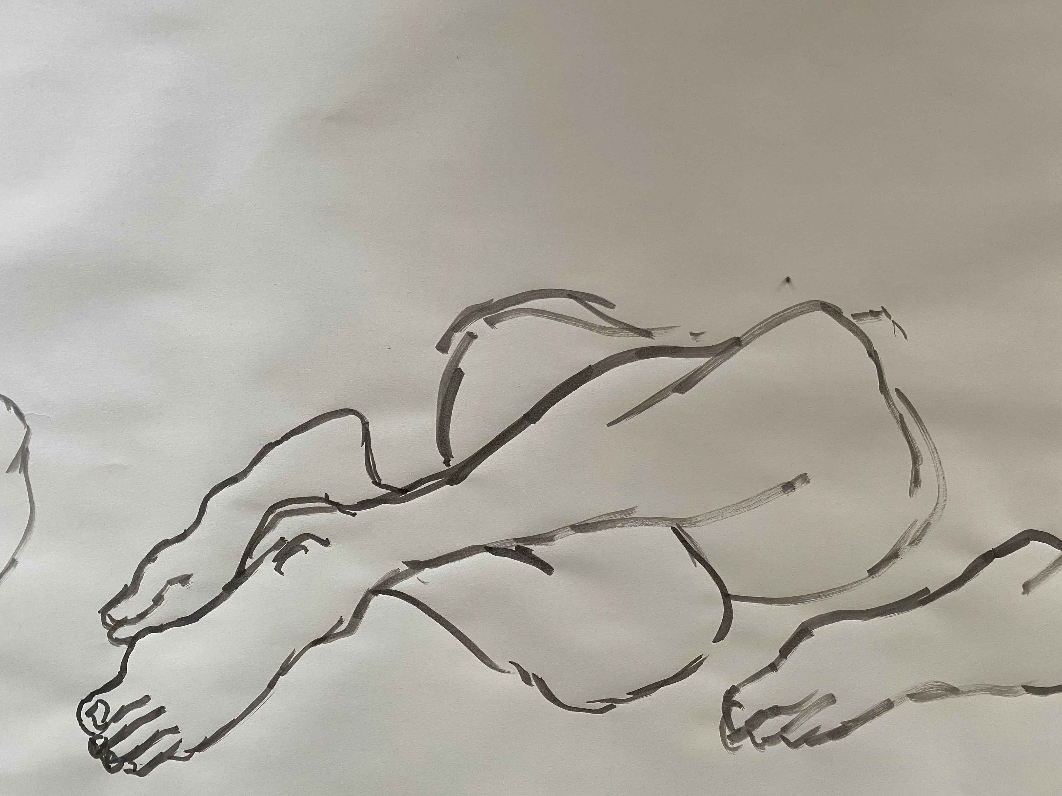
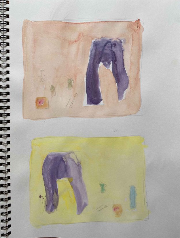
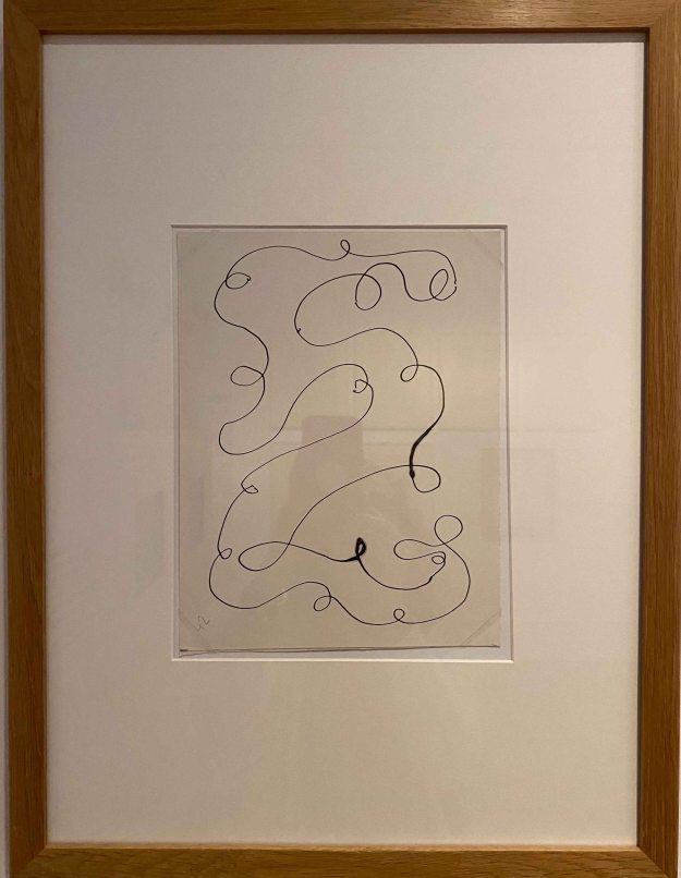
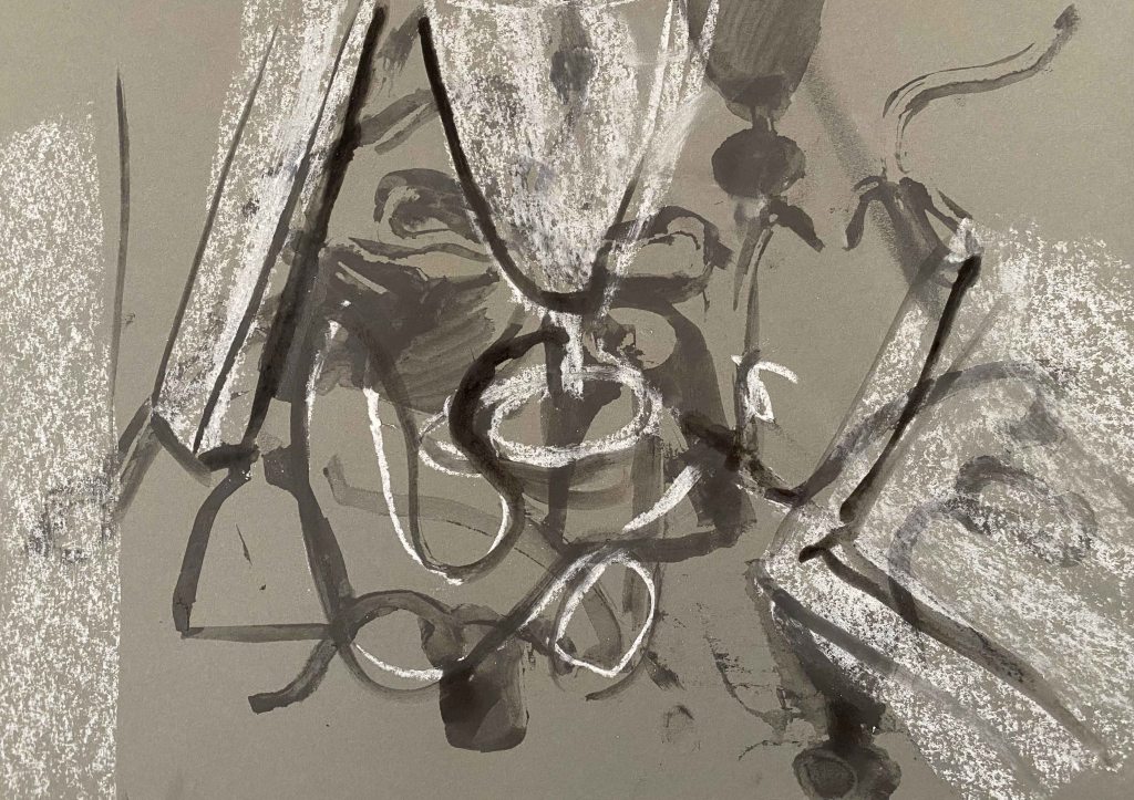
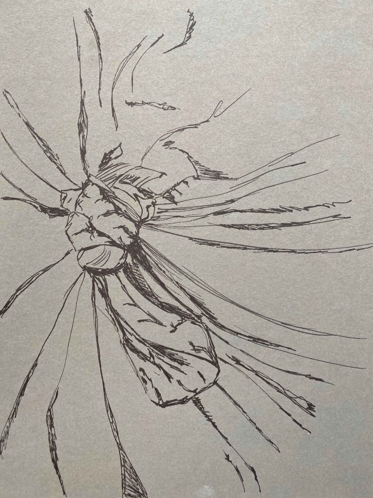
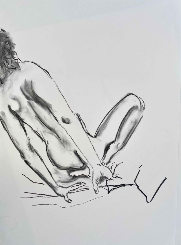
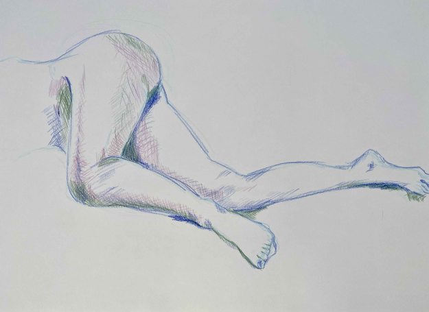
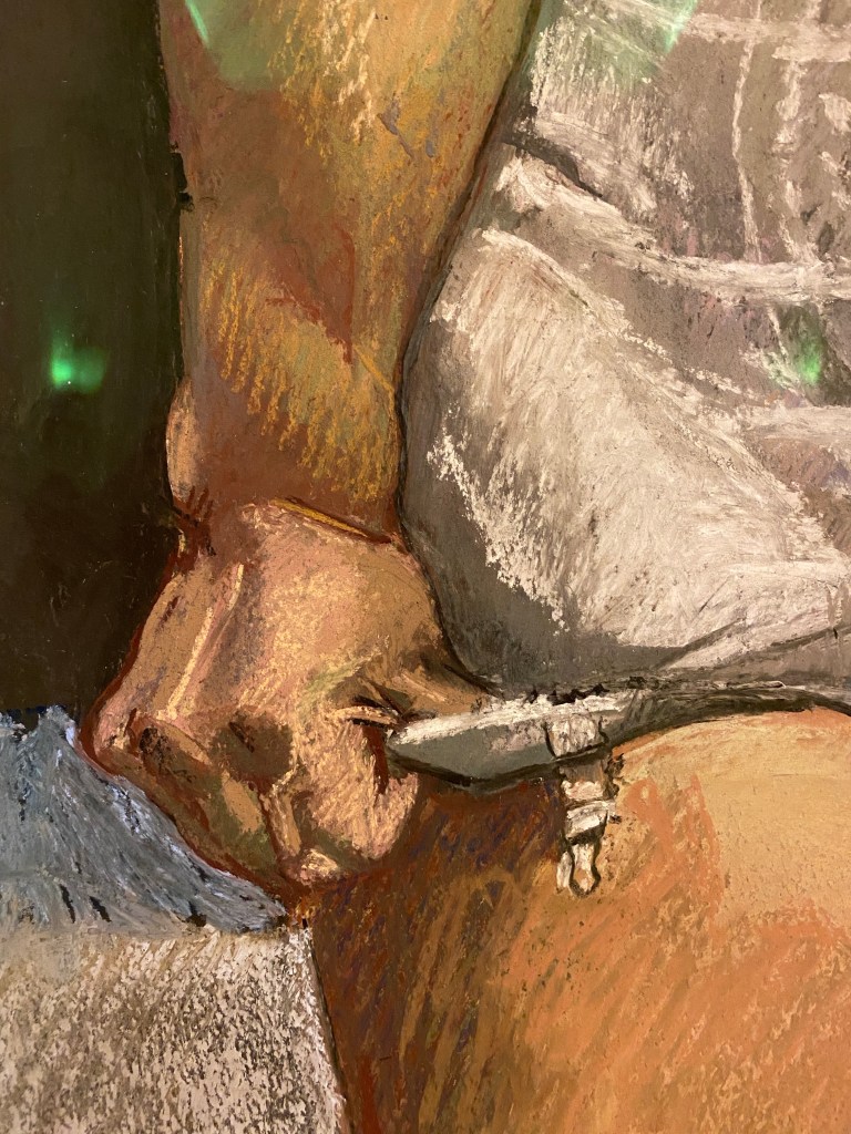
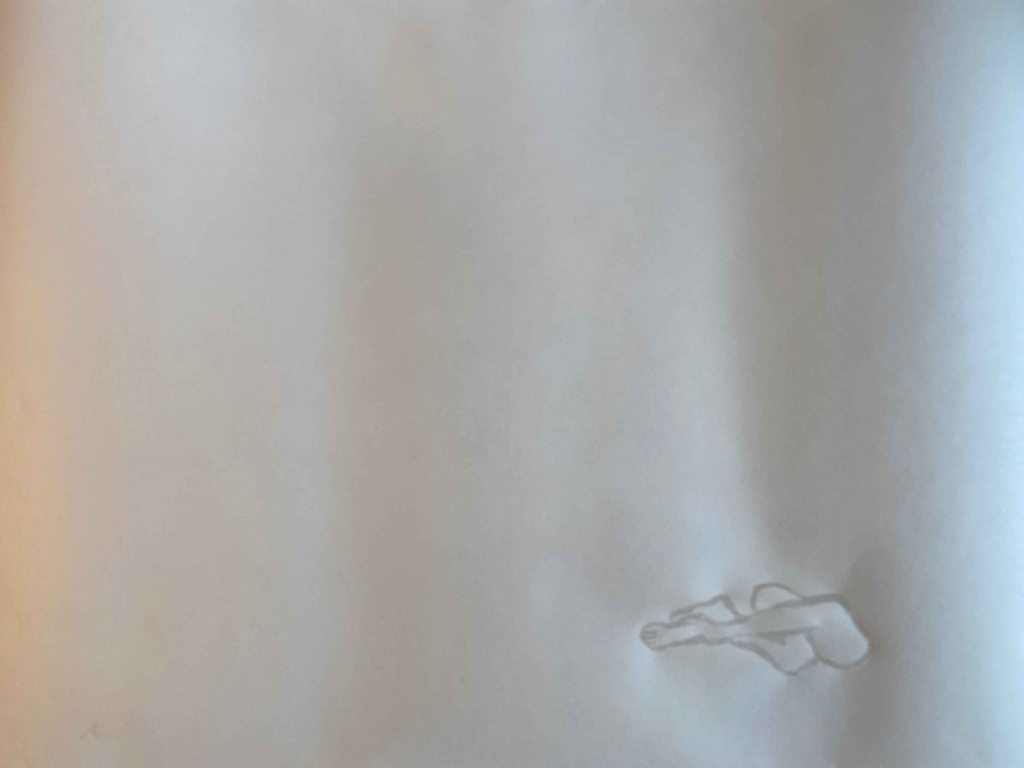
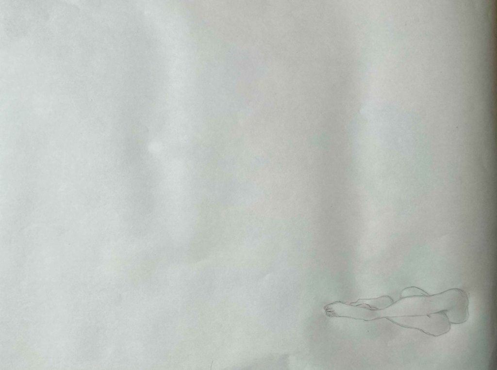
I decide to continue with the two legs, one folded backwards and the other draped over. This pose is at the same time simple and a little intriguing, it takes an extra second to realize how the legs are folded. I like the shape of the whole, forming something like a symbol, close to an infinite symbol.

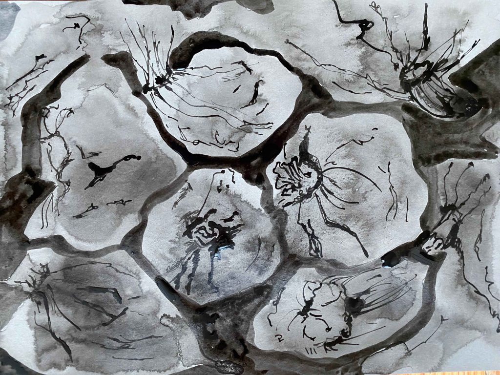
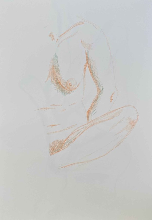
Although I initially started drawing on the cheap paper roll just for quick sketches, I notice how the wrinkles of the paper make me think of skin. I like the physicality of this, the tactile quality it adds, and decide to continue drawing on this too thin paper.

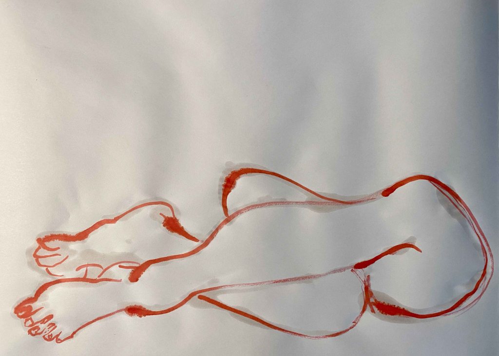
I start experimenting with a Winsor&Newton Vermillion ink. I draw in water first and then in red, so that it bleeds a little. This drawing in red reminds me of Louise Bourgeois’ inkdrawings.

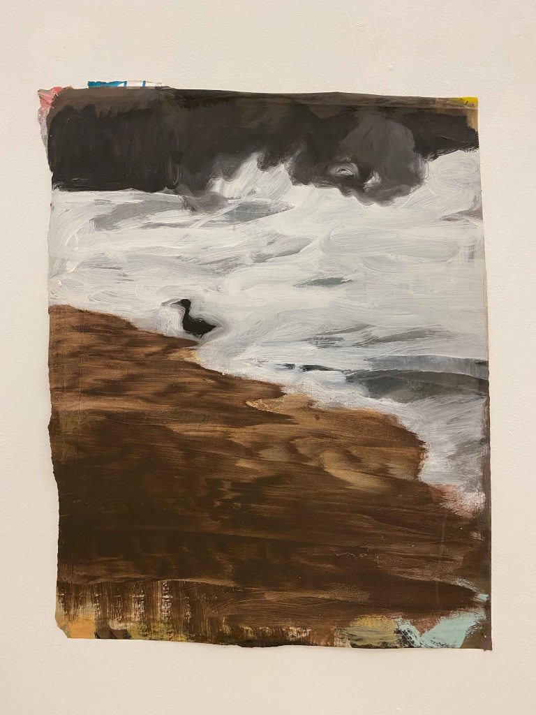
Using the water to create more wrinkles, also reminded me of a drawing by Portuguese artist Ilda David that I really liked from the book “Ilda David from dark to light”, drawn only in water on white paper:

(Image from: Faria, N (2016). Ilda David Do Negro a luz, Desenhos do 1986-2016. Portugal: Dokumenta Fundacao Carmona e Costa.)

This drawing is so simple and so effective. I try drawing my entwined limbs in water.

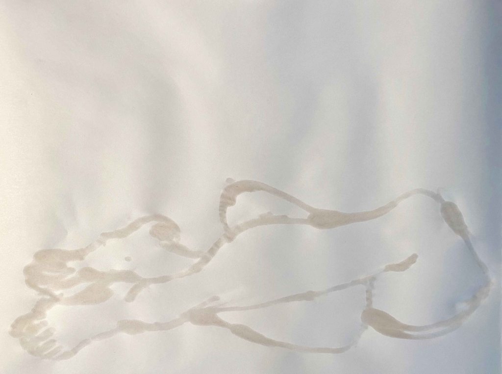
I find that my pose looks like a sign or a symbol. I will draw it small, leaving a large white page around tell the story and let this mark be a symbol.

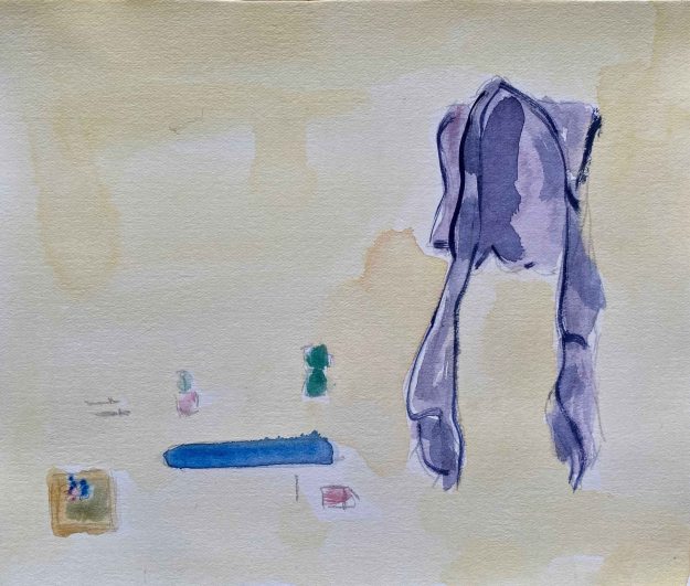
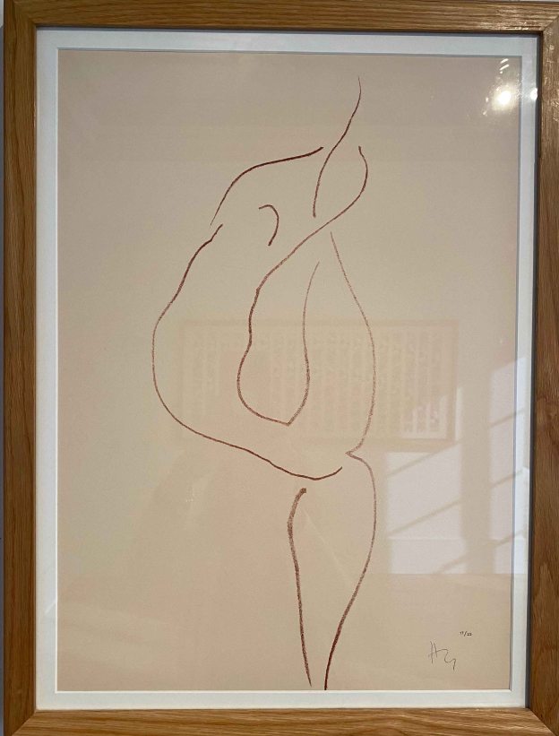
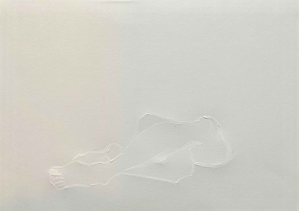
I find it effective how this very subtle mark sits on the page, but I am not happy with the shape. I decide to try and draw in pencil first and then water

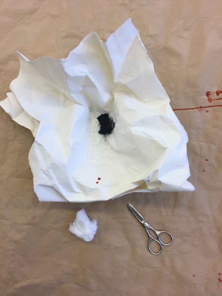
This drawing is much better! But when i try to erase the pencil (close up)…

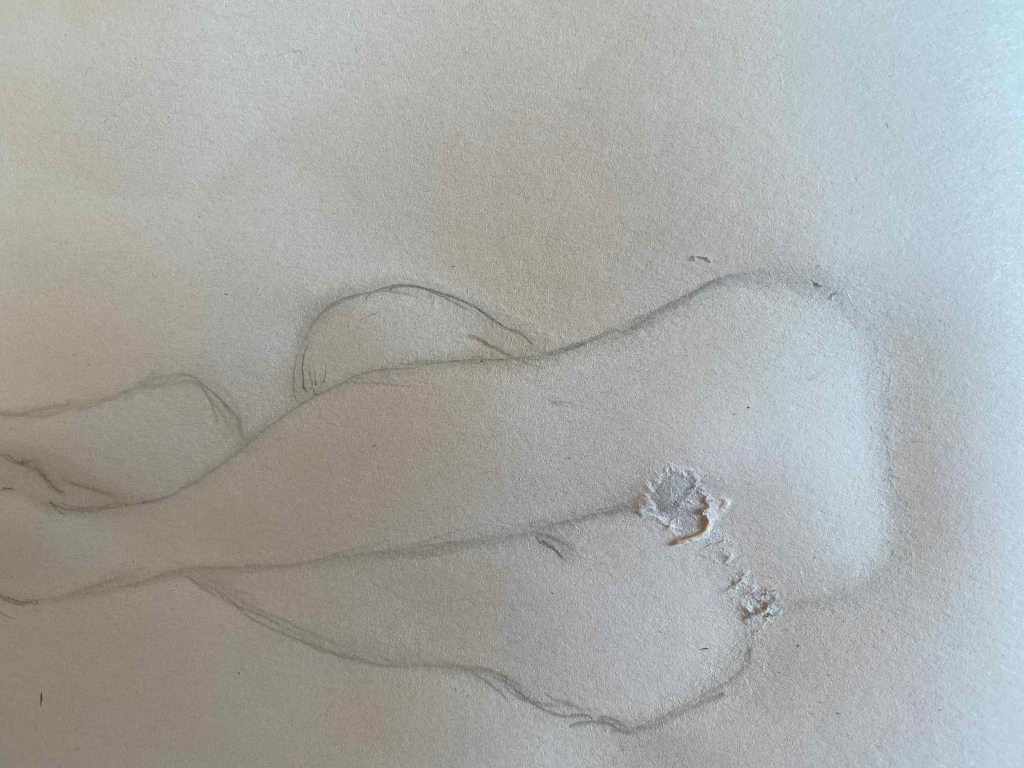
…I rubbed a hole in the paper…

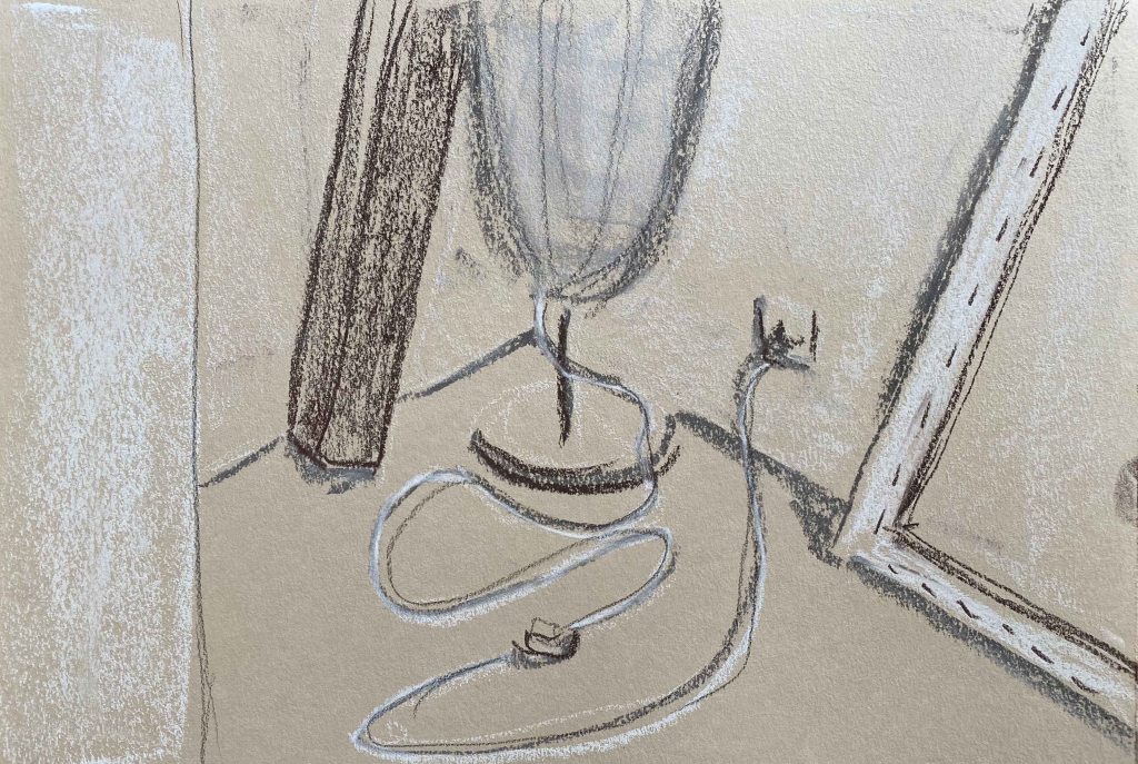
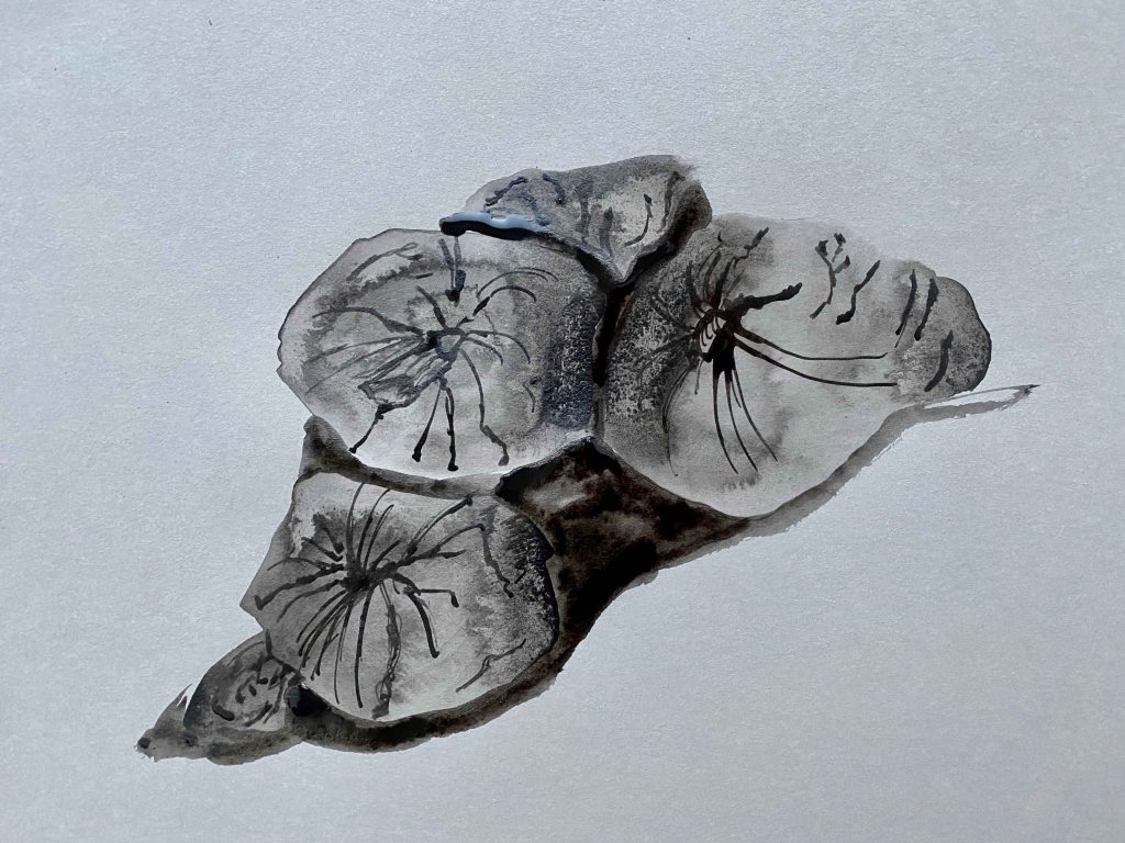
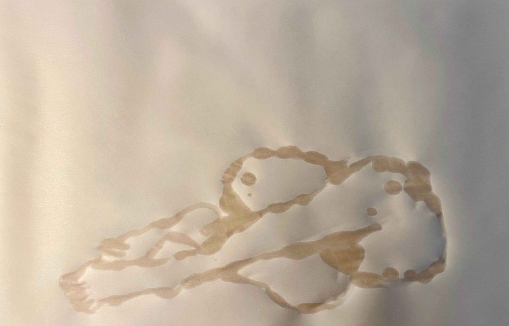
I decide to try this proportion of the white page and the small symbol with a brown ink too:

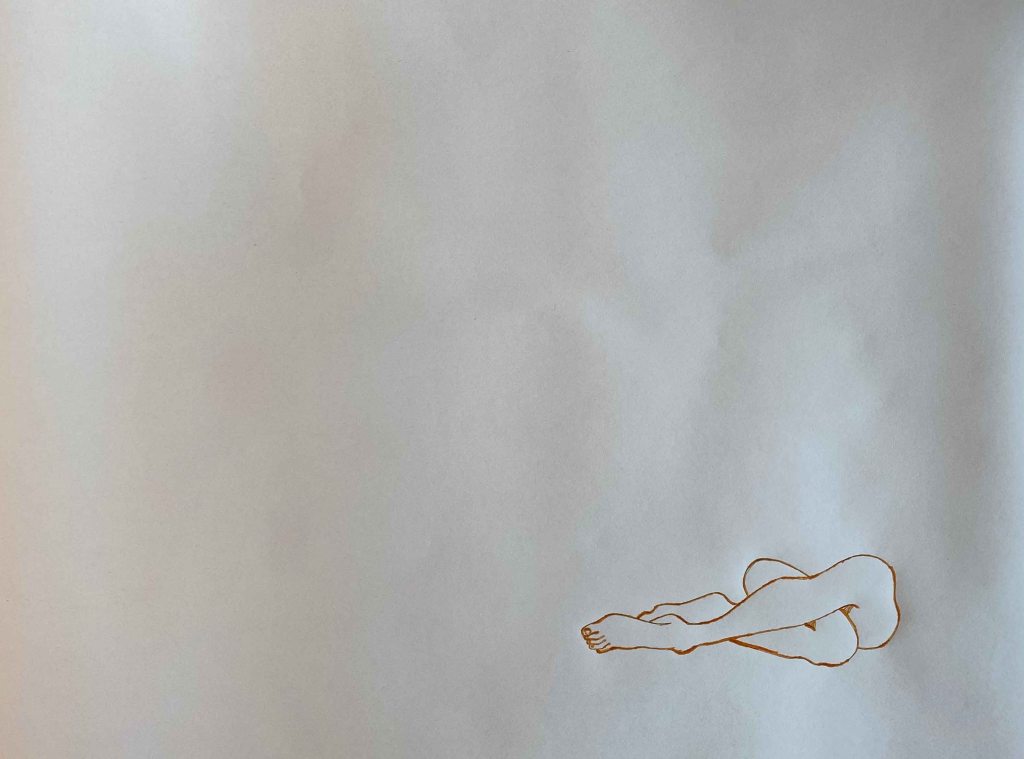
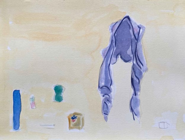
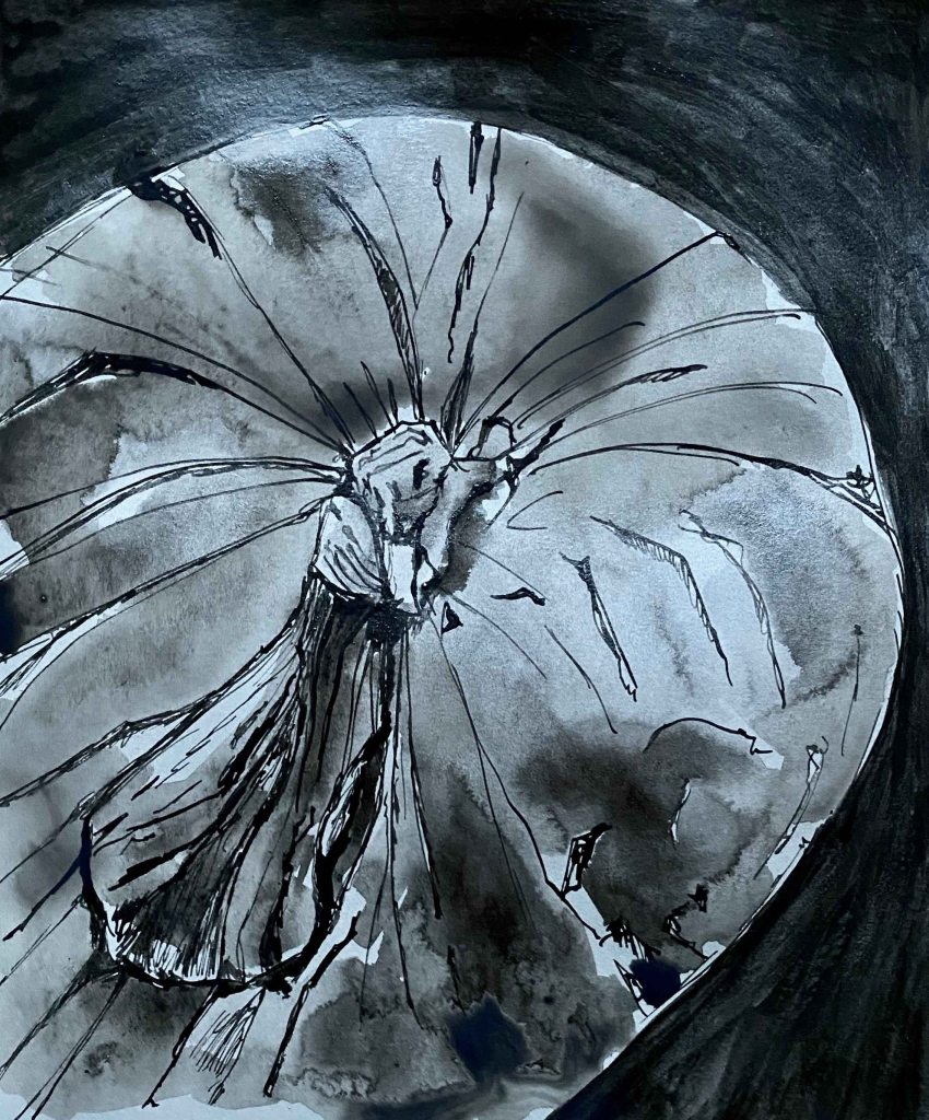
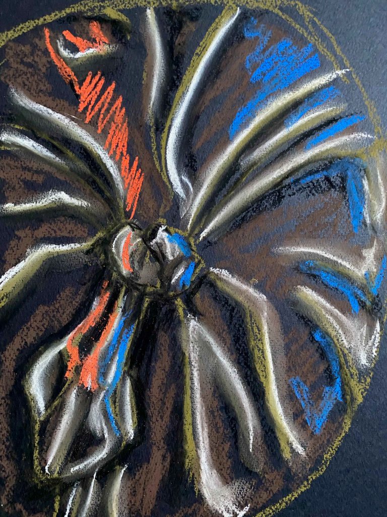
Here the drawing went well, but it is not effective with the brown ink. It needs to be either really subtle, like the water, or stronger on the page. I colour in the brown ink with a black Indian ink and add vermillion details in a cubic pattern:

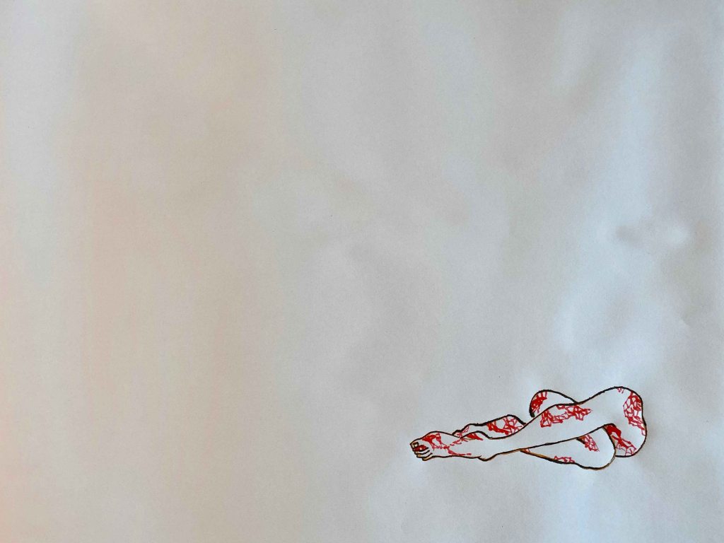
This drawing works again. It has enough interest to sit so slightly on the large page and still let the page be in balance.With this pattern, the legs have a snakelike character.

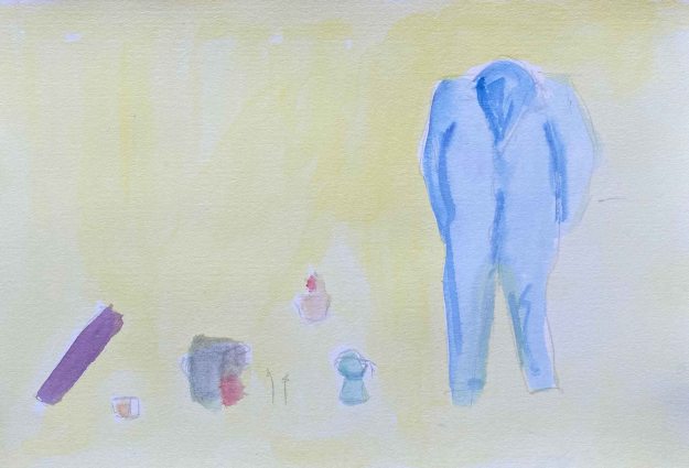
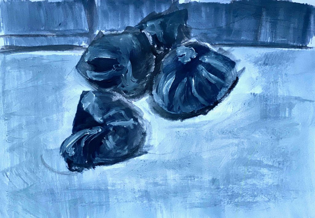
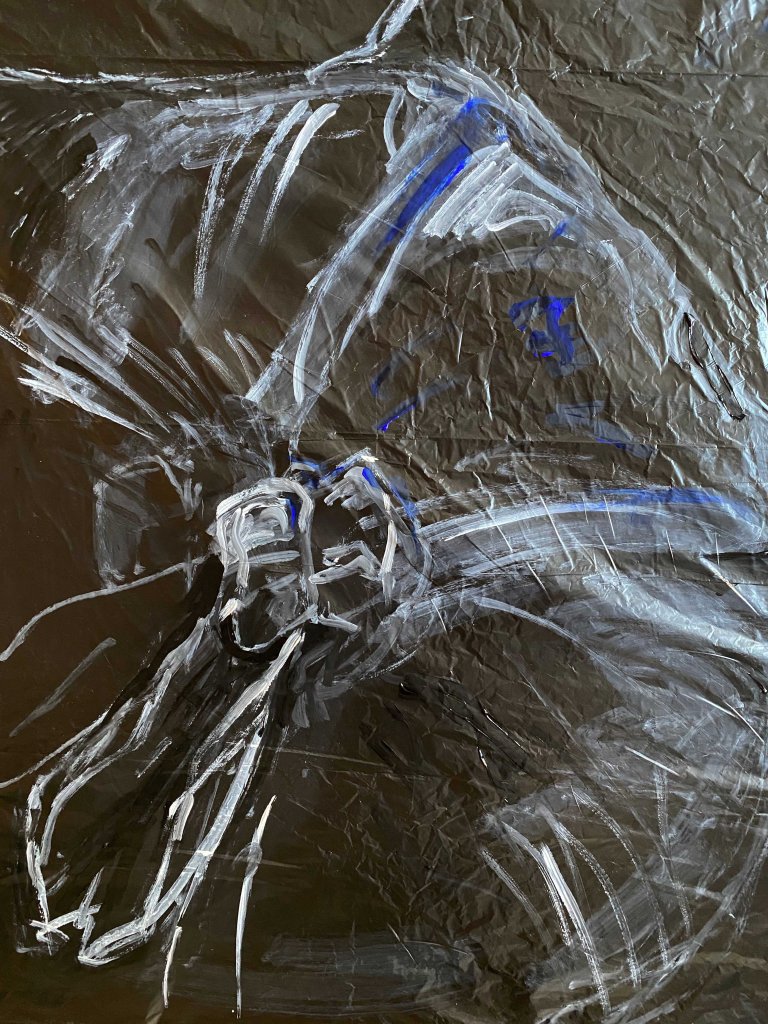
I am still curious about exploring the very subtle though, and decide to try out drawing the same pose twice again, with Winsor& Newton white ink on a Fabriano watercolour paper.

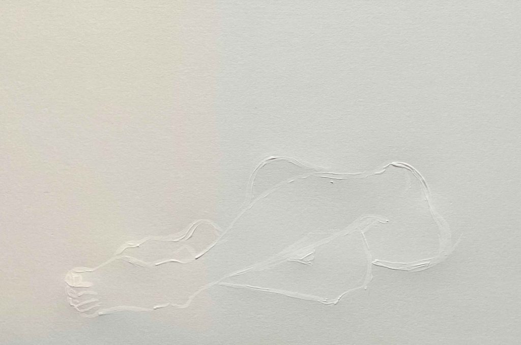
This could work, but is not as appealing and subtle as using only water.

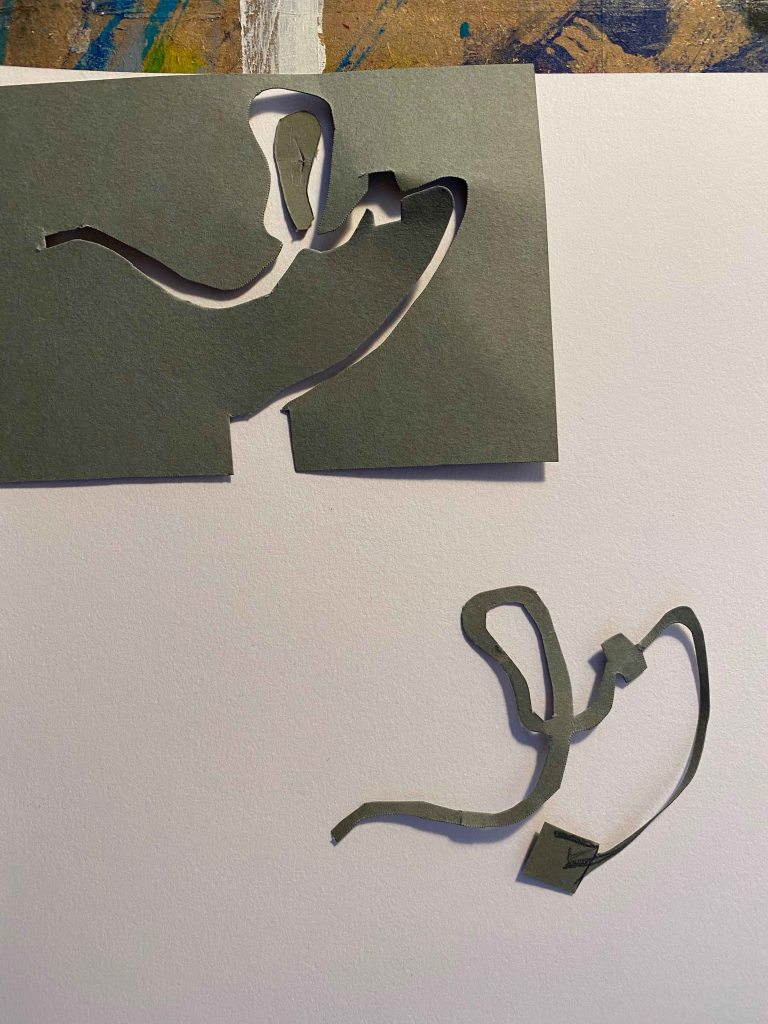
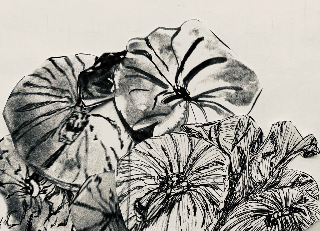
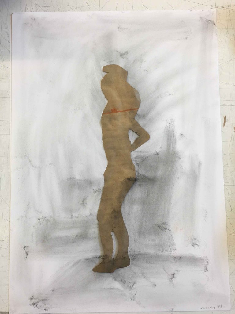
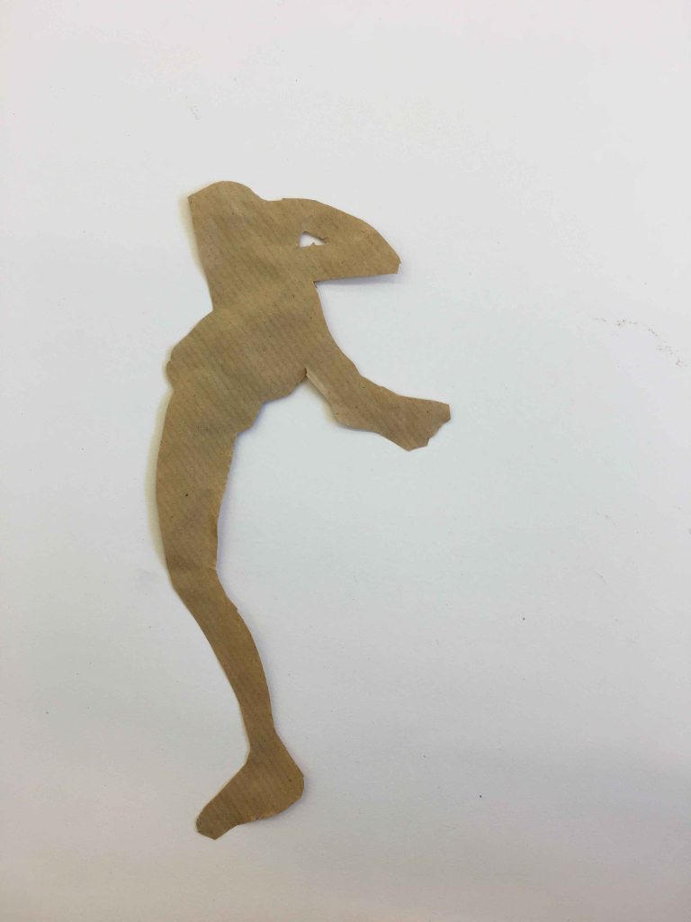
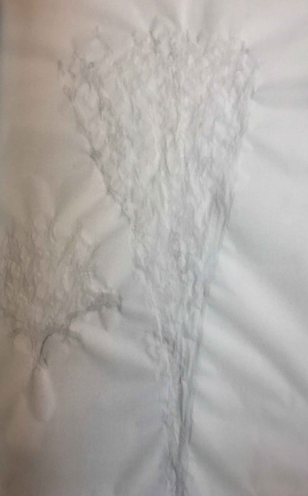
Next, I decide to try out a technique I tried in a lifedrawingclass- cutting out the shape of the pose and then drawing the contours using this positive or the negative mold with graphite powder.

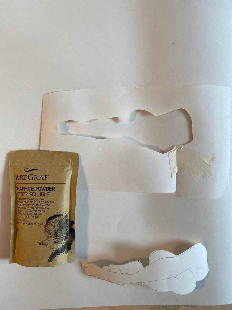
I am using a small drawing of the figure on the bottom of the page again.

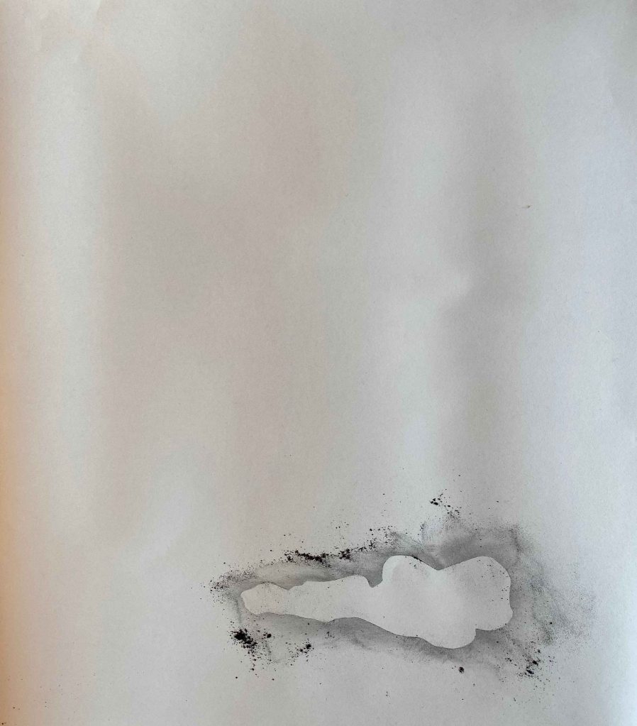
I like how it looks with the surrounding powder and wonder if I can fixate it like this.

The answer is no. I try this twice with different methods.

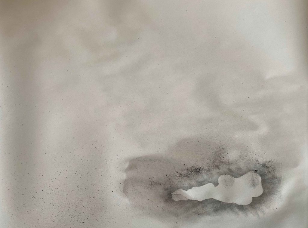
I find this second less messy version still has some interest, with the different layers of white and then graphite spreading out from the figure. It looks like a creature in a nest.

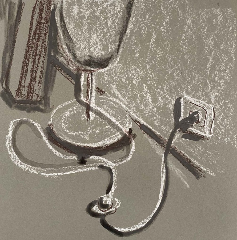
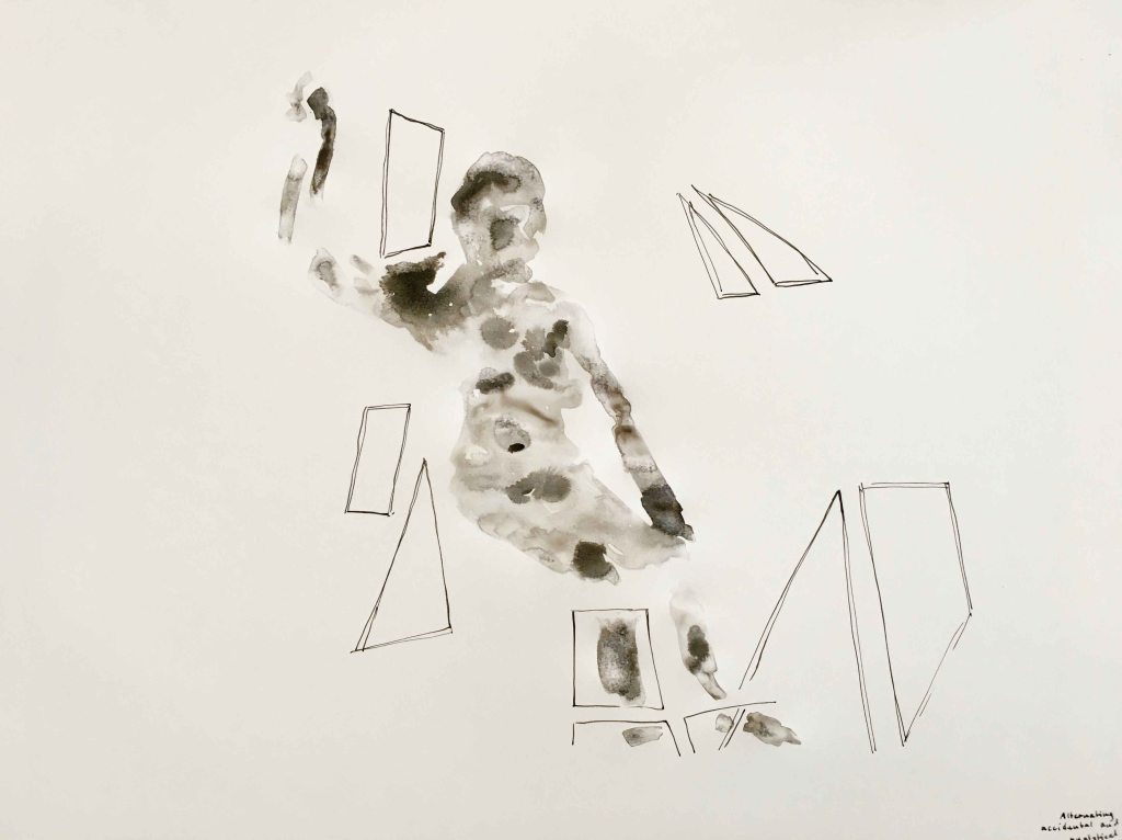
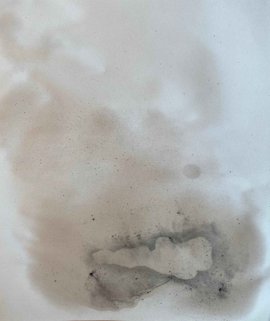
I continue with making a composition using the positive and the negative molds:

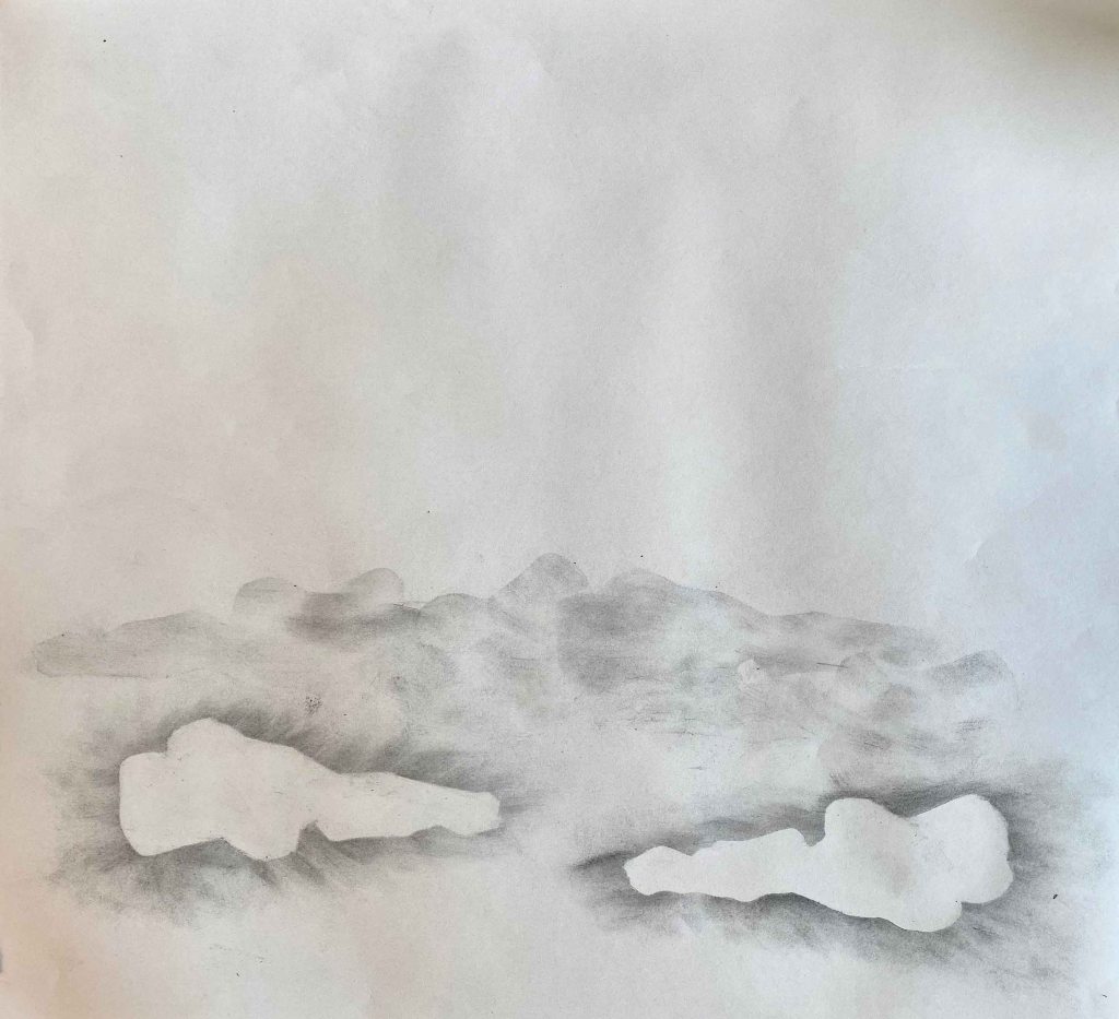
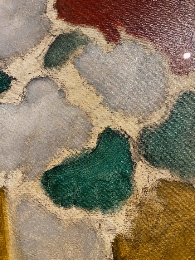
Here my two intertwined limbs have morphed in to a landscape. I see something like fallen soldiers on a battlefield.

I am still hanging on to the idea of my figure as a symbol and it’s relationship to the page when I discover these works on newsprint by Kaoru Arima in the wonderful book Vitamin D: New Perspectives in Drawing:

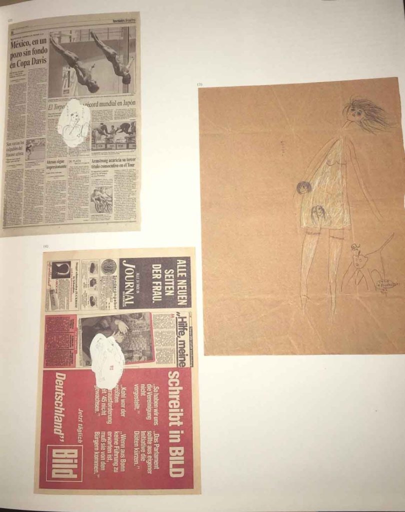
(Image from: Dexter, E (2005). Vitamin D: New Perspectives in Drawing . England: Phaidon press)

As a final trial for this project, I choose a page of a newspaper and paint a white cloud for my drawing to sit on. I choose a page with an image of a man with the arms crossed, which mirrors my crossed legs. I blacken out the face so that it doesn’t become the main focus .

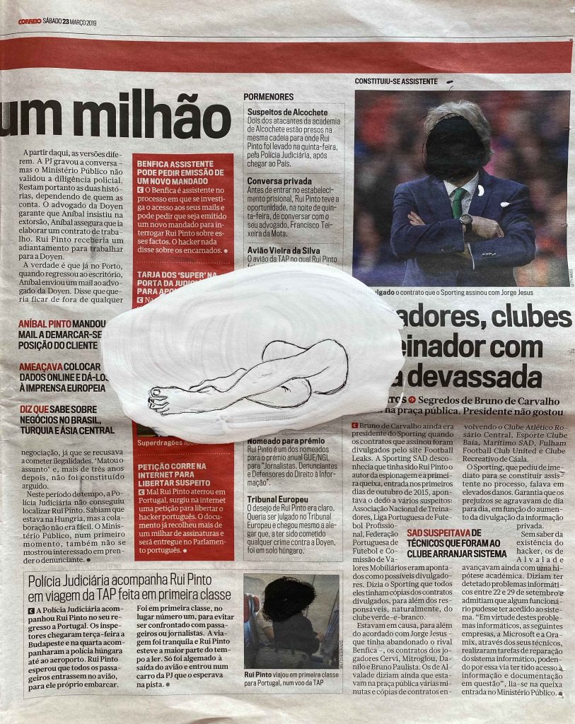
I like this final of many versions of this pose. I has an interesting interaction with the other elements of the page. It is placed on a different layer through the white dot, but competes in strength with the hard red blocks, the rather strong image top right and the larger texts. The drawing itself is a little caricatured with the foot too large. The man with the now black dot head is looking down at the drawn legs.

Reflection: How far does your drawing direct the viewer’s gaze? Did you manage to retain the tension in the limbs – or do they seem a bit floppy and directionless? Have you managed to add an extra dimension to what could otherwise be a technical or academic exercise?

I think this pose directs the viewers eyes in an interesting loop. When this symbol like drawing is small at the bottom right of the page, it redirects the viewer back towards the center again. It reminds me of an infinity sign or of the letter in an unknown pictorial alphabet. In the last version on newsprint, it competes with the many other strong elements, but I find that after scanning the page, the eyes return to the loop of the legs.

I have allowed the process to guide this project, responding to way the paper wrinkles or the graphite powder blows instead of approaching it from a technical or academical way. Inspired by the previous projects, I have played more with composition and scale than an accurate anatomical drawing. I can think of so many interesting ways this project could have gone. I lost sight of the Egon Schiele inspired way of seeing the limbs. I will choose to continue looking at the human figure for the assignment though and develop this further.

1.3 Changing the scale

From the course manual:

Aim: The focus of this project is to explode notions of scale and experiment with an extreme change of scale to achieve a powerful drawing which suggests monumental landscape or architecture. Before you start work, spend some time thinking about the implications of manipulating scale in drawing composition, for example scaling up a particular feature of a landscape, still life, or even a portrait.

In order to understand the scale of an object, I need to understand it in context. I will always perceive an object in comparison to another that I already have a sense of scale for. For example, If I see a human, or a car, I will have a stored idea of roughly how big they are. If I see a pebble the size of a human, I will perceive it as a rock, not a pebble, and if it is much larger than the human, as a hill or mountain maybe.

Method: Find a handful of small objects, e.g. pebbles, shells, buttons, toys. Cluster these objects together and focus in on a cropped area. Experiment with using a frame for this. Make a large drawing which gives the impression of a landscape view or architectural detail, using these objects as your source material.

“By cropping your subject you’ll ensure that the whole composition has power and energy.”

I immediately imagine to use pills as my subject- very small objects that can quickly become very big in our awareness in the case of illness, or addiction or also in the overuse of medication in our society.

Wanting to create a context that shows the changing scale of the pills, I place them in my hand (quick drawings in my sketchbook)

I know more or less how big a hand is, so when comparing the pills to the hand, I have a sense of their size. When they are much bigger than the hand, they seem huge.

How can I do this without the hand? I can choose a low standpoint, as if I am small and looking up at them. I try out several versions and viewpoints in pencil in my sketchbook:

Adding only a horizon line does not give the wanted effect. I try placing the pills against walls, or brick walls, as I intuitively know how big a brick is.

A tiled wall makes me think of a hospital, a brick wall some storage unit maybe.

I have decided that I will include the walls to put the pills in the context of a room.

I create a little “miniroom” with a folded paper and try out many compositions by photographing them:

These are the two compositions I choose to explore:

I am remembering the paintings of Alex Hanna, often featuring packages of pills leaning against a wall in monochrome paintings. I will keep the colour scheme very subdued too, echoing the dullness or sadness of the subject.

I want to draw as big as I can, so I use a roll of brown packing paper that I stitch together for a piece of 160x 120 cm:

I first try out both compositions in small in diluted acrylic on the same brown paper:

I choose the composition to the left and square it up to my very large paper:

I start with very diluted acrylics, but soon see that I need to use more coats to have the lightness of tone that I want. I am using Titanium White and Payne’s Grey Amsterdam acrylic paints.

I add the shadows in Indian ink:

I choose this paper because it allowed me to draw a very big picture, I might have had an advantage of starting from a white background and achieved subtler tones. In the flesh, as it is so big, the drawing has a rather strong impact already. On the photograph, I see that the composition is not yet enough to show a real change in scale. Maybe the pills are just lying in a small package for example, and are shown on a billboard.

I need to add another element to the context- like the tiles, that I will perceive as having a certain determined size that I know from experience. I will also add a hint of the ceiling of this “room”.

While marking the ceiling in charcoal and plotting out the bricks, I have a spontaneous idea to add the element of a door instead. A door will immediately show that this is a room, and we have an intuitive knowledge of the size of a door. This will be the final element that will really make the change in scale clear:

This is the final image, 160x120cm on brown paper, Amsterdam acrylics and Indian ink:

I think I have achieved an extreme change in scale in this image- the pills look huge put in the context of the room. The dimensions of the room became clearer when adding the elements of the ceiling and the door.

I think the pills have an oppressive, rather threatening quality which also reflects how something so small can become so big in my awareness.

1.2 Using space- Henri Matisse

After studying the work of Elisabeth Blackadder, I will make a different piece inspired by Henri Matisse’s more sophisticated use of space and pattern.

In the blogpost about the composition and use of space by Matisse, I chose to look at “The red studio” from 1911.

Image from: Ars. c2019. https://wwwmomaorg. [Online]. [13 December 2019]. Available from: https://www.moma.org/collection/works/78389

In this painting, I like the combination of the detailed elements and the swirling linedrawing of the furniture that creates depth the sense of space.

I start by looking at the line and shapes Matisse is using, while using items from my own surroundings.

I decide to paint my own livingroom/studio in this manner, but choosing a blue background. My walls are normally white, but I will imagine them blue, and take some freedom in moving the objects as well.

This is a study in acrylics and gel pens in my A4 sketchbook:

I decide to replicate this on an A1 Canson Mixed Media paper using acrylics for the painted items and pens for the linedrawing.

This is the final drawing, with some added decorative elements. It is difficult to see the line well on the photograph, it has a nice gloss in the flesh.

These are close ups:

I think that I have achieved balance between the painted elements that immediately attract the attention, and the space around it in this drawing. I believe the three smaller, lighter items on the right are balanced out by the heavier red frame on the left as well, not letting the drawing tilt to one side or the other.

1.2 Using Space- Elisabeth Blackadder

I have started this project by taking a look at the work of Elisabeth Blackadder and Henri Matisse, as I have described in a separate blogpost found here: https://clarasdrawing2.design.blog/2019/12/13/elisabeth-blackadder-henri-matisse/(opens in a new tab)

I am currently on an unplanned visit with my mother, so I start exploring different compositions in my small pocket sketchbook, by looking around for interesting objects. I think Elisabeth Blackadder would have found a lot of material here, my mother being somewhat of a collector too. They also share an interest for anything Japanese and cats.

I am placing different collections in various arrangements, working intuitively as I observed Elisabeth Blackadder doing in the videos, moving them around and combining shape and colours, leaving the objects flat, without shadow or sense of depth.

I am using coloured pencils in my small format pocket sketchbook.

I observe how important the weight of the larger colour fields is, without it the collection of little things completely loose interest . Also how a brighter coloured item immediately draws my attention and can balance out a much larger darker colour.

I discover a beautiful kimono and take some freedom with the colours and patterns when including it in the next compositions:

I continue my exploration on A4 sheets with the coloured pencils and water that turns them into watercolours (unfortunately on too thin paper that wobbles)

I think both of the above work- it is helpful to have the large red main object, the kimono, dominating the composition that immediately becomes clear and solid. I could maybe argue that there is more a sense of background in these than in paintings with many smaller objects and clearer balancing separate colour fields.

I think these last three would have benefited from painting the objects somewhat larger and use fewer items, for a clearer composition, they are all somewhat cluttered. The larger colour fields come more to value in the two right hand ones with the middle one being the calmest. Allowing the darker field surround the space where the smaller objects are placed holds the composition more balanced.

I have to leave France again, without the satisfaction of pushing any of these further. After three more stops, I am finally back home in Lisbon and approach this project again. I observe how different it feels to look at my own familiar objects when composing a still life- how I do not only see shapes and colours but my own ideas and preferences.

I liked several of the compositions with the kimono above and am continuing the idea of a larger clothes item dominating the image. I chose two for trials- a sloppy purple west and my blue winter painting overalls and start with some compositions in Lascaux Aquacryl in my A4 sketchbook.

I choose to continue the purple west on a slightly orange background and the blue overalls on the lemon yellow background, contrasting larger darker objects on bright backgrounds and in both cases placing the main object to the right side.

I switch to a Fabriano watercolour paper and continue with quick A5 trials in Lascaux Aquacryl:

I have added other objects that are meaningful to me- my yogamat, the espressomaker, a small plant, brushes and sketchbooks. I find the purple west interesting but too unclear a shape and decide to explore the version with the blue overalls:

I decide to continue with the composition to the left. I choose a Fabriano A2 watercolourpaper and Lascaux Aquacryl:

The image to the right has two layers of paint for brighter colours, more detail and I added a brown line to give it all some hold- something I observed in one of Blackadder’s kimono paintings.

Finally, I decide to go over the drawing with gel pens for some more life and a contemporary touch in this final version:

I think it is quite clearly inspired by Elisabeth Blackadder’s paintings, with the objects floating freely in a field without depth. I am still really unsatisfied with this drawing and launch into a final trial directly on the A2 paper, following my initial trials in the small sketchbook while still in France.

The verion on the left is in watercolour only, while the right side is after enhancing with gel pens. The objects are too small and blank to balance out the large surrounding colour fields. I would crop this drawing like this:

As a conclusion, I have used this exercise for a lot of intuitive trials and reflection on space and composition. It has been a lot of flapping around (also sleeping in five cities in 8 days), and I feel unsatisfied with the final outcomes. I feel like I have learnt some precious lessons about composition though, and definitely gained new respect for the art of Elisabeth Blackadder.

Elisabeth Blackadder / Henri Matisse

Elisabeth Blackadder (b. 1931)

As suggested in the course manual, I approach the work of Elisabeth Blackadder by watching the video on vimeo.com/25711526. Here I see the artists’ love for plants and for all kinds of objects that she collects. She shows a genuine curiosity for these flowers or objects, that she then reflects in her paintings.

Looking at her paintings, I can see how several objects are placed with a lot of space between them, allowing this space to become an important part of the composition. She uses the shapes, size and colours to balance out the composition, where the objects and the space around have equal importance. None of the objects overlap or have any sense of perspective or depth. There are also no cast shadows, so there is a sense of the objects floating in a colour field, rather than being placed on a surface.

“Stillife with cherrybark” is an example where the large purple and yellow blocks of colour balance each other and how the objects placed on the yellow surface are painted small and flat and all separately from each other. The whole is in harmony and balance. If I try to leave out the darker brown tube on the right hand side for example, the whole composition seems to tilt towards the left.

It has taken me a moment to start appreciating Elisabeth Blackadders’ paintings, but the more I look at them, the more I see these subtle touches that create the harmonious whole and I am curious to start a painting of my own inspired by her work.

Image from: Aitken dott. c2019. Scottish-gallerycouk. [Online]. [13 December 2019]. Available from: https://scottish-gallery.co.uk/artist/elizabeth-blackadder

Henri Matisse (1869-1954)

I can understand why we are also asked to take a look at Matisse’s work for this exercise on using space. Like Blackadder, Matisse creates a balance with form and colour, using the whole pictureplane so that the space around them complement the objects. Unlike Blackadder, Matisse really plays with pattern, and creates a sense of perspective and depth in his stilllife paintings.

I visited the Matisse Museum in Nice while on POP1 (shortlink to blogpost: https://wp.me/p94hP8-vb) where I took a picture of this ” Nature morte aux grenades” from 1947 , a merging of interior and exterior view where form, colour, shapes and balance take over as the subject matter.

IMG_5471

One painting that I have not seen in the flesh, but particularly like is “The red studio” from 1911. Here the paintings in the studio seem to be floating freely on the red surface, but the subtle line drawings of the furniture drawn in perspective create a sense of depth and form.

Image from: Ars. c2019. https://wwwmomaorg. [Online]. [13 December 2019]. Available from: https://www.moma.org/collection/works/78389

This is a combination of line and pattern I would also like to try out for a still life.

In his later works, Matisse focused more and more on form and colour, simplifying it to arrive at his famous cut outs.

A week has passed since my above text, and I just had to catch a flight over Nice airport and managed to make a quick detour to the Matisse Museum . The current exhibition is “Cinematisse”- conversation between the painter and cinema. Matisse was an avid cinemagoer and passionate about film- which was reflected in a lot of his paintings and drawings inspired by movies, with exotic influences like the faces of Inuit or the plants of the Caribbean.

To my delight, I found  “ Le Fauteuil Rocaille” from 1946 that was used as an example in the coursebook on display here today. In this painting, the way the chair occupies the whole picture frame and more is what makes it so impressive.

I observed how Matisse allows parts to remain unfinished with the canvas peeking through and used really wide, rough brushstrokes for the elements in starkly contrasting complimentary colours.

Other than ” Nature morte aux grenades” from 1947 that I wrote about above, there were unfortunately no other later still life paintings on display. I saw some of the very early still life from his student years, but they are still very classical and without the specific traits the artist developed.

I want to remember to allow some parts of a drawing or painting to remain unfinished, and observe the flowing, swirling lines Matisse uses, in plants or figures alike.

When comparing the work of Elisabeth Blackadder and Henri Matisse, I feel more affinity with the latter. The comparison is somewhat unfair, because I have admired Matisse’s work for a long time, whereas I am only discovering Elisabeth Blackadder right now. I think it is the sense of depth and the playful, flowing line that draws me more to Matisses’s work.

I am curious to continue with painting still life inspired by these two artists.

(photos my own from the visit)

Project 1 Observational drawing

This part of the course encourages me to take a closer look at composition through observational drawing.

Drawing 2 coursebook:

Aim: ” This project encourages you to reflect on the wider potential of observational drawing, in particular how you can use what you look at more experimentally as you develop your composition. You probably normally start by finding an interesting subject or setting up a still life. This project asks you to reverse this process by finding what may seem an initially unpromising subject, but one with several elements, and then building up the composition to create an interesting drawing. This will encourage you to reflect on the potential of a more creative and open-ended approach to composing drawings.

The “unpromising subject” immediately makes me think of the contemporary artist Mimei Thompson who paints beauty in the everyday, in a ripped open trashbag, in a fly, or in the weeds between her house and the studio.

(Images from Thompson, M. c2014-15. Mimei Thompson. [Online]. [7 December 2019]. Available from: http://www.mimeithompson.com/work/collection/2014-15/#, with permission of the author.)

In an interview with Alli Sharma for the “Articulated artists” blog, she sais: “I was interested in looking at neglected corners, with the idea of finding something transformative in the everyday.”

Quote from http://articulatedartists.blogspot.com/2013/10/mimei-thompson-talks-to-alli-sharma-at.html (Blogspotcom. 2019. Blogspotcom. [Online]. [21 September 2019]. Available from: http://articulatedartists.blogspot.com/2013/10/mimei-thompson-talks-to-alli-sharma-at.html)

This is a subject I like very much exploring – transforming the everyday, the so-obvious- we don’t see it, into something that make us reflect again.

When I look around the room, my glance first falls on a cable and a lamp in the corner- definitely unpromising and I decide to just start here.

I use pencils and soft pastels for a first approach.

I decide to try using cut out shapes and graphite powder as I experienced in a lifedrawing class recently.

I decide to move away from the initial motive and focus on repeating certain elements.

This was a good warm up, but I am still looking for an unpromising but captivating motive.

I discover it as soon as I step out of my front door the next morning :

I am a very early riser, and usually see the streets before the garbage van passed by- which is often a desolate sight. The problem of the amount of trash we produce is also one that I can burn for and am excited to look at through this exercise. I have lived years in Asia where the amount of trash, and especially plastic, become very painfully obvious, as the collection system is often lacking, so the issue is not swept away from sight.

From a visual point of view, I am interested in the glossy surface of the plastic bags and the interesting textures created in the creases. Before the daylight, the plastic reflects the colours of surrounding streetlamps and neon signs.

I start with some pencil sketches in my A4 sketchbook:

I continue looking for interesting lines with Indian ink. Here I am mixing very “analytical” marks drawn with a nib pen, and more accidental marks when dripping ink on wet places (A4 sketchbook).

Indian ink on grey paper starting with “accidental” blobs:

Then nib pen and brush:

I also do a quick sketch using oil paint on paper, in Payne’s grey and black, to get a feeling for a more painterly approach.

I photocopy the above sketches, as recommended in the course manual, and play around with different combinations and details and patterns.

This is my chosen composition:

The bin bags look like flowers and I start calling this drawing “toxic flowers”.

As I started with the bags found outside my own front door, I decide to try out combining a photo of my house and these toxic flowers. Using my own house as a background brings back the question of MY own responsibility in the mountain of trashbags brought out here. This is not a distant problem- how many bags have I brought out myself and how much of that could I have avoided?

A quick test drawing with the photocopied “toxic flowers”:

I like the contrast between the image in the background and the sketched details. I decide to take a photo and make a phototransfer of the front of my building, keeping the image black and white, or rather grey and grey.

With the difference in scale, I let the trash bags pile up to almost cover the house:

I like the absurdity of these images. I also create small trash bags that are more in scale with the house:

I also try to substitute the drawn bags with some I roll from a trashbag in plastic. In the second one, I allow the plastic to tower up to almost cover the house- really indicating the problem here, with a feeling of drowning in the quantity of trashbags.

Finally, I come back to the photocopied ink drawings with this more “romantical” composition, where the trash become decorative plants.

I like the aesthetic quality of the images above, and also the critical message they convey, but my images are becoming too illustrative, and I have lost track of the aim of the exercise- to work closely on the composition.

I come back to focusing on shapes and patterns with dry pastels on black paper. Here I am also introducing the colours of reflecting streetlights:

The idea of the plastic bags looking like flowers brings my thoughts to Georgia O Keeffe’s paintings of flowers in close up.

I explore various compositions of close ups of the trash bags, with the idea of a “toxic flower” in mind.

I chose the close up like the second in the bottom row and try it out with dry pastels on grey and black paper as well as ink nib pen.

There is a phallic element with the tied part of plastic, another parallell to Georgia O Keeffee’s orchid close ups.

As I liked my first experiments with inks above, I decide to draw this final composition detailed in ink with a nib pen , and then wet the drawing once the ink is dry, and apply random spots of ink around the detailed drawing.

This is the final result- Indian ink on grey paper (21x23cm):

I like the difference between shiny parts where the ink has dried thicker, and matte parts where the ink is thin.

I also want to try and draw this “toxic flower” directly on a dark grey trashbag, elevating the plastic bag to an object of beauty.

I do a quick drawing in pastels on black paper to try out the colours of reflecting neon signs for this composition.

This is the final drawing in colour on trash bag:

I overworked this drawing and it lost the spontaneity I was aiming for. I decide to give it another try and only add a slight touch of blue, instead of all the different reflected colours. This is the final drawing on a black trash bag:

Reflection: I could just keep going experimenting with this subject, so I have definitely managed to turn an unpromising subject into one that I can become really curious about and continue working on. In the middle, I got sidetracked to looking at it more conceptually and lost the focus on the composition, while using the phototransfer of my house as a background. Finally focusing on detail allowed me to come back to the essence and drawing the trashbags as a toxic flower.

I tried using dry pastels and Indian ink with nib pen and brushes, phototransfer and collage and finally drawing in acrylics on plastic bags.

Lifedrawing in ArCo Lisboa

I have started taking weekly Lifedrawing classes at ArCo- Centre de Arte e de Comunicacao Visual- in Lisbon. So far, I have had five classes that have all been very different taught by different teachers and using different media. The size of paper is always A2, to avoid working too small. I have been going to various lifedrawing classes before in Indonesia and here in Lisbon, where a model was provided but we were then entirely free to use our materials and methods. Here, the instructions are very precise and we all use the same material, with an incredible variety of outcome anyway.

8/11/2019

For the first class, we used coloured pencils and were instructed to draw only inner contours and very very slowly. Our eyes dart from the model to the paper where we are instructed to do strictly no marks without first looking at the model. This method is to catch ourselves when we start doing automated mark making for details like the little body hairs for example.

After 30 or more excruciatingly detailed minutes, we only had a few more minutes for the shading in coloured pencils, still without drawing outer contours.

We then repeated the exercise with another long pose.

This time we used the coloured pencils for some outer contours.

It was useful to see how dependent I am on outer contours and how easy it is to start automated mark making. I had a hard time slowing down so extremely and drawing little bodyhairs. I missed quick warm up poses to get a feeling for the proportions.

15/11/2019

Today we were using Indian ink with a nib pen and a brush. The aim of the exercise is to combine precise, analytical mark making with accidental marks.

Using the nib pen, we were again instructed to draw very precise inner contours, even the tattoos, without the help of the outer contours. I am used to always start a figure by a light “skeleton” to get the proportions right and find it extremely difficult to get the whole to work when so focused on small details.

After the ink was dry, we quickly painted the whole figure in water, and dripped ink on the wet parts, to form the accidental marks.

For the second pose, we inverted the process by starting with a figure in water with dripped ink.

Then we focused on a set of easels and other geometrical figures that were placed around the figure and had to choose some inner contours of these. I like the playful result of the combination of the figure and the geometrical shapes.

For the last pose, we were drawing in ink with the brush, only drawing the dark parts. Again, I was challenged by not drawing any skeleton to start from, but liked the result.

I truly enjoyed using the ink today and will continue exploring this.

22/11

Today our tools were scissors and graphite powder- which I had never used before , so this was really interesting.

Here we “draw” the figure with the scissors directly- without any initial pencil drawing to cut out. It felt incredibly difficult to keep anywhere near a realistic figure.

We then place the cutout on a white A2 paper and rub the graphite powder around it with a cotton ball. Finally, for the first pose, we added some detail and inner contours with a pencil.

Next, the model took three different poses after each other, that we cut out and combined on the same page, using the graphite powder.

We were then invited to use either the positive cutouts or the negative shapes left on the paper, to complete the page with repetitive shapes. I am pleased with the final result, which is a first on this course 🙂 This was a fun method of drawing that I would like to come back to as well.

29/11/2019

In todays lifedrawing sessions, we are using oil pastels on the habitual A2 paper.

We started by drawing the figure as a whole spot in a darker colour, again with strictly no outer contours to start with, just a blob that evolves from the inside out. Again, I am faced with seeing how attached I am to my constructive skeleton and outer contours!

Then we choose a lighter colour, and drew in all the lighter places on the figure.

I am definitely struggling with proportions, but enjoyed the combination of oil pastels.

For the second pose, we inverted the process by starting with a lighter colour.

Then we filled in the darker parts with the second colour.

Oil pastels is another media that I would like to experiment more with, so this was a good reminder.

3/12

Todays class completely killed my self confidence. We went back to the simple HB pencil and the challenge was to draw the proportions right. I had become used to draw a lot of quick “warm up poses” and then use a “skeleton” or geometrical shapes, or the “coil method” to find the right proportions. Here we were asked to start from a limb and just follow the contours with one single line around the figure. This all extremely slowly, which went terribly wrong from the start.

The second slow pose went even worse- stiff and wrong- my self confidence was superlow after today ‘class.

For the third pose, we used a charcoal stick. After drawing for 20 minutes, we erased the drawing with some paper, so that you could only see the traces. Then we drew again on top- “correcting” the mistakes of the drawing under.

In all, I benefit immensely from these classes, as they definitely bring me out of my comfort zone. I am missing quicker poses where I can sketch in the proportions roughly. Here we seem to draw maximum 3 poses in two hours, it is all very slow, and the slower, the worse the result it seems. It is very difficult to map in the proportions well without any type of help lines. This course really brings me to look intensely and only draw what I really see. I also like the variety of materials and methods, some of which I had not used before – like the graphite powder.

10/01/2020

After a long Christmas break, I am back to the Lifedrawing studio. Today the teacher was missing but the model present, so we were free to draw the way we wanted. I am quite sad to discover that despite really wanting to experiment, when in a slightly nervous setting , I go back to very boringly trying to draw anatomically correct with the most traditional media possible- charcoal and coloured pencils, all on A2 Canson paper.

One good thing with being free today was that we could ask the model for shorter poses though. These are five minute sketches:

We moved on to 10 minute poses:

This pose seemed very tricky to get, but I like how I placed her diagonal on the page which creates a certain dynamism.

I switched to coloured pencils for the two last poses:

I feel more confident getting the proportions right using the approach of today, but I walked away disappointed at not having been more daring.

17/01/2020

Today we had a new teacher and – surprise- we were asked to draw a very traditional 10 minute pose as anatomically accurate as we could in our chosen medium, as always on A2. I am using Indian ink with a thin brush.

After a walk around the room and looking at our drawings with a disappointed look, the teacher instead asked us to take our blocks and move around the model, only drawing the head, again focusing on anatomical correctness. (Charcoal sticks on A2)

Then we switched to drawing only the torso from different angles on the same page:

I was really struggling with this.

Then, we went back to our places and used charcoal again for a whole body in a classical pose, where I messed up the raised arm.

Finally we were asked to do what we wanted and I used a more fluid approach in ink for a lying pose.

Today I finished very disillusioned about my abilities. The rotation of different teachers and media and approaches is really good though. When I signed up for these classes, I was just expecting the access to a model, which is what lifedrawing classes I had experienced before. Here we are challenged to try different approaches every time, my self confidence is on a rollercoaster during these classes but I learn a lot!

ANOZERO 19- COIMBRA BIENNALE

On my way back from Porto to Lisbon, I had the chance of a short stop in Coimbra, to see some of the exhibitions for the “Anozero 19” Biennale.

Coimbra is a very old and beautiful university town, well worth a visit.  The Biennale was spread out through  the university buildings , and I would add a little hard to find! I saw a lot of interesting science exhibits in the Science department  before making my way to  some of the art works for example.

The theme of the Biennale was centered around the impact of the river Mondego in the city, and articulated through  5 words : silence, passage, marginal, invention, militancy- a theme broad enough for very varied  perspectives.

I started by seeing the part of the Biennale located in the Arts department of the University- in an amazing historical building with extremely  high ceilings and an inner courtyard.

This large format photograph stood out immediately with the shadows of the plants creating another layer over the faces, in a dreamy atmosphere. They eyes of the figures are closed and I possibly thought them blind, the pose is strange and the expressions unreadable, so it is unclear what is happening here.

This work is by Polish artist Joanna Piotrowska , who explores ambivalent and dysfunctional family relationships through these delicate, dreamy staged scenes in black and white photographs.

The next room showed large scale paintings by the Portuguese artist Joao Gabriel, especially commissioned for the Biennale.  The subjects are taken from screenshots  from gay porn movies from the 70s. The paintings are large scale, so the blurry bodies are almost life sized.

The subjectmatter  and the blue-brown colour scheme reminded me of paintings by Patrick Angus.

I really like how little detail Gabriel gives to the figures, they are faceless and painted in rough, seemingly quick brushstrokes.

There is a boldness in the approach , and in how much he dares to leave unfinished, like the head here only outlined, that I really like.

I have a tendency of becoming much too detailed and overworking my pieces, so this was a refreshing approach.

This  little panel of a bird in the streaming water, painted in large brushstrokes on a crooked piece of cardboard, was the only painting without the human couples, and I liked how it also had a smaller scale, and offered a welcome break in the display .

French artist Mattia Denisse used green table tops and posters on the walls to exhibit a large amount of imagined books that “will  be printed in the future”.

They cover a large area of subjects, from scientific books of imagined subjects to historical novels of imagined facts.

I  really enjoyed the humour, with absurd scientific tables or wordplays.  I also really appreciated the skillful combination of drawing and text, or geometrical schemes in an appealing graphic language.

I am not sure the presentation gave the best of the work. The identical format and repetition was less interesting to look at than an exhibition with varying formats and maybe frames to create highlights and some tension. But maybe this sloppier newspaper way showed another  aspect of how we are flooded by information that looks easy to either absorb or oversee, and it is only on a second or third look that you catch the absurdity or the humor in it.

I almost missed the installation of Bruno Zhu in the midst of the artefacts in the Science department, as I took it for a permanent exhibit.

Surrounded by instruments from historical times, he installed modern, small every day utensils on some white clean especially crafted pouches, thus elevating nail clippers or dish washing brushes to a historical object to look back at from the future. It was an interesting way to look at objects we take for granted with a new perspective, elevating them to a collection of curiosities.

On my hunt for more artworks, I saw a whole geological exhibition of interesting mineral formations, but unfortunately did not make it to any further exhibitions from the Biennale before having to return to Lisbon. These glimpses were rewarding though, and I will make sure to return with more time next time.

PAULA REGO – the Cry of imagination, at SERRALVES in PORTO

Simultaneously to the exhibition of Olafur Eliassson’s work at the Serralves Museum in Porto, I was delighted to discover a whole building dedicated to Paula Rego.

I love the way Paula Rego tells stories through her drawings and paintings and have visited her “Casa das Historias” in Cascais several times, which I documented in previous blogposts. (Shortlinks: https://wp.me/papvz2-e4 and https://wp.me/p94hP8-cD)

The exhibition started with a series of etchings , “the Pendle Witches” about the trial of witches in British history.

Paula Rego is often dealing with the role of a woman in society as a subject, through stories and literature that she transforms into images, or by telling her own story very openly, about depressions and abortions, about her family life.

I like the real expressions and quite awkward poses of the persons. I know from the movie “Paula Rego, Secrets and Stories” by her son director Nick Willing “, that she is using the same model, her assistant, who looks quite similar to the artist for the majority of her works.

In this second etching, I really like the emptiness, the feeling of some unfinished pieces creating space around the figure, and again , the quite awkward dynamic pose.

The painting “The strap” from 1995 had a whole room dedicated to it, which amplifies the vulnerability and loneliness of the figure.

This painting lives from the expression and pose of the figure, at the same time bewildered or angry and a little desperate, in a pose that is tense and awkward. The background gives little clues to what is happening, which also focuses the attention on the face and the cramped hands pulling on the underwear. It looks rather like the girl is trying to pull her panties longer to cover herself more, than that she is trying to take them off.

The work is in pastel on paper, and I take some close ups here to look at the mark making.

Paula Rego prefers to work in pastel to avoid expressionistic brushstrokes, but I find the marks here take on a similar quality, with rough strokes echoing the expression and tense pose, contrasting to the smeared parts of the background.

I recognized the small work “the Merman” from a visit to Cascais .

I find there is so much expression in this creature half human, half imagined or animal , with the hand reaching between the tails. I observe how parts are colored and others left untouched.

I like how Paula Rego often combines animals with human figures. This very full and loud painting from the 80’s is full of imagined beings.

It feels quite chaotic at first, but the diagonal composition with the body and penis of the spider figure pointing to the right bottom corner where figures point back up lead the eye.

I do prefer the calmer paintings though. In “Playroom” from 1986, I really enjoy the mirrored composition, with the two clear fields of complimentary colours red and green, both with the same motive of a girl and a dog.

I want to remember this mirrored composition and the depth it creates for my own drawing. I also enjoy the contrast between some parts being very detailed and patterned, while others are left untouched with the bare paper shining through, like here in the hand. This is another aspect to remember as I have a tendency to overwork my drawings.

Finally, “Possession 1-7” ,a series of 7 large scale paintings, left a lasting impression.

The same figure is lying on the same couch with similar clothing, just the poses and the expressions changing. When stepping into the room and surrounded by these large paintings, they become quite oppressing. There is a sense of ennui, of boredom in the expressions rather than possession I find. There is a small note about the artists experience with psychotherapy, so that is probably the theme here, but the paintings can also just give a sense of time passing without much change, a feeling of being stuck, in thought, in a personality, in a place.

This series remind me of the series “Depression”, that I have seen in previous exhibitions. There the figure is also lying on a couch with the same or similar black dress, but the expressions are stronger, more desperate and evoked stronger feelings.

I was delighted to see some more of Paula Rego’s work today, especially as she is using much pastel on paper, which was a good reminder about this medium before embarking on the new drawing course. I feel inspired by her markmaking and compositions, and her unique way of narrative and the way she uses her own story in her work.

OLAFUR ELIASSON at SERRALVES, PORTO

Finally, I managed to see an exhibition by Danish- Icelandic artist Olafur Eliasson- an artist whose installations have become  known all over the world  (his exhibition at Tate Modern in 20013 drew 2 million visitors) and left me very curious of what I would actually feel when  seeing something in the flesh.

The theme of the exhibition at Serralves in Porto is “Y/our future is now” and as all Eliassons work is focused on the relationship between humankind, nature, art, science, architecture and society.

I started by exploring the sculptures in the park and first encountered “ The curious vortex” from 2019.

This is a huge stainless steel swirling vortex, erupting like a geyser . Standing inside the centre of the vortex and looking up towards the moving trees and clouds, I could feel a sense of movement, and see how this heavy structure evokes a sense of lightness and perpetual movement.

There was also a beautiful glittering added by the reflecting moving leaves, of the surrounding trees that also added a sound to the experience and reinforced the sense of it moving.

Further, three large black and white steel spirals form the work “Human time is movement (winter, spring and summer) . 

They looked like lightdrawings photographed with a long exposure and I liked this idea of  lines in space. There was something joyful in the movements of these sculptures, I felt a smile when looking at them. And yes, I could feel how the movement of my eyes along the forms became a n experience of time.

The work “arctic tree horizon”  composed of logs in the grass around the museum building did not have the same visual impact at all. Probably because they looked very much at home in a park with huge ancient trees around. It was not until reading about them and their significance that I paid attention to them.  Iceland has very little or no trees and yet these huge logs come floating ashore there, carried by the currents of the sea and drifting ice. Eliasson collects the logs and transports them to yet other surroundings . After knowing this, the work evokes thoughts about migration, circulation as well as about our ecological system.

Inside the museum building , in the central atrium, I could walk on a tiny path through the “Yellow forest”- a small artificial forest of birchtrees in pots. It was lit by a huge ring of yellow light that looked very warm and inviting. In the centre, this light altered my perception of colour and everything around looked either grey or yellow. 

The work is supposed to evoke the dreamlike space of the forest as a place of relationship between humans and the Earth. I missed the feeling of forest, although I grew up in the North of Sweden and have many memories connected to birch tree forests. Here the rather thin ring of rather scrawny trees still had a very artificial feeling and I reacted more to the large plastic pots that held the trees. Looking back at this work mirrored in the next one had a larger impact. Seen in the mirrors from afar, this oasis of warmth and trees definitely looked like an attractive, warm, safe place.

“The listening dimension (orbit 1, orbit 2, orbit 3) is composed of wall sized mirrors with large golden and black rings that makes it look much ,much larger than the room.

Seen from above it is  a peculiar geometrical space, but when walking down into it, and becoming part of the reflections, another level of  perception happens. My own image , as well as the one of the rings and the other visitors is reflected into infinity and looks as if it is moving. Here I am seeing my father who was with me reflected into infinity.

The sense of space and reality become unsure. I feel like I am floating in space with an infinite number of rings and elements floating around me.

I have read on Olafur Eliassons website that he has a studio in Berlin employing over 80 people, which  sounds an incredible endeavor in itself. I was really happy to have the opportunity to see some of his works, although having to big expectations maybe lowered my experience a bit. I would be very curious about my experience if I were to walk through the fog tunnel made of food additives at the Tate Britain.

In any case, I enjoy the sculptural and experiential way Olafur Eliasson addresses the subjects of our relationship to nature, to what surrounds us and calls for more awareness in a way that engages the viewer and makes him a part of the experience, also then someone with a part of the issues and a responsibility  to continue interacting.


Eliasson, O. 2019. https://wwwolafureliassonnet. %5BOnline%5D. %5B27 November 2019]. Available from: https://www.olafureliasson.net

 Go back and edit info