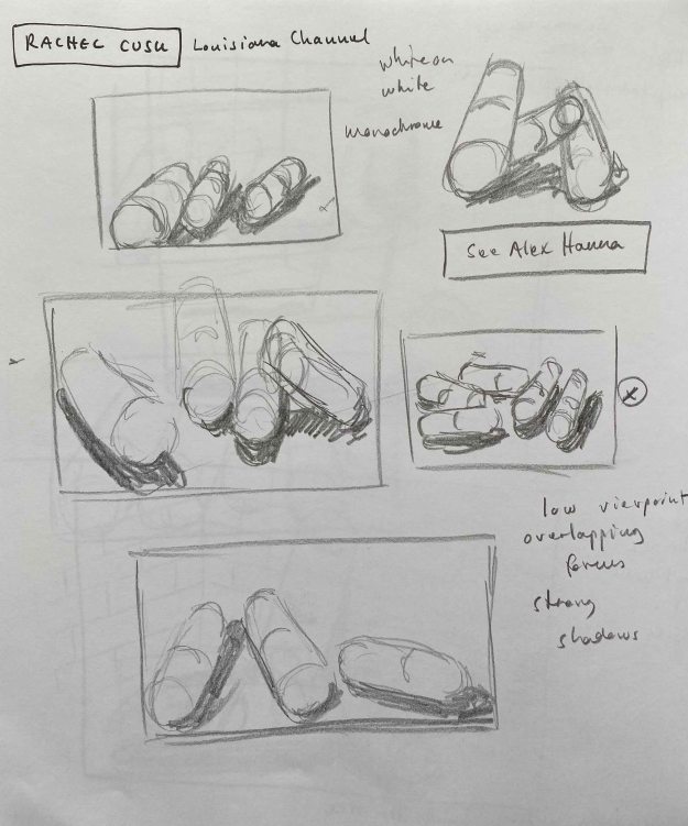
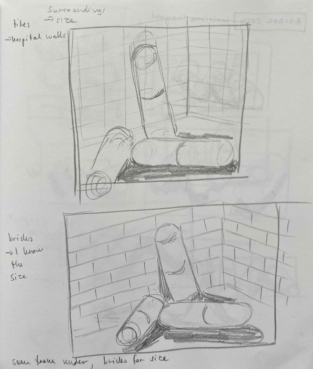
For your first assignment, review your sketchbooks and project work so far. Think about all you’ve learned about scale, cropping, selection, flexibility and judgment and make a decision about which area you’d like to develop for your assignment piece. This could result in one drawing or a series of drawings. Your subject can be anything you like but, whatever you choose, the relationships within your drawing(s) should set up an intriguing and engaging composition.
I start by reviewing some drawings from the projects of this chapter.
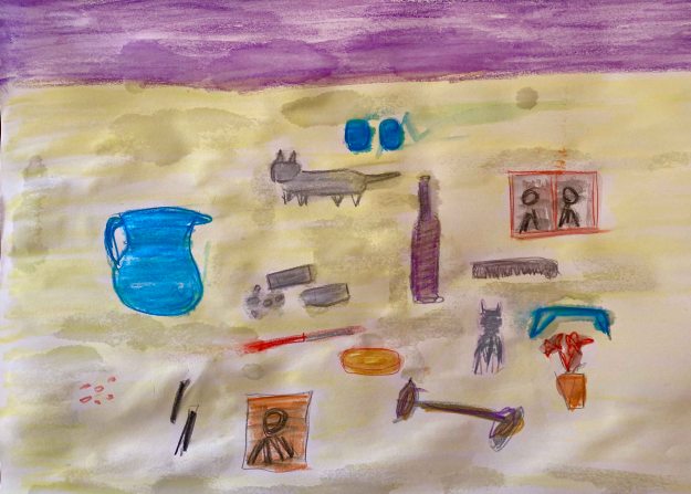
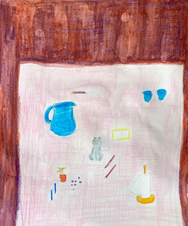
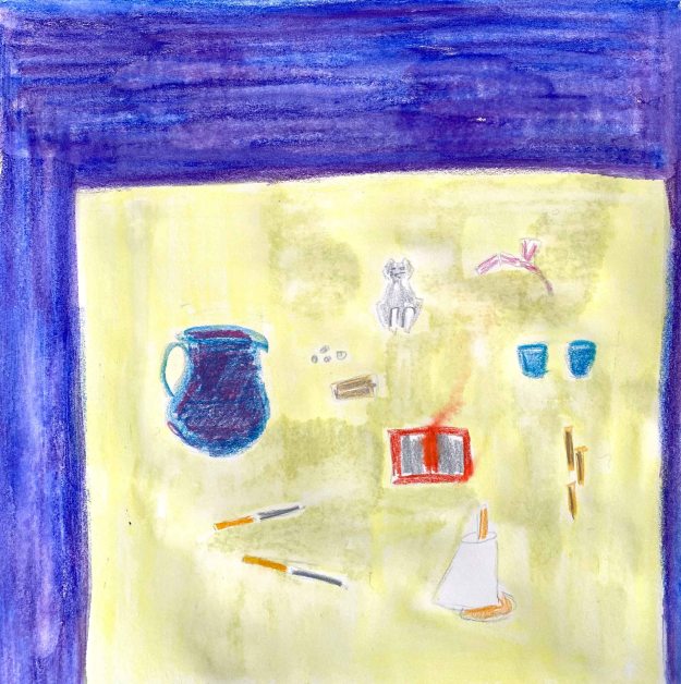
1.1 Observational drawing


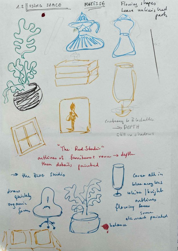
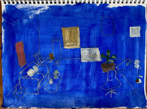
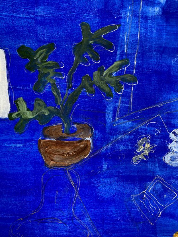
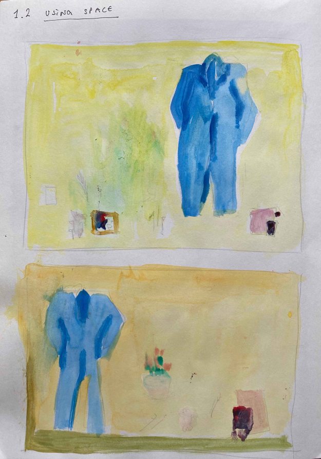
1.2 Using space

1.3 Changing the scale
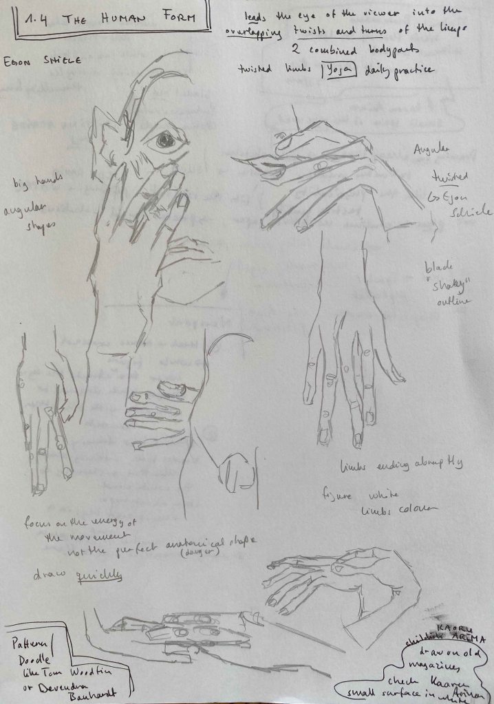
1.4 The human form
I am very interested in learning to draw and paint the human form and choose to continue exploring this for the first assignment. I am immediately exploding with ideas about where this could go:
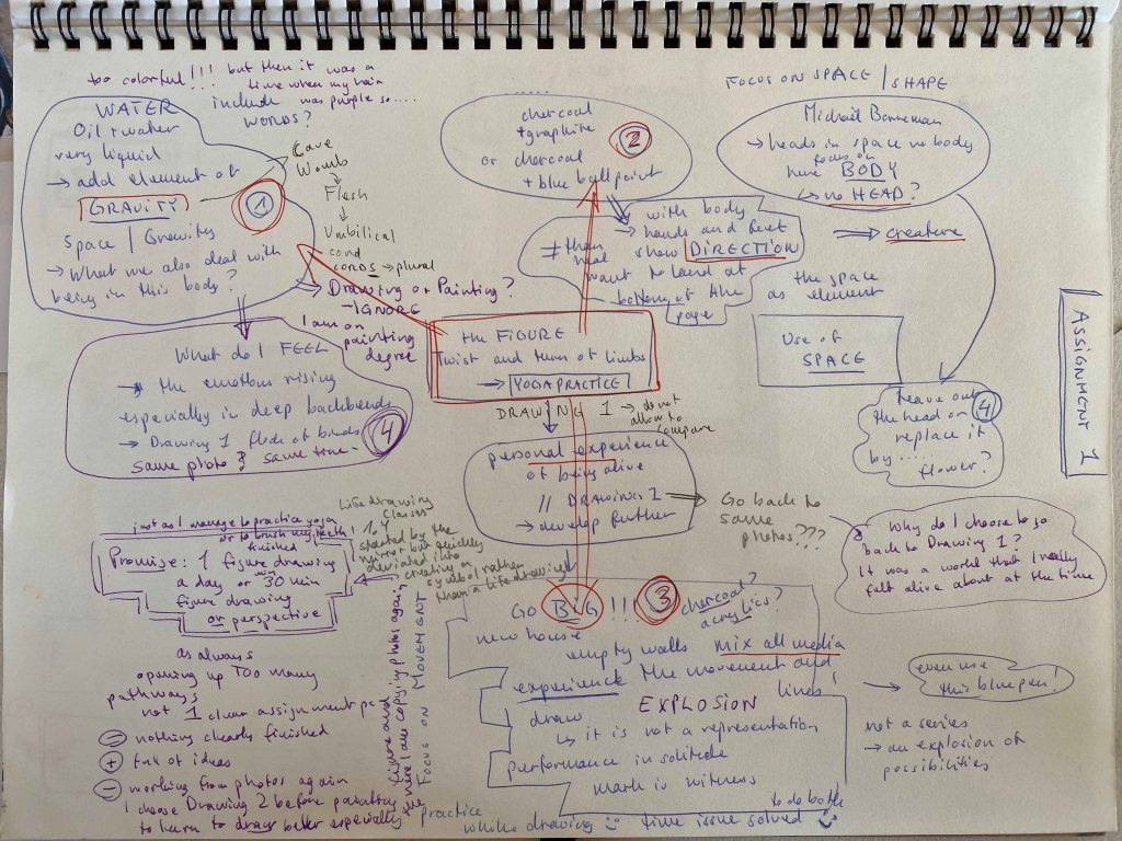
For Part 5 of Drawing 1, I explored figure drawing through yoga poses, focusing on how the poses feel while practicing. I produced some mixed media drawings through painting my hands and feet while moving on yogamat sized paper and a concertina book and still remember this as a work I really felt alive about at the time. I practice yoga (almost) daily and have so for the last 15 years, so it is very linked to my experience of the body. For this first assignment of Drawing 2, I want to reconnect to that last of Drawing 1 and bring it further ( and will not even allow my mind to compare or tell me that what I did years ago was better).
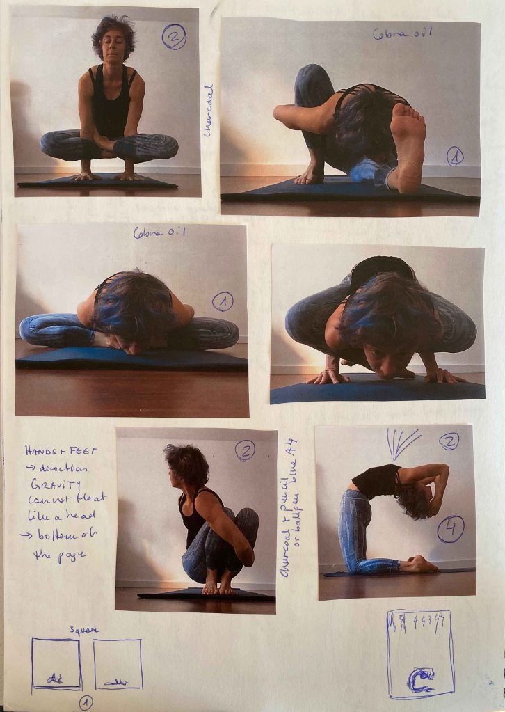
I start by looking for photos of myself practicing and although they are a few years old, they are the best clear photos I will use:
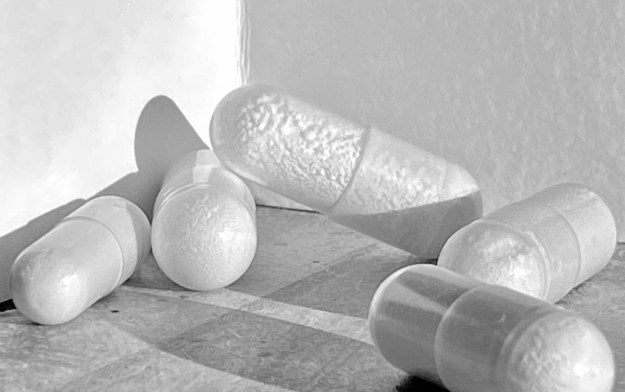
In several of the ideas I have on the Assignment map, I see these figures surrounded by a lot of space. I am thinking of the work by Matthew Carr that I saw during a visit to the National Portrait Gallery in London in 2017:

I really like the very special composition, with the tiny heads detached from any body or surrounding, floating on the grey page.
(Visit National portrait Gallery August 2017 , my photo)
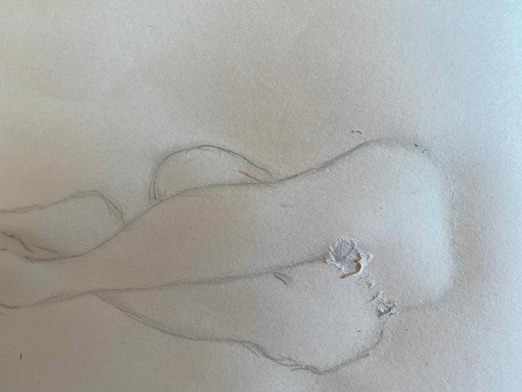
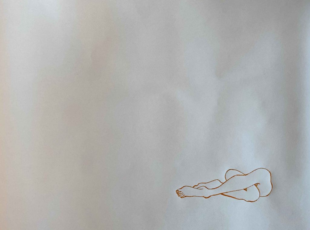
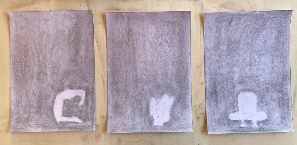
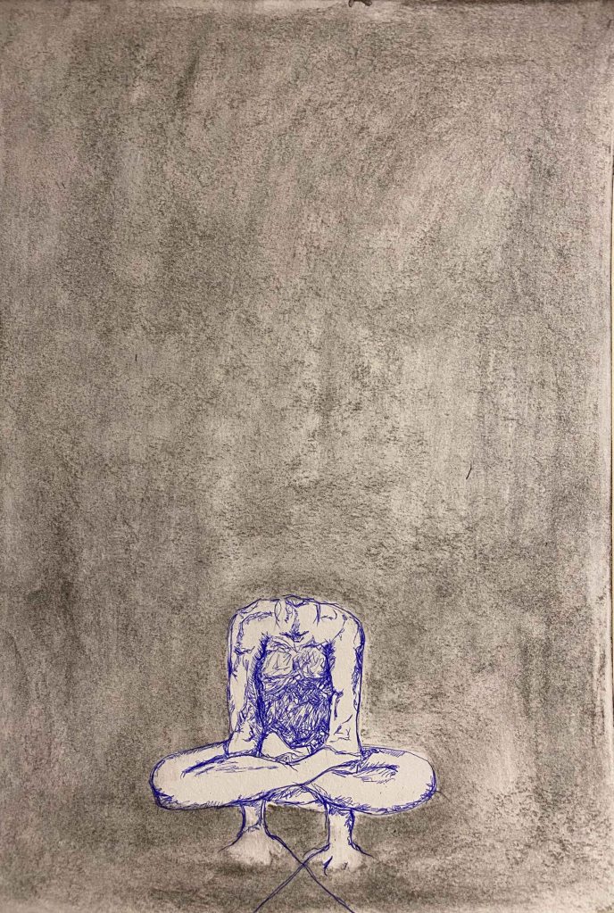
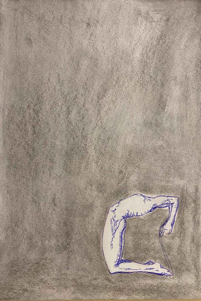
A body, hands and feet connected in a pose, contrary to a head, immediately show direction though and want to land at the bottom of the page. I reverse the idea of Matthew Carr by drawing three bodies without heads. I start with a smeared charcoal background:
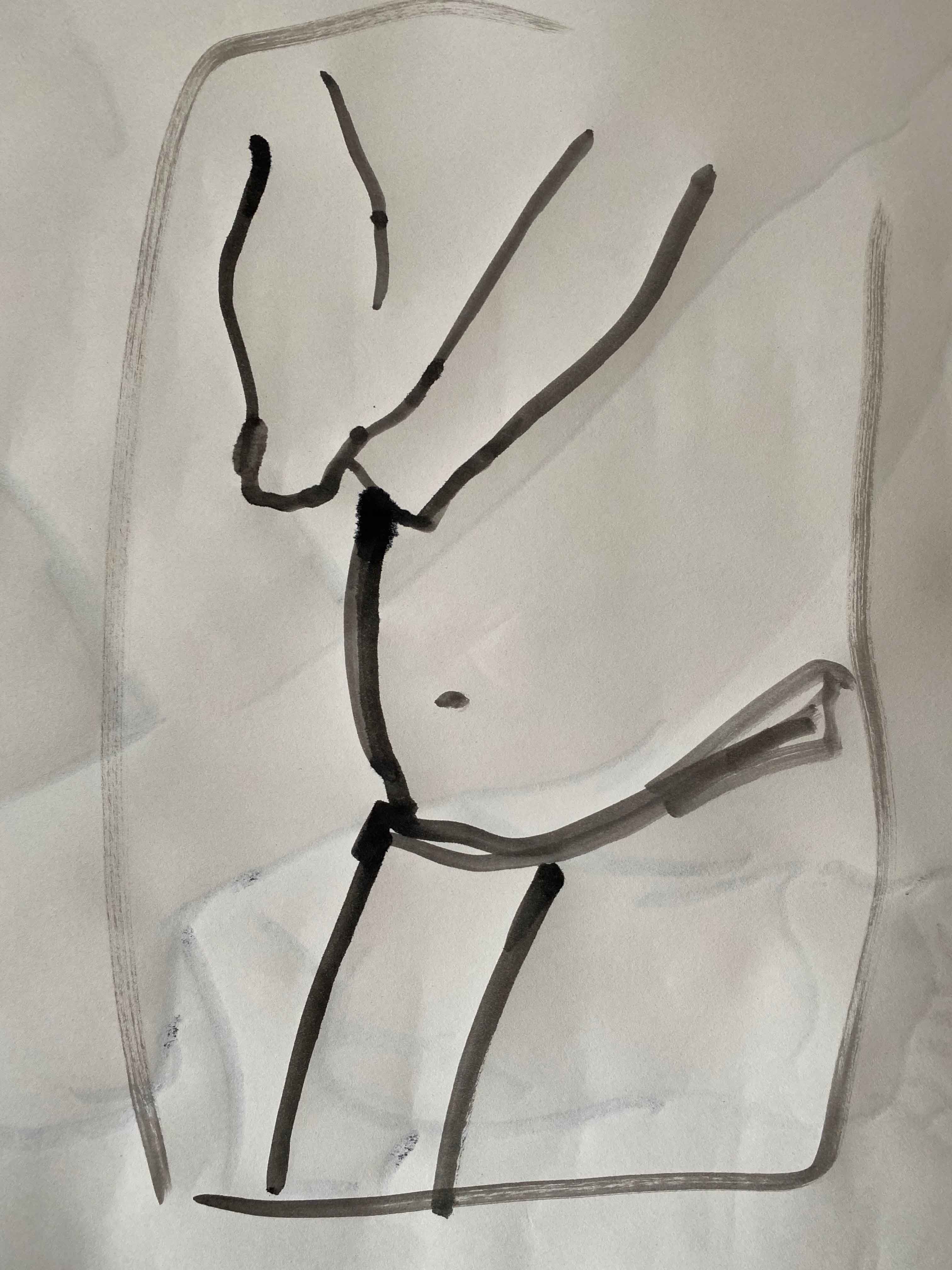
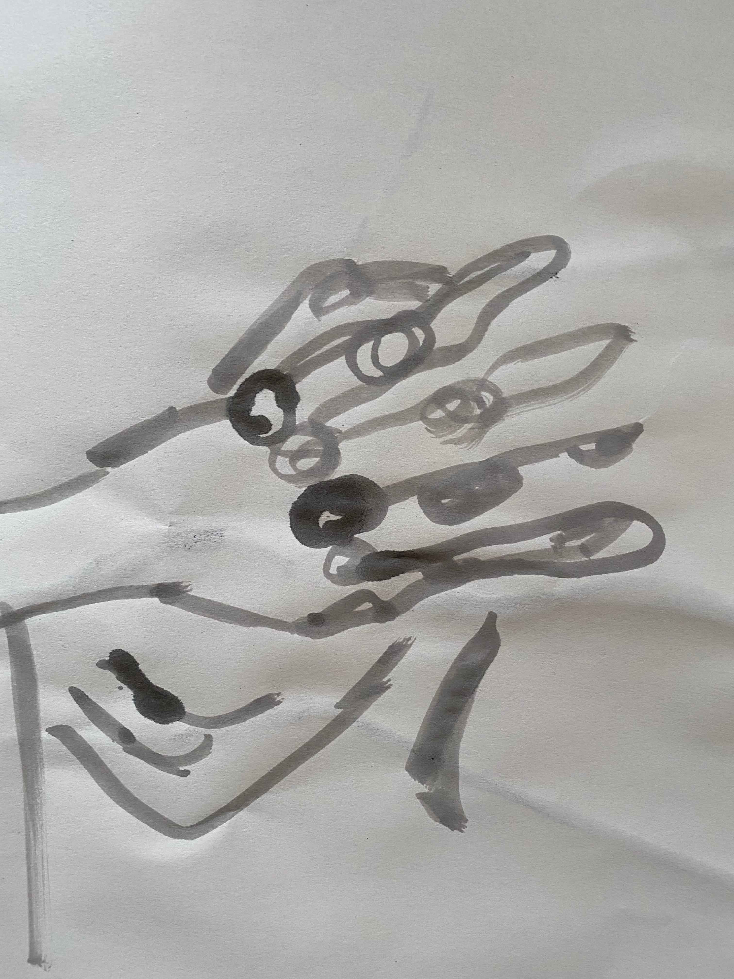
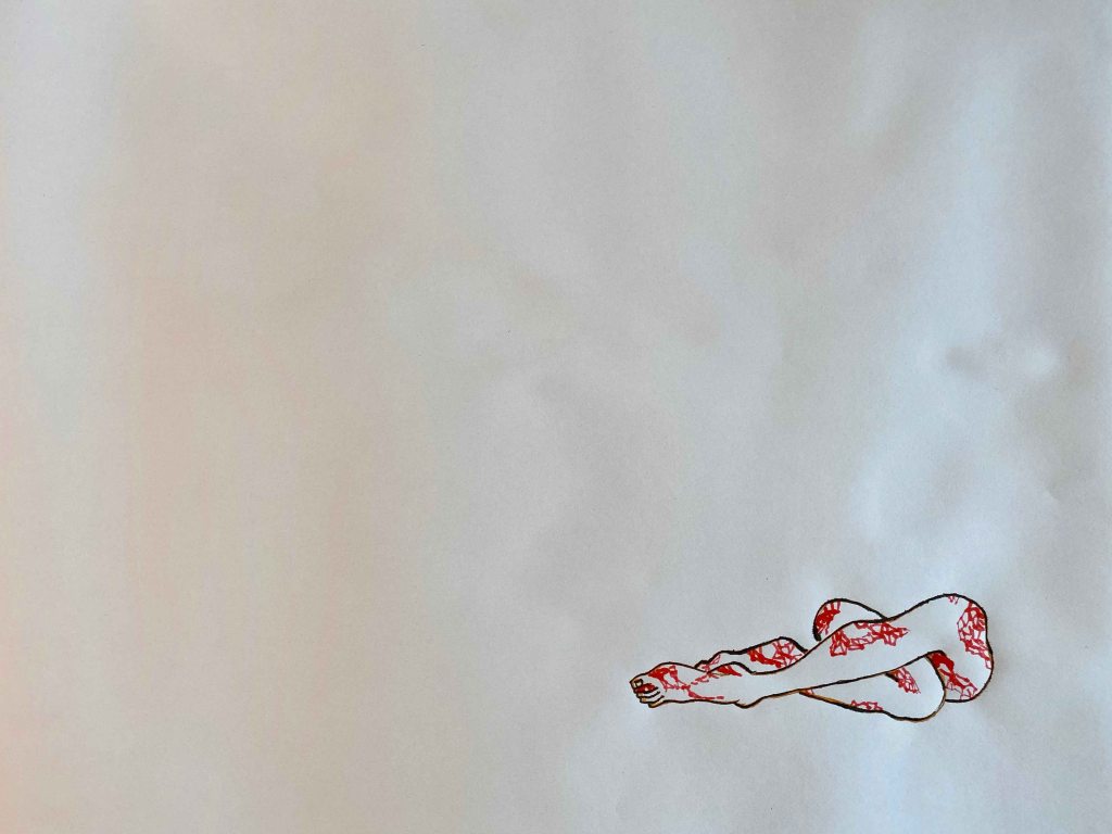
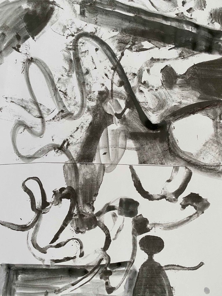
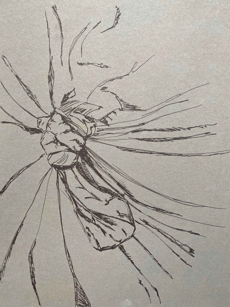
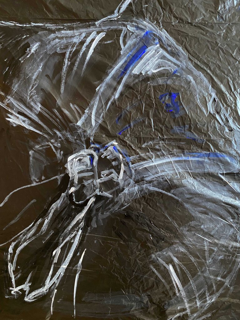
I will admit that I had the idea to draw the figures in a detailed realistic graphite drawing but after much erasing switched to a blue ballpoint pen and a free doodle drawing:
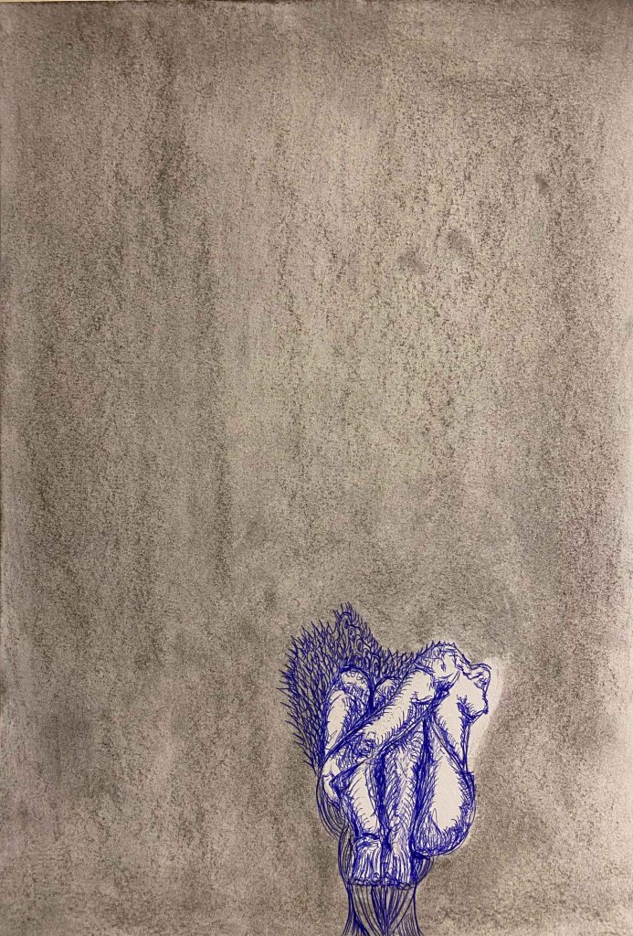
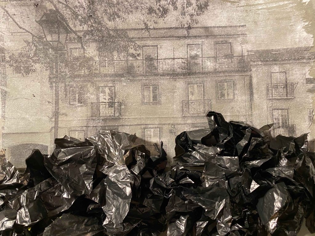
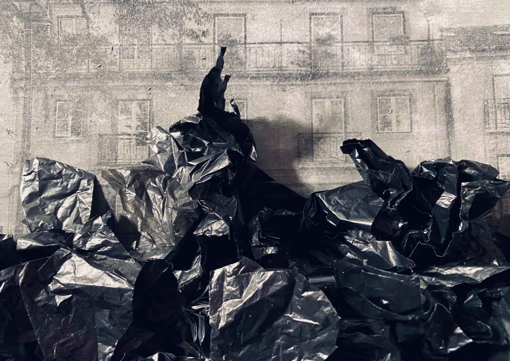
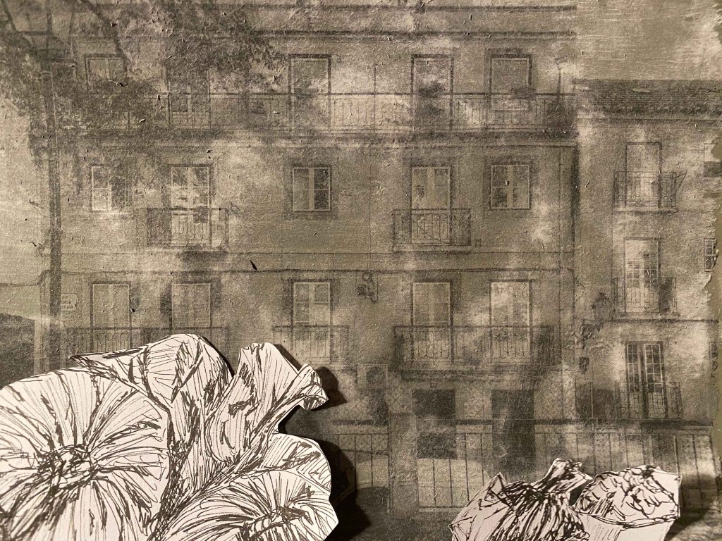
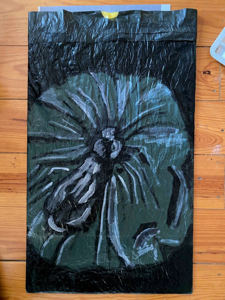
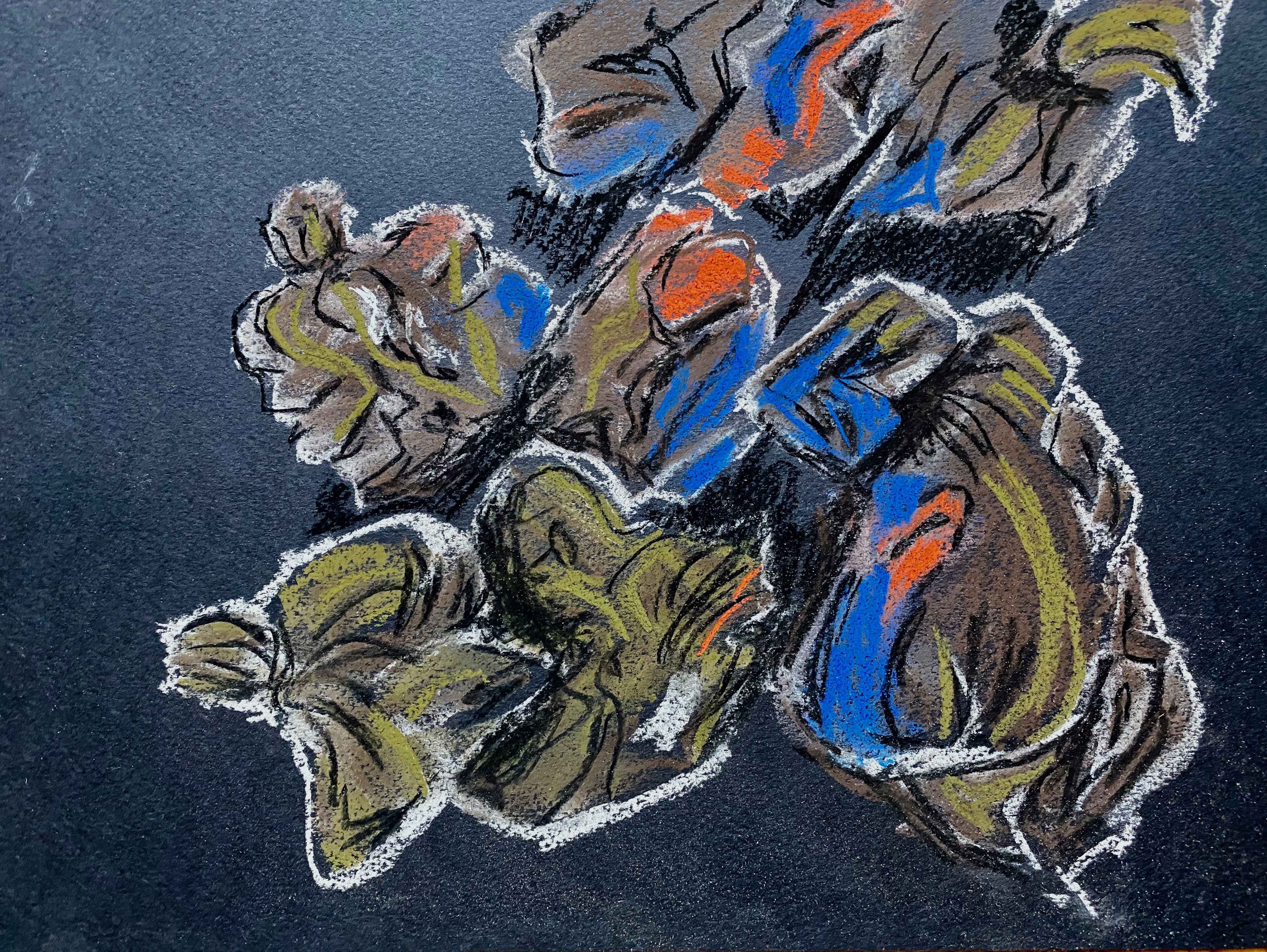
And then of course I couldn’t resist to add a flower poking out :
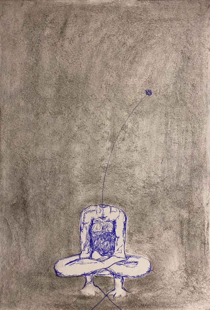
I was aiming for surreal and strange, expressing the mix of deep and weird feelings arising, but I don’t feel these drawings work yet.
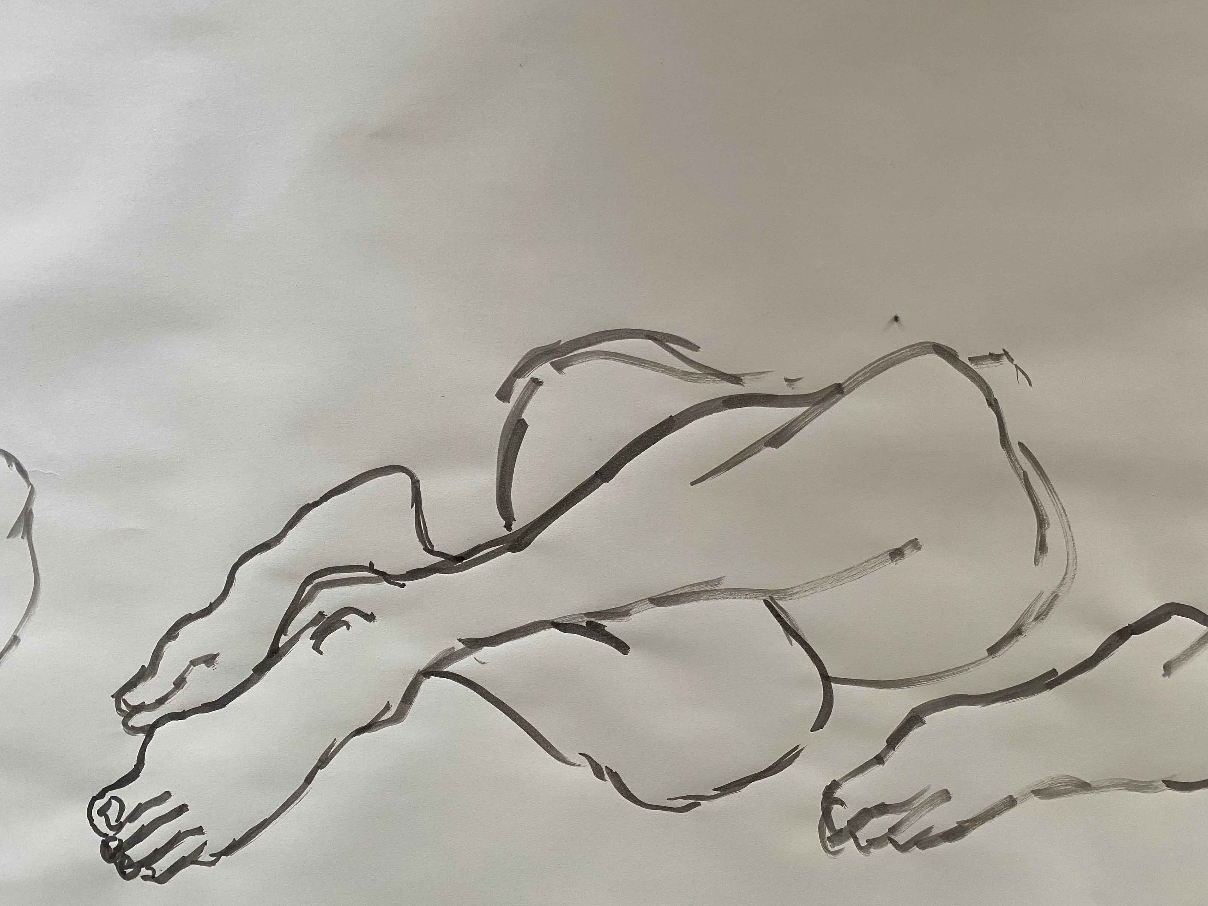
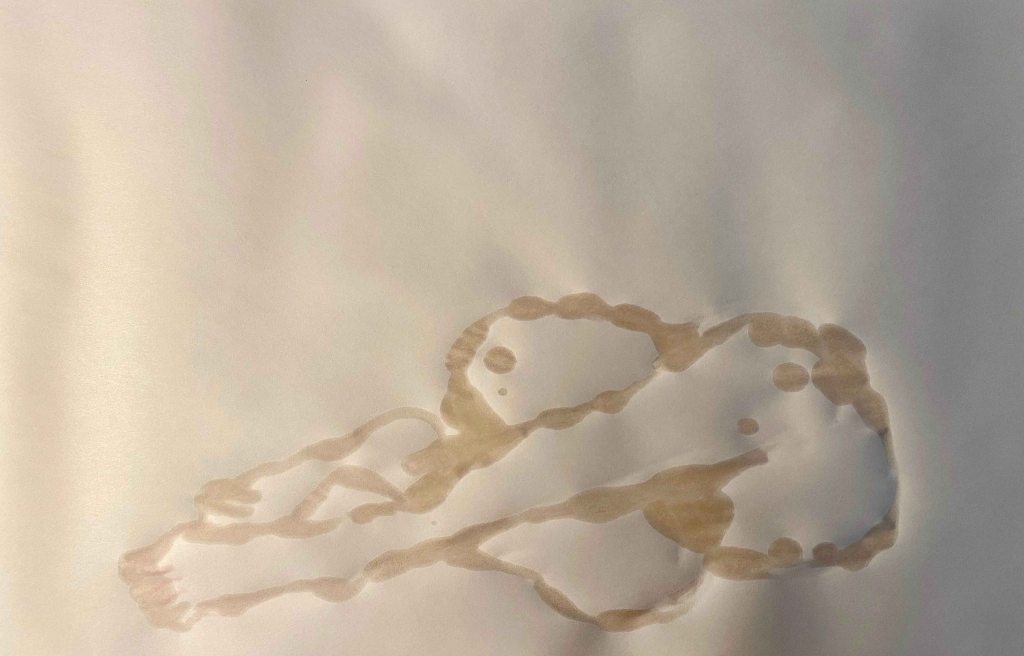
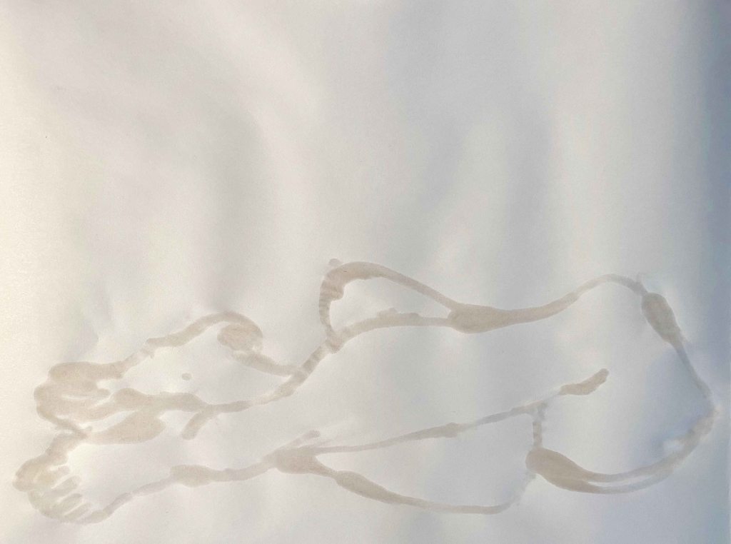
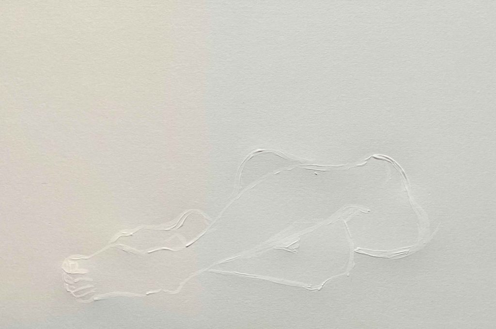
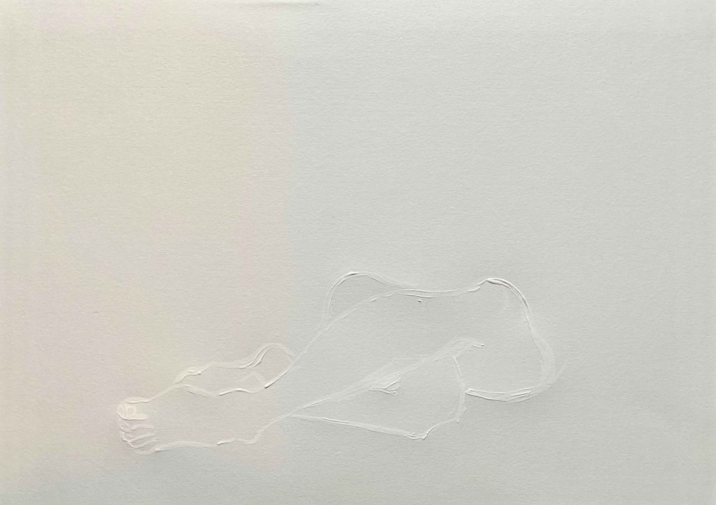
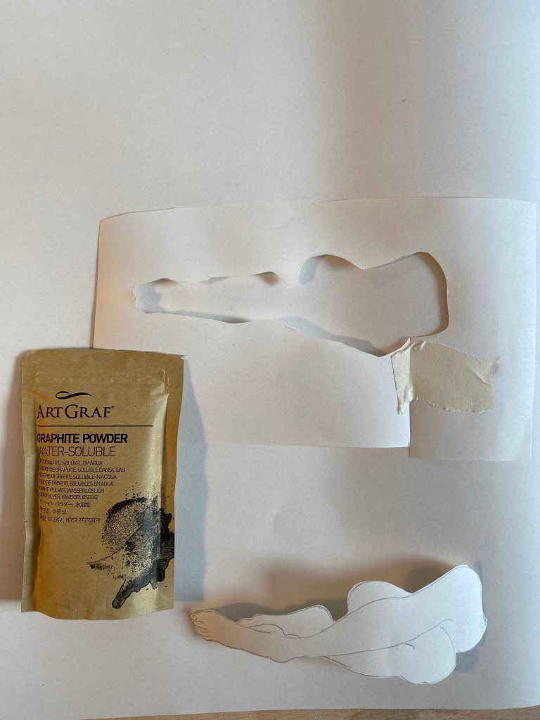
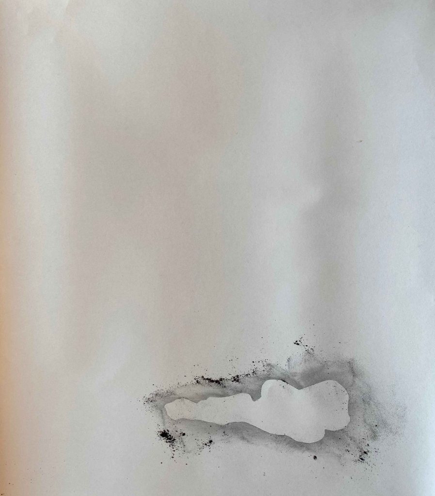
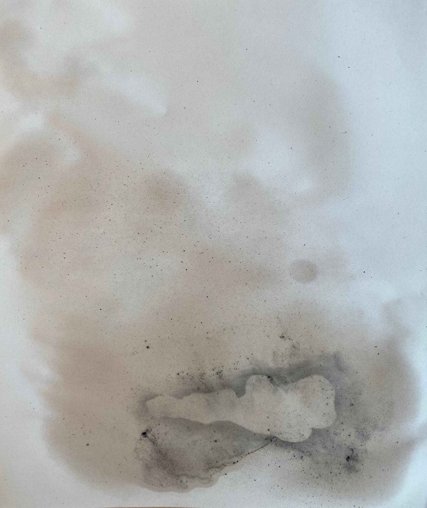
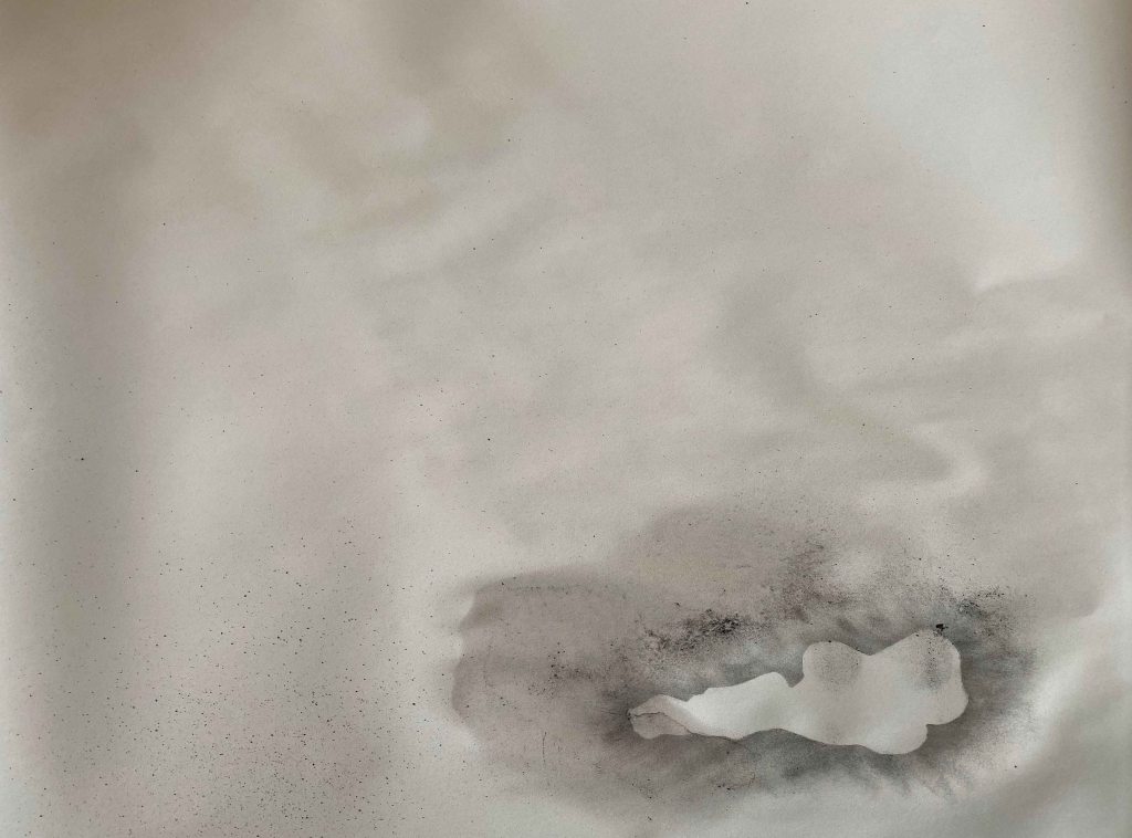
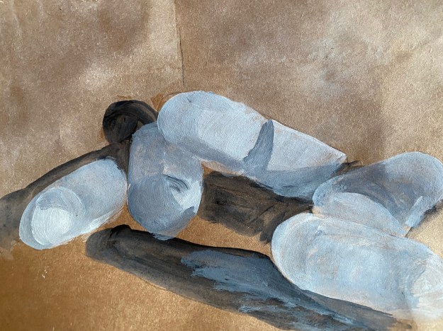
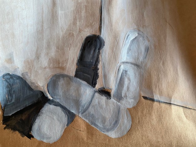
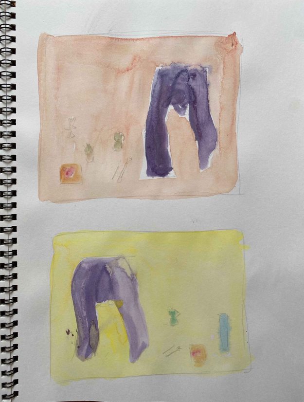
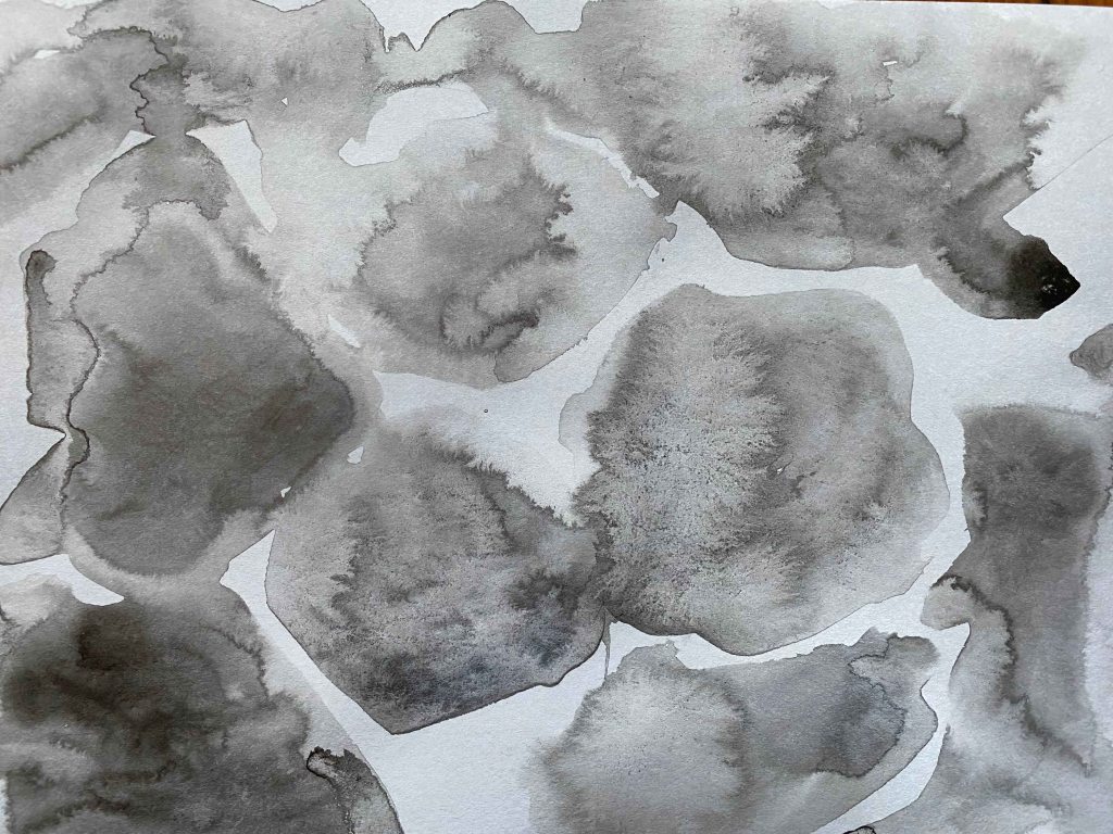
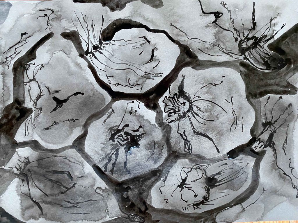
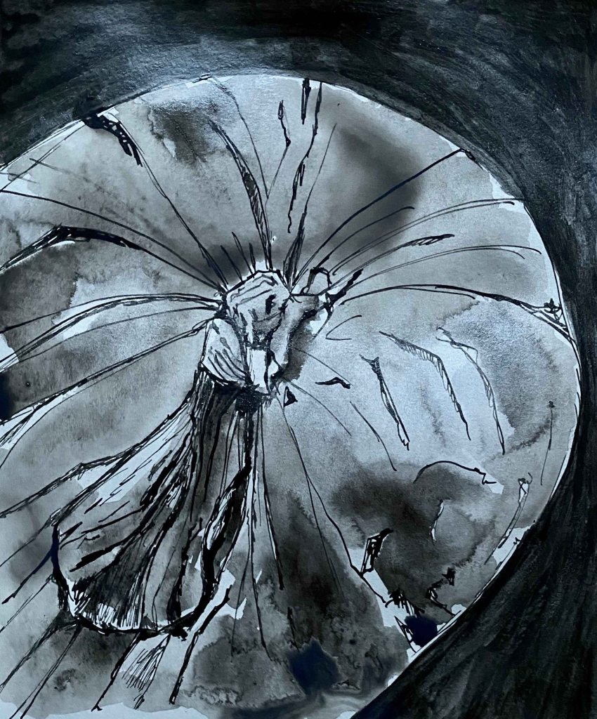
I choose two other poses that are even more anchored to the ground with a heavy sense of gravity from my photos and explore them in a similar composition on the page but with a different media- Indian ink. I am using a nature beige coloured A4 paper. I first draw the figures in water only with a large brush and then add small dots of ink:
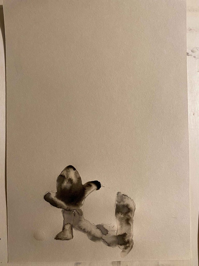
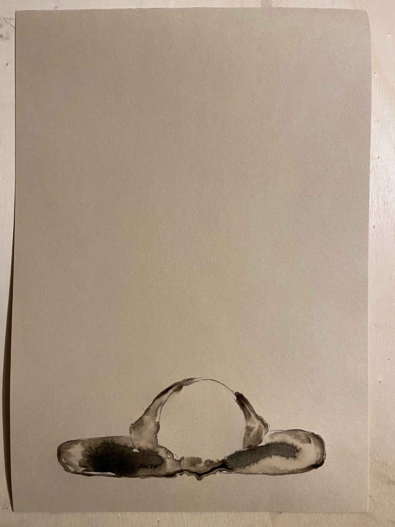
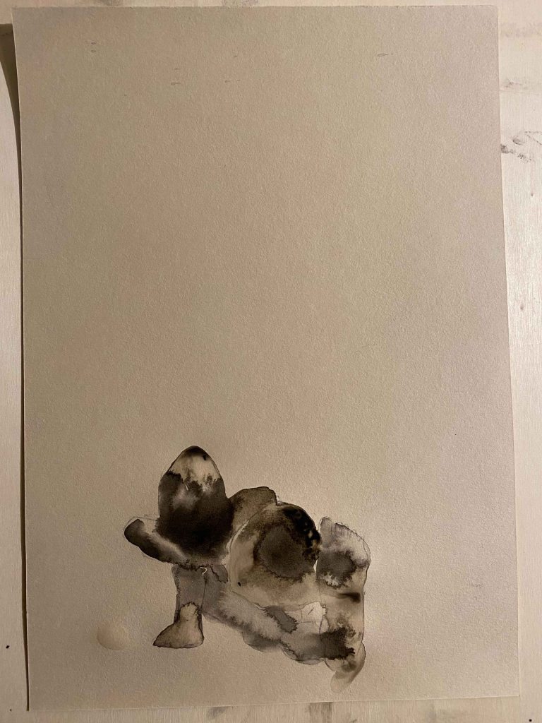
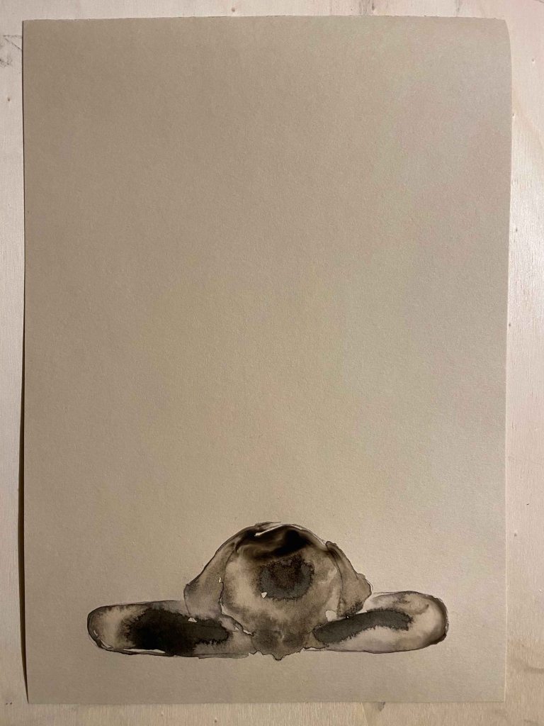
I need to add some dark lines to make the drawings more readable:
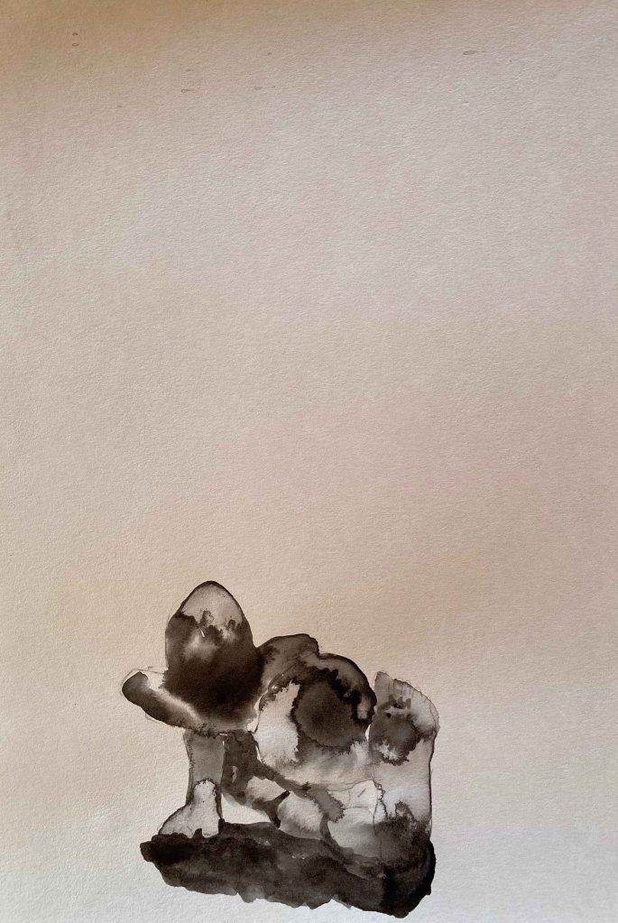
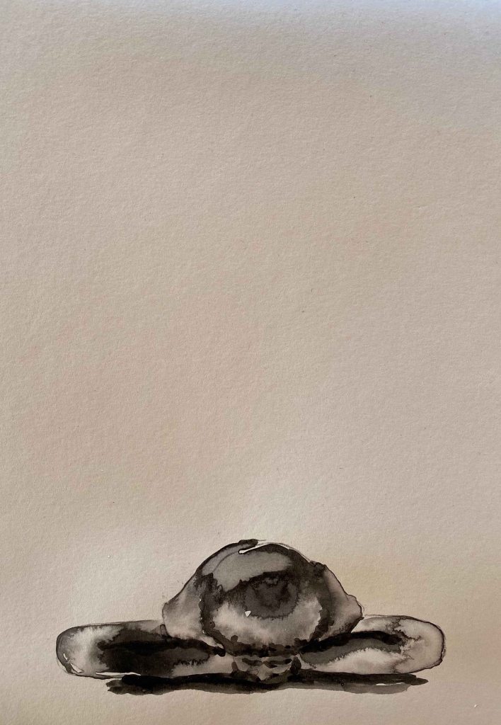
Within the figure, I like the contradiction between the complexity of the tones and shapes that form in the puddles with the simplicity of the whole. I also like the contrasts here of the dark, heavy figure and the vast emptiness of the surrounding that form an interesting tension. I think using a white paper would have added a sense of void around the figure, while the beige tone is “something” and reminiscent of skin. I am unsure through if you can see what is drawn here if you are not as familiar with the figure as I am.
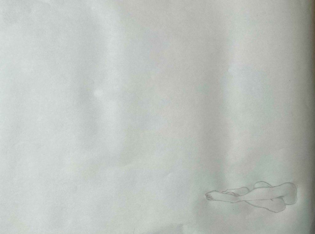
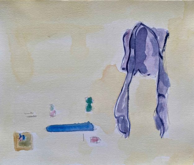
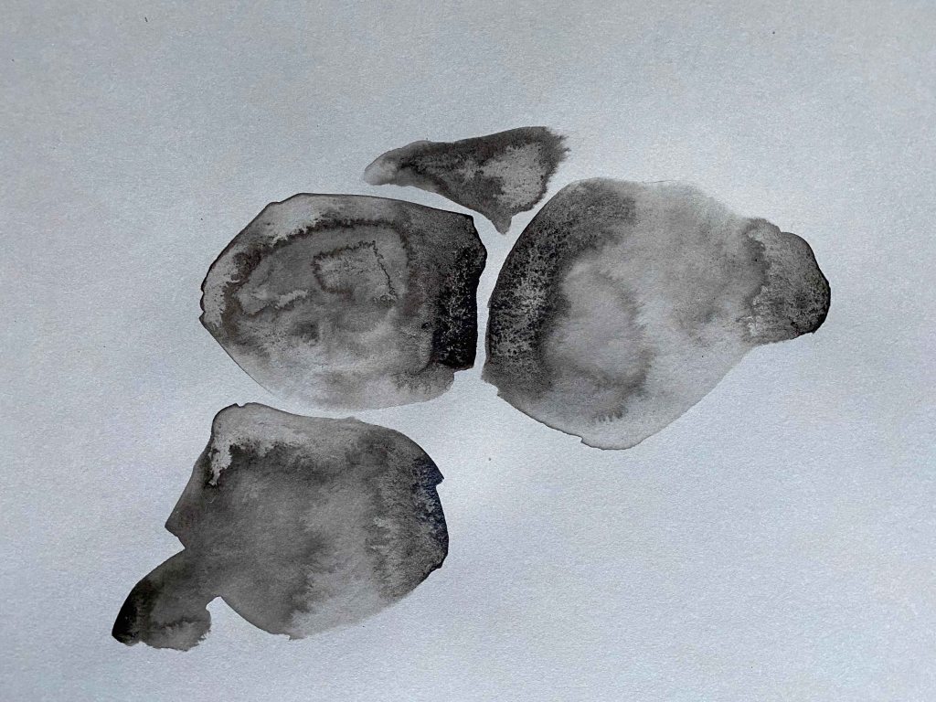
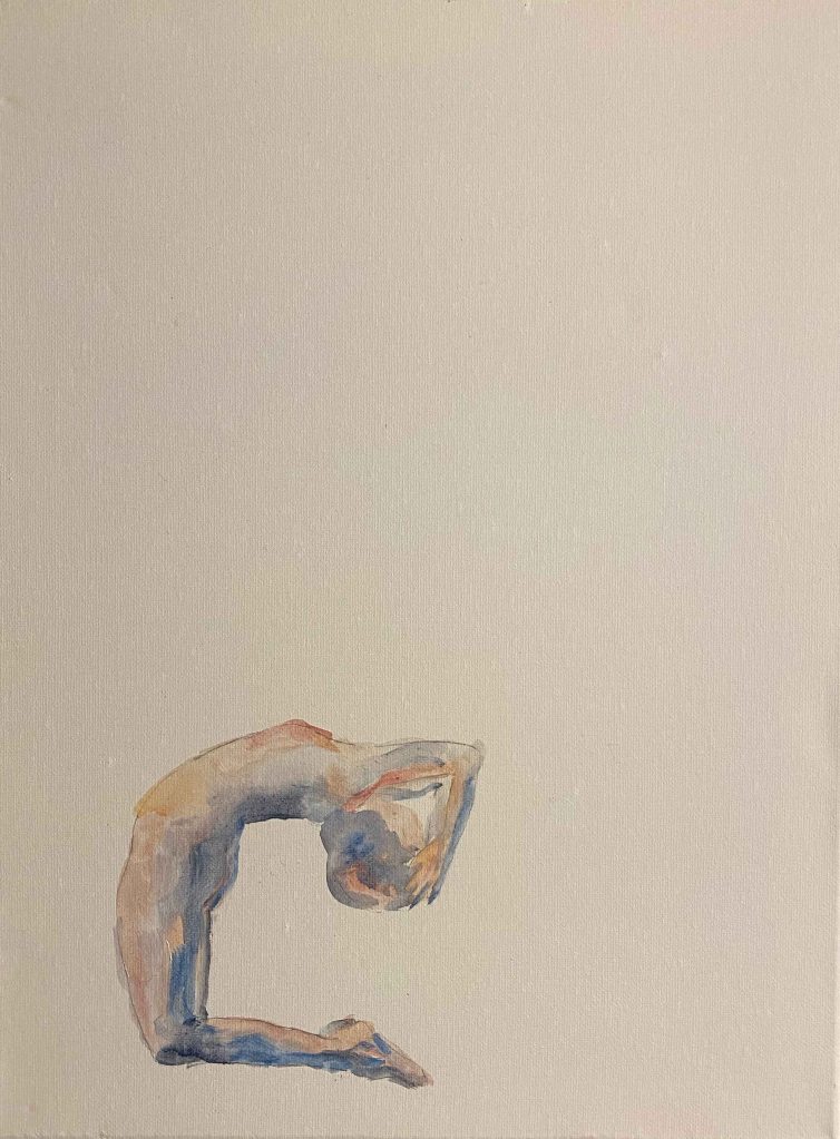
Both postures is a merging in towards my own center, and I want to draw this by placing the figures in a cave, or a womb (a birthing canal) and use flesh colours . After some experimenting in my A4 sketchbook, I decide to use a square format:
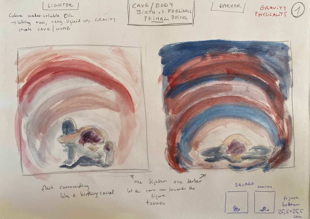
I have been experimenting with Cobra watersoluble oilpaints lately, diluting them too much and letting drops flow and will try this here – letting the element of the drops become one more element of gravity.
I start by painting the figures on a small square canvas 25,5×25,5 cm:

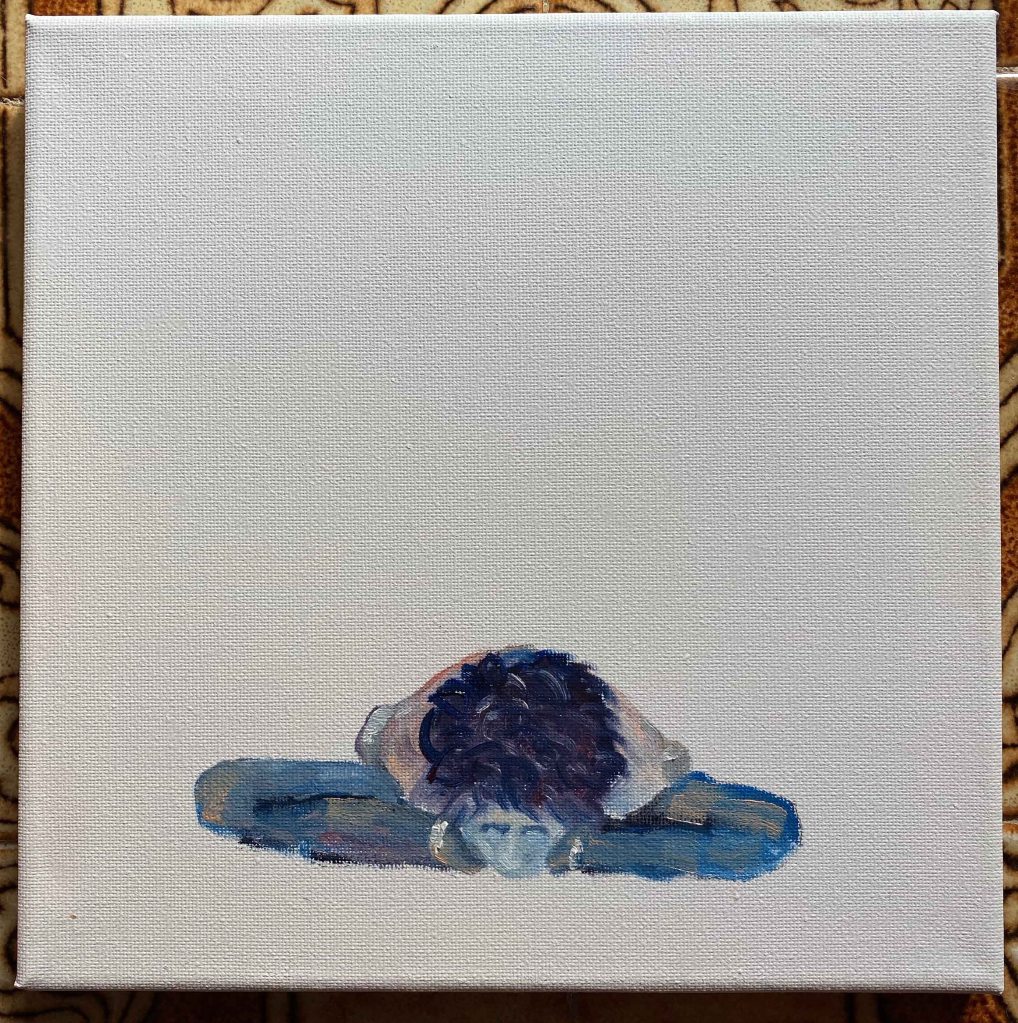
Then develop the cave/flesh/womb around, diluting the oil paints strongly and using a larger brush in large motions.
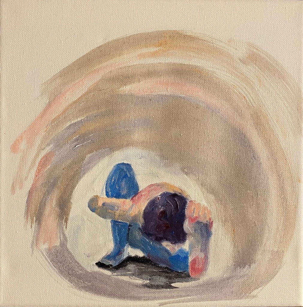
These are the final paintings with the paint dripping, emphasizing gravity:
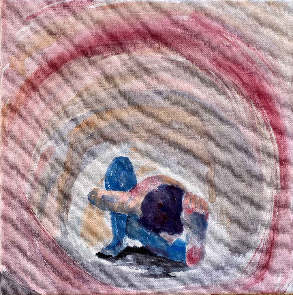
I was aiming for fleshcolours and the sense of inner organs, but this got more colourful than I intended. I am using photos from a time when my hair was purple though!
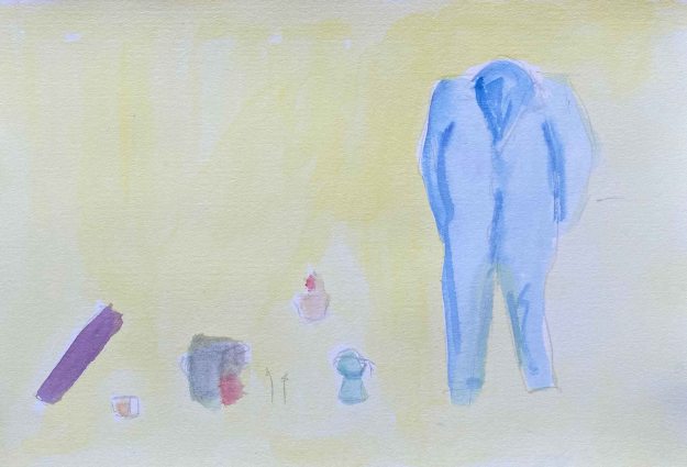
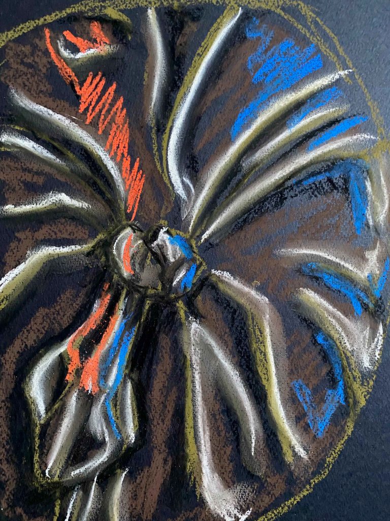
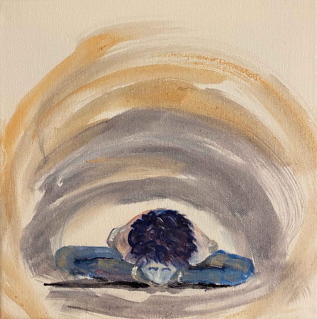
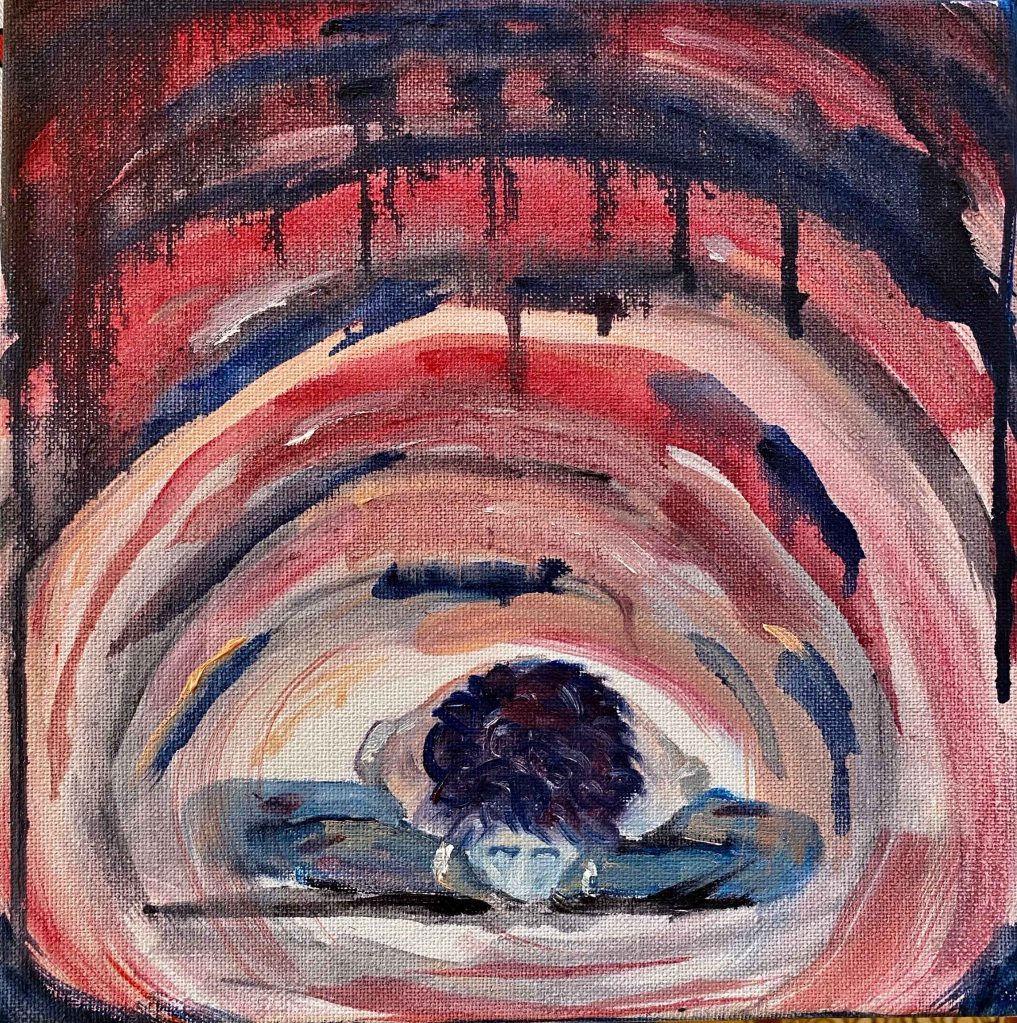
I want to try using the same paints in softer colours for another pose- a deep backbend. Deep backbends are the poses that bring up the strongest floods of emotions, especially fear, during the practice. I decide to come back to the vertical format and already know the title of this panting: Facing those fears.
A quick coloursketch on A4:
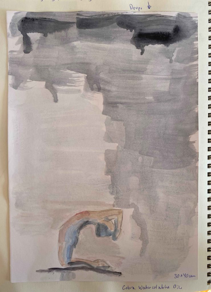
I choose a canvas of 30×40 cm and am careful not to overdo the colours this time. The paints are really strongly diluted with water. ( I need to ask my tutor if she has any experience with this and if there is an issue of fading with time.)
Again I start with the figure in the white space:
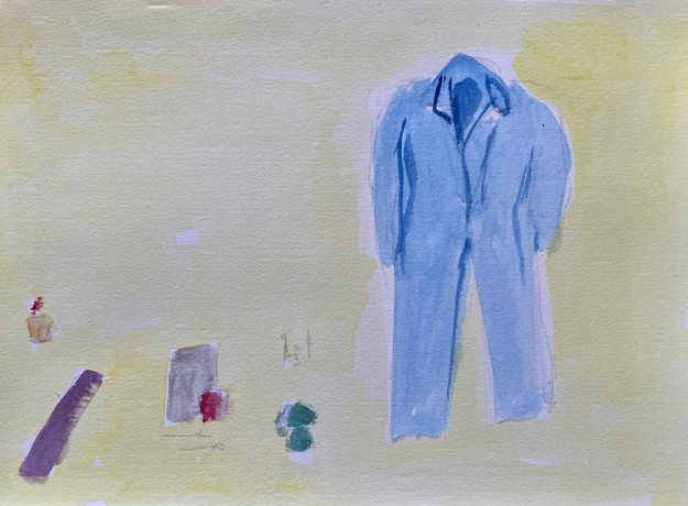
Then I add the background and let the strong, dark drops represent the fear:
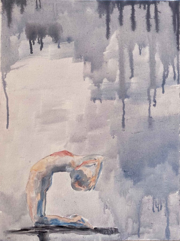
I am surprised how much I like this little painting. Sometimes I spend days and days on a painting. This was such a light and quick sketch/painting and it already feels finished. It really captures my feeling in this pose, such a vulnerable surrender.
I agree that these last three works are rather paintings than drawings, but I have decided to not let that stop me from exploring. I am on the painting pathway after all.
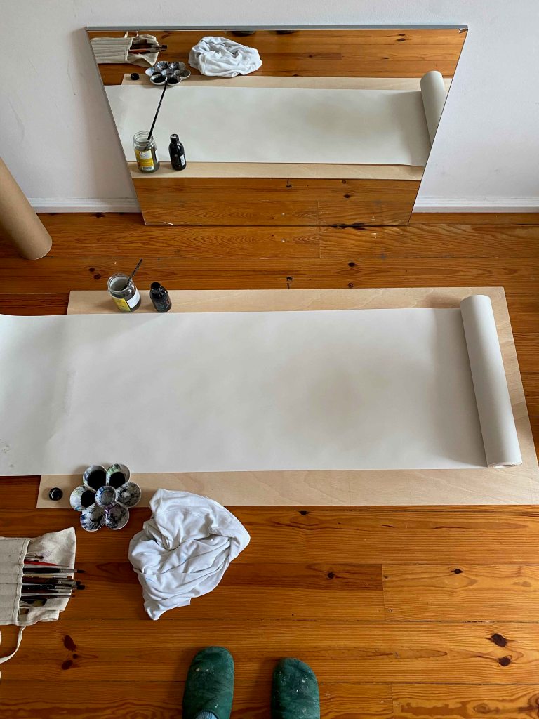
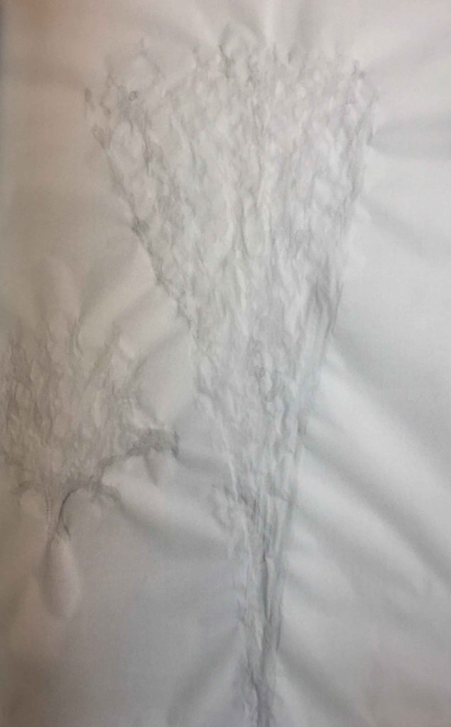
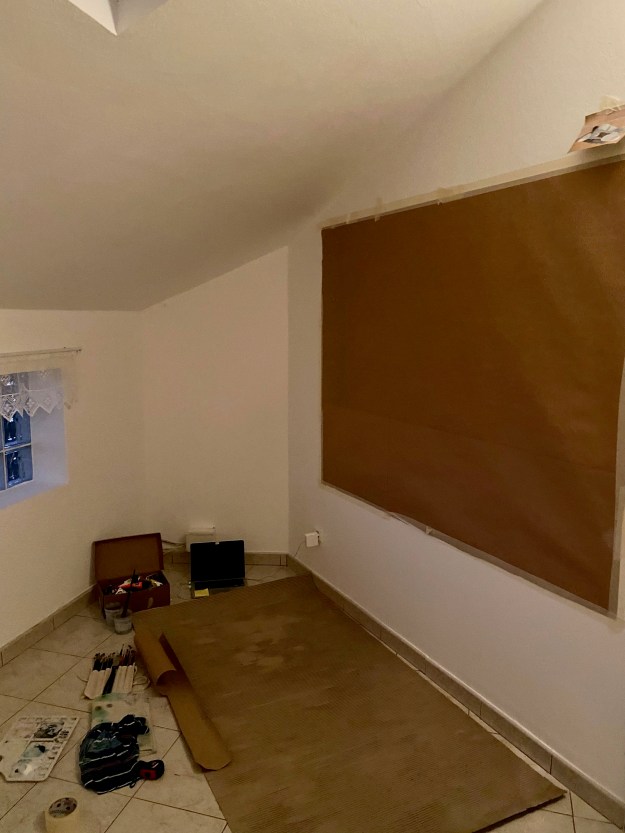
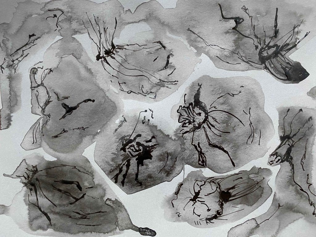
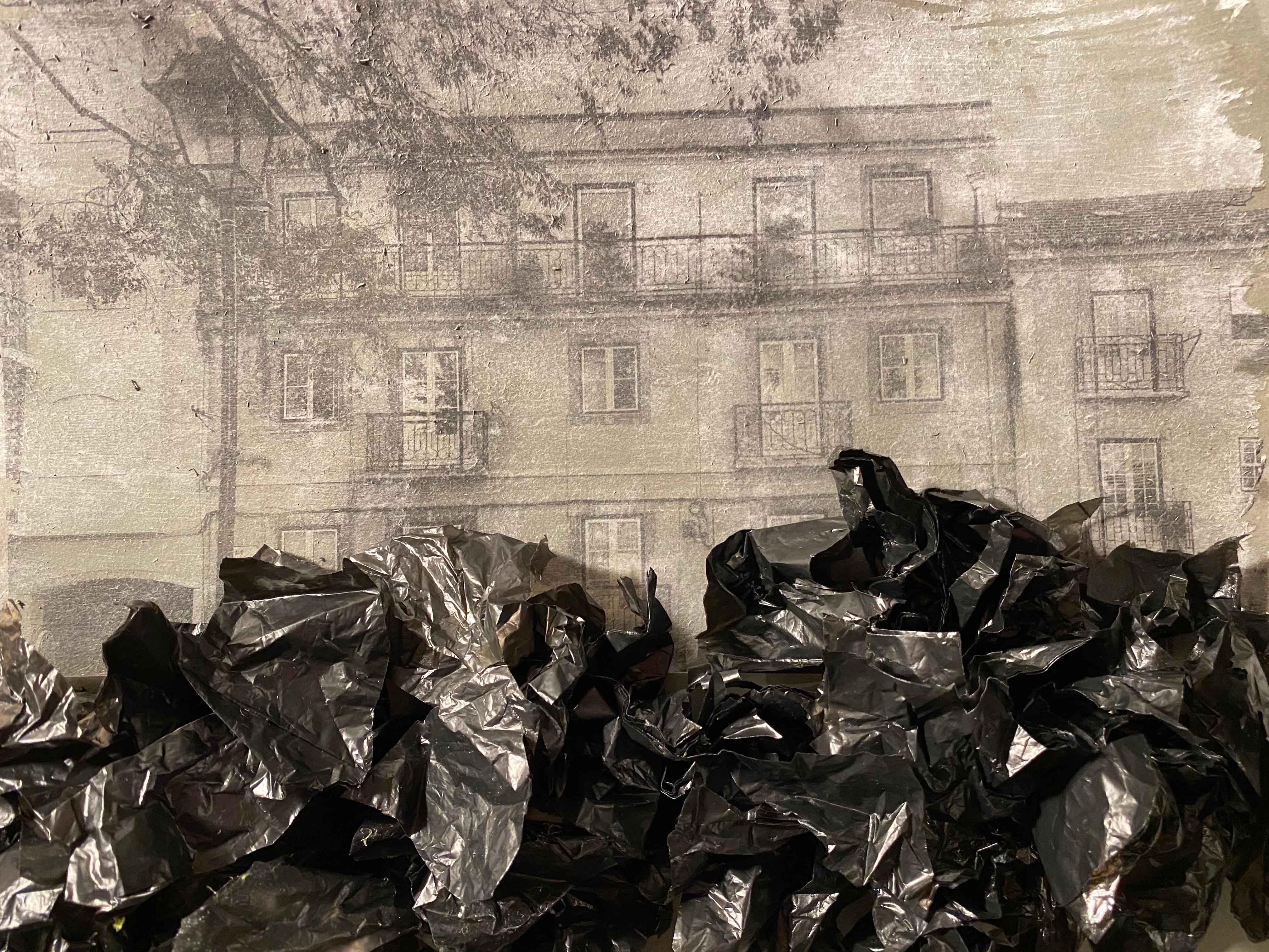
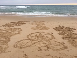
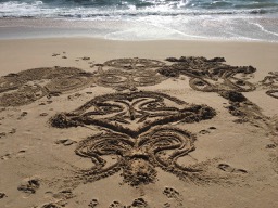
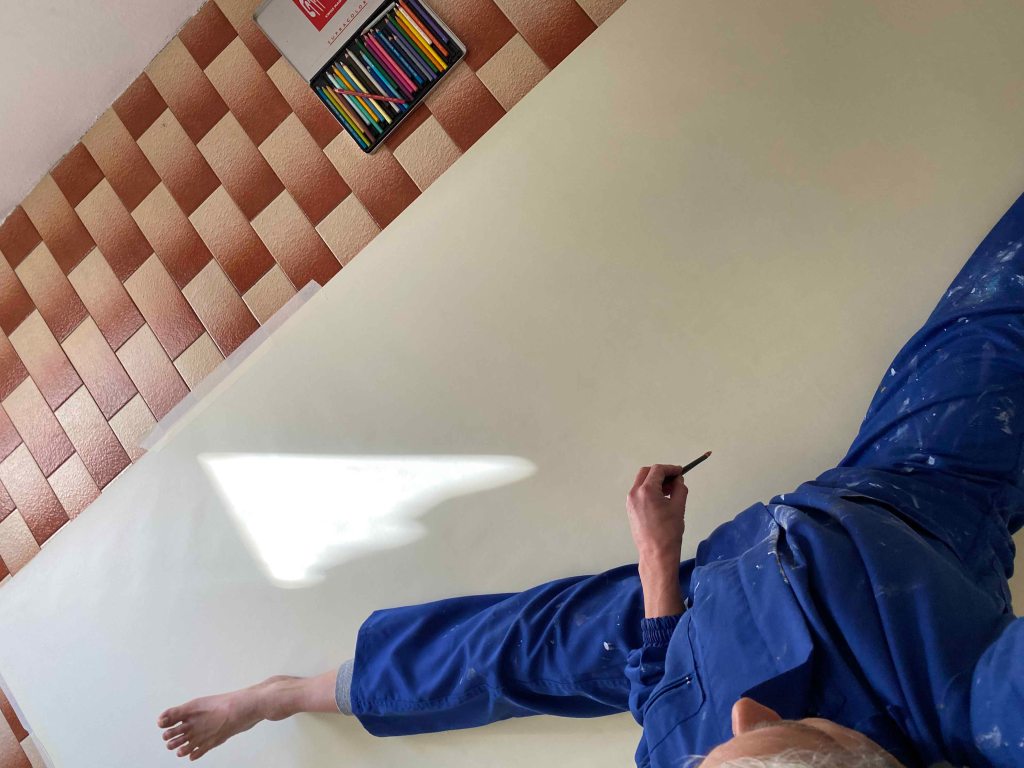
Finally, finally I have arrived at going BIG! I have had this dream of having a huge space where I can move around huge canvases and be messy for around 20 years I think, long before I even started to paint again. Until now I am still painting in our shared livingroom/studio with items from every familymember to watch out for. But NOW! We have just moved into a huge empty house that will be completely renovated- so this is my chance! I buy a big roll of whitish paper and prepare one larger than me canvas on the wall and another on the floor. Last summer I was doing many drawings in the sand by sitting or lying in different poses and moving my arms and legs symmetrically. Since then, I have been wanting to do this on paper.
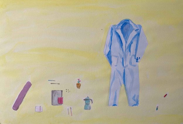
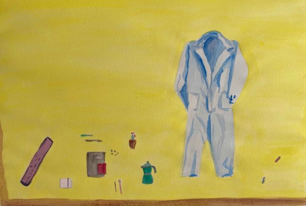
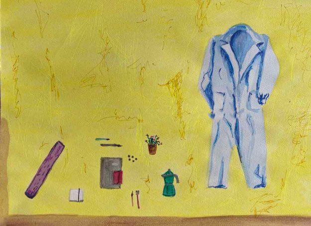
I am prepared:

I am listening to loud music in my headphones and standing in front of the vertical paper with a charcoal stick in each hand. I have promised myself not to be attached to the outcome, but just live the feeling in a sort of solitary performance and raise my arms wide- inhale.
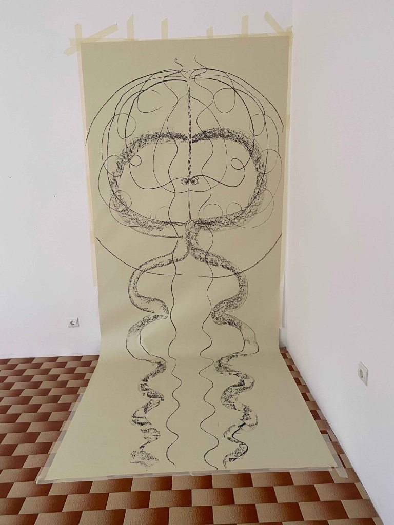
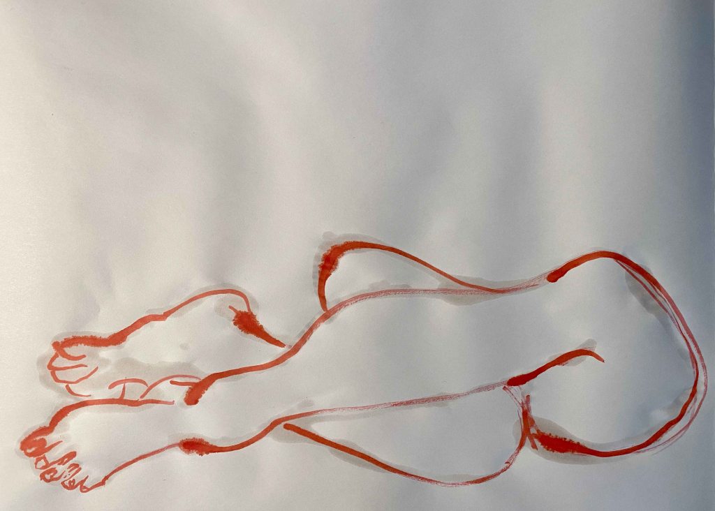
I still tricked myself into seeing something kind of figurative drawing instead of leaving it as an abstract pattern like in the sand. I decide to paint the feet red.
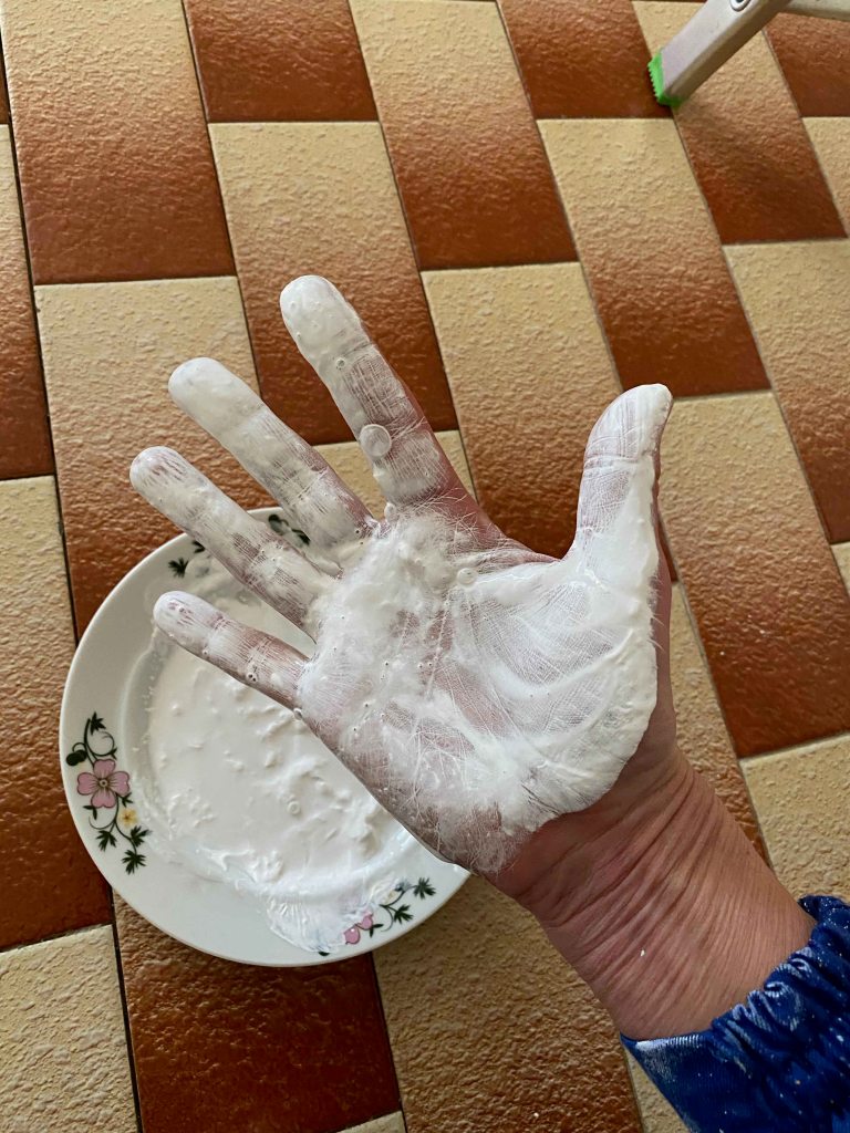
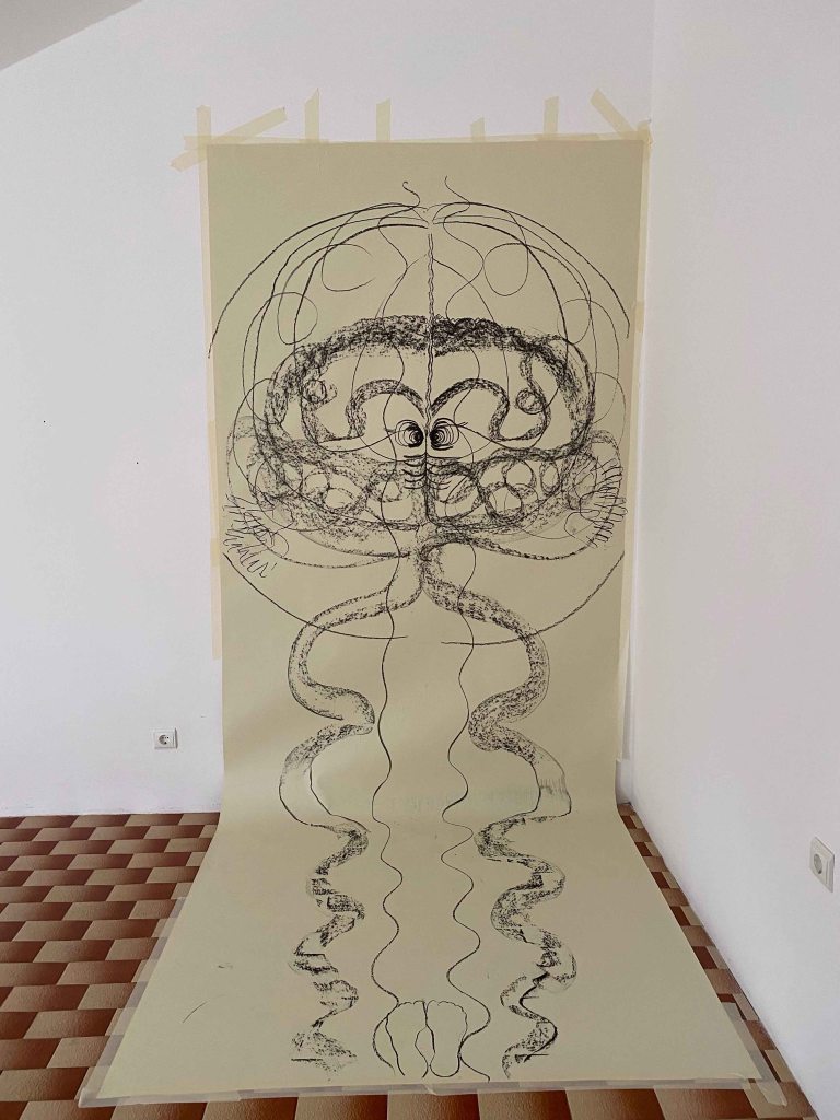
And getting into the paint with my hands..
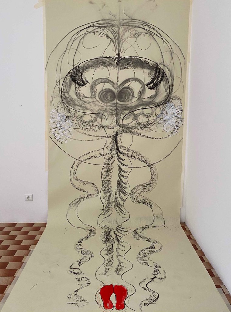
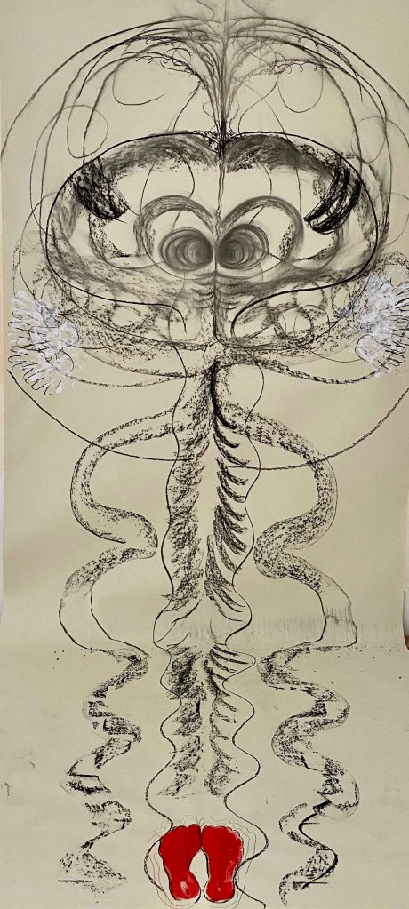
If I crop the drawing it has more or less the shape of a yogamat and is some snakelike Kundalini energy rising:
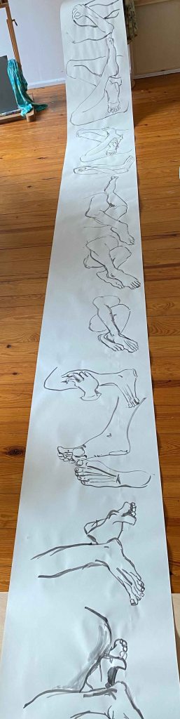
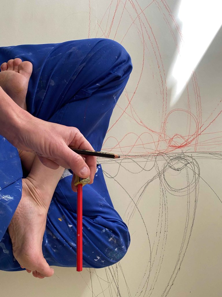
I move on to the paper on the floor and first sit in a center split. I am listening to a Shiva/Shakti song and will draw with a black coloured pencil in one hand and a red in the other.
I try to draw my own shape but am annoyed by my thick coveralls ( it is freezing cold up here in the attic) and my lines are too rugged:
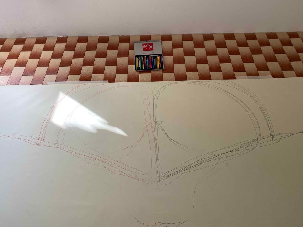
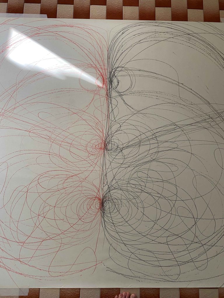
I shift to a lotus posture and draw in various symmetrical shapes as long as my arms can reach. This time I am slightly held back by having to use the sharpener all the time!
I am quite happy with the shapes produced:
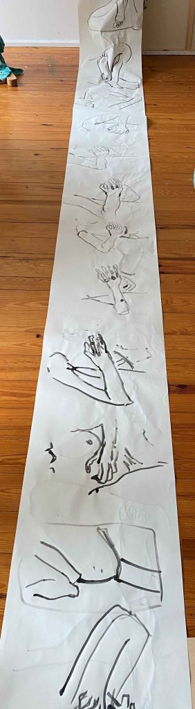
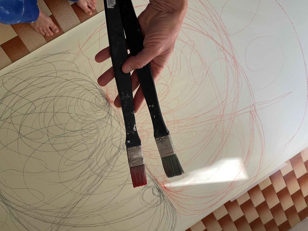
But I haven’t gotten this far to draw carefully in coloured pencils! I unpack my acrylic paints and realize that all my materials are for smaller formats- these are my largest brushes!
In position again, with one pot of red and one of black acrylics:
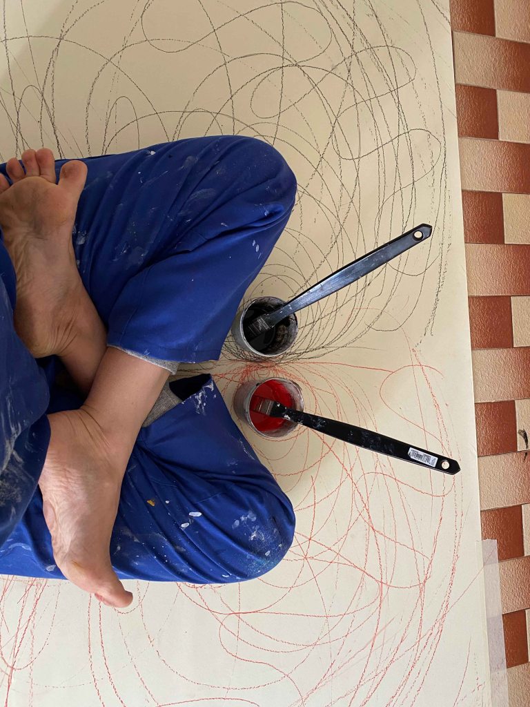
And this is where I should have stopped painting! At this stage, I find the drawing successful:

But I did not stop here… As always, I tried to discover a face or something recognizable, so this is the final drawing:
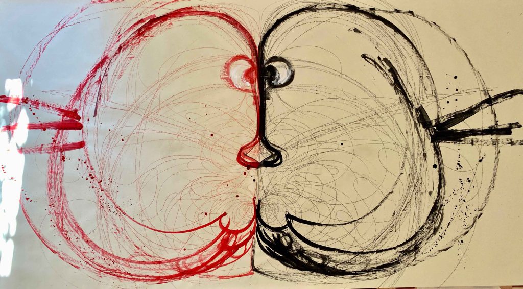
I am not particularly satisfied with these large drawings as results, but it has been an incredible experience of figure drawing in the sense that I have used my whole body in the expression. It has been an absolutely incredibly liberating experience and I definitely want to continue drawing HUGE and using all of my range of motion.
REFLECTION ON ASSIGNMENT 1:
For this Assignment I have neither produced a finished drawing , nor a series, or maybe I have produced several. I have allowed myself to open up lots of different pathways to continue exploring. So as a minus, nothing is clearly finished. On the plus side- I am full of ideas!
I will give myself a big minus for working too closely from photos though for all of the first drawings. During the contextual research about Prunella Clough, I admired the way she used her own photographs and let shapes and elements reappear in her paintings, rather than reproducing them and thought that I would love to work like that. And then, immediately after, I fall into the trap of using all the photos way too closely.The last paintings in huge formats were liberating as I did not have any reference other than my own joy of movement.
I chose to study Drawing 2 before Painting 2 with the precise wish to practice my drawing skills, especially the figure and perspective drawing which are my weakest points. This is definitely something I want to develop through this course, rather than relying too closely on photographs.