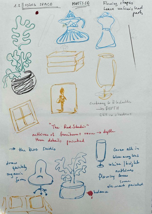
After studying the work of Elisabeth Blackadder, I will make a different piece inspired by Henri Matisse’s more sophisticated use of space and pattern.
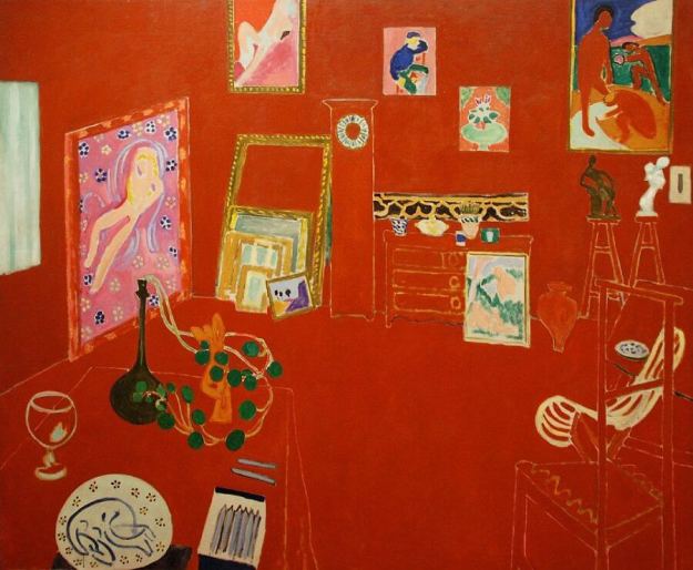
In the blogpost about the composition and use of space by Matisse, I chose to look at “The red studio” from 1911.
In this painting, I like the combination of the detailed elements and the swirling linedrawing of the furniture that creates depth the sense of space.
I start by looking at the line and shapes Matisse is using, while using items from my own surroundings.
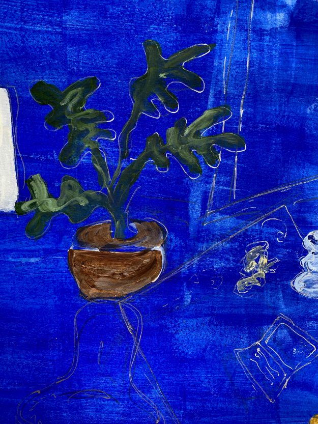
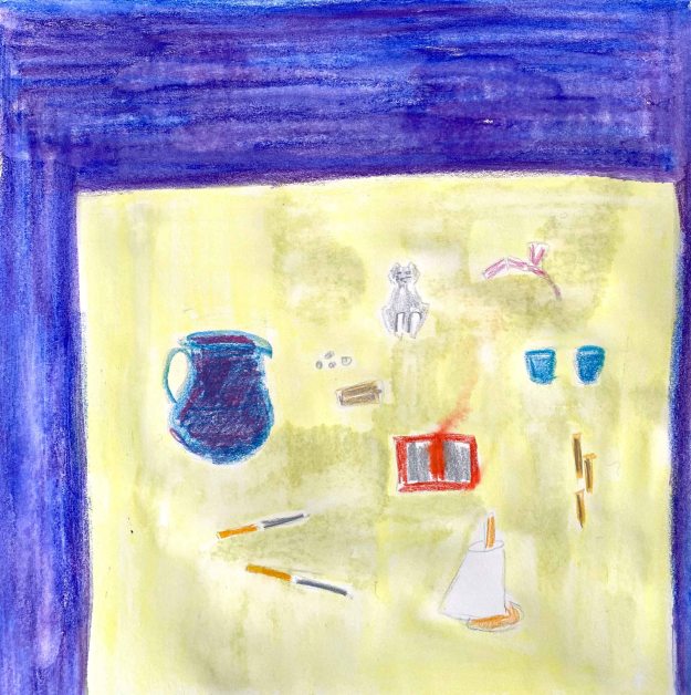
I decide to paint my own livingroom/studio in this manner, but choosing a blue background. My walls are normally white, but I will imagine them blue, and take some freedom in moving the objects as well.
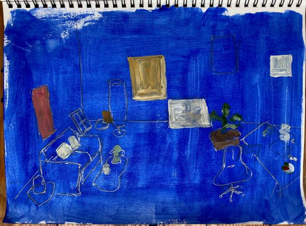
This is a study in acrylics and gel pens in my A4 sketchbook:
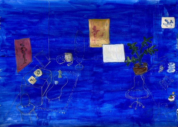
I decide to replicate this on an A1 Canson Mixed Media paper using acrylics for the painted items and pens for the linedrawing.
This is the final drawing, with some added decorative elements. It is difficult to see the line well on the photograph, it has a nice gloss in the flesh.
These are close ups:
I think that I have achieved balance between the painted elements that immediately attract the attention, and the space around it in this drawing. I believe the three smaller, lighter items on the right are balanced out by the heavier red frame on the left as well, not letting the drawing tilt to one side or the other.
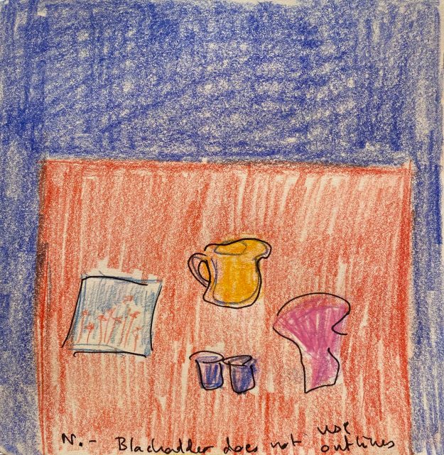
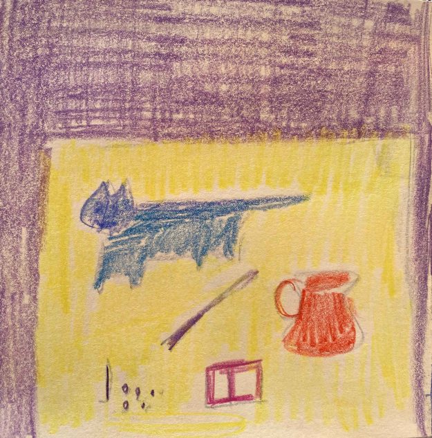
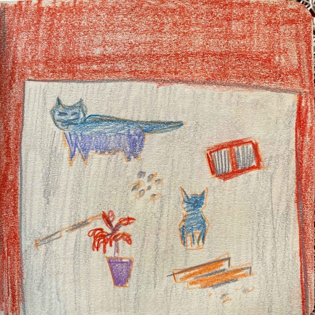
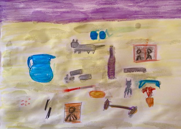
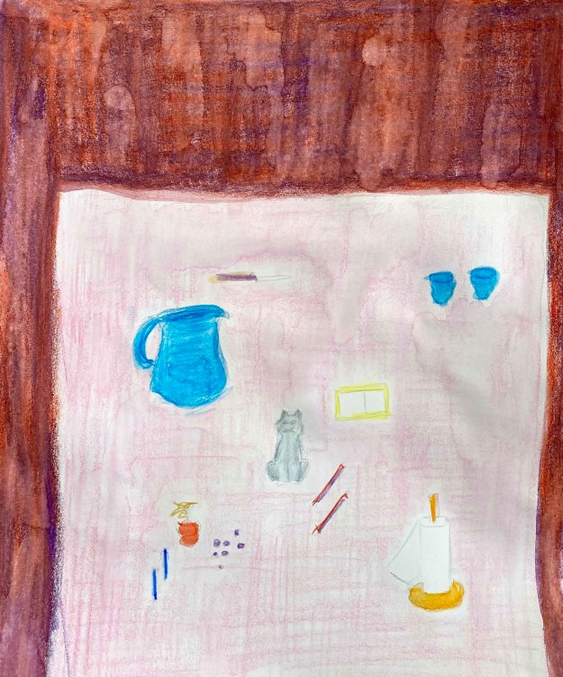
I am currently on an unplanned visit with my mother, so I start exploring different compositions in my small pocket sketchbook, by looking around for interesting objects. I think Elisabeth Blackadder would have found a lot of material here, my mother being somewhat of a collector too. They also share an interest for anything Japanese and cats.
I am placing different collections in various arrangements, working intuitively as I observed Elisabeth Blackadder doing in the videos, moving them around and combining shape and colours, leaving the objects flat, without shadow or sense of depth.
I am using coloured pencils in my small format pocket sketchbook.
I observe how important the weight of the larger colour fields is, without it the collection of little things completely loose interest . Also how a brighter coloured item immediately draws my attention and can balance out a much larger darker colour.
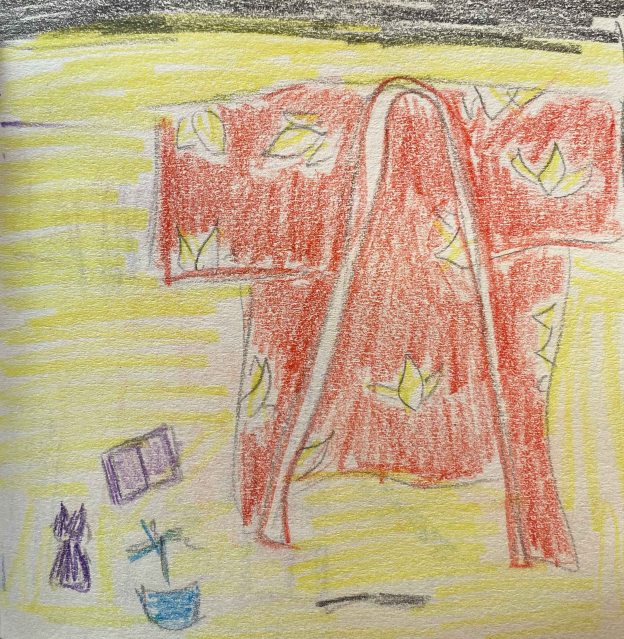
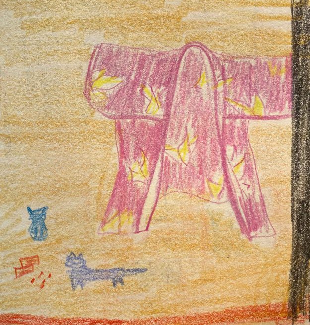
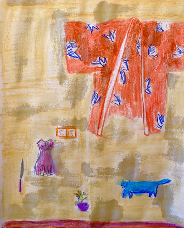
I discover a beautiful kimono and take some freedom with the colours and patterns when including it in the next compositions:
I continue my exploration on A4 sheets with the coloured pencils and water that turns them into watercolours (unfortunately on too thin paper that wobbles)
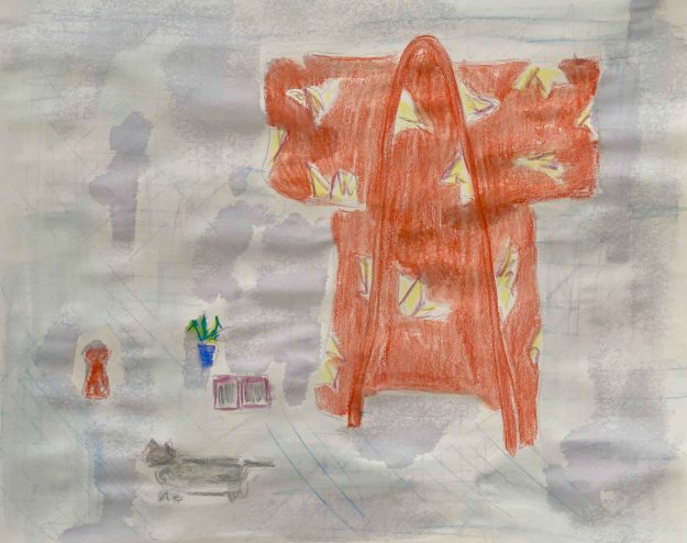
I think both of the above work- it is helpful to have the large red main object, the kimono, dominating the composition that immediately becomes clear and solid. I could maybe argue that there is more a sense of background in these than in paintings with many smaller objects and clearer balancing separate colour fields.
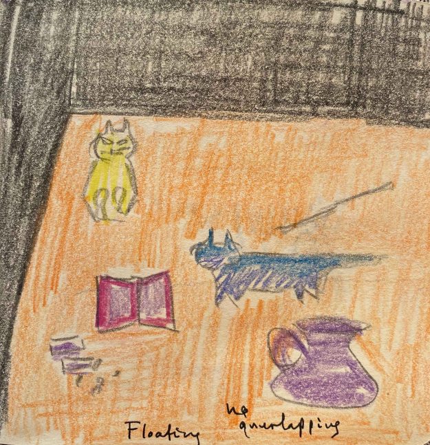
I think these last three would have benefited from painting the objects somewhat larger and use fewer items, for a clearer composition, they are all somewhat cluttered. The larger colour fields come more to value in the two right hand ones with the middle one being the calmest. Allowing the darker field surround the space where the smaller objects are placed holds the composition more balanced.
I have to leave France again, without the satisfaction of pushing any of these further. After three more stops, I am finally back home in Lisbon and approach this project again. I observe how different it feels to look at my own familiar objects when composing a still life- how I do not only see shapes and colours but my own ideas and preferences.
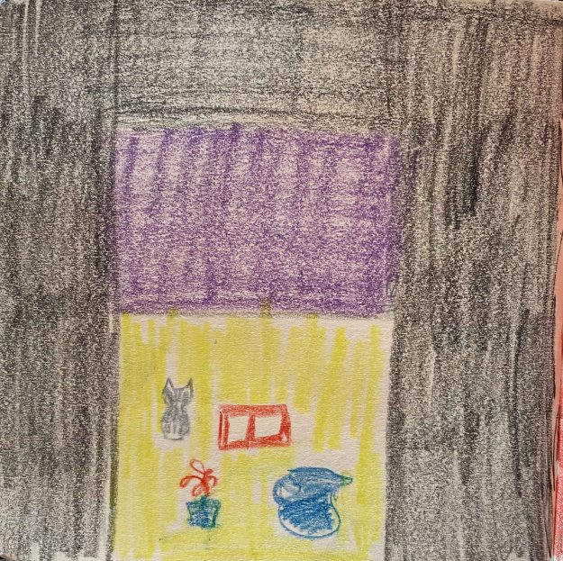
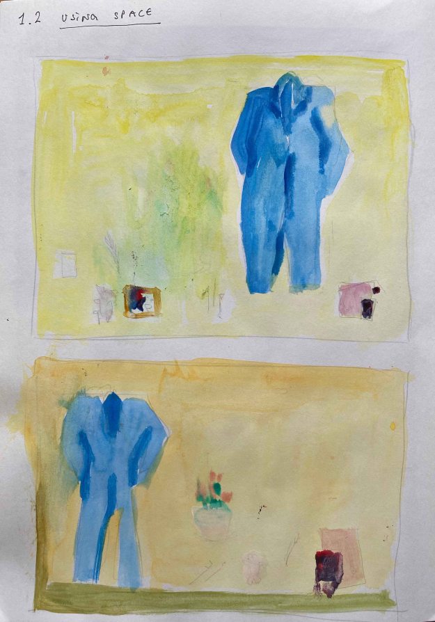
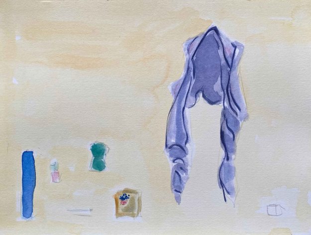
I liked several of the compositions with the kimono above and am continuing the idea of a larger clothes item dominating the image. I chose two for trials- a sloppy purple west and my blue winter painting overalls and start with some compositions in Lascaux Aquacryl in my A4 sketchbook.
I choose to continue the purple west on a slightly orange background and the blue overalls on the lemon yellow background, contrasting larger darker objects on bright backgrounds and in both cases placing the main object to the right side.
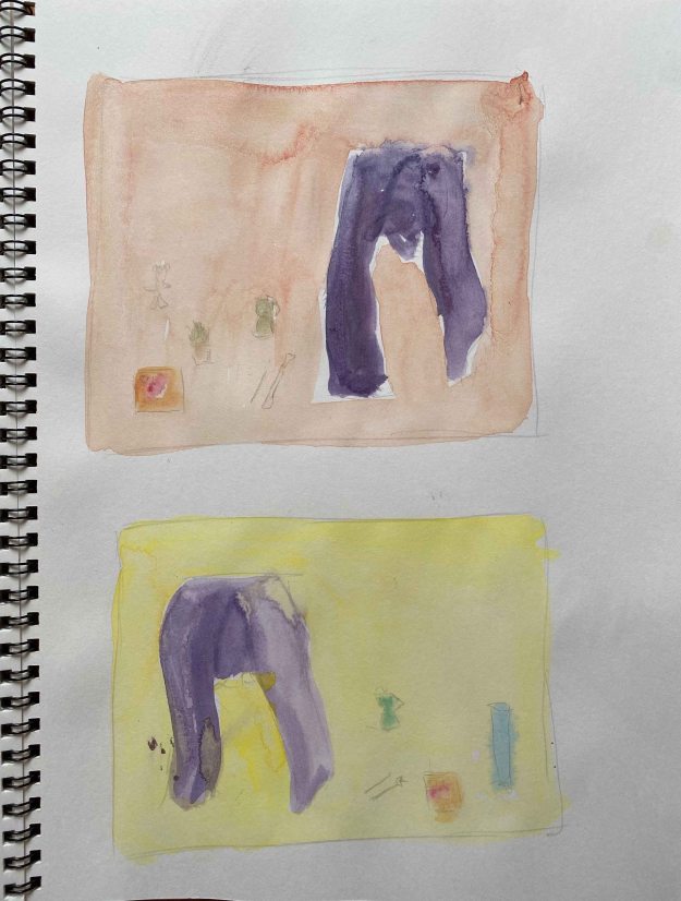
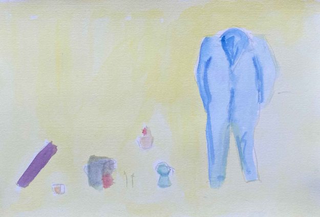
I switch to a Fabriano watercolour paper and continue with quick A5 trials in Lascaux Aquacryl:
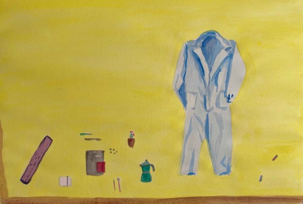
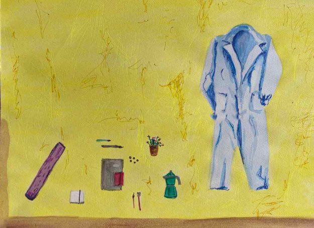
I have added other objects that are meaningful to me- my yogamat, the espressomaker, a small plant, brushes and sketchbooks. I find the purple west interesting but too unclear a shape and decide to explore the version with the blue overalls:
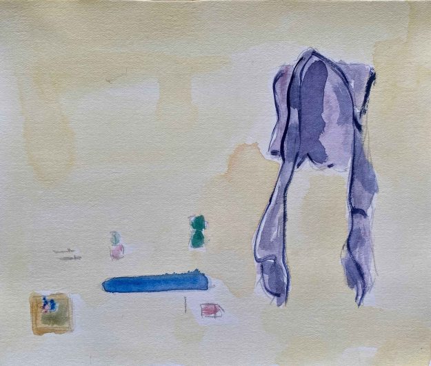
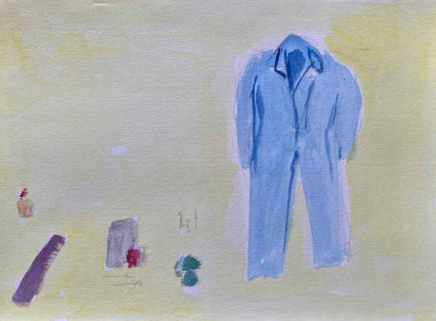
I decide to continue with the composition to the left. I choose a Fabriano A2 watercolourpaper and Lascaux Aquacryl:
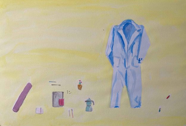
The image to the right has two layers of paint for brighter colours, more detail and I added a brown line to give it all some hold- something I observed in one of Blackadder’s kimono paintings.
Finally, I decide to go over the drawing with gel pens for some more life and a contemporary touch in this final version:
I think it is quite clearly inspired by Elisabeth Blackadder’s paintings, with the objects floating freely in a field without depth. I am still really unsatisfied with this drawing and launch into a final trial directly on the A2 paper, following my initial trials in the small sketchbook while still in France.
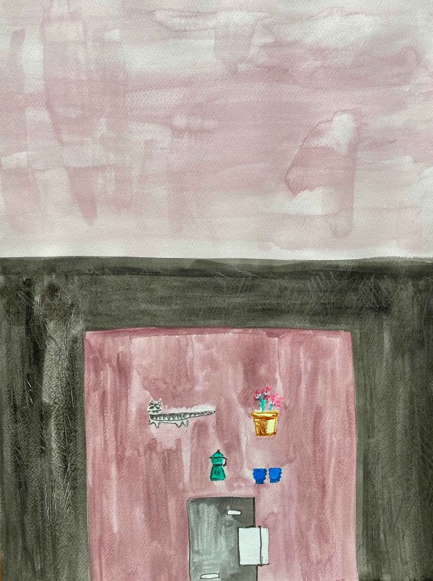
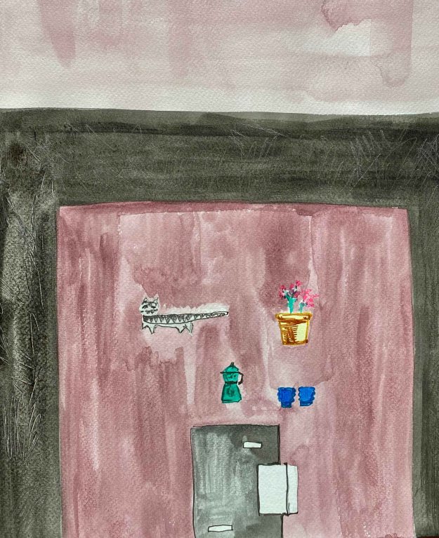
The verion on the left is in watercolour only, while the right side is after enhancing with gel pens. The objects are too small and blank to balance out the large surrounding colour fields. I would crop this drawing like this:
As a conclusion, I have used this exercise for a lot of intuitive trials and reflection on space and composition. It has been a lot of flapping around (also sleeping in five cities in 8 days), and I feel unsatisfied with the final outcomes. I feel like I have learnt some precious lessons about composition though, and definitely gained new respect for the art of Elisabeth Blackadder.