The drawings for Part 2 took me to quite personal and vulnerable places, so I was not quite sure what feedback to expect. I was delighted to receive a very encouraging and positive report from my tutor Emma Drye.
She recognized that I am exploring new ground and saw potential to develop new tools and find new ways forward with performance drawings and animations. Her advice: “Continue to let your conceptual content direct your process though.”, feels very important. So far I have chosen either a more conceptual approach or allowed for performance drawings, and it is an exciting meeting point to let these approaches come together.
I was experimenting with video for project 2.1 Space Depth and Volume, where I created a stop motion of a Wave crashing. This was a new approach that I will develop further.
Emma pointed out how in the portraits inspired by Auerbach for the same exercise- the Auerbach lines did not support the construction of the head- which was the missing link I needed to see.
My tutor formulated, how the large paintings with my body for Assignment 2, unlocked the way that my relationship with my body had been affected by my experiences and how important that was.
She recognized, that some of the paintings were too chaotic, and how the ones of a single moment that showed a clear iconographic image were easier to read for the viewer.
I guess, I was worried they were too empty or too simple , so it felt like a recognition that I can go on and explore single movement drawings. For sure, this opens up new possibilities and there are so many ways to continue this exploration!
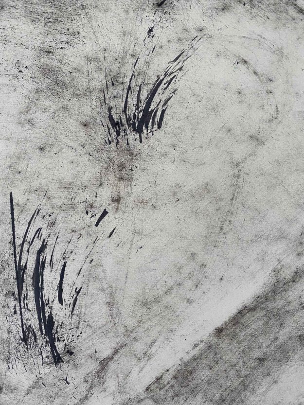
For the final painting in red on linen, there is also a too hidden narrative. Emma writes “This is something that would need to be worked on and developed to find its own place as a figurative painting.”
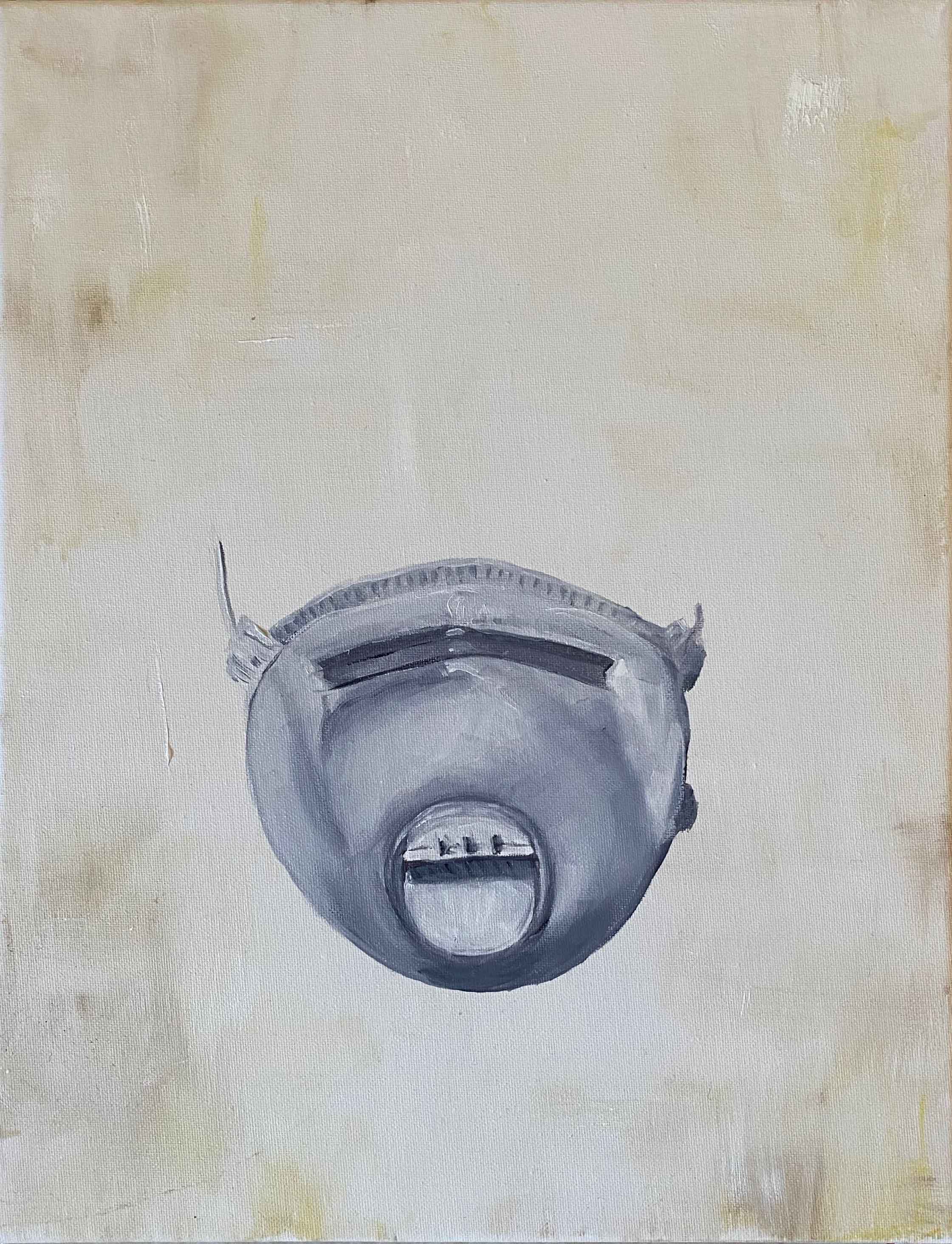
For Project 3 Narrative, where I produced a series I called “Family picnic” where I portrayed my family with a COVID mask, I agree with my tutor, that the drawings would have benefited from a different type of line. She suggested that a slightly more faltering , slightly more vulnerable and variable line would have given more information and would have conveyed something more about how the situation felt. I can absolutely see that now. I think at the time, I felt safer when choosing a rather boring way of drawing.
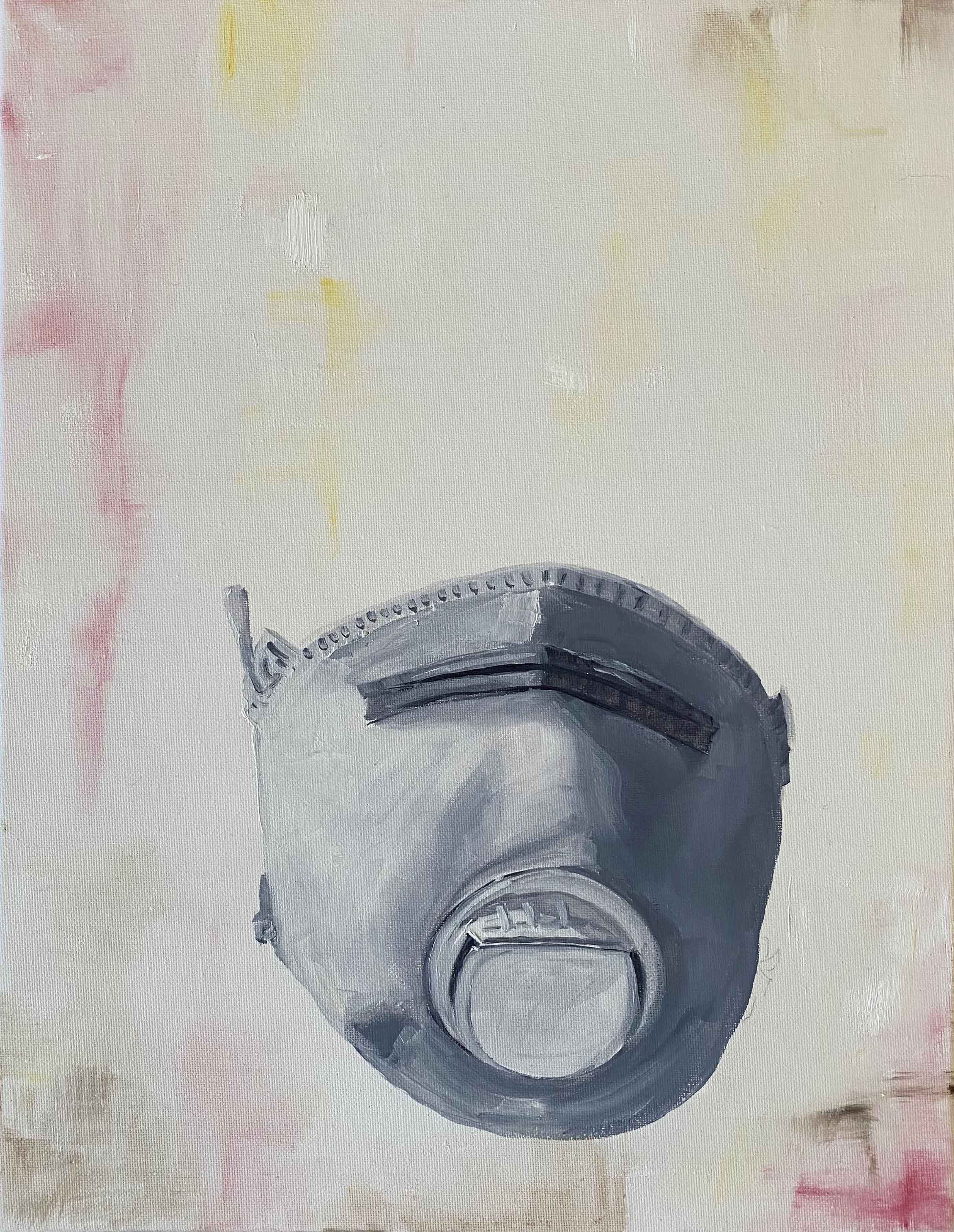
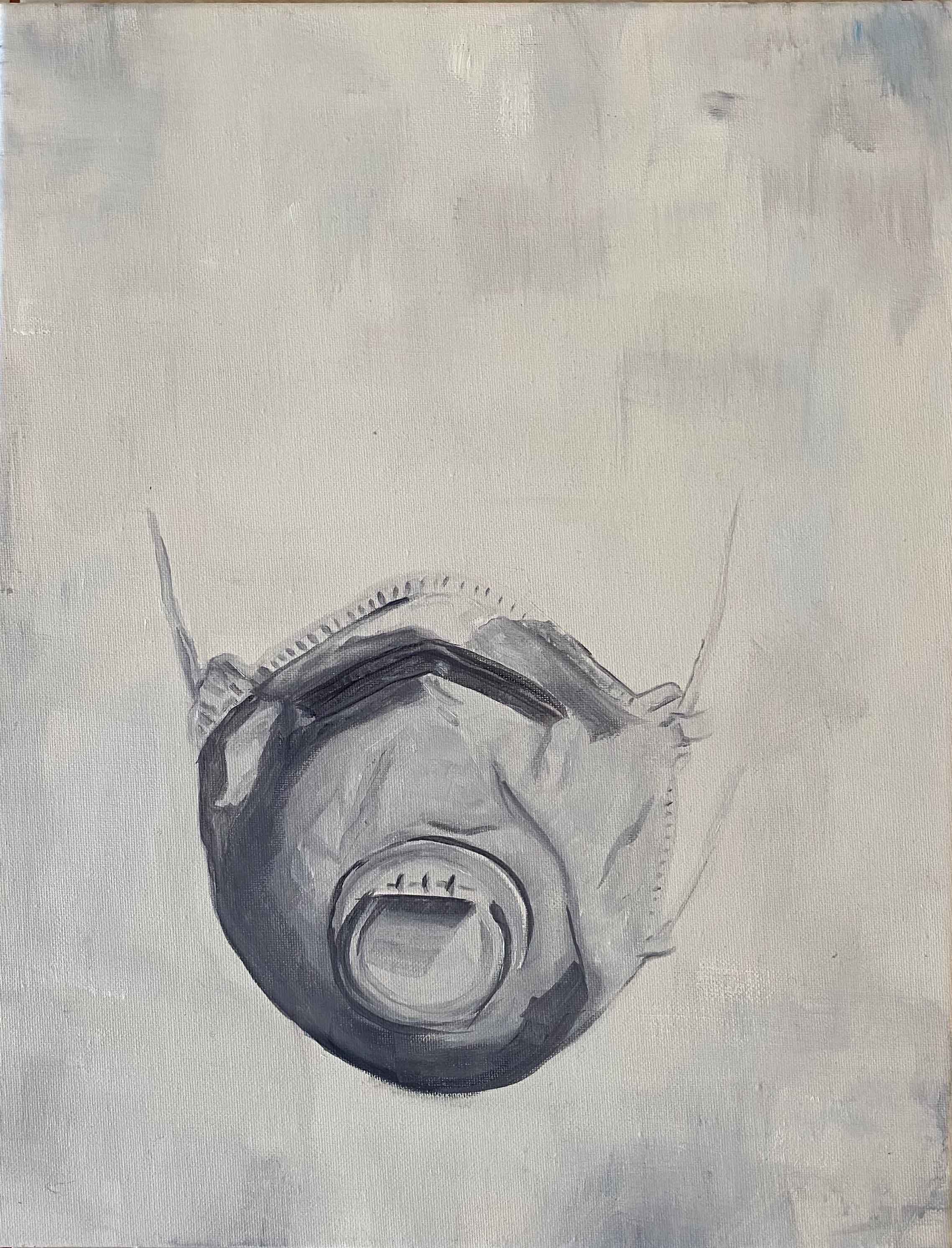
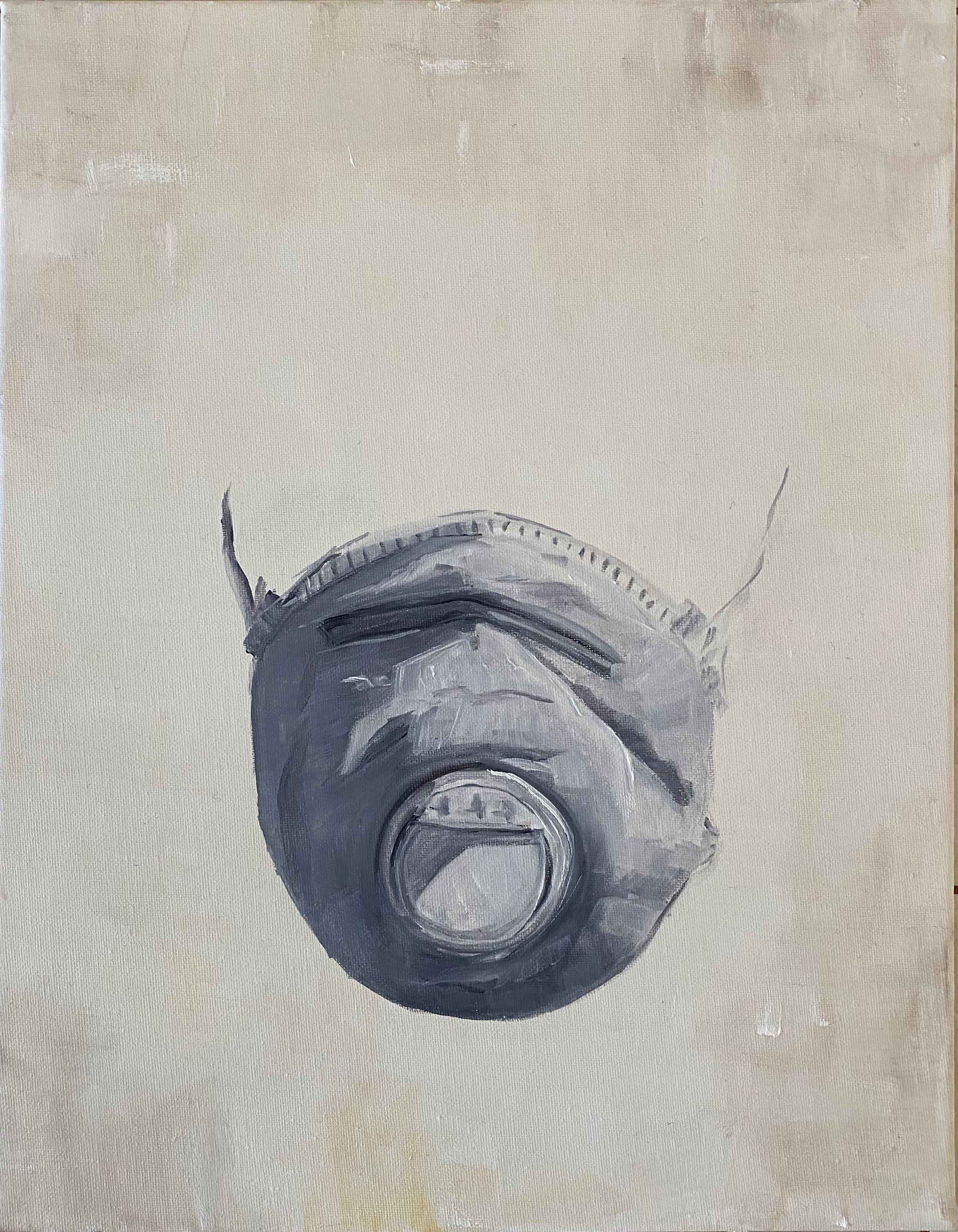
Similarly in the series of paintings for the same narrative, Emma really liked the surface that I have laid down, but was not convinced by the way that I actually painted the masks. I absolutely agree with that, and am quite surprised myself in hindsight about the difference in painting techniques between the backgrounds and the masks. I can’t believe this was not obvious to me while painting. I was really so taken myself by the conceptual idea, the narrative, that I navigated towards some calm safety in the techniques without meaning to.
By painting the COVID masks onto objects in a humorous way, my tutor recognized how I was working through the feelings that came up with this difficult subject and seeing the power of art that way. I found it really helpful to get this reflected back at me, as it was a spontaneous decision at the time.
Another helpful reminder was to not overwork the pieces- something I definitely have a tendency to do! There is the value of space!
I have a long list of artists to research, which I am really excited to start with:
Louise Bourgeois, Ana Mendieta, Yoko Ono, Marina Abramovic, Ulay, Carolee Schneeman, Rose Finn-Kelcey, Helen Chadwick, Cathy de Monchaux
Course manual: Make a drawing of a subject of your choice using the subject itself, or tools constructed from the subject, dipped in ink or paint.
THE BEACH
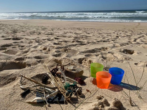
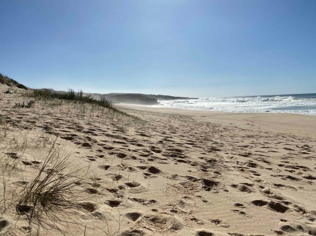
The directness of being outside in nature, at the beach, feeling, seeing and hearing the elements, and using only found materials to draw what is surrounding me, of course appealed to me. I prepared only a block of A4 watercolour paper, a pot of Indian ink and some white acrylic paints, and set off. This day, I did not yet know that a couple of days later it would become illegal to go to the beach, so this experience already carries a precious personal memory.
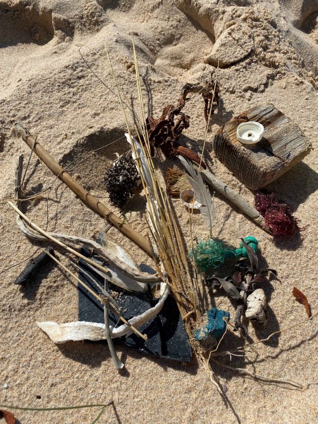
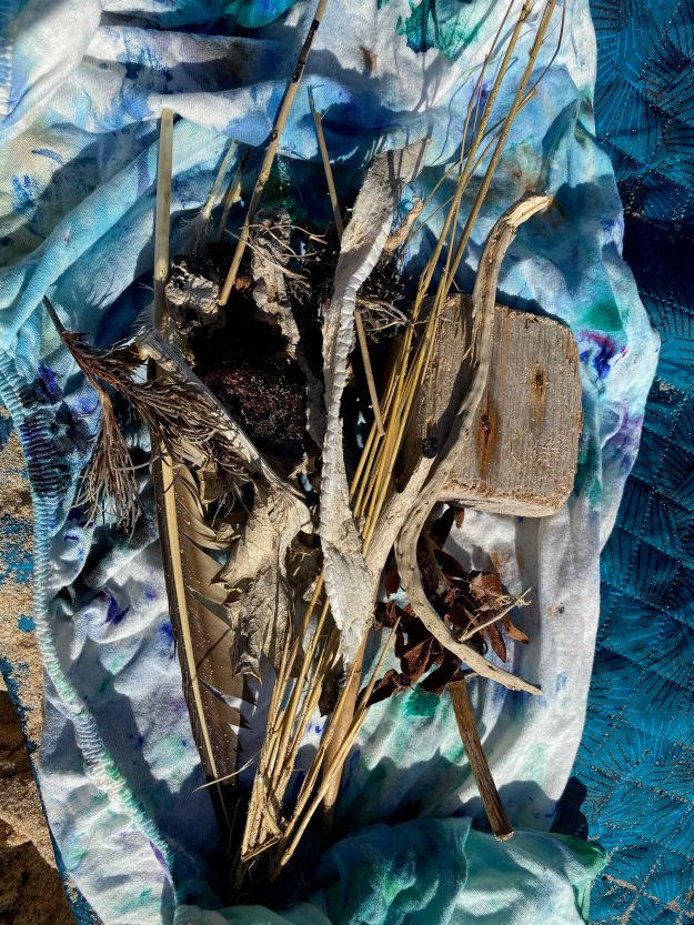
Within just a few minutes of walking in the sand, I had a whole collection of suitable painting materials- feathers, dry grasses, pieces of wood, trash, ropes and shells. And of course an unlimited supply of sand.
I started by trying out what marks my different tools can make with the ink.
I continued with a rather quick A4 drawing of the landscape around me, using the different marks.
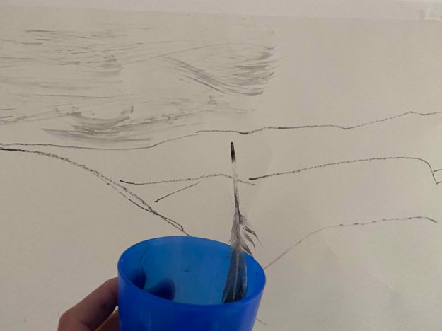
I try to associate the “tools” with the elements that I am drawing. So I am using a feather for the light marks of the sky, stones and woods for the rocks and an algae producing little bubbles for the water.
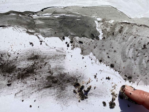
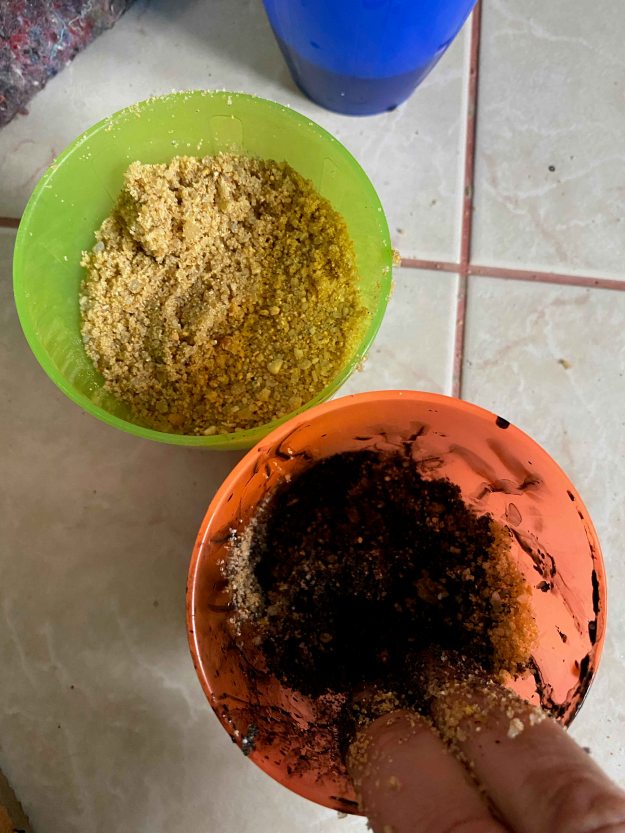
I am mixing ink and sand and rub it to the paper with my fingers for the sandy parts of the image.
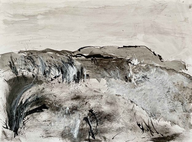
Finally, I add a few strokes of white acrylic paint on the crest of the waves with a feather. This is the first final sketch A4:
I regret adding the white marks, the drawing felt clearer and more focused on the variety of the marks before.
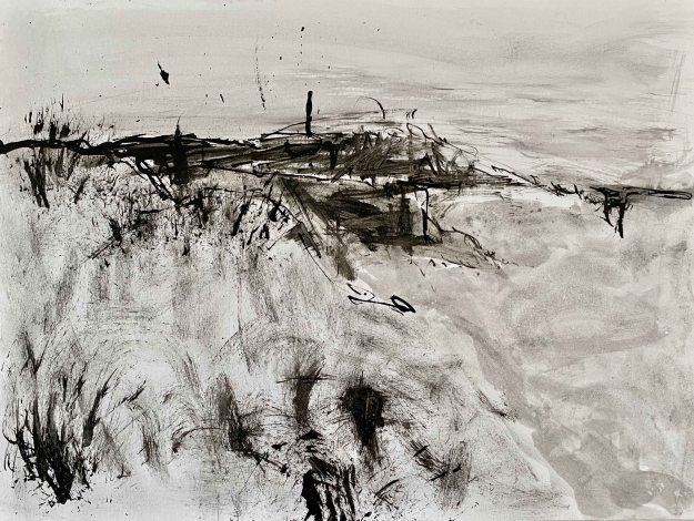
I start over and focus on the markmaking the different tools allow:
I am happier with this second, rougher version.
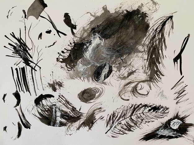
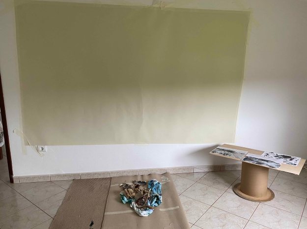
I decide to wrap my collection of tools and bring them home to push this further on a larger format drawing back in the studio.
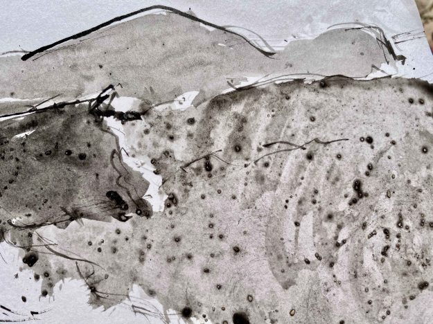
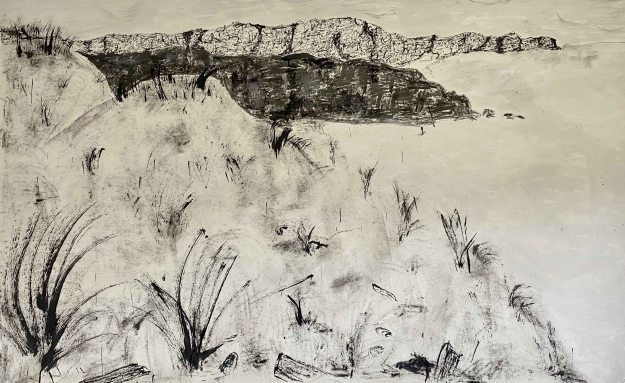
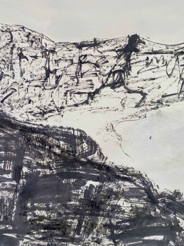
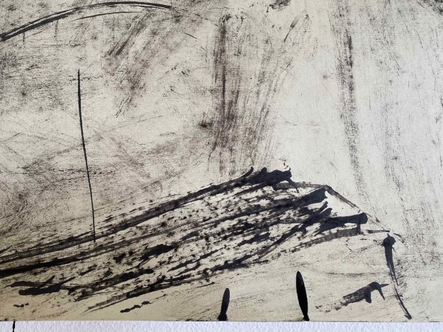
I follow the same principle of using “tools” or materials that are as close as possible to the elements I am depicting- using sand to draw sand, water algae to draw water, feathers for the sky, rocks for the rocks, grass for the grass etc.
This is the final drawing, approximately 150×250 cm:
These are some close-ups:
Water drawn with algae:
Rocks drawn with stones:
Sky drawn with feathers:
Wood drawn with wood:
Shells drawn with shells:
Sand drawn with sand:
And beach grasses drawn with different leaves, sticks and grasses:
I feel happy with the exploration of the different marks my found tools can make in the details, but in the larger piece made at home, I can definitely feel how less spontaneous it is and the final result is suffering from it. I much preferred the directness of the experience of painting on the beach.
( to be continued in a life after the virus…)
THE BODY
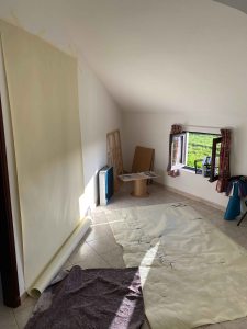
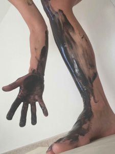
This assignment brief also feels like an invitation to explore bodypainting- painting my hands with my hands, my feet with my feet, my hair with my hair, my body with my body. I finally have a space that allows serious messiness, and I have of a long white roll of paper. Also, we are in quarantine by now, so painting on location is not an option. The thought of painting my body with my body is just getting louder and louder.
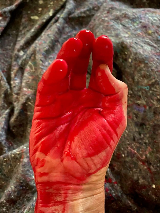
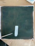
When I am standing here in front of the huge white paper, I have a lot of possible drawings in mind, but I want to stay spontaneous and just let one mark lead to the next. I start by covering my whole right side with a bright red paint acrylic and lie down on the paper.
And again:
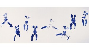
I couldn’t really guess how this would turn out, but the feeling of painting with my whole body is fantastic (despite is being really too cold!) This two prints looks like two figures interlaced and the wispy marks of the back hand randomly became a face. This drawing is already expressing a lot with so little that I decide to leave it for a day or two and see if I need to continue, instead of spoiling it by doing too much. I have an urge to walk around with my feet covered in black paint, but I am not sure.
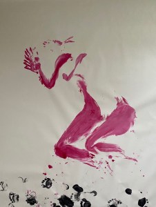
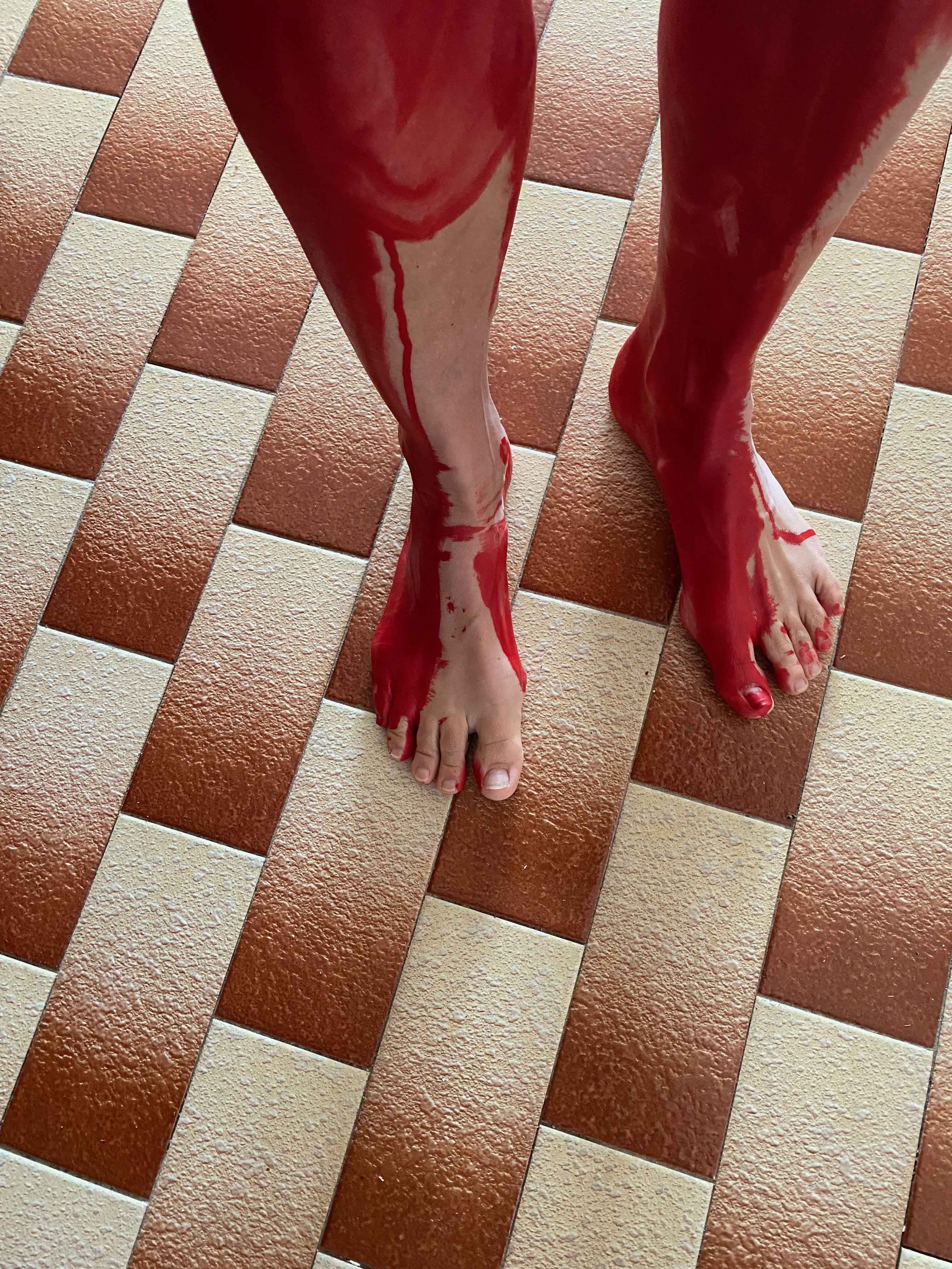
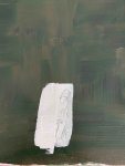
After coming back and looking at it for two days, I just can’t stop myself. I cover the soles of my feet with black and walk around at the bottom of the drawing.
It was a miss. I should have left it alone. What I can do now is crop it to this, leaving just some footsteps…:
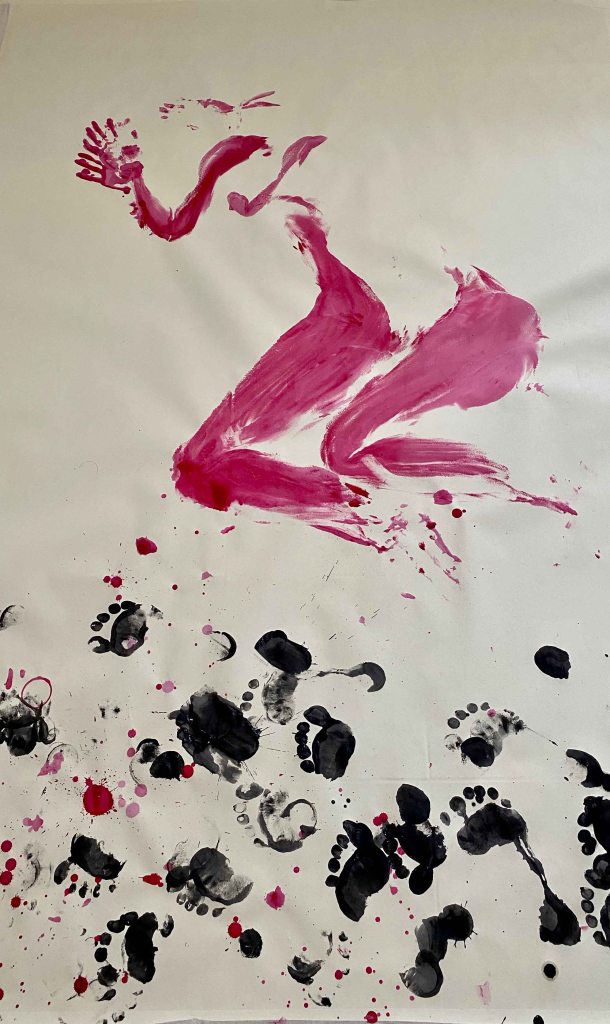
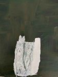
I start over again with a vertical paper larger than me:
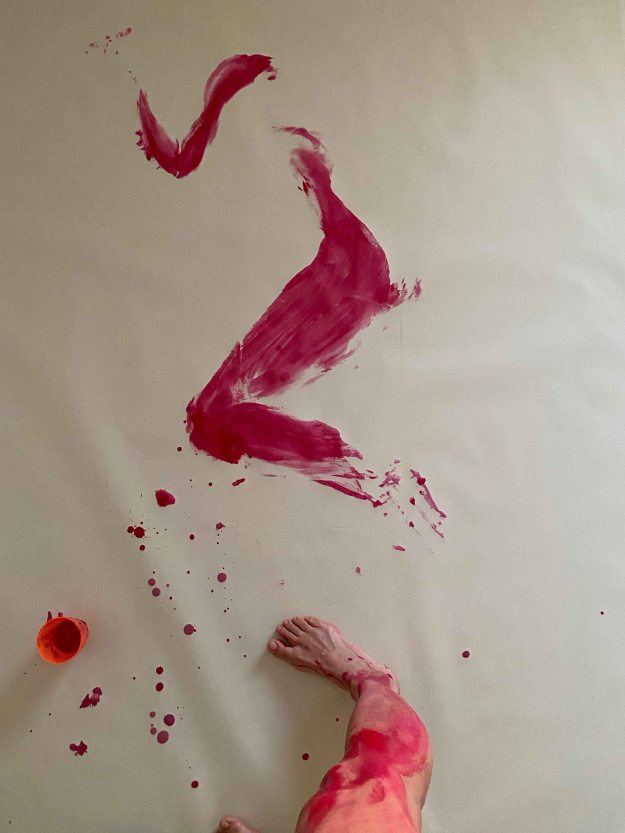
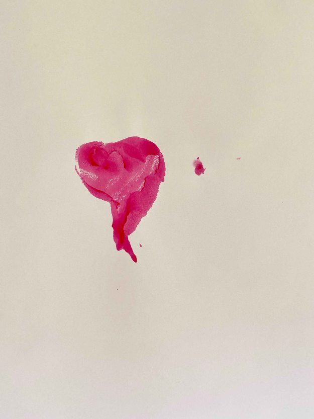
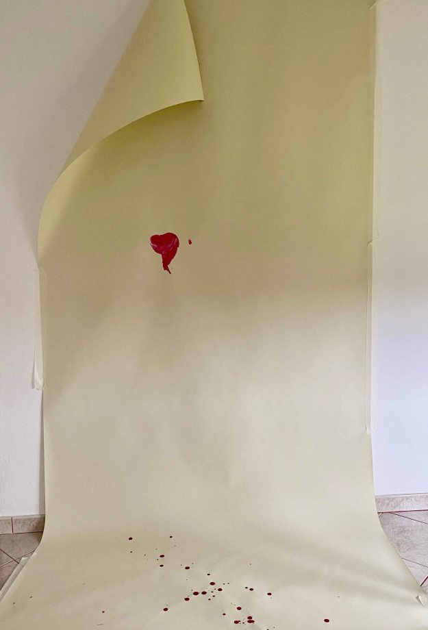
This time I am really seeing a fuller image of my whole body from the front and am especially curious about the marks from my hair. I feel magically drawn to the red colour again and when I look down on my body I start by covering my left breast, uneven and imperfect after surgery for breastcancer two years ago. I stop right there and just press that one breast to the paper. I spill some drops of paint to the floor.
I feel so much. This simple touch of my one mutilated breast on the large white paper said it all. I did quite a few drawings of the experience at the time but nothing expressed it as well as this. I feel how all that I was, suddenly became reduced to this one spot, how from being so much, I became a person with breastcancer. How lost I was. I was surprised at the strength of my feelings now. This experience lies two years back, and I would have thought that I had healed it both physically and emotionally.
This drawing is finished.
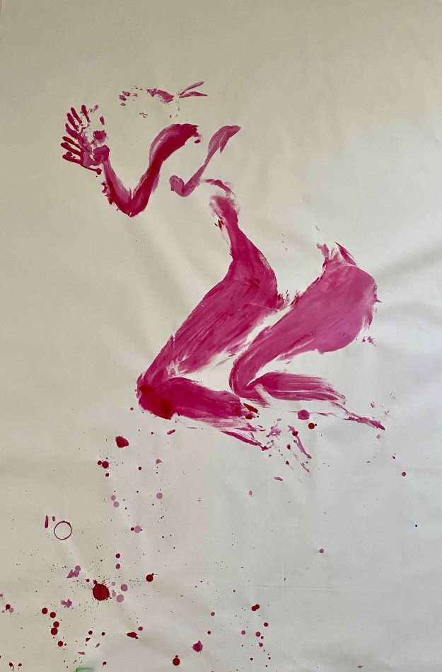
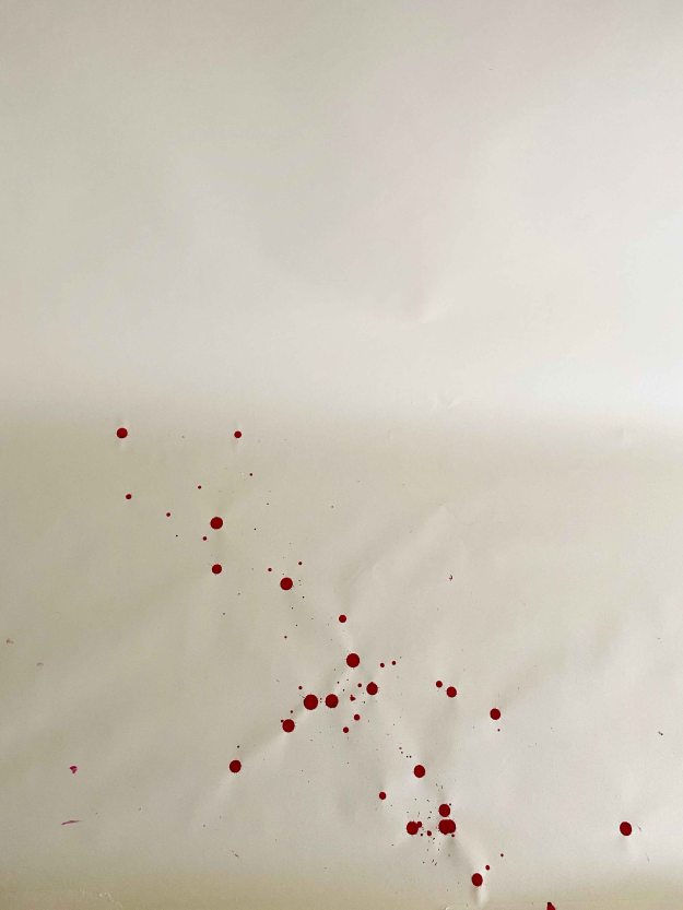
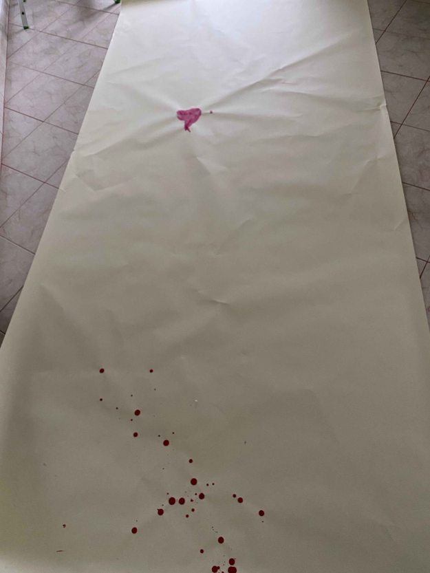
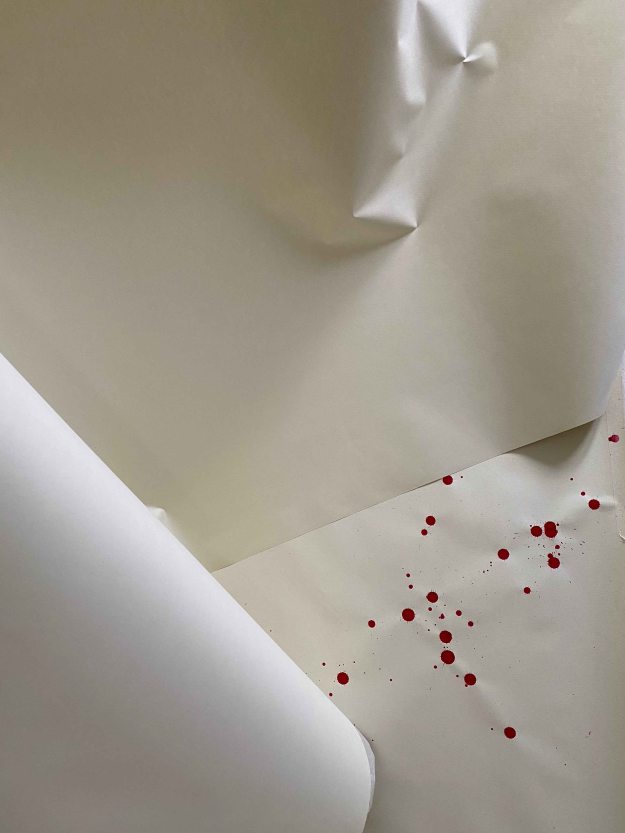
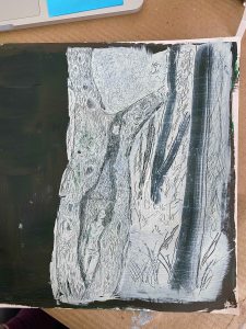
I continued by touching the paint and taking photos:
The direction and strength of this experience took me by surprise. It became more revealing and personal than I had intended. Also, I am incapable of judging how much this drawing is readable for anyone else, or if it is just so strong for myself.
The next day, I felt like taking it off the wall became a part of the experience- clearing and opening up to a feeling of relief.
BODY, nr 2
I am ready for a second trial and come back to painting my body with my body.
Meanwhile, I have researched the “Anthropométries series” by Yves Klein from the early 1960’s. He used nude models to act as “living brushes” in performances where they were covered in International Klein Blue (IKB)- a blue patented by Klein that he used in almost all his work- and then touched their bodies to huge canvases.
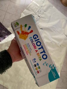
My studio is prepared with two large pieces of paper from my giant roll, one vertical and one horizontal. This time I am using childrens fingerpaint, as I had a really hard time scrubbing off the red acrylic paint last time. I can’t begin to imagine scrubbing of the precious IKB oil paint.
Yves Klein missed out on a really crucial part of the experience here I believe. Covering the body in paint and feeling how it wants to fall on the paper is an incredible experience that I would not want to miss!
I start by using the backside of the “Beach” drawing described above, so the paper has a wobbly surface here:
This is the final drawing:
It is almost like a limp figure carried by some birds, or upwards. I find it unfortunately chaotic. There are too many small marks to give a very clear and coherent sense of body. I do like the uneven surface though , that adds a level of texture.
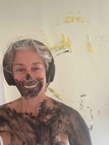
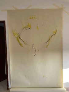
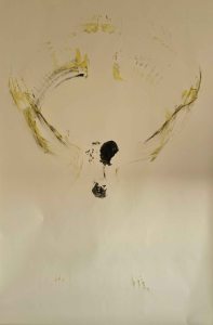
For the vertical paper, I add yellow colour to my underarms and stand in front of the paper lifting my arms as in a sun salutation.
I am closing my eyes and focusing on the movement.
I decide to press my black body to the paper too:
I really like the winglike aura, which reflects the feeling of the movement really well. This is a light drawing, unfortunately really tricky to photograph. It has much more atmosphere in the flesh. Emotionally, today’s’ drawings were just fun and messy, I did not experience as much as strongly as last time.
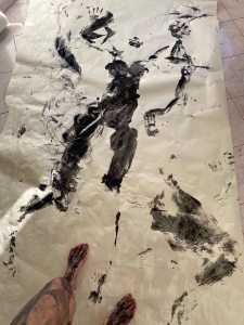
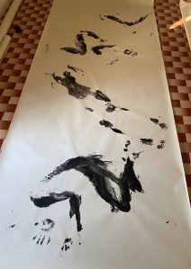
A couple of days later, I am ready for another trial. This time I prepare a longer piece of the paper on the floor, so that I can create a series of figures. I am using black paint again, liking the simplicity of it. Black could be ink or charcoal or many kinds of paint but has the connotation of being just that- a drawing medium, whereas the red spirals my imagination towards blood. I am avoiding using blue to be too close to Kleins’ project.
This is the final drawing. I have tried to create a wavelike movement, like springing up from a crouching position and continuing tumbling over.
I find the drawing stronger, when cropped to the two first figures:
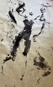
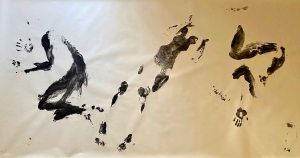
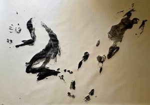
I prepare one more horizontal paper. This time I go back to the red, but without washing of the black layer and lie down one side after the next:
I like the creature like shape that comes out of this. It is not as strong as the image that I achieved the first time though, with the two figures intertwined.
This time again, I greatly enjoyed the experience. It is a magical feeling to stand in front of a huge white paper and not have any preconceived idea of what will happen, more than using my whole body as the drawing instrument to draw the body. It feels like I am stepping out of the process and allow it to happen, while at the same time being absolutely and literally immersed in the drawing.
BODY nr 3
Since looking at Yves Klein’s work, the idea of using oil on canvas has of course intensified with me saying yes- no- yes – no several times a day. Some time ago, I bought a first piece of untreated linen canvas to experiment with pouring diluted paints like Helen Frankenthaler. Am I going to use it for a single moment of body printing instead?
I am going to go for it… With the argument that I can always prime it and use it for something else later (although not as I intended).
I start by testing if it makes a difference, if I put the thin linen on an absorb able cloth surface or on a glossy paper. I imagine that the thin material will let the paint seep through and might react differently.
I will use watersoluble oil paints and also want to test how traumatizing the washing off is.
No, it does not make a difference if the underlying surface is absorbable. Actually, I am surprised at how resistant the surface is, I had imagined the diluted paint would bleed more.
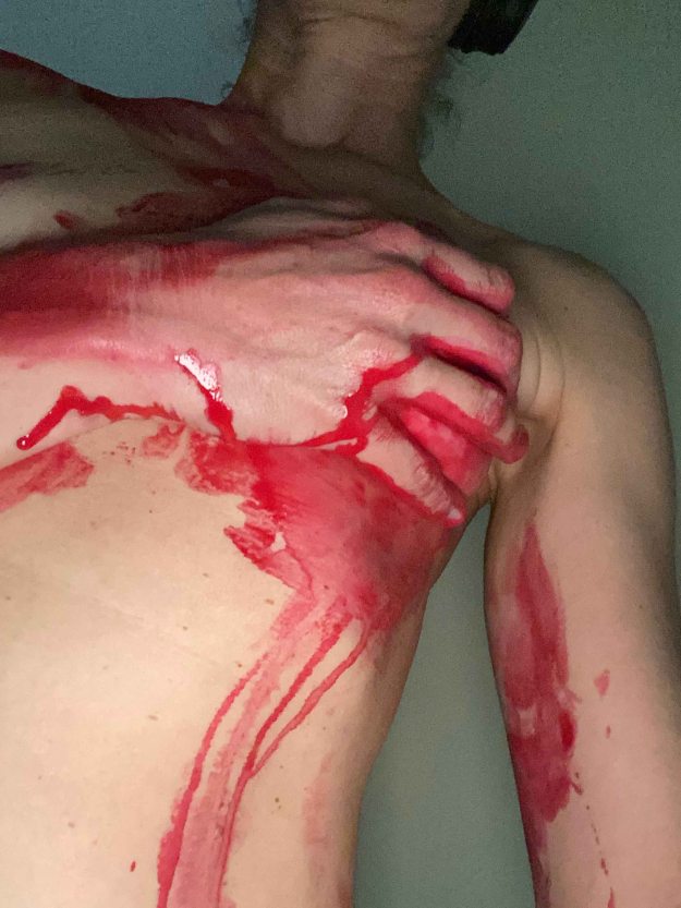
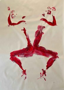
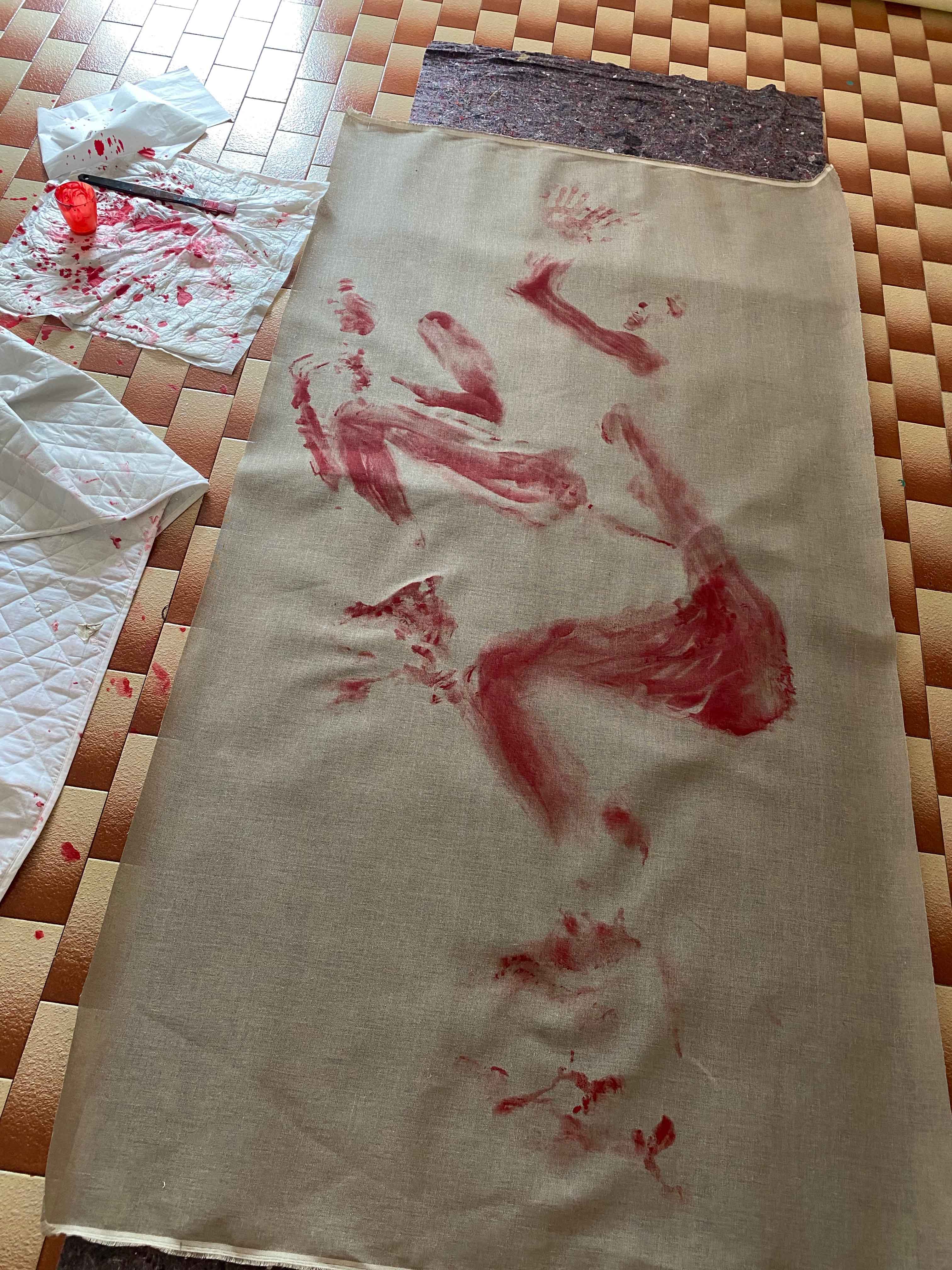
I choose to use red colour again, mixing Winsor&Newtons Artisan Cadmium red medium with a Cobra Carmin. The colour of the canvas is grey-brown and adding the red colour has a primal feel, reminiscent of a cave painting. It also feels primal because it looks like blood, adding another bodily element to the process.
It is all ready, but I feel a crushing responsibility at messing up the canvas, which takes away the lightness of the experience. I try lying down in different positions first without paint, which I did not do the previous times.
Here we go..
This is the painting after two rounds:
It is actually easier to wash off than acrylics! (And it helps that we have installed hot water in the house by now.)
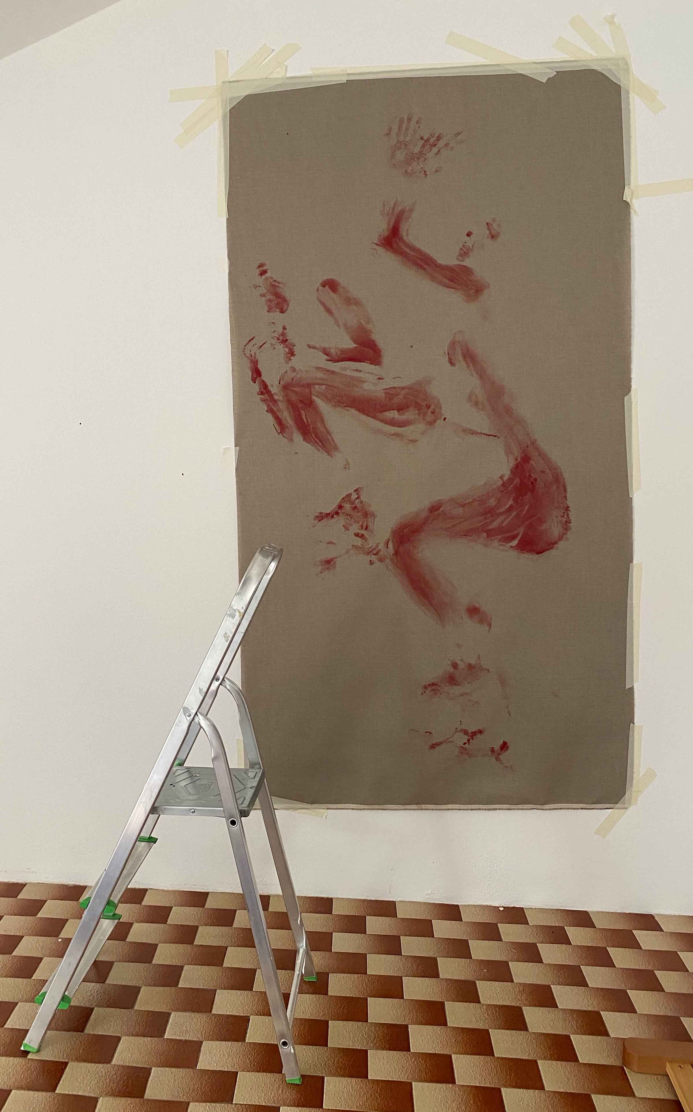
I hang the canvas vertically and take a photo with the ladder to show the scale:
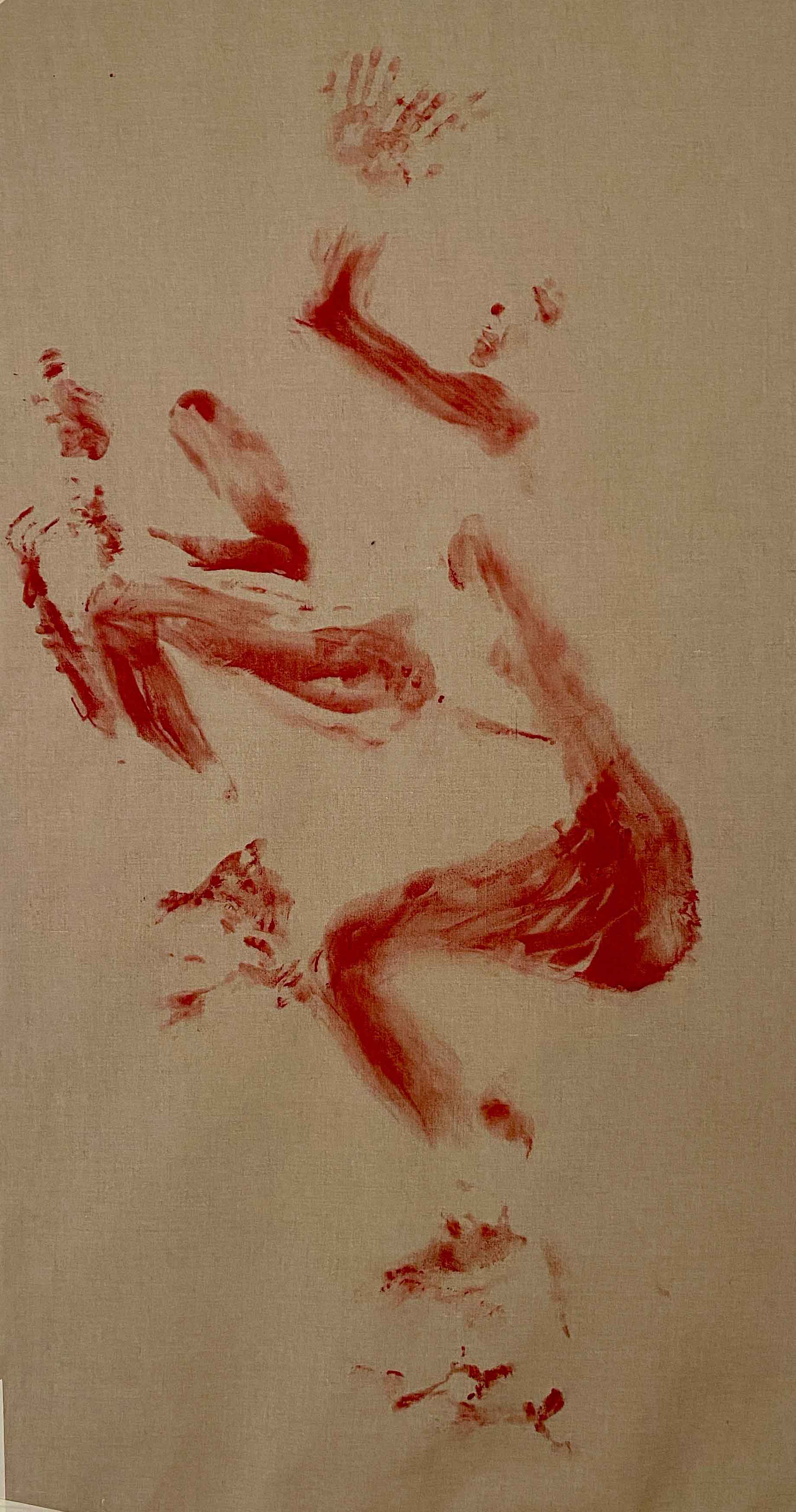
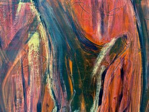
This is the final painting:
I am not overwhelmed with the result, but it is also not a total miss. Compared to the works on paper, there is a much wider range of tones, many a little blurred or “wispy” marks, depending on how much paint got absorbed. I feel that this painting is somewhere between a cave painting and an Xray.
As a whole, painting with my whole body has been an incredible experience in fusing the subject and the process. It has been really interesting and surprising to observe my feelings coming up through the experience. It is also a process to accept the result when I only have seconds to paint, and so much time and material to prepare and to clean up.
Course manual: “Aim: Materials and the way they are applied can be very expressive and can imply a narrative without using words. Thickly plastered encaustic or finely dusted chalk – each imparts information about itself and, through association, the subject or your response to it. Take time to experiment with the expressive potential of a range of materials and then make a selection to create a piece where the materials contribute significantly to the way the piece is read.
Method: Think of a person for whom you have strong feelings or hold a strong opinion. Find an object or item of clothing that reminds you of that person. Make a piece of artwork that uses the object to provide the imagery but uses the materials to give the viewer a sense of the person. In effect, you’re making a portrait of a person as an item of clothing. You could use your daughter’s first shoes, your mother’s hat. Thinking more widely, you could use a blue tooth device and tie to make a piece of work about bankers or an old school tie wrapped around a silver spoon for our political class. Experiment widely and produce as many pieces as you need to until you arrive at something which you think fits.”
My first idea for this project was to portray my 104 year old Lisbon neighbor, Donna Hortense, through her laundry.
She hangs out some pieces of personal underwear from her window every day (possibly the rest of the laundry gets taken care of), and these intimate pieces drying also function as a flag saying- “I am up and about and well”.
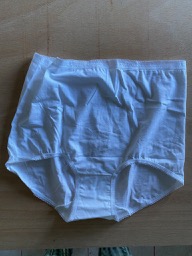
I was too shy to ask Donna Hortense to borrow her underwear, so I went as far as buying a pair of giant underwear …
I will definitely come back to this idea.. But for now COVID- 19 swiftly changed our lives. We packed up the family and within a day are living in quarantine in the countryside.
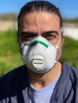
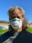
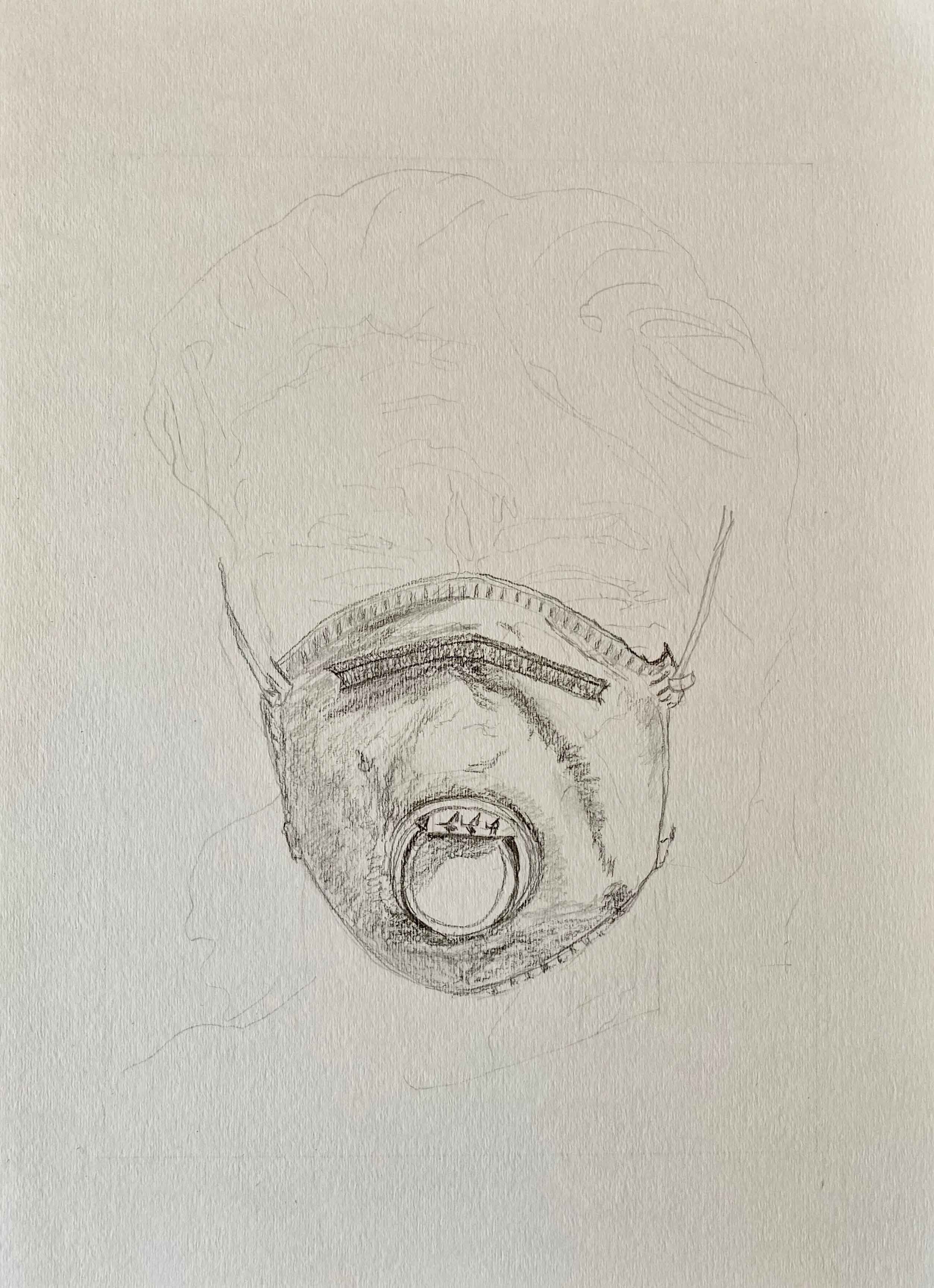
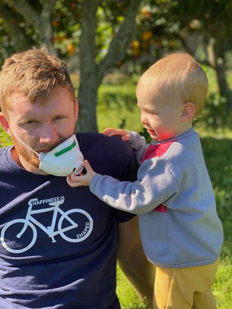
The virus has infected all of our thoughts and conversations to start with. I managed to buy one mask for the five of us, and this lonely mask has become a symbol of this whole situation and the start of my new narrative.
On the exact opposite of a personal item, the mask blocks out part of the features and our personality seems to fade away behind it. In that sense, I want to use the mask to give a sense of the absence of the person, rather than the presence.I will draw it as if on the face though, not as if placed on a surface.
I start by trying out different materials.
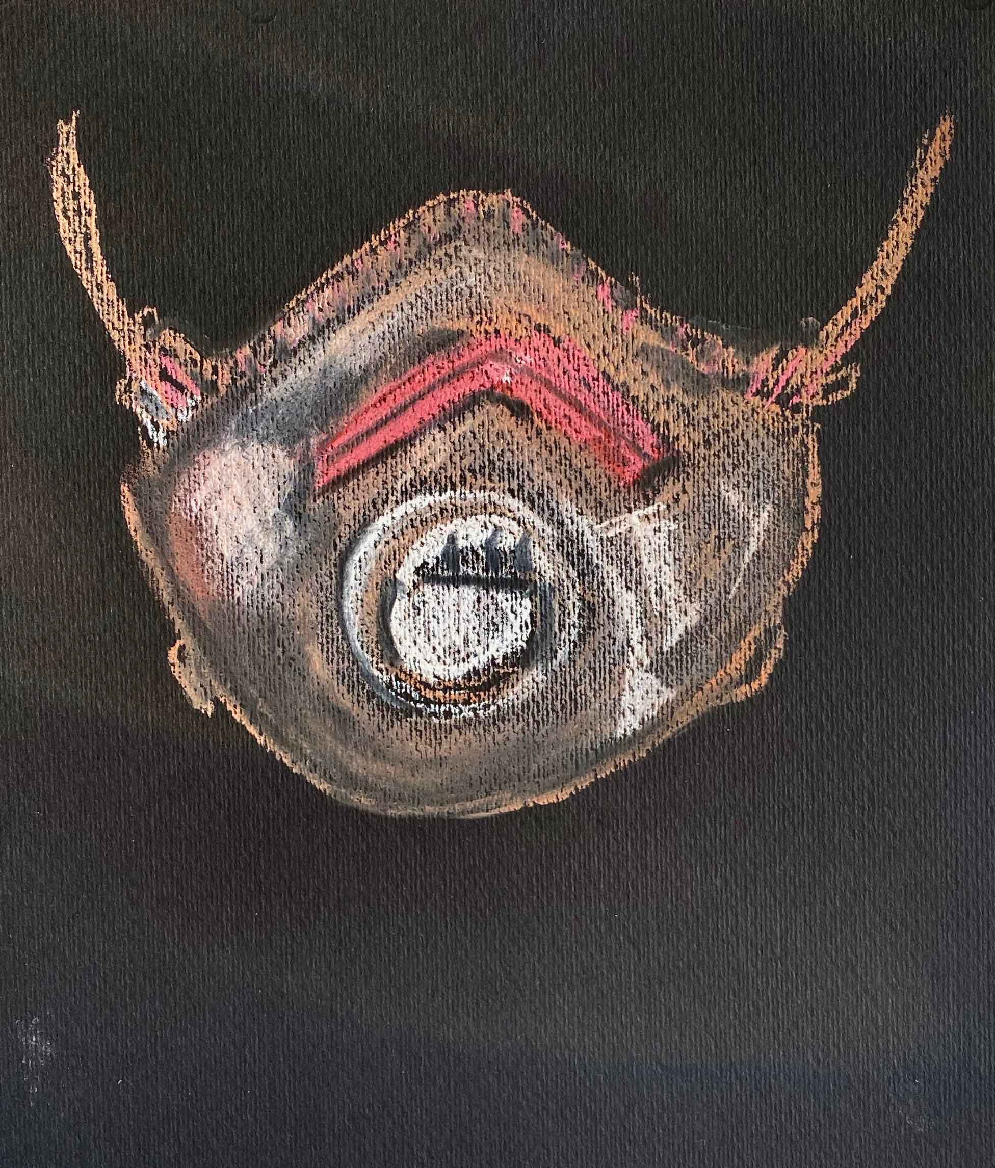
Rembrandt dry pastel in skin tones on black paper ( a silky touch like skin):
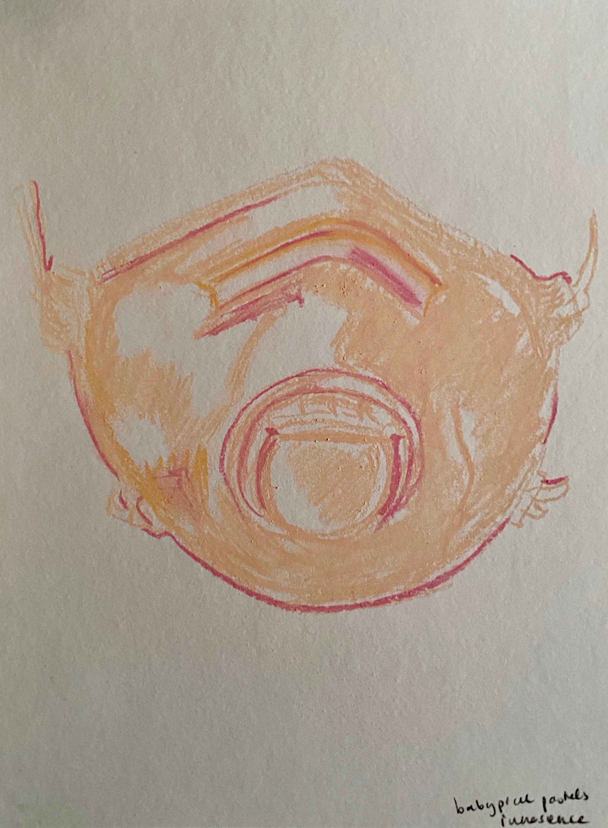
I try baby pink pastels on white paper too- aiming at a connotation of innocence:
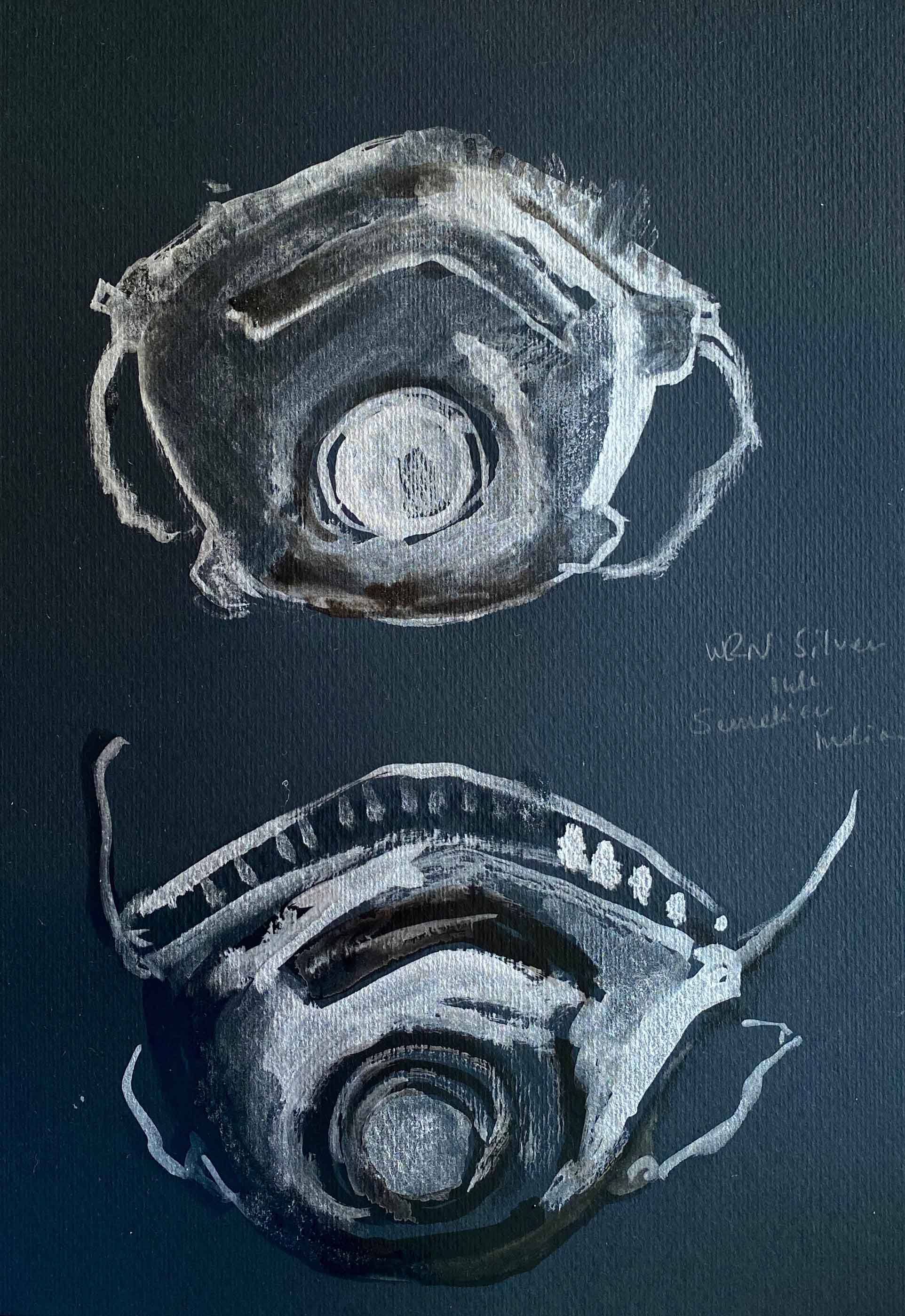
I continue experimenting with Winsor&Newton silver ink and Sennelier Indian ink for a metallic, shiny surface on black paper:
The same inks seem much warmer and softer on a warm grey paper:
I change for a transparent paper, with Indian ink and acrylics:
I like how the transparent paper wrinkles like a more alive surface. I also like the idea that I can hold it up to any face.
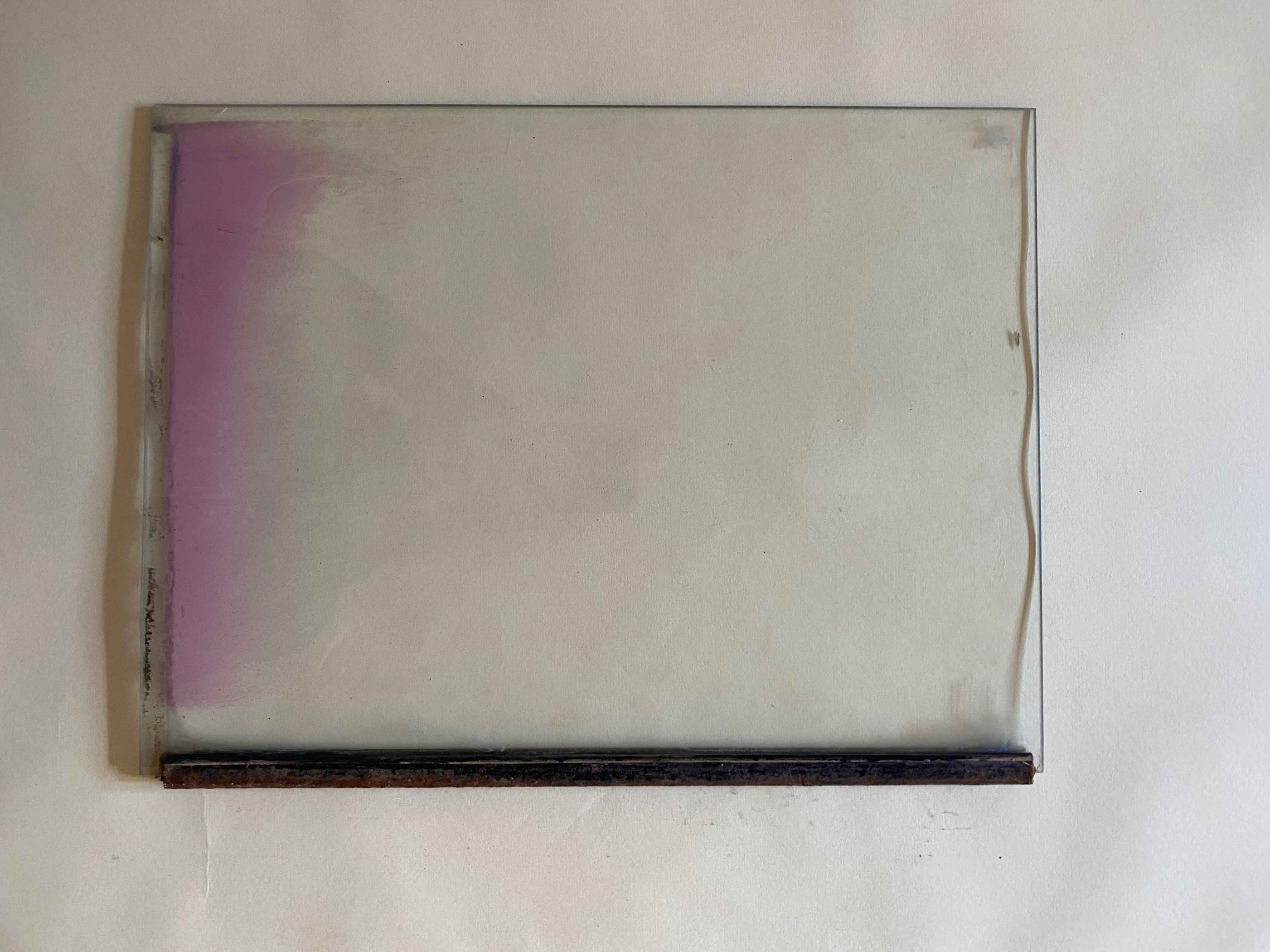
I push this idea of a mask that I can hold in front of a face further by using oil paints on glass. This ties in with a part of the parallel project where I have used oil paints for portraits of faces under water. I am using an old glass pane with some pink spray paint and a rusty border, which is quite creepy.
I want to try dripping the paint on the surface and allow it to pool, inspired by paintings by Genevieve Figgis.
Hmm, this looks like some sort of insect, interesting maybe, but not what I was aiming for. I have too little control when dripping on the glass.
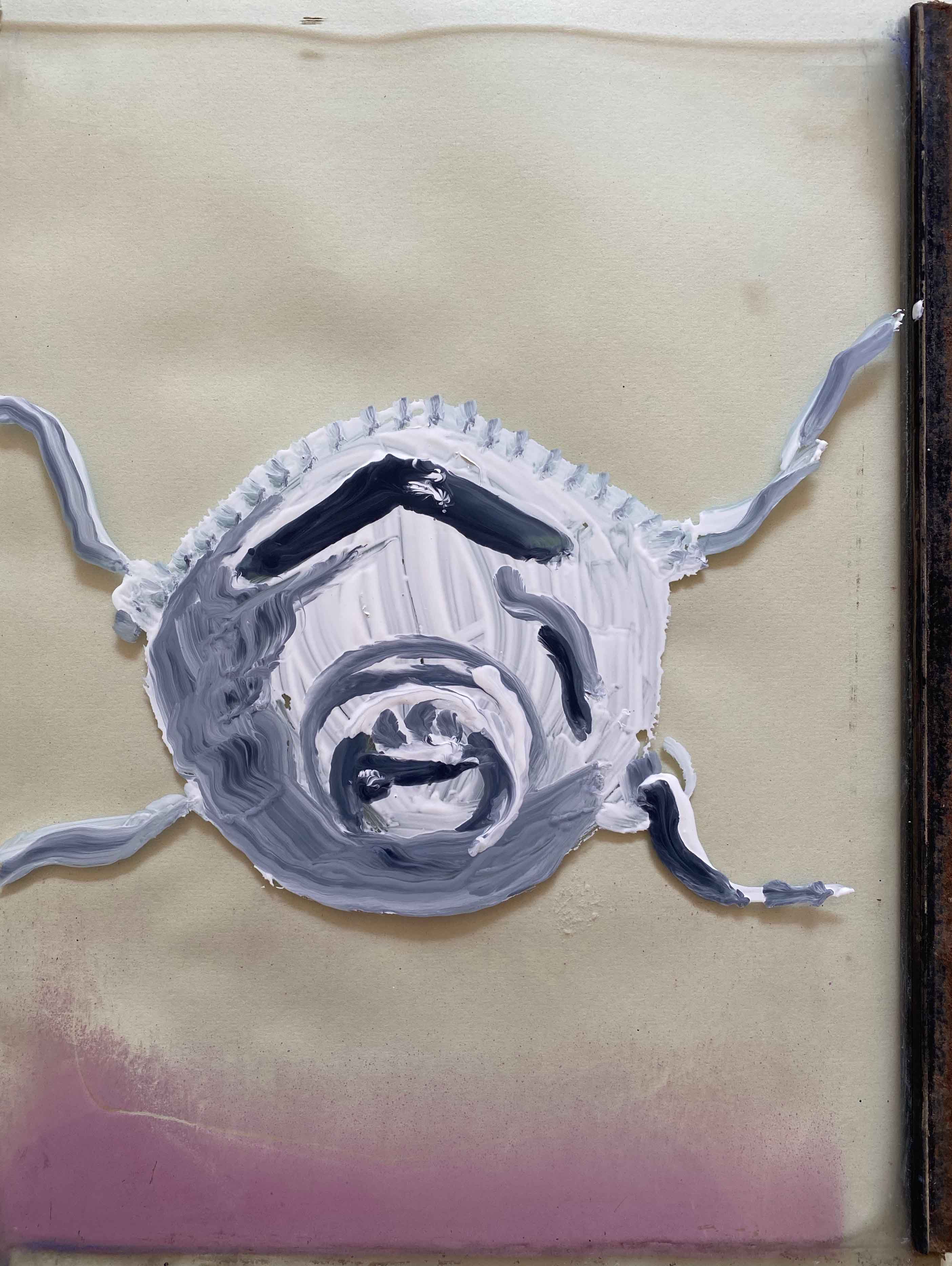
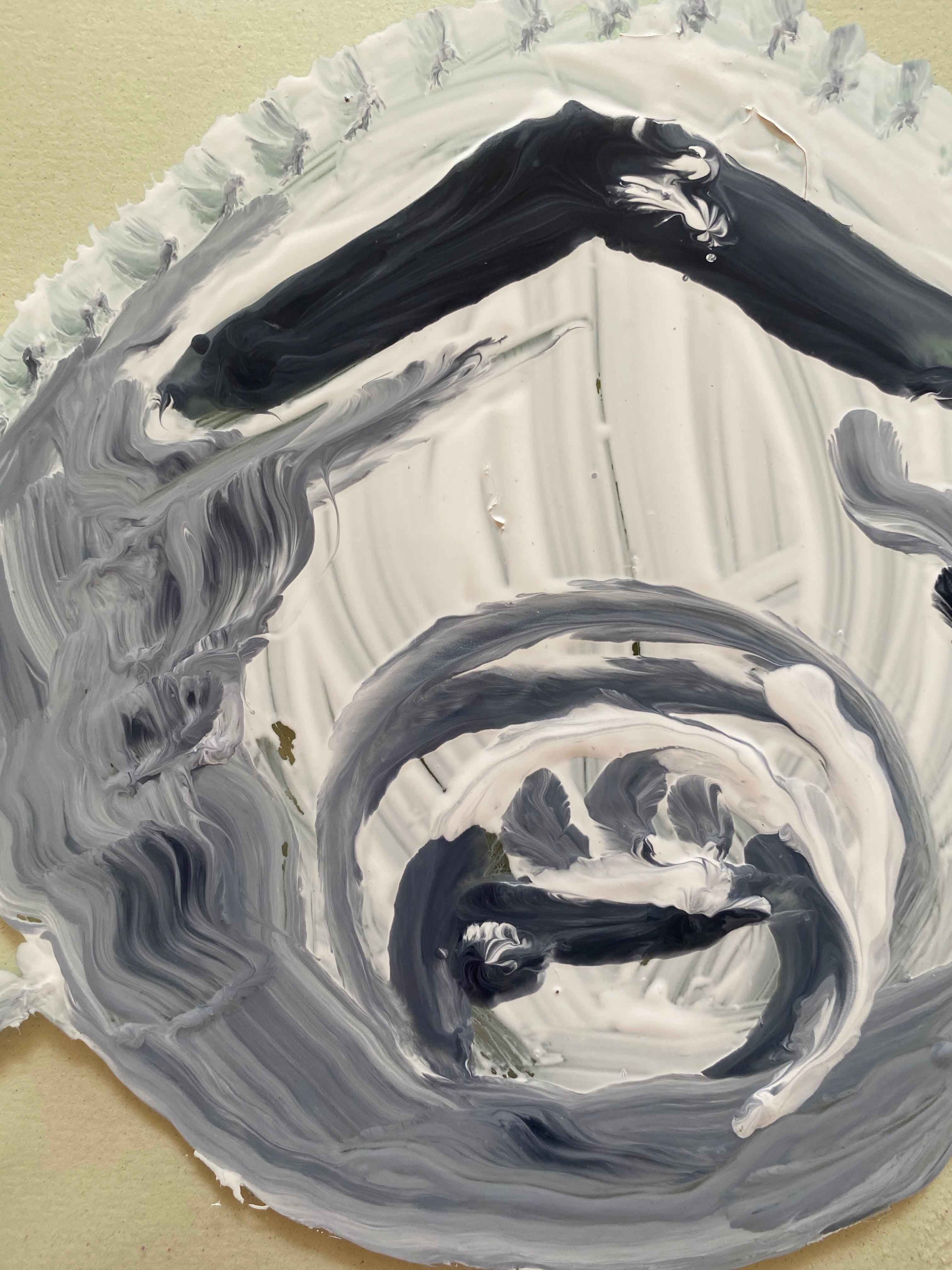
I have another go using a brush and then just drop a few drops:
This is closer to what I was aiming for. The thick oilpaint looks chunky and velvety and the fluid brushmarks are very visible:
A very different surface is a rough burlap that I have stretched over a frame of 60x80cm
The burlap is so rough that I will place a sheet of paper under and use very diluted oilpaints, imagining that the paint that seeps through the holes onto the paper also could create an interesting ghost image. (It didnt’t, just some puddles)
Besides the really rough surface, that you really would not like to touch your face, the size is different here.
All the previous trials were roughly A4, but this is big enough to cover my whole head if I would use it, which is repelling.
I guess I could return this burlap to the use of a sack transporting potatoes or so, which would make them unappetizing immediately.
I am not really drawn to any of the media I have explored so far because I already started off with a clear idea- and none of this has convinced me to see it differently.
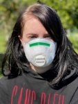
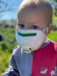
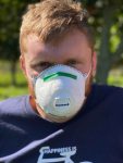
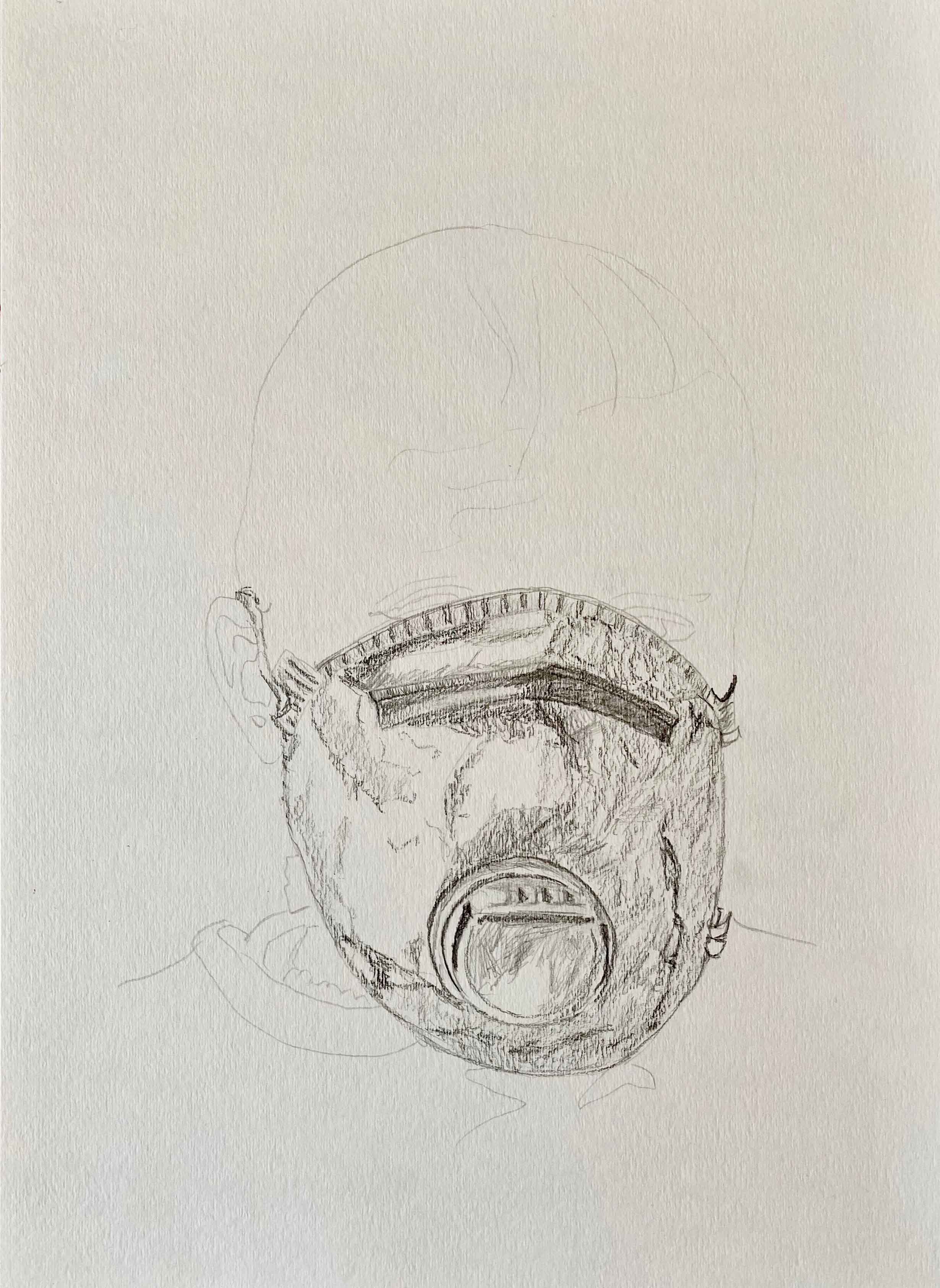
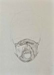
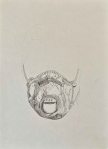
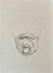
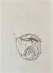
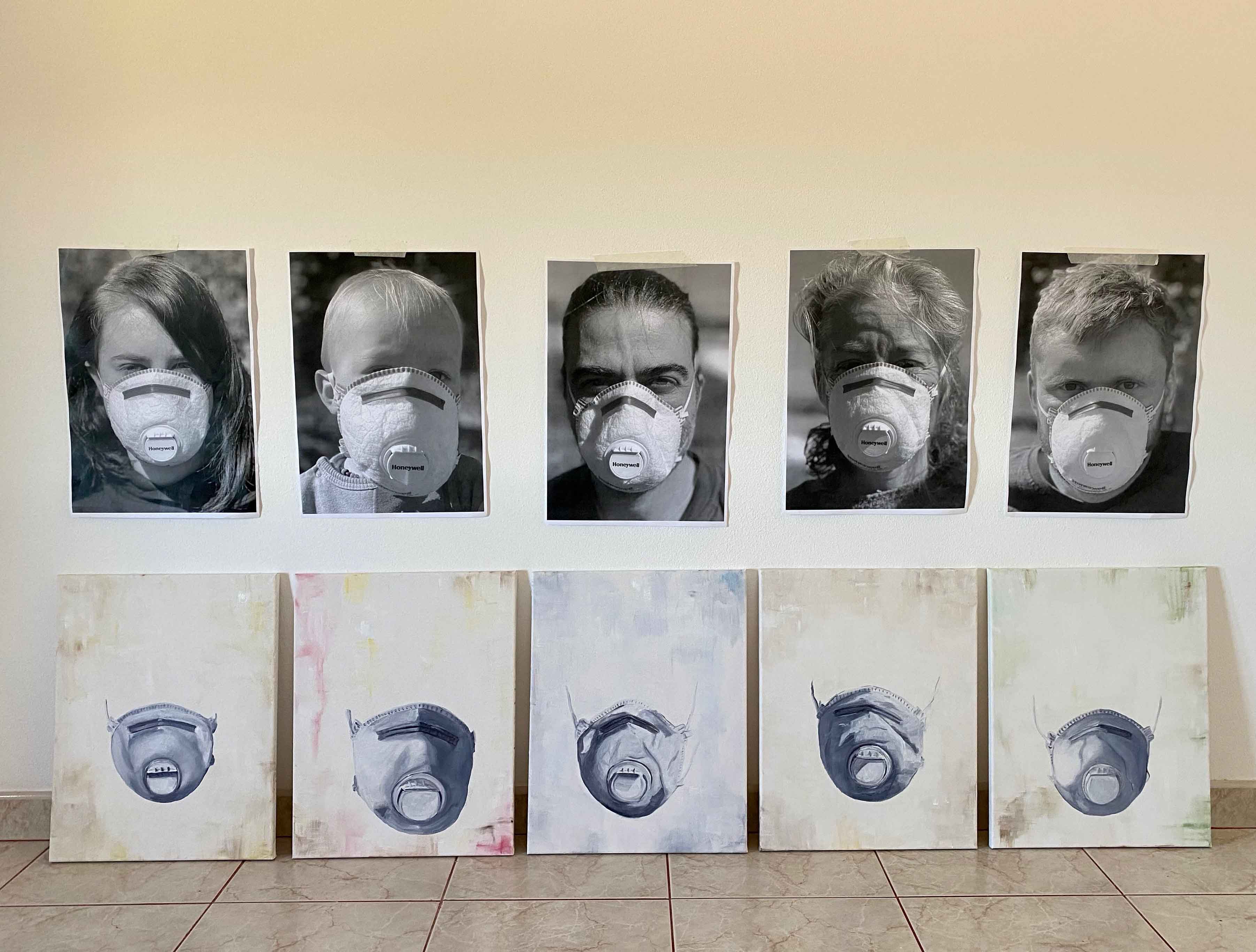
I imagine a series of my family members behind the same (one and only) mask we have. The portraits all very classical, passport picture shaped, to emphasize the impersonal, and I would choose simple pencil drawings. Everyone has a pencil and it is so everyday shopping list familiar which in normal times would be so comfortingly incongruous with using a mask.
We are so lucky to have a garden we can still walk out into in these strange quarantine times and I start by taking a series of photos that I call “family picnic”: ( or “Dejeuner sur l’herbe 2020”)
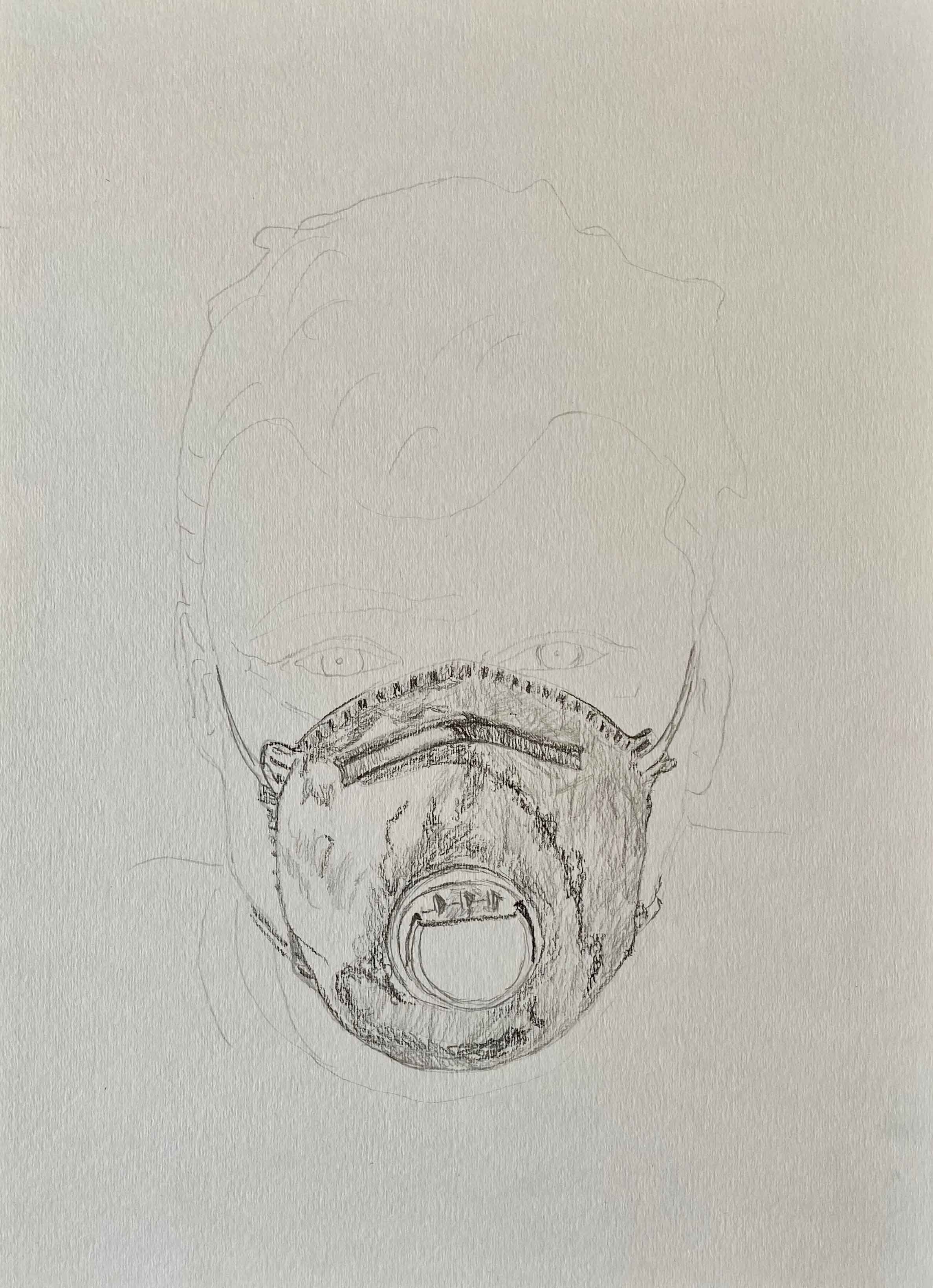
I have the idea to use video again for this subject – drawing the faces lightly in pencil- which also feels impersonal- and then slowly erasing them til only the masks are left. I think using video that adds a dimension of (short) time to the images, is a very fitting media to describe the process of fading of the personality behind fear, rules and statistics in these strange times of quarantine.
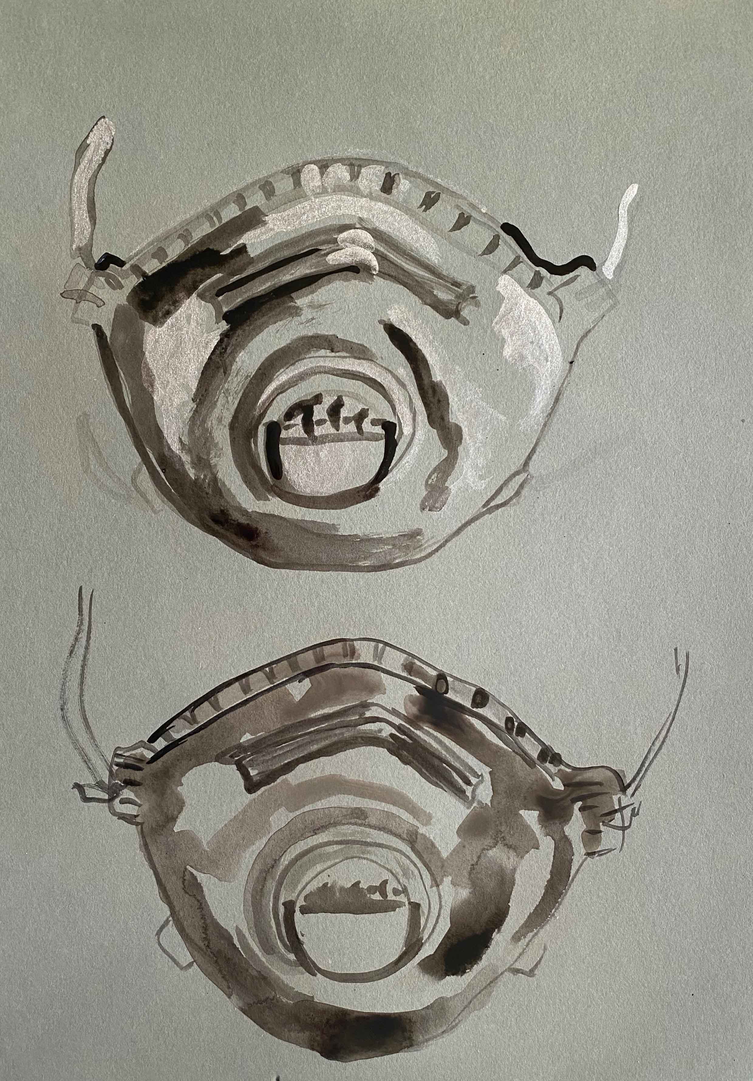
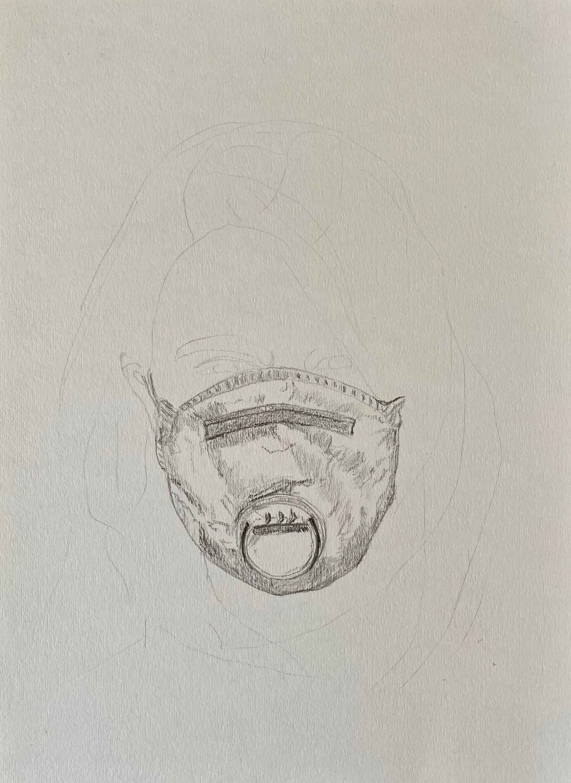
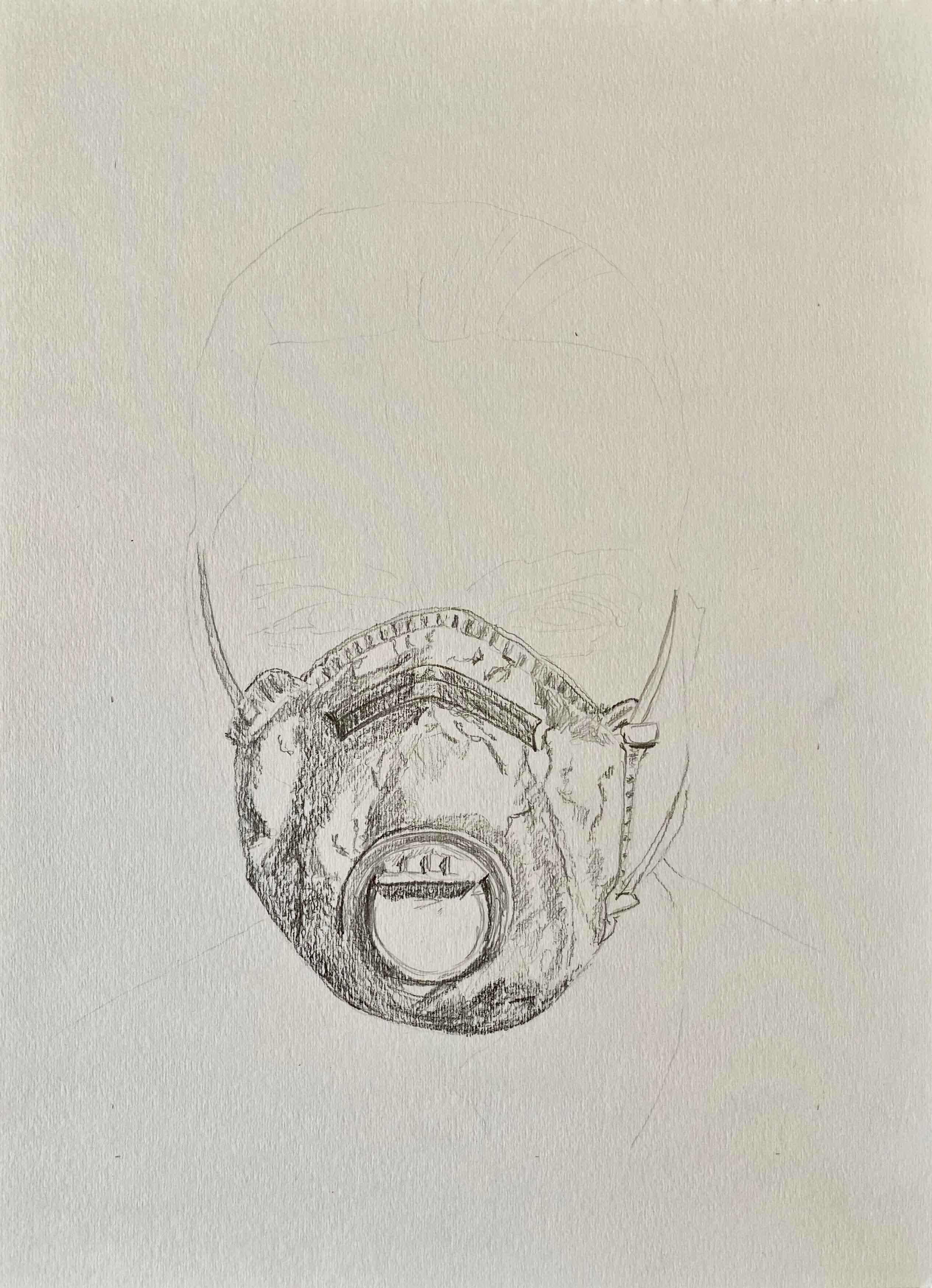
I start by creating a series of pencildrawings, using pencils HB, 3B, 5B and 8B for a tonal drawing of each mask on our faces.
This is how they look all together in a series:
Keeping the drawings as a series instead of one big painting of a family picnic is showing the isolation and separation of this time too.
I continued with finishing the portraits of me and my partner and started with the fading of these in the below video. (The soundtrack is my granddaughter’s loud reaction to my daughter trying to wean her off breastfeeding when bringing her to sleep. )
This simple stop motion video creates so many feelings of fear and became unsettling to a point that I decided to stop here and not pursue my original idea of continuing this process with drawings of the kids. It is actually way more unsettling than I had expected and I am quite chocked at where this inquiry brought me.
In the BBC Scotland movie “Cornelia Parker- What do artists do all day” (available on Youtube https://www.youtube.com/watch?v=tf7plwgxAzw), Cornelia Parker says about her work: “I am trying to unpick something that is a bit too hard to swallow”. It feels like what I am trying to do with this narrative.
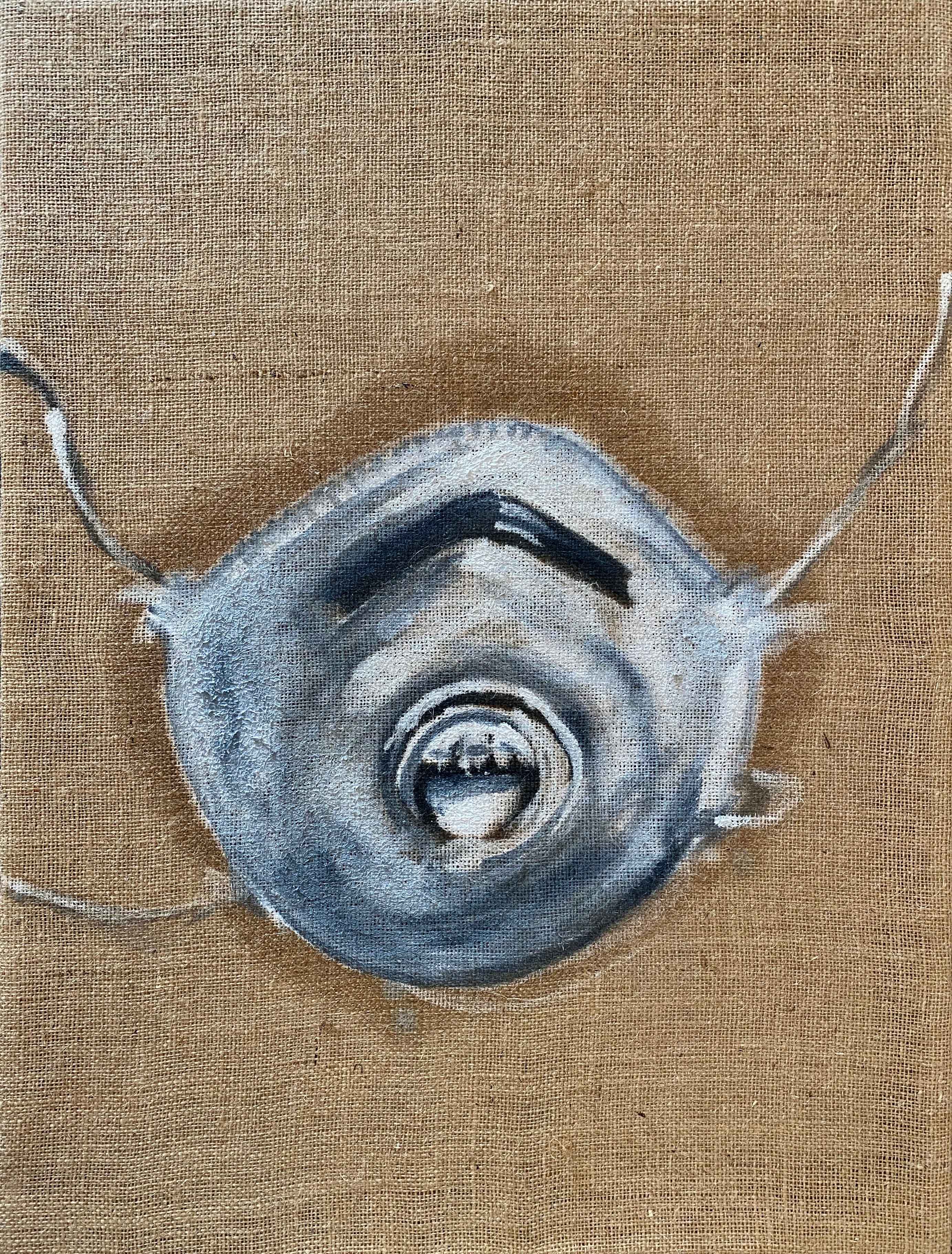
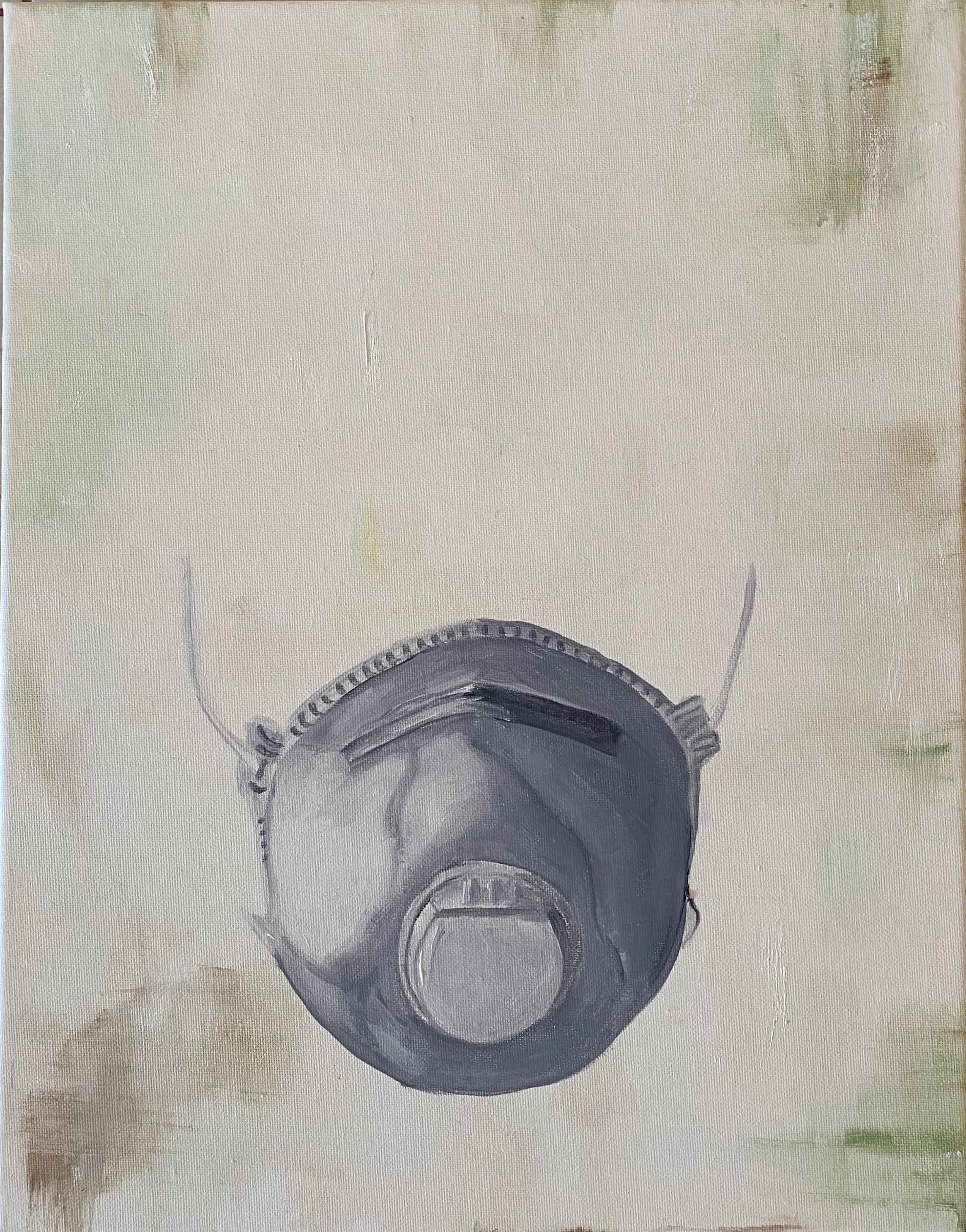
Instead of continuing with the fading of drawings, I seek comfort in painting. I continue in oil on canvas, keeping this passport picture format, but with only the masks visible. The faces remain present in their absence from the classical portrait sized painting. It feels slightly incongruous to dedicate a series of oil paintings to a flimsy object like the mask. What I am painting here is my fears.
I am taking inspiration in the almost monochrome paintings of items like pill packs or pillows by Alex Hanna. I am also thinking of the row of soup cans by Warhol- a pop symbol of consumerism at the time and translating it into THE consumer product of 2020- the mask- so desirable that it is not available to purchase anymore.
Originally, I thought of keeping the paintings as impersonal as possible by leaving the background white, but hearing of Michael Borreman never starting on a white background, I decide to give each background a slight tint of colour, matched with the person. In that way this background becomes symbolic of the person.
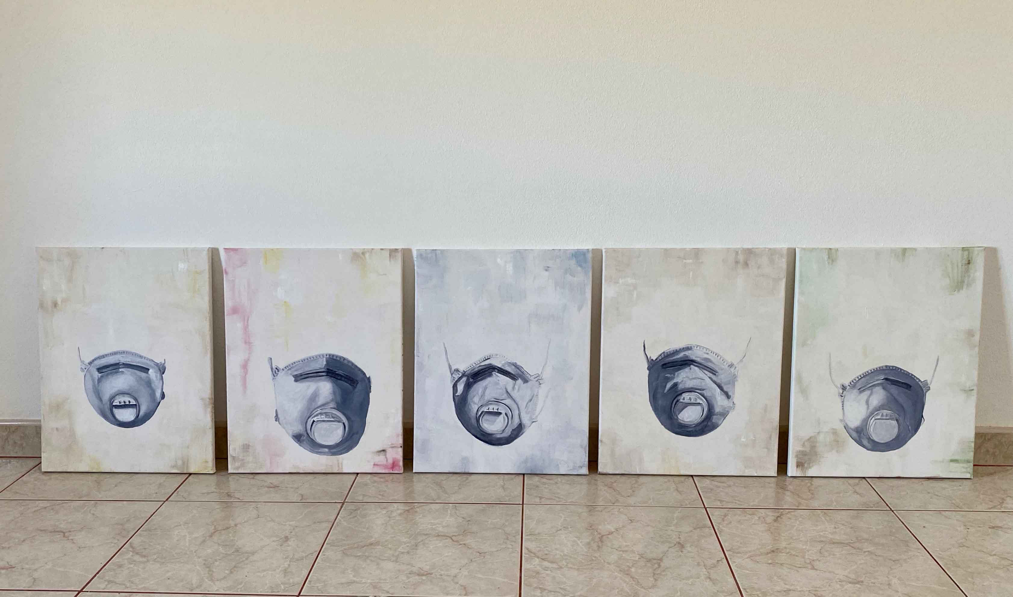
This are the final paintings , oil on mounted canvas 5 times 35x45cm:
This is how the paintings look beside each other:
This series worked out the way I wanted and expresses the loss of personality behind the masks that I was aiming for. There is a certain helplessness in the way the masks are hanging in space, as if on invisible faces, rather than placed somewhere tangible with a cast shadow.
At this point, I realize that I have gotten so moved by the subject that I played it too safe with the materials and lost track of the aim of this project. I have not achieved any real sense of relationship , nor of incongruity between the subject and the material .
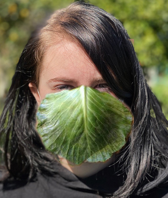
This mask is white, clean, soft, so it seems that a mask that would be dark, hard, in metal for example could be incongruous. But it just makes me think of another type of mask- a gas mask for example. The most incongruous I can think of would be a mask made of leaves and flowers or other natural materials. This mask speaks of danger and is artificial. Leaves would speak of nature. I created a Photoshop version of this idea:
I feel that I come dangerously close to a carnival mask though and will not pursue this.
Instead I think of the mask on incongruous supports. This connects to my parallel project, where I am using old items left behind by the former owners in my house between others, to explore the change happening here.
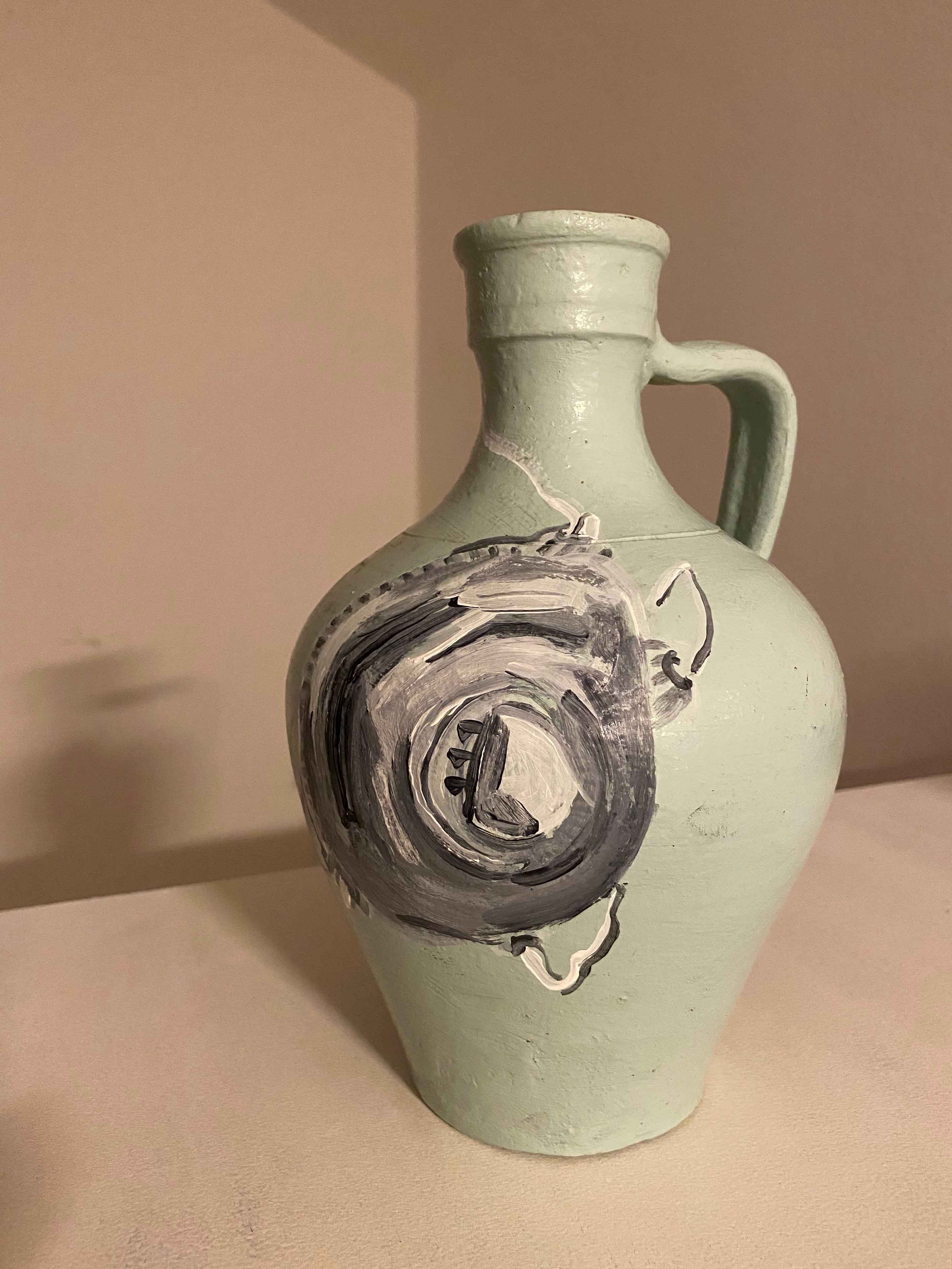
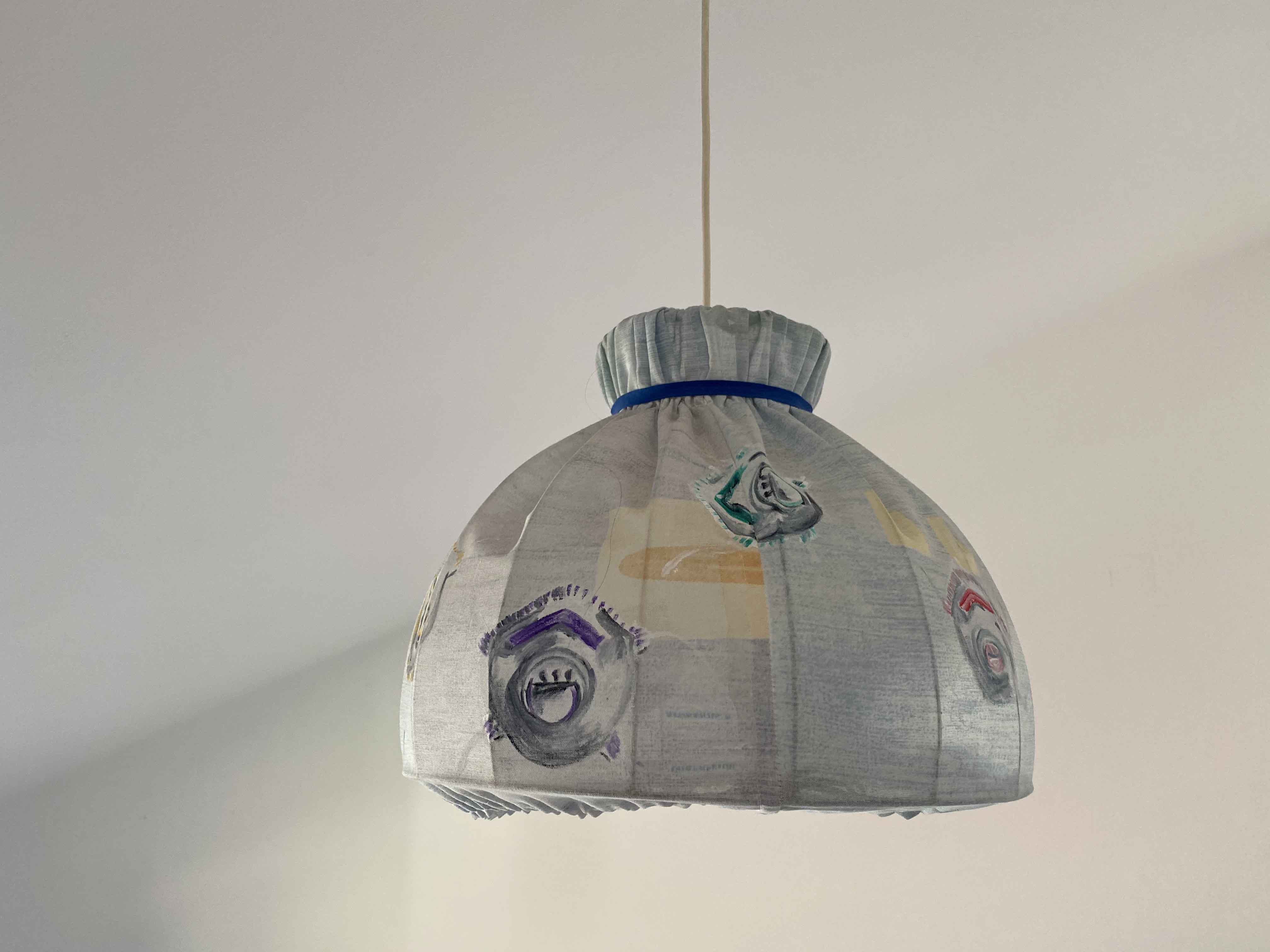
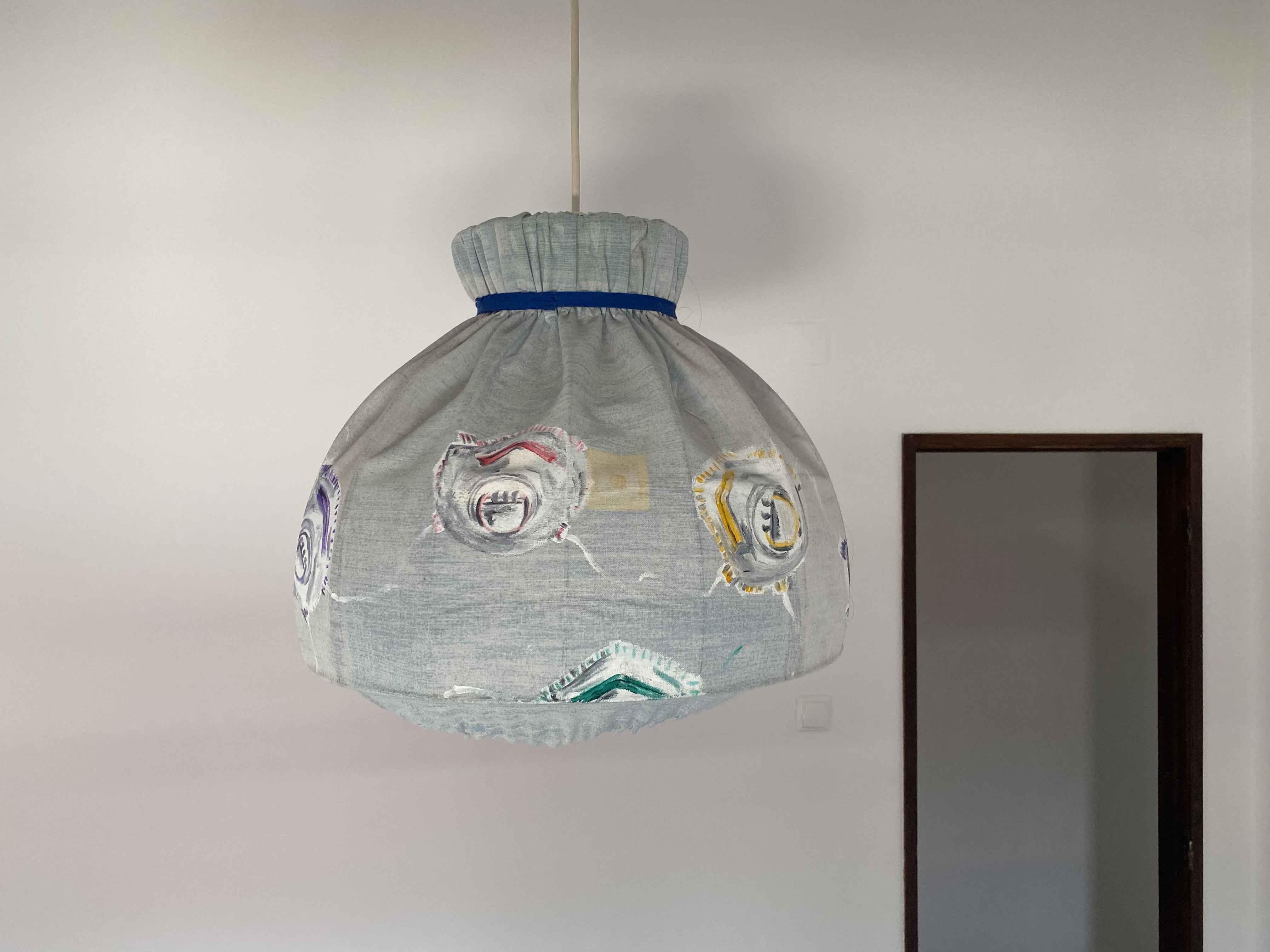
I decide that using the mask as motive on an old vase or as a pattern of a lampshade will push it out of it’s normal reality in an interesting way.
I am using acrylics and start with the vase:
To “normalize” the jug, I will add some grapes and grapeleaves:
I think this got quite funny by being absurd.
For the lampshade, I created the new pattern of 2020- colourful masks:
I could go on to Assignment 2 by using the mask as a tool to paint itself. That would actually work rather well as I have both soft parts to smear with and hard parts for interesting marks. I have seen more masks than I can stand for some time at this point though and am looking forward to a change. I am happy that I found a way to have some laughs about it in the end though- with the jug and the lampshade designs- as this narrative took me to darker places than I expected.
Course manual: Method: Build up a variety of surfaces using whatever comes to hand that has two differently coloured layers. Make several drawings by scratching through into the second layer. You can use wax and acrylic paint, oil glazes on board, household paint on wood, varnish on metal. Vary the scale of the drawings depending on your support. Choose a subject from your sketchbook or learning log and push through to make complete drawings, not just squares of texture with random marks. That way you’ll really learn what the materials can do.
I am on a worktrip to Rome and extend my stay a few days to visit my friend and painter Ellen Strasser in her studio in the Italian countryside.
Her studio is light and spacious and my dream.
Ellen clears a table for me to work on and I start on exercise 2.2- exploring mark-making materials.
Ellen has a treasure box full of suitable materials to scratch into the surface.
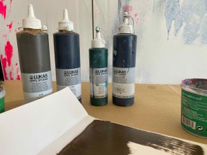
I am not staying long enough for oilpaints to dry, so I chose to work in acrylics- discovering Lukas Cryl brand that I have not tried before.
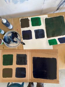
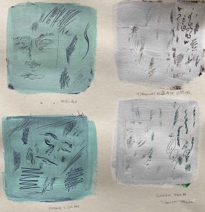
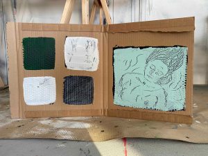
I start by exploring different marks on different colored surfaces on a cardboard box, and two different thicker glossy papers.
The result is much better scratching quickly into the still wet paper.
I have a problem with the scratching tool piercing too far into the paper and damaging it.
I will need to build up several layers of acrylics to create a solid base.A little frustrated by this discovery, I scratch into the left over paint on my metal palette, which is more successful:
This is really a fun experience. I will wash this away now, but I will look for some metal when home to try this again.
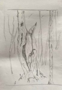
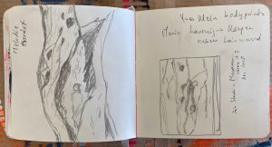
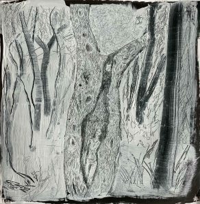
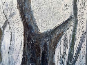
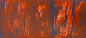
As for my subject, I am working from a photo that my friend Isa has sent me from her trip to Australia, where she is standing inside the trunk of a tree. I am fascinated by this forest, especially considering the recent tragic forest fires.
I start by an A4 sketch in pencil:
And some close ups of the figure in my pocket sketchbook:
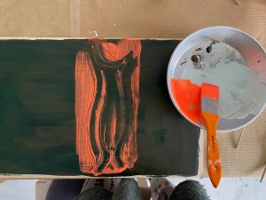
Then I prepare one of the supports with several layers of Sap green and Burnt umber Lucas Cryl. The top layer is Titanium White mixed with a little of these two colours.
I apply the top layer in small steps and scratch along the way, as the acrylics dry very fast and I can make much more free marks in the wet paint.
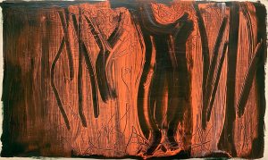
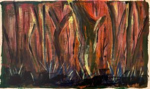
I am using very fine detailed marks and am spending a lot of time developing this into something very boring. I decide to start making larger, rougher marks. This is the whole drawing:
I am much happier with the rougher marks on forest on the sides. The detailed figure in the tree is too precious and looks like a lace curtain.
I try to add some colour:
This made it even more awful. I cover the other colours with Payne’s Grey.
I will stop here because it is just a rather awful drawing. I am happy for the mark making experiments though- this is definitely an example of many different marks:
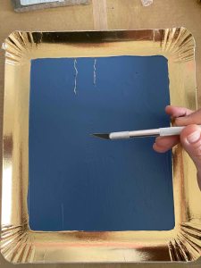
I have found a gold paper cake tray that I am hoping will allow me to do something close to the metal palette above (if treated more carefully).
I start by covering it in Lukas Cryl Steel blue- an amazing blue tone.
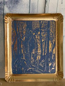
I am using the drawing of Isa in the tree above and a scalpel to carefully scratch out a variety of marks.
The result here is more fun and fitting to the golden frame, but it is still not a drawing that I like.
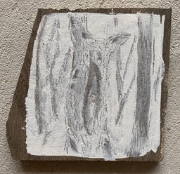
I have also found a broken tile and try using it as a background, covering it with Titanium white with some burnt umber.
The drawing remains a little unclear here, which adds a small note of mystery that I like. I also like to hold the drawing in my hand like a precious object.
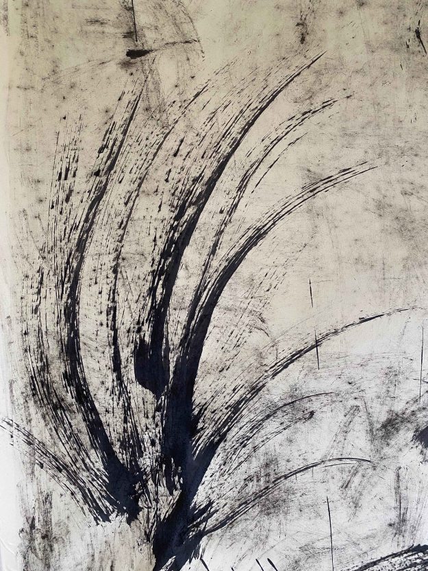
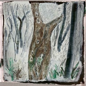
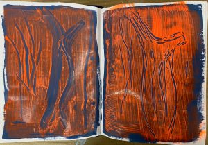
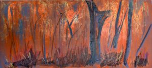
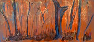
So far, I was most happy with the roughly wiped marks for the forest around the main tree. I prepare two larger new backgrounds to try out this quicker wiping and scratching- one in Steel Blue and another with the same mix of Sap green and Raw Umber as above.
Experimenting in my sketchbook, I discover the effect of a Luminescent Orange- it is really shifting things.
I start with the brown background. As before , I apply the paint piece by piece to avoid it drying before I can manipulate it.
I enjoy the larger swiping marks! Then i add structure, grass and leaves using different thickness of wooden sticks. This is the first drawing:
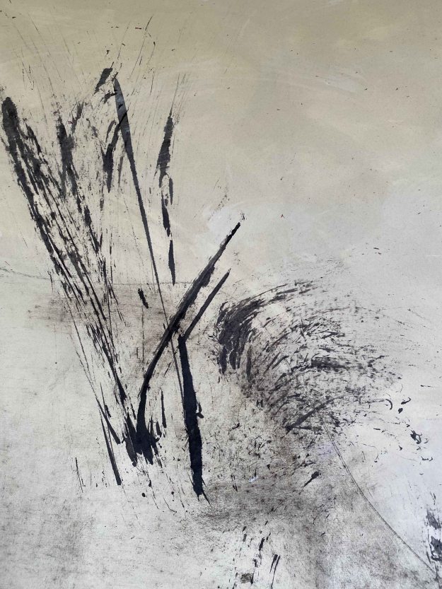
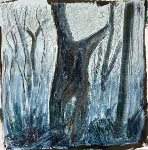
And the second one on Steel blue:
I like the minimalist and almost abstract character of these drawings. But then I am also curious to see how I can push it further and add paint on top that I then continue making marks in.
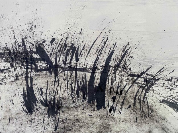
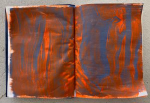
I have gone from the romantic hide away in a tree trunk to a blazing bush fire and feel that this is a much truer drawing. I feel that there is depth lacking on the right side and add a few more trees in the foreground and more marks in the ground.
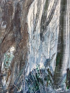
For the drawing on a brown background, the bushfire develops like this:
In hindsight, I think the strongest drawings were the very simple almost abstract first versions of these drawings, especially the blue one. Pushing them further allowed me to add many layers of different marks though.
I need to change subject, and decide to turn to some portraits under water that I developed for a story about drowning, painting on glass for the parallel project. I am looking at the photos of these facial expressions under water again and continue with some mark making experiments on another of the prepared boards.
In my A5 sketchbook:
I am really fascinated by the Fluorescent Signal Red and will try it out for this subject too. It reminds me of the colour of a life west too, connecting it to the subject from another side too.
I also try out the combination of Steel blue and Fluorescent Signal Red in the A5 sketchbook:
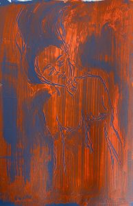
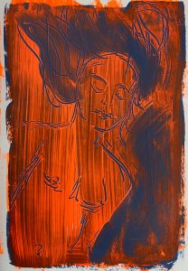
I prepare a thicker page of A4 in Steel blue and then Fluorescent Signal Red.
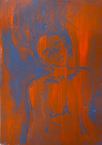
The paint is pushed to the sides by my wooden stick and it almost looks like a woodcut or similar. This is the drawing I am most happy with so far. I like the expression and how the blue and orange is divided in and around the figure.
I discover that there is a Fluorescent Magenta as well, so need to try out this colour too..although the Fluorescent Signal Red carries more meaning for the subject.
I have really enjoyed working in two colours only, and also enjoyed “rediscovering” acrylics. I would like to try out this technique with oil paint or wax that dries much more slowly as well.
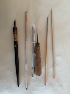
I have had the chance to try out many different markmaking tools, but these are the ones I used most:
It is time to pack and leave. I have absolutely loved working alongside an artist friend, although we were working on very different things, it is wonderful to share the joy of making.
3 weeks later
Only three weeks later, a joyful trip to Italy seems like from another lifetime. We are in the midst of corona virus Covid 19 measures and in a lock down here in Portugal and in most surrounding countries.
I finally manage to restart with this exercise and will try out scratching into oil paint on wood.
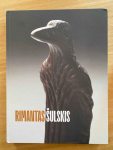
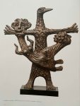
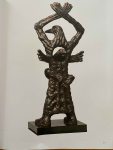
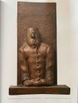
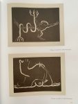
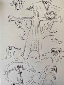
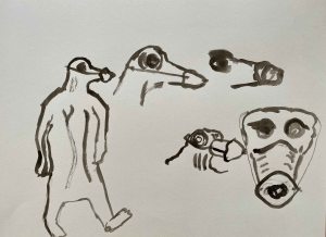
I am inspired by a book about the work of Lithuanian sculptor Rimantas Sulskis that was gifted to me recently. I am really touched by his bronze sculptures expressing the oppression under the Soviet Union through bird-men or birds and men in various intertwined forms.
They are humorous and touching and really expressing the struggle and pain and I find them fantastic.
The same figures reappear in Sulskis monoprints and ink drawings:
(Images from the book “Rimantas Sulskis” : Andriusute-zukiene, R & Morenaite, D(2019).Rimantas Sulskis. Lithuania:Vilniaus Dailes Akademijos Leidykla, reproduced with permission of Rimantas Sulskis estate.)
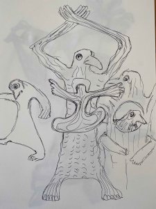
I am wondering how I can develop a drawing about the oppression of today- the Corona virus- inspired by Sulskis without copying his work too closely.
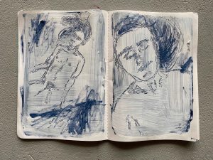
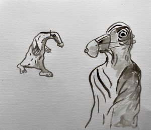
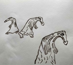
I start by drawing from the book just to familiarize myself with the figures:
Then the idea comes to place a mask over the bird mans beak, symbolizing what is happening to the world now.
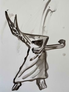
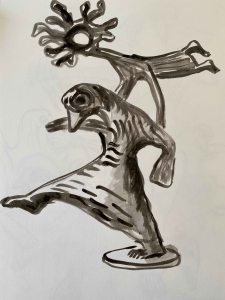
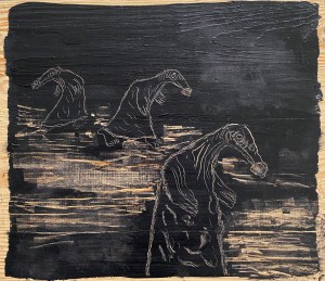
I am going to paint with oil on the lid of a wooden box:
I cut two watercolour papers to the the size of the board to try out two different compositions in Indian ink:
I choose the one on the right.
I then try out different ways of applying paint and scratching into the surface on the underside of the panel.
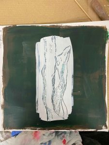
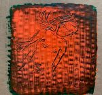
I see that I need to apply a coat of Transparent Gesso so that the paint does not seep into the wood. I am using a Liquitex transparent gesso. When dry, I apply a thick coat of Payne’s Grey Cobra oil paint to the wooden lid.
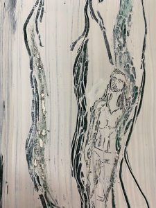
This is the final drawing, oil on wood:
I like how the feeling of the wooden surface comes through, and I quite like the playful, cartoon like figures that help me express a serious subject that has definitely infected my mind.
Again, this has been a project that has pushed me to explore a method of drawing that I would not consider otherwise, and I could just go on varying surfaces and media, but it is time to move on to the next project.
D2 manual: “Aim: A significant period of western art history has been dominated by the attempt to create a believable illusion of space and depth in two dimensions. The idea of the picture frame as a window onto a simulated vista has long been regarded as just one of many possible interesting routes but the relationship between drawings on surfaces and drawings of surfaces is still absolutely vital and many artists make use of that interplay.
The description of space, depth and volume relies on depicting the way in which light operates on objects and the change in tonality that this produces. In the pitch dark, we see nothing. Natural light tends to fall on an object from one side and the sense that we make of the shadows it casts is how we judge three dimensions. The human mind is sophisticated at reading tone, which makes it hard for an aspiring artist to create a convincing visual illusion – the viewer is not easily fooled.The first step for any student is to correct any over-reliance on outline. What we translate as an outline is actually just the moment that something disappears from view – either because something has come in front of it or because its surface has changed direction and slipped from view to reveal what is behind. Either way, being able to sit the two planes next to each other without ringing one of them with a black outline will immediately give a sense of volume and space. An outline pulls us back to the picture plane. This is not a problem in itself but, as it is so often used by students, use this project to try not doing it.
Method: Cover a whole sheet of paper with charcoal so that you have a blank black rectangle. Make a drawing from a subject of your choice by drawing into the charcoal using a rubber or selection of rubbers. When you’ve worked into the charcoal for about an hour using just a rubber (depending on how fast you work), go back to your charcoal and begin to redraw in darker tones using the side of the charcoal. Continue in this way using the rubber as a white to the charcoal’s black and develop the drawing until you’re happy with it. Try to avoid using outlines – instead, use sweeps of the rubber or the side of the charcoal to build up patches of tone. If you do use an outline, look at the two neighbouring tones, decide which is the darker and then blend the outline into that one. Bear in mind that as you move along the object’s silhouette, the relationships might change and the outline might switch allegiance.
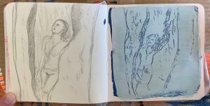
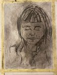
I am approaching this project while visiting my artist friend Constanca in her studio and we use this method to draw a portrait of each other while drawing.
We only have medium size willow sticks of charcoal and a simple eraser available
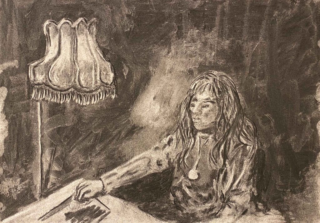
This is my final portrait of Constanca, and a big lampshade behind her, after much rubbing and filling in.
I am not happy with this drawing, it was hard to capture any likeness while she was moving and this drawing does really not make her beauty any justice. I am also annoyed at myself for enjoying working in shade only, and then still having the impulse to add line at the very end.
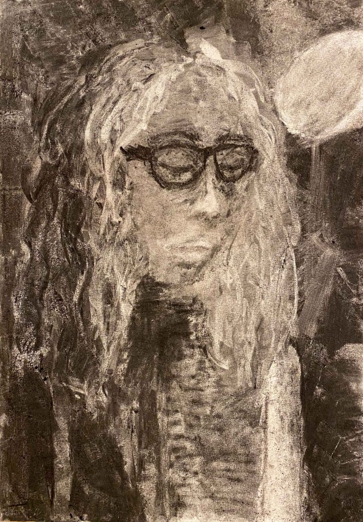
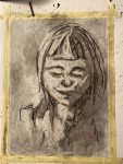
This is Constancas portrait of me:
I felt very happy at “rediscovering” charcoal through this project, and it was wonderful and playful to share the experience. We will definitely draw more together in the future!
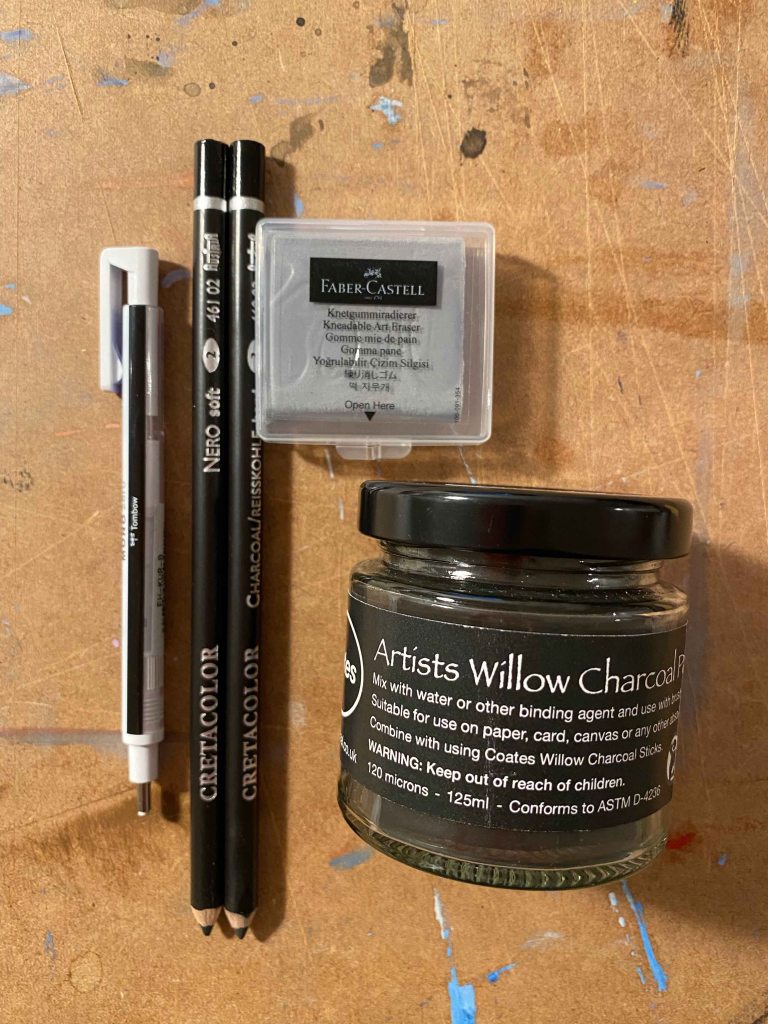
I aquire a few more specific tools for this kind of drawing for my second attempt in my own studio:
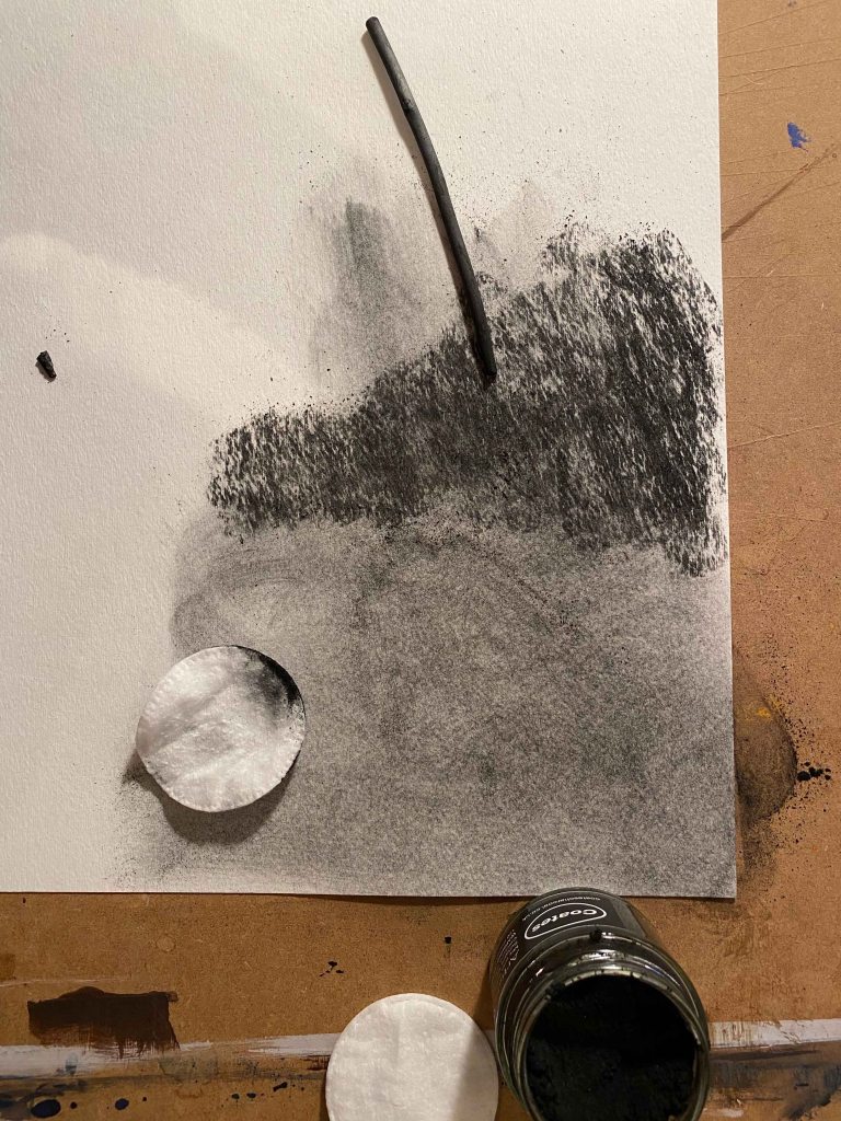
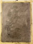
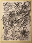
I was excited to try the willow charcoal powder, but find that when using it dry, I can not reach the depth of dark as I can with using the sticks- even if applying many layers:
I am reading the book “that which is not drawn” with conversations between William Kentridge and Rosalind C. Morris. (Kentridge, W & Morris, R.C (2014). That which is not drawn. India: Seagull Books.)
William Kentridge works in large charcoal drawings which he erases and transforms constantly, taking photos to document each step and then creating stop motion animated films. He is depicting transformation.
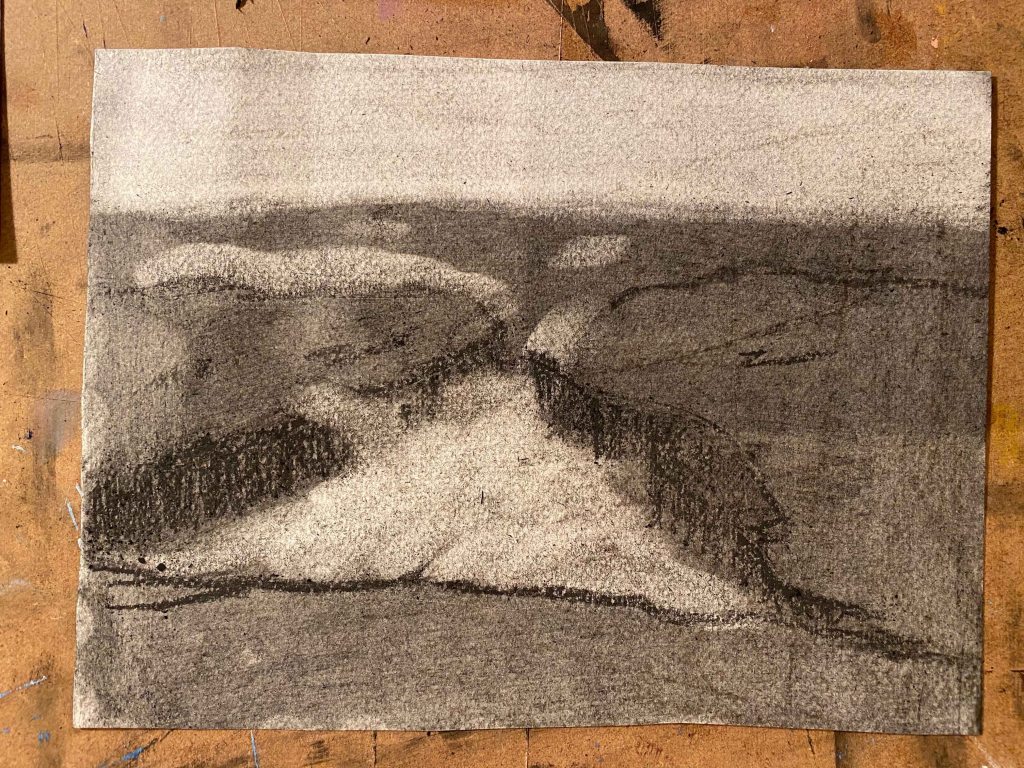
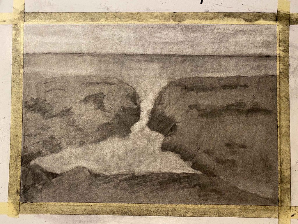
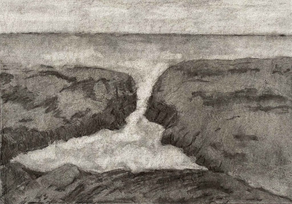
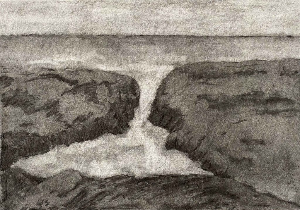
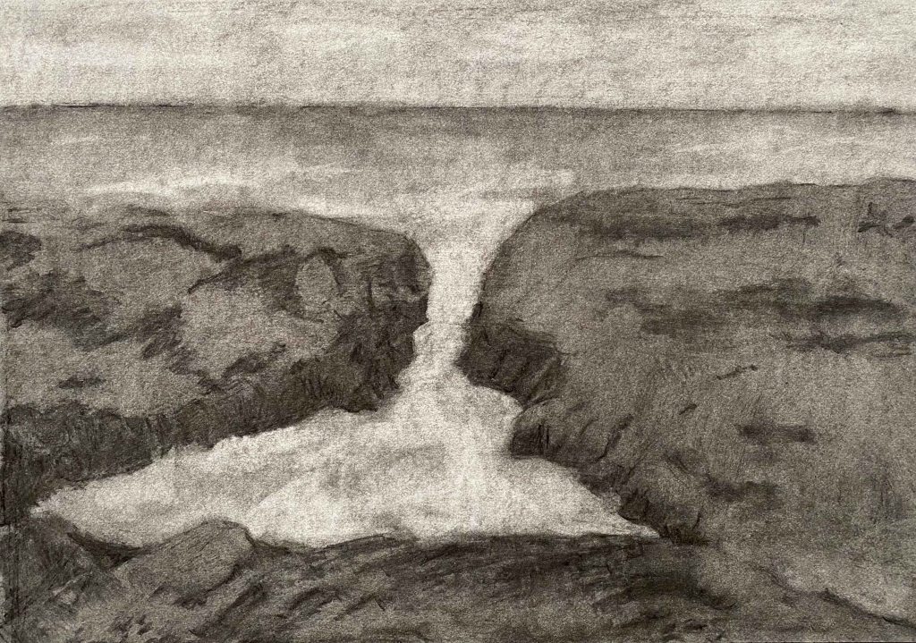
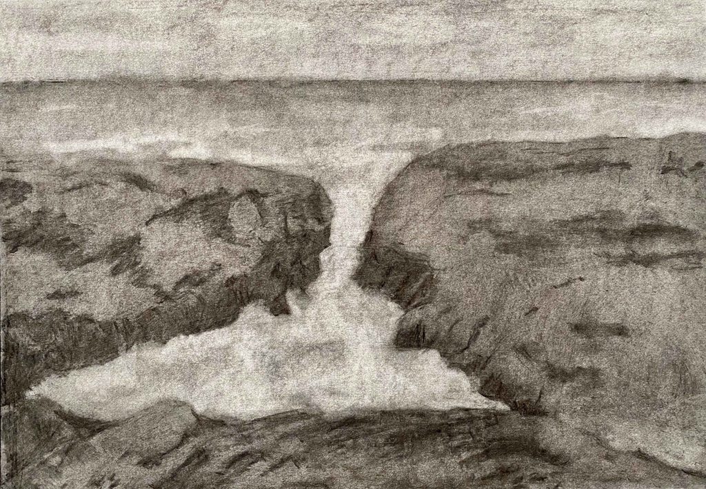
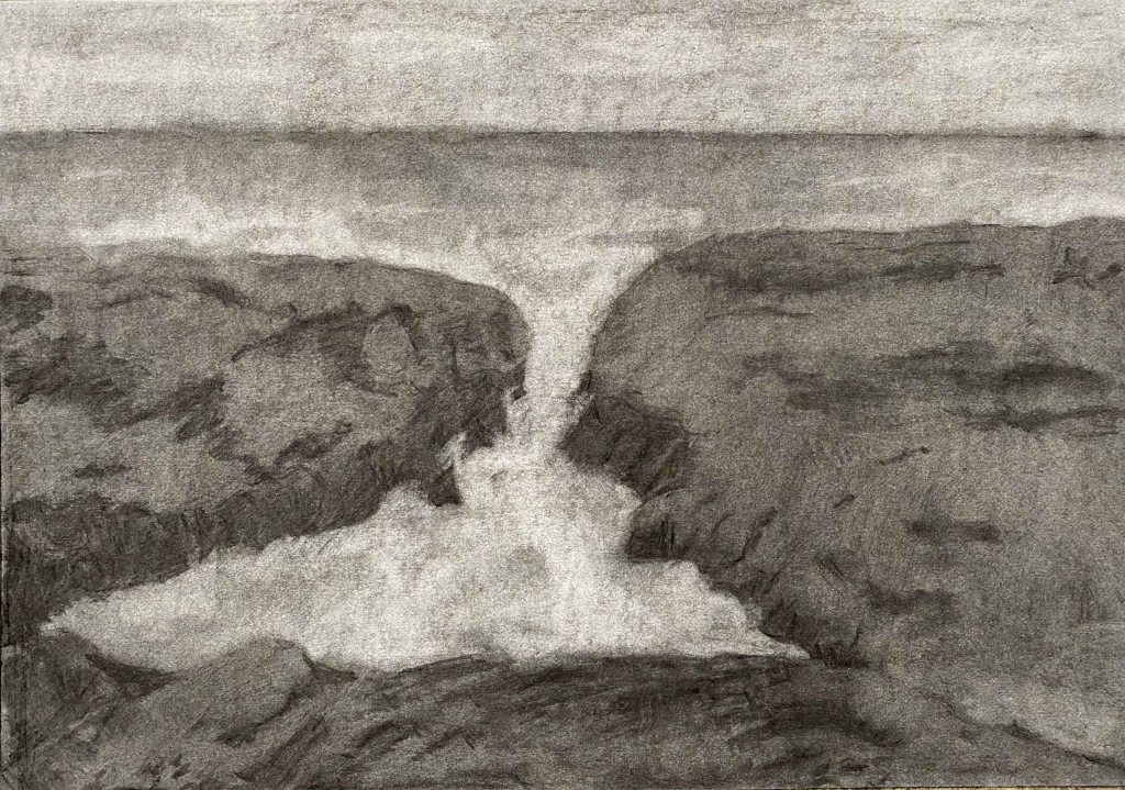
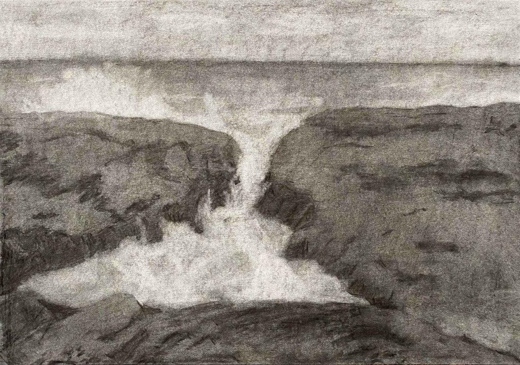
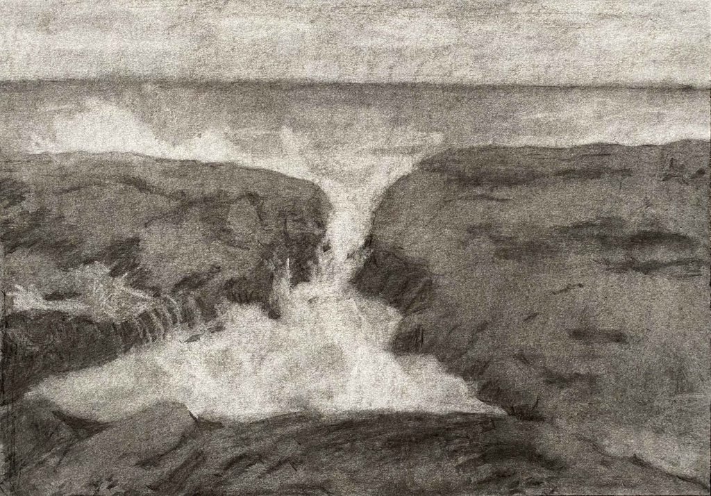
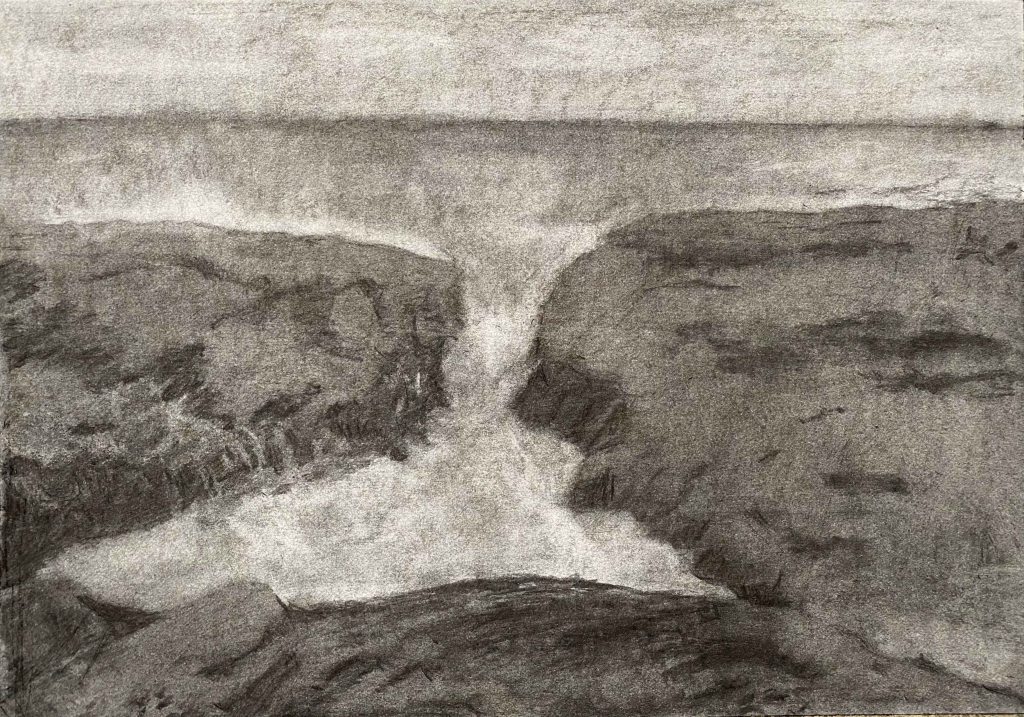
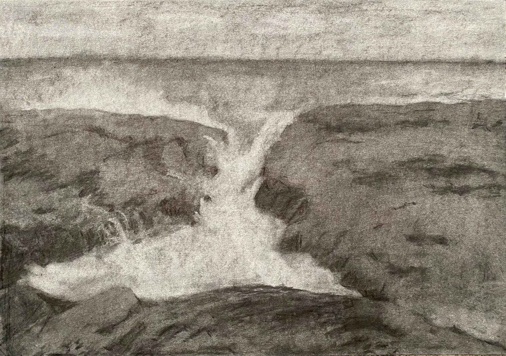
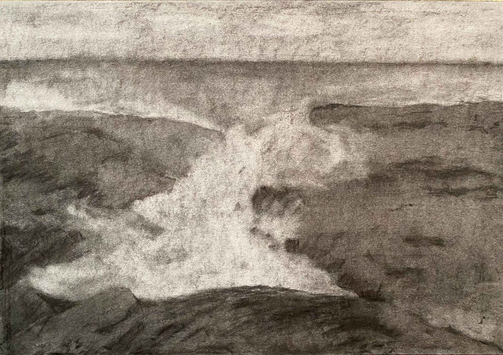
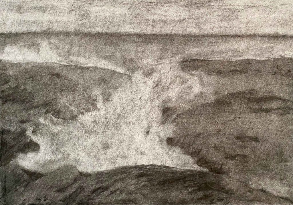
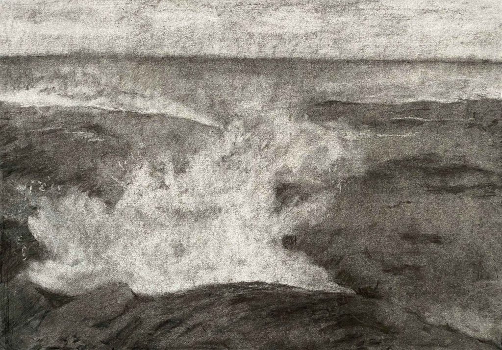
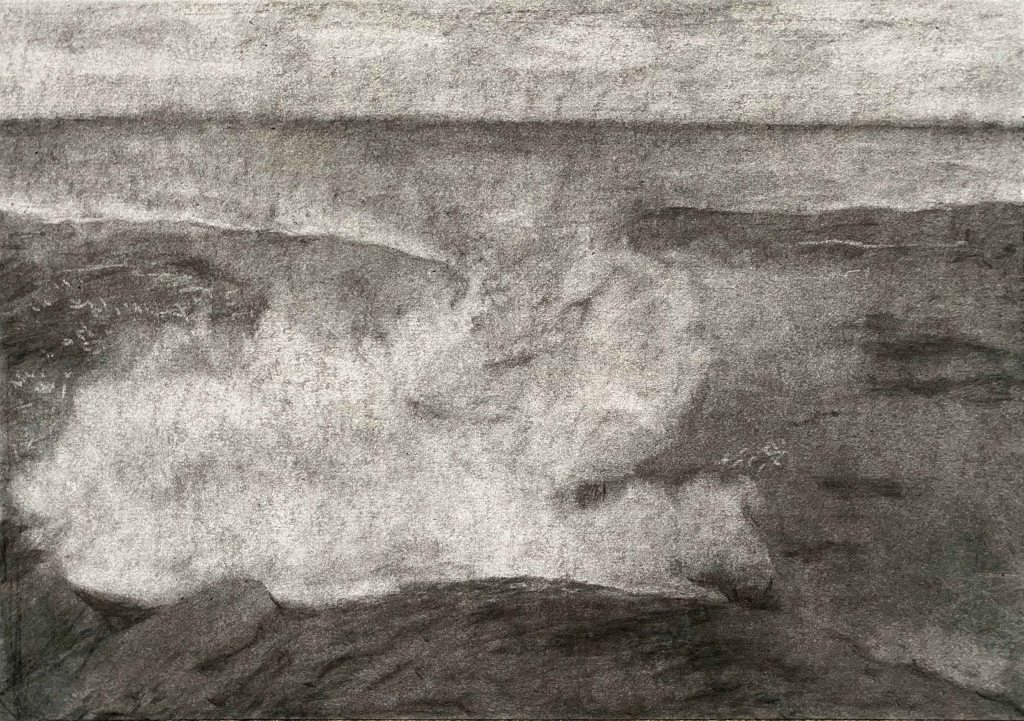
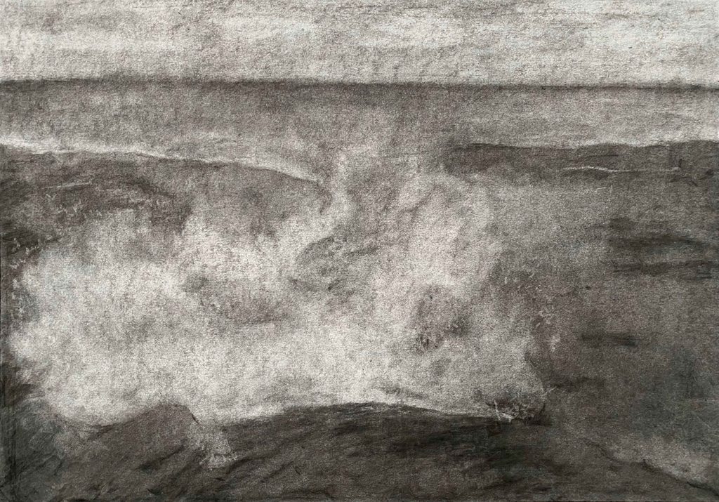
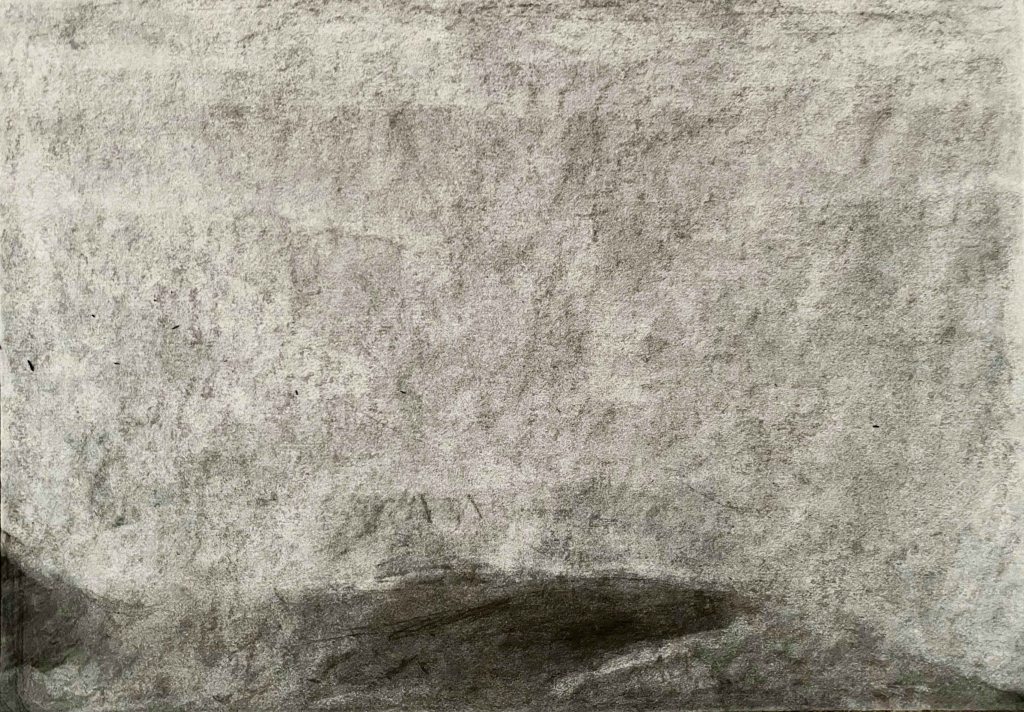
I am really excited to try this out with this project. I am going to use a moving ,crashing wave as my subject, to play with the eraser to create more or less foam on the crest of the wave, without it being a form that has to be too precise to feel right.
I start by trying out different papers:
Canson recycle, Strathmore watercolour 300g and Smooth surface cartridge paper. I had the idea that a rougher paper would give a better tooth and result, but actually the smooth cartridge paper allows for whiter erasing which is a main advantage.
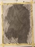
I also try out the different marks my new eraser tools can achieve:
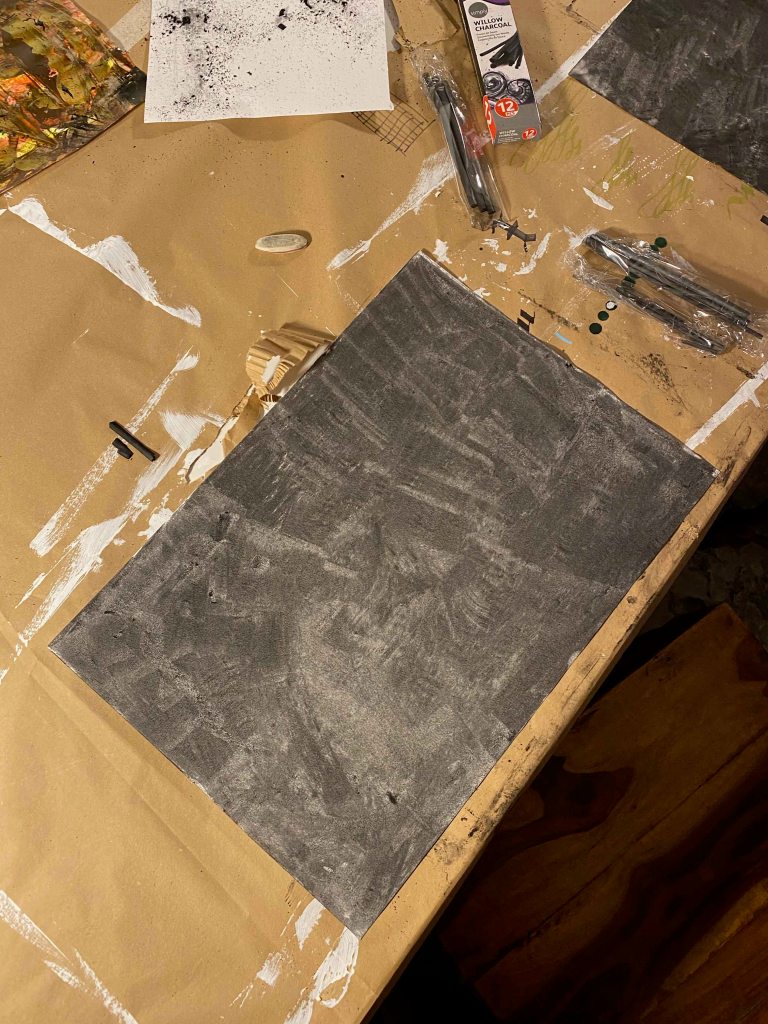
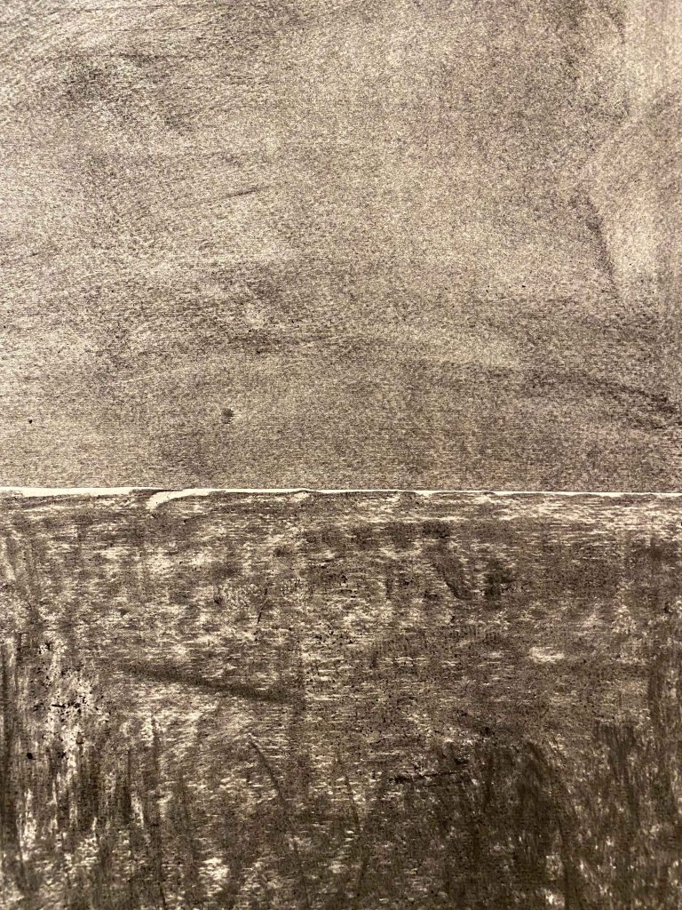
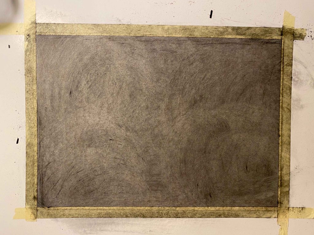
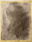
Preparing my smooth cartridge paper A3 with a layer of charcoal and starting to erase the sky:
Here I encounter the problem, that my board under the paper has lines from previous painting that show up as marks through the pressure, that are then not possible to erase- as seen above.
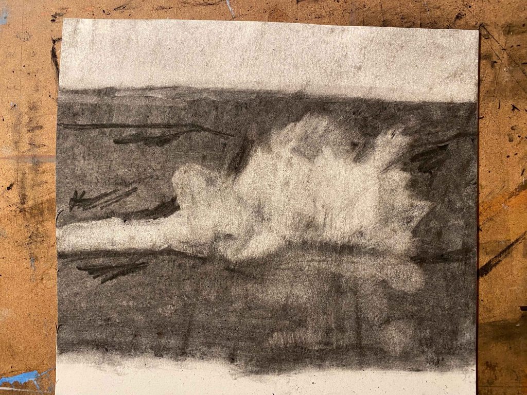
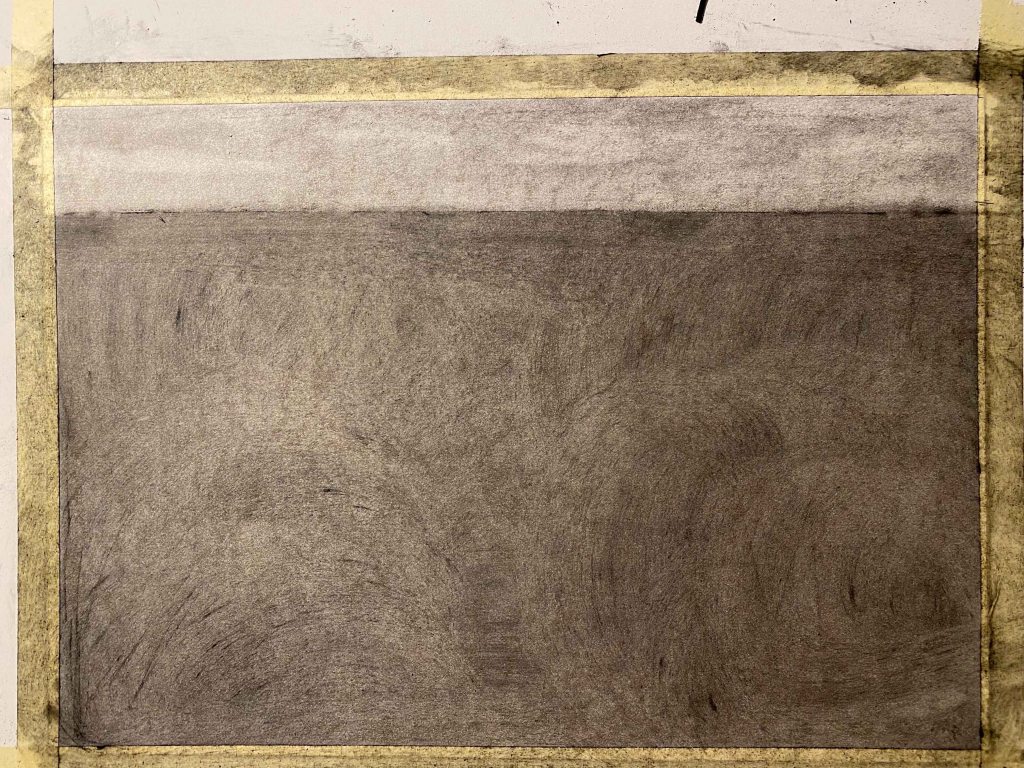
New start on a smooth board:
I continue erasing and smudging and filling in til I have a sea landscape as a starting point:
By now it is night and as photography is a main part of this project, I decide to leave the drawing til daylight:
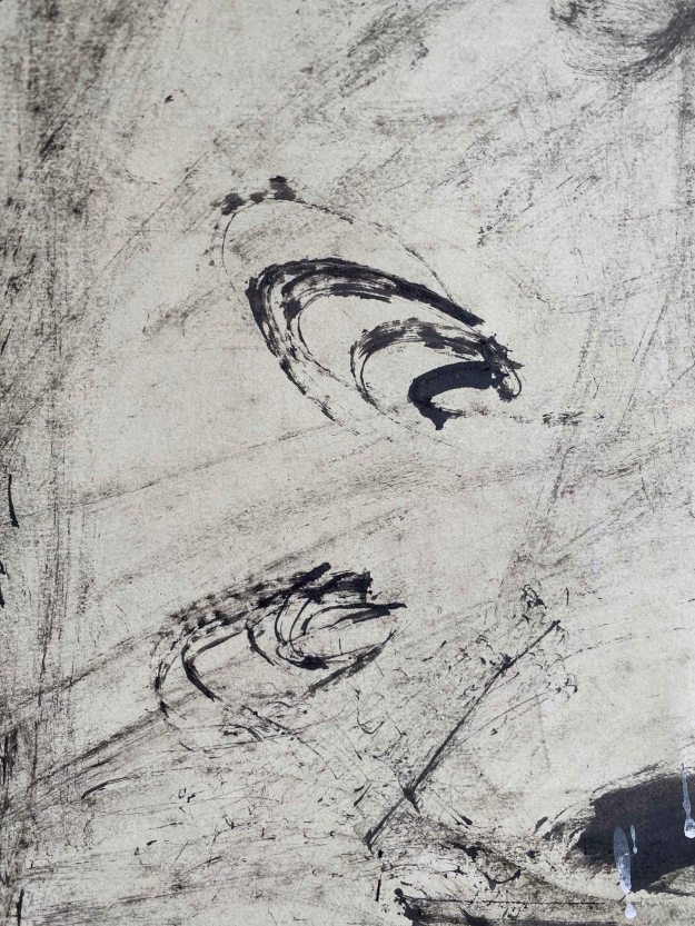
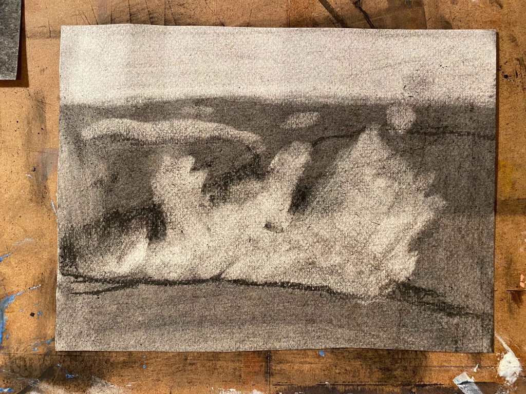
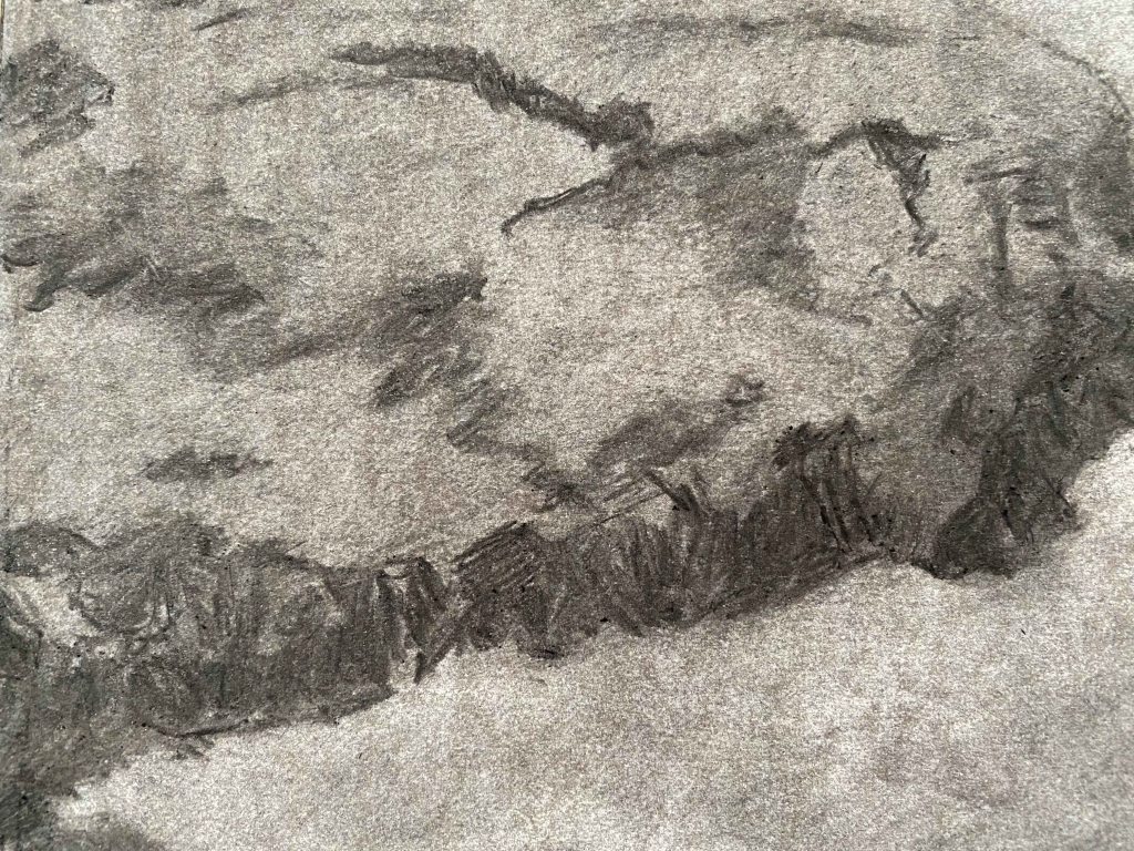
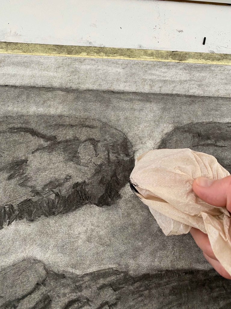
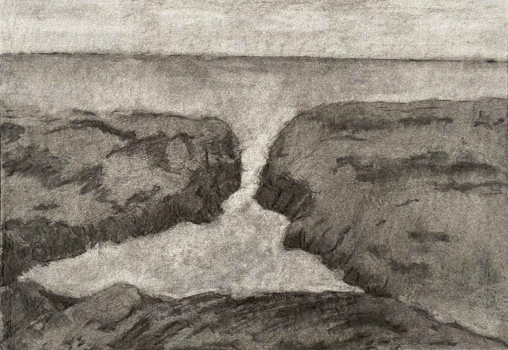
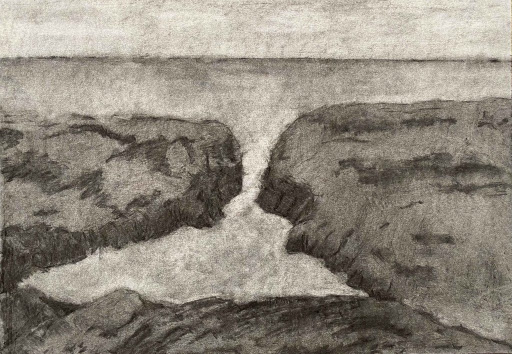
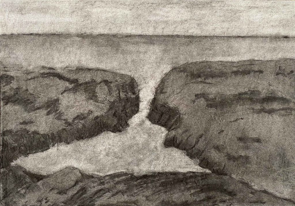
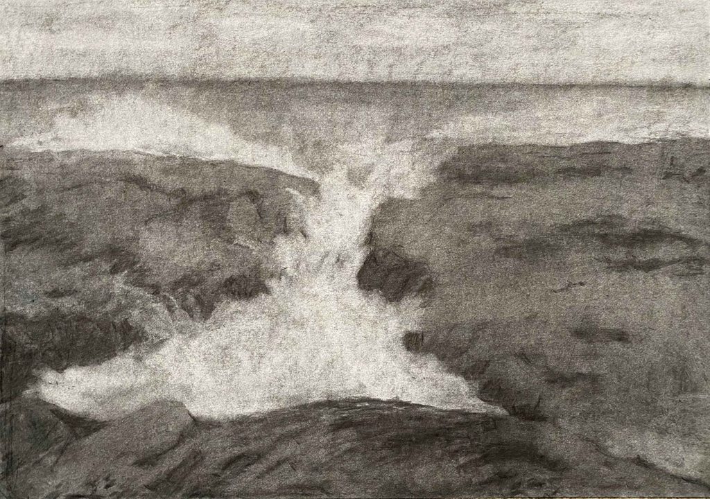
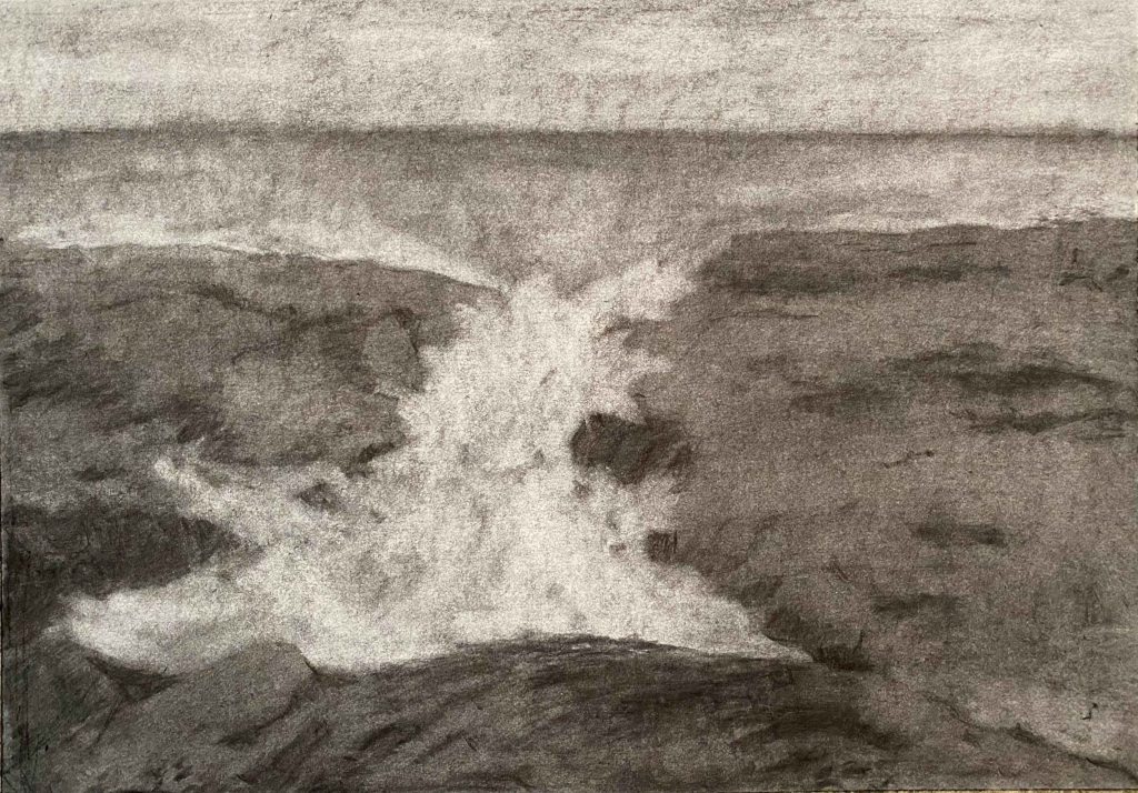
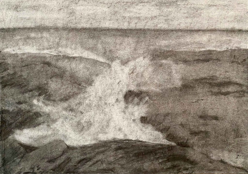
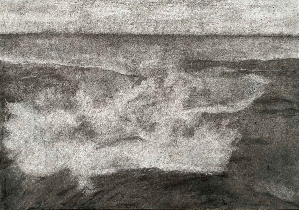
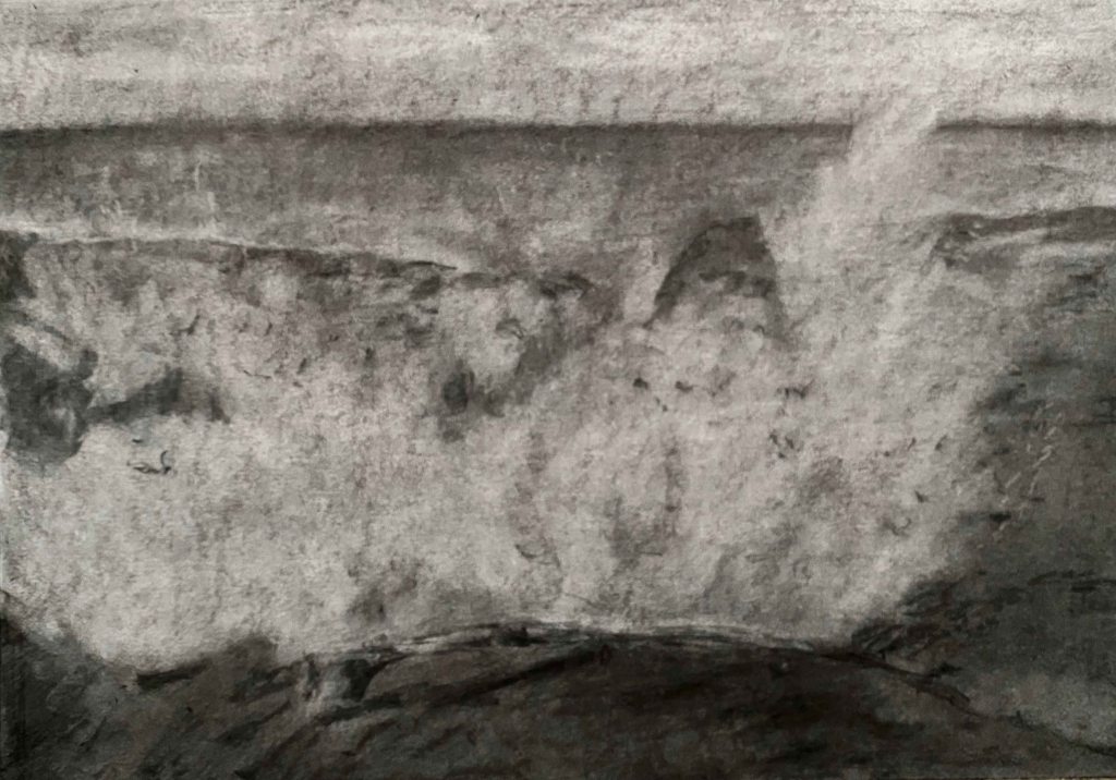
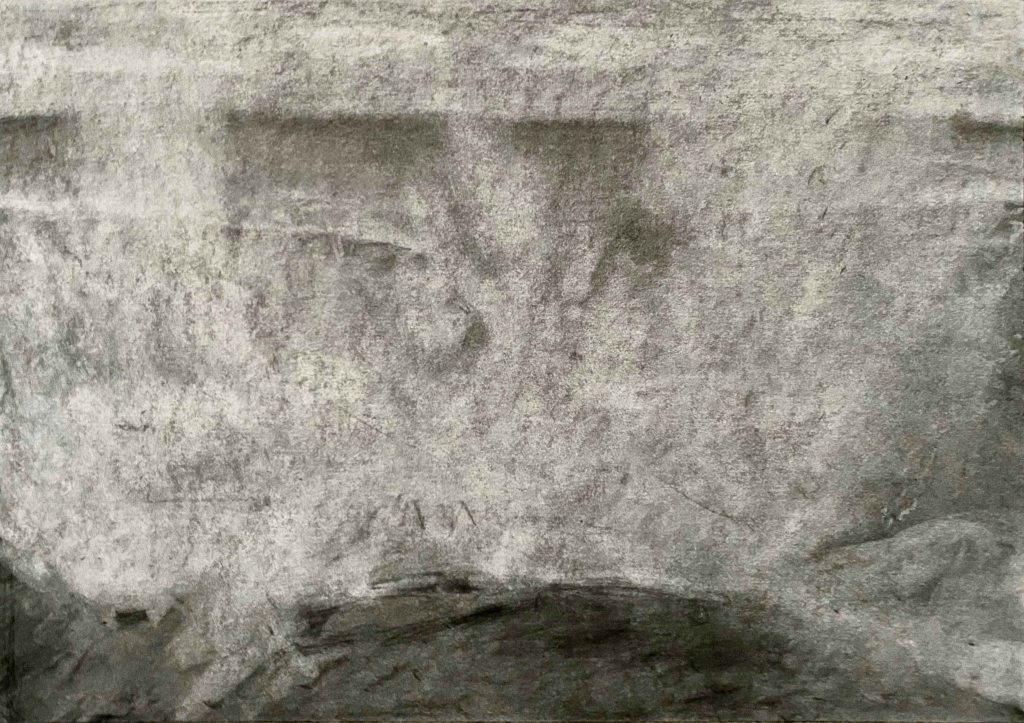
With good light, I start the process of transforming the wave, while taking a total of 27 photos of the change:
Now it is time to use Imovie to try and string these photos together to a stop motion film. I have never done this before and encounter all kinds of technical little hurdles, like a default zoom action between the images. Finally I have a small movie.
For the sound, I am in the city, not at the sea, and this is more a symbolical wave of feeling crushed. I record the sound of the trashtruck coming to pick up the recycled glass, and also the unbearable acoustics of the cafeteria where I often have lunch. I add both soundtracks and play them louder and louder to the increasing of the wave, and finally the silence at the last overwhelming image.
This free WordPress version does not support video, so please follow this link to You tube to see the video:
I am not overly happy with the final result- but I feel thrilled at having rediscovered the pleasure of using charcoal and having tried something very different with this stop motion video. Next time, I definitely need to fix the camera at one place instead of holding it in my hand as to avoid the jumping motions between images.
I think this series of drawings give a good illusion of space and depth, and the stop motion video adds the dimension of time as well.
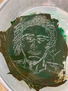
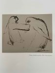
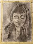
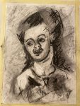
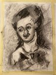
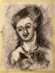
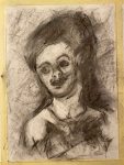
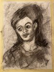
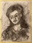
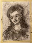
By now, I have come across the charcoal portraits by Frank Auerbach and am absolutely in awe. He documents the many changes and the quest for the perfect form and all the movement in between in one single drawing, sometimes so intensely that the paper rubs off.
I am particularly fascinated by this portrait of Catherine Lampert with its free squiggles and lines. It conveys a restlessness in capturing the features that I can feel.
I definitely want to try to draw a portrait inspired by this drawing.
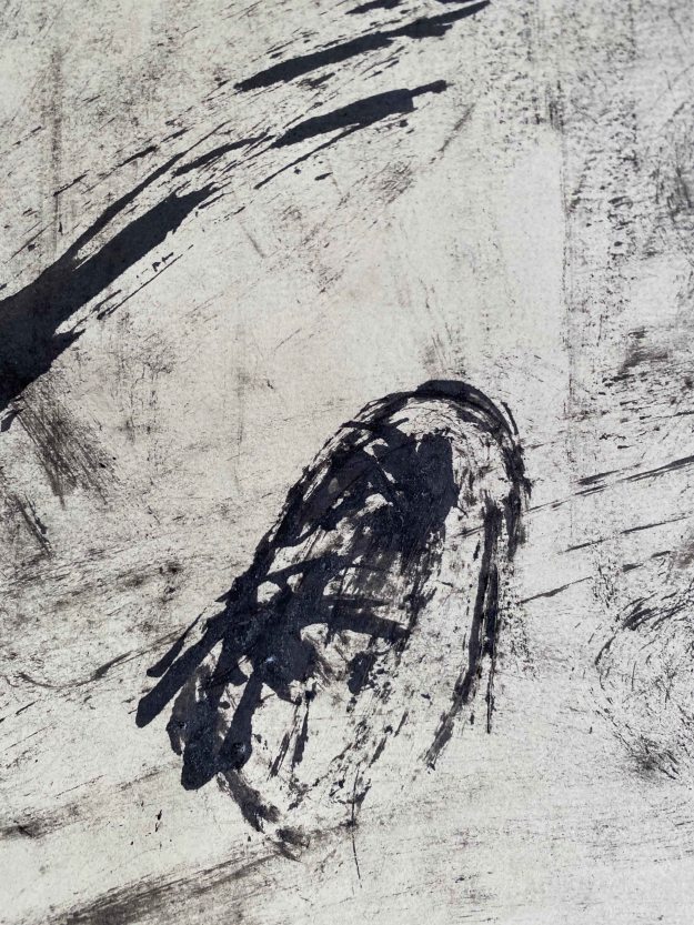
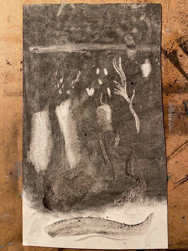
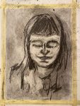
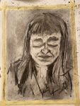
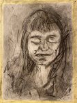
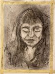
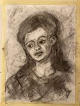
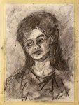
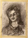
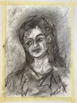
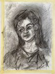
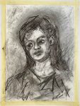
I start by covering the Winsor&Newton Smooth Surface Cartridge Paper in A3 size with a layer of charcoal, and then follow a long process of adding and erasing. I am drawing an imaginary portrait with closed eyes .
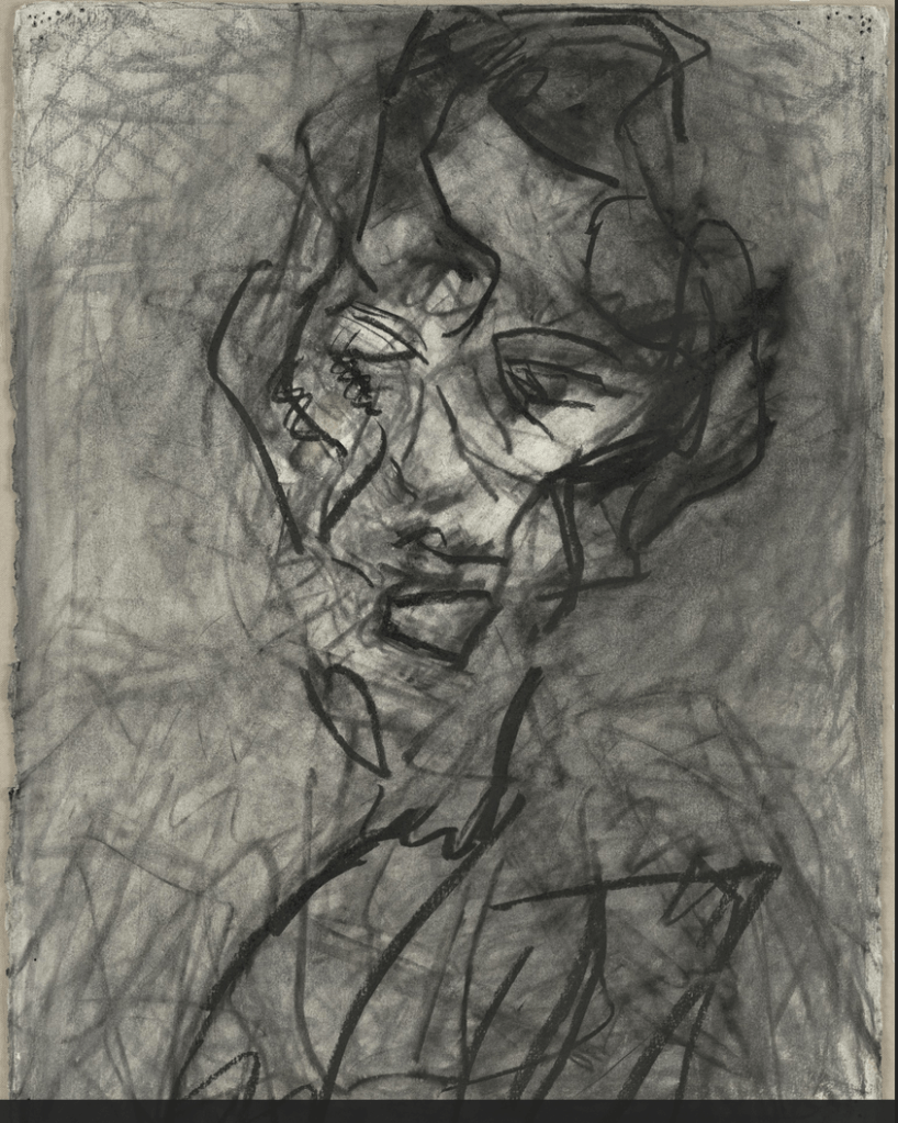
This is the final portrait in daylight:
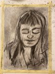
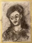
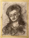
This portrait still lacks some depth, but I am happy with the free marks inspired by Auerbach. I need to try this once more though, with a head turned to the side.
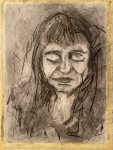
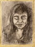
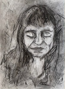
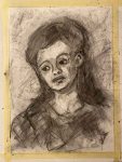
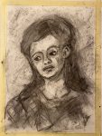
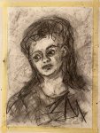
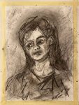
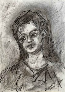
This is the process this time:
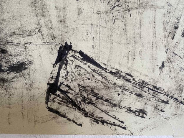
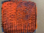
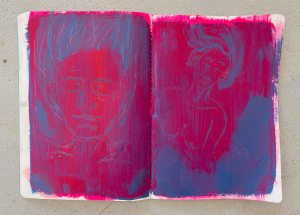
This is the final drawing “Beatrice”A3:
This time, there is a better sense of depth and I like the expression and tilt of the head and how the shape sits in the surrounding space. It is still very controlled and boring compared to Auerbachs portraits. It has helped me take one more small step towards loosening up the markmaking though.
Using charcoal in this way has helped me overcoming relying on outline instead of tone and has helped me rediscover this beautiful, versatile medium.