Assignment 5: “Review the project work that you’ve completed for this part of the course and then produce a drawing that needs a period of time to elapse during its production.”
Since I started my studies with the OCA several years ago, I have had the plan to start drawing a drawing a day as a diary, but til now I have not implemented it.
I have just discovered OCA student led initiative “OCAtober” which gives a word day as a prompt for a drawing that is then posted on Instagram. I will participate in this to start my drawing diary and also to overcome my shyness of publishing works that don’t feel “good enough”. Combining these small drawings into a larger work will then produce the drawing that has needed a period of time to elapse during its production.
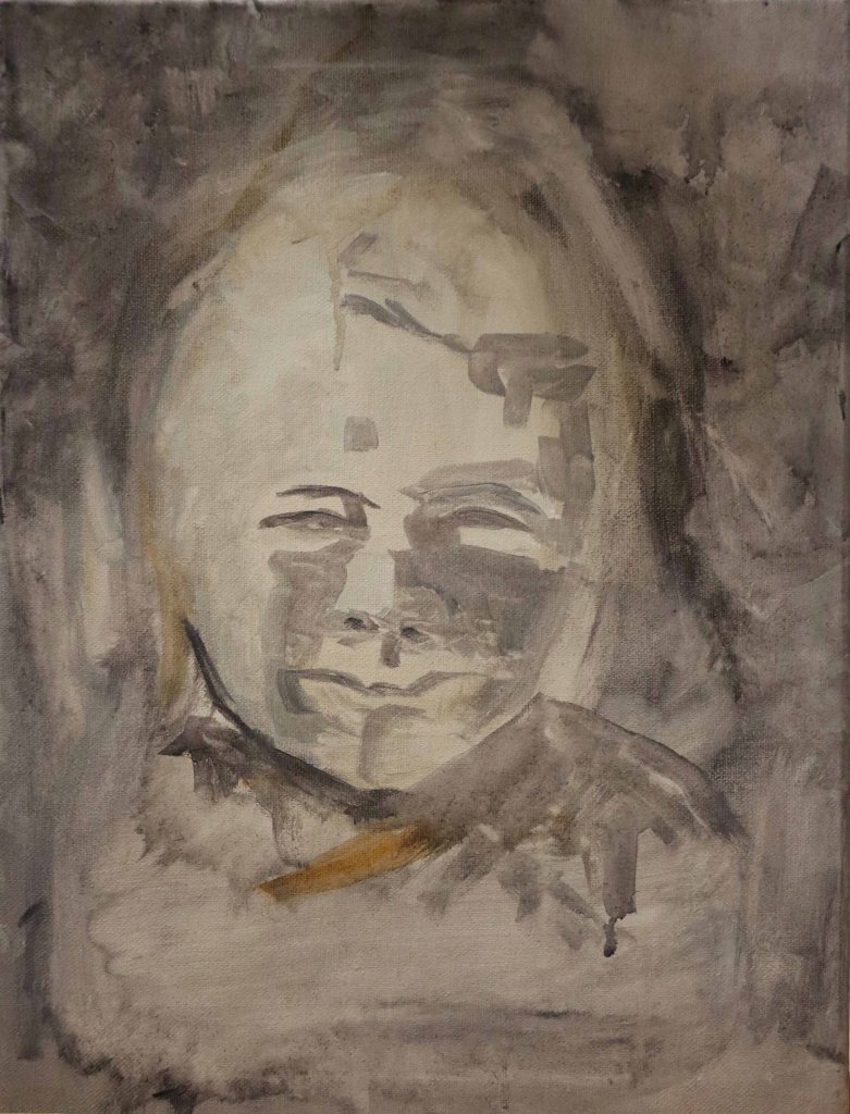
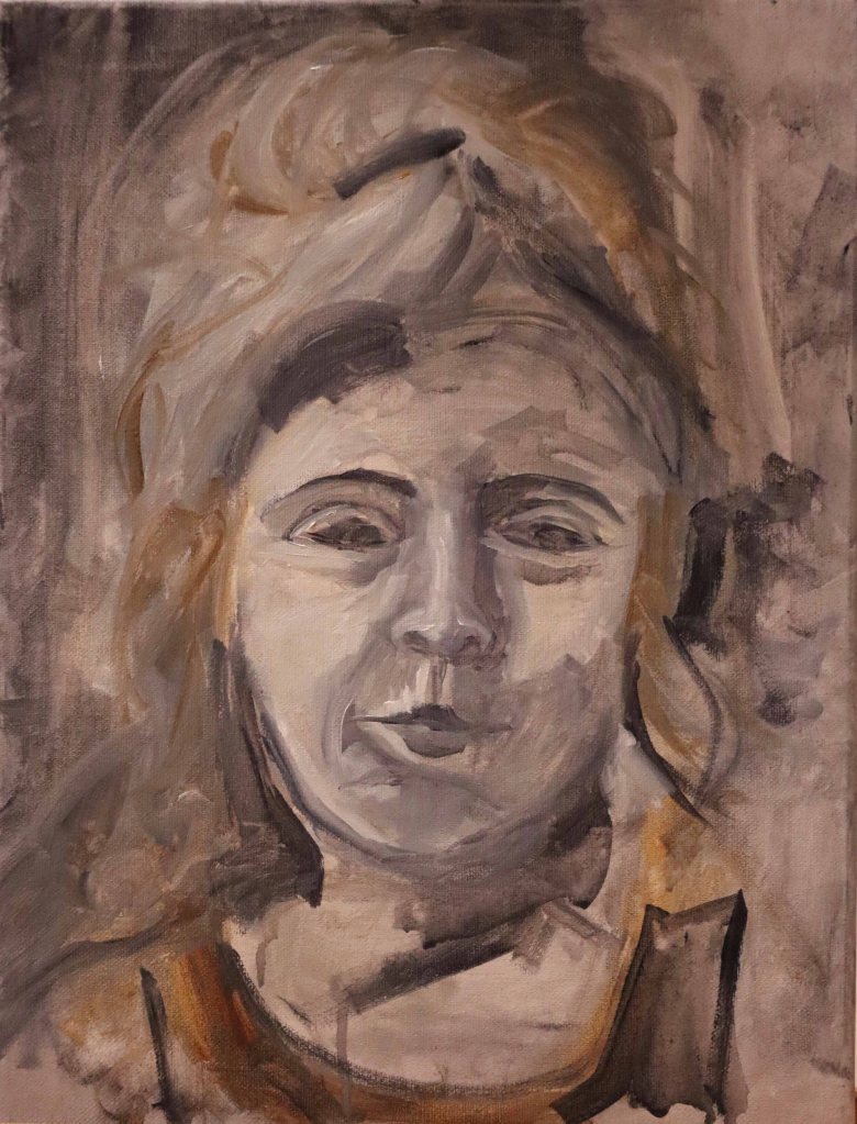
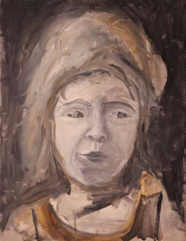
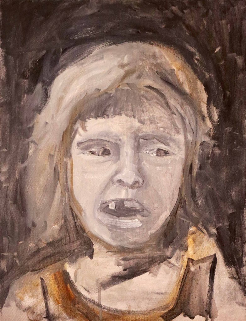
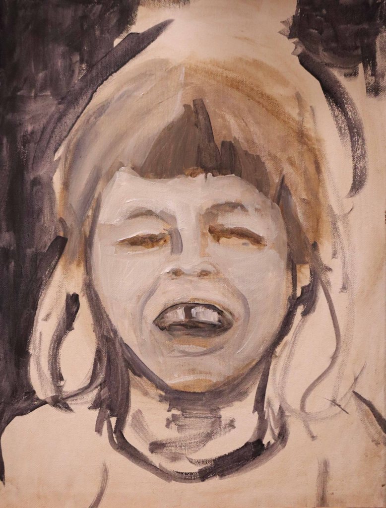
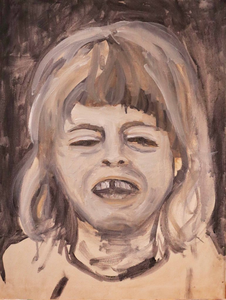
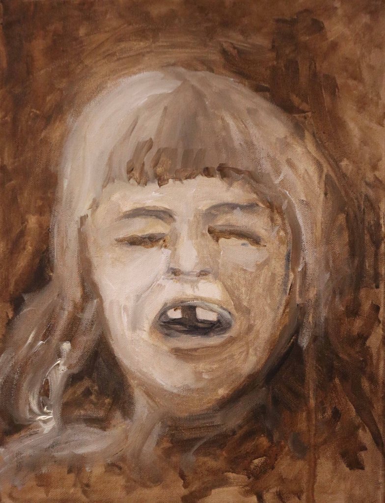
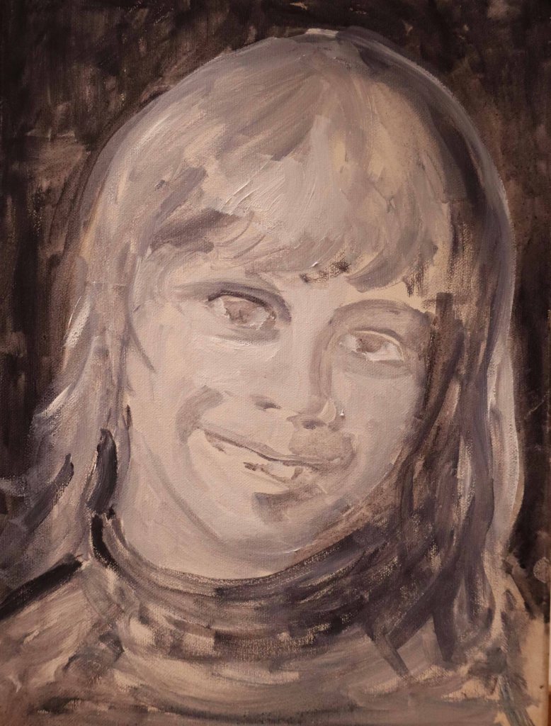
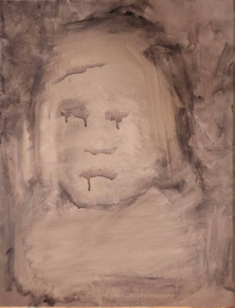
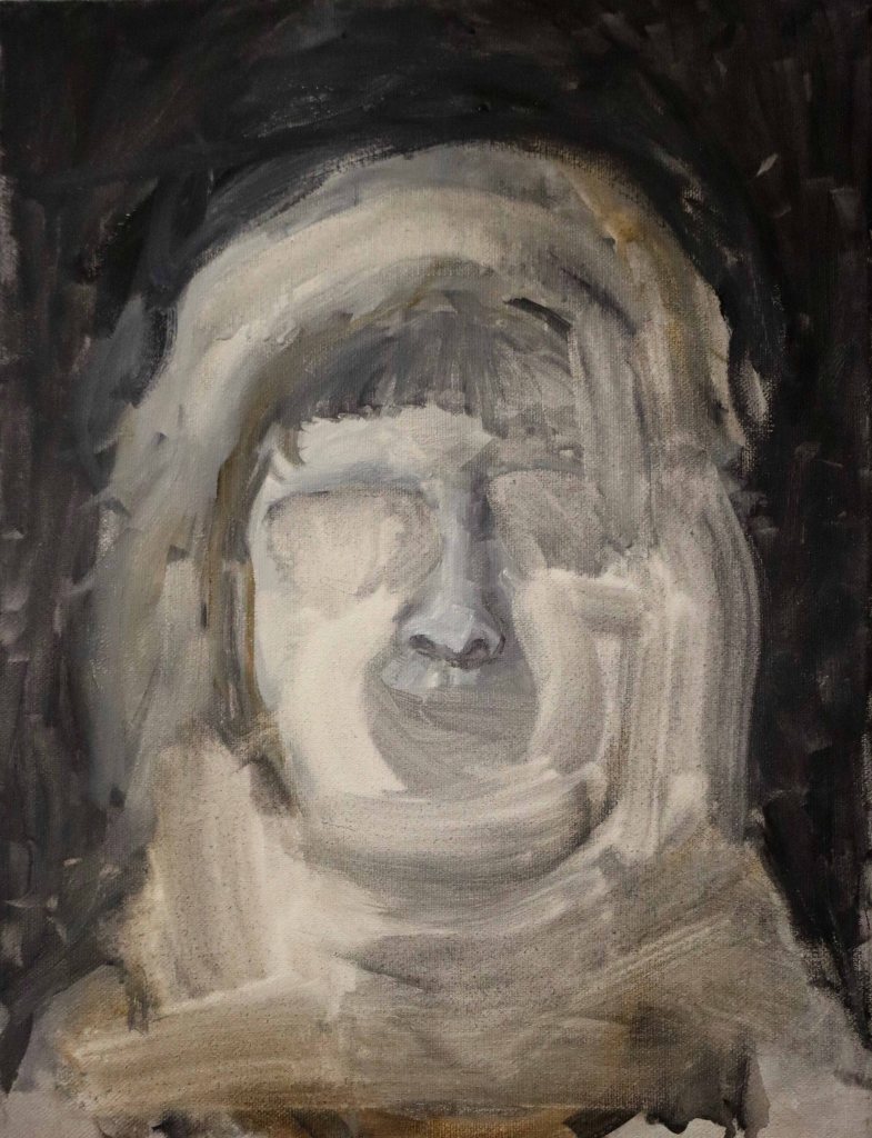
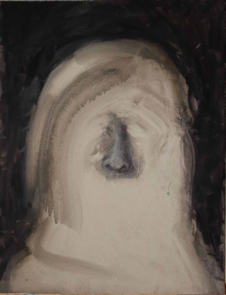
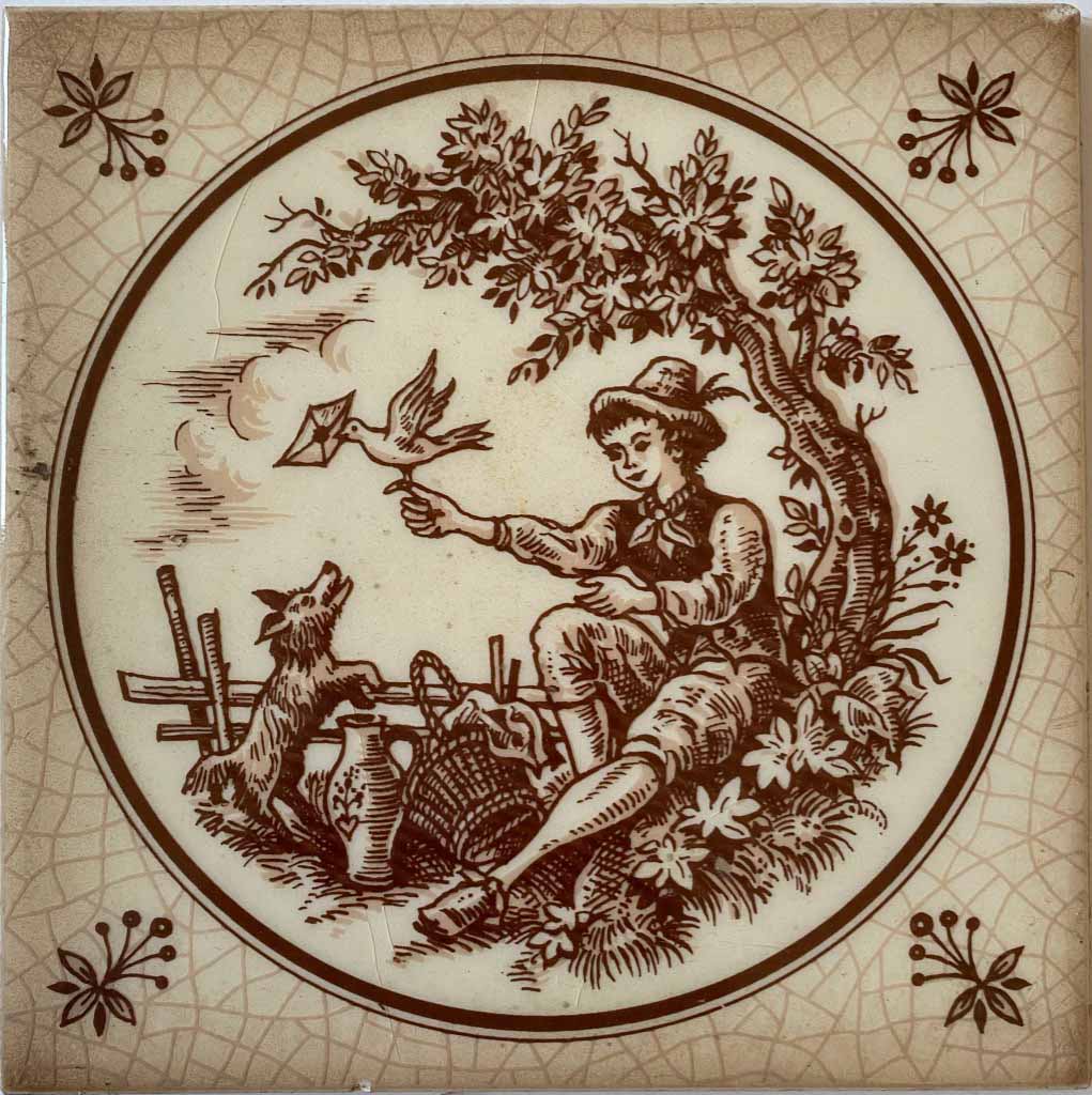
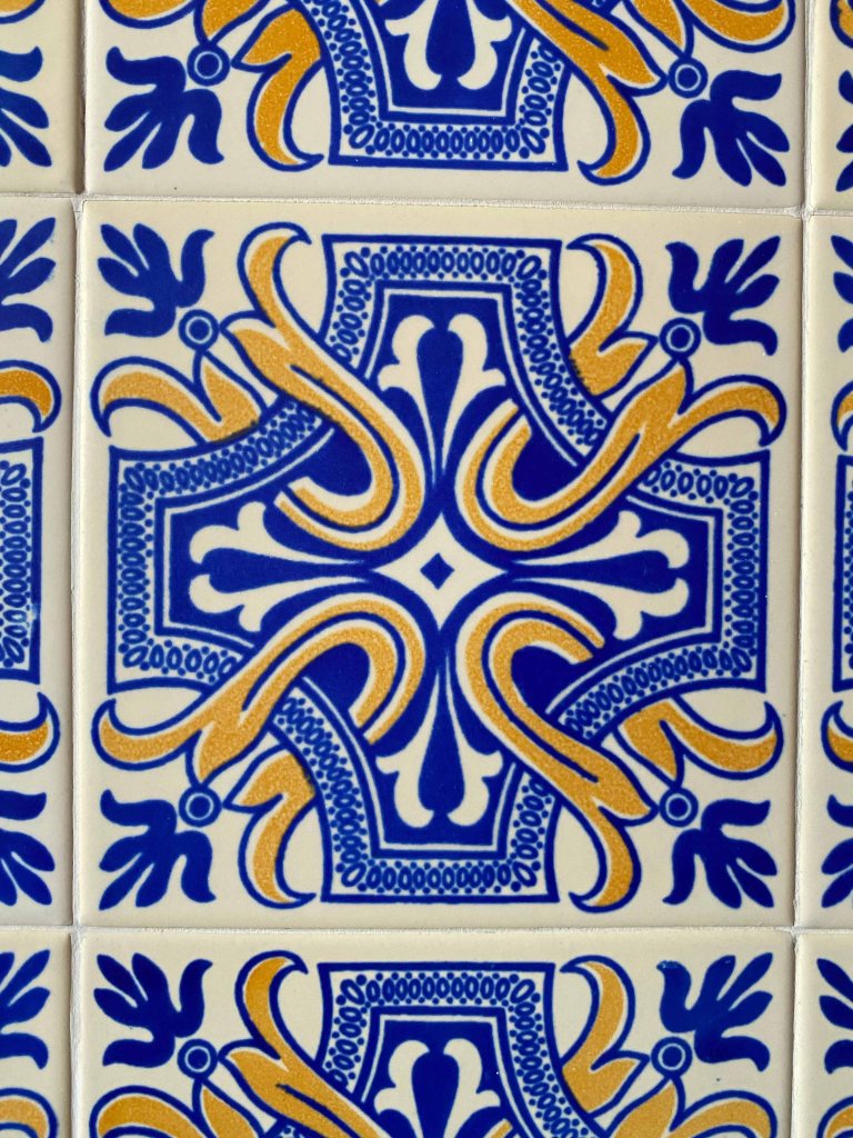
During a visit to “Trema” contemporary art gallery in Lisbon last year, I discovered the Portuguese artist Carlos Barão.
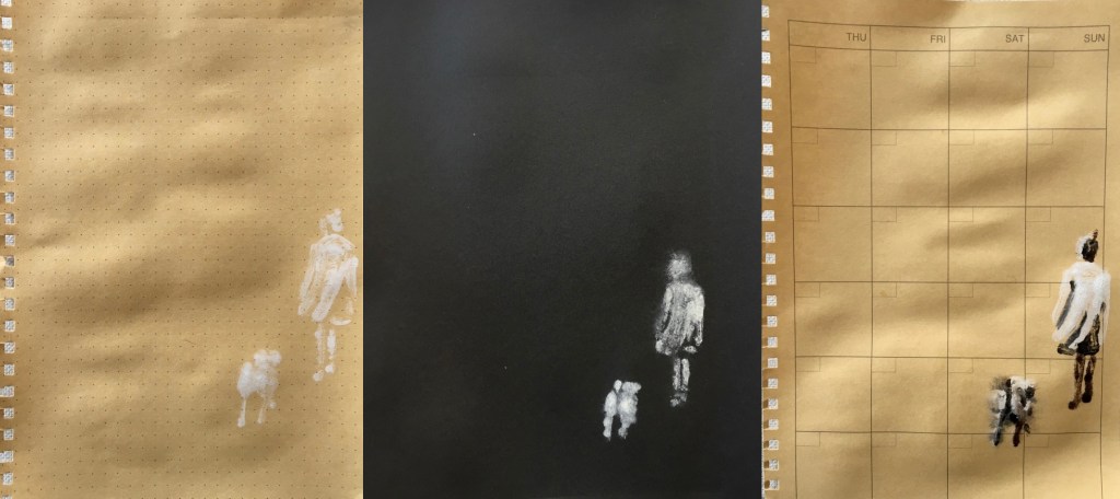
He paints or draws a small painting a day and then combines them into series on larger canvases. His art is quite dark and contains much text, an intriguing mix of drawing, painting and text always in black, red or earth tones.


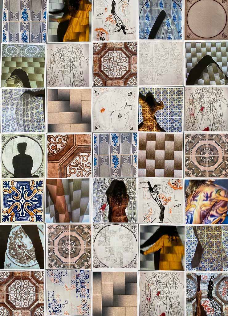
The first thing I notice, is that the drawings are different in size and support, but proportional, and it can be quite tricky to combine them in the end. I counted that the larger panels contain respectively 67 and 80 small drawings. The newer framed works contained 20 drawings.
In a series of older works (2010-14), Barão combined same sized drawings, 35 pieces per panel, and he still used different papers. I would guess they are 30x30cm. I will choose to start with this as it will make combining the final drawings much easier. ( I might change and include other formats after the first month of OCAtober is over).
")
I am often attracted to works that contain an obscure or incomplete narrative, and this is what I find in the work of Carlos Barão and what I hope to create in my own drawing diary.
About Carlos Barão: “the artist seems to want to tell a tale – perhaps a fairy tale – that transcends his own life. As a result the on-looker is invited to complement the story-in-suspension with his own references and memories. The gap between the image and its meaning seems to reside in the personal and non-transmittable ambit of each of us. (…)
The paintings of Carlos Barao speak an apparently inaccessible language, like the feeling of something intimate and strange – Das Unheimliche according to Freud. “
Hugo Dinis, in “Something Strangely Familiar II“, in Cat. Galley Pedro Serrenho, Lisbon. 2009
(Images and quote from: 2018. Carlos Barao artist. [Online]. [1 October 2020]. Available from: http://www.carlosbarao.com/ingles.htm)
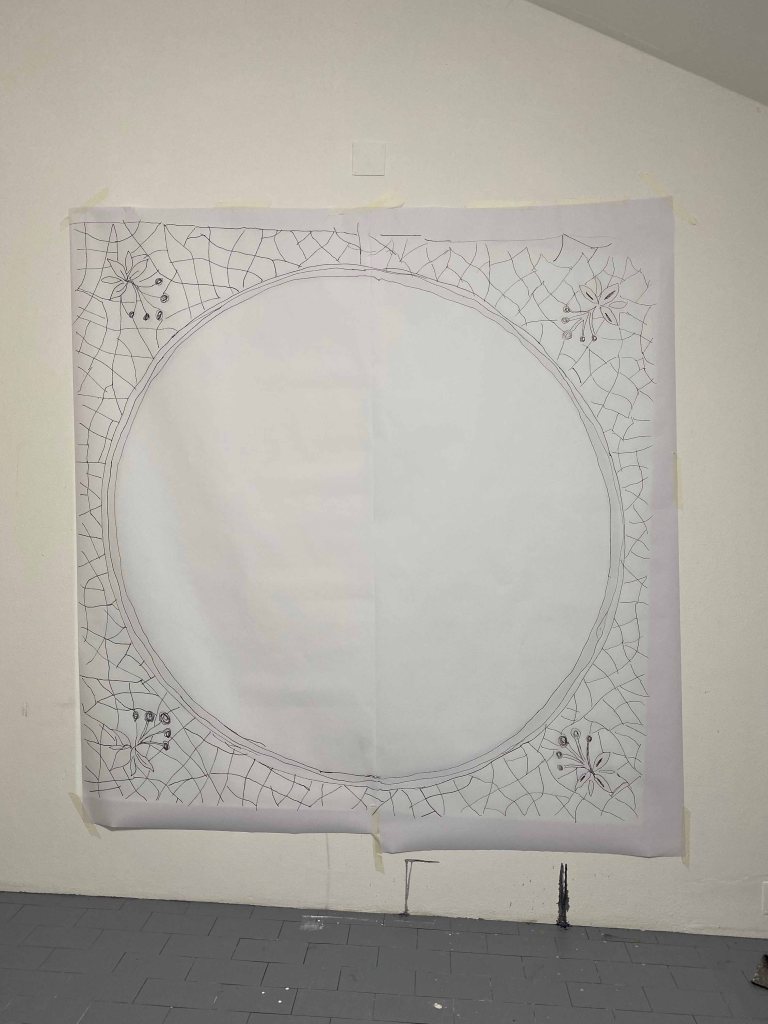
Drawing diary for “OCAtober”
I decide to use the format 20x20cm to keep the final panel manageable in size when combining many of the drawings. I prepare papers in various qualities and shades of that size.
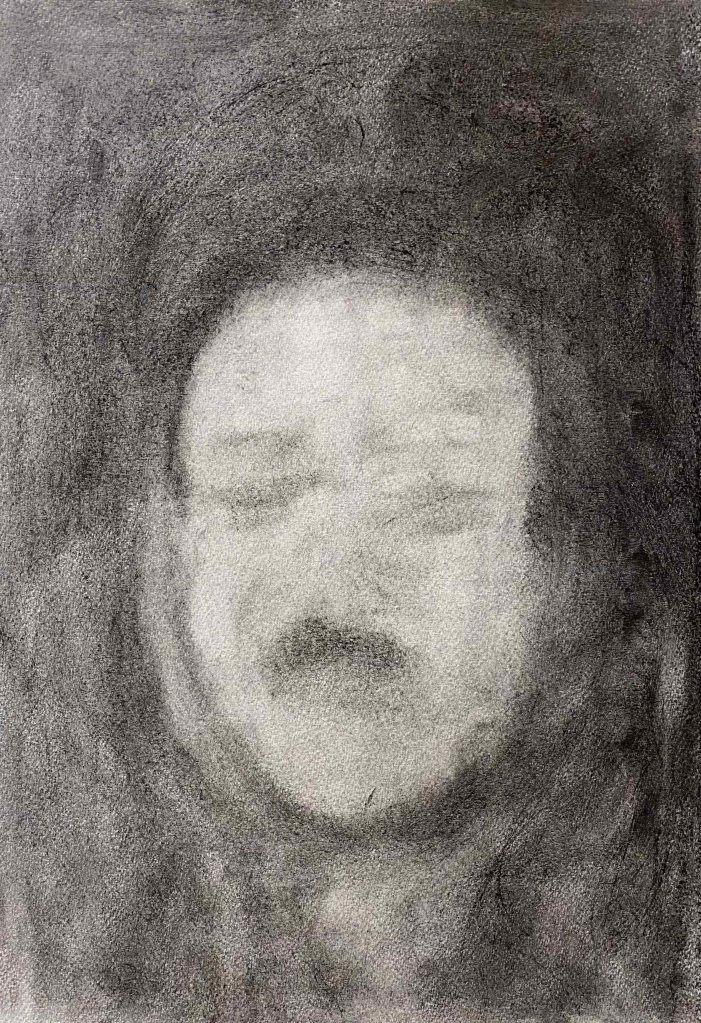
Day 1: Imposter
I had to start by looking up what imposter means, and then thought of how many faces/ roles/ masks we are wearing, and how not all of them feel true.

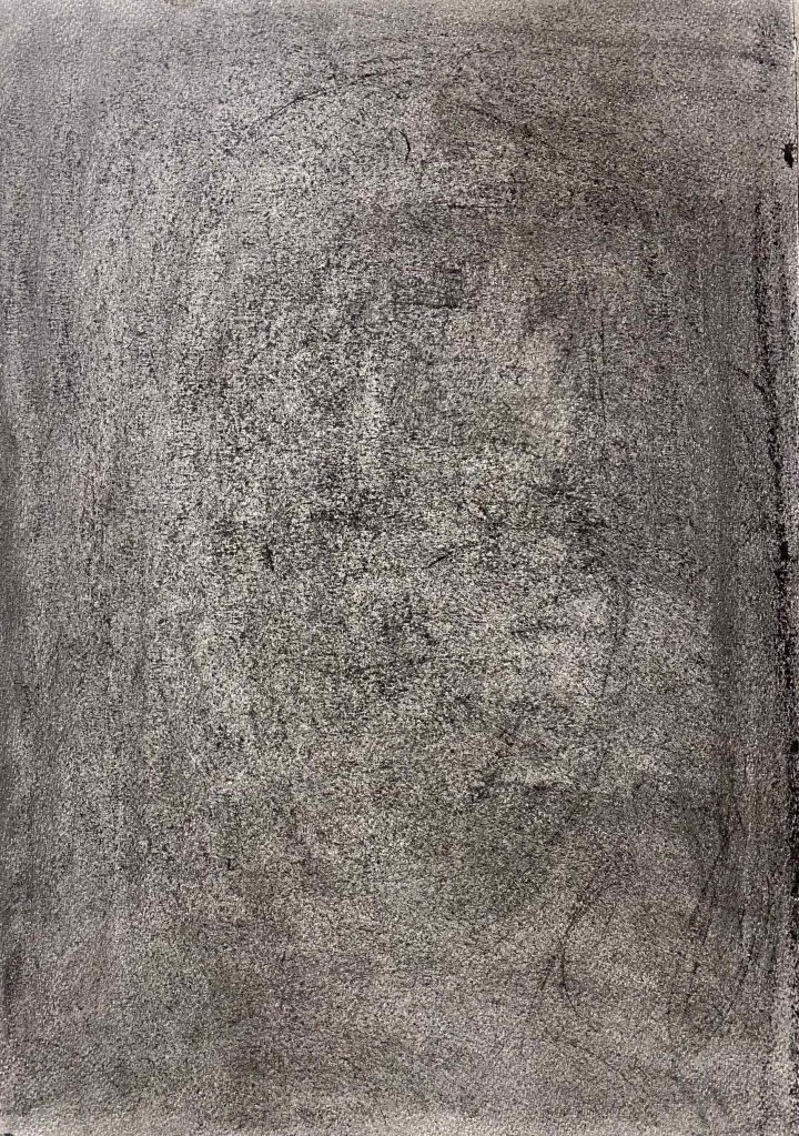
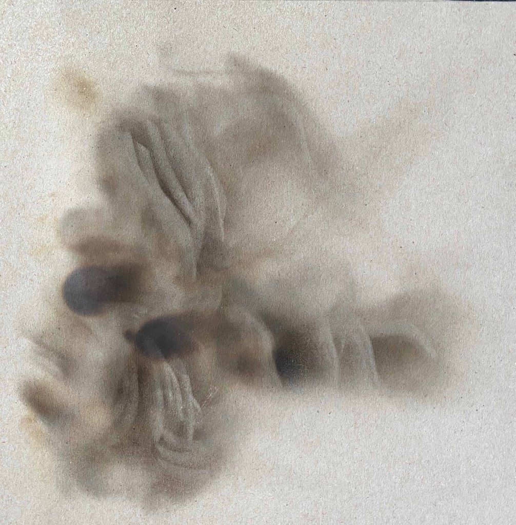
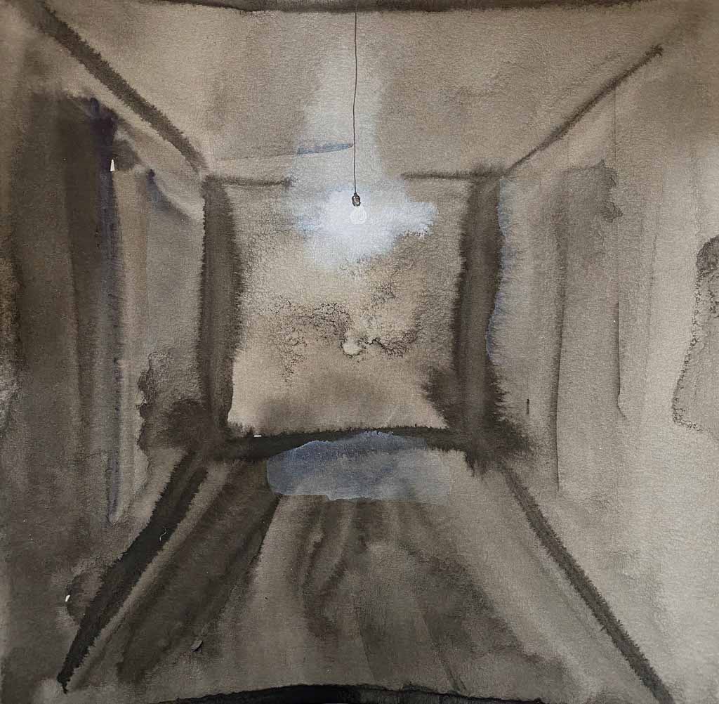
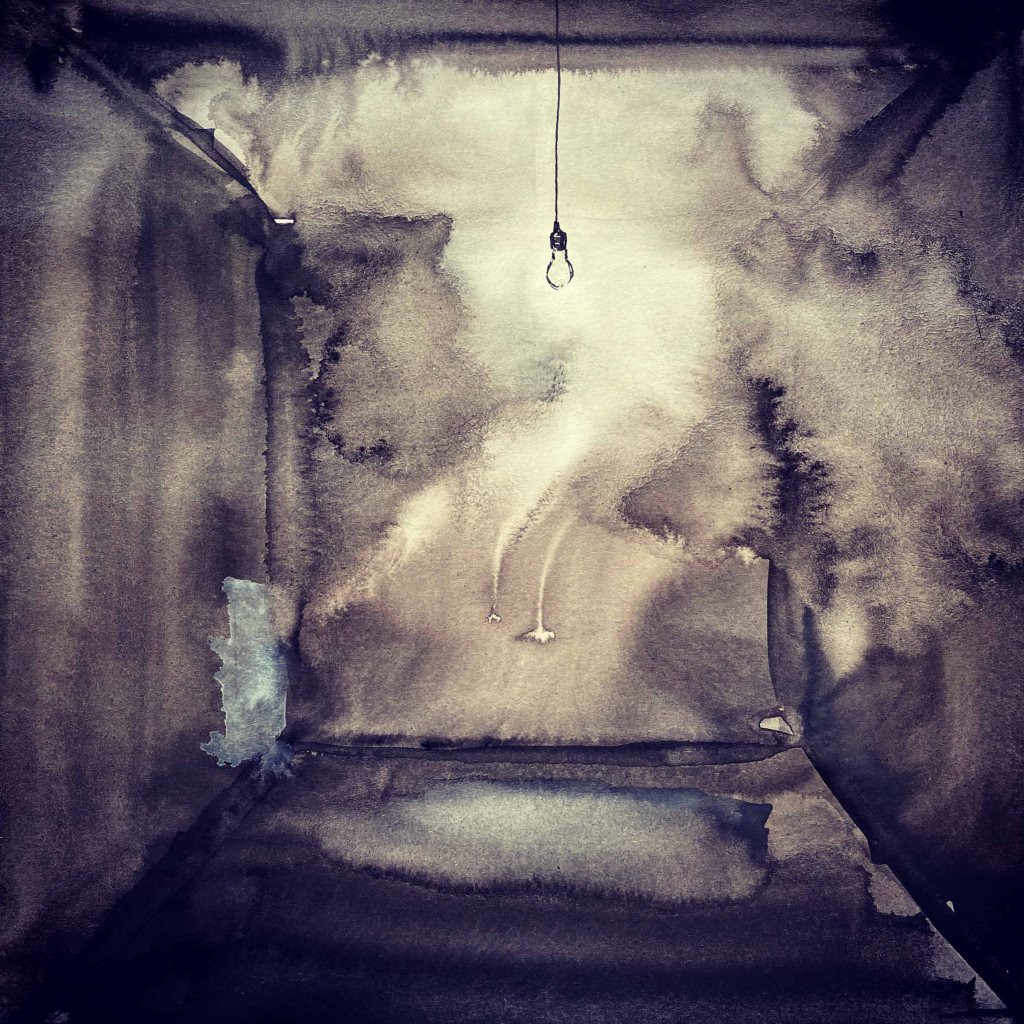
Day 2: Dark
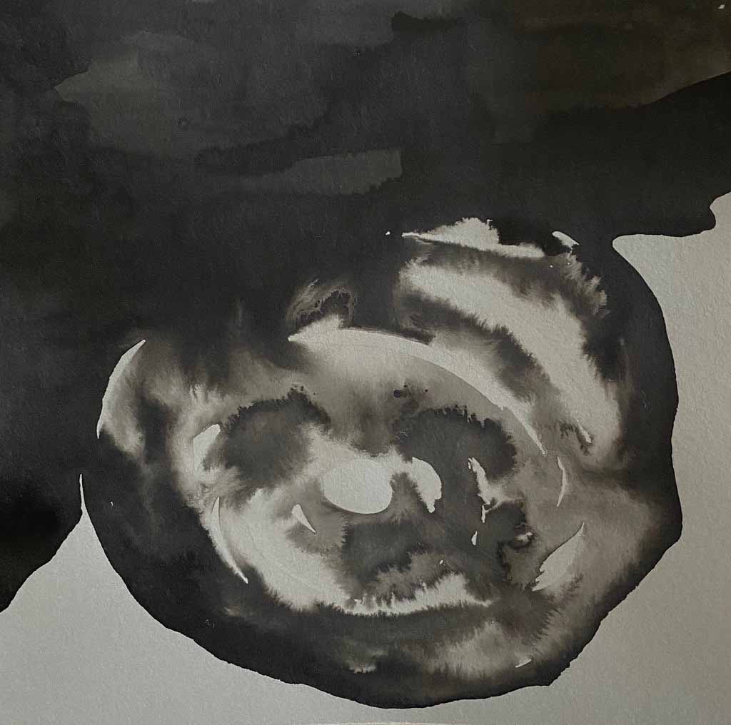
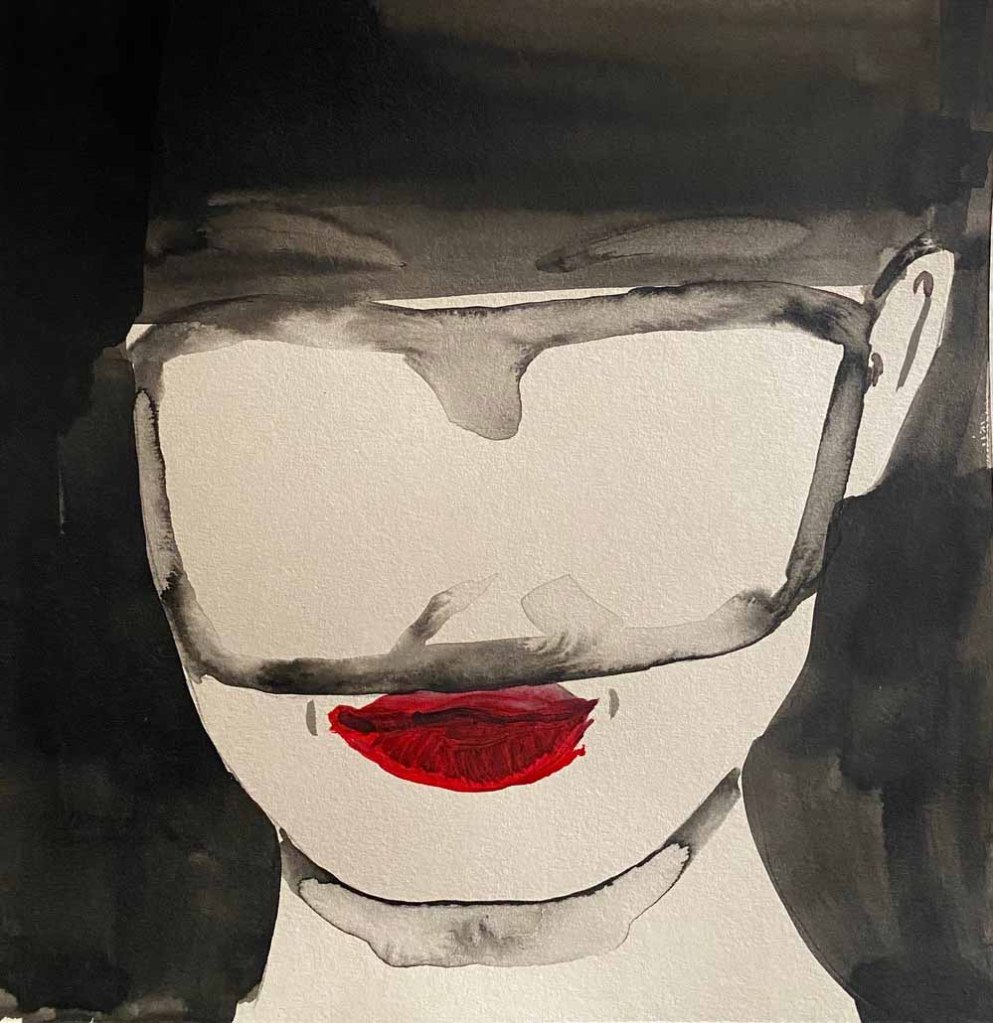
Ink on paper. I chose this one:
Day 3: Cutting
Cobra watersoluble oil on oilprepared paper:

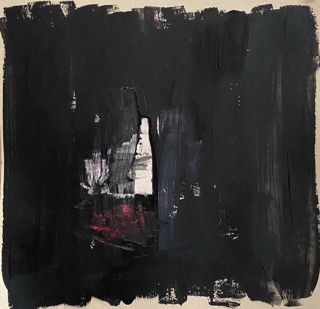
I am planning to keep to monochrome images or use quite dull colours, like here Payne’s grey, maybe adding some earth tones or green where needed.
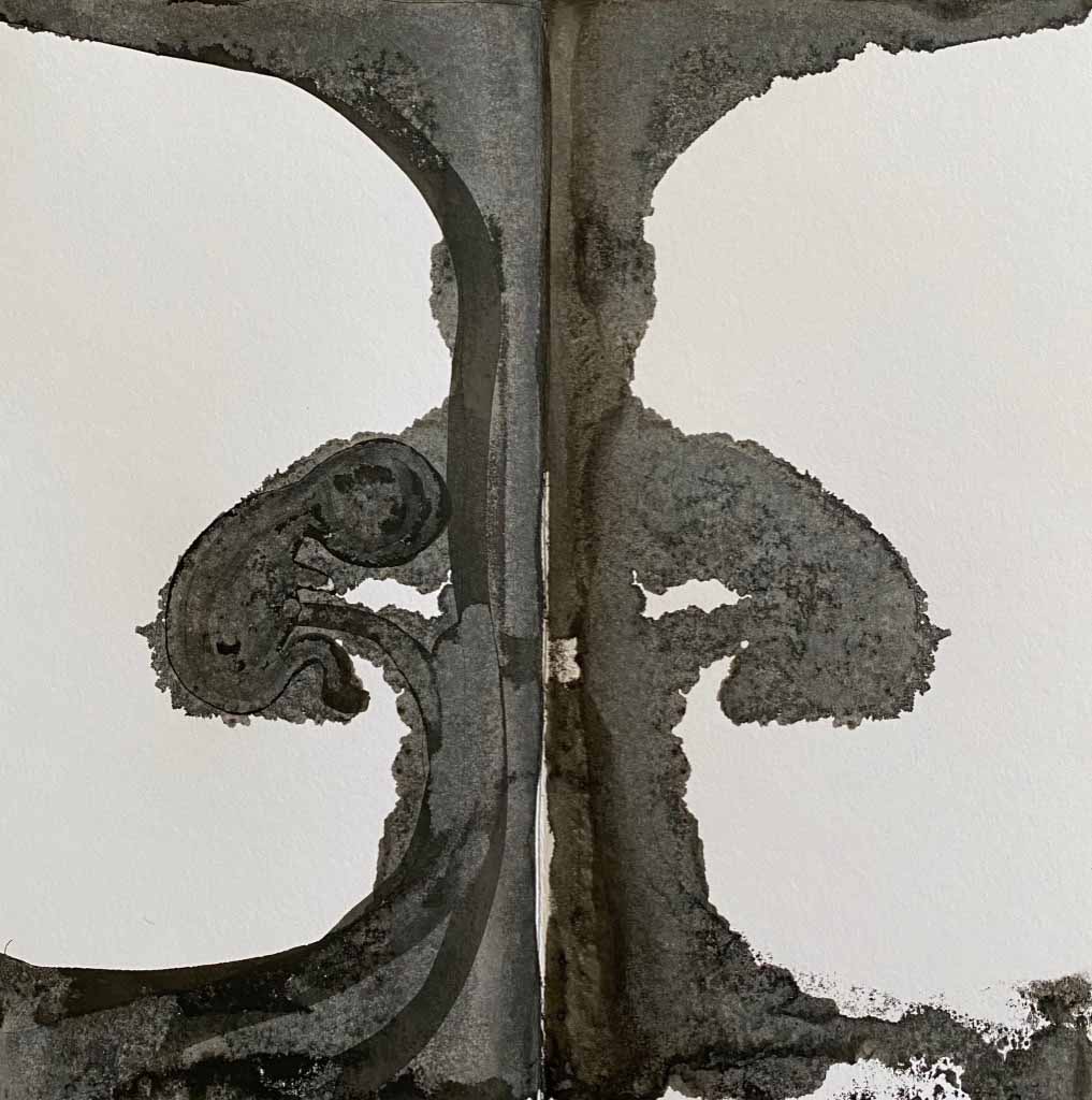
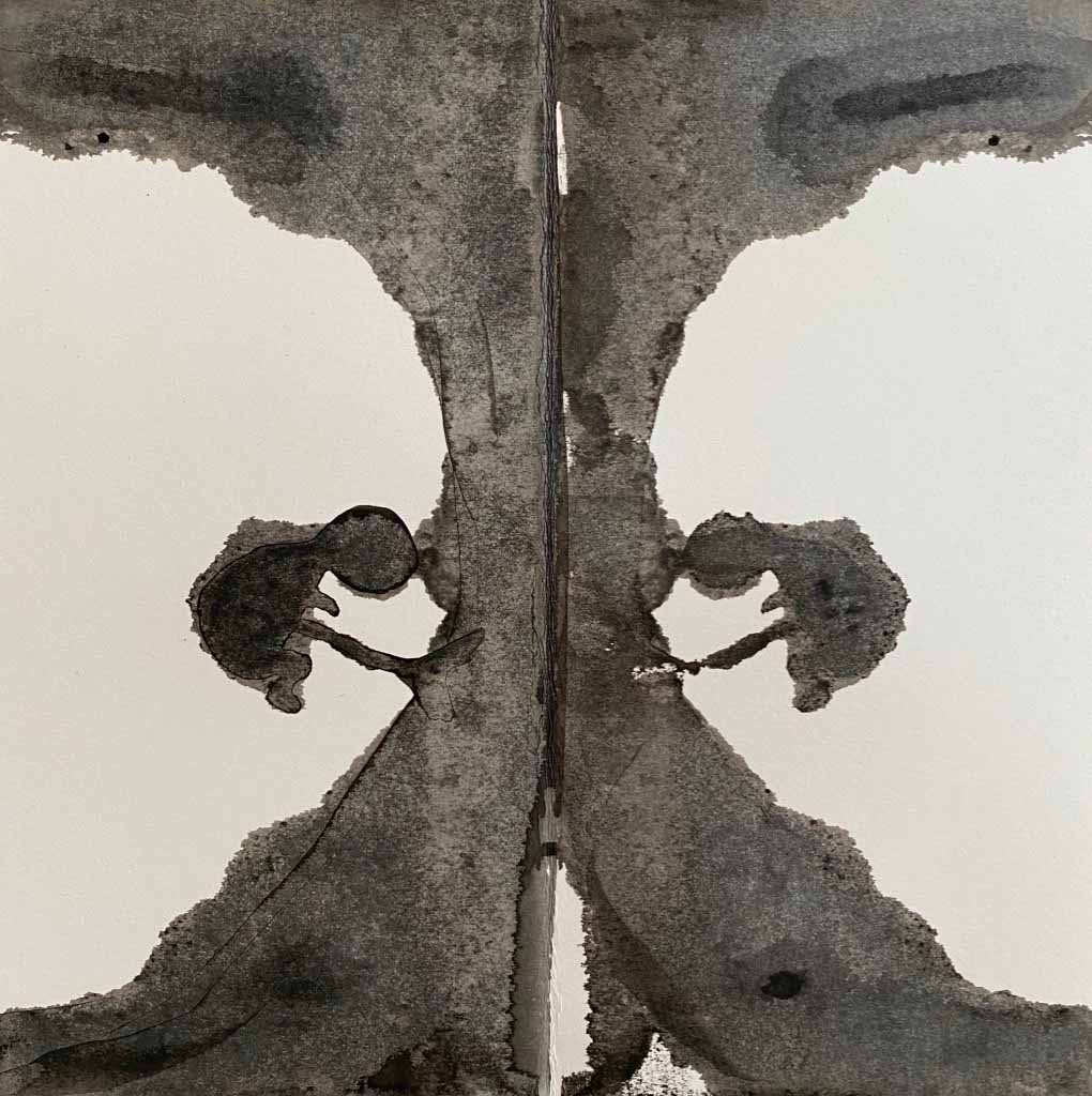
Day 4:Twin
Inkdrawings, the duplicated by folding the paper in half
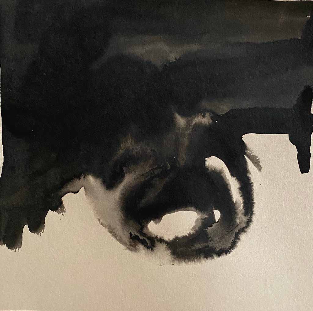
Day 5: Shed

Watercolour and acrylic on brown wrapping paper
Day 6: Lake
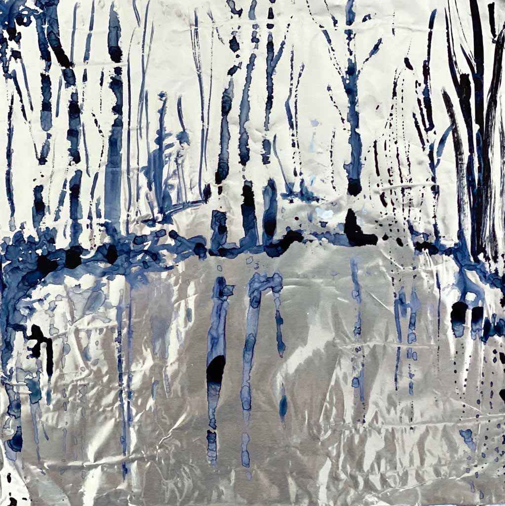
Today I experimented with QoRwatercolour on aluminium foil, to create that reflective quality of the watersurface.
Day 7:Toast
A very full day in the city, so today I did a quick drawing in a cafe, specially ordering toast to draw in on newsprint and photographing it on the spot. I think this image reflects the morning cafe mood well.

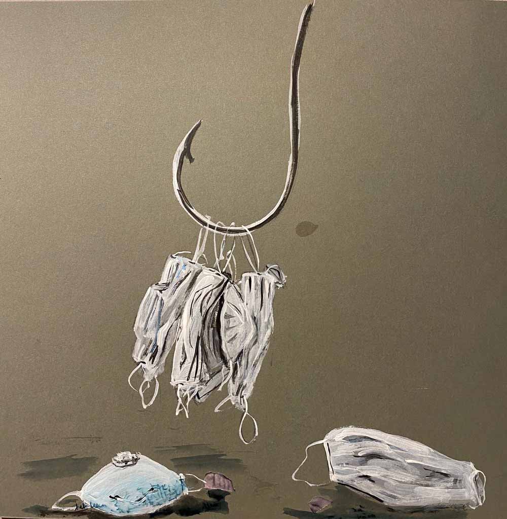
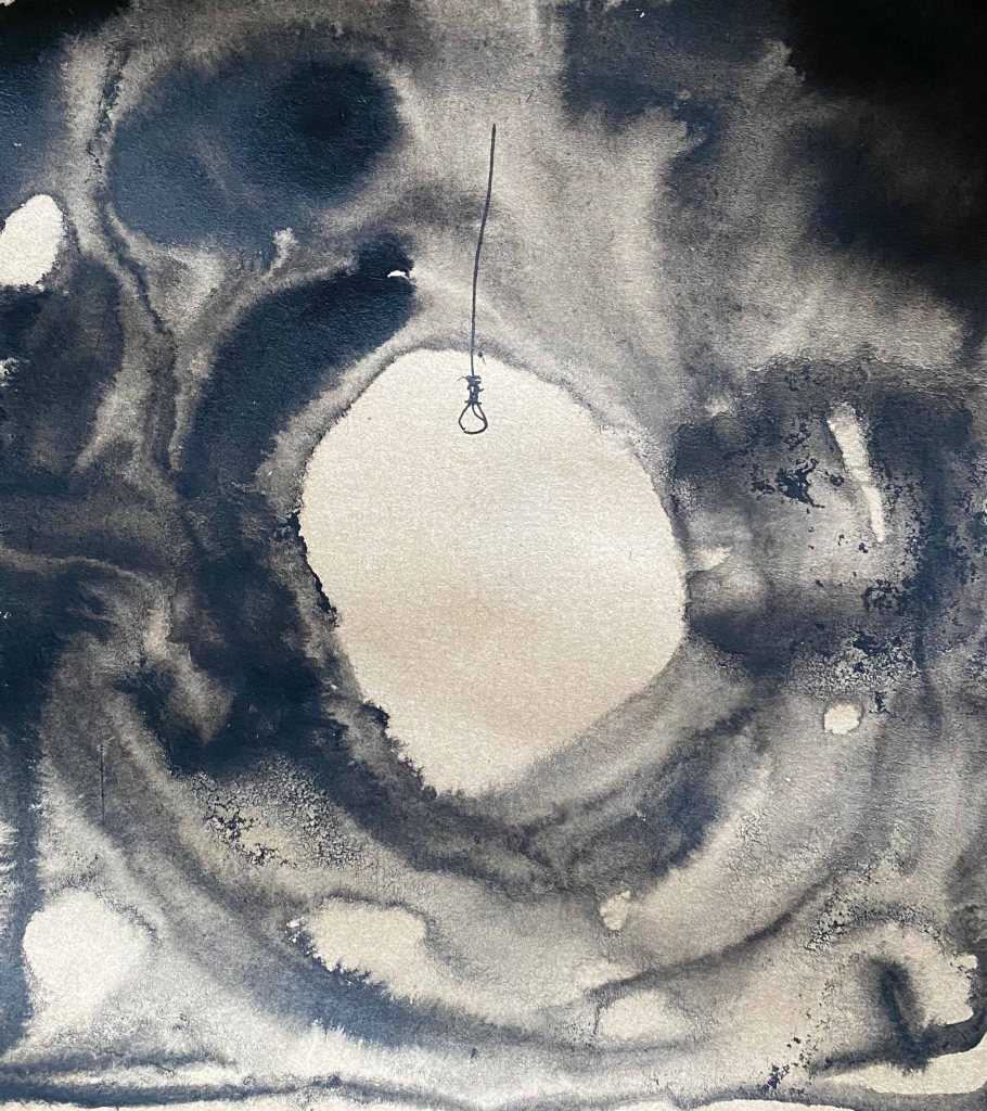
Day 8: Hook
A very full day , so I am grateful for this challenge or I would definitely not have drawn anything today, now I make it a late night. I have been wearing a mask all day in the city today, and am appalled by the amount of discarded masks I see everywhere. Acrylics on grey paper.
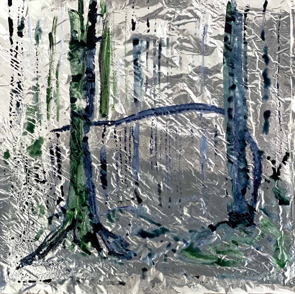
Day 9: Acid
As a photographer, I visited forests destroyed by acid rain a few years ago, a sight that I will never forget. Ink on paper.
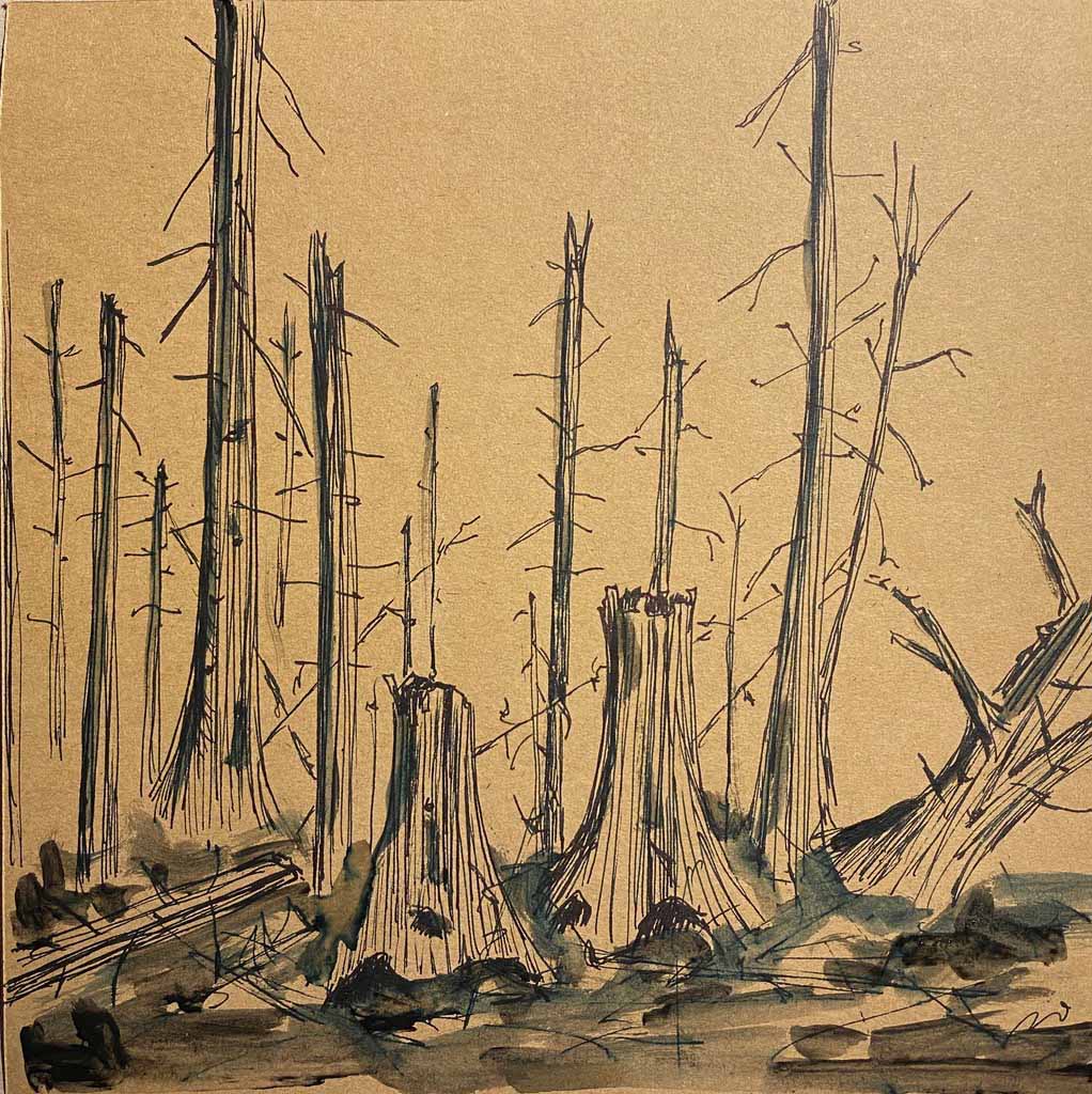
I then sprayed bleach on the drawing, filming the slow deterioration, melting of the trees. The very short film impression can be seen under the #OCAtober Instagram or @nowclara, link https://www.instagram.com/p/CGHr9KtgoJI/
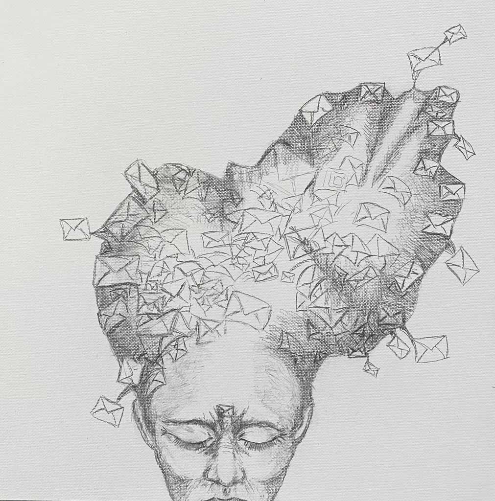
Day 10: Mail
Todays’ prompt brought me back to my overflowing Inbox
Day 11: Sacrifice
Todays prompt was a tricky one, my imagination went from rituals of sacrifice, to the sacrifices of a mother for her children, and finally landed with how we are all sacrificing our planets natural resources for our lifestyle. Acrylics on newsprint of an article about forests disappearing.
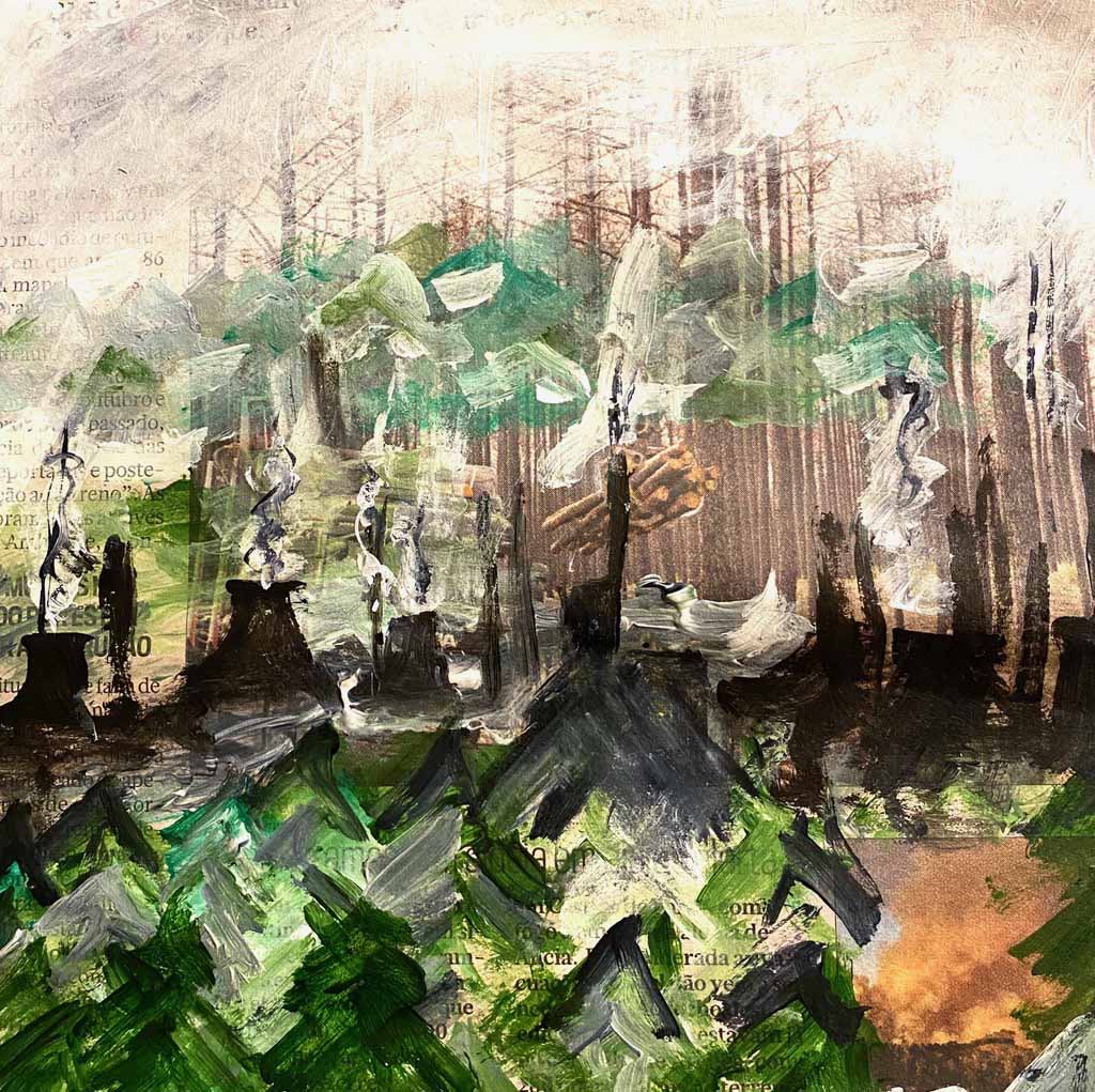
I am not happy with the final result here, but this type of challenge is also about learning to let go of everything having to be satisfying.
Day 12: Sharp
Today is a “cheatday” with really too little time. I use a quick trick, cutting a sharp line in paper.

I like the simplicity of this, and realize that I have to include more simple, graphical elements in the series.
Day 13: Throne
Another tricky prompt. My result is too illustrative .
Ink and acrylics on paper.

Day 14: Spoon
I am immediately thinking of a couple spooning, and decide to use monoprinting, oil on glass and acrylic paper
This is the one I choose:, I added a cloud of ink on the back to add some depth.
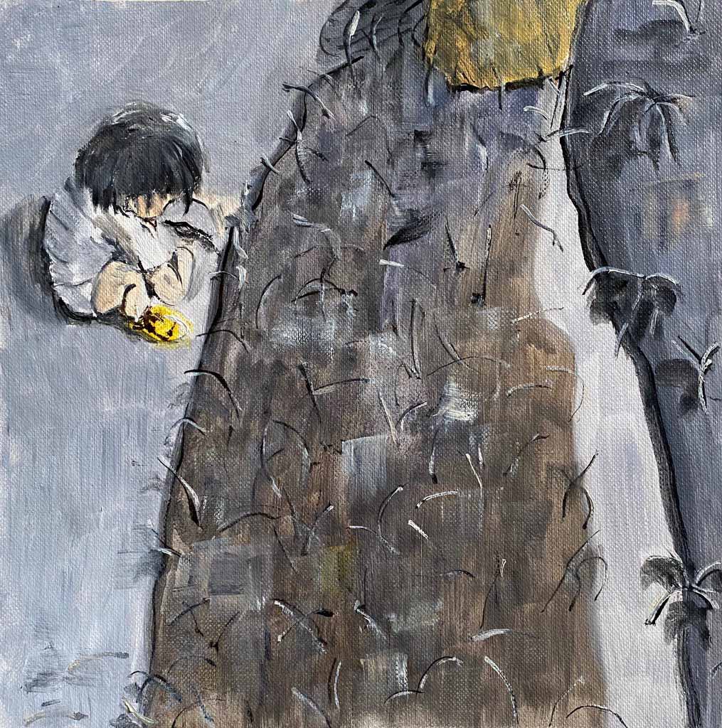
Day 15: Hair
Hair in the sink! We have the perfect 70’s sink in the house. Cobra oil on oilprepared paper:

This little painting got a little too colourful for the series, but I think the mood of the scene fits in. It will be interesting to see when trying to puzzle the pieces together.
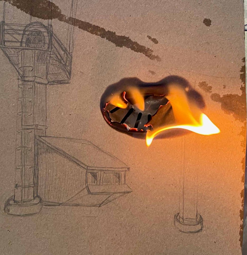
Day 16: Fire
I decide to make a pencildrawing of some industrial scene that I literally set on fire. This drawing will not be on the final panel as it is now a pile of ashes…
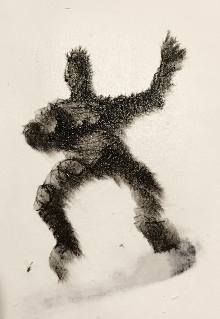
Day 17: Riser
Inkpen on wet paper. I really like this simple, spontaneous figure.
Day 18: Depart
Three monoprints on different papers of the same motive.
Day 19: Pocket
I have been thinking all day of todays’ prompt, and after all ideas with someone stuck in a pocket, or a mask in the suitpocket, I landed on a quick and simple abstract “pocket of light”, acrylics on paper.
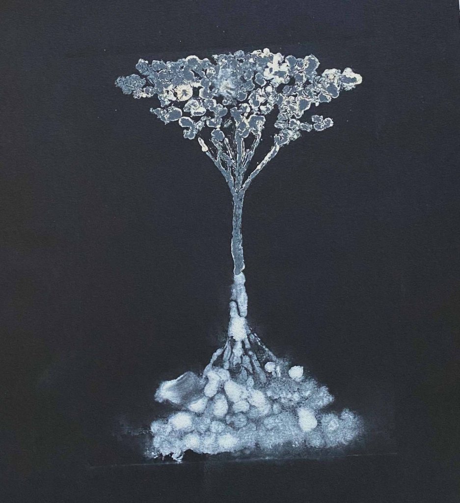
Day 20: Tree
Another monoprint of a “tree of life” with white oilcolour on black paper
Day 21: Match
I decide to use todays’ prompt as a drawing tool instead of the subject- drawing by holding a match to the paper:
And the final little drawing:
Day 22: Kitchen
This was the one day I skipped..
Day 23: Rotten
I found a genuinely rotten small pumpkin in the garden just in time for this prompt- Watercolour and Indian ink.
Day 24: Party
White gel pen and watercolour on black paper


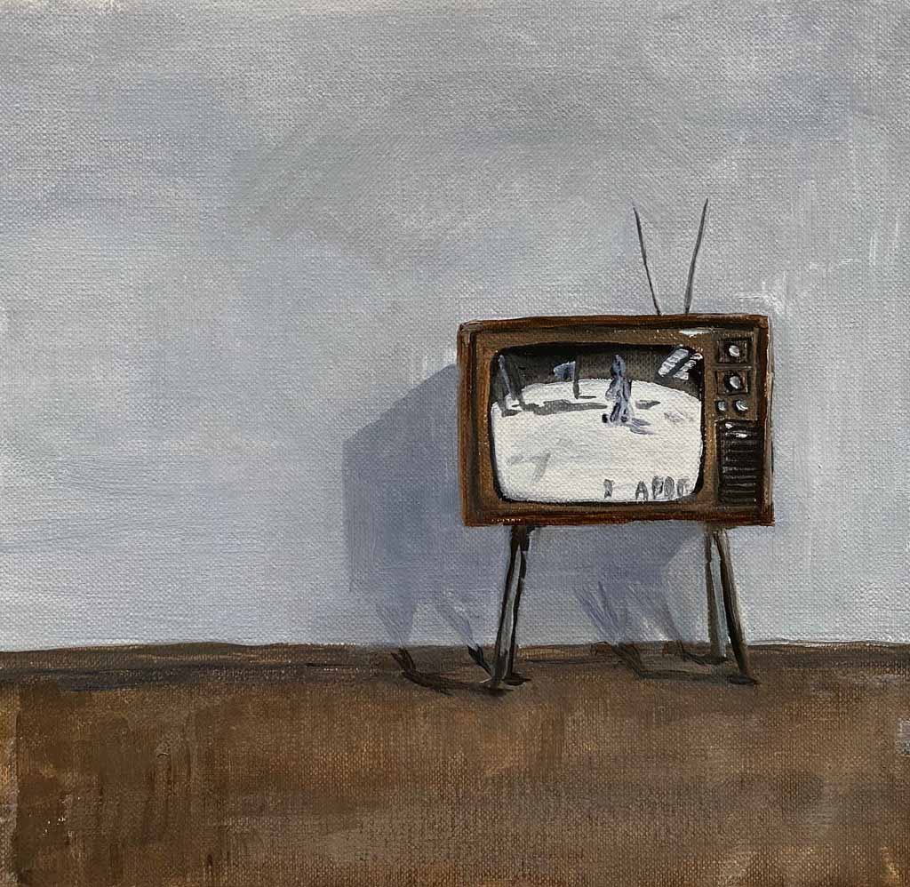
Day 25: Moon
I started with a whole series of monorpints that were very boring
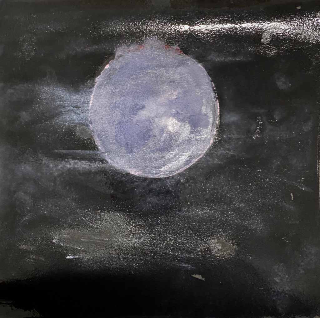
So instead I decided to paint the memory of the moonlanding on an oldfashioned TV in watersoluble oils.
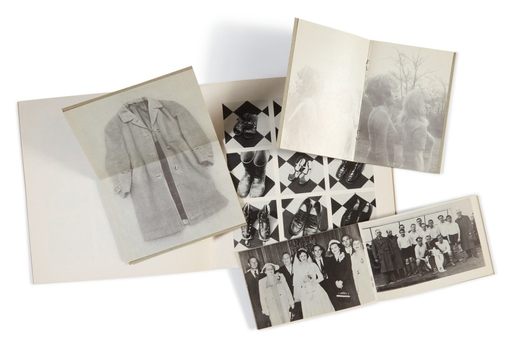
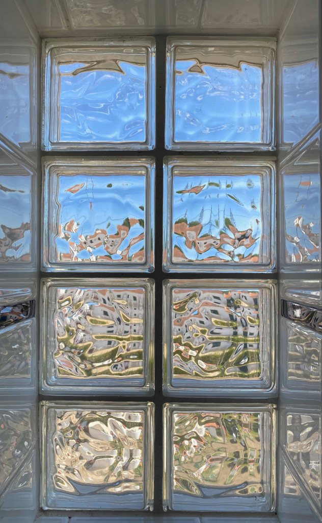
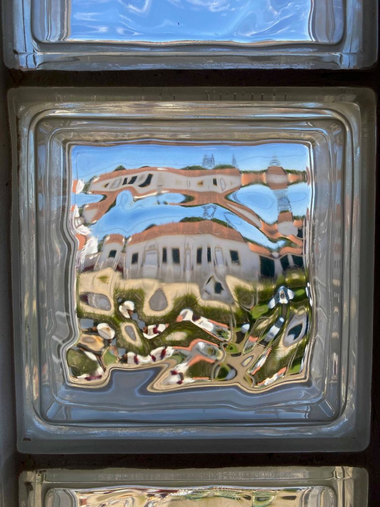
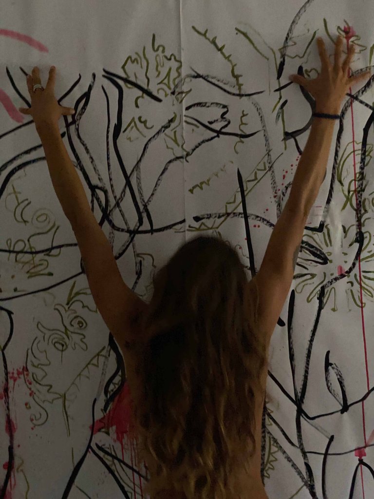
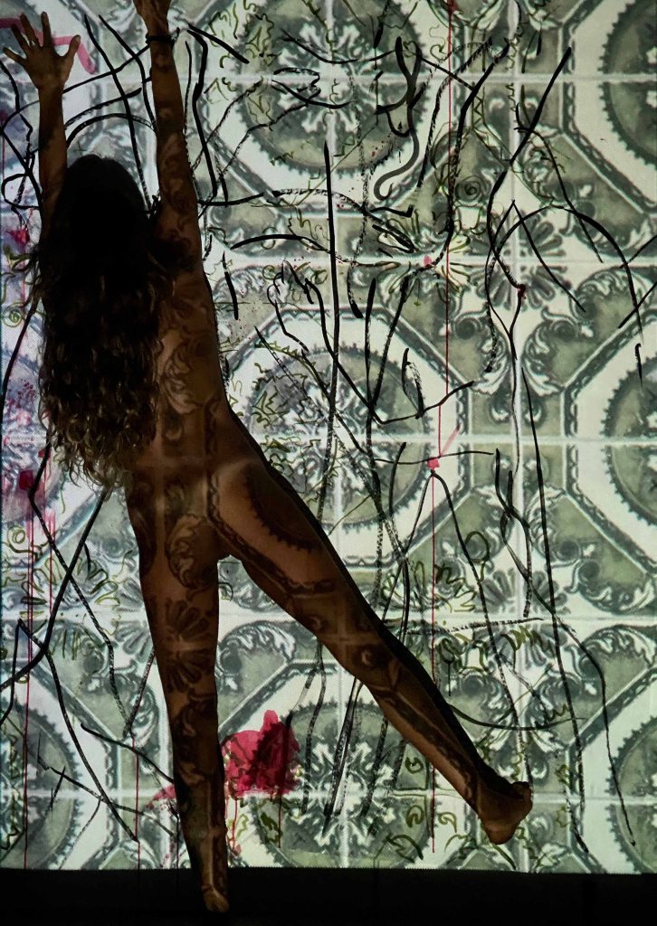
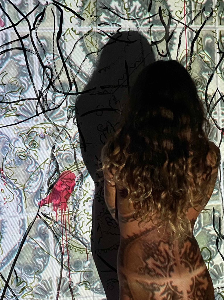
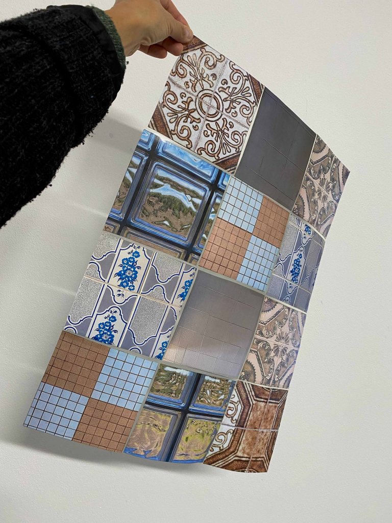
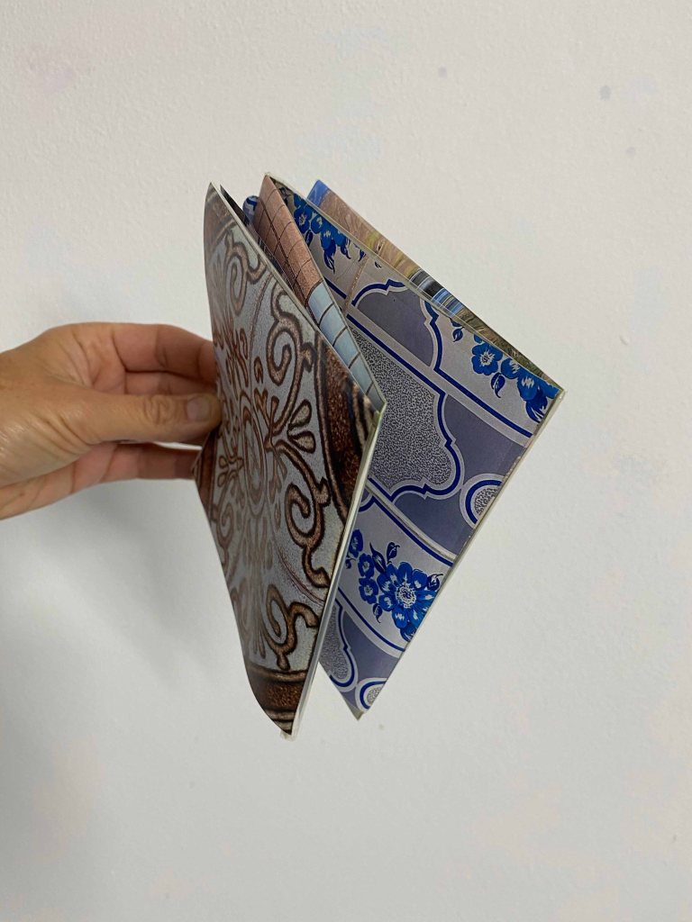
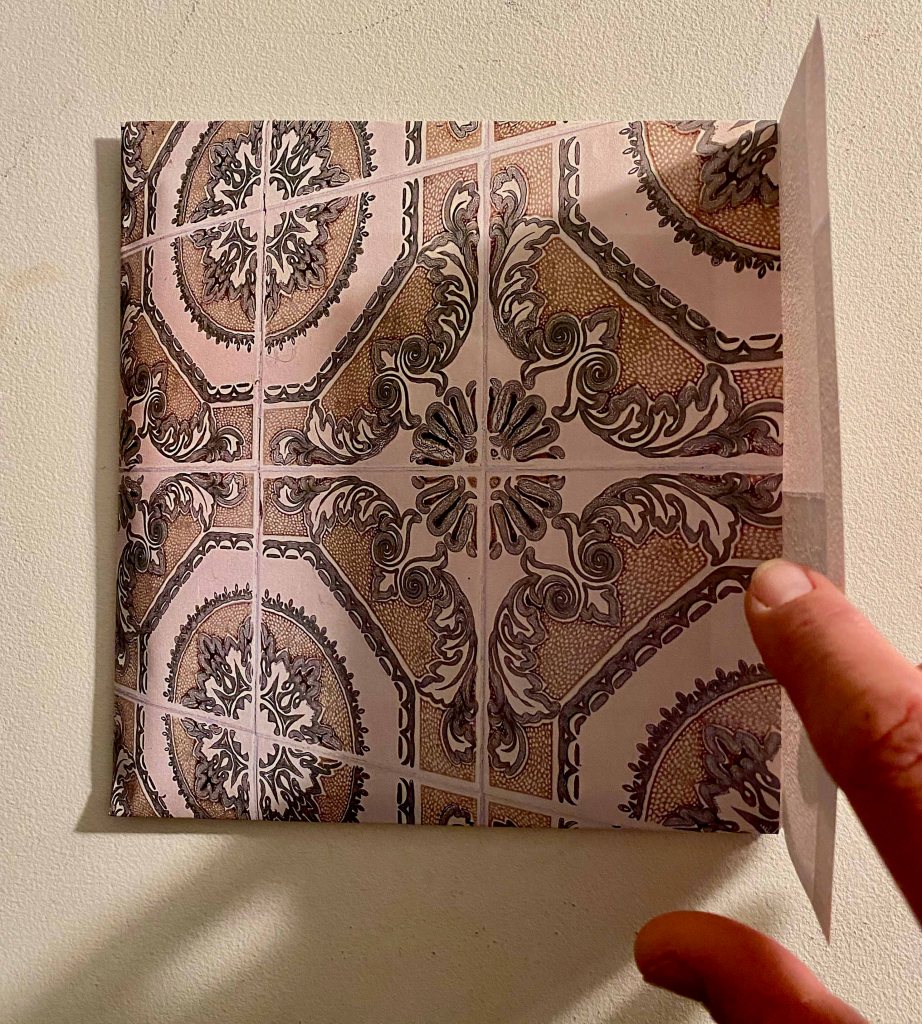
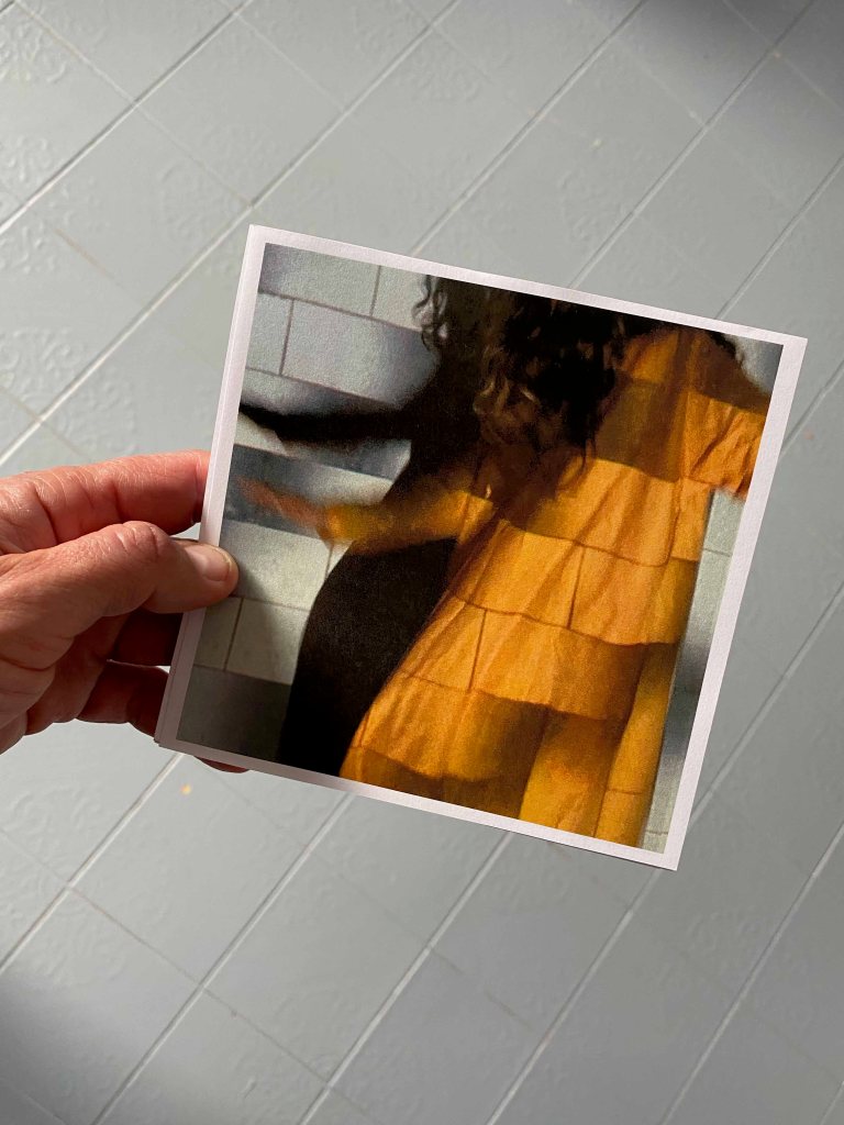
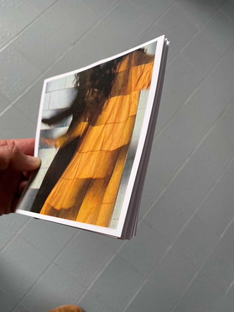
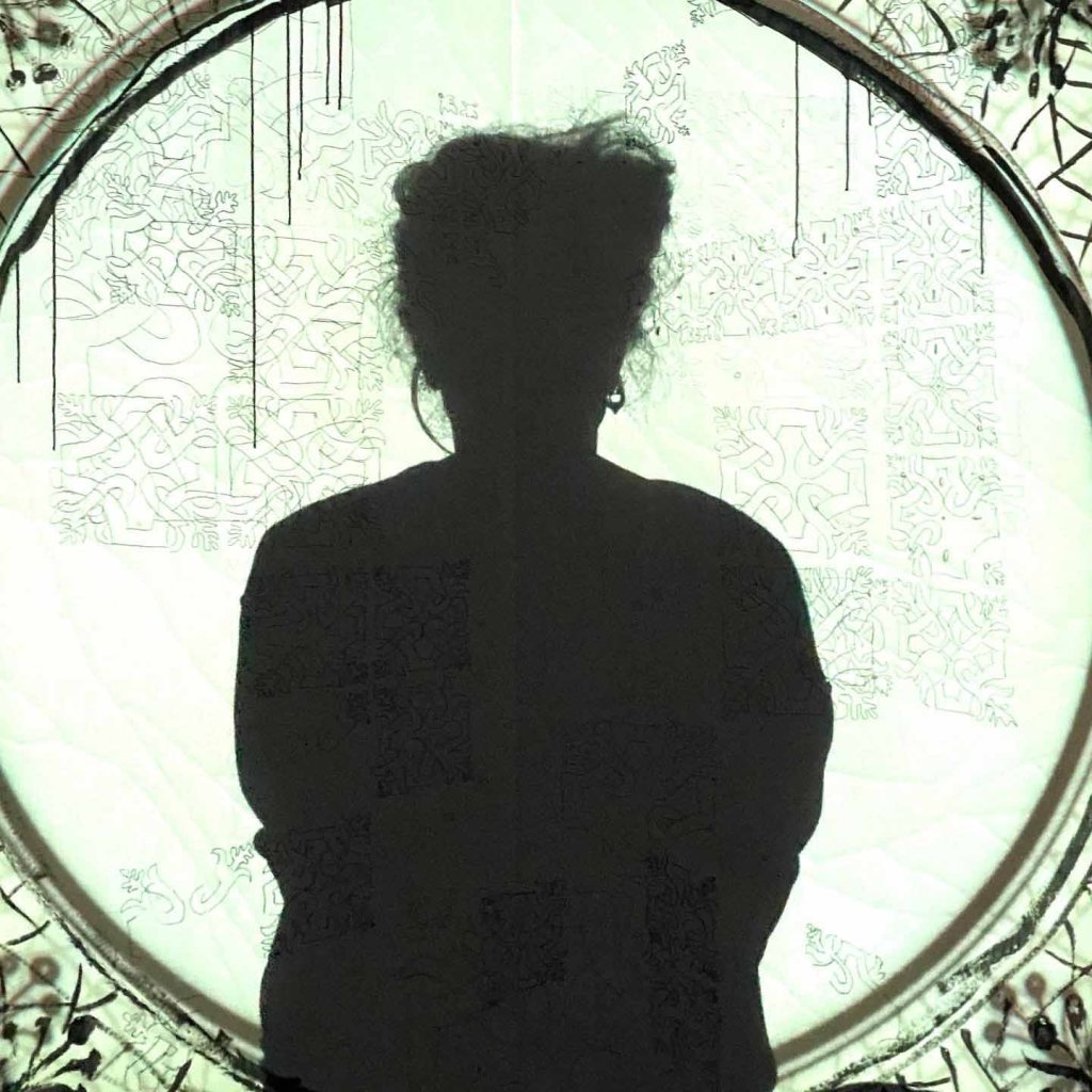
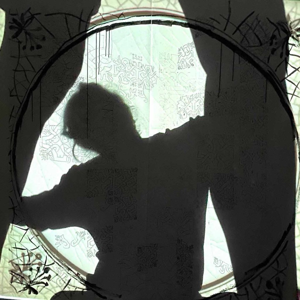
I also posted two photos that I took for project 5.2 An artists book:
Day 26: Cellar
Indian ink on wet paper

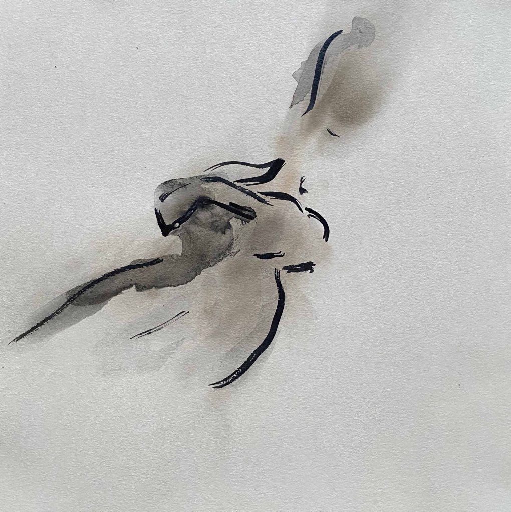
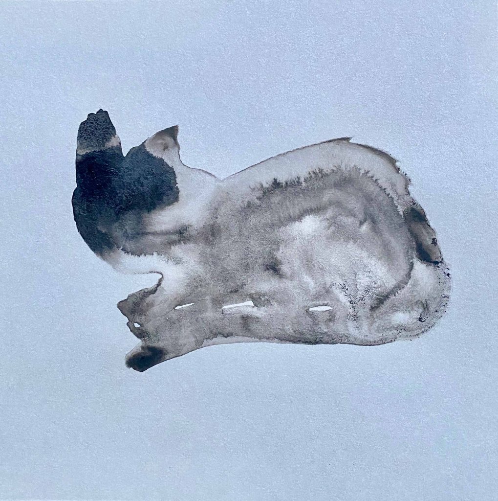
Day 27: Feline
Again, I am experimenting with “happy accidents” with Indian ink on wet paper

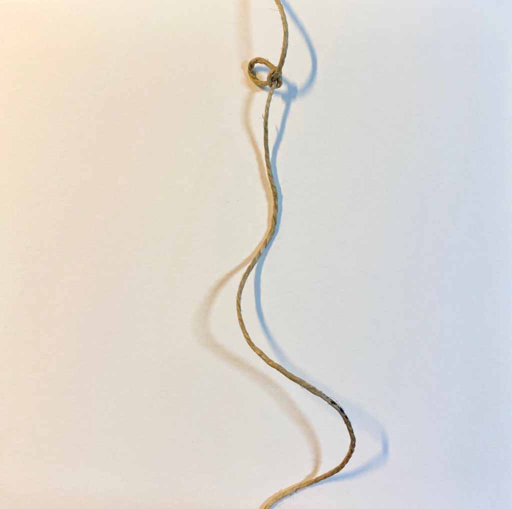
Day 28: Tie
Here I start by a series of monoprints of various knots to a not very satisfactory result
Finally I choose a much simpler, very graphic version:
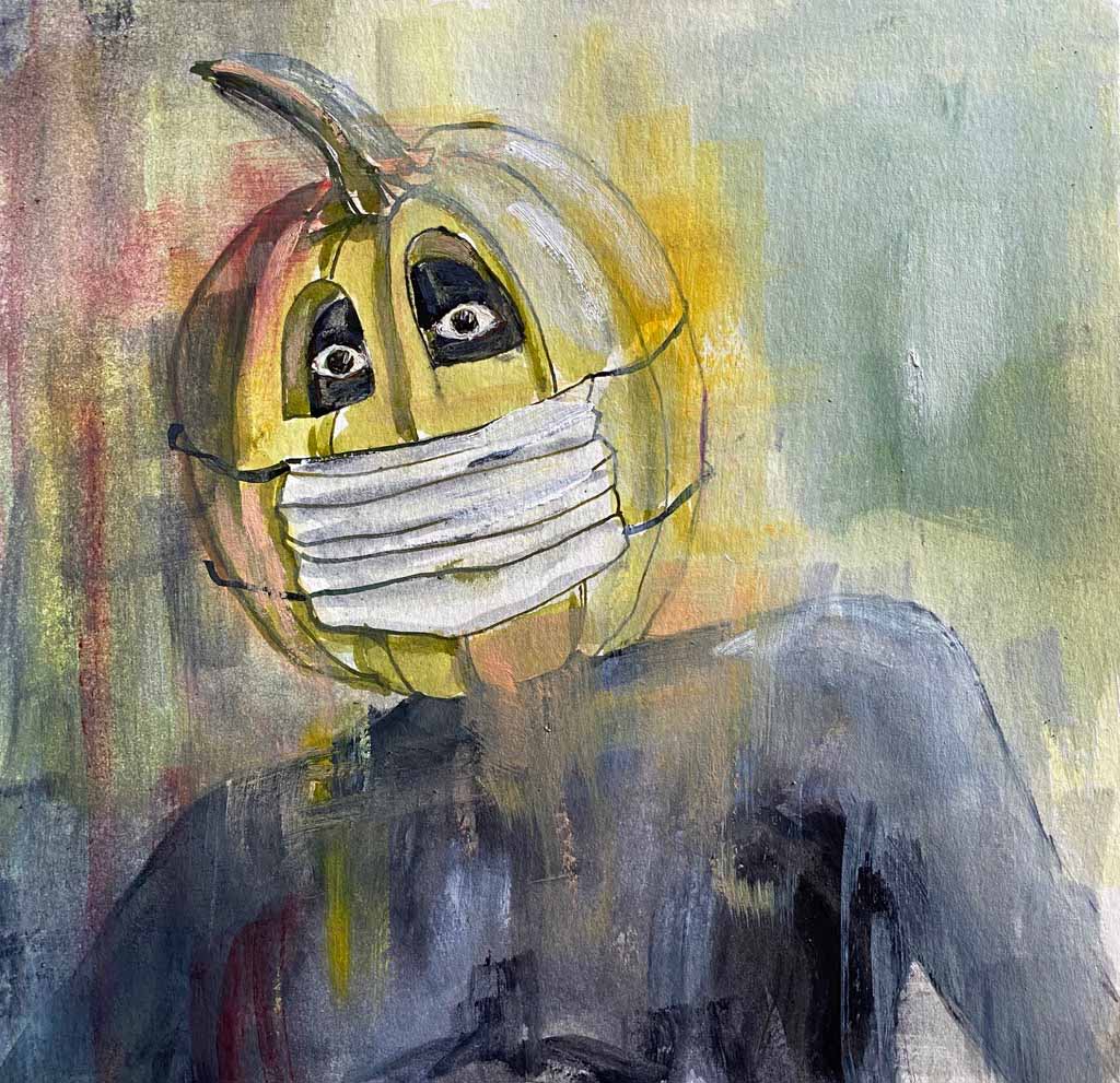
Day 29: Trick
Halloween is coming up, and on top of that we all are wearing masks already, so a masquerade pumpkin head seemed appropriate. Oil and ink on oilpaper.
Day 30: Flowerbed
It is autumn and the flowerbeds are dry and dull- oil on paper
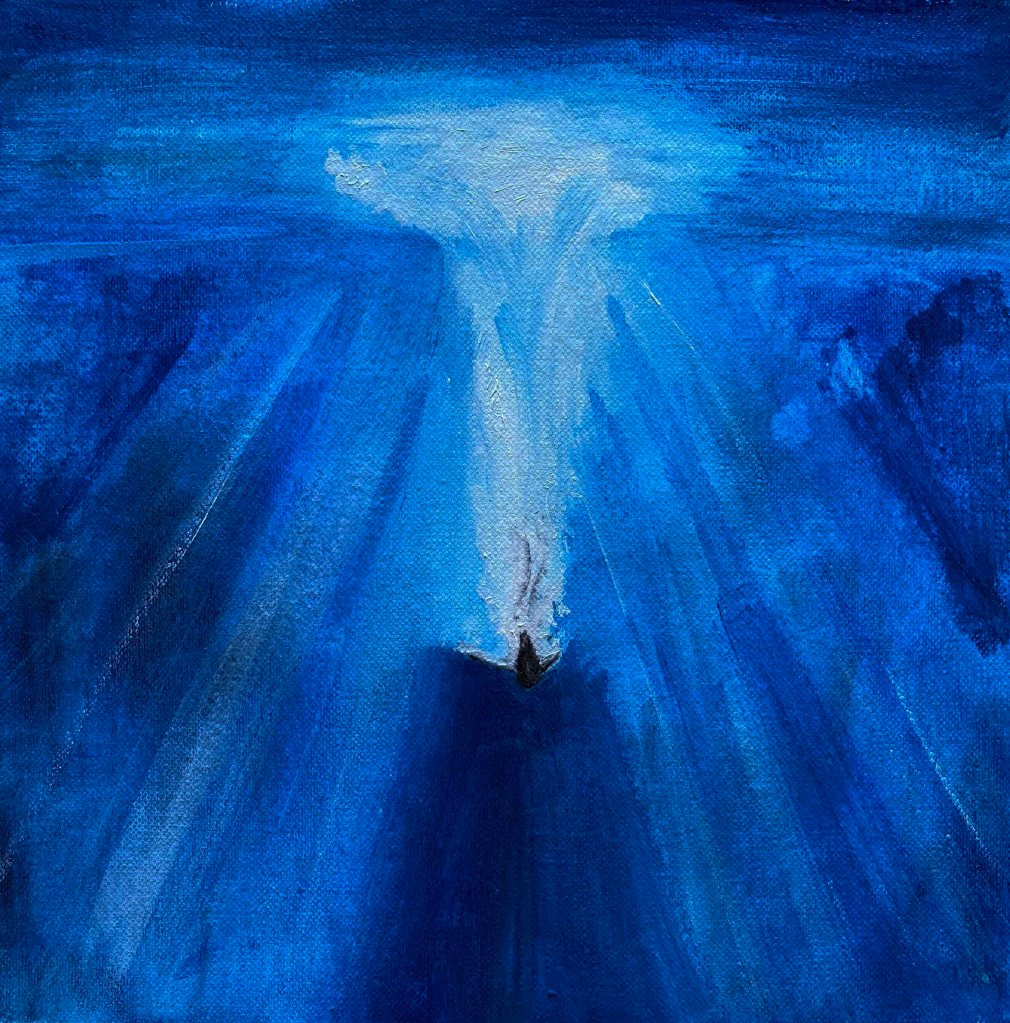
Day 31: Blue
Here I have two ideas, and time to realize them both: diving into the deep blue ocean, and feeling blue. The first one is oil on paper:
The second one is mixed media (pencil, ink, watercolour) on black paper
FINALLY, I have arrived to the end of the month. This was a very useful exercise in just doing, no matter the circumstances, and also in just posting/showing, even when I am not satisfied. It has pushed me into a productive flow. It has also taught me to look more lightly at Instagram and earned me several new followers. It has produced a small body of work that needed a period of time to elapse during its production- responding to the Assignment 5 brief. I am more happy with certain pieces than others naturally.
One problem that I see in combining them into the planned panels, is that they are partly too illustrative and standing too well alone. This is probably the result of over thinking the prompts and also a side effect of showing them daily on Instagram- which called for a more “finished” piece.
I will continue this drawings on squares for 21 more days, without prompts and without showing them individually, to hopefully allow some more “connective”, spontaneous pieces to happen that can work as a final panel.
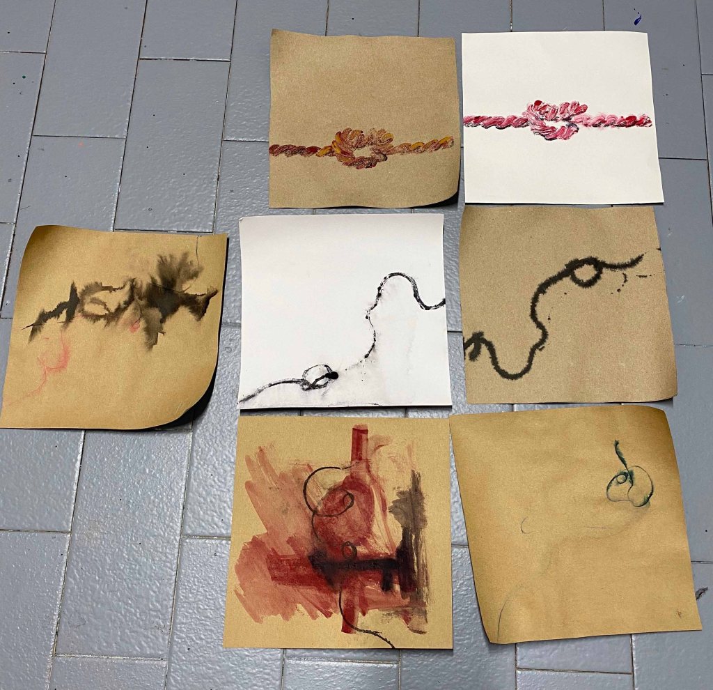
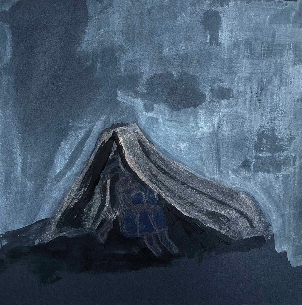
These are the following pieces:
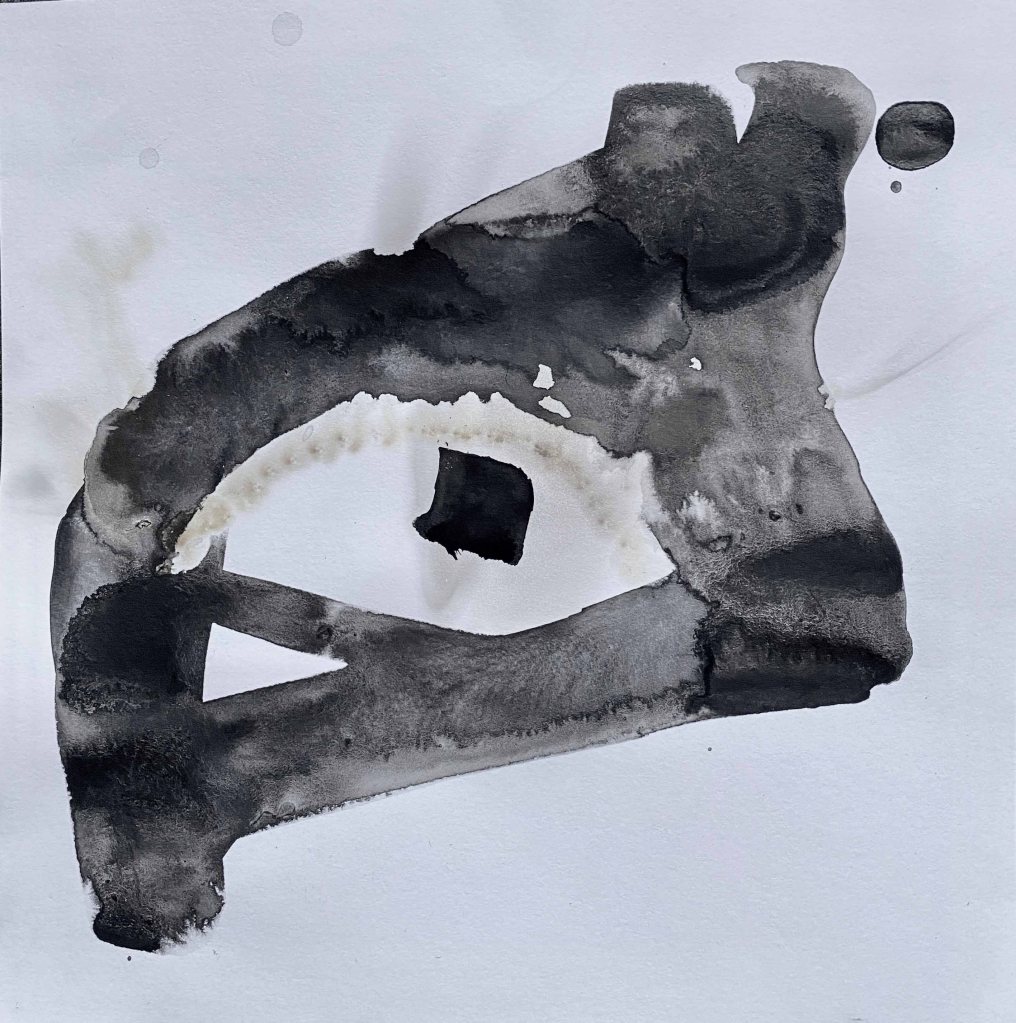

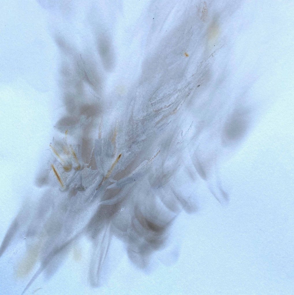
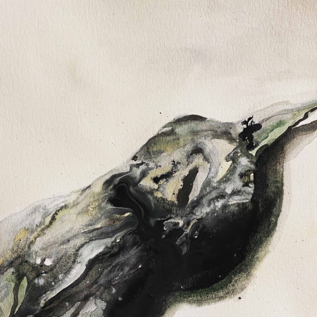
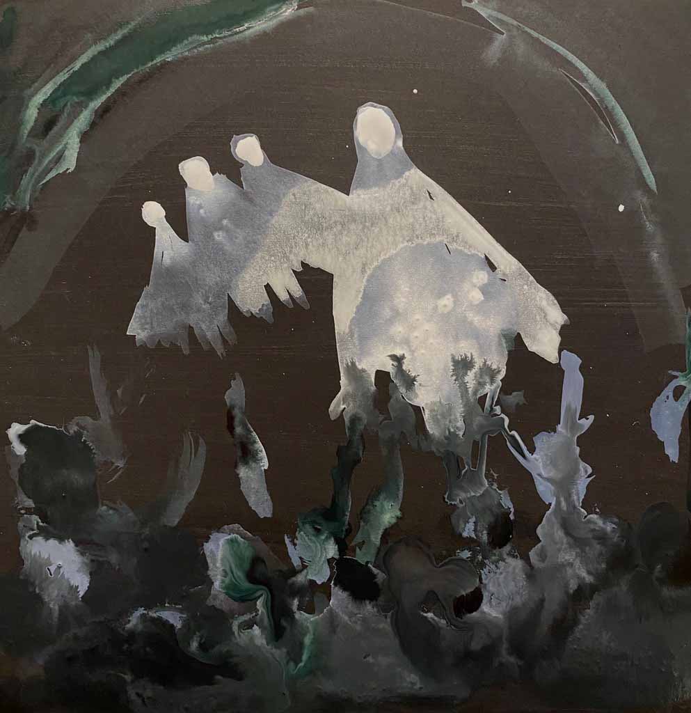
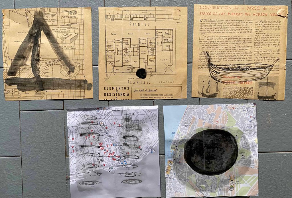
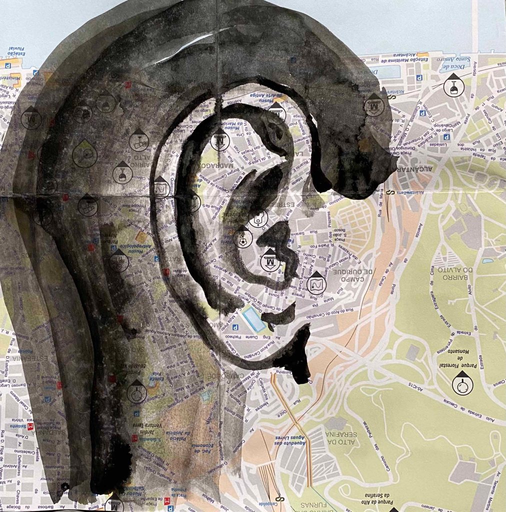
I will not post them all individually, but here are some that I find special.
I particularly like the pieces where I used found paper, an old map and a very old magazine found in our house. I added to them very sparingly:
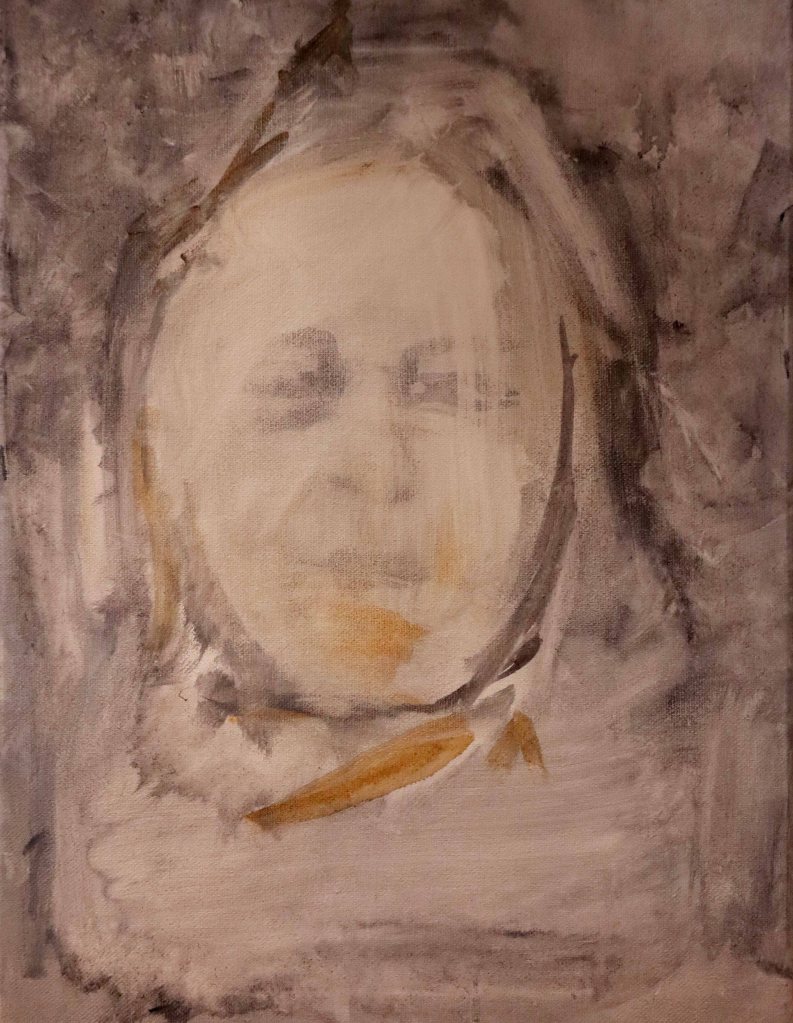
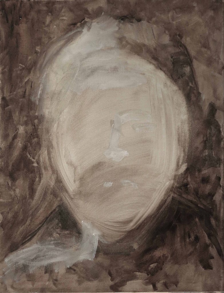
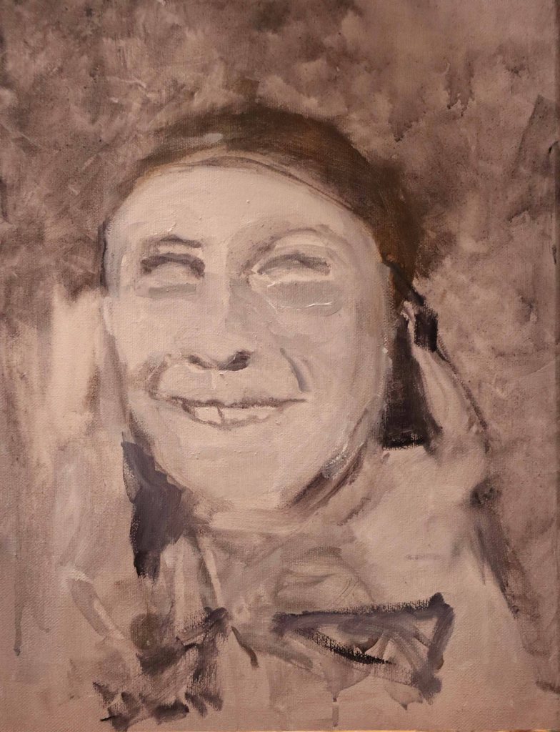
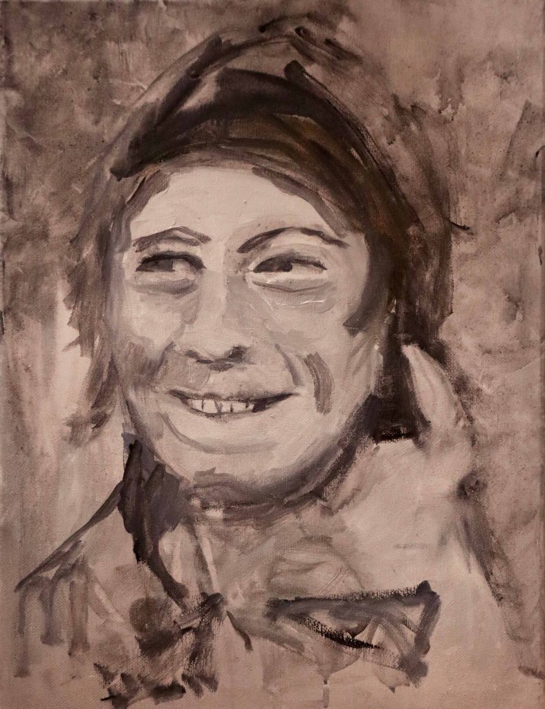
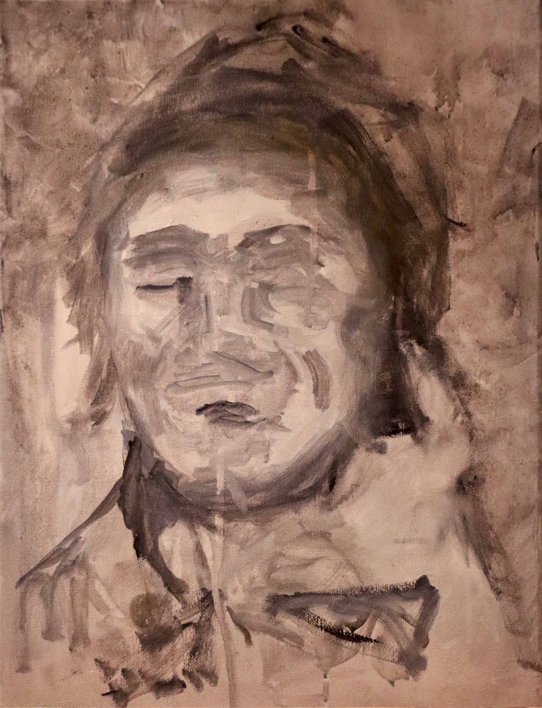
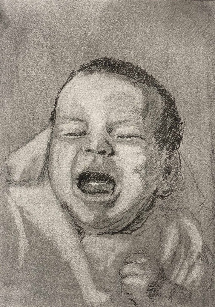
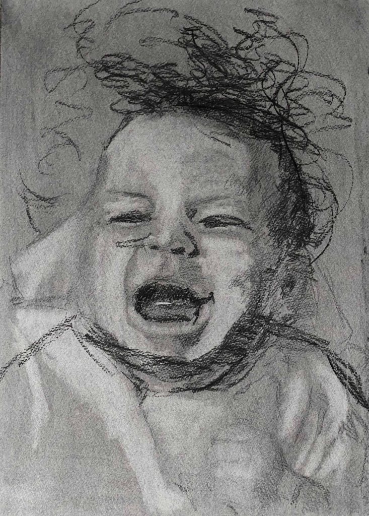
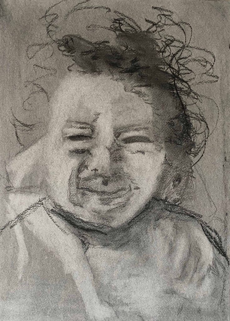
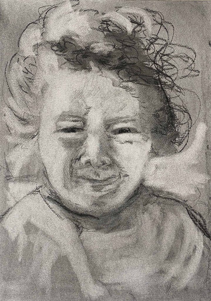
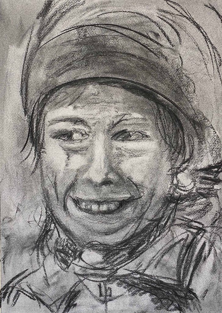
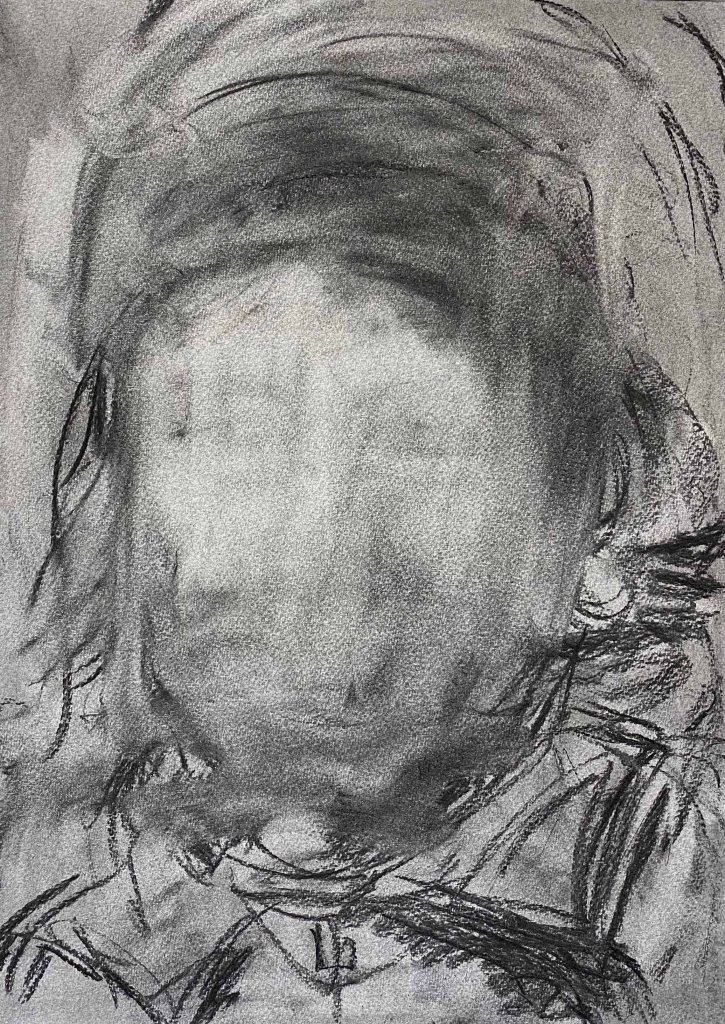
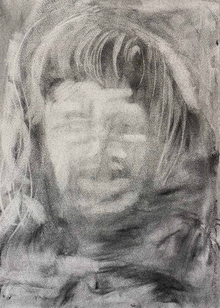
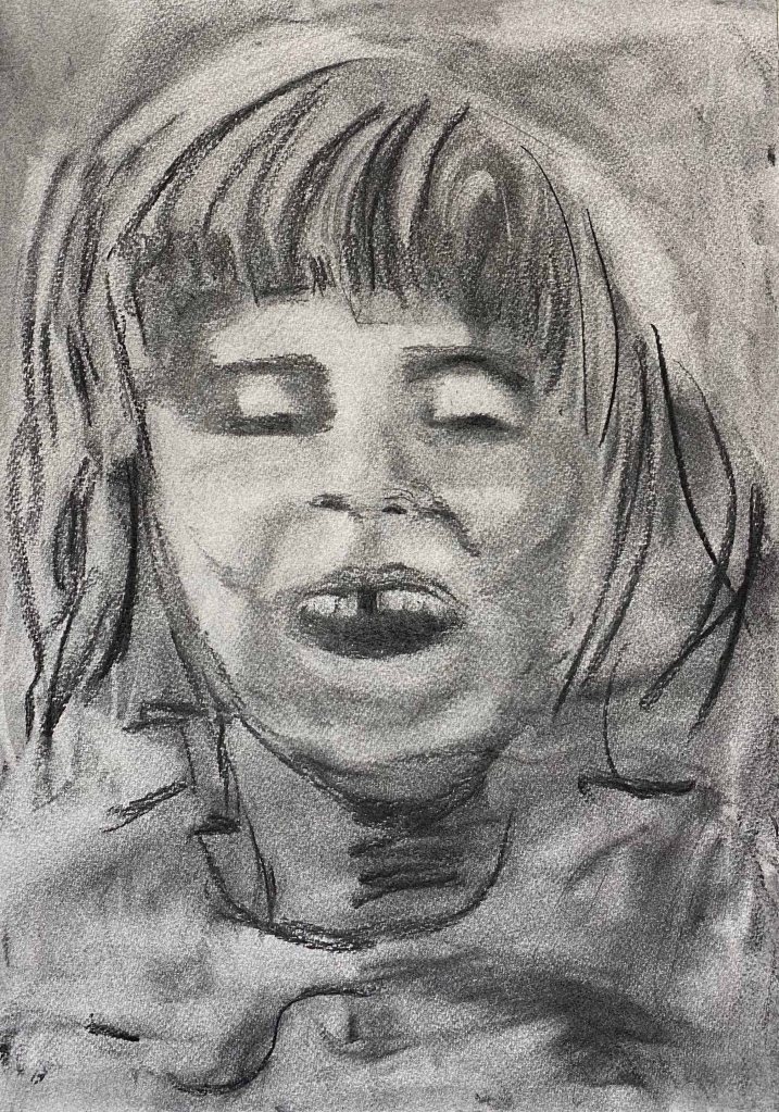
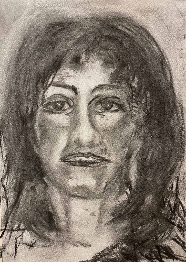
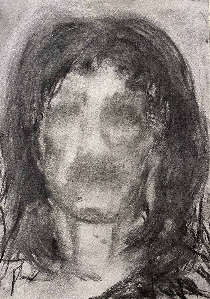
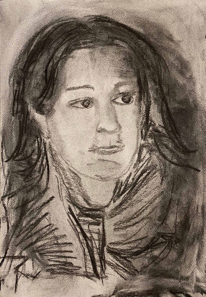
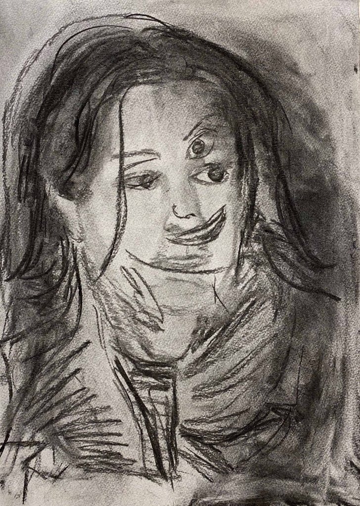
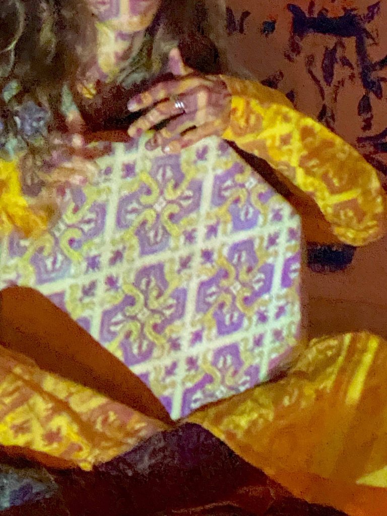
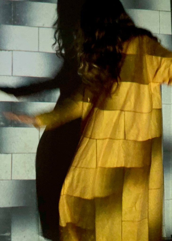
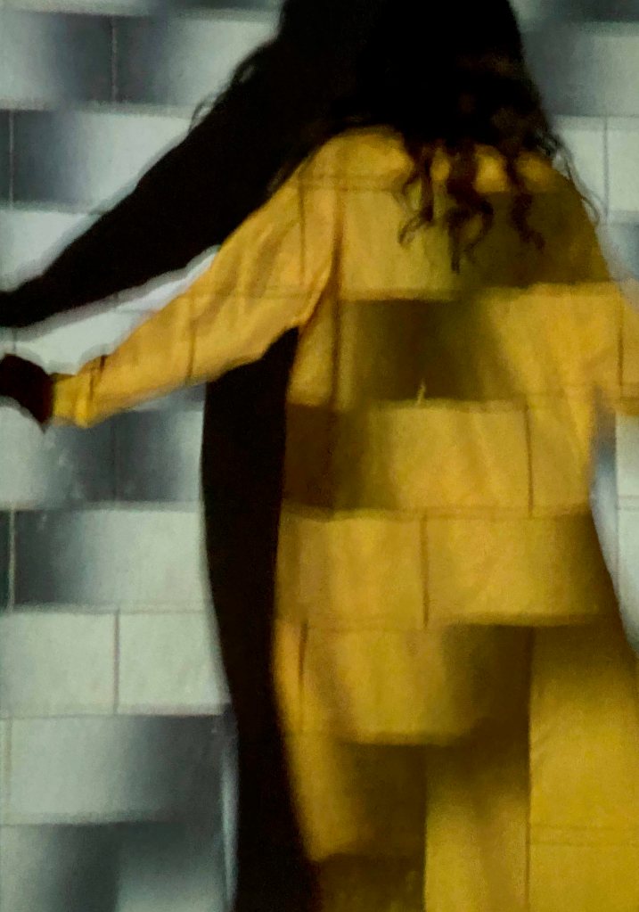
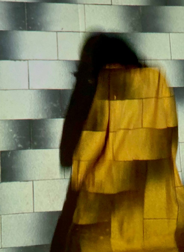
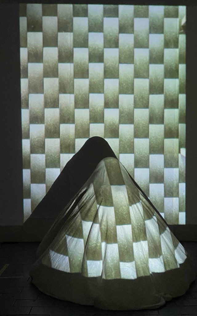
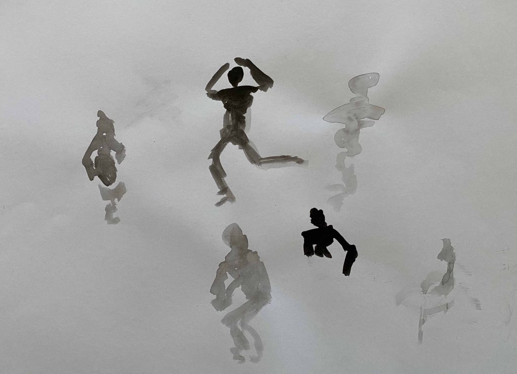
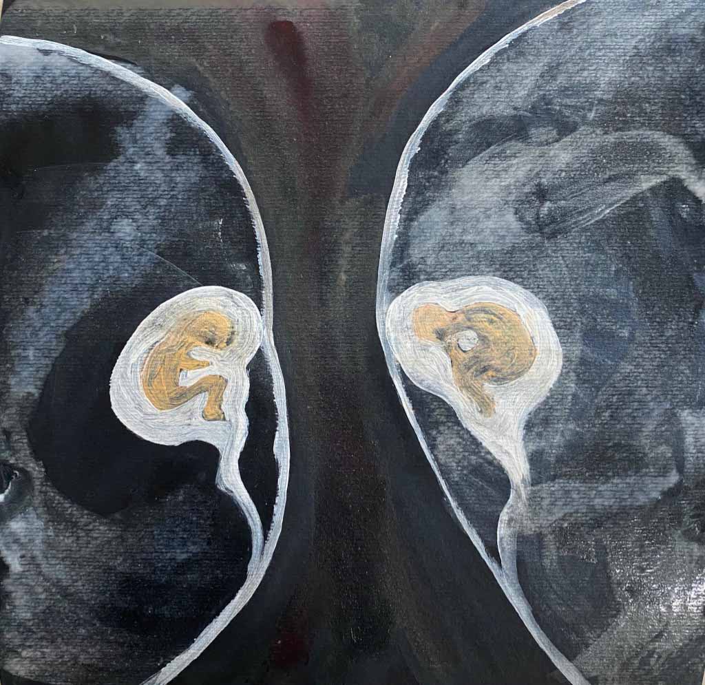
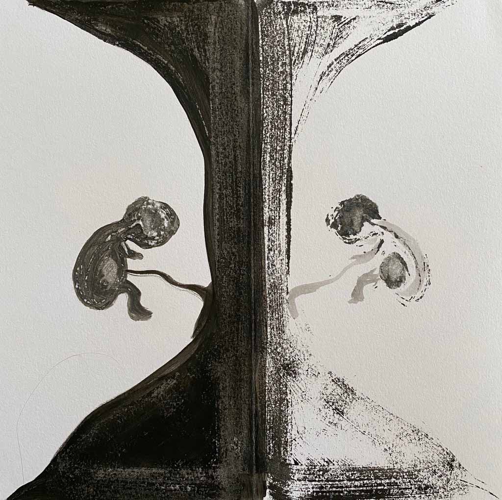
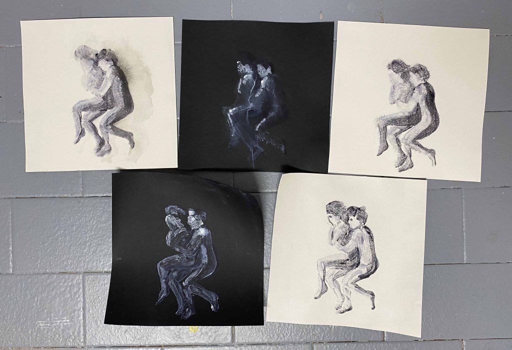
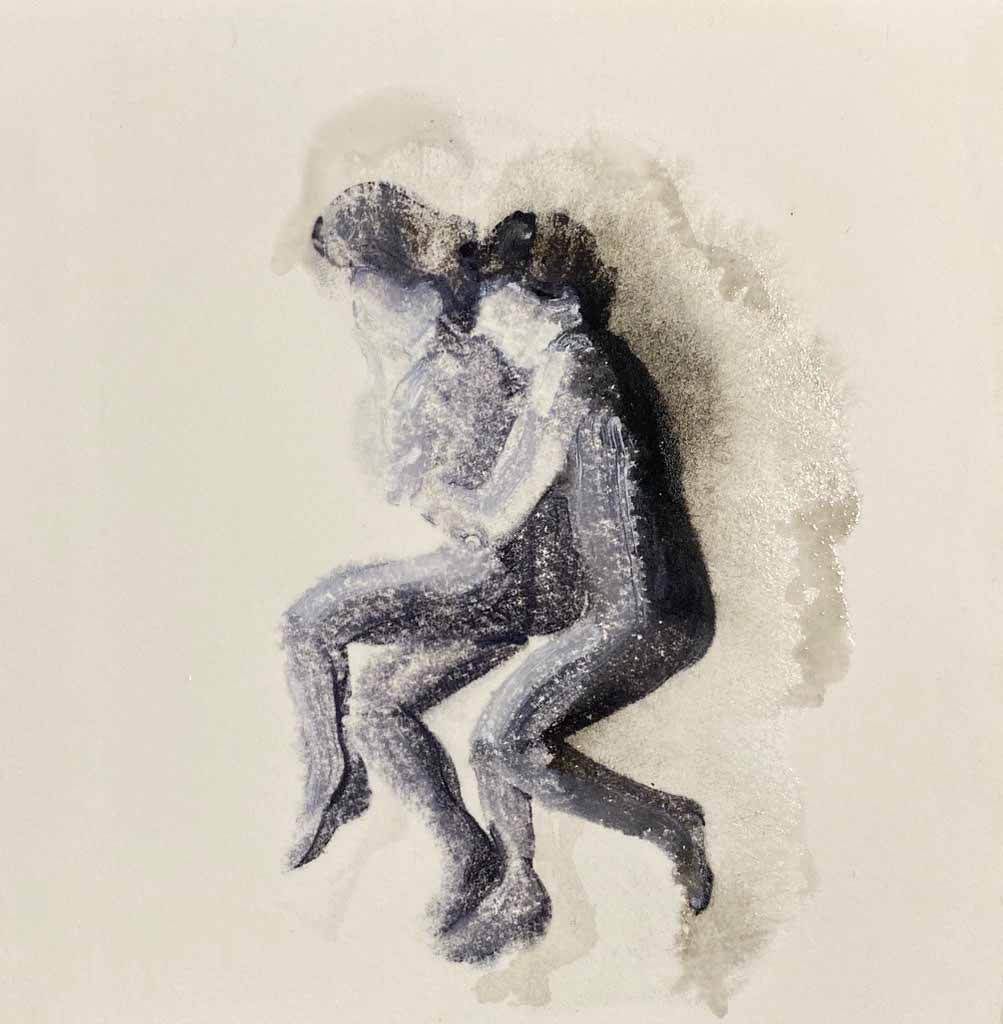
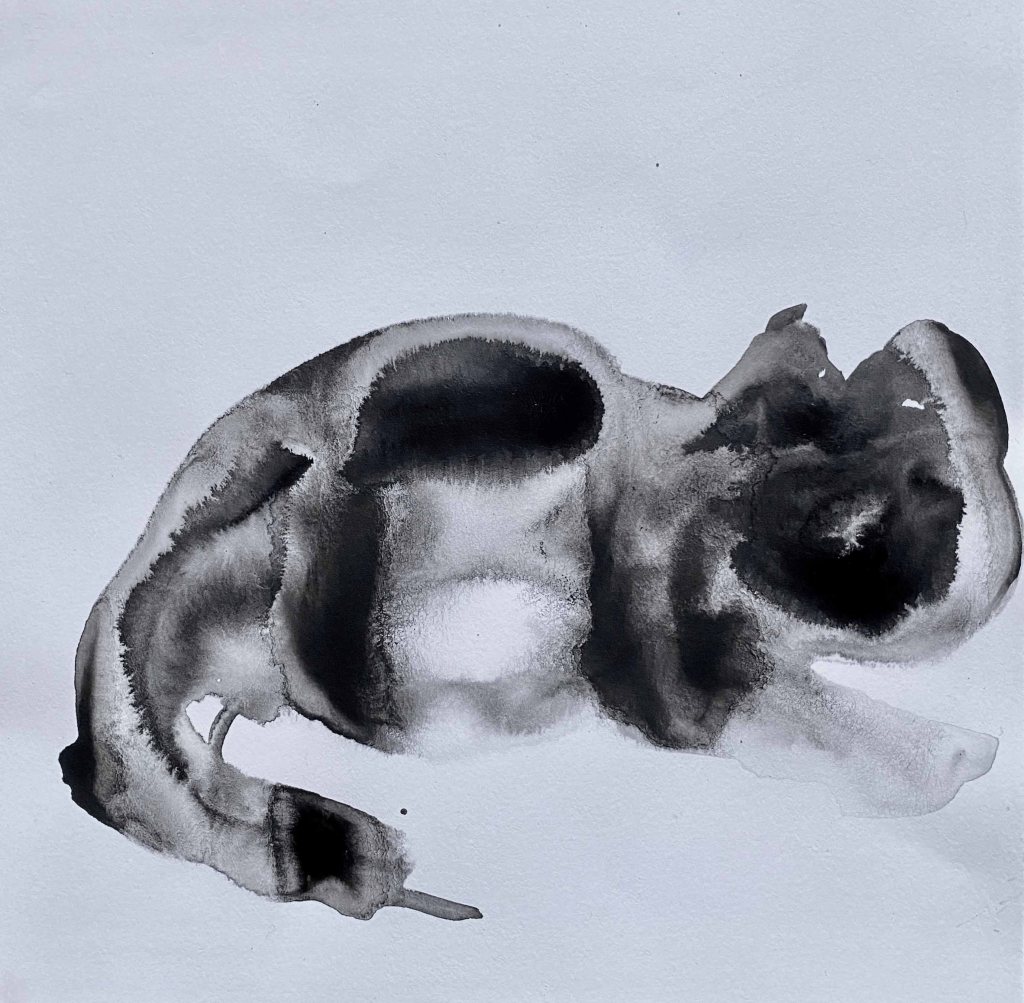
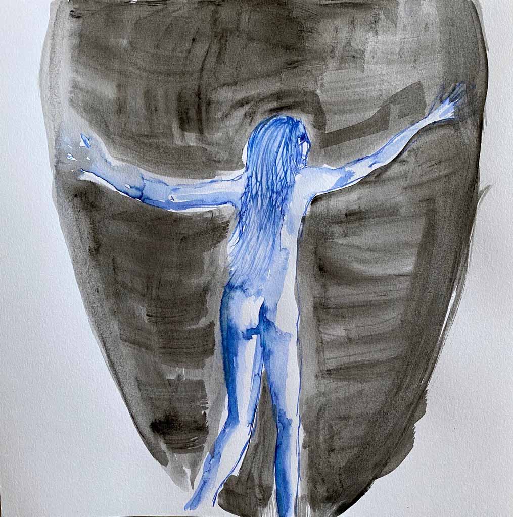
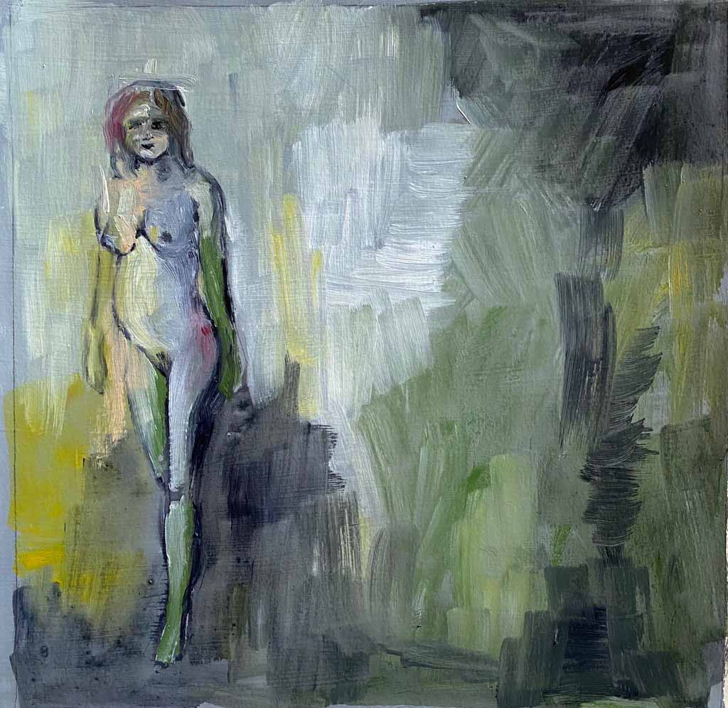
I have a pregnant friend, and am sketching her as another possibility for a painting that would fit in with the subject of Assignment 5. These are just some first sketches to remember the pregnant body.

I finally have small paintings/drawings from 52 days- it is an impressive little stack!
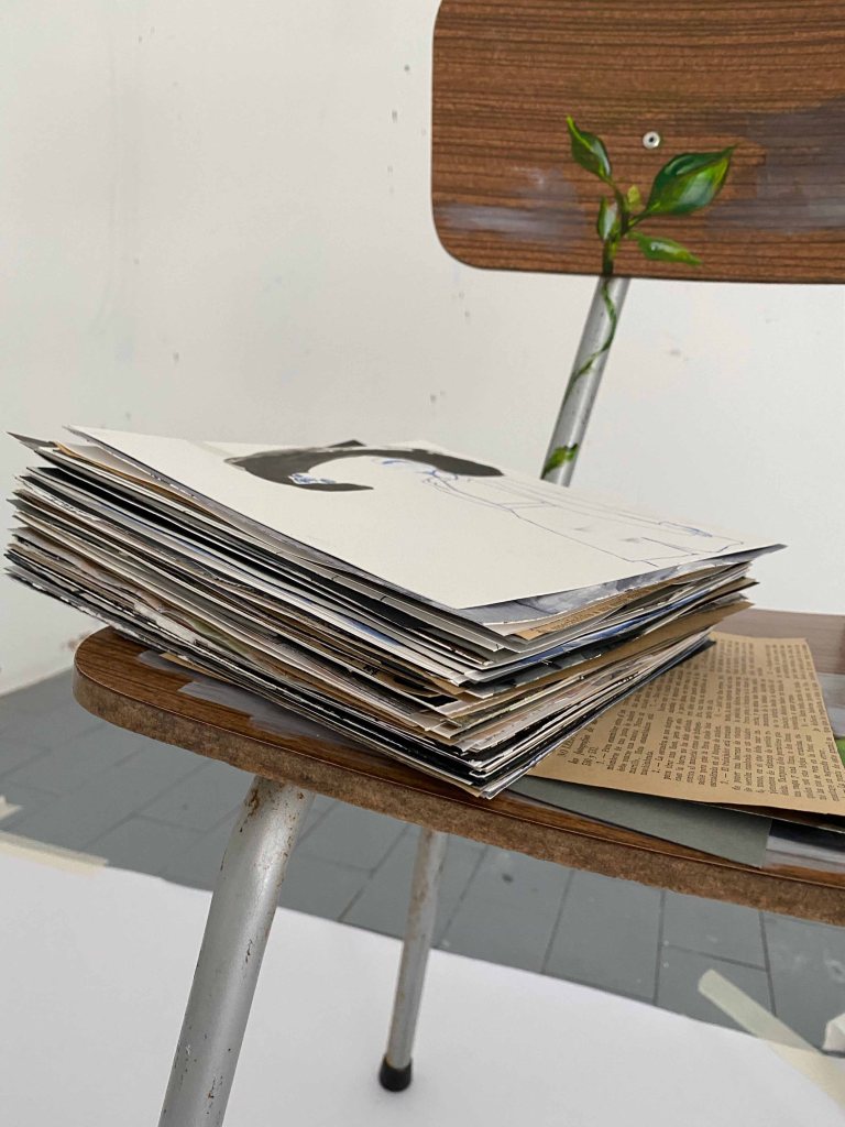
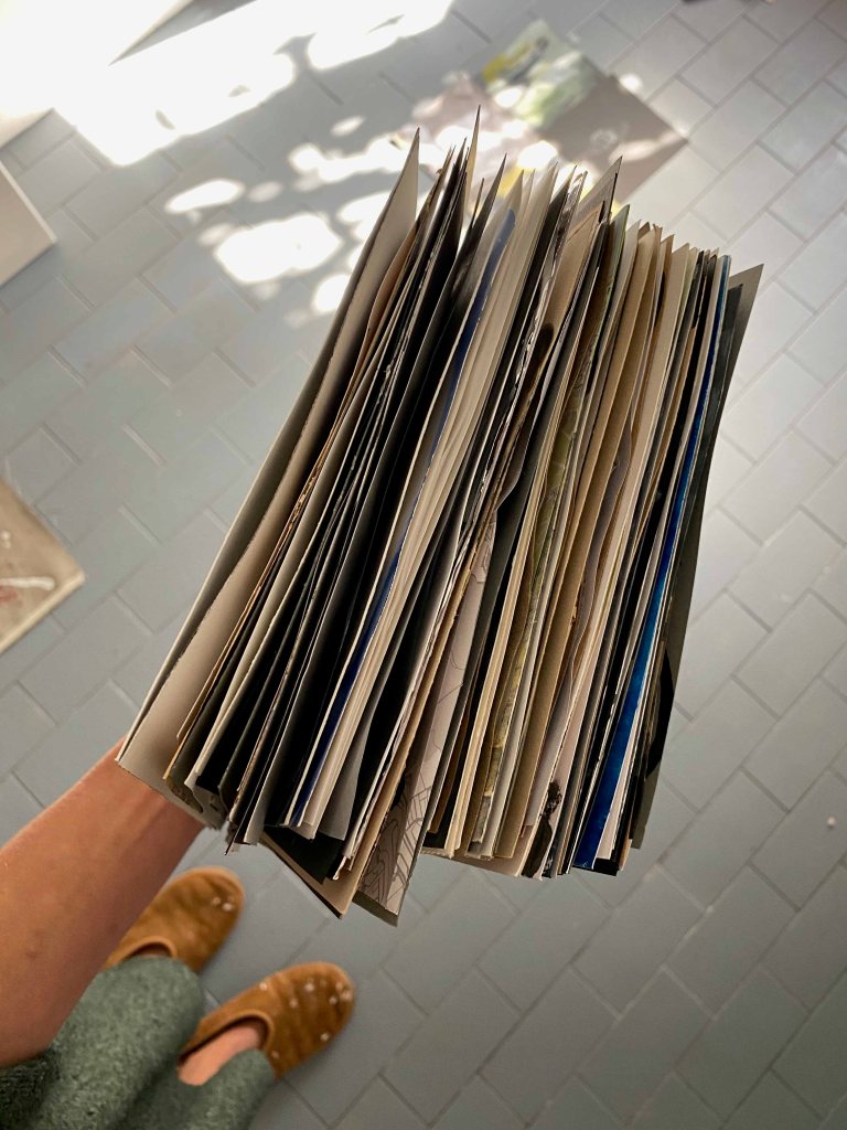
When I am holding them all together , I realize that this too, would have been a nice artist’s book bound together.
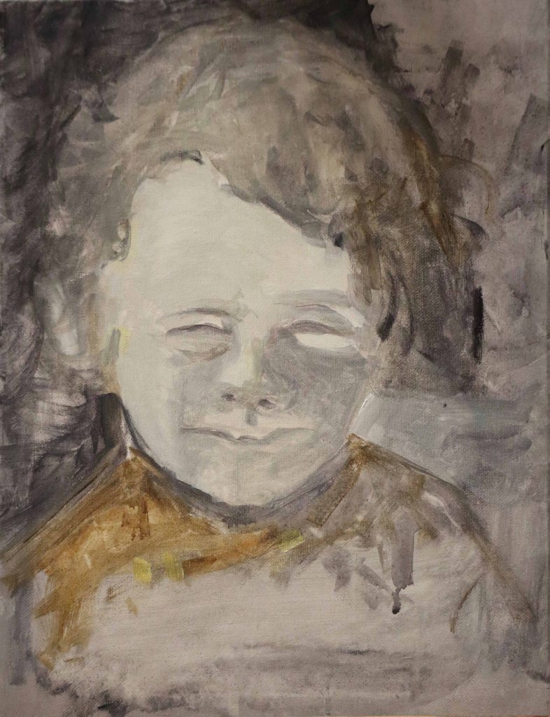
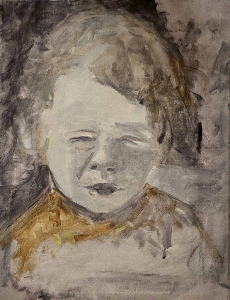
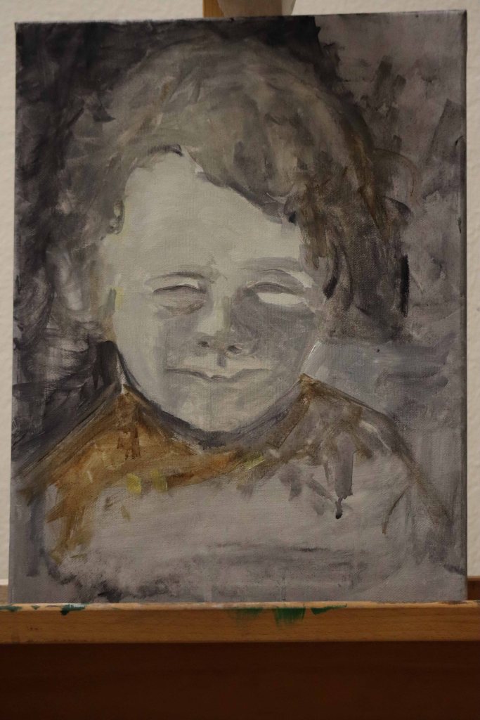
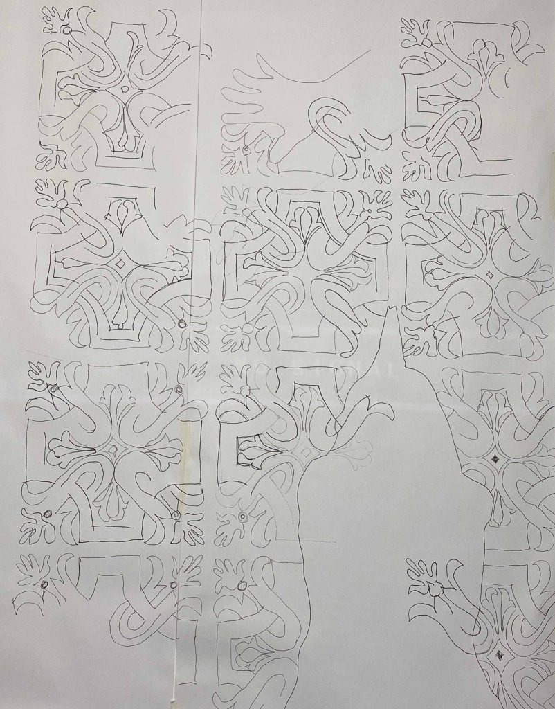
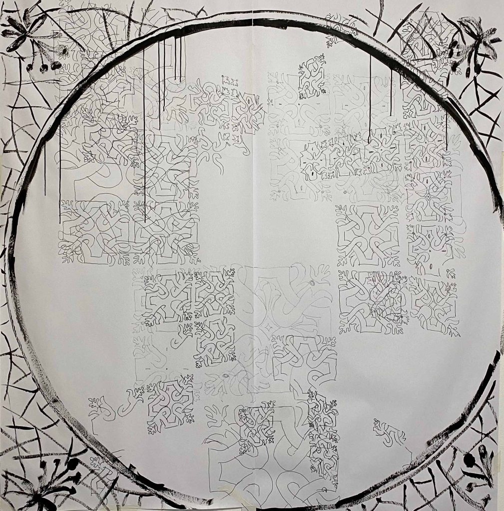
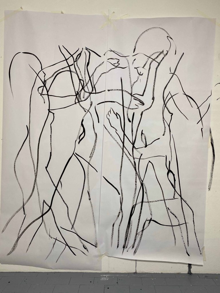
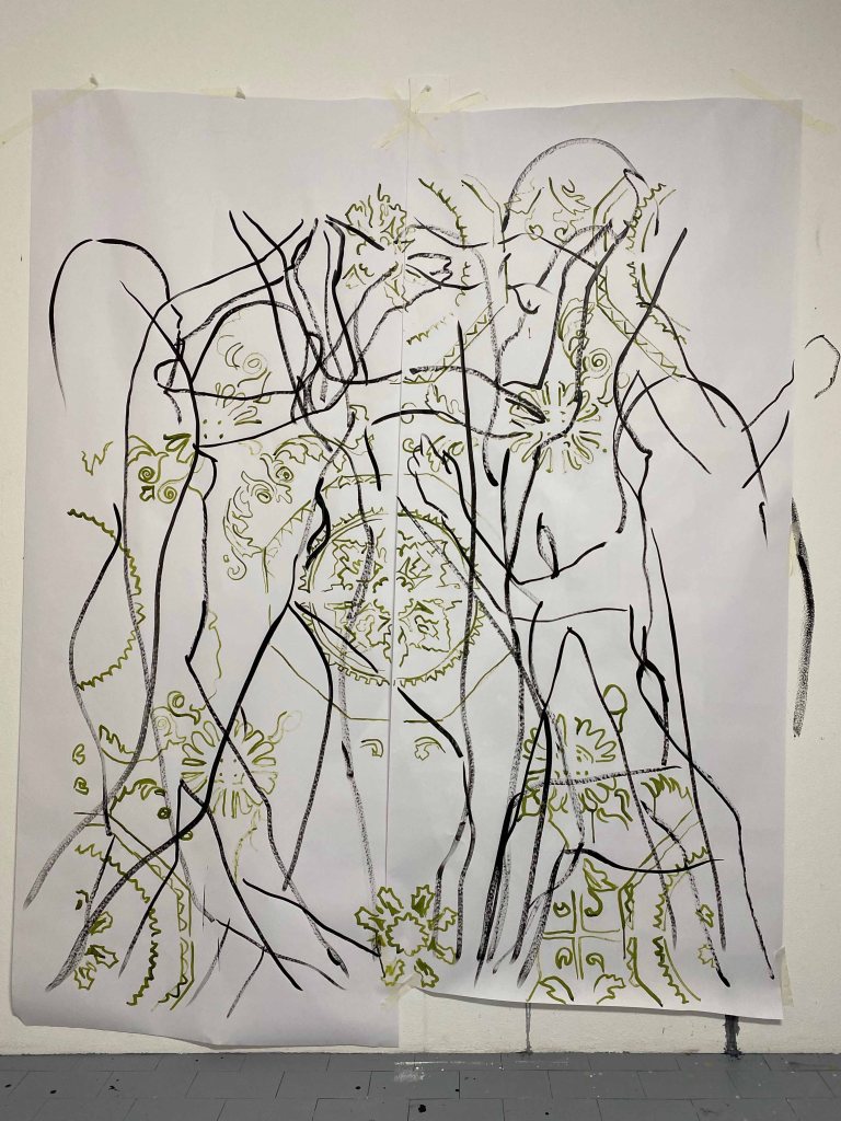
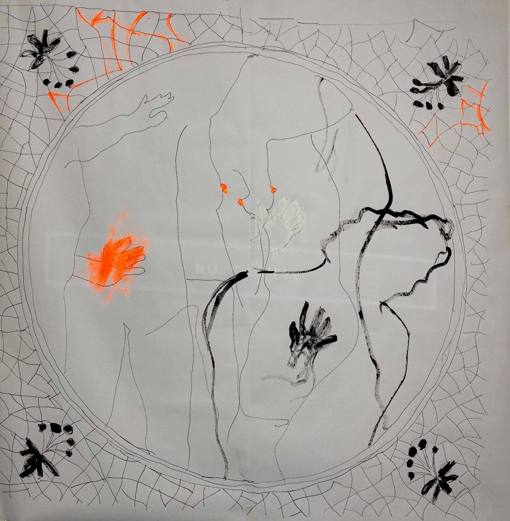
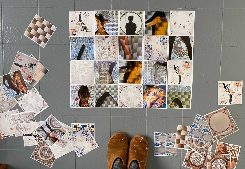
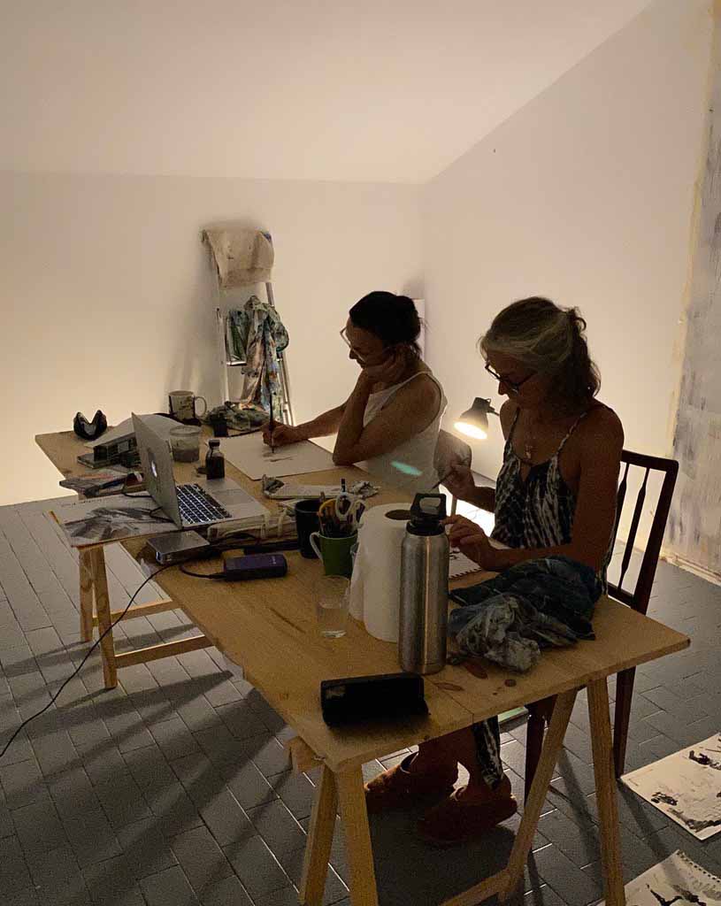
But it seems like I am all for puzzles this time, so here is the development of the panel:
I try a square version:
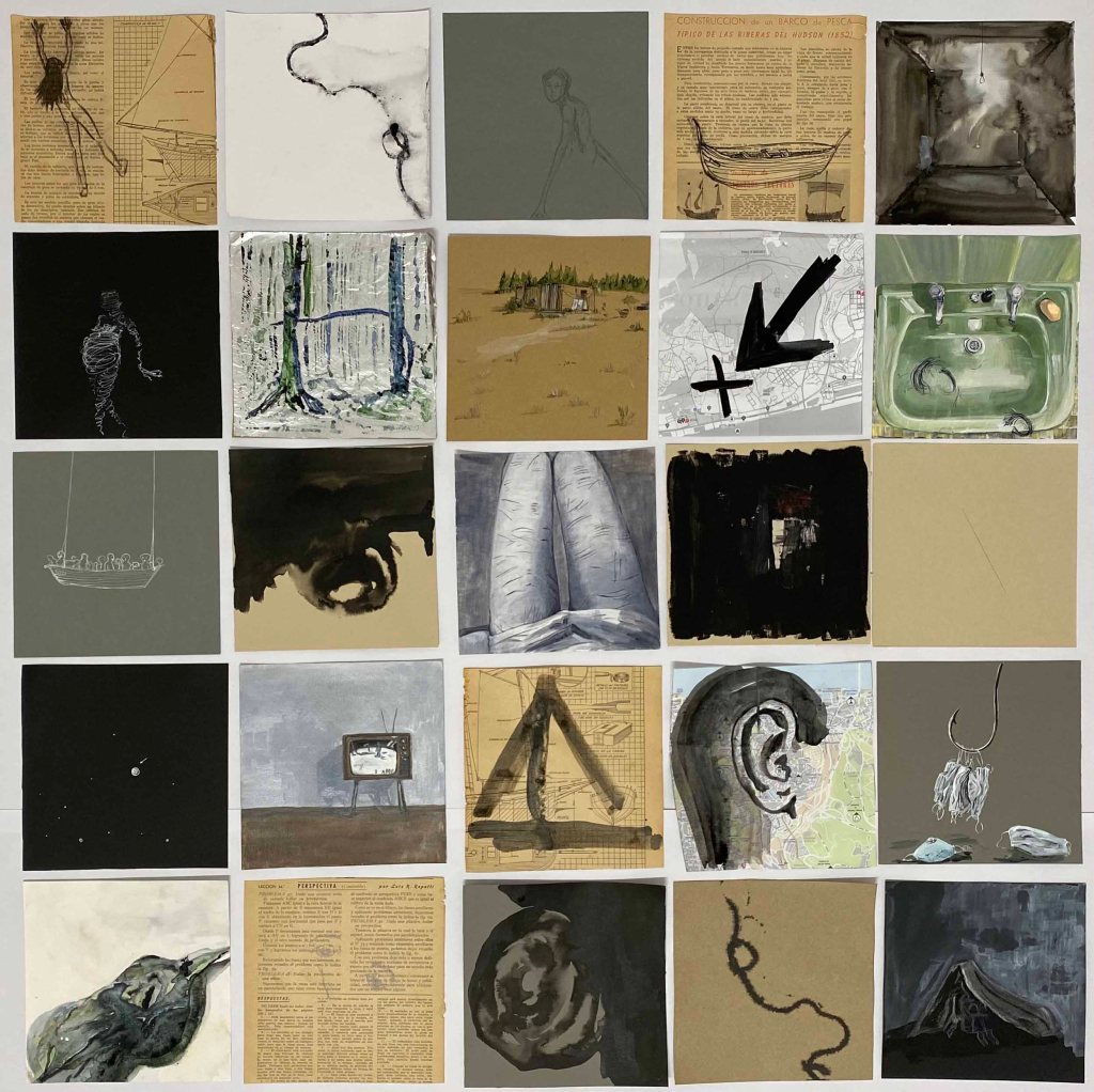
I try another version starting from the very first drawing from October 1: Imposter:
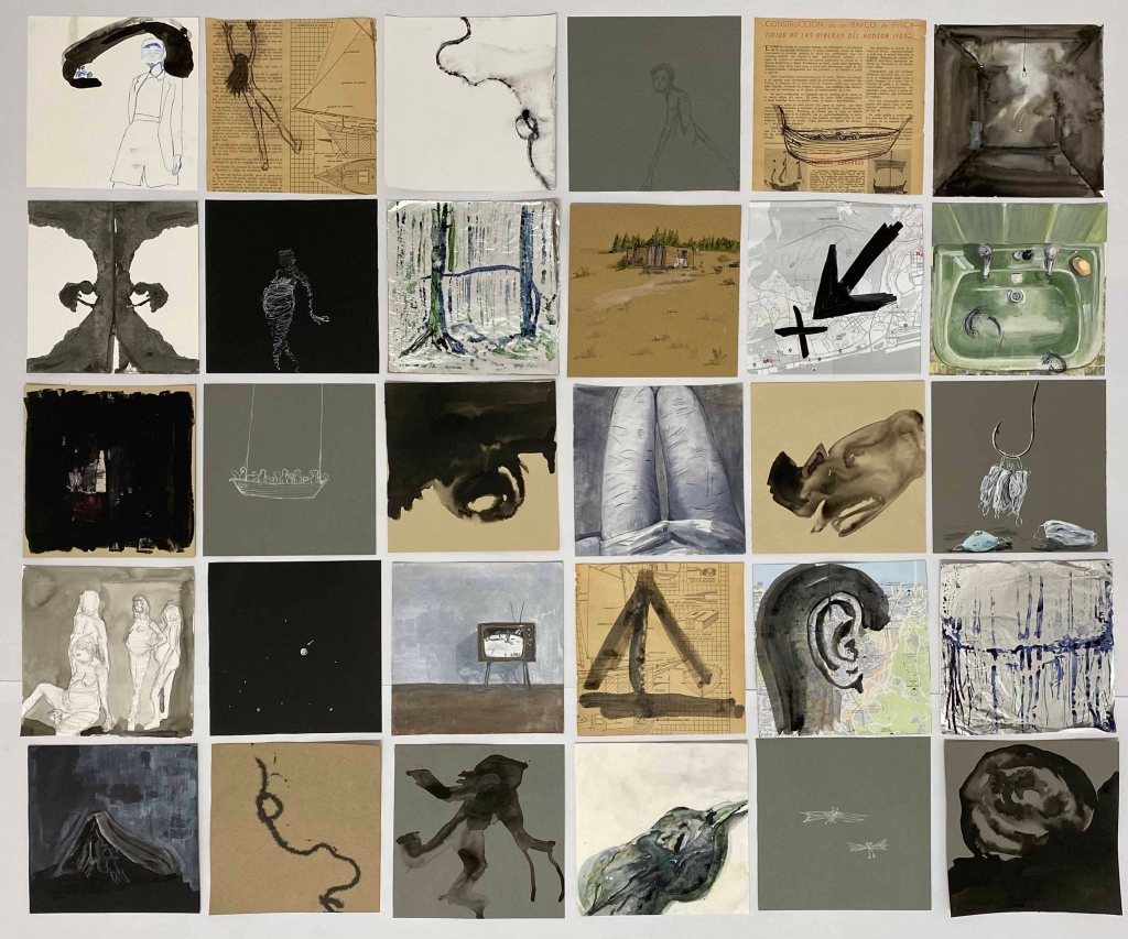
Another version containing my favorites:
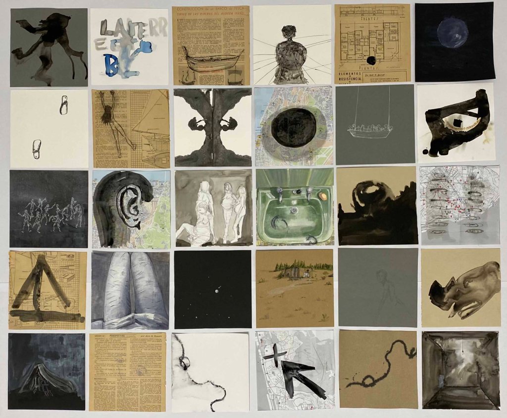
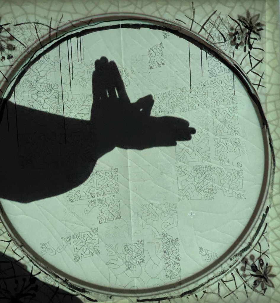
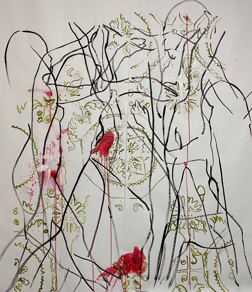
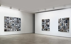
And here, the final panel- where I had to let go of some of those favorites in favor of a more coherent whole:
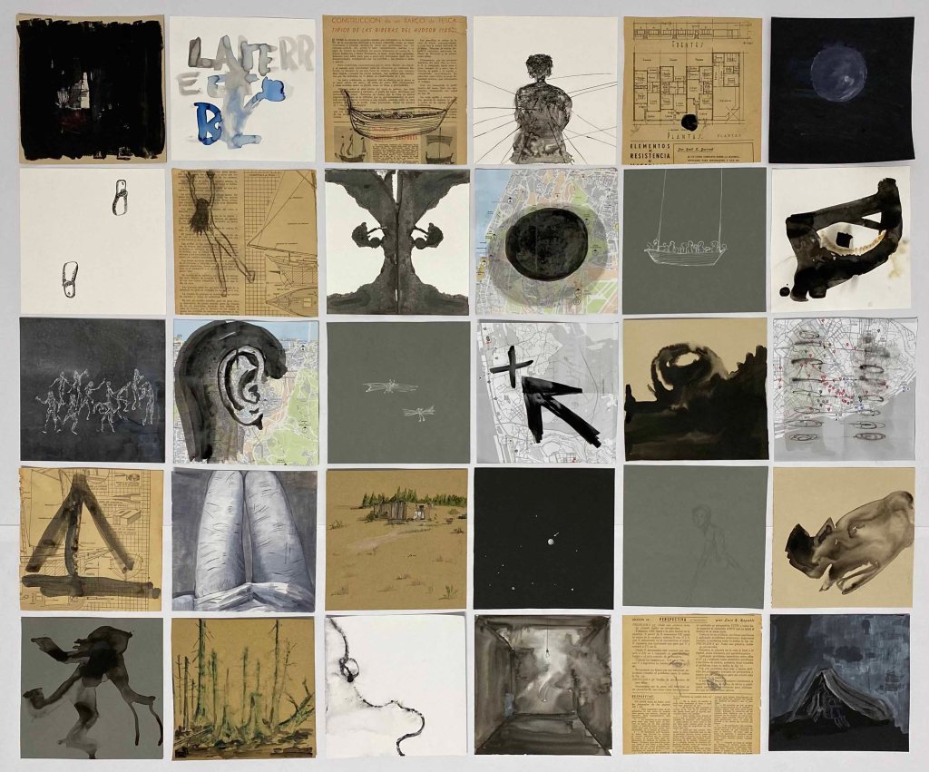
I am happy with the different mix of techniques and papers used, and how they still flow together as one work, balancing between rather complex full drawings and more empty, clear ones. I believe these drawings have a certain value in themselves but noticed how I had to let go of several of my preferred ones for the whole to be stronger- with clearer and not so detailed drawings working better in context with others.
It has been a very useful project for me to let this develop slowly over 52 days, to really come into the routine of drawing everyday- and hope that this is just the beginning!