Category Archives: Art visits

ART BASEL Online Viewing Rooms

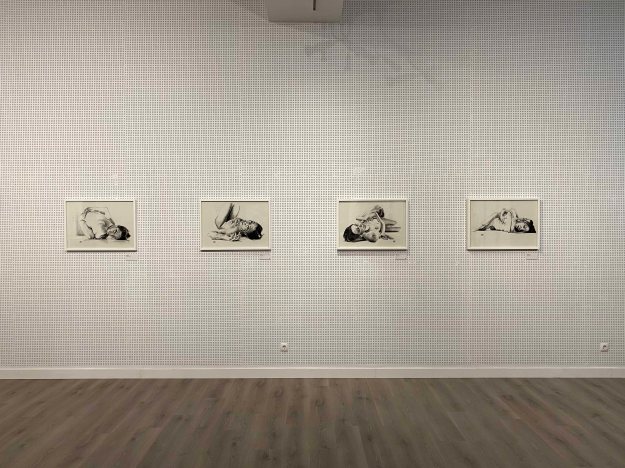
Due to the Covid 19 situation, Art Basel opened the access to all artworks online through their Online Viewing Rooms from June 19-26. As I have not seen any exhibitions in the flesh for a long time , due to this worldwide situation,  I am keen to browse the online version of this largest art fair in the world, taking place in Europe in Basel, in the USA in Miami and in Asia in Hong Kong.

There is an incredible amount of information and art works here. 282 galleries from 35 countries show over 4000 artworks! As this is a commercial event, it often shows the works with a pricetag, which puts them in an very different context than seeing the same works in an exhibition. They are also organized by gallery instead of by artist or theme, which brings another dynamic to the viewing, clearly placing the work in this commercial context-  a good reality check for a dreaming aspiring artist like me.

I started by watching an introductory video about the event (https://www.artbasel.com/ovr) and was already overwhelmed by the amount of highly successful contemporary artists mentioned that I did not know! This is a list of the artists highlighted that I want to take a more in-depth look at:

Carrie Mae Weems , Glenn Lighton, Deanna Lawson, Theaster Gates, Nicole Eisenmann, Monica Bonvincini, Jeffrey Gibson, Wade Guyton, Cecile B Evans.

Another category named the “Young Voices” highlighted promising emerging artists to look out for:

Issy Wood, Chen Tiangzhuo, Hanna Miletic, Jonathan Lyndon Chase, Paul Mpagi Sepuya, Rafa Esparza.

A search for these artists with the search engine of the website is not very successful though, several are not found at all, so I decide to leave this list for a general internet search afterwards. Instead I wander through the viewing rooms randomly, much like I would a real art fair and just look for something that catches my eye.

At first I am a little disappointed at the amount of Photography and sculpture or installation presented, in comparison to drawing and painting.

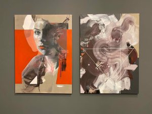
These two paintings by Liliane Tomasko presented by Kerlin Gallery are the first interesting works I encounter,  I am drawn into the layers of clear brushstrokes. These is something about these wide, visible brushstrokes that remind me of the work of Mimei Thompson, although Thompsons’ art is figurative with everyday subjects, like weeds from the backyard or a torn open trash bag. These paintings remain abstract, but I find myself following the forms and trying to make out something figurative that seems to just lurk under the surface.

(Tomasko, L. 2020. Https://wwwartbaselcom/catalog/artwork/104940/Liliane-Tomasko-Hold-on-to-Yourself-5-18-2020. [Online]. [25 June 2020]. Available from: https://www.artbasel.com/catalog/artwork/104940/Liliane-Tomasko-Hold-on-to-Yourself-5-18-2020)

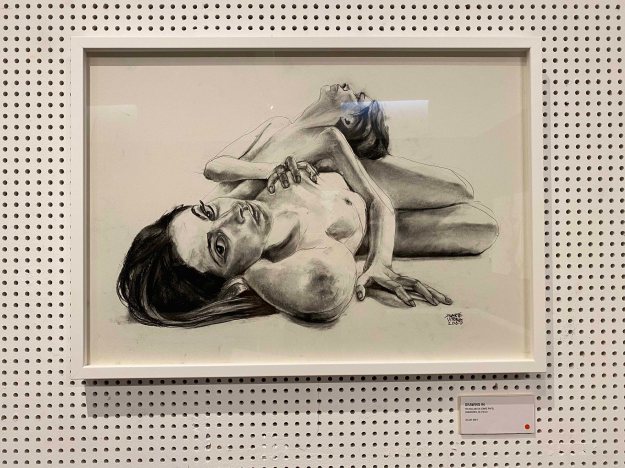
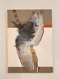
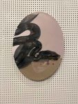
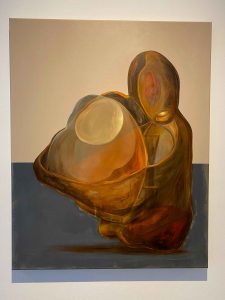
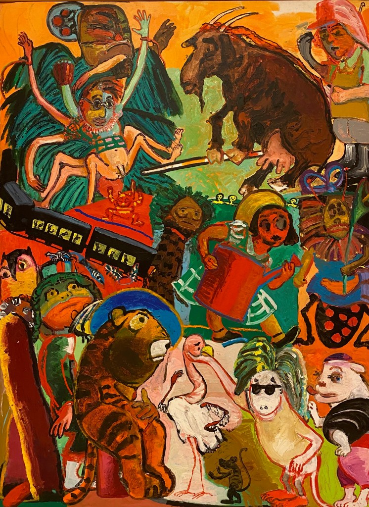
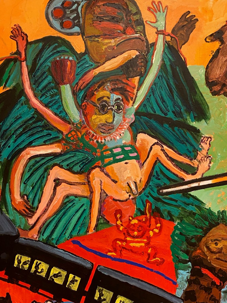
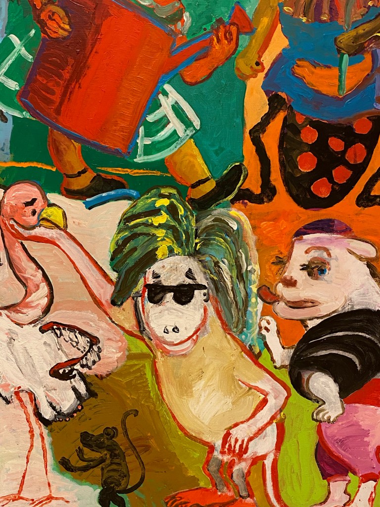
Next, I discovered the paintings of Miriam Kahn (Gallery Jocelyn Wolff) where crudely painted humane figures in translucent colours attract my attention. They are clumsy and caricaturist but exude a strange power with their shining limbs and the way they look straight into my eyes with their childishly drawn faces.

In the midst of the comical, I can feel this insecure uncomfortable humanness.

(Cahn, M. 2020. Artbaselcom/catalog/artwork/113703/Miriam-Cahn-au-travail-27-5-27-6-11. [Online]. [25 June 2020]. Available from: https://www.artbasel.com/catalog/artwork/113703/Miriam-Cahn-au-travail-27-5-27-6-11)

In this artwork by Mariela Scafati (Gallery Isla Flotanta) , I find the composition of small paintings put together really effective and an idea to remember.


(Scafati, M. 2020. Artbaselcom/catalog/artwork/106369/Mariela-Scafati-Montaje-de-los-tiempos-posibles. [Online]. [25 June 2020]. Available from: https://www.artbasel.com/catalog/artwork/106369/Mariela-Scafati-Montaje-de-los-tiempos-posibles)

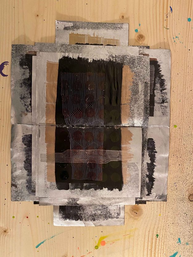
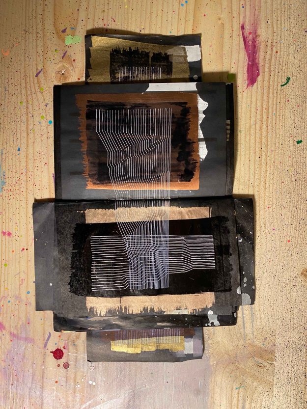
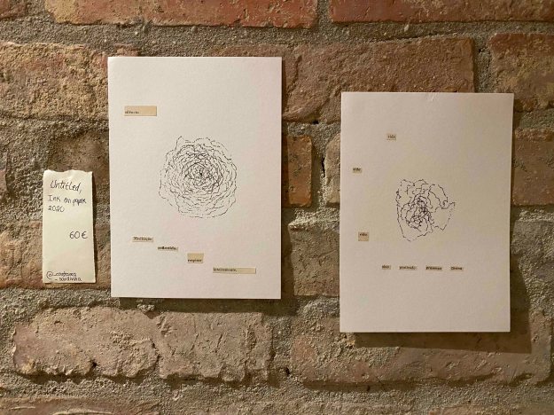
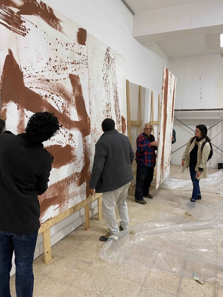
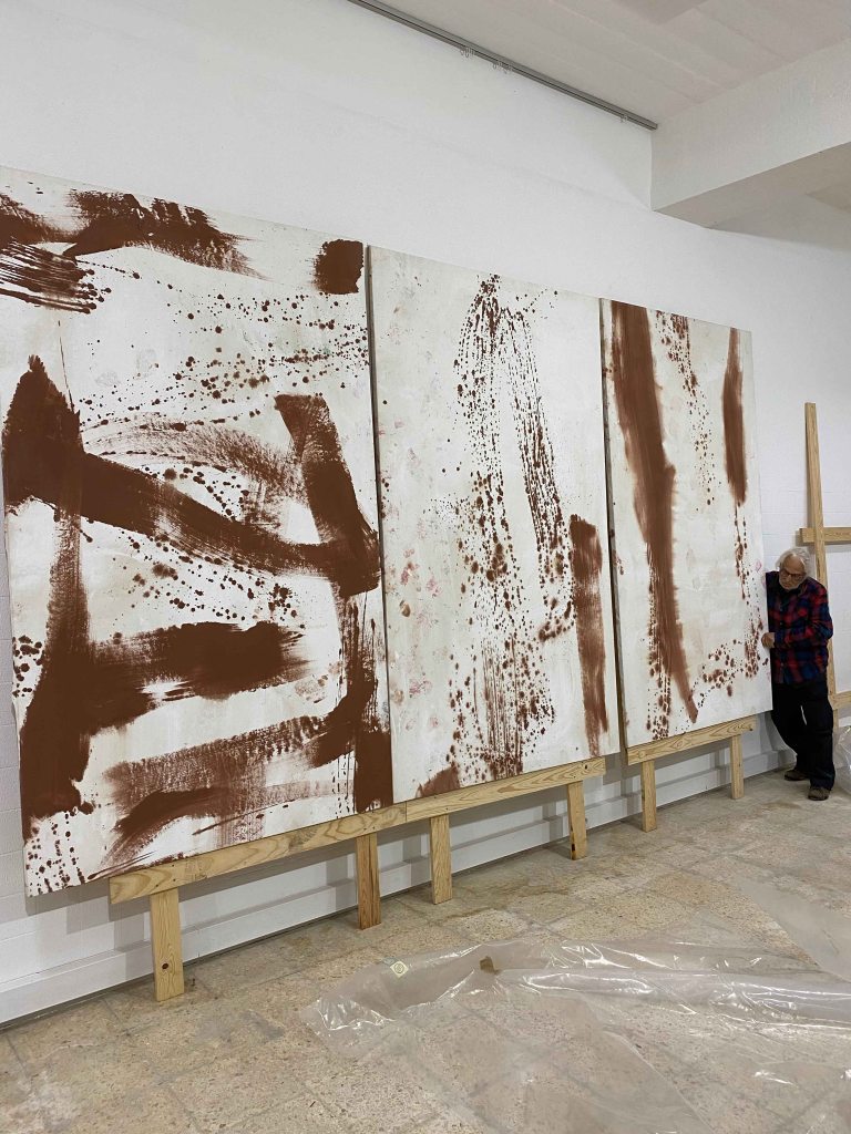
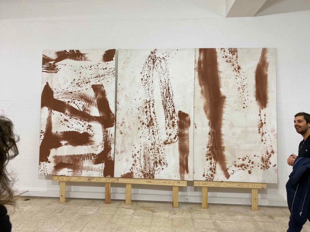
I am right now working on the art-specific piece for Assignment 4 in a corridor that is not possible to look at in one glimpse, so this could be one way to present images from the separate parts of the artwork.

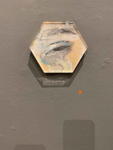
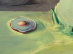
I really like this painting in only white and blue by A.R Penck from 1976 (Michael Werner Gallery).

I want to remember how the different figures in different sizes cohabit in flatness- without a sense of perspective.

(Penck, A.R. 2020. Artbaselcom/catalog/artwork/107230/A-R-Penck-Traudel. [Online]. [25 June 2020]. Available from: https://www.artbasel.com/catalog/artwork/107230/A-R-Penck-Traudel)

Looking at Pencks’ work quickly connects me to more viewing rooms with recognized modern masters and I am amazed at the amount of small works on paper on sale in the million dollar range. I try to navigate away from Matisse and Picasso towards more contemporary painting.

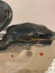
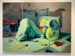
The works of Wu Chen (Magician Space Gallery) are somewhere between fairytale and grotesque, like this painting of a fat Christmas man posing nude on the bed in some red and fleshcoloured  boudoir with a mirror over him. The name “Portrait of the Male Female Male” figure also alludes to the classic female nude you would expect in a similar setting.

The reflection in the mirror looks more like a female body and the whole feels really strange.

(Chen, W. 2020. Artbaselcom/catalog/artwork/107368/Wu-Chen-Portrait-About-the-Male-Female-Male-Figure. [Online]. [26 June 2020]. Available from: https://www.artbasel.com/catalog/artwork/107368/Wu-Chen-Portrait-About-the-Male-Female-Male-Figure)

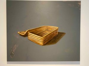
I stopped to take a look at the ceramic bowls by Urara Tsuchiya (Union Pacific Gallery).

These bowls are full of little nude figures, and some animals intertwined in some unclear postures, opening up some strange narrative. I see that I am always drawn to story and these tell a strange story in a slightly uneasy way while at the same time posing as a colourful decorative item.

(Tsuchiya, H. 2020. Artbaselcom/catalog/artwork/107778/Urara-Tsuchiya-Henry. [Online]. [26 June 2020]. Available from: https://www.artbasel.com/catalog/artwork/107778/Urara-Tsuchiya-Henry)

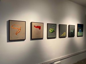
I found these small works on paper by Cameron Clayborn (Simone Subal Gallery) really attractive in their simplicity.

The one on the left is called “a puddle with promise” which I find so fitting.

(Clayborn, C. 2020. Artbaselcom/catalog/artwork/109738/Cameron-Clayborn-a-puddle-with-promise. [Online]. [26 June 2020]. Available from: https://www.artbasel.com/catalog/artwork/109738/Cameron-Clayborn-a-puddle-with-promise)

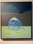
The same artist presents several inflatable sculptures, like this pillow like one, which also sparks my imagination with its cow like pattern- I can start spinning a lot of ideas from here.

(Clayborn, C. 2020. Artbaselcom/catalog/artwork/111841/Cameron-Clayborn-inflatable-5. [Online]. [26 June 2020]. Available from: https://www.artbasel.com/catalog/artwork/111841/Cameron-Clayborn-inflatable-5)

The Galerie Guido W. Baudach shows several painters that I found worth looking into.

Tamina Amadyar’s clean, abstract painting felt so soothing after the overload of narrative .

(Amadyar, T. 2020. Artbaselcom/catalog/artwork/104303/Tamina-Amadyar-overlook. [Online]. [26 June 2020]. Available from: https://www.artbasel.com/catalog/artwork/104303/Tamina-Amadyar-overlook)

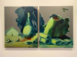
This painting by Yves Sherer looks abstract at a first glimpse, then it looks like a patterned piece of cloth stamped into the ground, scratched and abandoned.

The title “Sirens (Teotihuacan)” can maybe speak about mermaids or maybe about the wailing signal of sirens, and then the name of an Aztec civilization that has disappeared. There seem to be as many layers of meaning here that there is of paint. The pattern on the cloth looks a little like a map, but the whole then scratched and torn.

(Sherer, Y. 2020. Artbaselcom/catalog/artwork/104009/Yves-Scherer-Sirens-Teotihuacan. [Online]. [26 June 2020]. Available from: https://www.artbasel.com/catalog/artwork/104009/Yves-Scherer-Sirens-Teotihuacan)

This painting by Andy Hope from 1930 finds its way my heart with the shriveled figure with twisted eyes and a little unlucky shape.

(Hope, A. 2020. Artbaselcom/catalog/artwork/103915/Andy-Hope-1930-HEEDRAHTROPHIA-8. [Online]. [26 June 2020]. Available from: https://www.artbasel.com/catalog/artwork/103915/Andy-Hope-1930-HEEDRAHTROPHIA-8)

Meiro Koizumi’s works  (Annett Gelink Gallery) are called “works on paper” and I am not sure if they are drawings or overworked photographs.

I am drawn in by the fog covering the figures faces creating a sense of mystery- I want to know more. An internet search shows that this Japanese artist is mainly working in video, exploring the domain between public and private. It is true that these scenes look like stills from movies.

(Koizumi, M. 2020. Artbaselcom/catalog/artwork/108829/Meiro-Koizumi-Fog-12. [Online]. [26 June 2020]. Available from: https://www.artbasel.com/catalog/artwork/108829/Meiro-Koizumi-Fog-12)

Here I found a painting that I really like by Kudzanai Chiurai (Goodman Gallery)- a black figure almost not standing out from the black background and a foreground with different types of texts. The posture, the dull colours, the sharp contrast between light and dark, the combination of figure and text- I really appreciate this painting.

(Chiurai, K. 2020. Artbaselcom/catalog/artwork/103051/Kudzanai-Chiurai-A-few-hours-later. [Online]. [26 June 2020]. Available from: https://www.artbasel.com/catalog/artwork/103051/Kudzanai-Chiurai-A-few-hours-later)

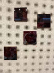
Gallery ChertLuedde presented a long series called “20 th Century alienation” of photographs by David Horvitz showing the same masked person with gloves holding different white sheets of paper with words .

I am not so attracted to the visual here, but I really like the idea and can see more words emerging in my own work.

(Horvitz, D. 2020. Artbaselcom/catalog/artwork/113146/David-Horvitz-20th-Century-Alienation. [Online]. [26 June 2020]. Available from: https://www.artbasel.com/catalog/artwork/113146/David-Horvitz-20th-Century-Alienation)

By now, the Viewing Rooms have already closed, so I turn to an online search of the artists highlighted by the organizers, picking out the ones working with drawing or painting, which is what interests me most.

Carrie Mae Weems (Photography and film)

Deanna Lawson (Photography)

Theaster Gates (Installation, Performance, Dance, Sculpture)

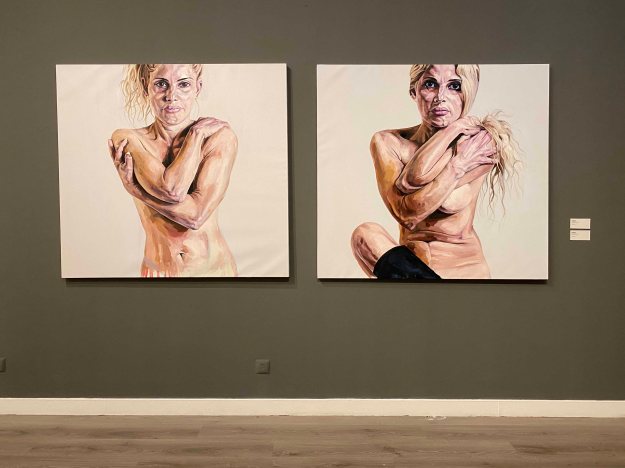
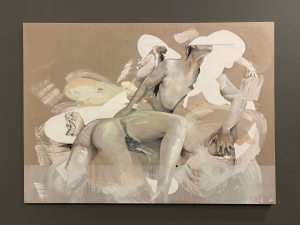
Nicole Eisenmann is the first painter included on the list. She paints the figure because she knows the world through her body, and understands her desires and anxieties through her body, and also the desires and anxieties of our culture.

This painting from 2020 is called “Shitstorm”, which is a very evocative title.

The figures look like from caricatures and are often limp or lying, many charged with sexual motives , and many others with words. I like the artists titles, like “Incelesbian” or “Ridykelous”.

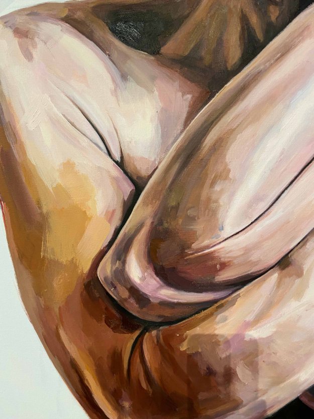
I find this painting below interesting because of the unusual cropping.

Kern, A. 2020. Anton Kern Gallery. [Online]. [27 June 2020]. Available from: https://www.antonkerngallery.com/artists/nicole_eisenman

Nicole Eisenmann has also created several large scale sculptures. As a whole, this caricature style does not capture me, although I enjoy the artists irony and playfulness.

Monica Bonvincini (Sculpture and performance)

Jeffrey Gibson is the second painter of the list, even if he also works in sculpture and performance. He merges history and ritual from several different traditions to describe the world we live in today, and especially uses the aestetics of Native American cultures.He uses a lot of pattern and text in his paintings.

I was immediately drawn to his painted punching bags. They are multicoloured, multi patterened creations hanging in the room, often also containing a message in text, like here “One becomes the other” and “I put a spell on you”

(Sam. 2020. Seattle Art Museum. [Online]. [27 June 2020]. Available from: http://gibson.site.seattleartmuseum.org/)

With these he is fighting using words and ideas rather than fists and guns, he wants to spark the conversation to be more inclusive.

I really like painting on objects myself and found this combination of idea, object, painting and text brilliant.

Wade Guyton is mainly making digital paintings on canvas using scanners and digital inkjet that are then worth millions of dollars. So he is combining the traditional support of painting with new technology. On MoMA’s website, his art is being describes as “post-conceptual”.


(Image from: Dzewior, Y. 2020. Museum Ludwig. [Online]. [1 July 2020]. Available from: https://www.museum-ludwig.de/en/exhibitions/archive/2020/wade-guyton.html)

The letters X, U and flames are recurring themes, and in the later works- large black and white surfaces.

Again, this is not a style of painting I would like to explore myself.  Although I am aware of the impact and possibilities of digital technology, I am actually drawn to the exact opposite- the non-technological, tactile, physical qualities of paint and also the conceptual- how to express an idea through paint.

Cecile B. Evans (video, installation, sculpture and performance)

It was interesting to then jump to Cecile B Evans work which is exploring how we value emotion in contemporary society, and precisely how digital technology has impacted that.

There is an excellent interview with Evans on the Luisiana Channel : https://channel.louisiana.dk/video/cecile-b-evans-virtual-real

Although video is not my chosen media, I found a lot of the artists ideas around how technology influences us and how it regulates our emotions, very relevant and exciting.

I am moving on to the artists described as “Young Voices”

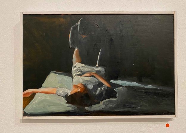
Issy Wood is both a writer and a figurative painter.

(Images from:   Ishikawa, C. 2020. Carlos Ishikawa. [Online]. [1 July 2020]. Available from: http://www.carlosishikawa.com/artists/issywood/)

Her paintings are surreal and dark, with obscure narratives that leaves me with an uneasy feeling. I can understand a certain fascination that these paintings have. Looking at exhibition views, I find it interesting how Wood alternates large paintings with really small ones.

Chen Tiangzhuo (performance video work and installations, music)

Hana Miletic (Textiles)

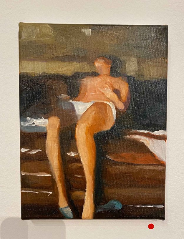
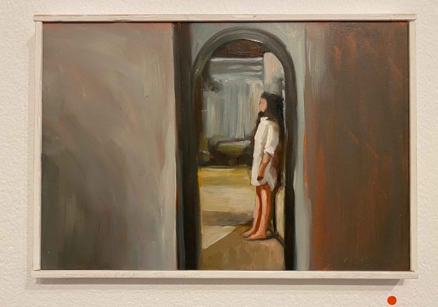
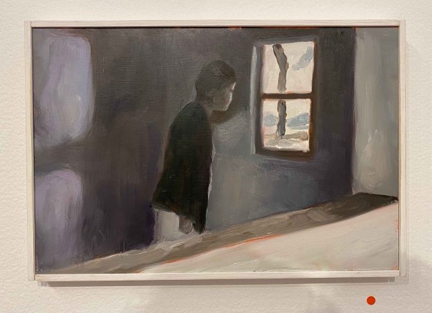
Jonathan Lyndon Chase is a painter focusing mainly on queer. black bodies.

I am quite fascinated by the boldness of these flatly painted, unfinished, unproportional figures. In the painting on the left, I find the unfinished bits and how fragmented the figures become really interesting. In the painting on the left, I am interested in the colour and movement of the figure.

Paul Mpagi Sepuya (Photographer)

Rafa Esparza (Performance and installations using bricks) Rafa Esparza also uses the adobe as supports for his paintings. His work centers around the theme of brown and queer.

As a whole, I am not convinced researching the Art Basel Viewing Rooms and the artists mentioned there was the best approach for an interesting online art visit. I spent a lot of time navigating between rooms and feeling quite overwhelmed with the amount of art, without really seeing much that I felt really touched by. I also had a feeling that I missed many things that would have been really interesting, but I did not chance upon them. Of course this would have been another experience in the flesh and probably incredibly inspiring. For my online art visits, I need to be more focused and clear about what I am looking for and looking at to really appreciate it.


Duarte Vitoria at Espaço Exhibitionista, Lisbon

After what feels like a very long lockdown due to Covid 19, I am back in Lisbon and am visiting a fist exhibition again: Duarte Vitoria at the Espaço Exhibitionista Gallery.

This is one of my favorite Lisbon galleries, showing a new exhibition of contemporary Portuguese artists every month.

In this exhibition, Duarte Vitoria presents drawings and paintings of female figures. They are unsettling, distorted, foreshortened.

In some of the paintings, the skeleton seems to protrude beneath the skin. In others, the figures are contorted and seem in agony.

Some seem to have a sexual note, but it is unclear what is happening.

In the exhibition catalogue, well known Portuguese writer Valter Hugo Mae describes the work as ” a study on the extremes in physicality. They approach the near abnormality of gesture, searching as the demanding choreographer, for the unforeseen or at least perceptible movement in our daily reading”.

I find that as unclear as the feelings I have when seeing these paintings.

There is definitely a feeling of anguish and some irritation.

A series of drawings in charcoal are the works that I prefer, and I am told they are drawn with live models, starting as blind drawings, with the artist not looking at the paper.

I can see anguish and pain and the direct eye contact with the viewer has something of a call for help.

I was puzzling if these two half figure portraits are of the same woman in different roles, with almost the same expression. The titles “Squeeze” and “Memorie” do not give any clue. The way of applying paint is rough, with large patches of colours:

The skin tones are picking up the tone of the background so that the figures seem flatter and paler, again staring straight to the viewer, but here with a more defiant look, almost arrogant.

There is an unease in the poses that is very clearly transferred to me, the viewer. I feel like an uninvited onlooker in some intimate, intriguing and anguishing setting.

Rebecca Fontaine- Wolf, Between Worlds

Yesterday I visited the exhibition “Between Worlds” by British painter Rebecca Fontaine Wolf in the Espacoexhibitionista Gallery in Lisbon.

I already loved the diversity of formats, surfaces and shapes that the artist used- smaller works behind perplex glass, ovals, large format linen canvases or very small canvases.

It was also a combination of figurative works and some abstract. I feel how I immediately relate to these works with the female figure. The title “Between worlds” relates to the artist being between different stages of her life, and also to being a woman and experiencing different cycles of life.

Several of the paintings contained self portraits of the artist, like here “Blood Moon”, combined with an abstract painting, which also had some triangles symbolizing womanhood.

The second self portrait  ” Milk Moon” was hanging on the opposite wall.

Together these two portraits captured two different sides of the artist, two different phases or moods.

Another portrait that spoke to me strongly had a smear over the eyes that pulled in my attention. A quick effect, but I felt how it really worked here, in combination with the squares and lines behind the head.

I am quite fascinated by this combination recurring in all the paintings, of figure and some abstract colour fields and lines. I especially like how the artist knows exactly when to stop- and leave parts of the linen canvas untouched.

The oval painting of a serpent seems a little more illustrative and different from the rest, but the title ” Moon Serpent” ties it to the other “Moon Paintings”.

The largest and more monochrome painting contained several female figures, intertwined into impossible postures.

There is a lot of confusion and pain in this painting, some anxiety in the hands grabbing or even digging into the flesh. I can relate to the feelings that this painting expresses for me.

I also really liked this little series of close ups of the expressions in the faces painted on wood and then covered by a dark sheet of perplex- a technical idea to remember!

The artist used wood and perplex for some other smaller paintings too, in interesting different shapes, like the oval eye beside her name on the top image by the entrance, or like here in a hexagonal.

I am definitely fascinated by the way Rebecca Fontaine Wolf applies paint. First thing to remember is to leave parts uncovered. Then she combines acrylics with oil paints and boldly leaves parts in charcoal drawings:

I am intrigued by the way the paint pearls- is she applying acrylics on top of oil paints or what is happening here? Something to explore…

This was a wonderful art visit for me- I felt inspired by the subject and by the many technical new ideas I carried away. I heard that the artist is staying in Portugal for art residencies and hope to catch more of her work soon.

Teresa Murta at NAVE Gallery, Lisbon

Last week, I visited the opening of Teresa Murta’s individual exhibition “Absurdo” at the NAVE Gallery, Lisbon.

Teresa Murta paints in acrylics on canvas and the motives are absurd, almost abstract but with some elements that are seemingly recognizable.

The shapes seem organic, or some sorts of containers, and sometimes look like some species of creatures.

The painting below looks like some sort of box, but becomes absurd melting as well upon closer inspection and it remains unclear what it really is:

I found myself trying to make out shapes and put some sense to them, rather than just enjoying the forms.

Some elements, like the egg, keeps recurring like a surrealist symbol in several of the paintings.

There is a feeling of being in a world after some catastrophe in several of the paintings, like surreal abandoned machines scattered.

I have difficulty relating to these absurd machine or organic worlds, except maybe with a certain unease.

The paintings below, especially the one on the right were probably my favorites because they felt more like imaginary creatures with a certain expression on them, that could spark my imagination.

According to the exhibition catalogue, the paintings “go beyond reality and caress our sensitivity”. “Facing Teresa Murta’s work is a plunge into a world where the reality of simple and pure things is contaminated by the though that lives in our eyes.” (exhibition catalogue)

I had a conversation with the artist, asking her if the recurring elements, like the egg or sponge, have a specific meaning. She replied that the works are all totally process based. She never has an idea or sketch before she starts, she just starts with abstract shapes and colours, and then sees if her brain can recognize some of the forms, that she then develops into something more readable.

I am not very attracted to this type of absurd art, but had a wonderful evening and learned a lot just from talking to a passionate artist who works in a very different way.


Artist days at Esquina Atelier, Lisbon

Esquina Atelier is a small artist driven artist residency and gallery space in Lisbon. February 6-8 they created an event called ” Come exhibit with me” where all four residents decided on artist friends to create a group exhibition. I was lucky enough to be invited to show some paintings here in this small, cozy and fun event.

Felipe Fernandes is a graffiti artist whose name “Pura poesia” is to be seen all over Lisbon. Because of this, he is the most well known artist of the group. In this exhibition, he showed “visual poetry” which is always consisting of lines or words on dark backgrounds.

“Pain” and “poesia” are the most recurring words. I enjoyed the versatility of the supports Filipe used and the different ways he exposed the pieces- some on paper, some on textiles, some large and some very small strung together in series.

Most of all, I liked one corner where he displayed a row of artists books:

The books are made out of drawings in different sizes and papers and although the motive of the lines and words on dark were quite similar, the juxtaposition of the different papers and textures and slight variation in lines made the subtle differences clear.

The lines themselves become a coded language and the few words we can read, like “rehab notes” or “pain” sets the context. I found this an exciting inspiration for the format of the artists book I will make later in the course. It was interesting to note how important the tactile experience became with the different qualities of paper.

Marta Simoes showed some colourful landscapes in oil:

More interesting were her drawings of clouds in liquid graphite:

I believe these rather quick works could have benefited from a more careful presentation maybe.

Fransisco Marques is a more classical painter. I really loved his very dark portrait “The Old man” (with horns) painted in many layers of oil over a long period of time:

This photo really does not do the painting justice. It is alive from the incredibly richness of different tones of black.

His graphite drawing also has an incredible amount of small detail and different layers of narrative:

I was surprised by the very different feel of Francisco’s other oil painting of a sort of clay figure with a crudely drawn face:

I really liked the body of work of Constanca Sardinha, which is very different from any of my own drawings. She sits on various buses through the city of Lisbon with a pen poised over a piece of paper and lets the movements of the bus create a random drawing. I was quite captivated by the method and the delicate drawings that resulted from it. Back in the studio, Constanca interprets what she sees and feels when looking at the drawing and collages fitting words that she cuts out from old magazines or school books.

It was interesting to discover how different I felt about the drawings before and after knowing about her method. The fact of the marks being random increased their attractiveness with a strange fascination. They also had a very different impact depending on the size and the presentation alone or in small groups.

The next artist wanted to remain anonymous and presented only as “the friend of Francisco”. Apparently he always exposes his work without revealing his name to avoid being caught up in becoming popular. Possibly he is also a graffiti artist. I am not even sure he was present at the opening.

I enjoyed his rather delicate ink drawings, mainly of patterns that looked like shavings of wood in different shapes. I also really liked the way they were framed behind glass without any background.

I also really liked this portrait in subtle tones that looked like done with rubbing of charcoal, a way of drawing that I am exploring right now for part 2 of the course.

I showed some mono prints in oil that looked very different on the patterned tiles of the room:

I also showed an oilpainting of my pregnant daughter on cardboard presented on an easel:

Here I am posing with my granddaughter in front of a painting in acrylics on paper:

And at last a small painting in oil on aluminium:

It was a very fun evening and we all received so much encouraging, positive feedback. It felt really good to co-create a small event like this with other artists. This is all very, very new for me. It was only three months ago that I dared upload some of my paintings on Instagram and to actually show something live felt like a leap. This first experience was so positive though, it is definitely worth to dare and to invest some time and energy in communicating and connecting.

Gabriel Garcia at Espaco exhibitionista

I recently visited the beautiful exhibition of Portuguese painter Gabriel Garcia in the Espaco Exhibitionista gallery in Lisbon.

The title of the exhibition is “Who throws the First Rock”, which was presented in golden letters on a wooden table, with stones around- a beautiful moment in itself. I liked how this added a three-dimensional piece to the exhibition who was otherwise only paintings on the walls.

Two walls presented really large paintings of men hiding their faces in hoodies or ties in a rather desperate move, hiding or maybe punishing themselves in some ways.

The stones were present on the ground of the paintings.

I was even more affected by another series of mid size paintings showing a disrupted narrative, hands washing themselves in a sink for example. A very simple gesture, but given the title of the exhibition and the dark tone of the paintings, they seem to be washing off a sin.

The whole back wall was occupied by a double row of very small oil paintings.

They seemed to be painted from very different snapshots, of domestic scenes, of terrorist attacks, of someone longingly looking through a window. At first glance they were rather usual scenes from images I would feel frequently confronted with. Looking longer, I was taken by a very dark feeling though. All the paintings have a heavy, desperate, given up or aggressive tone.

I liked that the stories here remain so unclear, that we as viewers have to add our own imagination to complete the narrative. There is a certain despair in the paintings that I felt uncomfortable feeling, at the same time as I admire how Garcia manages to make me feel so strongly.

As an artist I was pleased to see the red dots of “sold” on almost all the paintings, which felt encouraging.


Studio visit: Vitor Pomar

Today I went for a visit organized by ArCo, Centro de Arte e Comunicacao Visual to the Lisbon studio of the famous abstract artist Vitor Pomar.

It was the first time I went for this type of a visit and it was just beautiful to see the working space and works in process by an artist whose paintings I had previously seen in museums, mainly in Fundacao Gulbenkian.

Vitor took advantage of the many strong arms available to move around paintings between the studio and the storage.

His paintings are huge, all in acrylics and very colourful after a brief black and white period in the 60/70’s.

Generally, I have difficulty engaging with abstract art, and so also with Vitor Pomars oevre, especially the very colourful ones with very varied marks. I felt more attracted to the newer works with fewer marks and mainly one colour of marks on one colour of background, like the ones being moved above.

He works on linen, and on this particular one on the floor that looked very different from most other works, he used a transparent gesso to let the linen shine through, an idea that I really liked and will use:

It was interesting to feel how my perception shifted when Vitor described the work and the titles. This last series is the one I could engage most with- titled 9/11 about the falling twin towers:

It was an exciting and inspiring visit and I would love to move around paint on huge canvases in a huge space like Vitors 🙂

ANOZERO 19- COIMBRA BIENNALE

On my way back from Porto to Lisbon, I had the chance of a short stop in Coimbra, to see some of the exhibitions for the “Anozero 19” Biennale.

Coimbra is a very old and beautiful university town, well worth a visit.  The Biennale was spread out through  the university buildings , and I would add a little hard to find! I saw a lot of interesting science exhibits in the Science department  before making my way to  some of the art works for example.

The theme of the Biennale was centered around the impact of the river Mondego in the city, and articulated through  5 words : silence, passage, marginal, invention, militancy- a theme broad enough for very varied  perspectives.

I started by seeing the part of the Biennale located in the Arts department of the University- in an amazing historical building with extremely  high ceilings and an inner courtyard.

This large format photograph stood out immediately with the shadows of the plants creating another layer over the faces, in a dreamy atmosphere. They eyes of the figures are closed and I possibly thought them blind, the pose is strange and the expressions unreadable, so it is unclear what is happening here.

This work is by Polish artist Joanna Piotrowska , who explores ambivalent and dysfunctional family relationships through these delicate, dreamy staged scenes in black and white photographs.

The next room showed large scale paintings by the Portuguese artist Joao Gabriel, especially commissioned for the Biennale.  The subjects are taken from screenshots  from gay porn movies from the 70s. The paintings are large scale, so the blurry bodies are almost life sized.

The subjectmatter  and the blue-brown colour scheme reminded me of paintings by Patrick Angus.

I really like how little detail Gabriel gives to the figures, they are faceless and painted in rough, seemingly quick brushstrokes.

There is a boldness in the approach , and in how much he dares to leave unfinished, like the head here only outlined, that I really like.

I have a tendency of becoming much too detailed and overworking my pieces, so this was a refreshing approach.

This  little panel of a bird in the streaming water, painted in large brushstrokes on a crooked piece of cardboard, was the only painting without the human couples, and I liked how it also had a smaller scale, and offered a welcome break in the display .

French artist Mattia Denisse used green table tops and posters on the walls to exhibit a large amount of imagined books that “will  be printed in the future”.

They cover a large area of subjects, from scientific books of imagined subjects to historical novels of imagined facts.

I  really enjoyed the humour, with absurd scientific tables or wordplays.  I also really appreciated the skillful combination of drawing and text, or geometrical schemes in an appealing graphic language.

I am not sure the presentation gave the best of the work. The identical format and repetition was less interesting to look at than an exhibition with varying formats and maybe frames to create highlights and some tension. But maybe this sloppier newspaper way showed another  aspect of how we are flooded by information that looks easy to either absorb or oversee, and it is only on a second or third look that you catch the absurdity or the humor in it.

I almost missed the installation of Bruno Zhu in the midst of the artefacts in the Science department, as I took it for a permanent exhibit.

Surrounded by instruments from historical times, he installed modern, small every day utensils on some white clean especially crafted pouches, thus elevating nail clippers or dish washing brushes to a historical object to look back at from the future. It was an interesting way to look at objects we take for granted with a new perspective, elevating them to a collection of curiosities.

On my hunt for more artworks, I saw a whole geological exhibition of interesting mineral formations, but unfortunately did not make it to any further exhibitions from the Biennale before having to return to Lisbon. These glimpses were rewarding though, and I will make sure to return with more time next time.

PAULA REGO – the Cry of imagination, at SERRALVES in PORTO

Simultaneously to the exhibition of Olafur Eliassson’s work at the Serralves Museum in Porto, I was delighted to discover a whole building dedicated to Paula Rego.

I love the way Paula Rego tells stories through her drawings and paintings and have visited her “Casa das Historias” in Cascais several times, which I documented in previous blogposts. (Shortlinks: https://wp.me/papvz2-e4 and https://wp.me/p94hP8-cD)

The exhibition started with a series of etchings , “the Pendle Witches” about the trial of witches in British history.

Paula Rego is often dealing with the role of a woman in society as a subject, through stories and literature that she transforms into images, or by telling her own story very openly, about depressions and abortions, about her family life.

I like the real expressions and quite awkward poses of the persons. I know from the movie “Paula Rego, Secrets and Stories” by her son director Nick Willing “, that she is using the same model, her assistant, who looks quite similar to the artist for the majority of her works.

In this second etching, I really like the emptiness, the feeling of some unfinished pieces creating space around the figure, and again , the quite awkward dynamic pose.

The painting “The strap” from 1995 had a whole room dedicated to it, which amplifies the vulnerability and loneliness of the figure.

This painting lives from the expression and pose of the figure, at the same time bewildered or angry and a little desperate, in a pose that is tense and awkward. The background gives little clues to what is happening, which also focuses the attention on the face and the cramped hands pulling on the underwear. It looks rather like the girl is trying to pull her panties longer to cover herself more, than that she is trying to take them off.

The work is in pastel on paper, and I take some close ups here to look at the mark making.

Paula Rego prefers to work in pastel to avoid expressionistic brushstrokes, but I find the marks here take on a similar quality, with rough strokes echoing the expression and tense pose, contrasting to the smeared parts of the background.

I recognized the small work “the Merman” from a visit to Cascais .

I find there is so much expression in this creature half human, half imagined or animal , with the hand reaching between the tails. I observe how parts are colored and others left untouched.

I like how Paula Rego often combines animals with human figures. This very full and loud painting from the 80’s is full of imagined beings.

It feels quite chaotic at first, but the diagonal composition with the body and penis of the spider figure pointing to the right bottom corner where figures point back up lead the eye.

I do prefer the calmer paintings though. In “Playroom” from 1986, I really enjoy the mirrored composition, with the two clear fields of complimentary colours red and green, both with the same motive of a girl and a dog.

I want to remember this mirrored composition and the depth it creates for my own drawing. I also enjoy the contrast between some parts being very detailed and patterned, while others are left untouched with the bare paper shining through, like here in the hand. This is another aspect to remember as I have a tendency to overwork my drawings.

Finally, “Possession 1-7” ,a series of 7 large scale paintings, left a lasting impression.

The same figure is lying on the same couch with similar clothing, just the poses and the expressions changing. When stepping into the room and surrounded by these large paintings, they become quite oppressing. There is a sense of ennui, of boredom in the expressions rather than possession I find. There is a small note about the artists experience with psychotherapy, so that is probably the theme here, but the paintings can also just give a sense of time passing without much change, a feeling of being stuck, in thought, in a personality, in a place.

This series remind me of the series “Depression”, that I have seen in previous exhibitions. There the figure is also lying on a couch with the same or similar black dress, but the expressions are stronger, more desperate and evoked stronger feelings.

I was delighted to see some more of Paula Rego’s work today, especially as she is using much pastel on paper, which was a good reminder about this medium before embarking on the new drawing course. I feel inspired by her markmaking and compositions, and her unique way of narrative and the way she uses her own story in her work.

OLAFUR ELIASSON at SERRALVES, PORTO

Finally, I managed to see an exhibition by Danish- Icelandic artist Olafur Eliasson- an artist whose installations have become  known all over the world  (his exhibition at Tate Modern in 20013 drew 2 million visitors) and left me very curious of what I would actually feel when  seeing something in the flesh.

The theme of the exhibition at Serralves in Porto is “Y/our future is now” and as all Eliassons work is focused on the relationship between humankind, nature, art, science, architecture and society.

I started by exploring the sculptures in the park and first encountered “ The curious vortex” from 2019.

This is a huge stainless steel swirling vortex, erupting like a geyser . Standing inside the centre of the vortex and looking up towards the moving trees and clouds, I could feel a sense of movement, and see how this heavy structure evokes a sense of lightness and perpetual movement.

There was also a beautiful glittering added by the reflecting moving leaves, of the surrounding trees that also added a sound to the experience and reinforced the sense of it moving.

Further, three large black and white steel spirals form the work “Human time is movement (winter, spring and summer) . 

They looked like lightdrawings photographed with a long exposure and I liked this idea of  lines in space. There was something joyful in the movements of these sculptures, I felt a smile when looking at them. And yes, I could feel how the movement of my eyes along the forms became a n experience of time.

The work “arctic tree horizon”  composed of logs in the grass around the museum building did not have the same visual impact at all. Probably because they looked very much at home in a park with huge ancient trees around. It was not until reading about them and their significance that I paid attention to them.  Iceland has very little or no trees and yet these huge logs come floating ashore there, carried by the currents of the sea and drifting ice. Eliasson collects the logs and transports them to yet other surroundings . After knowing this, the work evokes thoughts about migration, circulation as well as about our ecological system.

Inside the museum building , in the central atrium, I could walk on a tiny path through the “Yellow forest”- a small artificial forest of birchtrees in pots. It was lit by a huge ring of yellow light that looked very warm and inviting. In the centre, this light altered my perception of colour and everything around looked either grey or yellow. 

The work is supposed to evoke the dreamlike space of the forest as a place of relationship between humans and the Earth. I missed the feeling of forest, although I grew up in the North of Sweden and have many memories connected to birch tree forests. Here the rather thin ring of rather scrawny trees still had a very artificial feeling and I reacted more to the large plastic pots that held the trees. Looking back at this work mirrored in the next one had a larger impact. Seen in the mirrors from afar, this oasis of warmth and trees definitely looked like an attractive, warm, safe place.

“The listening dimension (orbit 1, orbit 2, orbit 3) is composed of wall sized mirrors with large golden and black rings that makes it look much ,much larger than the room.

Seen from above it is  a peculiar geometrical space, but when walking down into it, and becoming part of the reflections, another level of  perception happens. My own image , as well as the one of the rings and the other visitors is reflected into infinity and looks as if it is moving. Here I am seeing my father who was with me reflected into infinity.

The sense of space and reality become unsure. I feel like I am floating in space with an infinite number of rings and elements floating around me.

I have read on Olafur Eliassons website that he has a studio in Berlin employing over 80 people, which  sounds an incredible endeavor in itself. I was really happy to have the opportunity to see some of his works, although having to big expectations maybe lowered my experience a bit. I would be very curious about my experience if I were to walk through the fog tunnel made of food additives at the Tate Britain.

In any case, I enjoy the sculptural and experiential way Olafur Eliasson addresses the subjects of our relationship to nature, to what surrounds us and calls for more awareness in a way that engages the viewer and makes him a part of the experience, also then someone with a part of the issues and a responsibility  to continue interacting.


Eliasson, O. 2019. https://wwwolafureliassonnet. %5BOnline%5D. %5B27 November 2019]. Available from: https://www.olafureliasson.net

 Go back and edit info