Last week, I visited the opening of Teresa Murta’s individual exhibition “Absurdo” at the NAVE Gallery, Lisbon.
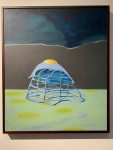
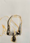
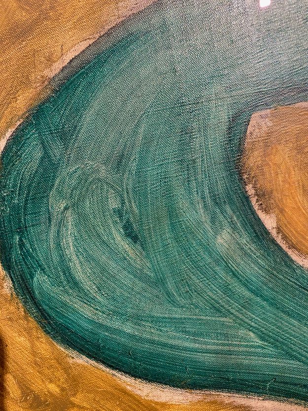
Teresa Murta paints in acrylics on canvas and the motives are absurd, almost abstract but with some elements that are seemingly recognizable.
The shapes seem organic, or some sorts of containers, and sometimes look like some species of creatures.
The painting below looks like some sort of box, but becomes absurd melting as well upon closer inspection and it remains unclear what it really is:
I found myself trying to make out shapes and put some sense to them, rather than just enjoying the forms.
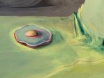
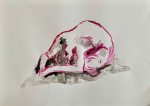
Some elements, like the egg, keeps recurring like a surrealist symbol in several of the paintings.
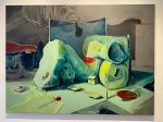
There is a feeling of being in a world after some catastrophe in several of the paintings, like surreal abandoned machines scattered.
I have difficulty relating to these absurd machine or organic worlds, except maybe with a certain unease.
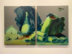
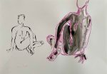
The paintings below, especially the one on the right were probably my favorites because they felt more like imaginary creatures with a certain expression on them, that could spark my imagination.
According to the exhibition catalogue, the paintings “go beyond reality and caress our sensitivity”. “Facing Teresa Murta’s work is a plunge into a world where the reality of simple and pure things is contaminated by the though that lives in our eyes.” (exhibition catalogue)
I had a conversation with the artist, asking her if the recurring elements, like the egg or sponge, have a specific meaning. She replied that the works are all totally process based. She never has an idea or sketch before she starts, she just starts with abstract shapes and colours, and then sees if her brain can recognize some of the forms, that she then develops into something more readable.
I am not very attracted to this type of absurd art, but had a wonderful evening and learned a lot just from talking to a passionate artist who works in a very different way.
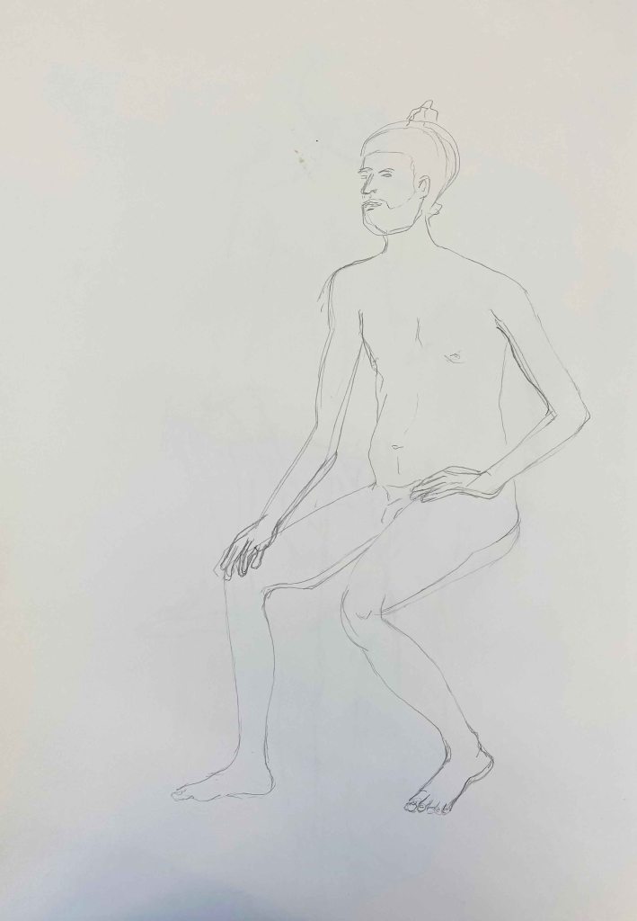
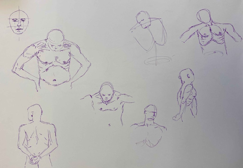
Lifedrawing in ArCo- Centro de Arte e Comunicacao , Lisbon 7th of March
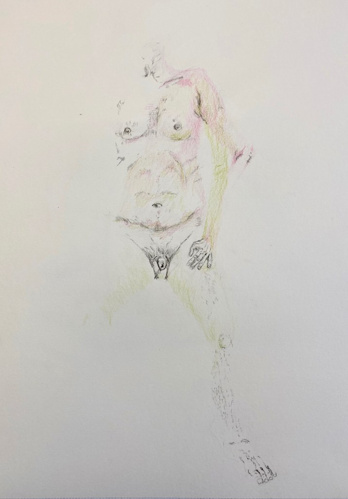
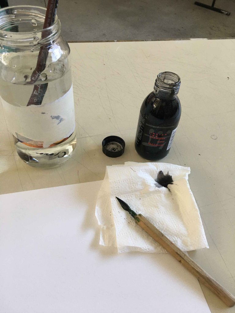
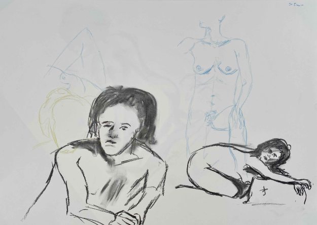
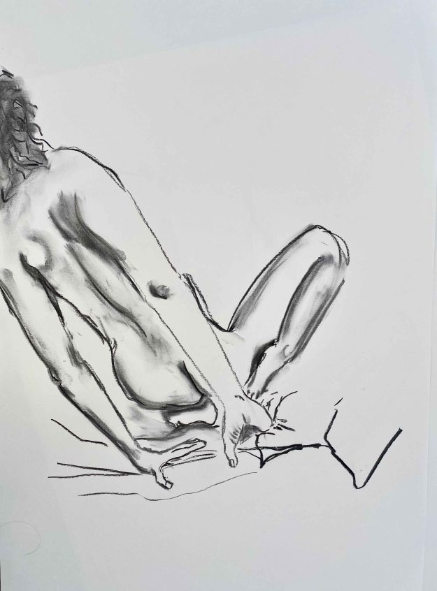
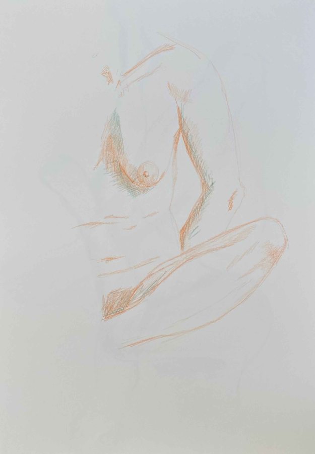
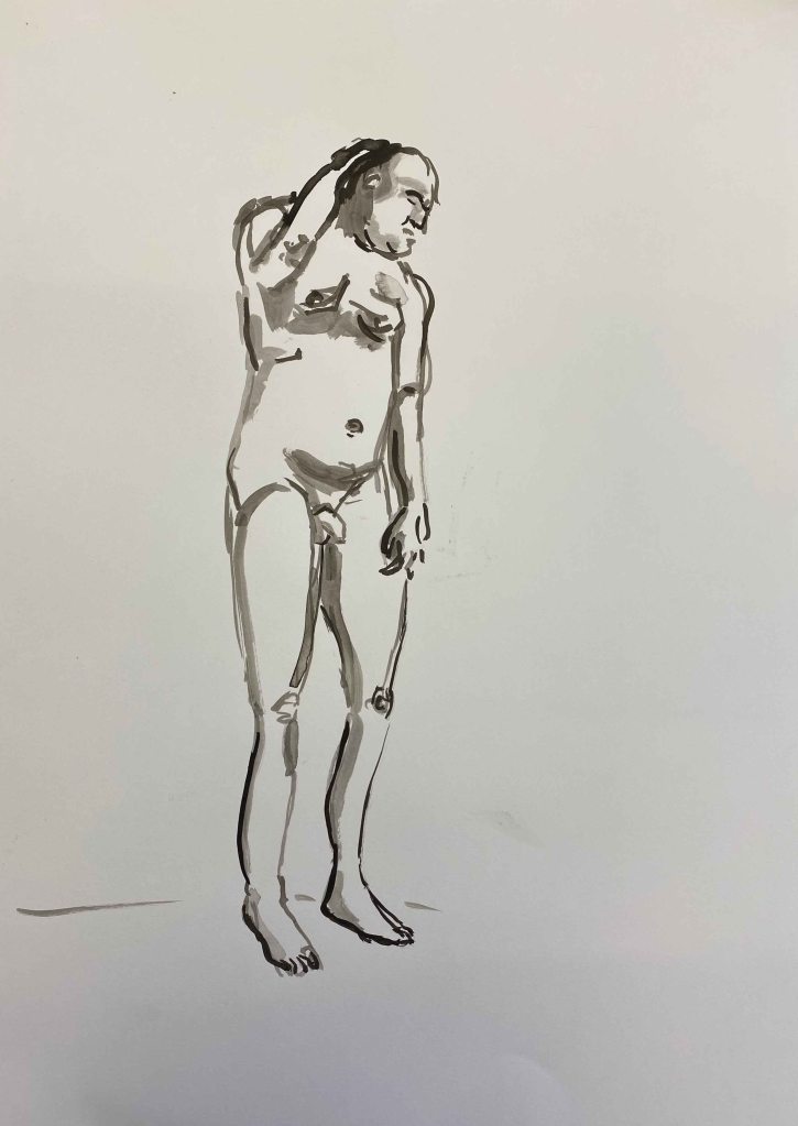
After a longer break, I am back to Lifedrawingclasses at ArCo in Lisbon. Today’s class was student led, meaning that we could all use the materials we wanted and decide together on the time of the poses. We started with a whole range of 5 minute and 10 minute poses. I started using Indian ink applied with a small stick, all drawings on A2 format:
And one drawing with water and dripping the ink onto wet parts:
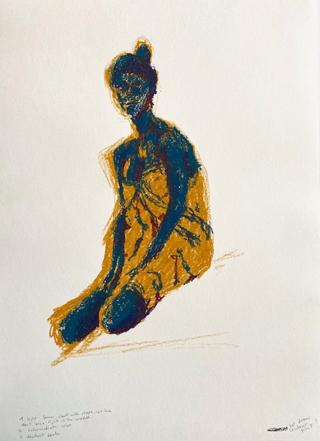
I continued using oil pastels with this same method of applying ink:
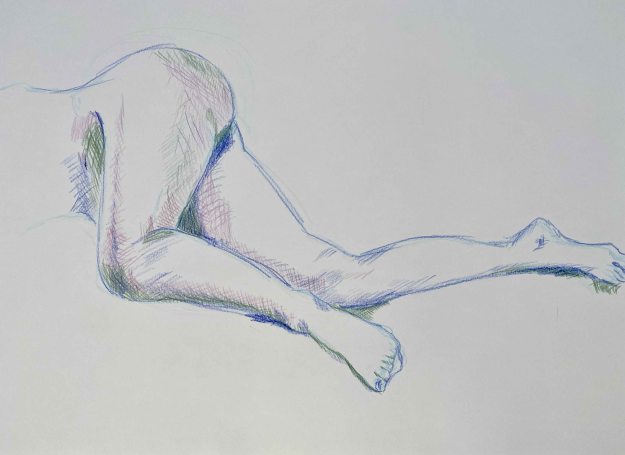
I really like the looseness of using ink. When I tried combining it with a neater pencildrawing, I got stiff and uninteresting immediately:
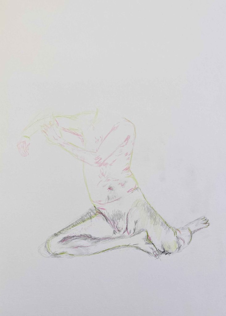
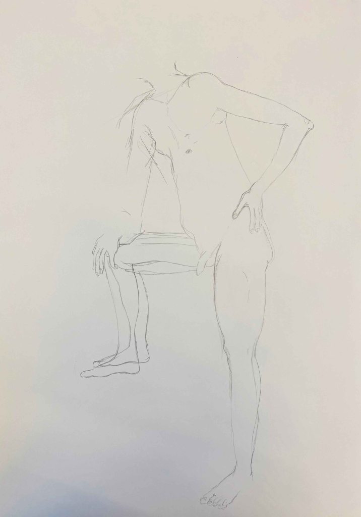
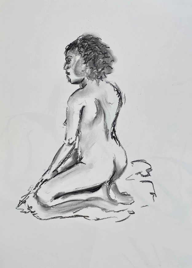
For the last pose, we had 20 minutes:
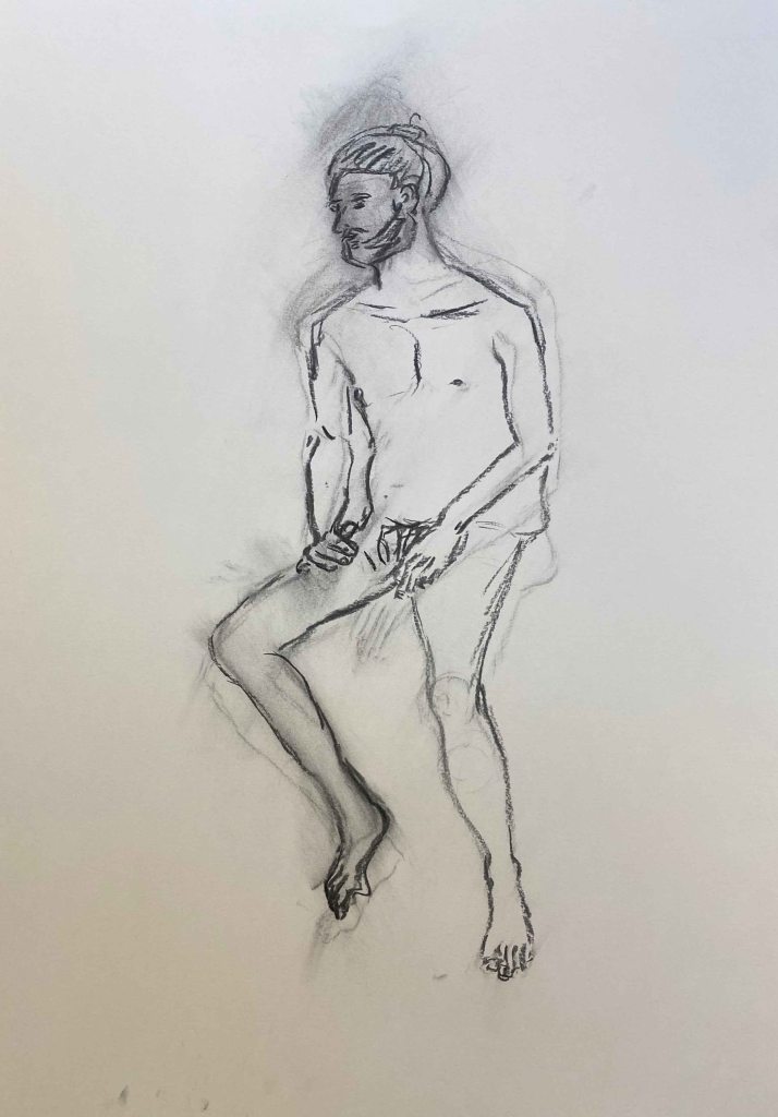
I felt happier with the quicker poses, and feel how I prefer applying ink loosely with a stick or using water. On the whole, I felt really happy to be back to lifedrawing. It was a fun and cooperative atmosphere between the students and the model and I found the poses challenging and interesting.
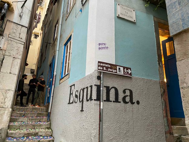
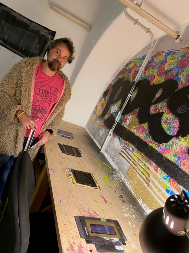
Esquina Atelier is a small artist driven artist residency and gallery space in Lisbon. February 6-8 they created an event called ” Come exhibit with me” where all four residents decided on artist friends to create a group exhibition. I was lucky enough to be invited to show some paintings here in this small, cozy and fun event.
Felipe Fernandes is a graffiti artist whose name “Pura poesia” is to be seen all over Lisbon. Because of this, he is the most well known artist of the group. In this exhibition, he showed “visual poetry” which is always consisting of lines or words on dark backgrounds.
“Pain” and “poesia” are the most recurring words. I enjoyed the versatility of the supports Filipe used and the different ways he exposed the pieces- some on paper, some on textiles, some large and some very small strung together in series.
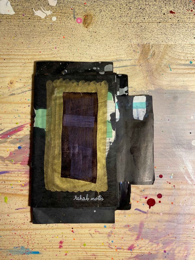
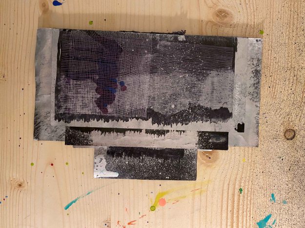
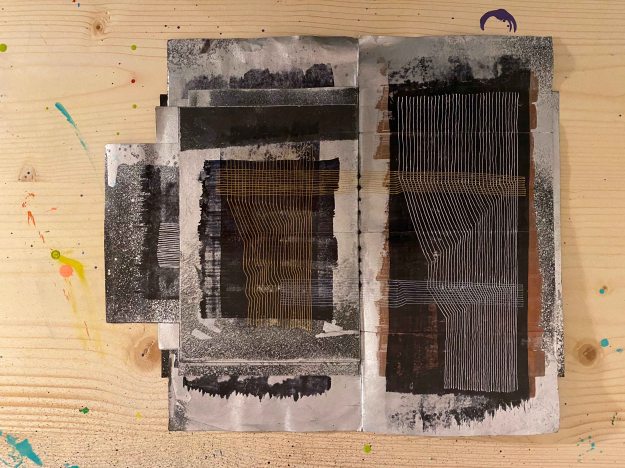
Most of all, I liked one corner where he displayed a row of artists books:
The books are made out of drawings in different sizes and papers and although the motive of the lines and words on dark were quite similar, the juxtaposition of the different papers and textures and slight variation in lines made the subtle differences clear.
The lines themselves become a coded language and the few words we can read, like “rehab notes” or “pain” sets the context. I found this an exciting inspiration for the format of the artists book I will make later in the course. It was interesting to note how important the tactile experience became with the different qualities of paper.
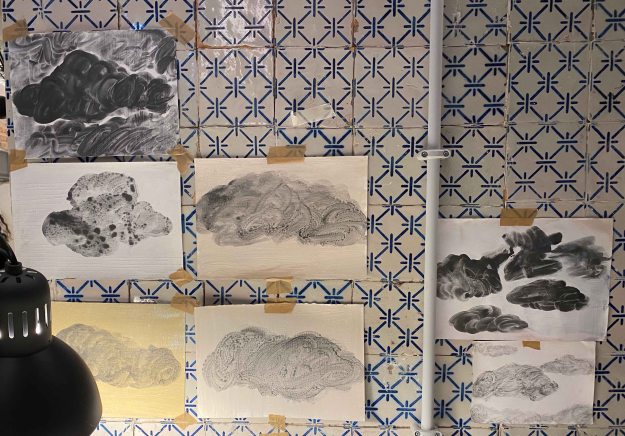
Marta Simoes showed some colourful landscapes in oil:
More interesting were her drawings of clouds in liquid graphite:
I believe these rather quick works could have benefited from a more careful presentation maybe.
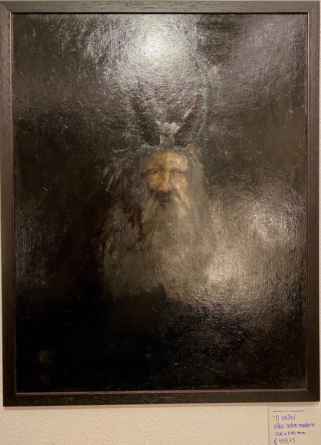
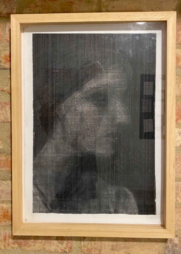
Fransisco Marques is a more classical painter. I really loved his very dark portrait “The Old man” (with horns) painted in many layers of oil over a long period of time:
This photo really does not do the painting justice. It is alive from the incredibly richness of different tones of black.
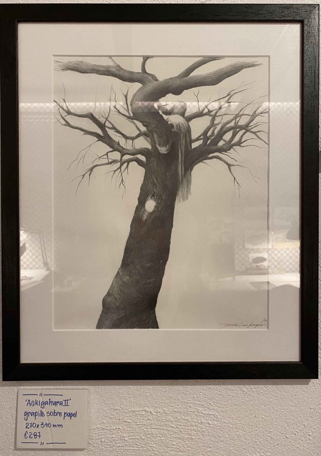
His graphite drawing also has an incredible amount of small detail and different layers of narrative:
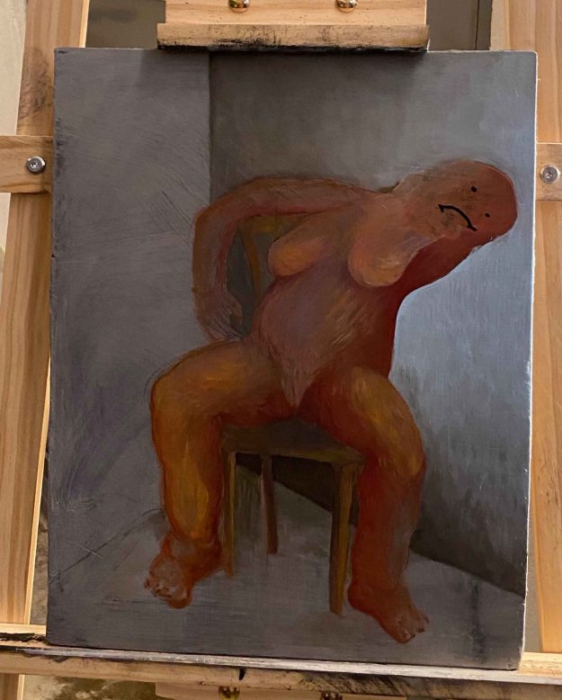
I was surprised by the very different feel of Francisco’s other oil painting of a sort of clay figure with a crudely drawn face:
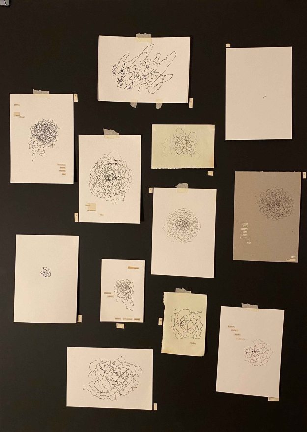
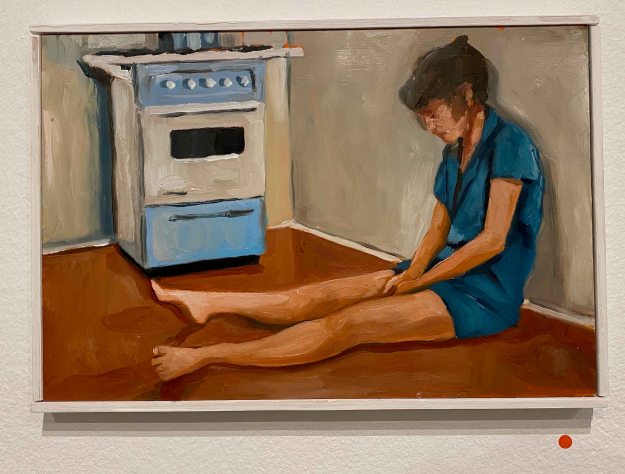
I really liked the body of work of Constanca Sardinha, which is very different from any of my own drawings. She sits on various buses through the city of Lisbon with a pen poised over a piece of paper and lets the movements of the bus create a random drawing. I was quite captivated by the method and the delicate drawings that resulted from it. Back in the studio, Constanca interprets what she sees and feels when looking at the drawing and collages fitting words that she cuts out from old magazines or school books.
It was interesting to discover how different I felt about the drawings before and after knowing about her method. The fact of the marks being random increased their attractiveness with a strange fascination. They also had a very different impact depending on the size and the presentation alone or in small groups.
The next artist wanted to remain anonymous and presented only as “the friend of Francisco”. Apparently he always exposes his work without revealing his name to avoid being caught up in becoming popular. Possibly he is also a graffiti artist. I am not even sure he was present at the opening.
I enjoyed his rather delicate ink drawings, mainly of patterns that looked like shavings of wood in different shapes. I also really liked the way they were framed behind glass without any background.
I also really liked this portrait in subtle tones that looked like done with rubbing of charcoal, a way of drawing that I am exploring right now for part 2 of the course.
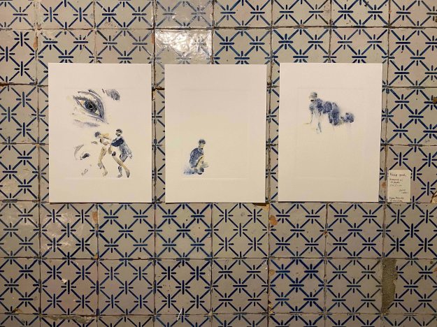
I showed some mono prints in oil that looked very different on the patterned tiles of the room:
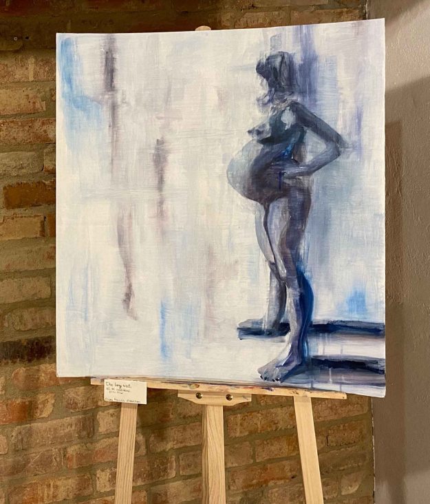
I also showed an oilpainting of my pregnant daughter on cardboard presented on an easel:
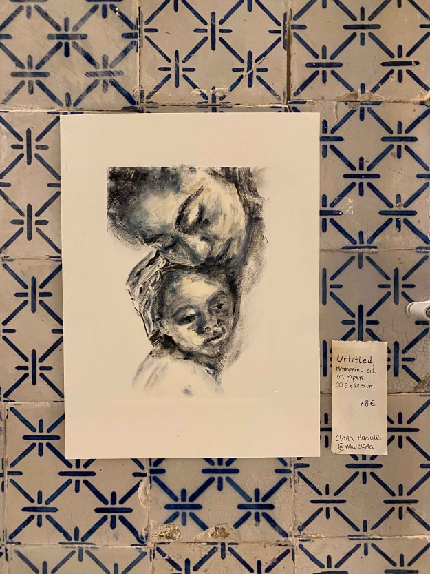
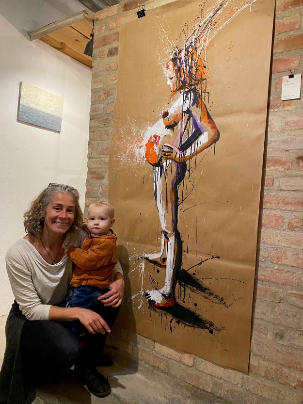
Here I am posing with my granddaughter in front of a painting in acrylics on paper:
And at last a small painting in oil on aluminium:
It was a very fun evening and we all received so much encouraging, positive feedback. It felt really good to co-create a small event like this with other artists. This is all very, very new for me. It was only three months ago that I dared upload some of my paintings on Instagram and to actually show something live felt like a leap. This first experience was so positive though, it is definitely worth to dare and to invest some time and energy in communicating and connecting.
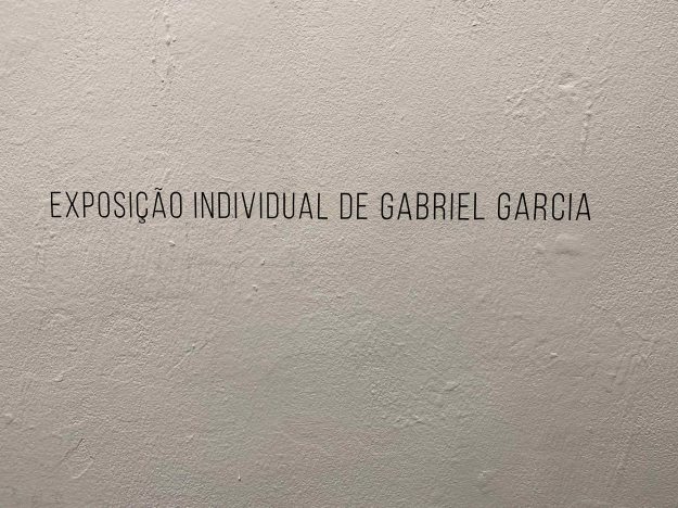
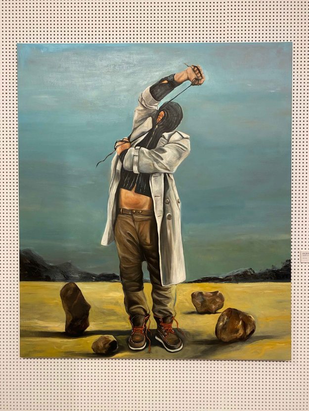
I recently visited the beautiful exhibition of Portuguese painter Gabriel Garcia in the Espaco Exhibitionista gallery in Lisbon.
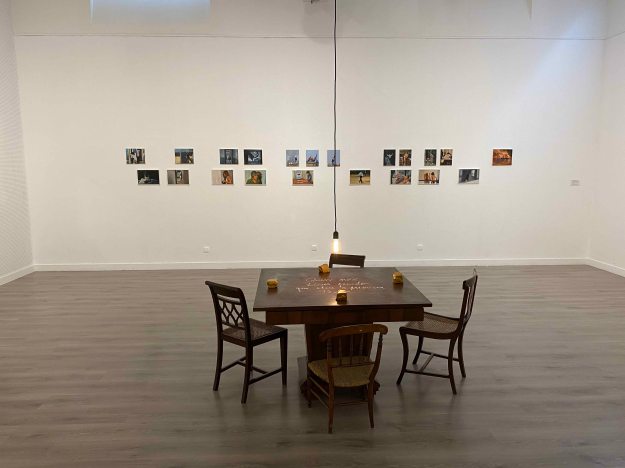
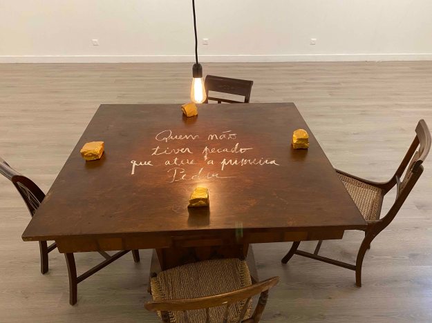
The title of the exhibition is “Who throws the First Rock”, which was presented in golden letters on a wooden table, with stones around- a beautiful moment in itself. I liked how this added a three-dimensional piece to the exhibition who was otherwise only paintings on the walls.
Two walls presented really large paintings of men hiding their faces in hoodies or ties in a rather desperate move, hiding or maybe punishing themselves in some ways.
The stones were present on the ground of the paintings.
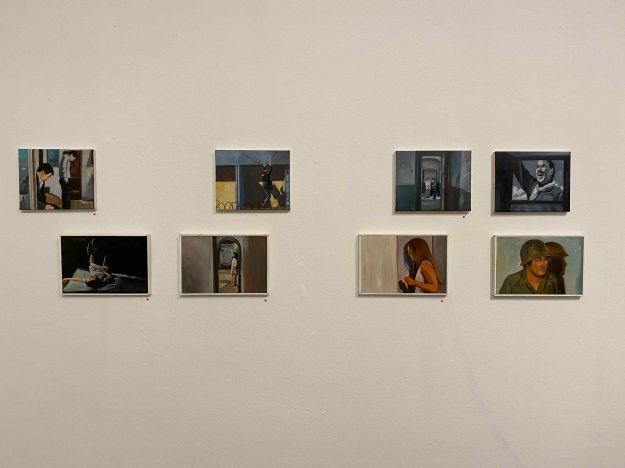
I was even more affected by another series of mid size paintings showing a disrupted narrative, hands washing themselves in a sink for example. A very simple gesture, but given the title of the exhibition and the dark tone of the paintings, they seem to be washing off a sin.
The whole back wall was occupied by a double row of very small oil paintings.
They seemed to be painted from very different snapshots, of domestic scenes, of terrorist attacks, of someone longingly looking through a window. At first glance they were rather usual scenes from images I would feel frequently confronted with. Looking longer, I was taken by a very dark feeling though. All the paintings have a heavy, desperate, given up or aggressive tone.
I liked that the stories here remain so unclear, that we as viewers have to add our own imagination to complete the narrative. There is a certain despair in the paintings that I felt uncomfortable feeling, at the same time as I admire how Garcia manages to make me feel so strongly.
As an artist I was pleased to see the red dots of “sold” on almost all the paintings, which felt encouraging.
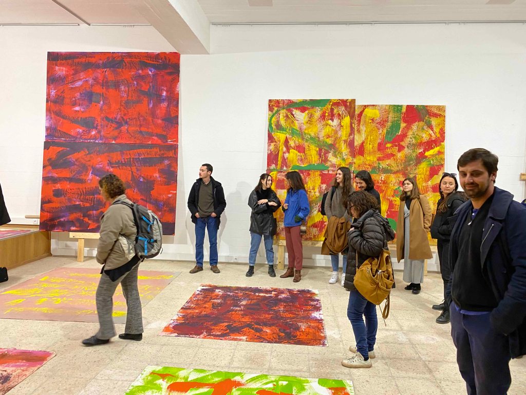
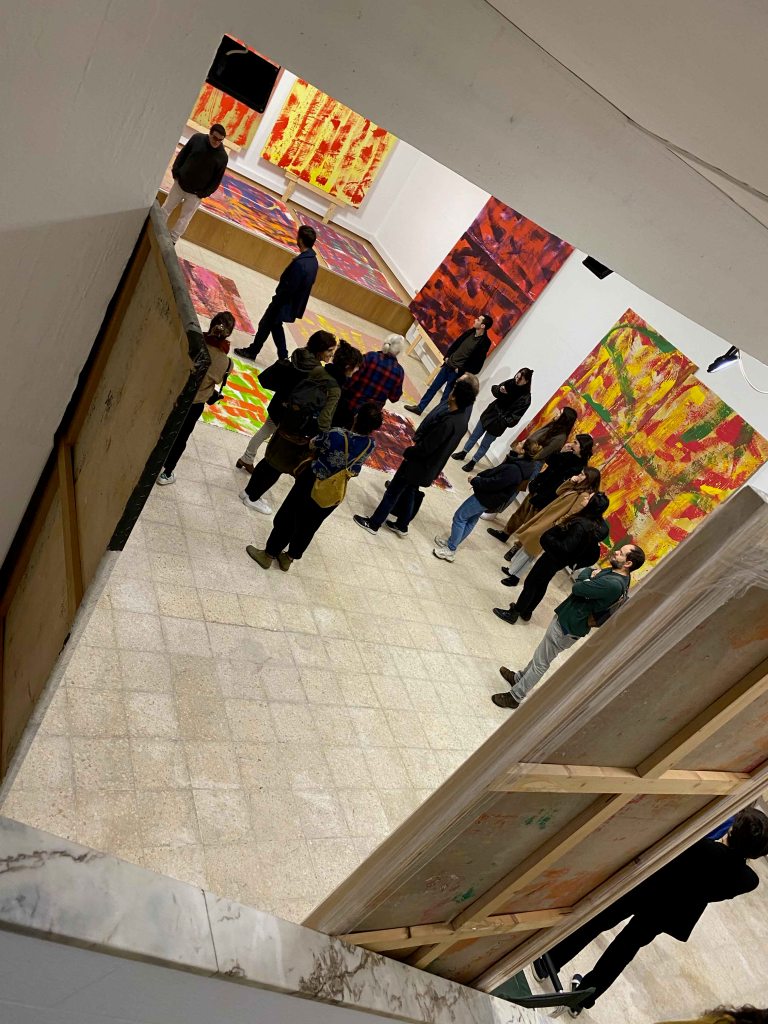
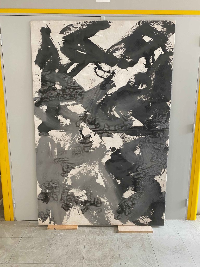
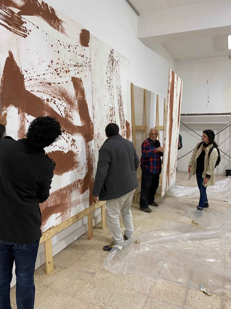
Today I went for a visit organized by ArCo, Centro de Arte e Comunicacao Visual to the Lisbon studio of the famous abstract artist Vitor Pomar.
It was the first time I went for this type of a visit and it was just beautiful to see the working space and works in process by an artist whose paintings I had previously seen in museums, mainly in Fundacao Gulbenkian.
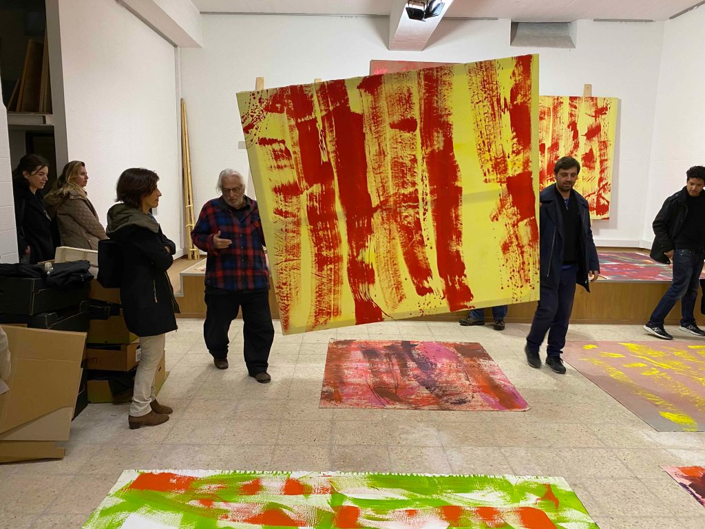
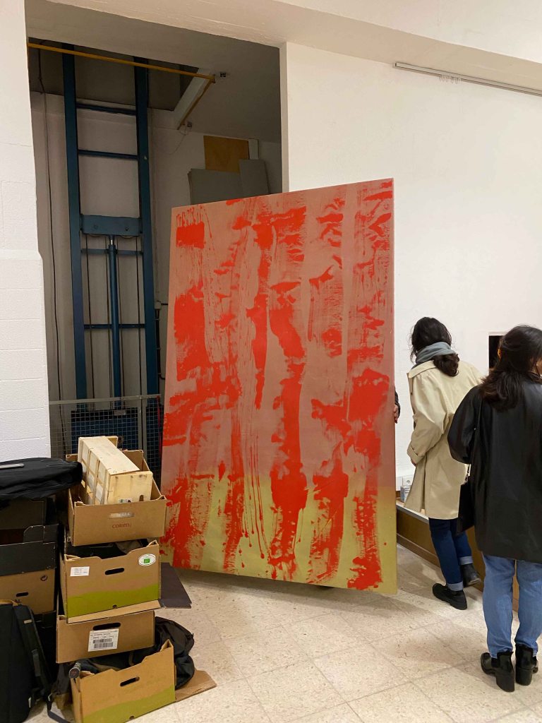
Vitor took advantage of the many strong arms available to move around paintings between the studio and the storage.
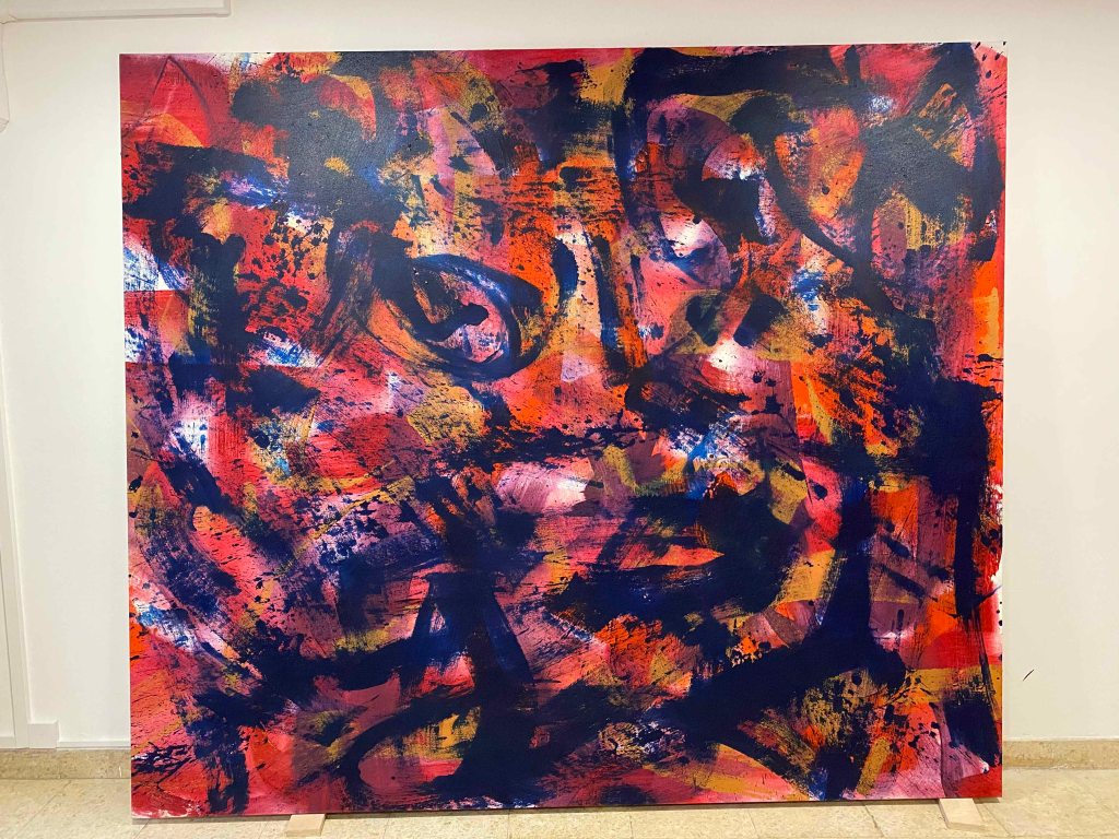
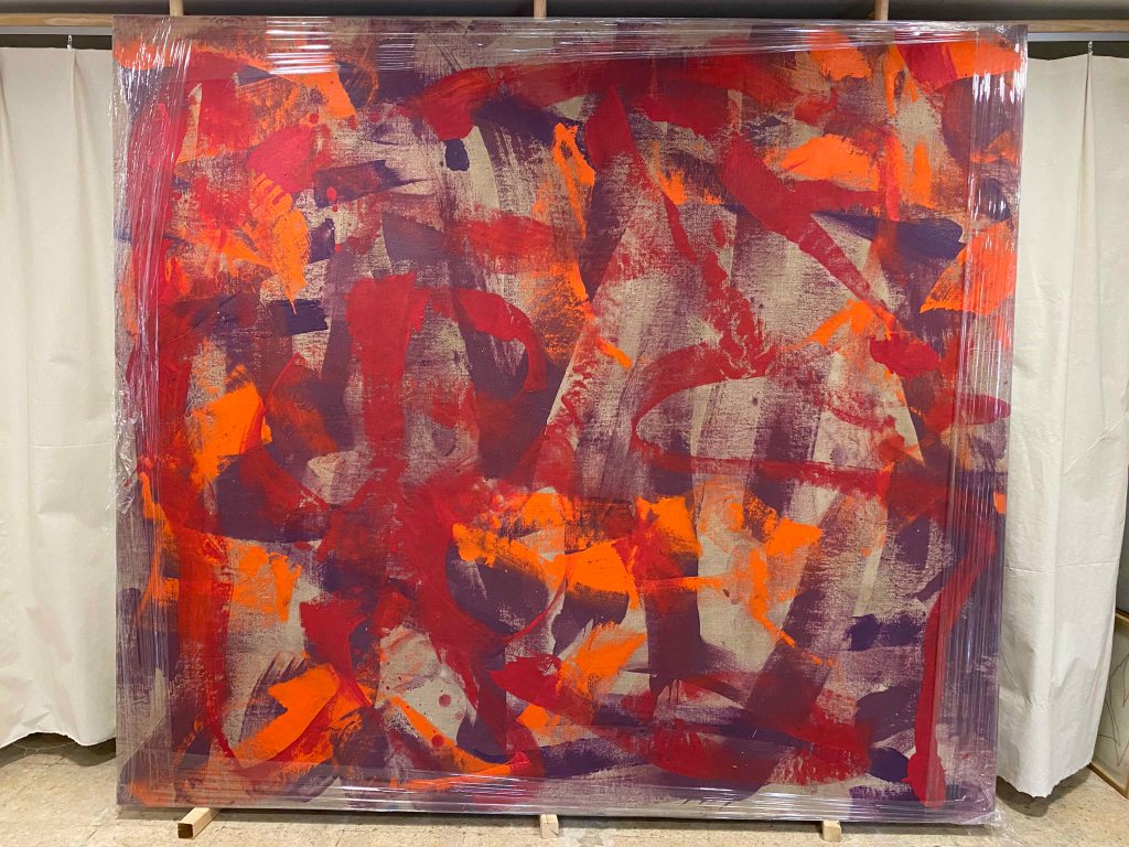
His paintings are huge, all in acrylics and very colourful after a brief black and white period in the 60/70’s.
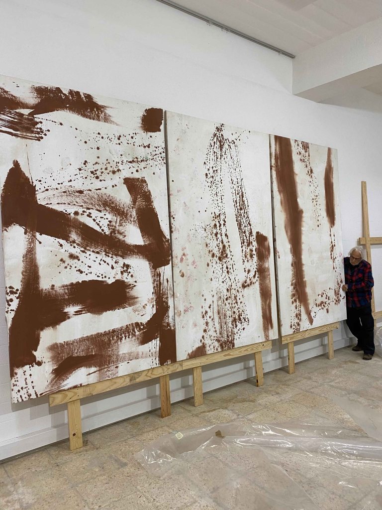
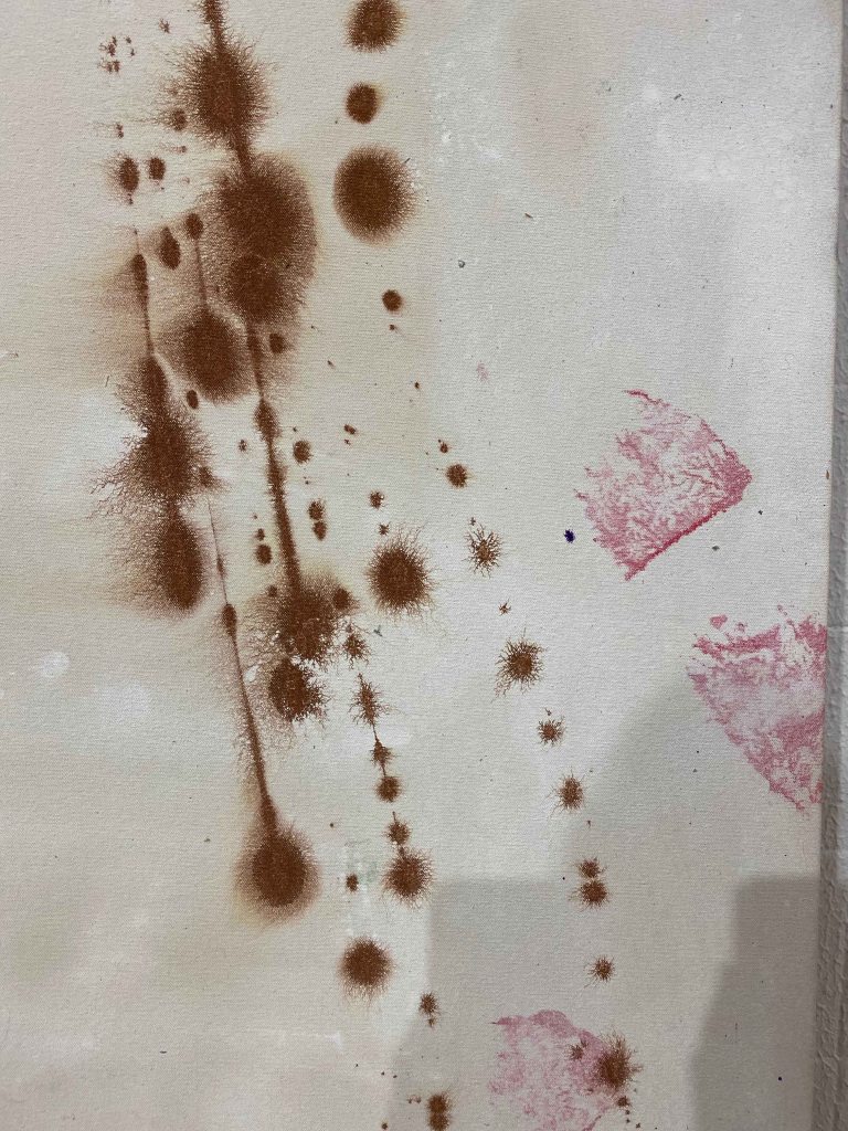
Generally, I have difficulty engaging with abstract art, and so also with Vitor Pomars oevre, especially the very colourful ones with very varied marks. I felt more attracted to the newer works with fewer marks and mainly one colour of marks on one colour of background, like the ones being moved above.
He works on linen, and on this particular one on the floor that looked very different from most other works, he used a transparent gesso to let the linen shine through, an idea that I really liked and will use:
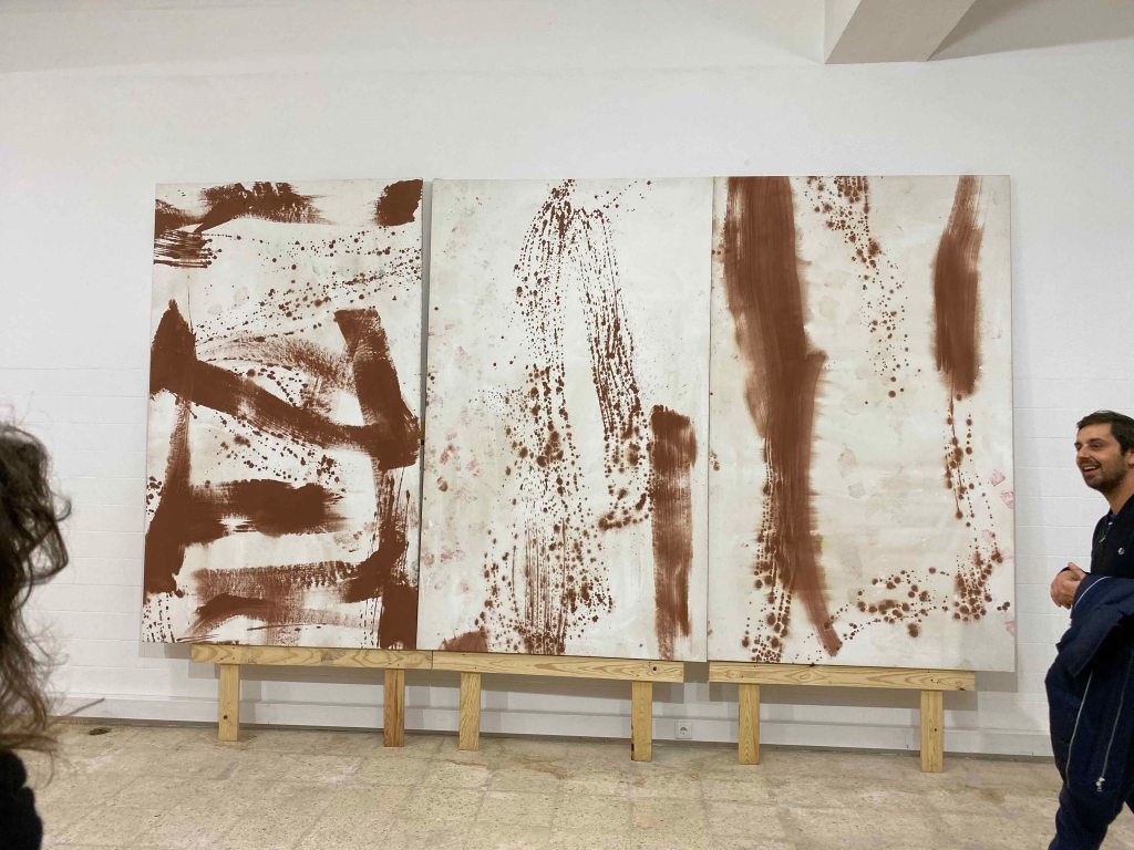
It was interesting to feel how my perception shifted when Vitor described the work and the titles. This last series is the one I could engage most with- titled 9/11 about the falling twin towers:
It was an exciting and inspiring visit and I would love to move around paint on huge canvases in a huge space like Vitors 🙂
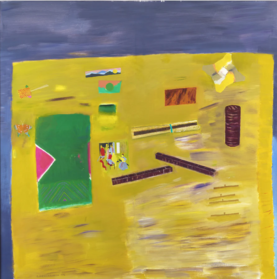
Course manual: “The Tate has been bequeathed the Prunella Clough archive and has made some of it available on the internet. Prunella Clough began her artistic career in 1937 and, apart from a brief gap during the war, continued working until her death in 1999. She won the prestigious Jerwood prize for drawing just months before her death. Prunella Clough lived a full creative life and the subtleties and sheer celebratory joy in the way she used everyday objects in her compositions is inspirational. Look at her painting entitled Wire Tangle (at the start of Part One). Note how she developed her original visual source material into a sophisticated painting, changing the scale and making decisions about the composition to create an image that is much more than a simple natural still life.“
I am delighted to discover this British artist that I was not very familiar with and am especially attracted to her work from the 1970’s onwards, where the whole focus seems to be on form and composition. I found it very interesting to discover through the film, how the artist builds up an extensive library of reference photos, but never reproduces a photo in her paintings. She collects shapes that then reappear in paintings. This is valuable information, as I have a tendency of using reference photos too literally.
I also found it very interesting, that Prunella Clough uses many words in her sketchbooks, she does a “language sketch”, describing what she sees and beyond that, what other sensations come up around the object that she is looking at.
I also really like her choice of subject – the overlooked or forgotten, something others would walk past. This connects to our first project of this course- to paint something unpromising, that then through careful composition gets elevated to something beautiful. The paintings also show the impact of man made objects upon the land- a subject that is very important in todays’ world of environmental concern.
I am reproducing four of my favourite paintings by Prunella Clough from the Tate website.
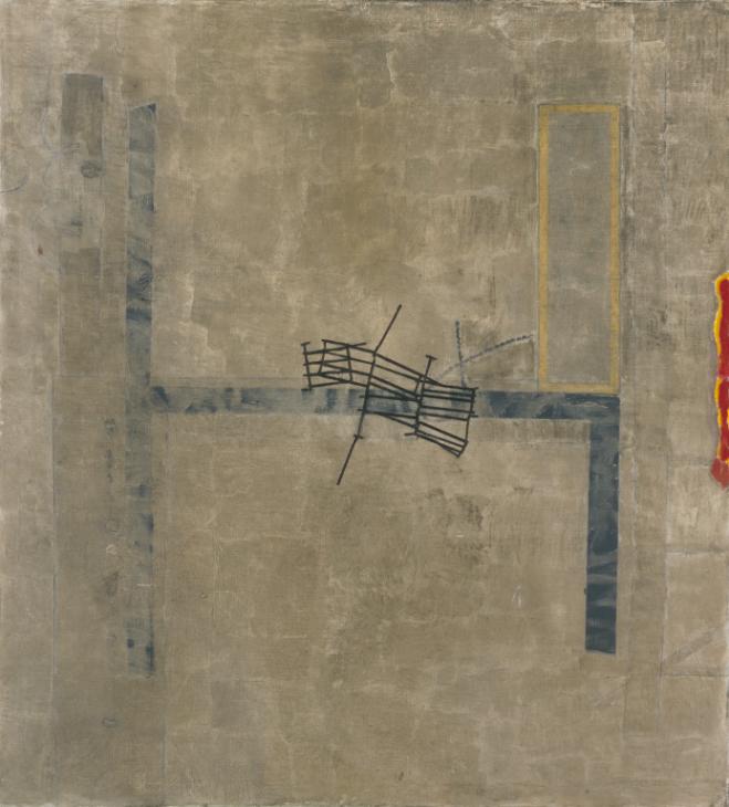
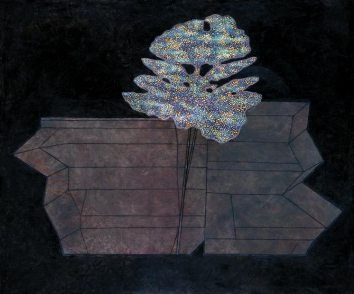
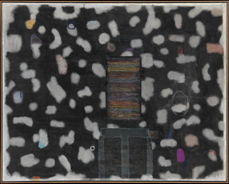
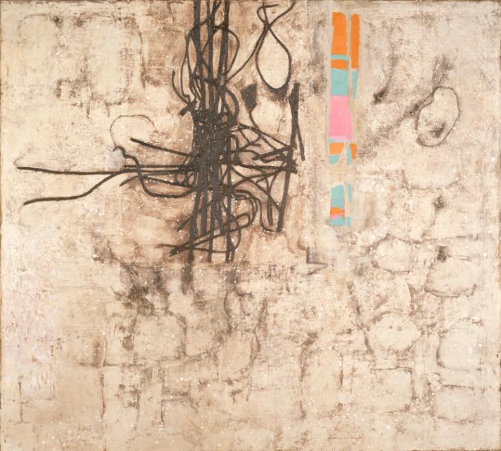
Broken Gates 1982
False Flower 1993
Stack 1993
Wire and Demolition 1982
I like that there is a seemingly simple and clear composition, and only looking more attentively do I become aware of the many layers the paintings contain.
When I heard that before studying art, Prunella Clough made maps for the office of war, I can feel how that carries forward in her compositions as territories and borders.
Her palette is mainly earthtones from light browns and beige to dark colours, but then with some small, bright elements standing out, in balance to the larger more subdued areas.
All that we have been looking at through this chapter- unpromising subjects, the relationship between the object and the background and the notion of scale, come together in Prunella Cloughs work.
As suggested in the course manual, I approach the work of Elisabeth Blackadder by watching the video on vimeo.com/25711526. Here I see the artists’ love for plants and for all kinds of objects that she collects. She shows a genuine curiosity for these flowers or objects, that she then reflects in her paintings.
Looking at her paintings, I can see how several objects are placed with a lot of space between them, allowing this space to become an important part of the composition. She uses the shapes, size and colours to balance out the composition, where the objects and the space around have equal importance. None of the objects overlap or have any sense of perspective or depth. There are also no cast shadows, so there is a sense of the objects floating in a colour field, rather than being placed on a surface.
“Stillife with cherrybark” is an example where the large purple and yellow blocks of colour balance each other and how the objects placed on the yellow surface are painted small and flat and all separately from each other. The whole is in harmony and balance. If I try to leave out the darker brown tube on the right hand side for example, the whole composition seems to tilt towards the left.
It has taken me a moment to start appreciating Elisabeth Blackadders’ paintings, but the more I look at them, the more I see these subtle touches that create the harmonious whole and I am curious to start a painting of my own inspired by her work.
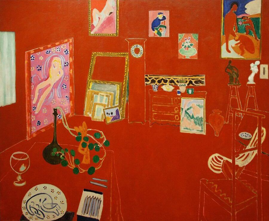
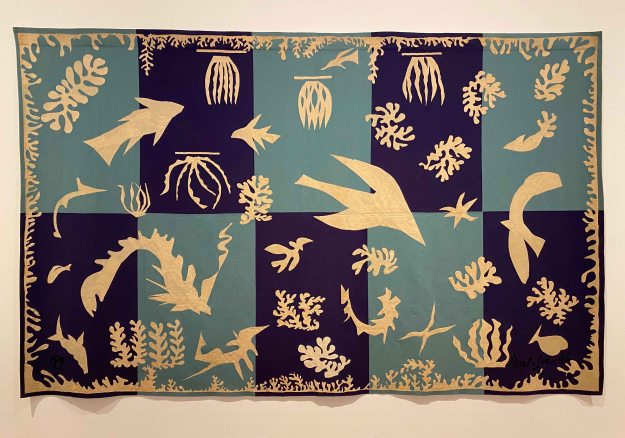
I can understand why we are also asked to take a look at Matisse’s work for this exercise on using space. Like Blackadder, Matisse creates a balance with form and colour, using the whole pictureplane so that the space around them complement the objects. Unlike Blackadder, Matisse really plays with pattern, and creates a sense of perspective and depth in his stilllife paintings.
I visited the Matisse Museum in Nice while on POP1 (shortlink to blogpost: https://wp.me/p94hP8-vb) where I took a picture of this ” Nature morte aux grenades” from 1947 , a merging of interior and exterior view where form, colour, shapes and balance take over as the subject matter.
One painting that I have not seen in the flesh, but particularly like is “The red studio” from 1911. Here the paintings in the studio seem to be floating freely on the red surface, but the subtle line drawings of the furniture drawn in perspective create a sense of depth and form.
This is a combination of line and pattern I would also like to try out for a still life.
In his later works, Matisse focused more and more on form and colour, simplifying it to arrive at his famous cut outs.
A week has passed since my above text, and I just had to catch a flight over Nice airport and managed to make a quick detour to the Matisse Museum . The current exhibition is “Cinematisse”- conversation between the painter and cinema. Matisse was an avid cinemagoer and passionate about film- which was reflected in a lot of his paintings and drawings inspired by movies, with exotic influences like the faces of Inuit or the plants of the Caribbean.
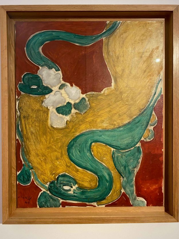
To my delight, I found “ Le Fauteuil Rocaille” from 1946 that was used as an example in the coursebook on display here today. In this painting, the way the chair occupies the whole picture frame and more is what makes it so impressive.
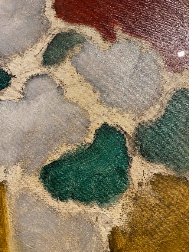
I observed how Matisse allows parts to remain unfinished with the canvas peeking through and used really wide, rough brushstrokes for the elements in starkly contrasting complimentary colours.
Other than ” Nature morte aux grenades” from 1947 that I wrote about above, there were unfortunately no other later still life paintings on display. I saw some of the very early still life from his student years, but they are still very classical and without the specific traits the artist developed.
I want to remember to allow some parts of a drawing or painting to remain unfinished, and observe the flowing, swirling lines Matisse uses, in plants or figures alike.
When comparing the work of Elisabeth Blackadder and Henri Matisse, I feel more affinity with the latter. The comparison is somewhat unfair, because I have admired Matisse’s work for a long time, whereas I am only discovering Elisabeth Blackadder right now. I think it is the sense of depth and the playful, flowing line that draws me more to Matisses’s work.
I am curious to continue with painting still life inspired by these two artists.
I have started taking weekly Lifedrawing classes at ArCo- Centre de Arte e de Comunicacao Visual- in Lisbon. So far, I have had five classes that have all been very different taught by different teachers and using different media. The size of paper is always A2, to avoid working too small. I have been going to various lifedrawing classes before in Indonesia and here in Lisbon, where a model was provided but we were then entirely free to use our materials and methods. Here, the instructions are very precise and we all use the same material, with an incredible variety of outcome anyway.
8/11/2019
For the first class, we used coloured pencils and were instructed to draw only inner contours and very very slowly. Our eyes dart from the model to the paper where we are instructed to do strictly no marks without first looking at the model. This method is to catch ourselves when we start doing automated mark making for details like the little body hairs for example.
After 30 or more excruciatingly detailed minutes, we only had a few more minutes for the shading in coloured pencils, still without drawing outer contours.
We then repeated the exercise with another long pose.
This time we used the coloured pencils for some outer contours.
It was useful to see how dependent I am on outer contours and how easy it is to start automated mark making. I had a hard time slowing down so extremely and drawing little bodyhairs. I missed quick warm up poses to get a feeling for the proportions.
15/11/2019
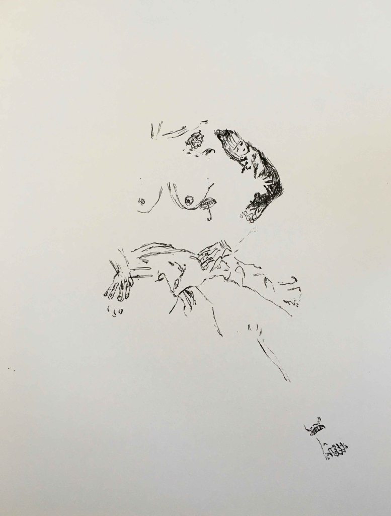
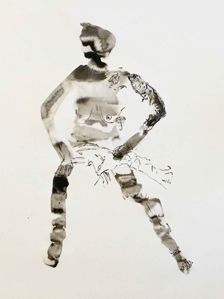
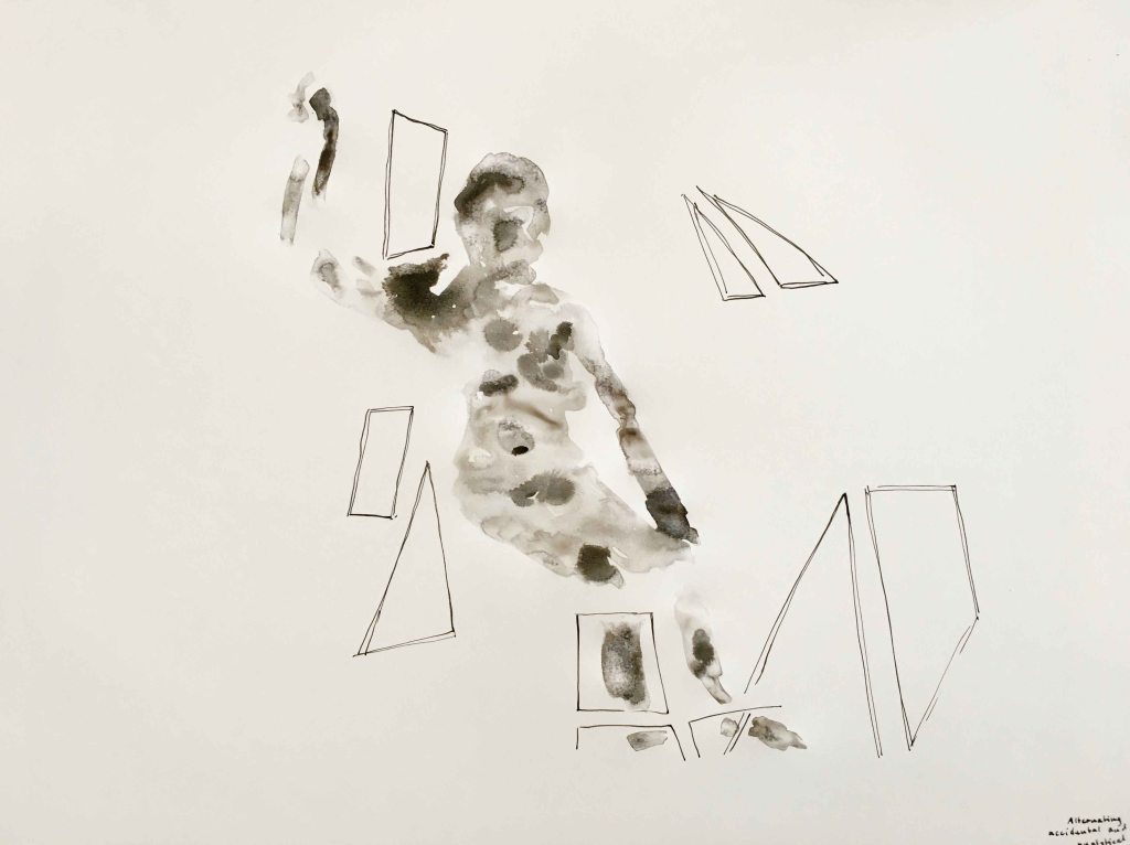
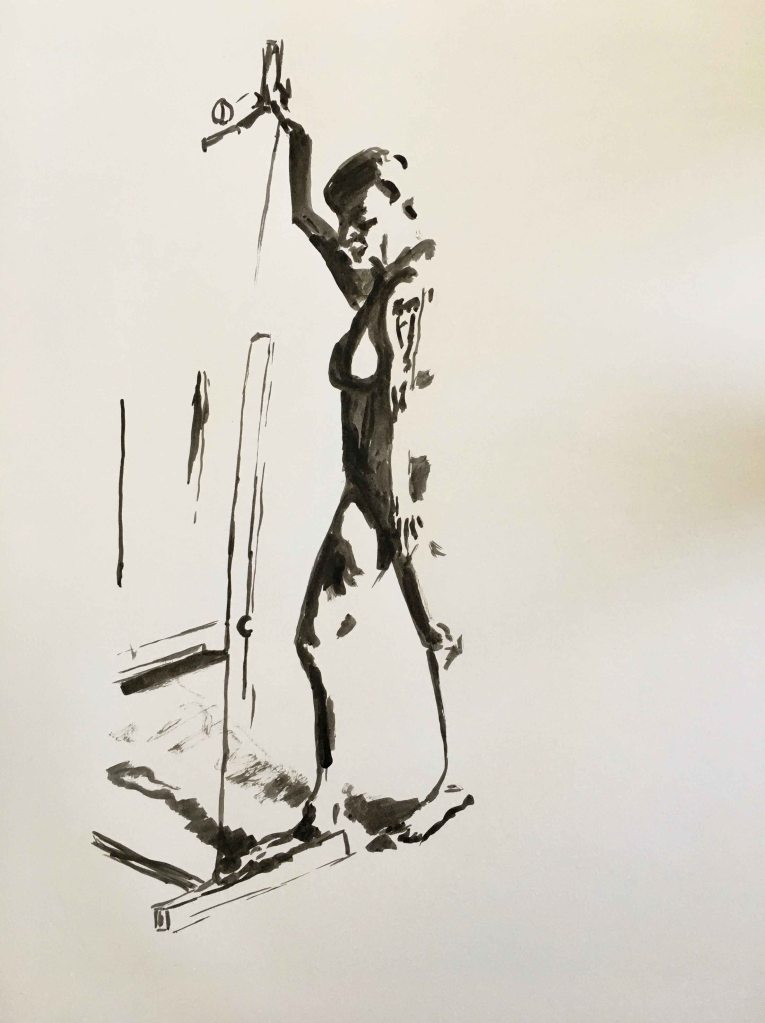
Today we were using Indian ink with a nib pen and a brush. The aim of the exercise is to combine precise, analytical mark making with accidental marks.
Using the nib pen, we were again instructed to draw very precise inner contours, even the tattoos, without the help of the outer contours. I am used to always start a figure by a light “skeleton” to get the proportions right and find it extremely difficult to get the whole to work when so focused on small details.
After the ink was dry, we quickly painted the whole figure in water, and dripped ink on the wet parts, to form the accidental marks.
For the second pose, we inverted the process by starting with a figure in water with dripped ink.
Then we focused on a set of easels and other geometrical figures that were placed around the figure and had to choose some inner contours of these. I like the playful result of the combination of the figure and the geometrical shapes.
For the last pose, we were drawing in ink with the brush, only drawing the dark parts. Again, I was challenged by not drawing any skeleton to start from, but liked the result.
I truly enjoyed using the ink today and will continue exploring this.
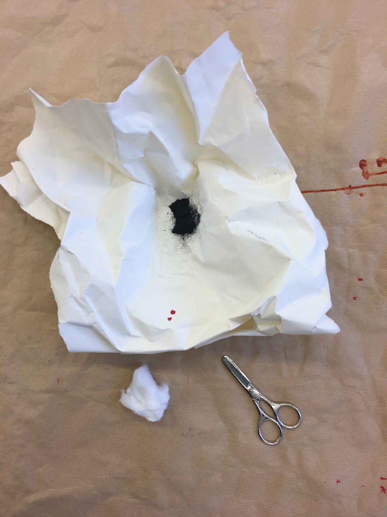
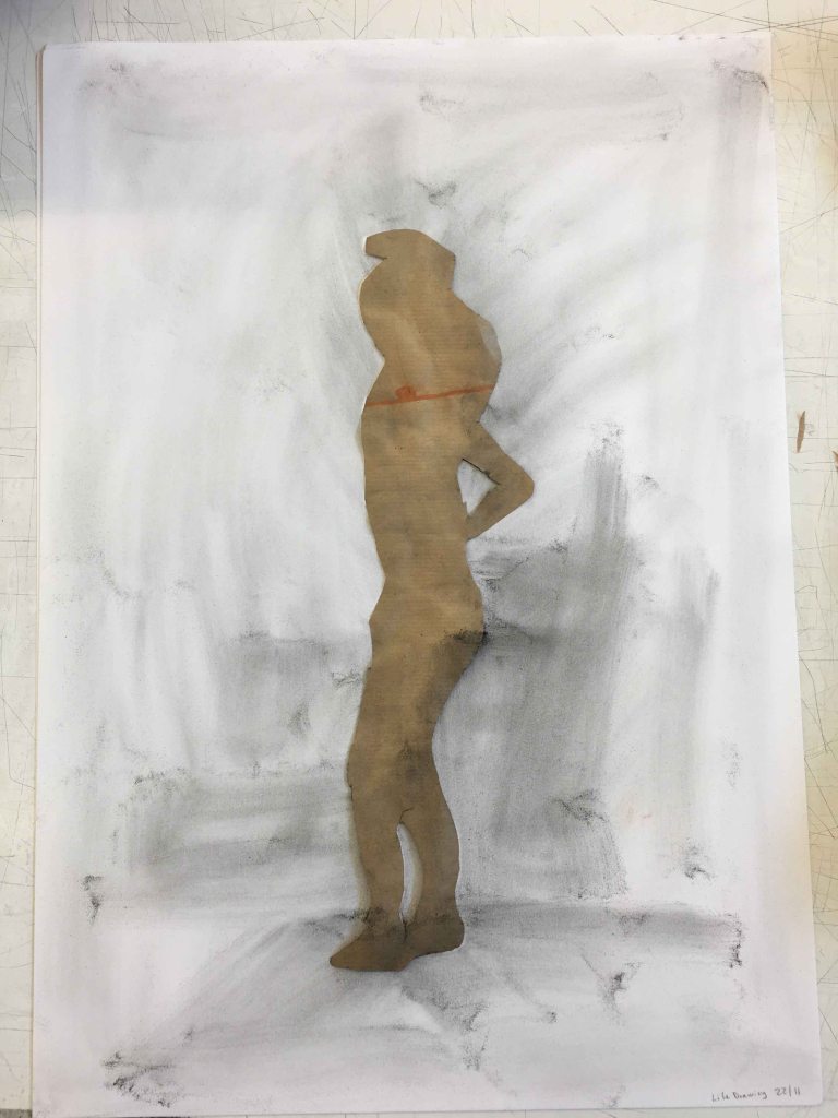
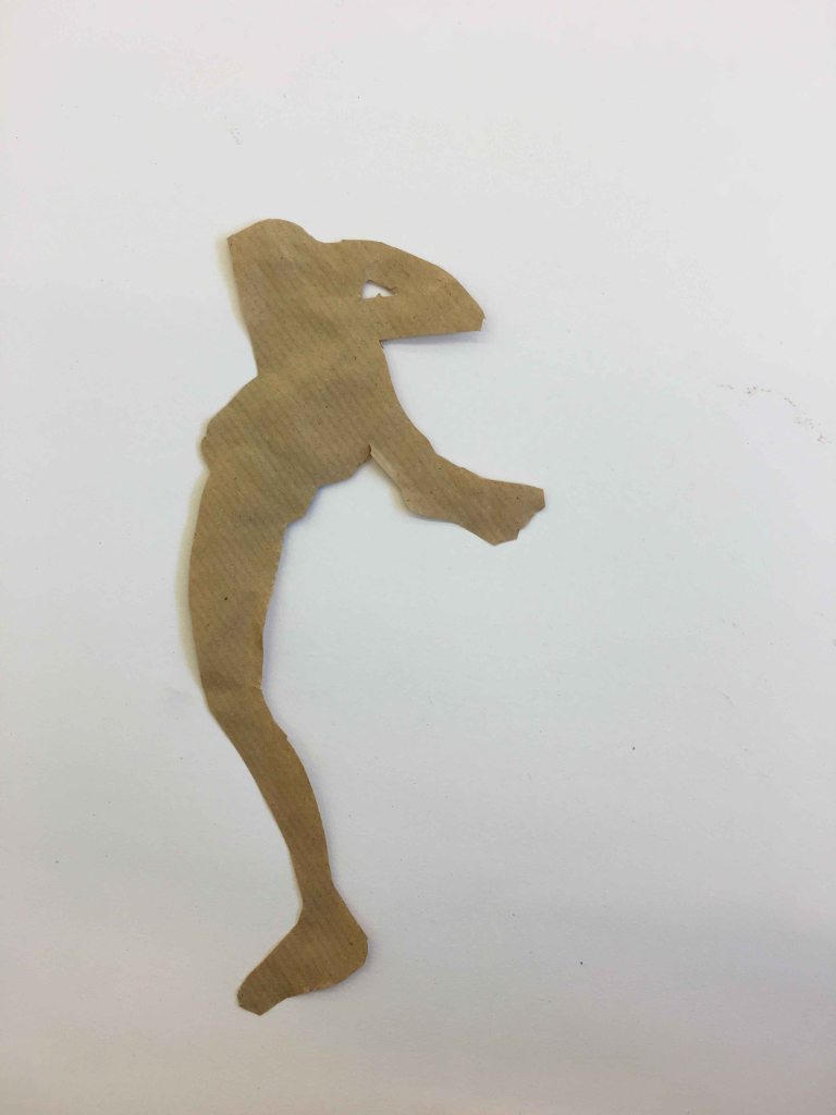
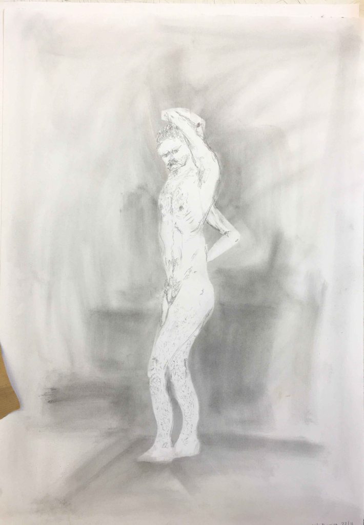
22/11
Today our tools were scissors and graphite powder- which I had never used before , so this was really interesting.
Here we “draw” the figure with the scissors directly- without any initial pencil drawing to cut out. It felt incredibly difficult to keep anywhere near a realistic figure.
We then place the cutout on a white A2 paper and rub the graphite powder around it with a cotton ball. Finally, for the first pose, we added some detail and inner contours with a pencil.
Next, the model took three different poses after each other, that we cut out and combined on the same page, using the graphite powder.
We were then invited to use either the positive cutouts or the negative shapes left on the paper, to complete the page with repetitive shapes. I am pleased with the final result, which is a first on this course 🙂 This was a fun method of drawing that I would like to come back to as well.
29/11/2019
In todays lifedrawing sessions, we are using oil pastels on the habitual A2 paper.
We started by drawing the figure as a whole spot in a darker colour, again with strictly no outer contours to start with, just a blob that evolves from the inside out. Again, I am faced with seeing how attached I am to my constructive skeleton and outer contours!
Then we choose a lighter colour, and drew in all the lighter places on the figure.
I am definitely struggling with proportions, but enjoyed the combination of oil pastels.
For the second pose, we inverted the process by starting with a lighter colour.
Then we filled in the darker parts with the second colour.
Oil pastels is another media that I would like to experiment more with, so this was a good reminder.
3/12
Todays class completely killed my self confidence. We went back to the simple HB pencil and the challenge was to draw the proportions right. I had become used to draw a lot of quick “warm up poses” and then use a “skeleton” or geometrical shapes, or the “coil method” to find the right proportions. Here we were asked to start from a limb and just follow the contours with one single line around the figure. This all extremely slowly, which went terribly wrong from the start.
The second slow pose went even worse- stiff and wrong- my self confidence was superlow after today ‘class.
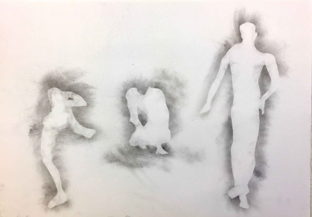
For the third pose, we used a charcoal stick. After drawing for 20 minutes, we erased the drawing with some paper, so that you could only see the traces. Then we drew again on top- “correcting” the mistakes of the drawing under.
In all, I benefit immensely from these classes, as they definitely bring me out of my comfort zone. I am missing quicker poses where I can sketch in the proportions roughly. Here we seem to draw maximum 3 poses in two hours, it is all very slow, and the slower, the worse the result it seems. It is very difficult to map in the proportions well without any type of help lines. This course really brings me to look intensely and only draw what I really see. I also like the variety of materials and methods, some of which I had not used before – like the graphite powder.
10/01/2020
After a long Christmas break, I am back to the Lifedrawing studio. Today the teacher was missing but the model present, so we were free to draw the way we wanted. I am quite sad to discover that despite really wanting to experiment, when in a slightly nervous setting , I go back to very boringly trying to draw anatomically correct with the most traditional media possible- charcoal and coloured pencils, all on A2 Canson paper.
One good thing with being free today was that we could ask the model for shorter poses though. These are five minute sketches:
We moved on to 10 minute poses:
This pose seemed very tricky to get, but I like how I placed her diagonal on the page which creates a certain dynamism.
I switched to coloured pencils for the two last poses:
I feel more confident getting the proportions right using the approach of today, but I walked away disappointed at not having been more daring.
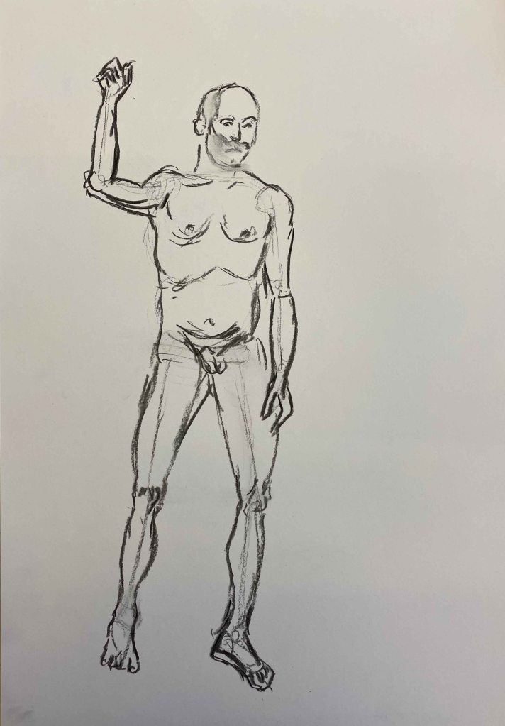
17/01/2020
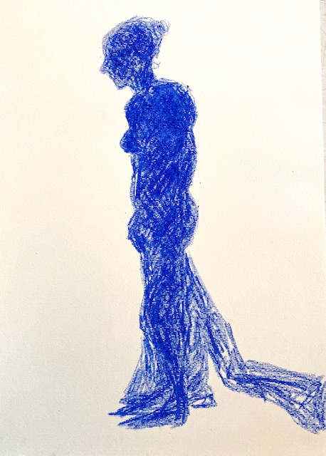
Today we had a new teacher and – surprise- we were asked to draw a very traditional 10 minute pose as anatomically accurate as we could in our chosen medium, as always on A2. I am using Indian ink with a thin brush.
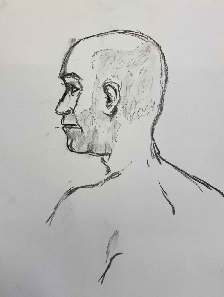
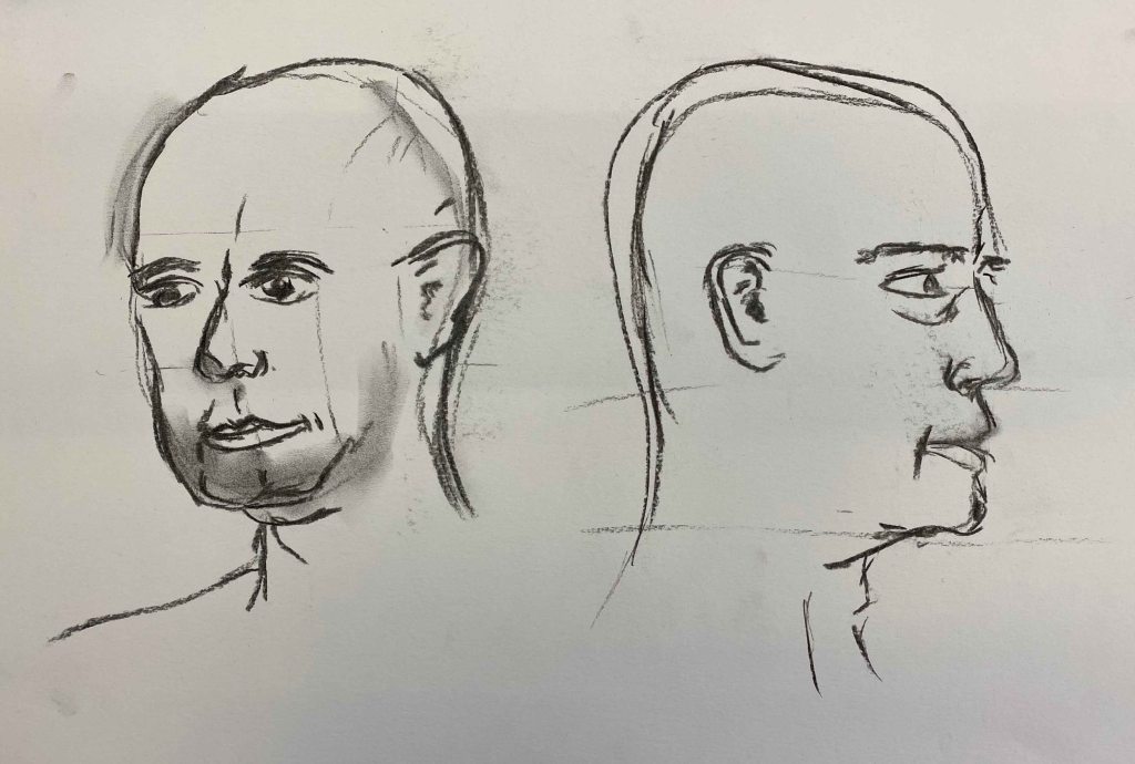
After a walk around the room and looking at our drawings with a disappointed look, the teacher instead asked us to take our blocks and move around the model, only drawing the head, again focusing on anatomical correctness. (Charcoal sticks on A2)
Then we switched to drawing only the torso from different angles on the same page:
I was really struggling with this.
Then, we went back to our places and used charcoal again for a whole body in a classical pose, where I messed up the raised arm.
Finally we were asked to do what we wanted and I used a more fluid approach in ink for a lying pose.
Today I finished very disillusioned about my abilities. The rotation of different teachers and media and approaches is really good though. When I signed up for these classes, I was just expecting the access to a model, which is what lifedrawing classes I had experienced before. Here we are challenged to try different approaches every time, my self confidence is on a rollercoaster during these classes but I learn a lot!
On my way back from Porto to Lisbon, I had the chance of a short stop in Coimbra, to see some of the exhibitions for the “Anozero 19” Biennale.
Coimbra is a very old and beautiful university town, well worth a visit. The Biennale was spread out through the university buildings , and I would add a little hard to find! I saw a lot of interesting science exhibits in the Science department before making my way to some of the art works for example.
The theme of the Biennale was centered around the impact of the river Mondego in the city, and articulated through 5 words : silence, passage, marginal, invention, militancy- a theme broad enough for very varied perspectives.
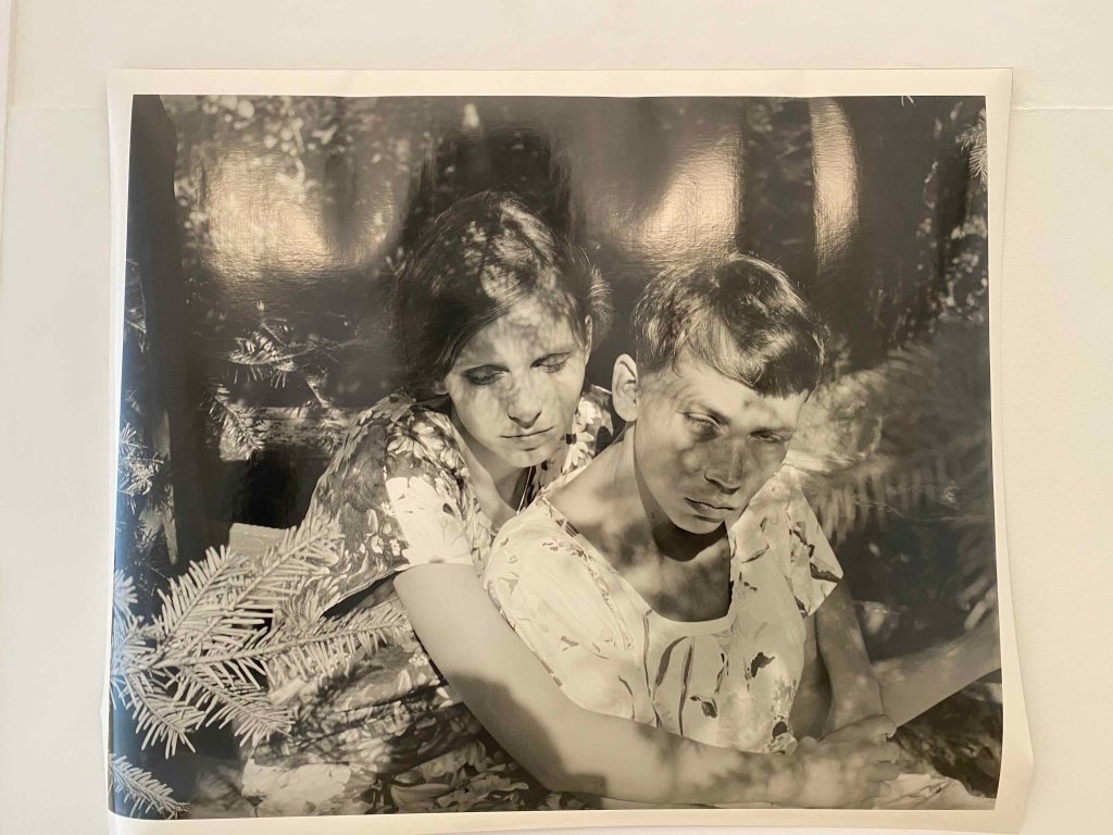
I started by seeing the part of the Biennale located in the Arts department of the University- in an amazing historical building with extremely high ceilings and an inner courtyard.
This large format photograph stood out immediately with the shadows of the plants creating another layer over the faces, in a dreamy atmosphere. They eyes of the figures are closed and I possibly thought them blind, the pose is strange and the expressions unreadable, so it is unclear what is happening here.
This work is by Polish artist Joanna Piotrowska , who explores ambivalent and dysfunctional family relationships through these delicate, dreamy staged scenes in black and white photographs.
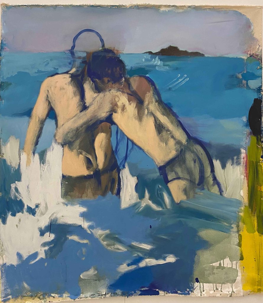
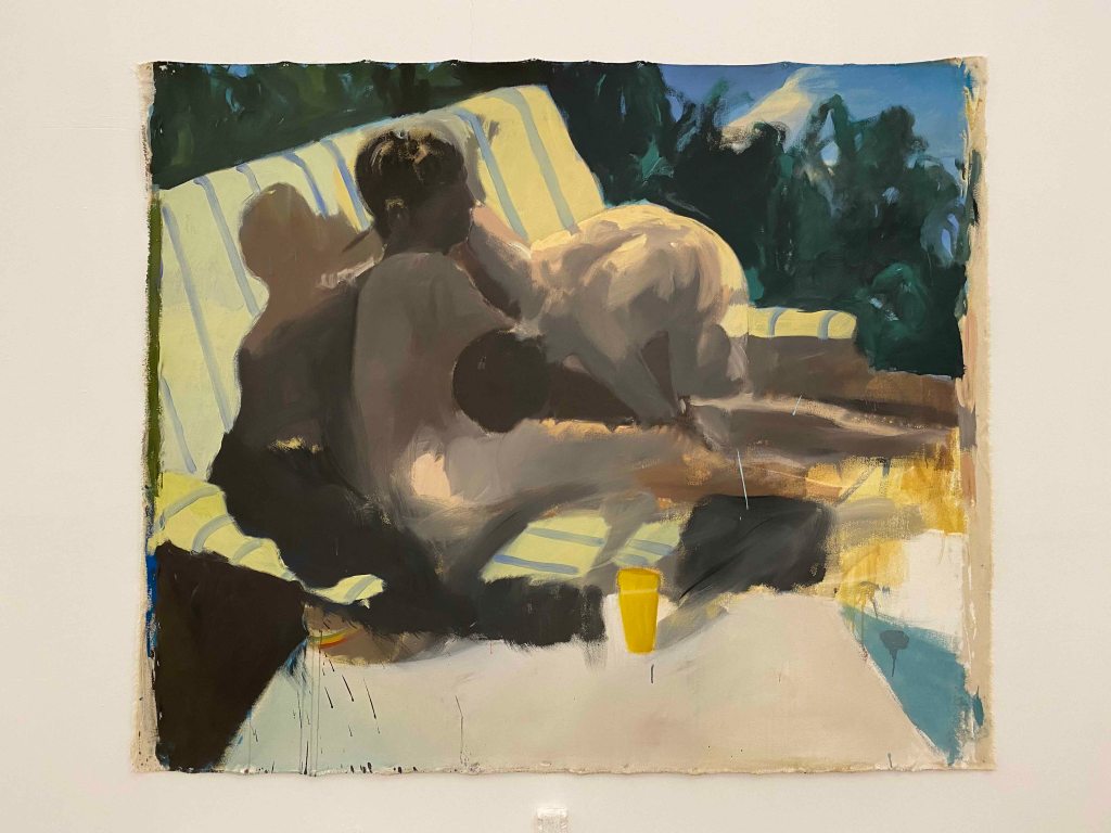
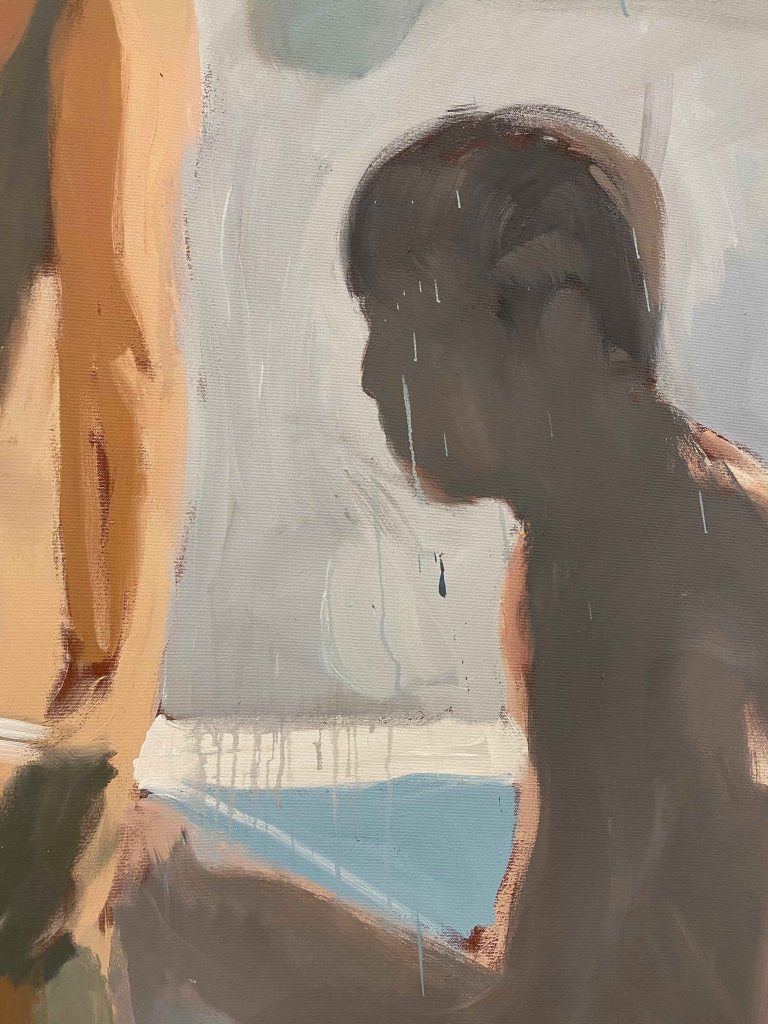
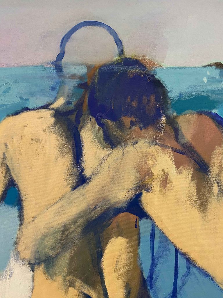
The next room showed large scale paintings by the Portuguese artist Joao Gabriel, especially commissioned for the Biennale. The subjects are taken from screenshots from gay porn movies from the 70s. The paintings are large scale, so the blurry bodies are almost life sized.
The subjectmatter and the blue-brown colour scheme reminded me of paintings by Patrick Angus.
I really like how little detail Gabriel gives to the figures, they are faceless and painted in rough, seemingly quick brushstrokes.
There is a boldness in the approach , and in how much he dares to leave unfinished, like the head here only outlined, that I really like.
I have a tendency of becoming much too detailed and overworking my pieces, so this was a refreshing approach.
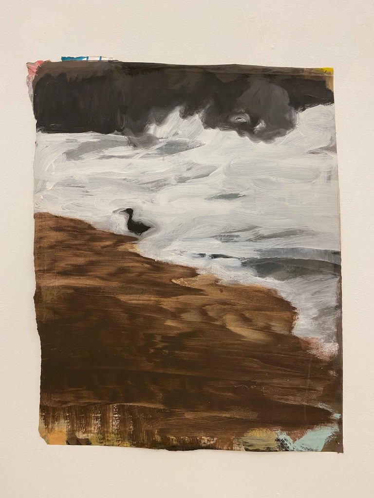
This little panel of a bird in the streaming water, painted in large brushstrokes on a crooked piece of cardboard, was the only painting without the human couples, and I liked how it also had a smaller scale, and offered a welcome break in the display .
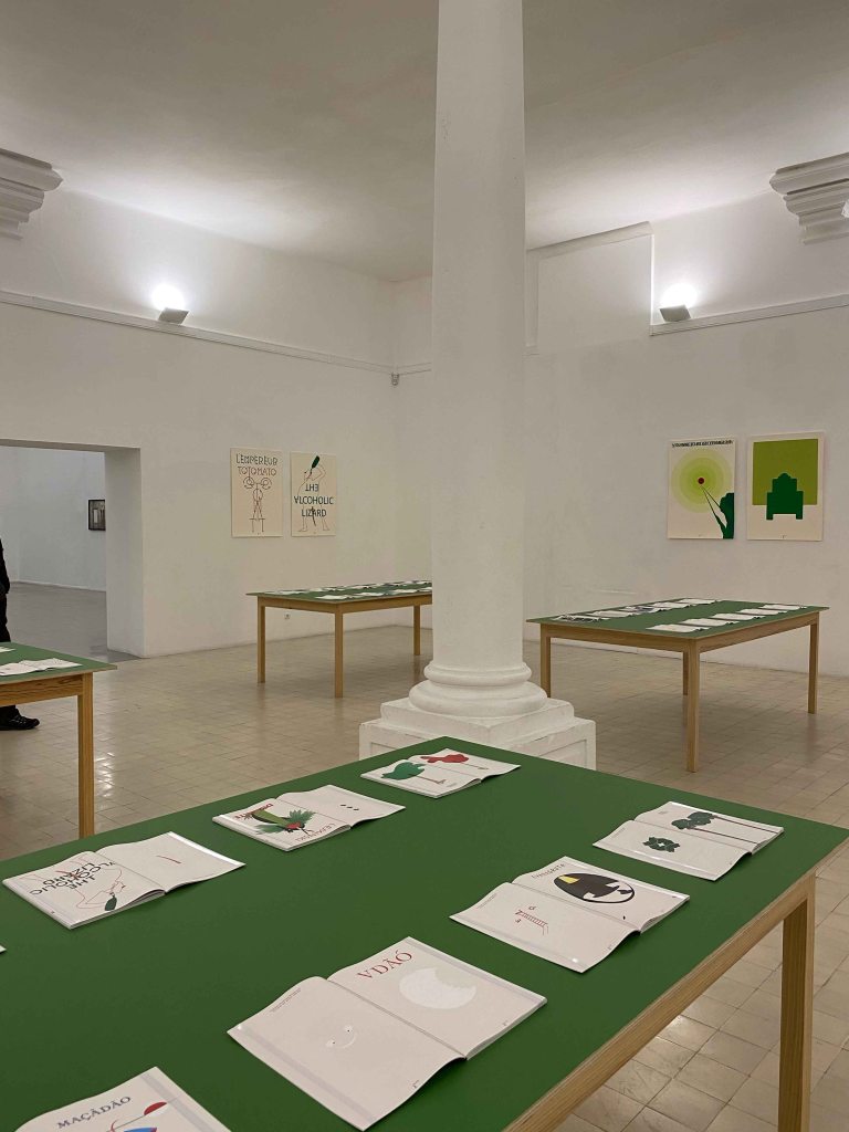
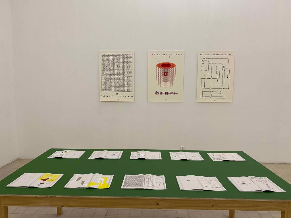
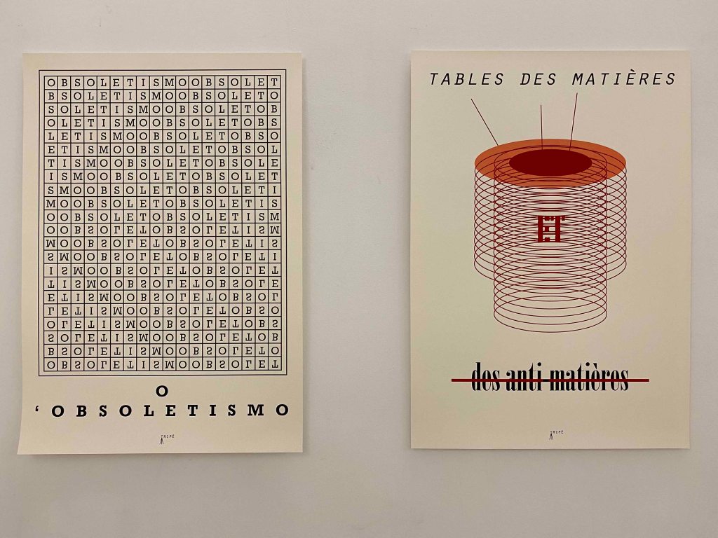
French artist Mattia Denisse used green table tops and posters on the walls to exhibit a large amount of imagined books that “will be printed in the future”.
They cover a large area of subjects, from scientific books of imagined subjects to historical novels of imagined facts.
I really enjoyed the humour, with absurd scientific tables or wordplays. I also really appreciated the skillful combination of drawing and text, or geometrical schemes in an appealing graphic language.
I am not sure the presentation gave the best of the work. The identical format and repetition was less interesting to look at than an exhibition with varying formats and maybe frames to create highlights and some tension. But maybe this sloppier newspaper way showed another aspect of how we are flooded by information that looks easy to either absorb or oversee, and it is only on a second or third look that you catch the absurdity or the humor in it.
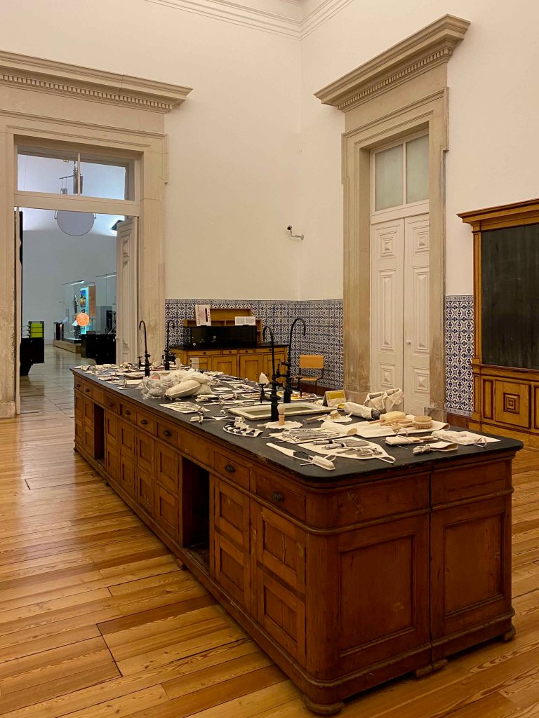
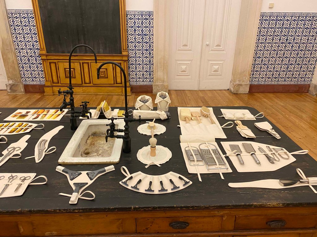
I almost missed the installation of Bruno Zhu in the midst of the artefacts in the Science department, as I took it for a permanent exhibit.
Surrounded by instruments from historical times, he installed modern, small every day utensils on some white clean especially crafted pouches, thus elevating nail clippers or dish washing brushes to a historical object to look back at from the future. It was an interesting way to look at objects we take for granted with a new perspective, elevating them to a collection of curiosities.
On my hunt for more artworks, I saw a whole geological exhibition of interesting mineral formations, but unfortunately did not make it to any further exhibitions from the Biennale before having to return to Lisbon. These glimpses were rewarding though, and I will make sure to return with more time next time.
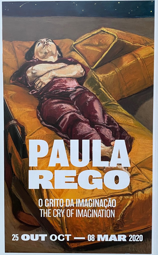
Simultaneously to the exhibition of Olafur Eliassson’s work at the Serralves Museum in Porto, I was delighted to discover a whole building dedicated to Paula Rego.
I love the way Paula Rego tells stories through her drawings and paintings and have visited her “Casa das Historias” in Cascais several times, which I documented in previous blogposts. (Shortlinks: https://wp.me/papvz2-e4 and https://wp.me/p94hP8-cD)
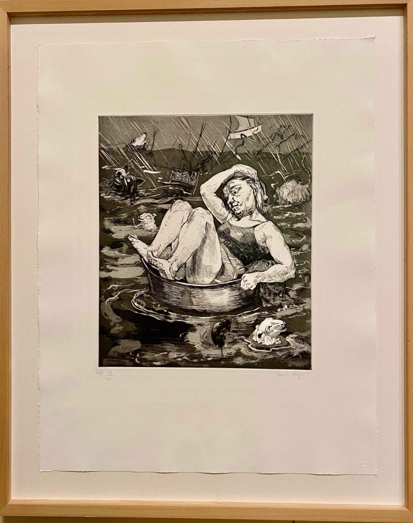
The exhibition started with a series of etchings , “the Pendle Witches” about the trial of witches in British history.
Paula Rego is often dealing with the role of a woman in society as a subject, through stories and literature that she transforms into images, or by telling her own story very openly, about depressions and abortions, about her family life.
I like the real expressions and quite awkward poses of the persons. I know from the movie “Paula Rego, Secrets and Stories” by her son director Nick Willing “, that she is using the same model, her assistant, who looks quite similar to the artist for the majority of her works.
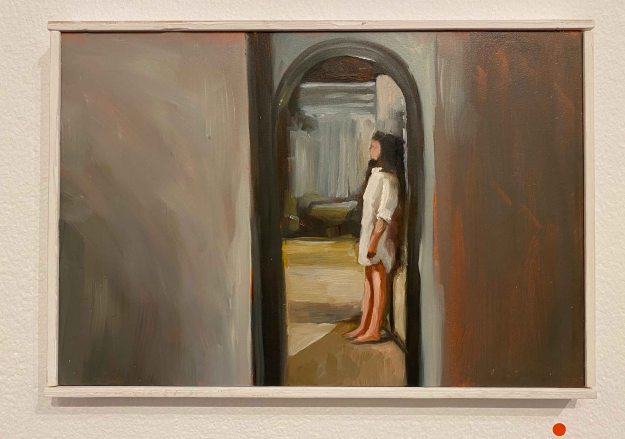
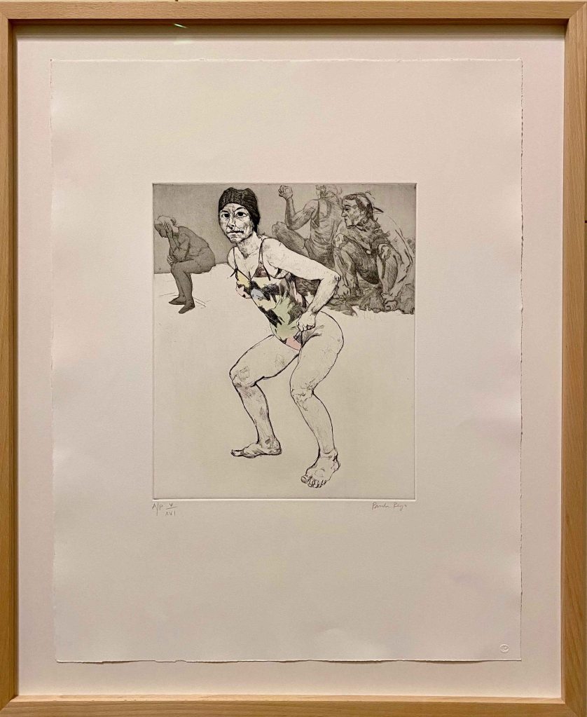
In this second etching, I really like the emptiness, the feeling of some unfinished pieces creating space around the figure, and again , the quite awkward dynamic pose.
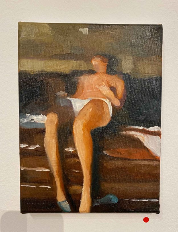
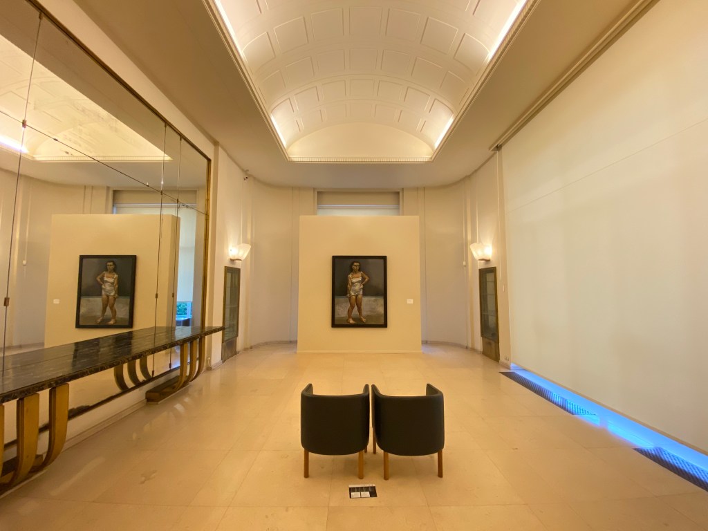
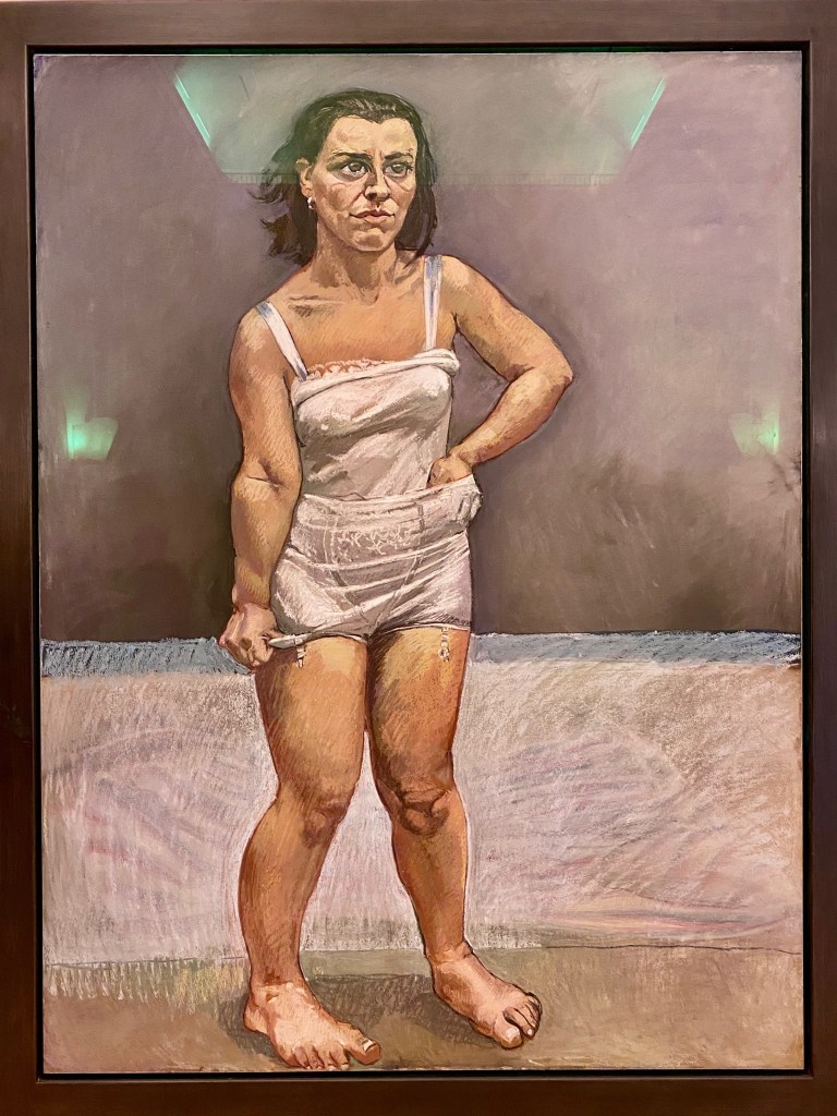
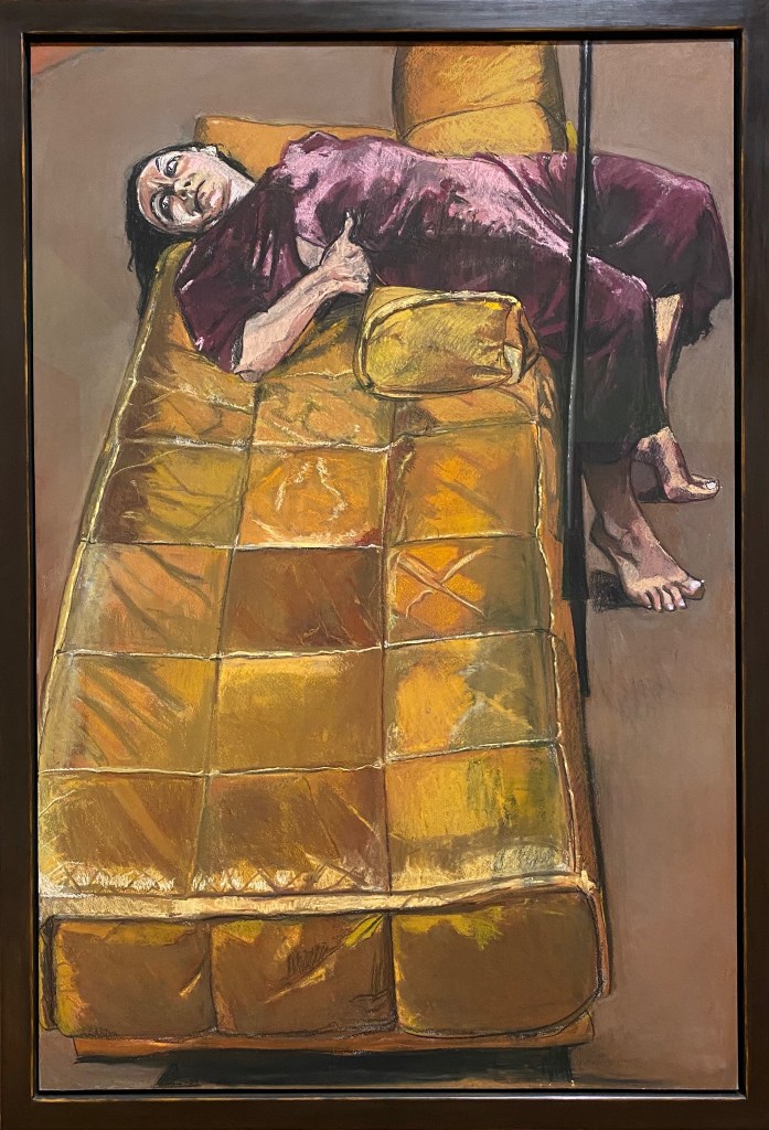
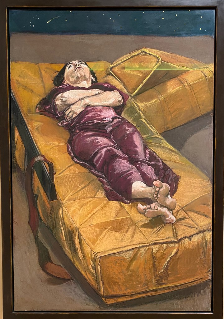
The painting “The strap” from 1995 had a whole room dedicated to it, which amplifies the vulnerability and loneliness of the figure.
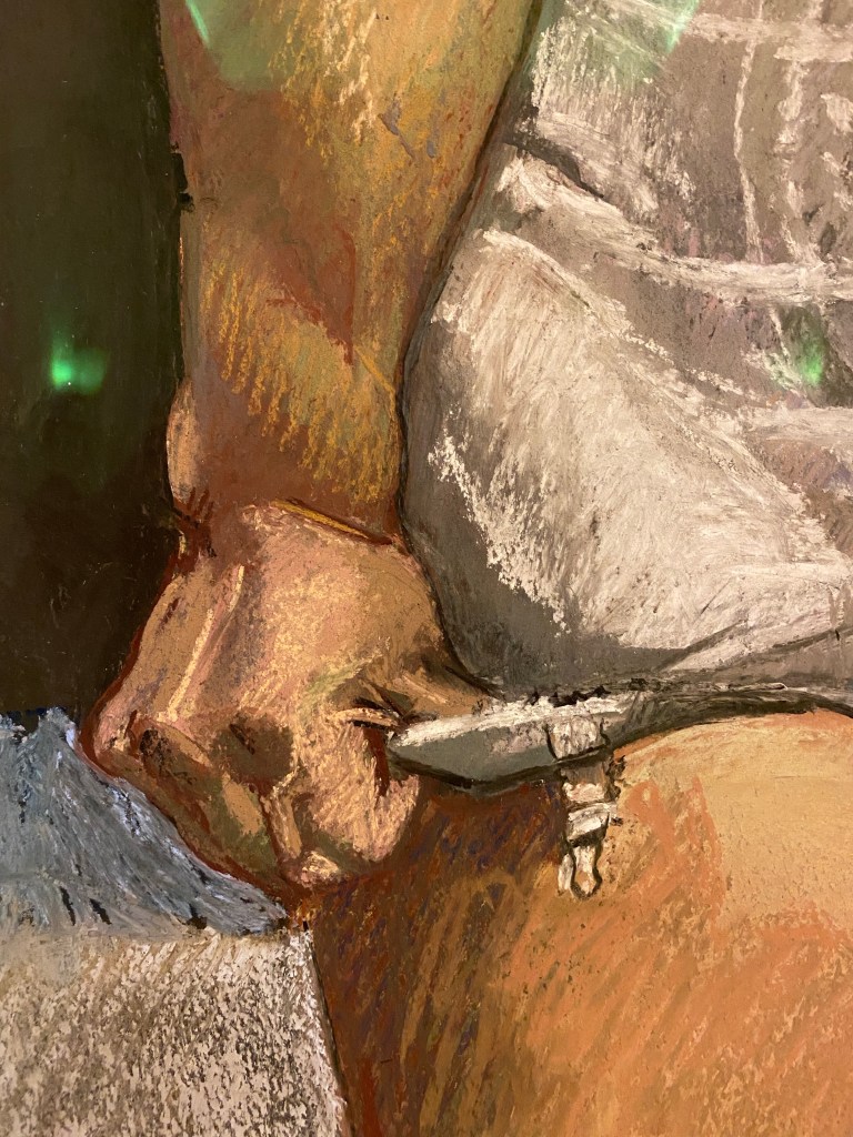
This painting lives from the expression and pose of the figure, at the same time bewildered or angry and a little desperate, in a pose that is tense and awkward. The background gives little clues to what is happening, which also focuses the attention on the face and the cramped hands pulling on the underwear. It looks rather like the girl is trying to pull her panties longer to cover herself more, than that she is trying to take them off.
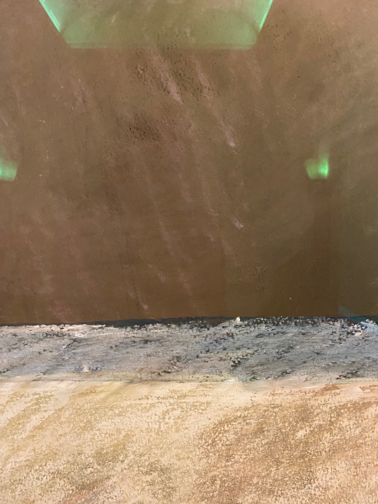
The work is in pastel on paper, and I take some close ups here to look at the mark making.
Paula Rego prefers to work in pastel to avoid expressionistic brushstrokes, but I find the marks here take on a similar quality, with rough strokes echoing the expression and tense pose, contrasting to the smeared parts of the background.
I recognized the small work “the Merman” from a visit to Cascais .
I find there is so much expression in this creature half human, half imagined or animal , with the hand reaching between the tails. I observe how parts are colored and others left untouched.
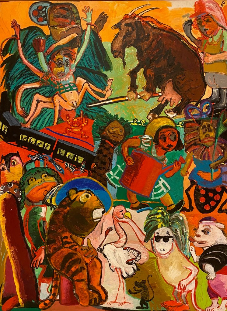
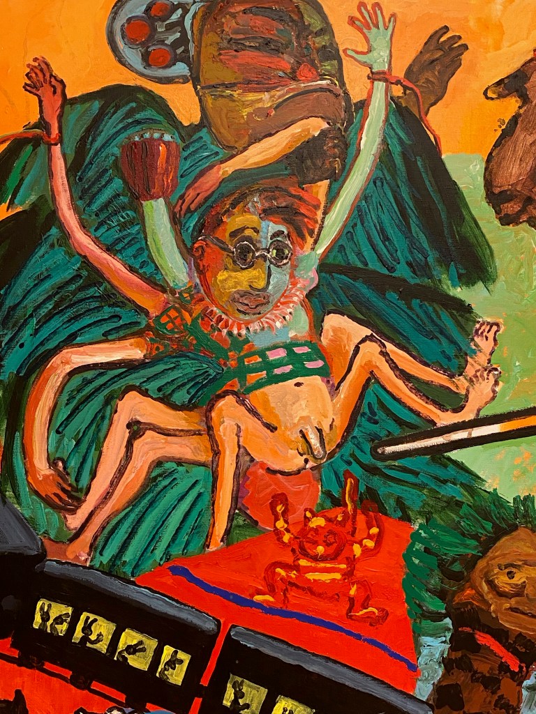
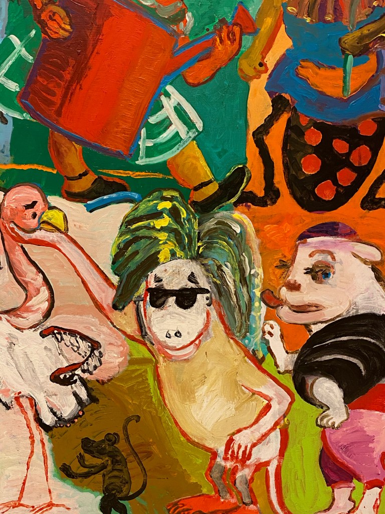
I like how Paula Rego often combines animals with human figures. This very full and loud painting from the 80’s is full of imagined beings.
It feels quite chaotic at first, but the diagonal composition with the body and penis of the spider figure pointing to the right bottom corner where figures point back up lead the eye.
I do prefer the calmer paintings though. In “Playroom” from 1986, I really enjoy the mirrored composition, with the two clear fields of complimentary colours red and green, both with the same motive of a girl and a dog.
I want to remember this mirrored composition and the depth it creates for my own drawing. I also enjoy the contrast between some parts being very detailed and patterned, while others are left untouched with the bare paper shining through, like here in the hand. This is another aspect to remember as I have a tendency to overwork my drawings.
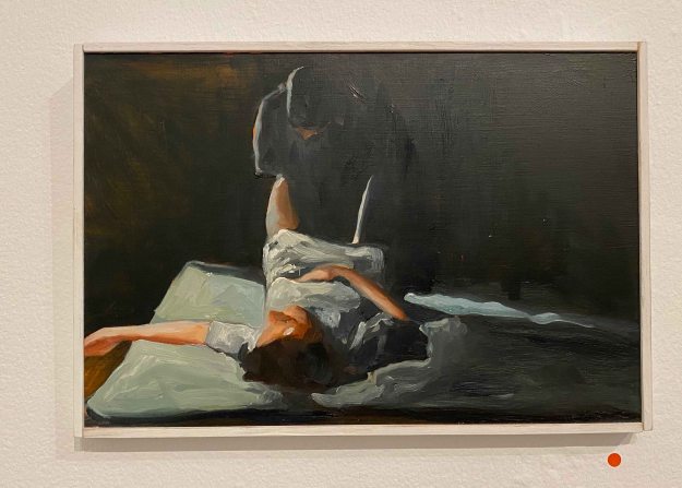
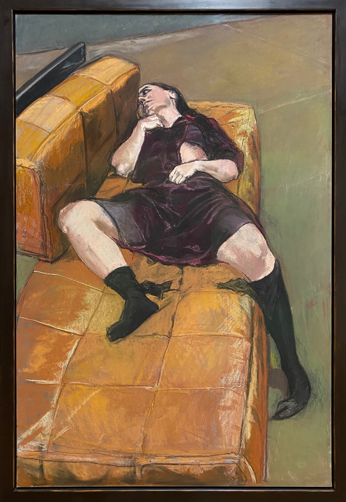
Finally, “Possession 1-7” ,a series of 7 large scale paintings, left a lasting impression.
The same figure is lying on the same couch with similar clothing, just the poses and the expressions changing. When stepping into the room and surrounded by these large paintings, they become quite oppressing. There is a sense of ennui, of boredom in the expressions rather than possession I find. There is a small note about the artists experience with psychotherapy, so that is probably the theme here, but the paintings can also just give a sense of time passing without much change, a feeling of being stuck, in thought, in a personality, in a place.
This series remind me of the series “Depression”, that I have seen in previous exhibitions. There the figure is also lying on a couch with the same or similar black dress, but the expressions are stronger, more desperate and evoked stronger feelings.
I was delighted to see some more of Paula Rego’s work today, especially as she is using much pastel on paper, which was a good reminder about this medium before embarking on the new drawing course. I feel inspired by her markmaking and compositions, and her unique way of narrative and the way she uses her own story in her work.