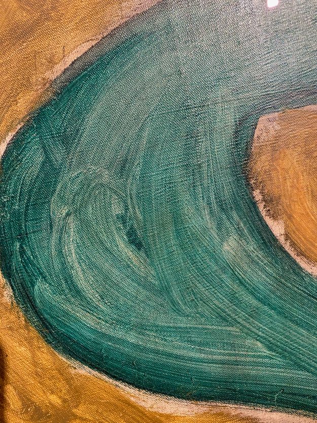
Course manual: “The Tate has been bequeathed the Prunella Clough archive and has made some of it available on the internet. Prunella Clough began her artistic career in 1937 and, apart from a brief gap during the war, continued working until her death in 1999. She won the prestigious Jerwood prize for drawing just months before her death. Prunella Clough lived a full creative life and the subtleties and sheer celebratory joy in the way she used everyday objects in her compositions is inspirational. Look at her painting entitled Wire Tangle (at the start of Part One). Note how she developed her original visual source material into a sophisticated painting, changing the scale and making decisions about the composition to create an image that is much more than a simple natural still life.“
I am delighted to discover this British artist that I was not very familiar with and am especially attracted to her work from the 1970’s onwards, where the whole focus seems to be on form and composition. I found it very interesting to discover through the film, how the artist builds up an extensive library of reference photos, but never reproduces a photo in her paintings. She collects shapes that then reappear in paintings. This is valuable information, as I have a tendency of using reference photos too literally.
I also found it very interesting, that Prunella Clough uses many words in her sketchbooks, she does a “language sketch”, describing what she sees and beyond that, what other sensations come up around the object that she is looking at.
I also really like her choice of subject – the overlooked or forgotten, something others would walk past. This connects to our first project of this course- to paint something unpromising, that then through careful composition gets elevated to something beautiful. The paintings also show the impact of man made objects upon the land- a subject that is very important in todays’ world of environmental concern.
I am reproducing four of my favourite paintings by Prunella Clough from the Tate website.
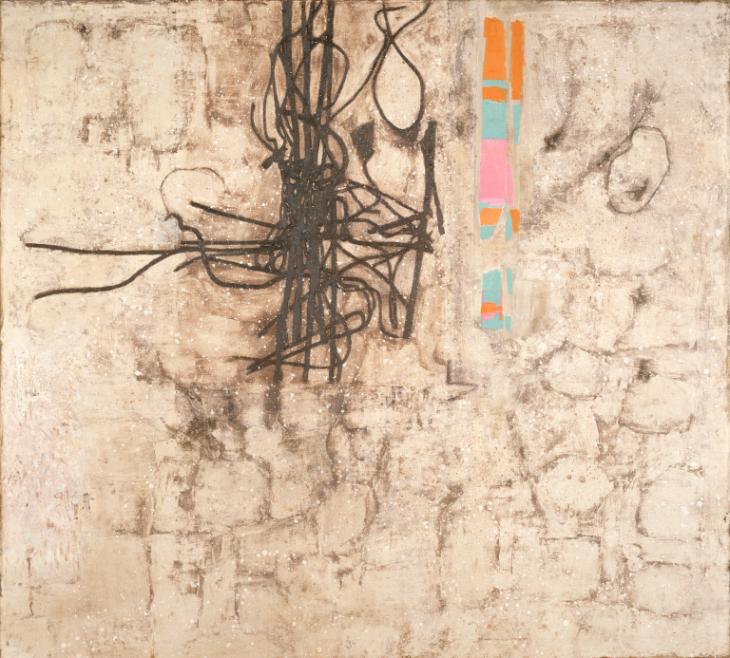
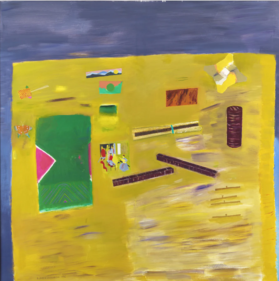
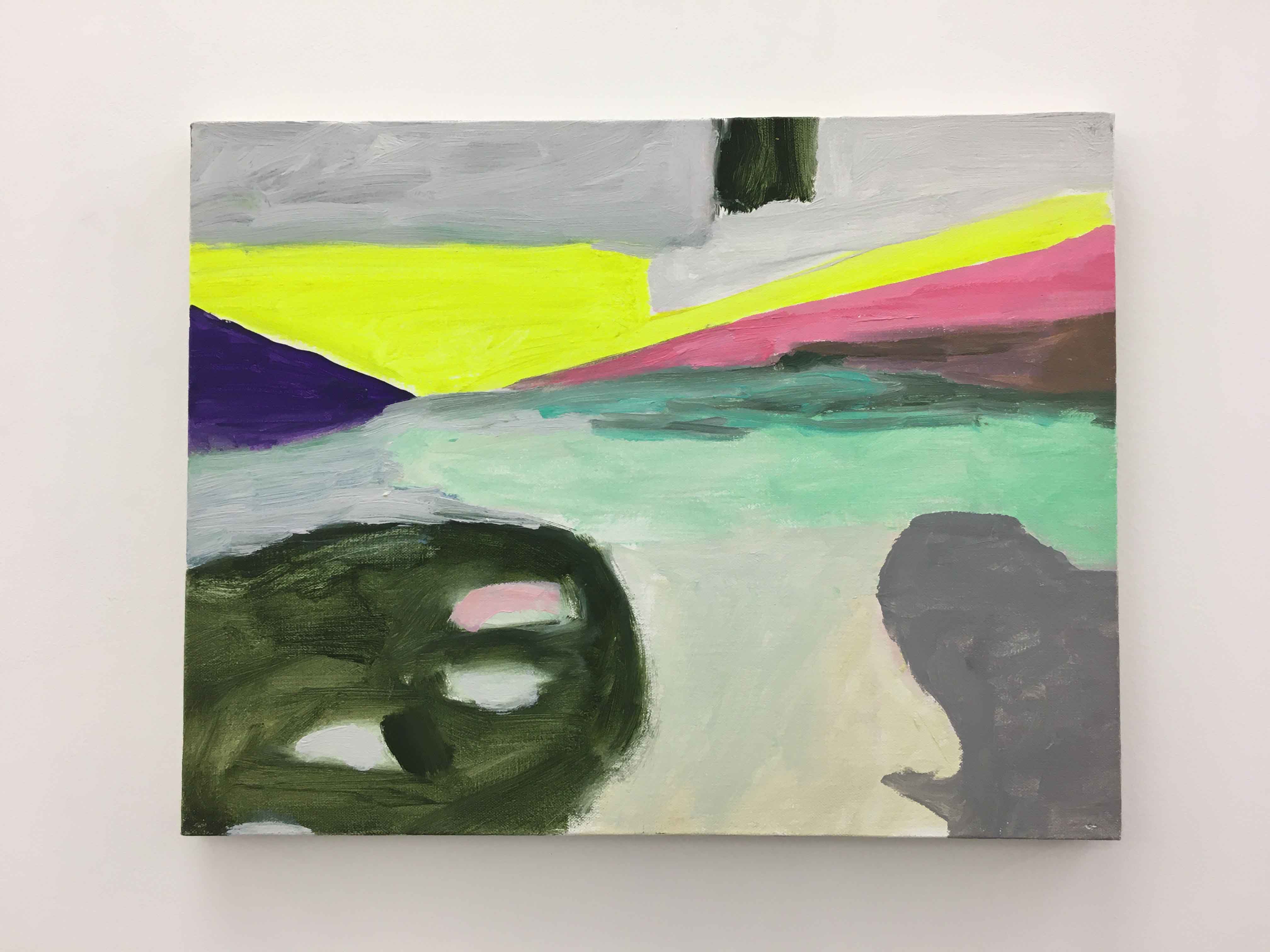
Broken Gates 1982
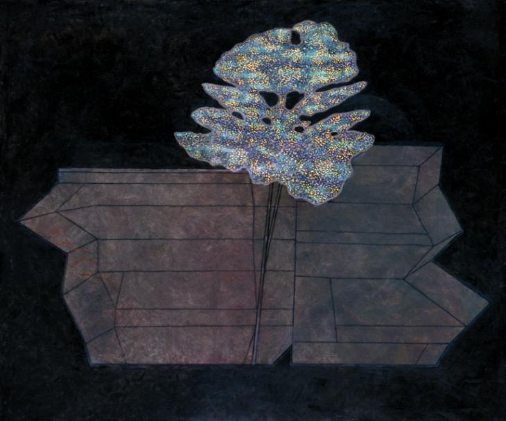
False Flower 1993
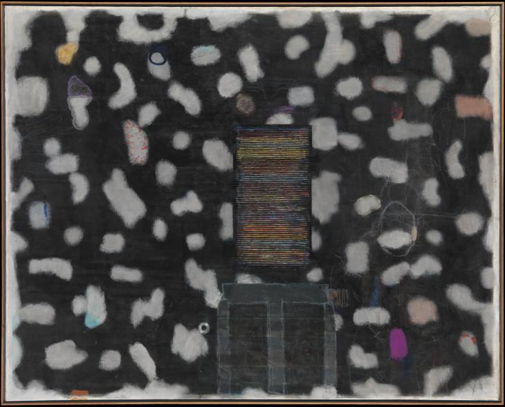
Stack 1993
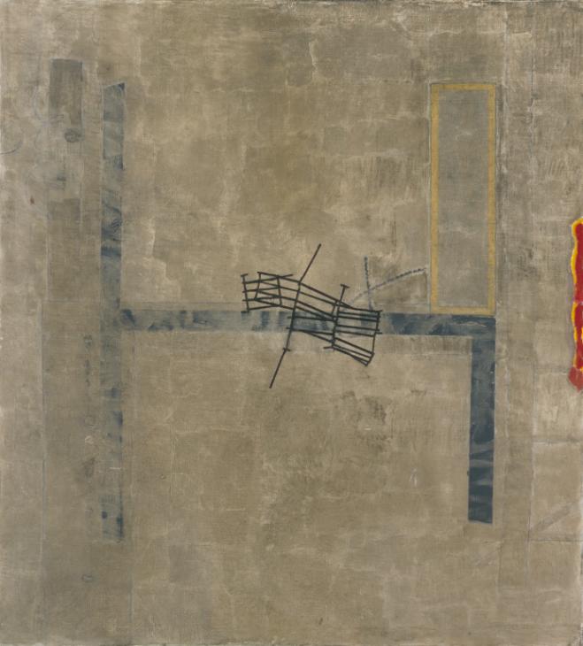
Wire and Demolition 1982
I like that there is a seemingly simple and clear composition, and only looking more attentively do I become aware of the many layers the paintings contain.
When I heard that before studying art, Prunella Clough made maps for the office of war, I can feel how that carries forward in her compositions as territories and borders.
Her palette is mainly earthtones from light browns and beige to dark colours, but then with some small, bright elements standing out, in balance to the larger more subdued areas.
All that we have been looking at through this chapter- unpromising subjects, the relationship between the object and the background and the notion of scale, come together in Prunella Cloughs work.
As suggested in the course manual, I approach the work of Elisabeth Blackadder by watching the video on vimeo.com/25711526. Here I see the artists’ love for plants and for all kinds of objects that she collects. She shows a genuine curiosity for these flowers or objects, that she then reflects in her paintings.
Looking at her paintings, I can see how several objects are placed with a lot of space between them, allowing this space to become an important part of the composition. She uses the shapes, size and colours to balance out the composition, where the objects and the space around have equal importance. None of the objects overlap or have any sense of perspective or depth. There are also no cast shadows, so there is a sense of the objects floating in a colour field, rather than being placed on a surface.
“Stillife with cherrybark” is an example where the large purple and yellow blocks of colour balance each other and how the objects placed on the yellow surface are painted small and flat and all separately from each other. The whole is in harmony and balance. If I try to leave out the darker brown tube on the right hand side for example, the whole composition seems to tilt towards the left.
It has taken me a moment to start appreciating Elisabeth Blackadders’ paintings, but the more I look at them, the more I see these subtle touches that create the harmonious whole and I am curious to start a painting of my own inspired by her work.
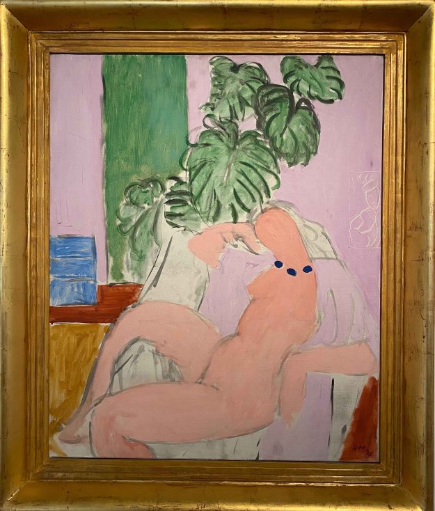
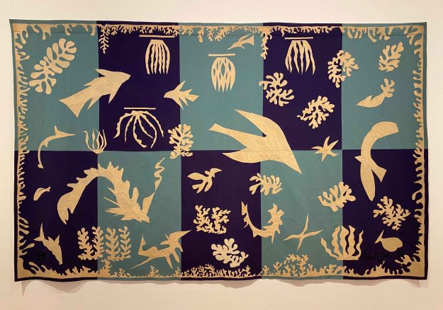
I can understand why we are also asked to take a look at Matisse’s work for this exercise on using space. Like Blackadder, Matisse creates a balance with form and colour, using the whole pictureplane so that the space around them complement the objects. Unlike Blackadder, Matisse really plays with pattern, and creates a sense of perspective and depth in his stilllife paintings.
I visited the Matisse Museum in Nice while on POP1 (shortlink to blogpost: https://wp.me/p94hP8-vb) where I took a picture of this ” Nature morte aux grenades” from 1947 , a merging of interior and exterior view where form, colour, shapes and balance take over as the subject matter.
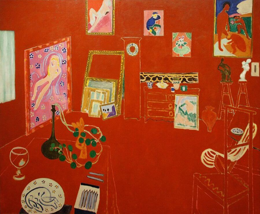
One painting that I have not seen in the flesh, but particularly like is “The red studio” from 1911. Here the paintings in the studio seem to be floating freely on the red surface, but the subtle line drawings of the furniture drawn in perspective create a sense of depth and form.
This is a combination of line and pattern I would also like to try out for a still life.
In his later works, Matisse focused more and more on form and colour, simplifying it to arrive at his famous cut outs.
A week has passed since my above text, and I just had to catch a flight over Nice airport and managed to make a quick detour to the Matisse Museum . The current exhibition is “Cinematisse”- conversation between the painter and cinema. Matisse was an avid cinemagoer and passionate about film- which was reflected in a lot of his paintings and drawings inspired by movies, with exotic influences like the faces of Inuit or the plants of the Caribbean.
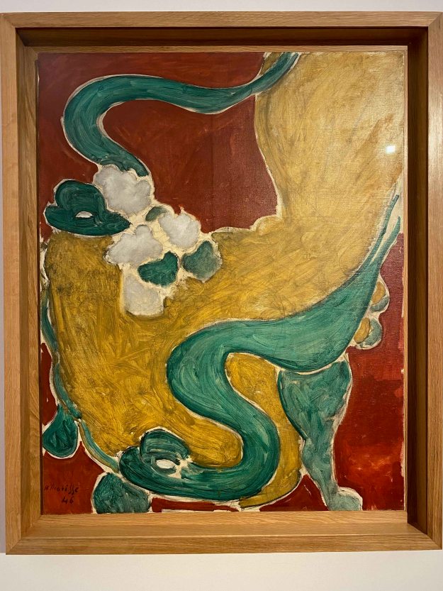
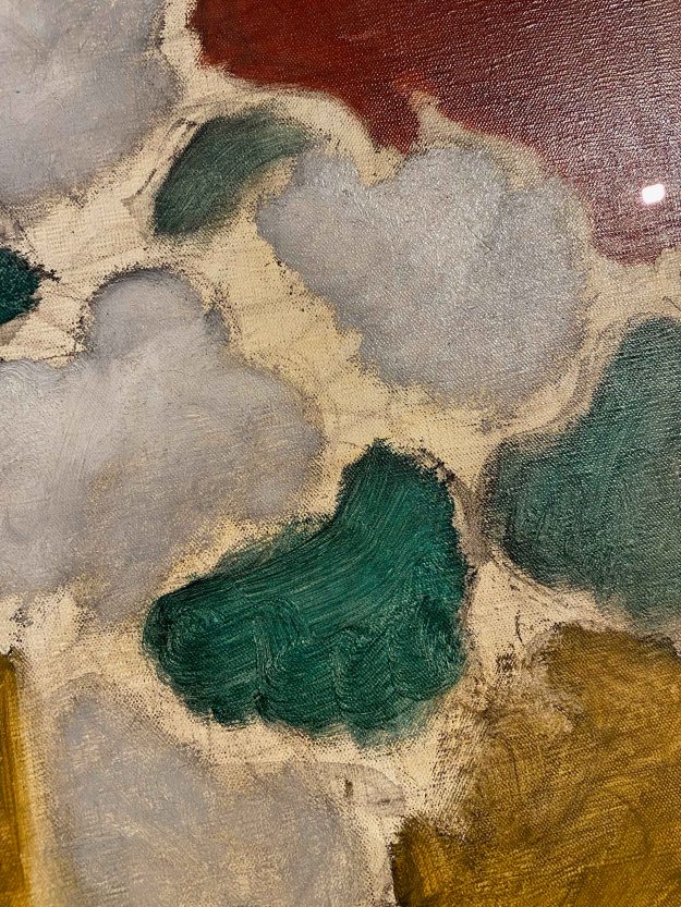
To my delight, I found “ Le Fauteuil Rocaille” from 1946 that was used as an example in the coursebook on display here today. In this painting, the way the chair occupies the whole picture frame and more is what makes it so impressive.
I observed how Matisse allows parts to remain unfinished with the canvas peeking through and used really wide, rough brushstrokes for the elements in starkly contrasting complimentary colours.
Other than ” Nature morte aux grenades” from 1947 that I wrote about above, there were unfortunately no other later still life paintings on display. I saw some of the very early still life from his student years, but they are still very classical and without the specific traits the artist developed.
I want to remember to allow some parts of a drawing or painting to remain unfinished, and observe the flowing, swirling lines Matisse uses, in plants or figures alike.
When comparing the work of Elisabeth Blackadder and Henri Matisse, I feel more affinity with the latter. The comparison is somewhat unfair, because I have admired Matisse’s work for a long time, whereas I am only discovering Elisabeth Blackadder right now. I think it is the sense of depth and the playful, flowing line that draws me more to Matisses’s work.
I am curious to continue with painting still life inspired by these two artists.
On my way back from Porto to Lisbon, I had the chance of a short stop in Coimbra, to see some of the exhibitions for the “Anozero 19” Biennale.
Coimbra is a very old and beautiful university town, well worth a visit. The Biennale was spread out through the university buildings , and I would add a little hard to find! I saw a lot of interesting science exhibits in the Science department before making my way to some of the art works for example.
The theme of the Biennale was centered around the impact of the river Mondego in the city, and articulated through 5 words : silence, passage, marginal, invention, militancy- a theme broad enough for very varied perspectives.
I started by seeing the part of the Biennale located in the Arts department of the University- in an amazing historical building with extremely high ceilings and an inner courtyard.
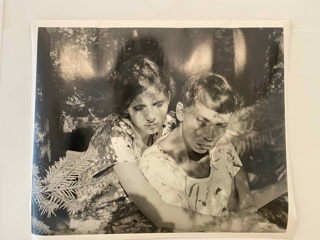
This large format photograph stood out immediately with the shadows of the plants creating another layer over the faces, in a dreamy atmosphere. They eyes of the figures are closed and I possibly thought them blind, the pose is strange and the expressions unreadable, so it is unclear what is happening here.
This work is by Polish artist Joanna Piotrowska , who explores ambivalent and dysfunctional family relationships through these delicate, dreamy staged scenes in black and white photographs.
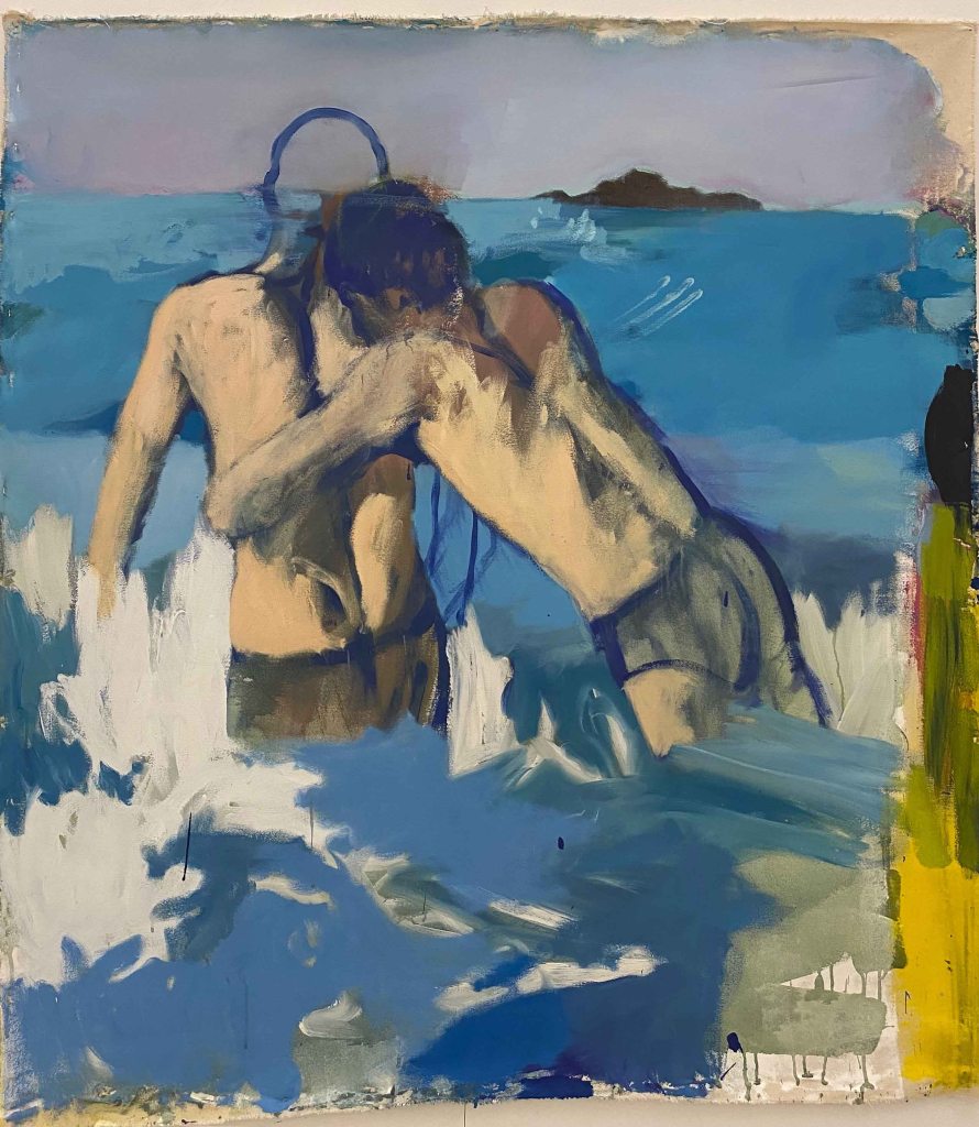
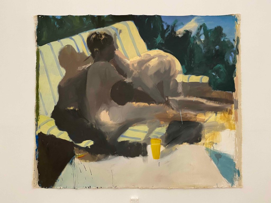
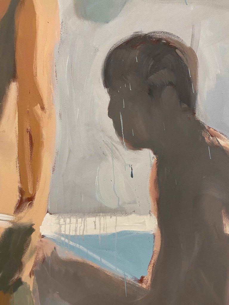
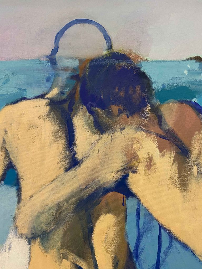
The next room showed large scale paintings by the Portuguese artist Joao Gabriel, especially commissioned for the Biennale. The subjects are taken from screenshots from gay porn movies from the 70s. The paintings are large scale, so the blurry bodies are almost life sized.
The subjectmatter and the blue-brown colour scheme reminded me of paintings by Patrick Angus.
I really like how little detail Gabriel gives to the figures, they are faceless and painted in rough, seemingly quick brushstrokes.
There is a boldness in the approach , and in how much he dares to leave unfinished, like the head here only outlined, that I really like.
I have a tendency of becoming much too detailed and overworking my pieces, so this was a refreshing approach.
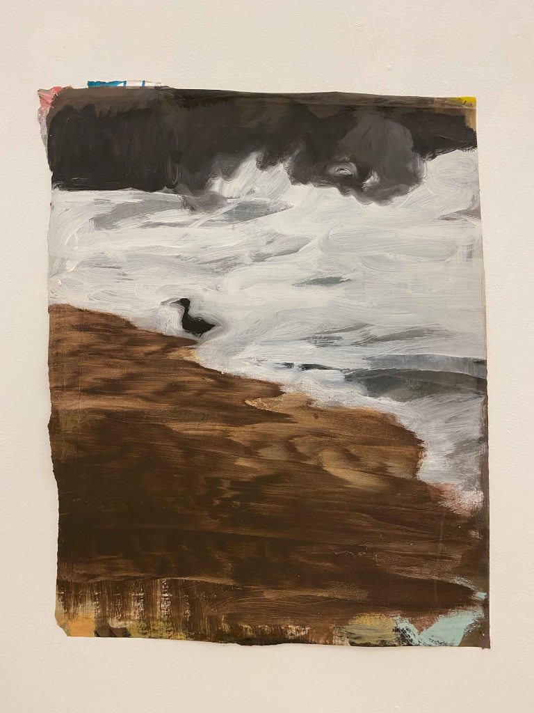
This little panel of a bird in the streaming water, painted in large brushstrokes on a crooked piece of cardboard, was the only painting without the human couples, and I liked how it also had a smaller scale, and offered a welcome break in the display .
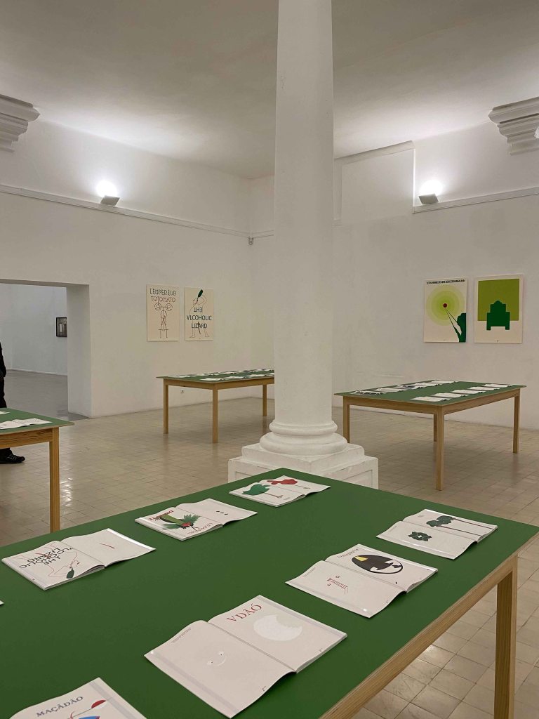
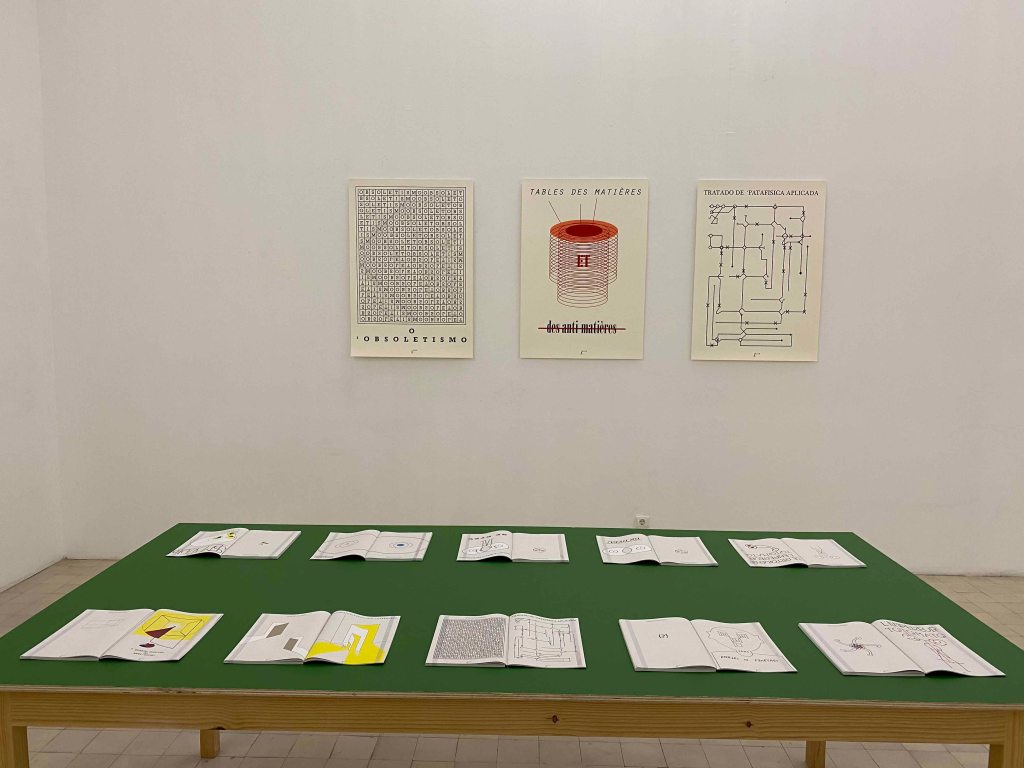
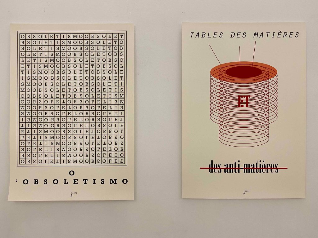
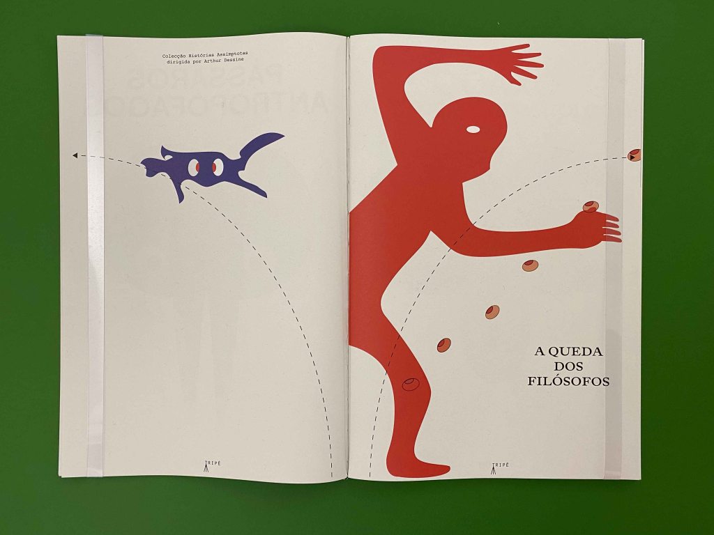
French artist Mattia Denisse used green table tops and posters on the walls to exhibit a large amount of imagined books that “will be printed in the future”.
They cover a large area of subjects, from scientific books of imagined subjects to historical novels of imagined facts.
I really enjoyed the humour, with absurd scientific tables or wordplays. I also really appreciated the skillful combination of drawing and text, or geometrical schemes in an appealing graphic language.
I am not sure the presentation gave the best of the work. The identical format and repetition was less interesting to look at than an exhibition with varying formats and maybe frames to create highlights and some tension. But maybe this sloppier newspaper way showed another aspect of how we are flooded by information that looks easy to either absorb or oversee, and it is only on a second or third look that you catch the absurdity or the humor in it.
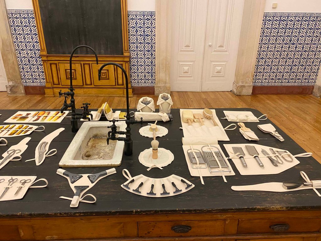
I almost missed the installation of Bruno Zhu in the midst of the artefacts in the Science department, as I took it for a permanent exhibit.
Surrounded by instruments from historical times, he installed modern, small every day utensils on some white clean especially crafted pouches, thus elevating nail clippers or dish washing brushes to a historical object to look back at from the future. It was an interesting way to look at objects we take for granted with a new perspective, elevating them to a collection of curiosities.
On my hunt for more artworks, I saw a whole geological exhibition of interesting mineral formations, but unfortunately did not make it to any further exhibitions from the Biennale before having to return to Lisbon. These glimpses were rewarding though, and I will make sure to return with more time next time.
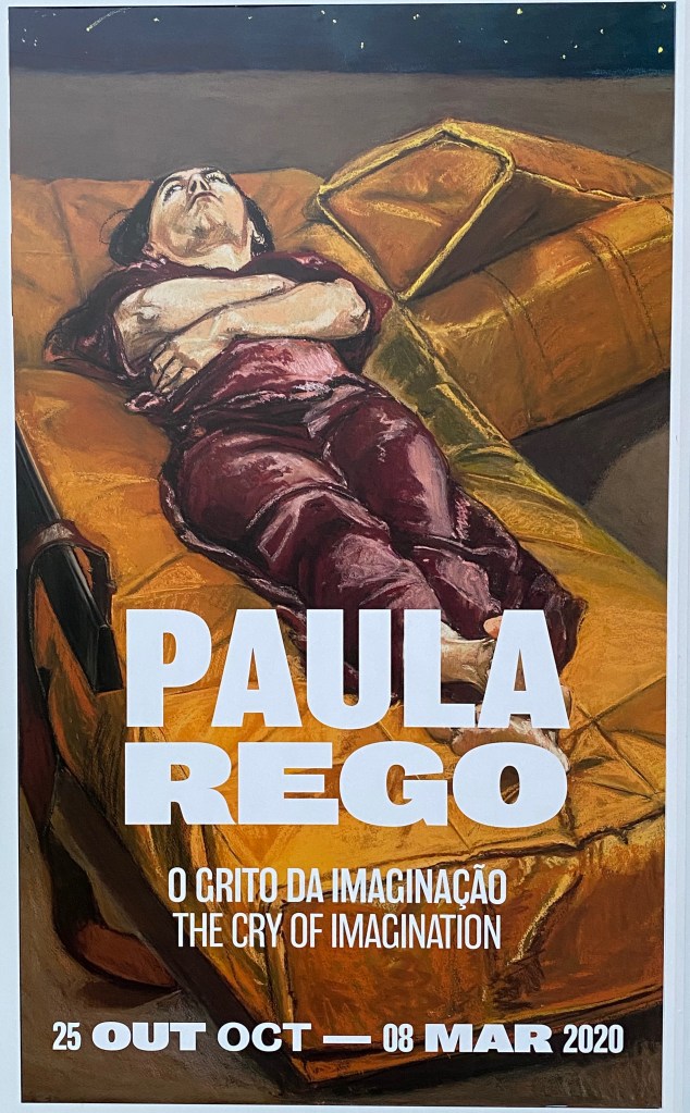
Simultaneously to the exhibition of Olafur Eliassson’s work at the Serralves Museum in Porto, I was delighted to discover a whole building dedicated to Paula Rego.
I love the way Paula Rego tells stories through her drawings and paintings and have visited her “Casa das Historias” in Cascais several times, which I documented in previous blogposts. (Shortlinks: https://wp.me/papvz2-e4 and https://wp.me/p94hP8-cD)
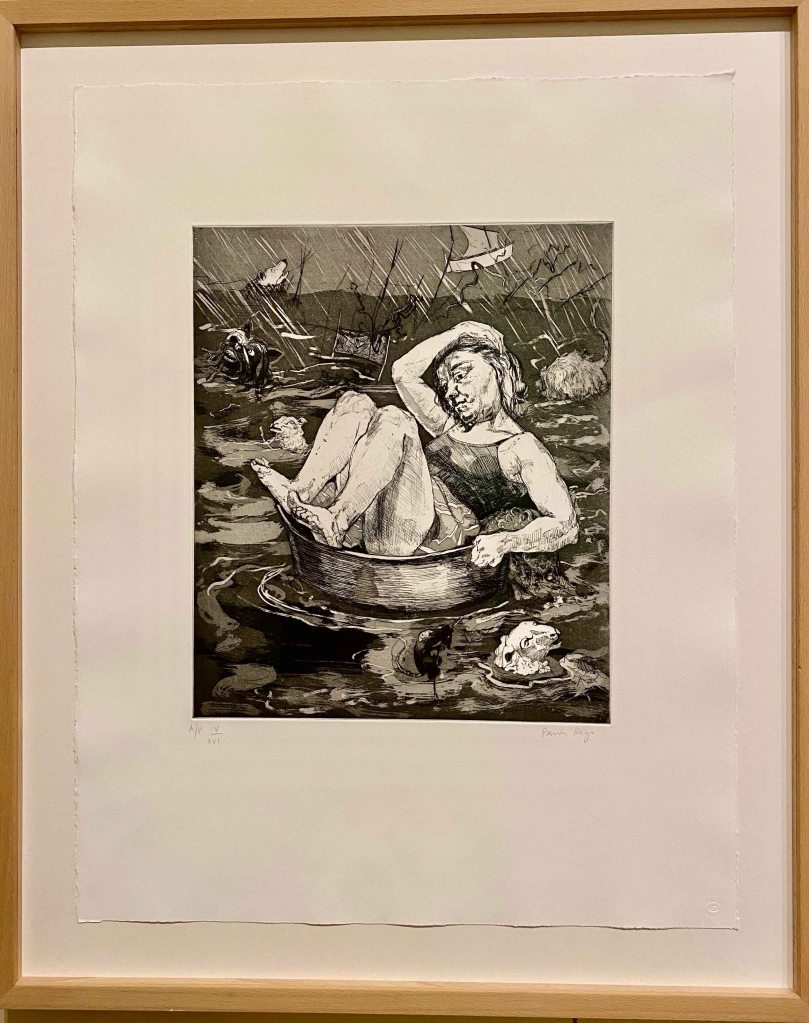
The exhibition started with a series of etchings , “the Pendle Witches” about the trial of witches in British history.
Paula Rego is often dealing with the role of a woman in society as a subject, through stories and literature that she transforms into images, or by telling her own story very openly, about depressions and abortions, about her family life.
I like the real expressions and quite awkward poses of the persons. I know from the movie “Paula Rego, Secrets and Stories” by her son director Nick Willing “, that she is using the same model, her assistant, who looks quite similar to the artist for the majority of her works.
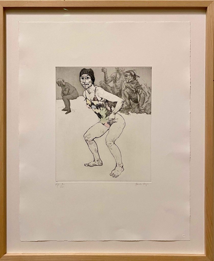
In this second etching, I really like the emptiness, the feeling of some unfinished pieces creating space around the figure, and again , the quite awkward dynamic pose.
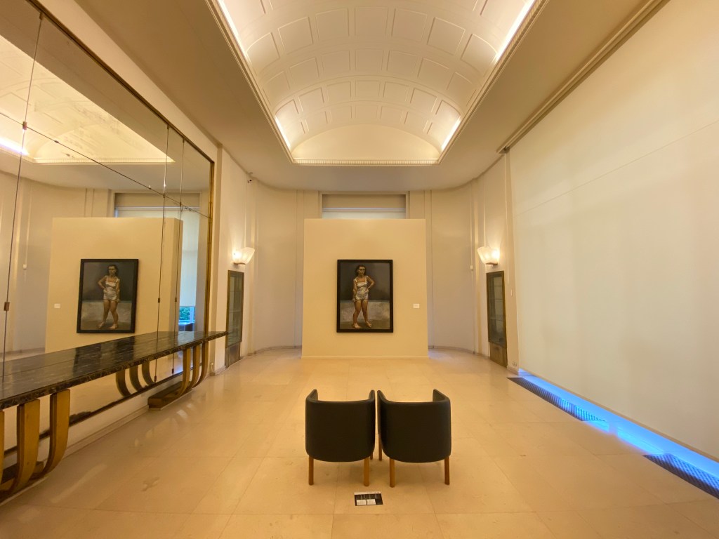
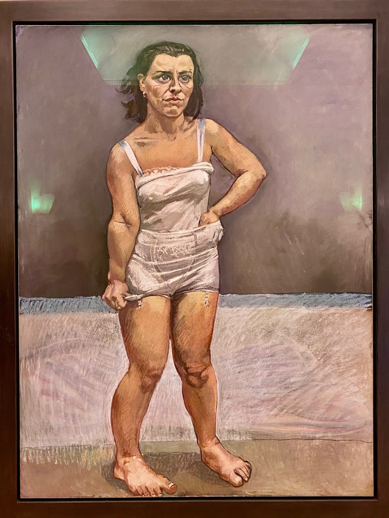
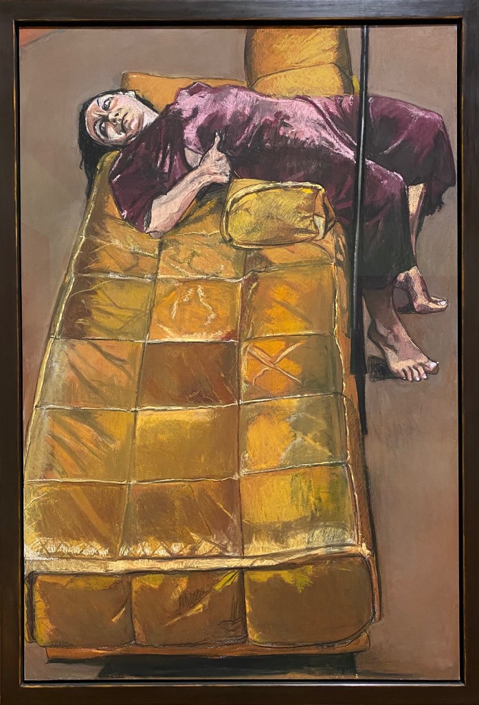
The painting “The strap” from 1995 had a whole room dedicated to it, which amplifies the vulnerability and loneliness of the figure.
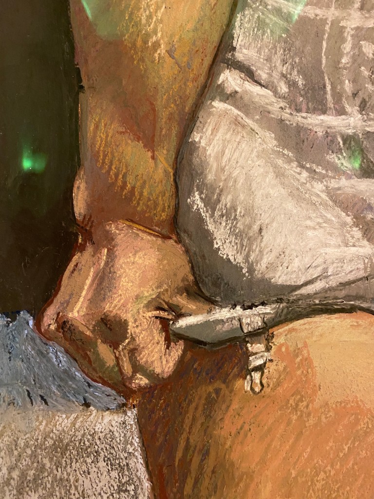
This painting lives from the expression and pose of the figure, at the same time bewildered or angry and a little desperate, in a pose that is tense and awkward. The background gives little clues to what is happening, which also focuses the attention on the face and the cramped hands pulling on the underwear. It looks rather like the girl is trying to pull her panties longer to cover herself more, than that she is trying to take them off.
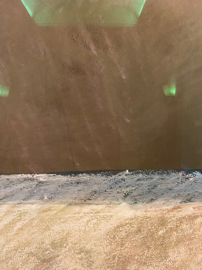
The work is in pastel on paper, and I take some close ups here to look at the mark making.
Paula Rego prefers to work in pastel to avoid expressionistic brushstrokes, but I find the marks here take on a similar quality, with rough strokes echoing the expression and tense pose, contrasting to the smeared parts of the background.
I recognized the small work “the Merman” from a visit to Cascais .
I find there is so much expression in this creature half human, half imagined or animal , with the hand reaching between the tails. I observe how parts are colored and others left untouched.
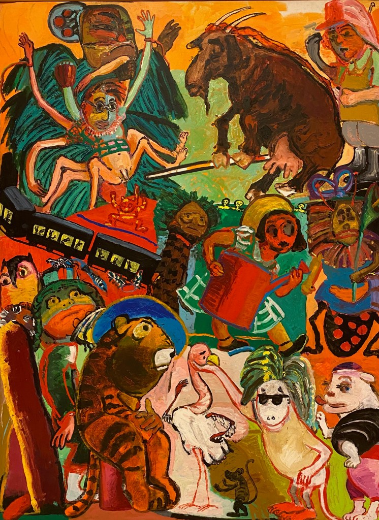
I like how Paula Rego often combines animals with human figures. This very full and loud painting from the 80’s is full of imagined beings.
It feels quite chaotic at first, but the diagonal composition with the body and penis of the spider figure pointing to the right bottom corner where figures point back up lead the eye.
I do prefer the calmer paintings though. In “Playroom” from 1986, I really enjoy the mirrored composition, with the two clear fields of complimentary colours red and green, both with the same motive of a girl and a dog.
I want to remember this mirrored composition and the depth it creates for my own drawing. I also enjoy the contrast between some parts being very detailed and patterned, while others are left untouched with the bare paper shining through, like here in the hand. This is another aspect to remember as I have a tendency to overwork my drawings.
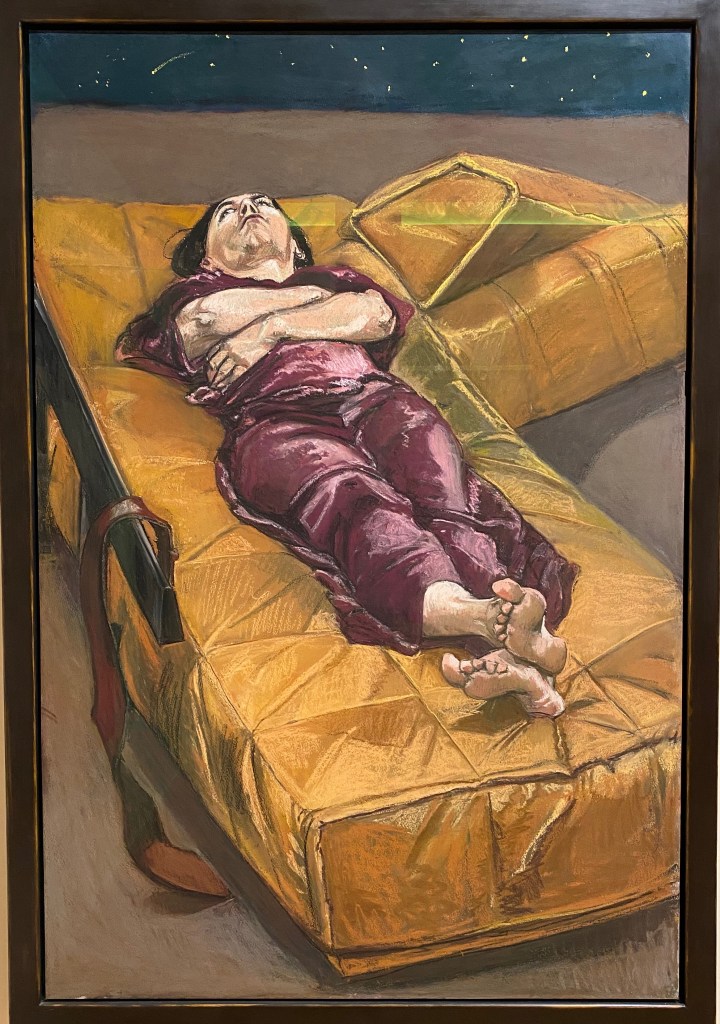
Finally, “Possession 1-7” ,a series of 7 large scale paintings, left a lasting impression.
The same figure is lying on the same couch with similar clothing, just the poses and the expressions changing. When stepping into the room and surrounded by these large paintings, they become quite oppressing. There is a sense of ennui, of boredom in the expressions rather than possession I find. There is a small note about the artists experience with psychotherapy, so that is probably the theme here, but the paintings can also just give a sense of time passing without much change, a feeling of being stuck, in thought, in a personality, in a place.
This series remind me of the series “Depression”, that I have seen in previous exhibitions. There the figure is also lying on a couch with the same or similar black dress, but the expressions are stronger, more desperate and evoked stronger feelings.
I was delighted to see some more of Paula Rego’s work today, especially as she is using much pastel on paper, which was a good reminder about this medium before embarking on the new drawing course. I feel inspired by her markmaking and compositions, and her unique way of narrative and the way she uses her own story in her work.
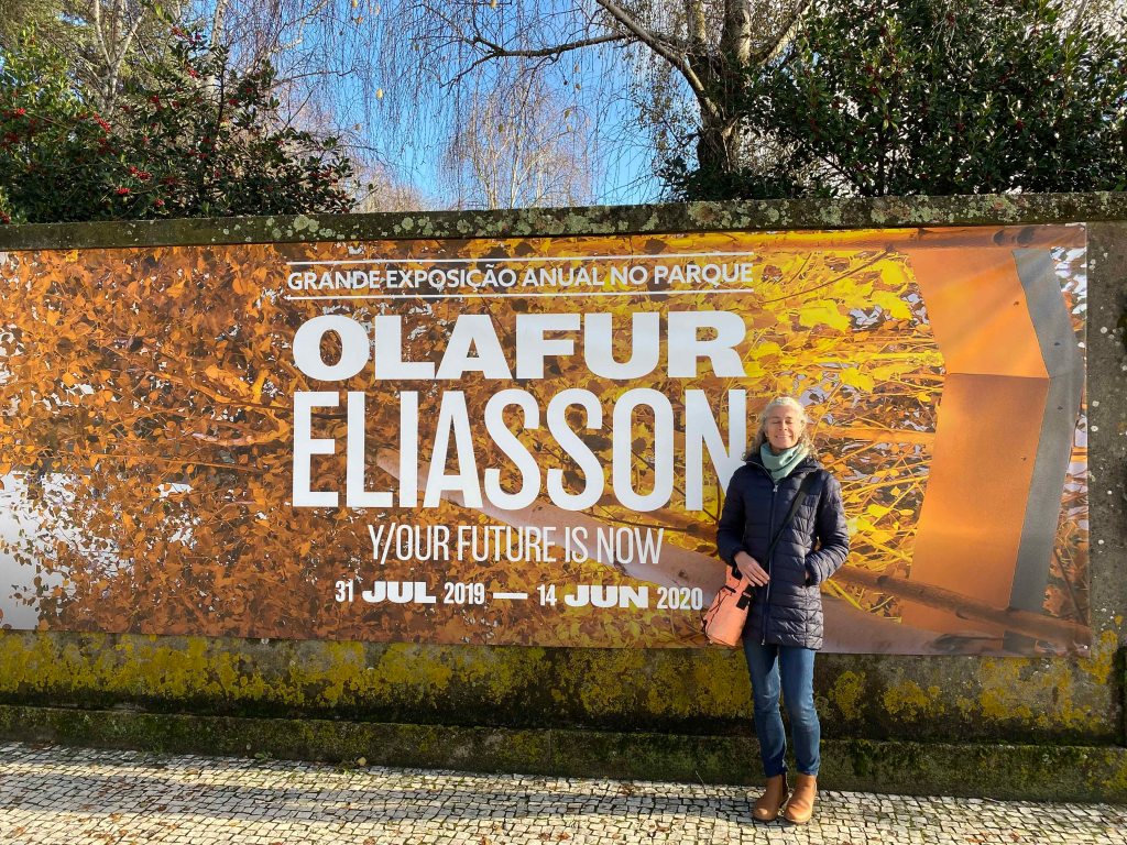
Finally, I managed to see an exhibition by Danish- Icelandic artist Olafur Eliasson- an artist whose installations have become known all over the world (his exhibition at Tate Modern in 20013 drew 2 million visitors) and left me very curious of what I would actually feel when seeing something in the flesh.
The theme of the exhibition at Serralves in Porto is “Y/our future is now” and as all Eliassons work is focused on the relationship between humankind, nature, art, science, architecture and society.
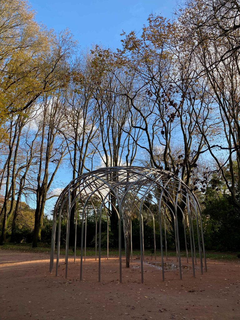
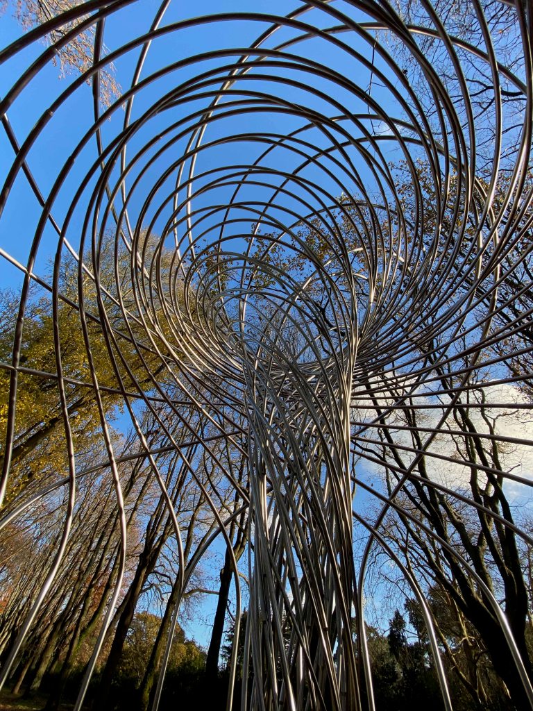
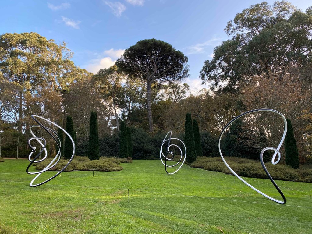
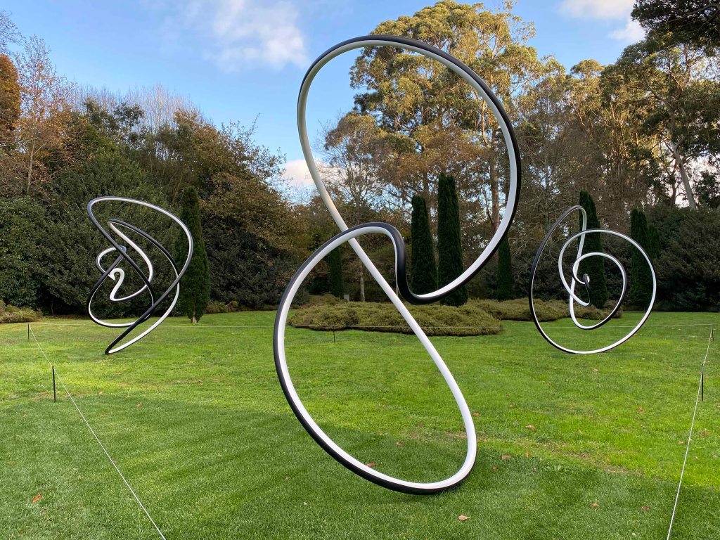
I started by exploring the sculptures in the park and first encountered “ The curious vortex” from 2019.
This is a huge stainless steel swirling vortex, erupting like a geyser . Standing inside the centre of the vortex and looking up towards the moving trees and clouds, I could feel a sense of movement, and see how this heavy structure evokes a sense of lightness and perpetual movement.
There was also a beautiful glittering added by the reflecting moving leaves, of the surrounding trees that also added a sound to the experience and reinforced the sense of it moving.
Further, three large black and white steel spirals form the work “Human time is movement (winter, spring and summer) .
They looked like lightdrawings photographed with a long exposure and I liked this idea of lines in space. There was something joyful in the movements of these sculptures, I felt a smile when looking at them. And yes, I could feel how the movement of my eyes along the forms became a n experience of time.
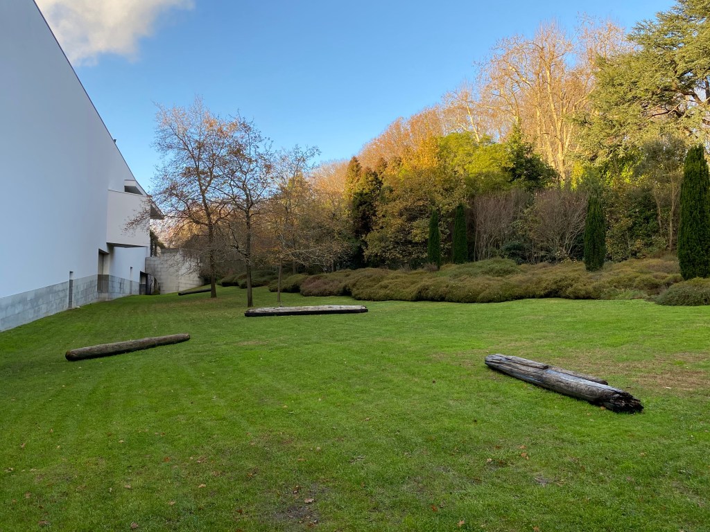
The work “arctic tree horizon” composed of logs in the grass around the museum building did not have the same visual impact at all. Probably because they looked very much at home in a park with huge ancient trees around. It was not until reading about them and their significance that I paid attention to them. Iceland has very little or no trees and yet these huge logs come floating ashore there, carried by the currents of the sea and drifting ice. Eliasson collects the logs and transports them to yet other surroundings . After knowing this, the work evokes thoughts about migration, circulation as well as about our ecological system.
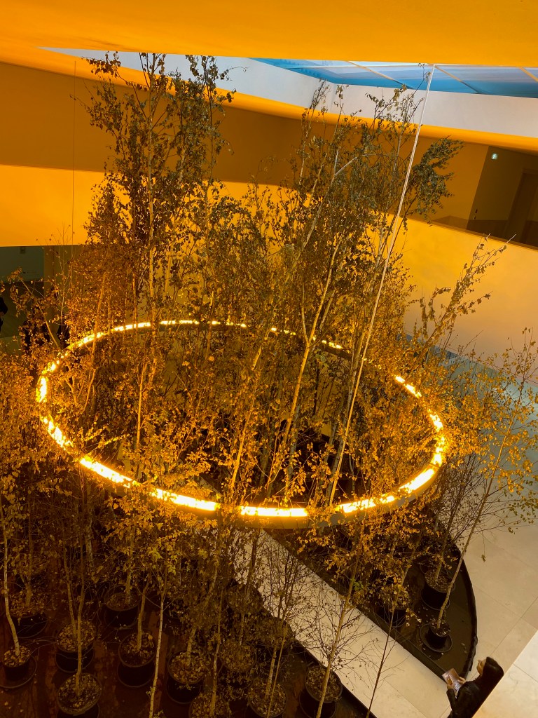
Inside the museum building , in the central atrium, I could walk on a tiny path through the “Yellow forest”- a small artificial forest of birchtrees in pots. It was lit by a huge ring of yellow light that looked very warm and inviting. In the centre, this light altered my perception of colour and everything around looked either grey or yellow.
The work is supposed to evoke the dreamlike space of the forest as a place of relationship between humans and the Earth. I missed the feeling of forest, although I grew up in the North of Sweden and have many memories connected to birch tree forests. Here the rather thin ring of rather scrawny trees still had a very artificial feeling and I reacted more to the large plastic pots that held the trees. Looking back at this work mirrored in the next one had a larger impact. Seen in the mirrors from afar, this oasis of warmth and trees definitely looked like an attractive, warm, safe place.
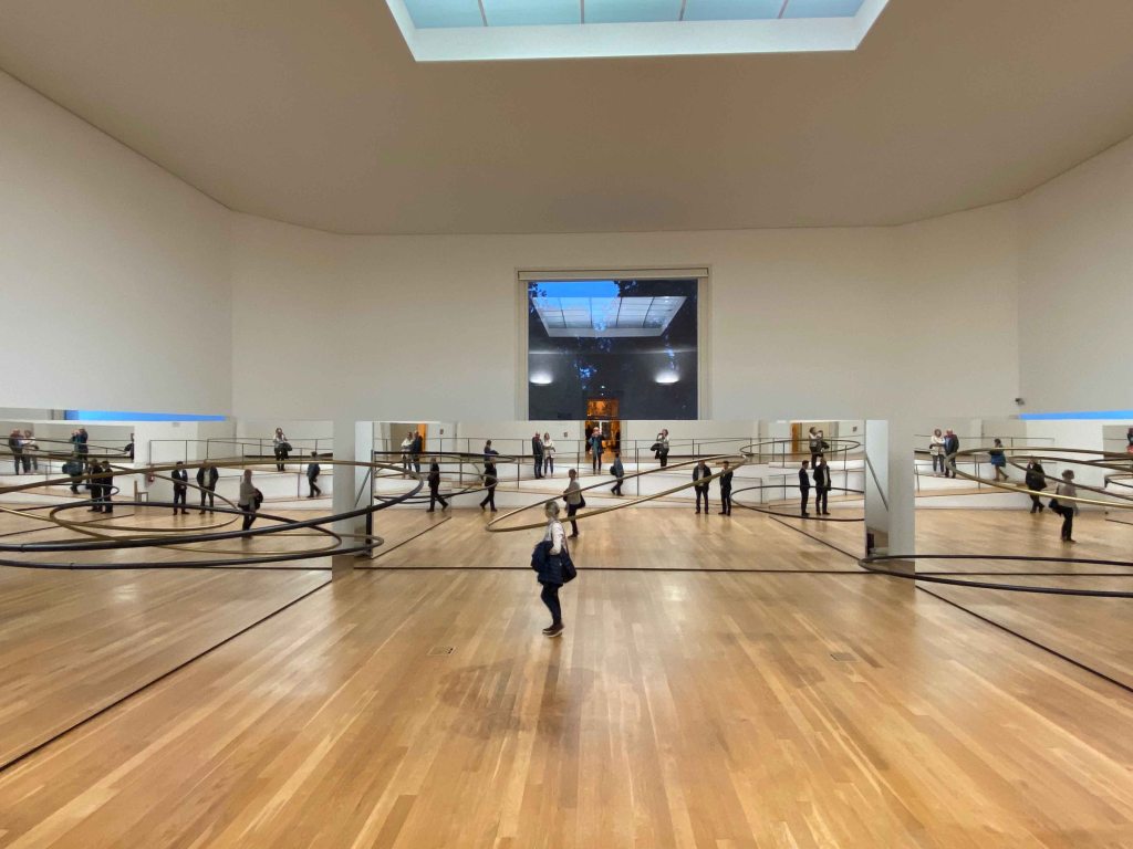
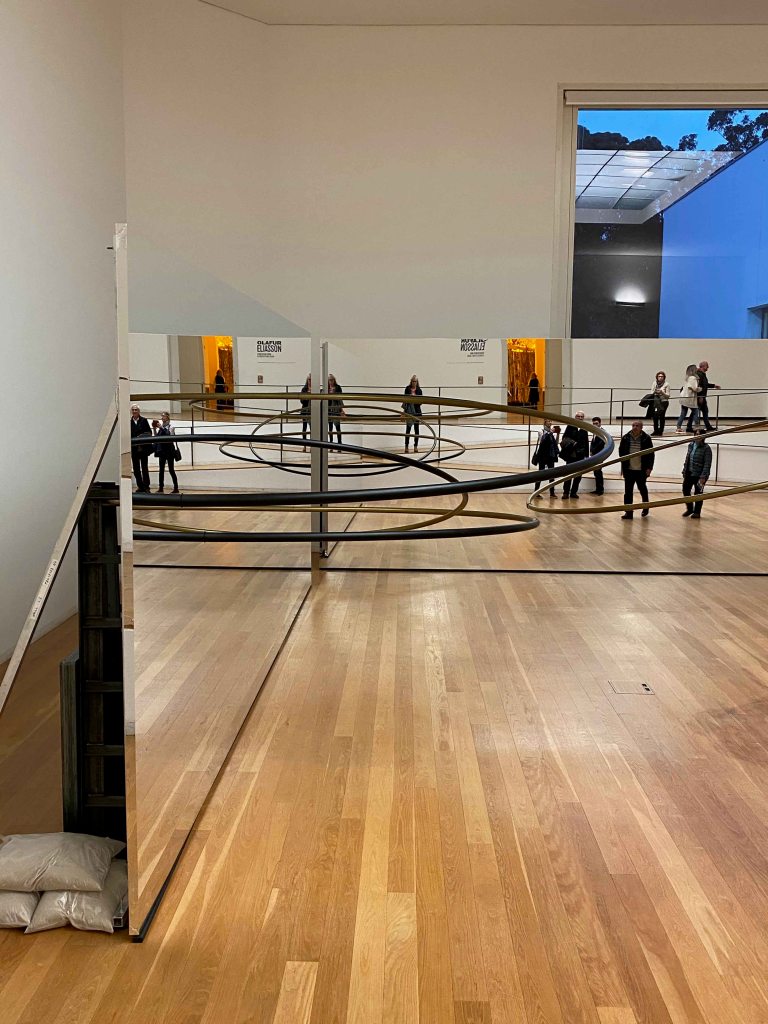
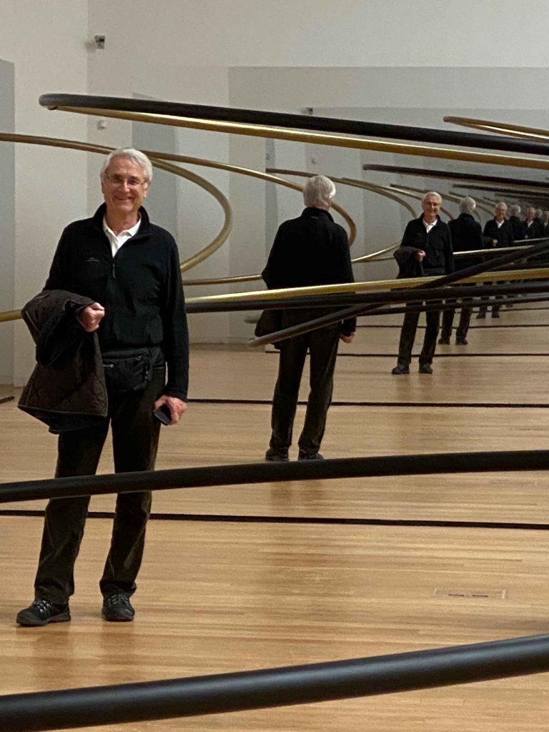
“The listening dimension (orbit 1, orbit 2, orbit 3) is composed of wall sized mirrors with large golden and black rings that makes it look much ,much larger than the room.
Seen from above it is a peculiar geometrical space, but when walking down into it, and becoming part of the reflections, another level of perception happens. My own image , as well as the one of the rings and the other visitors is reflected into infinity and looks as if it is moving. Here I am seeing my father who was with me reflected into infinity.
The sense of space and reality become unsure. I feel like I am floating in space with an infinite number of rings and elements floating around me.
I have read on Olafur Eliassons website that he has a studio in Berlin employing over 80 people, which sounds an incredible endeavor in itself. I was really happy to have the opportunity to see some of his works, although having to big expectations maybe lowered my experience a bit. I would be very curious about my experience if I were to walk through the fog tunnel made of food additives at the Tate Britain.
In any case, I enjoy the sculptural and experiential way Olafur Eliasson addresses the subjects of our relationship to nature, to what surrounds us and calls for more awareness in a way that engages the viewer and makes him a part of the experience, also then someone with a part of the issues and a responsibility to continue interacting.
On the 15 th to 17 th of November, a large number of galleries came together for the “Lisbon Art weekend” with exciting exhibitions and events.
I really enjoyed this wonderful opportunity to create an itinerary through the city and visit several galleries I did not know before over the course of the weekend.
Gallery 3+1
I chose Gallery 3+1 with the individual exhibition “Almost nothing” by Brazilian artist Maria Laet for the opening ceremony, as this is an artist whose name keeps coming up and I still did not know her work.
Her work centers around the subject of “ time as action, intention and disintegration”
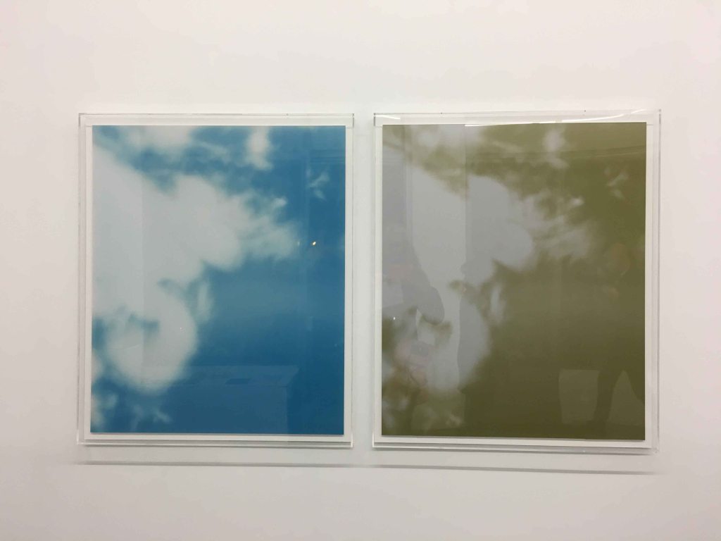
In this piece called “Overhead” she has placed a photogram of the rays of sun through a tree beside the photograph of the same. Now they look the same, but the photogram will disintegrate over time until the image disappears, while the photograph remains as a witness. I find it visually captivating now, and I like the idea of witnessing the slow transformation and thus having a sense of time incorporated in the work.
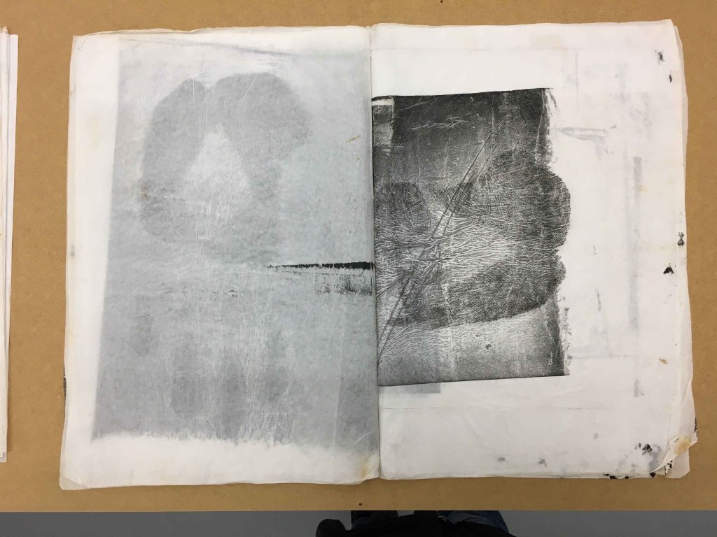
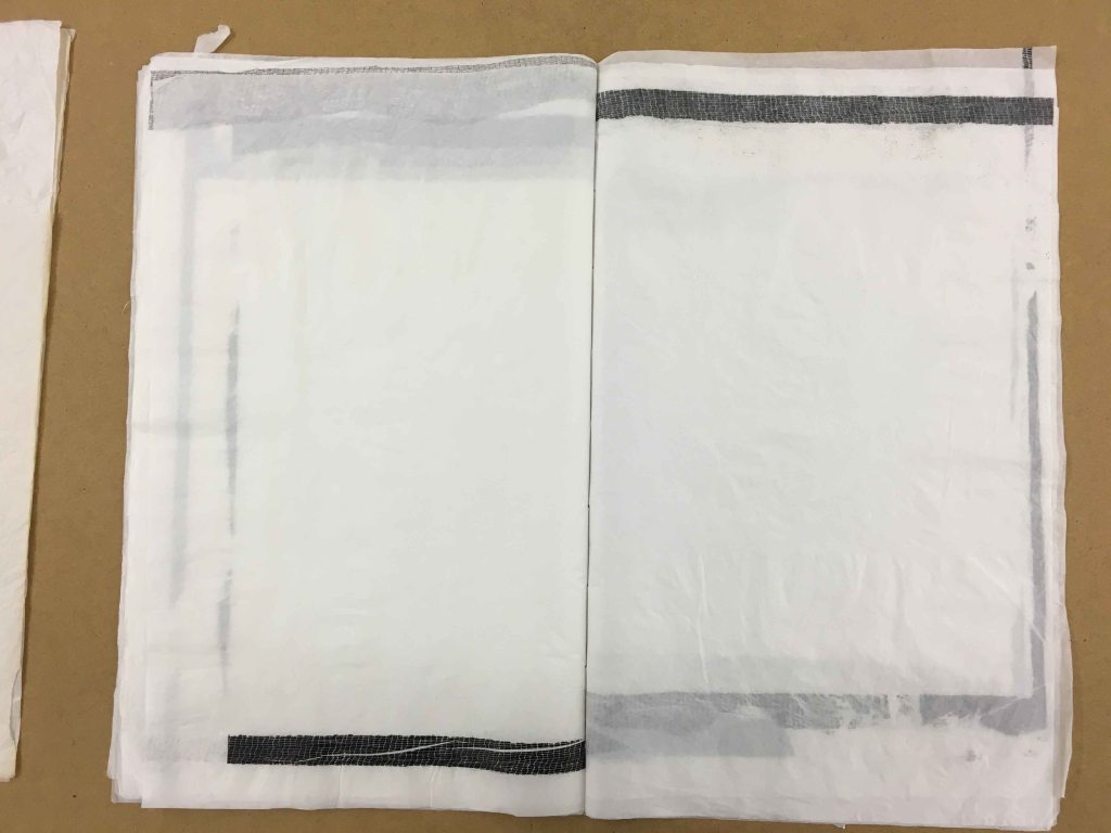
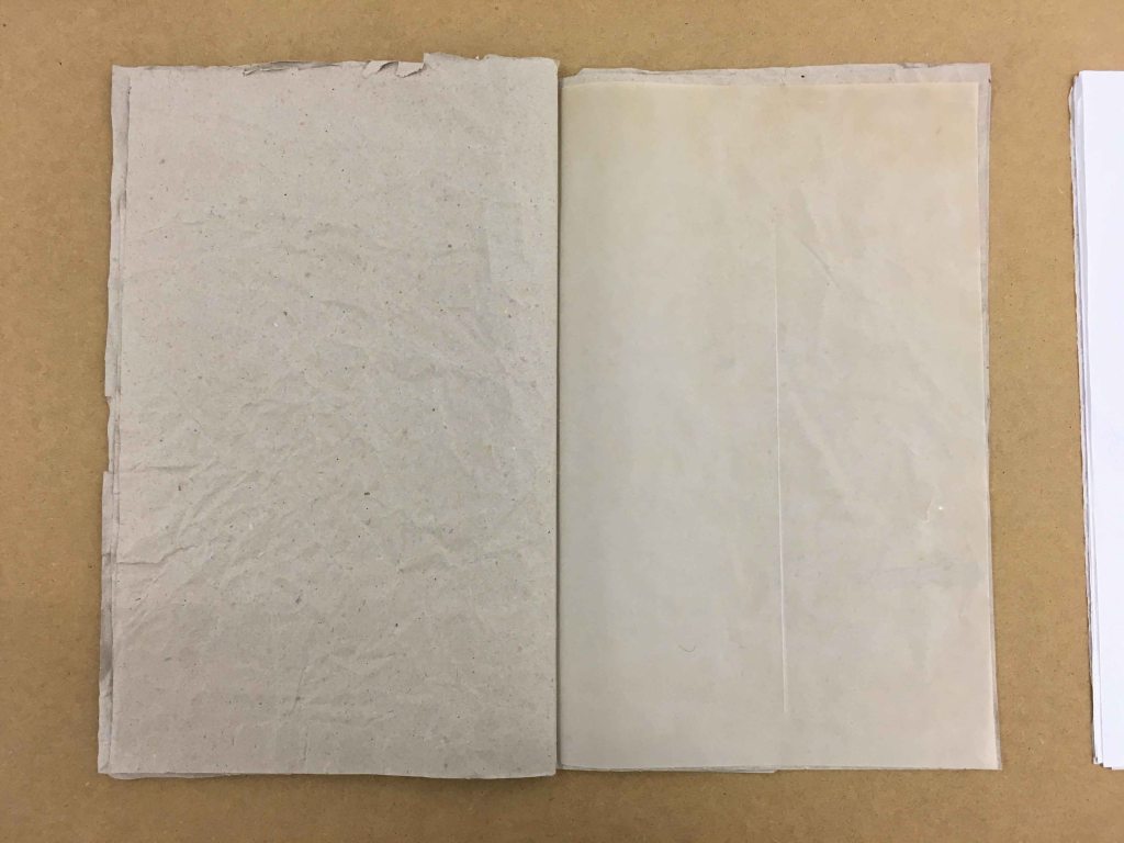
“That which we don’t see “ was presented as books lying on a long table. It is made of papers used to wrap or support other works, so just traces of something else that we would normally not give a second look.
I really enjoyed the subtlety of the differences in papers and tones of white with the wrinkles and creases becoming gentle lines forming patterns and drawings. I like how light and subtle these “drawings” felt.
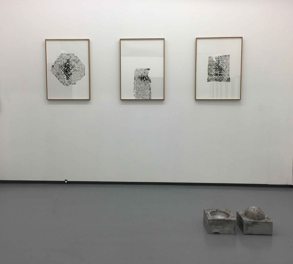
The idea to present an object (sculpture) in front of paintings or more graphical works on the wall was something that I saw on multiple occasions in the Ar Co exhibition in Lisbon in May this year.
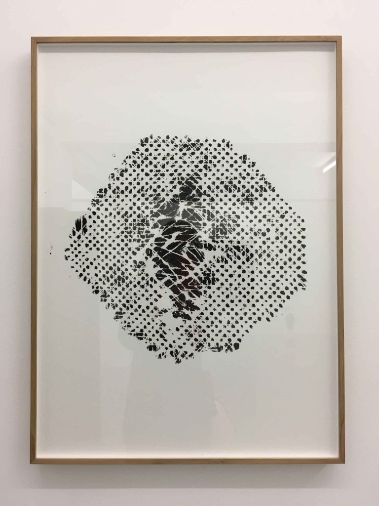
Here the molds around a balloon that the artist filled with one long breath remain, after the balloon itself has already shrunk. On the wall, we see rubbings with an oil stick over the backs of old, broken wickerchairs.
The rubbing through the backs of these chairs create beautiful graphical patterns. I quite loved this idea which sparks my imagination to try with other objects. The worn chairs express a sense of time again, and every rubbing is an original, so a fleeting record of this chair on this paper. The molds are also records of a fleeting object- a blown up balloon with a single breath of the author.
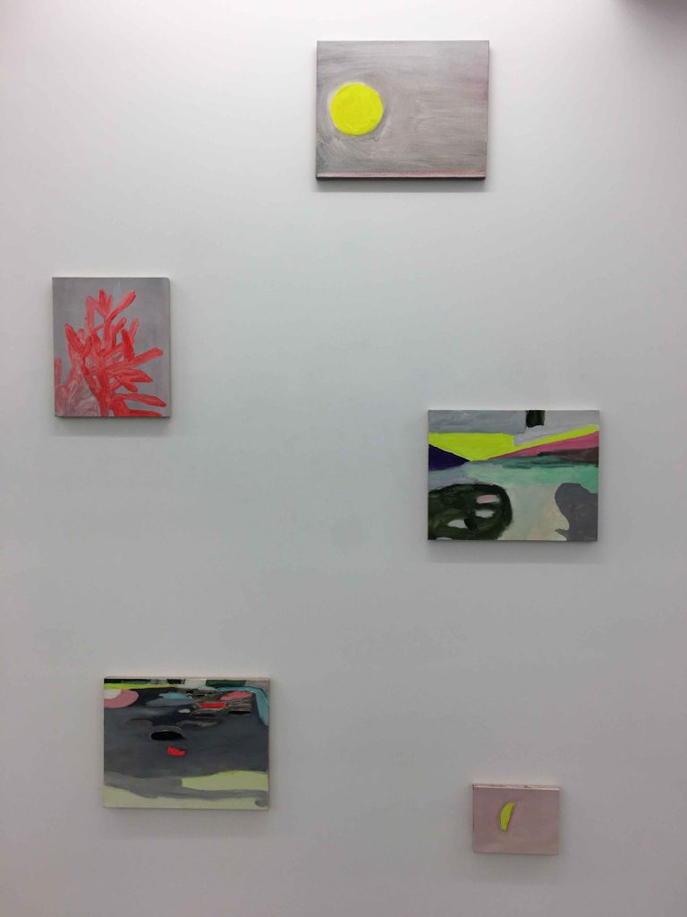
In the same gallery, but outside of this exhibition, I discovered a series of small paintings by another Brazilian artist- Gabriela Machado.
Dividing her time between Brazil and Portugal, Machado allows the light and colours of her surroundings to appear, amplified in the paintings while using motives mainly from nature. I was touched by these small, very colourful paintings, by her using almost fluorescent coulours and still keeping a sense of calm and quiet in them.
I like the simplicity of the motives and how she allows some close ups to become almost abstract. I definitely have a tendency to over complicate my motives and this was a refreshing reminder how sometimes much less is more.
I returned to the gallery later to ask to see more, and discovered this new series painted in oil on rough, unprepared linen, letting the lines bare in some places. Again, I loved the really bold use of colour, and also the unfinished character with the linen.
CARPINTARIAS DE ST LAZARO
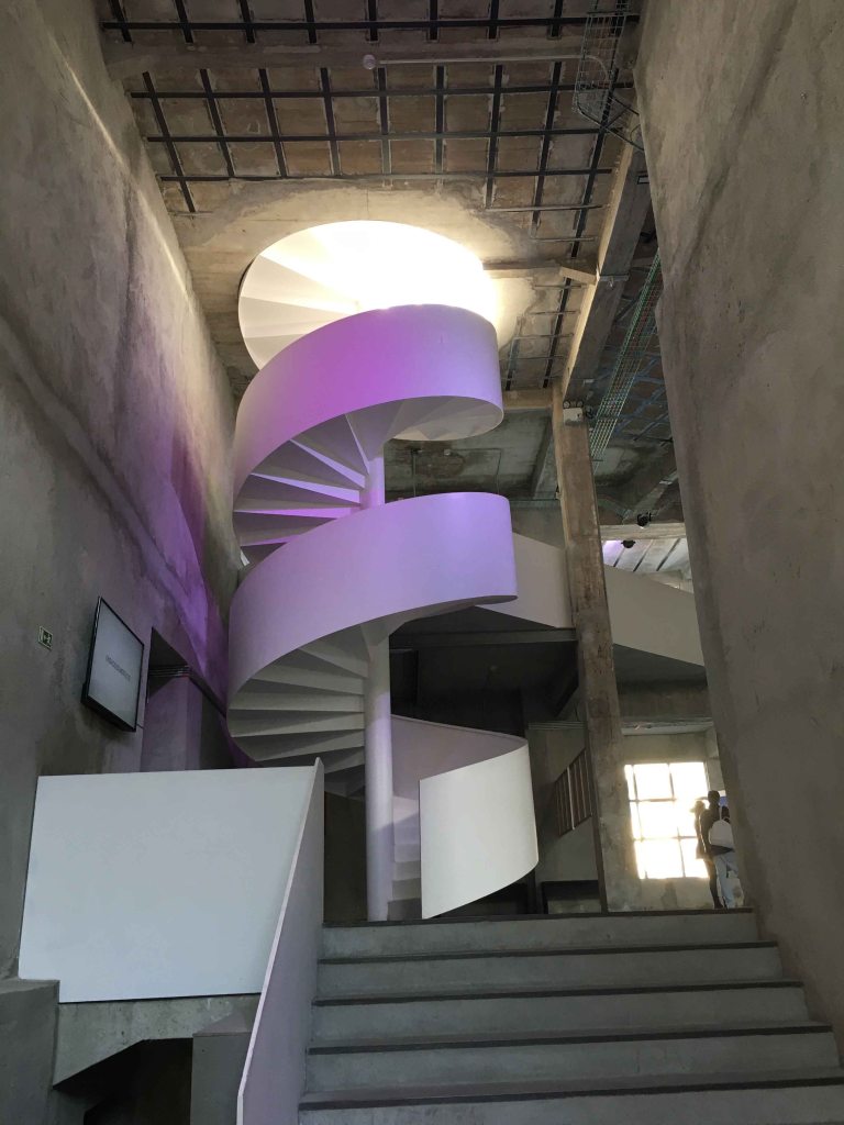
On Saturday morning, I started my gallery visits with the rebuilt woodworking space “Carpintarias de St Lazaro”. I discovered that this is an amazing exhibition space I had not visited previously.
For this Lisbon Art Weekend, the Carpintarias showcased a photography exhibition with very different series from an international choice of photographers.
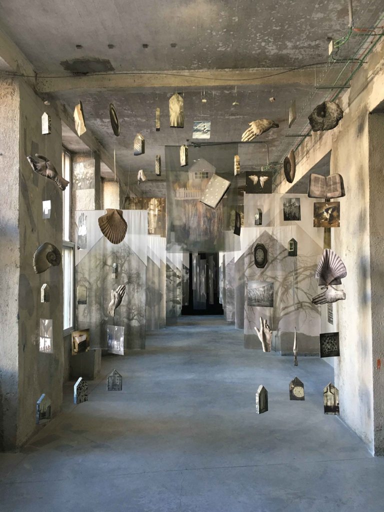
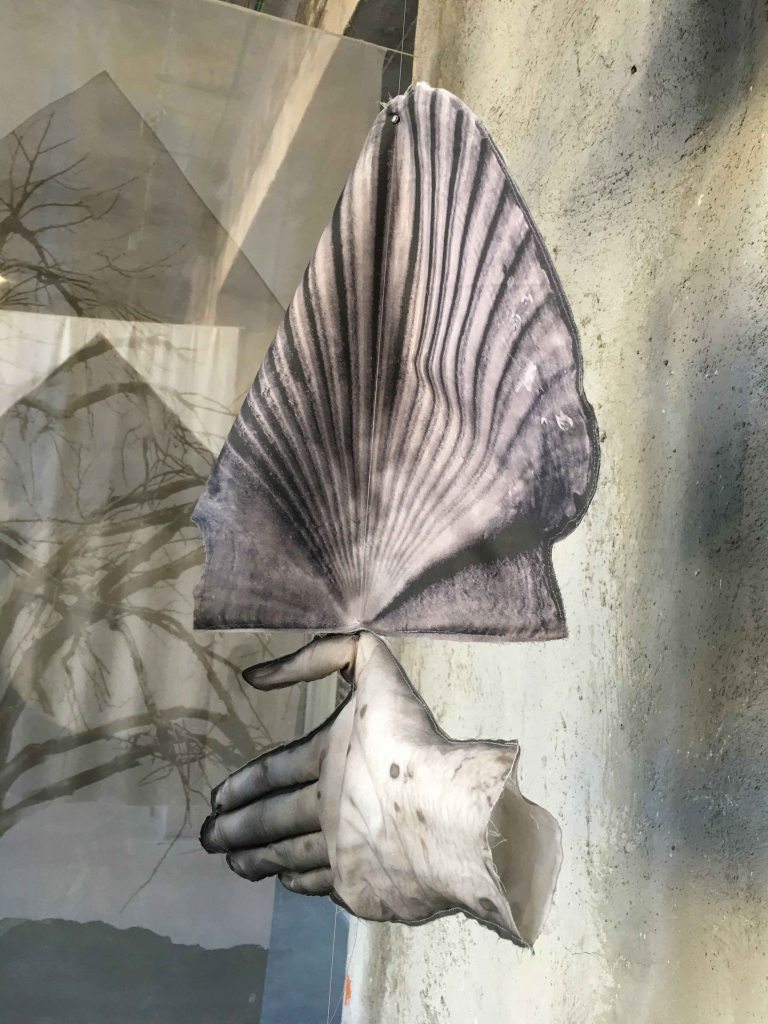
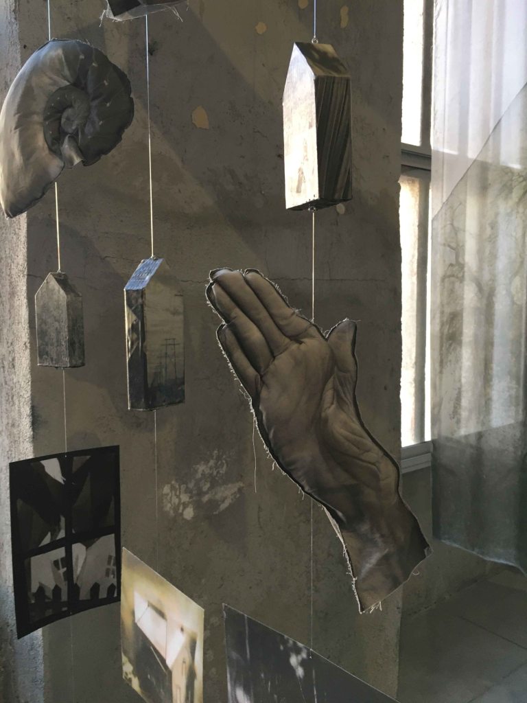
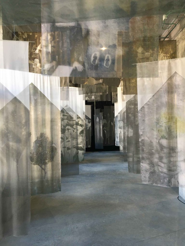
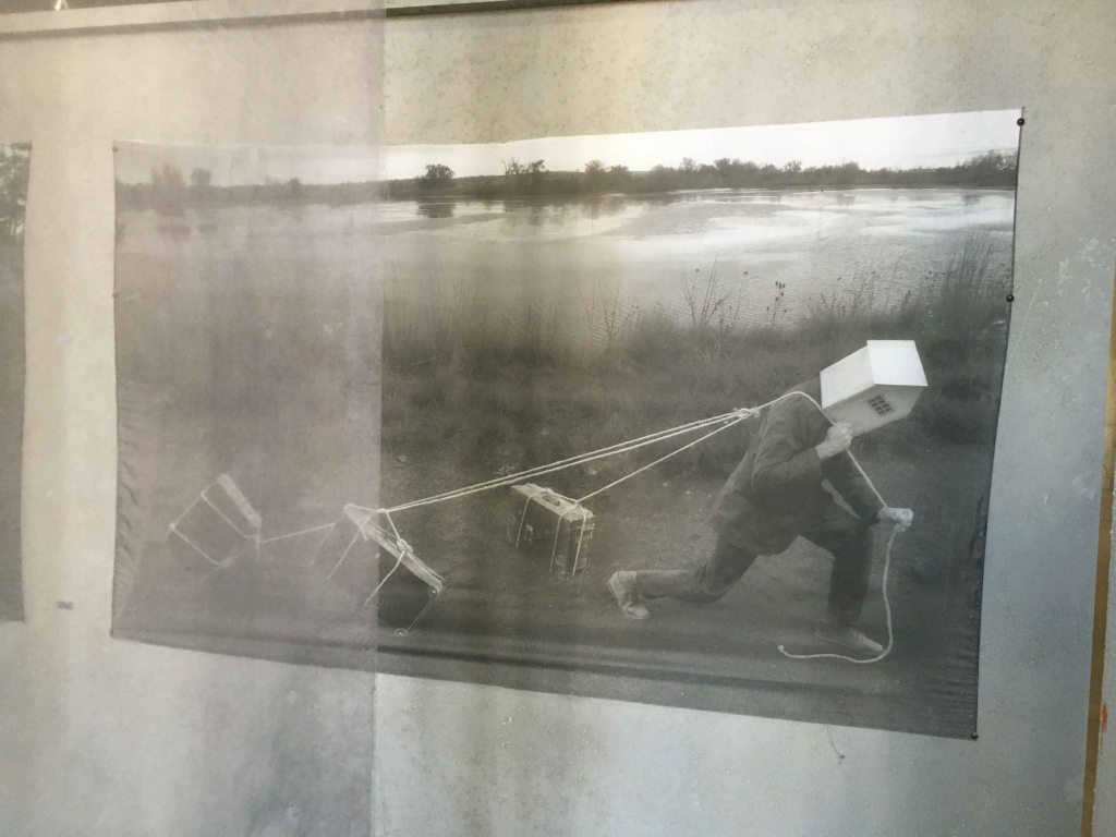
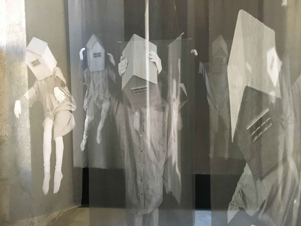
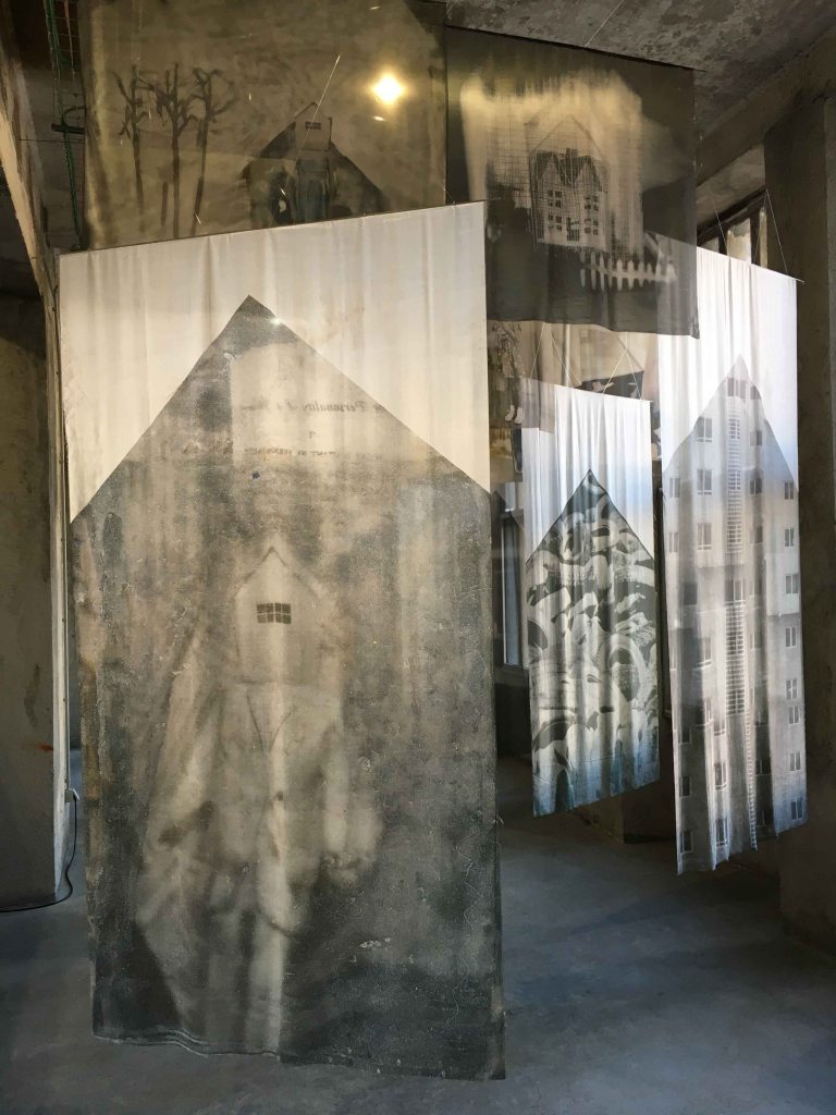
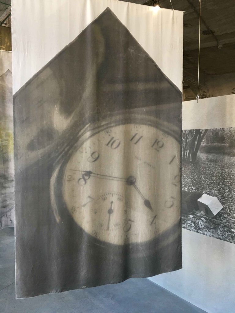
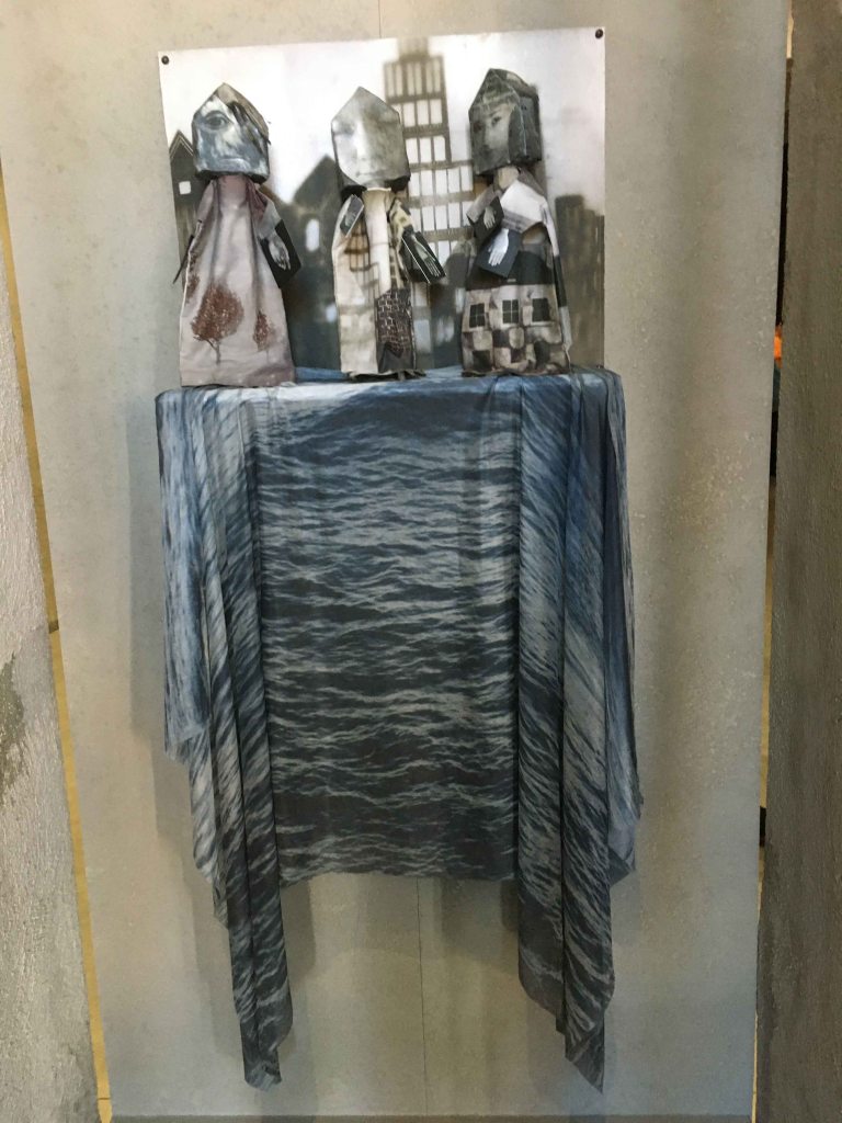
I was immediately drawn to the three dimensional work “On longing” by Melanie Walker. In this work she has combined textiles with photography so that the images are hanging and the viewer can walk through them. The transparency of the pieces add an element of layer and immersion into the piece.
I felt drawn into the experience of this corridor where everything becomes a little blurred and unreal.
Walker is using the image of a house as a metaphor addressing themes of longing for belonging, a home, homelessness or also the crisis of refugees on the search for a safe home. Her figures are all carrying this metaphorical home on/in their heads.
She is also addressing our sense of time by the direct image of huge clocks.
She displayed a collection of puppets with the same metaphorical houses on their heads:
This exhibit definitely cam alive through the original way it was presented and through the combination of photographs and textile that gave the images a tactile and moving element and the experience of looking became much more immersive. The transparency of the cloths added a sense of dream or unreal. As a nomad and someone constantly trying to define a home in a new country, the theme of longing for belonging and a safe house feels very familiar to me.
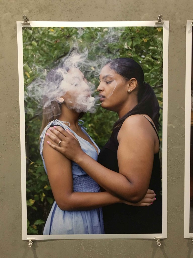
The series “The Girls who spun gold” by Nydia Blas explores how young girls of African descent reclaim their power, their exploration, discovery and understanding of their own body when living in a society where this very body they reside in is not deemed worthy of protection.
I feel a lot of trust and cooperation between the girls and the photographer here, that has led to a strong series with humor and sincerity.
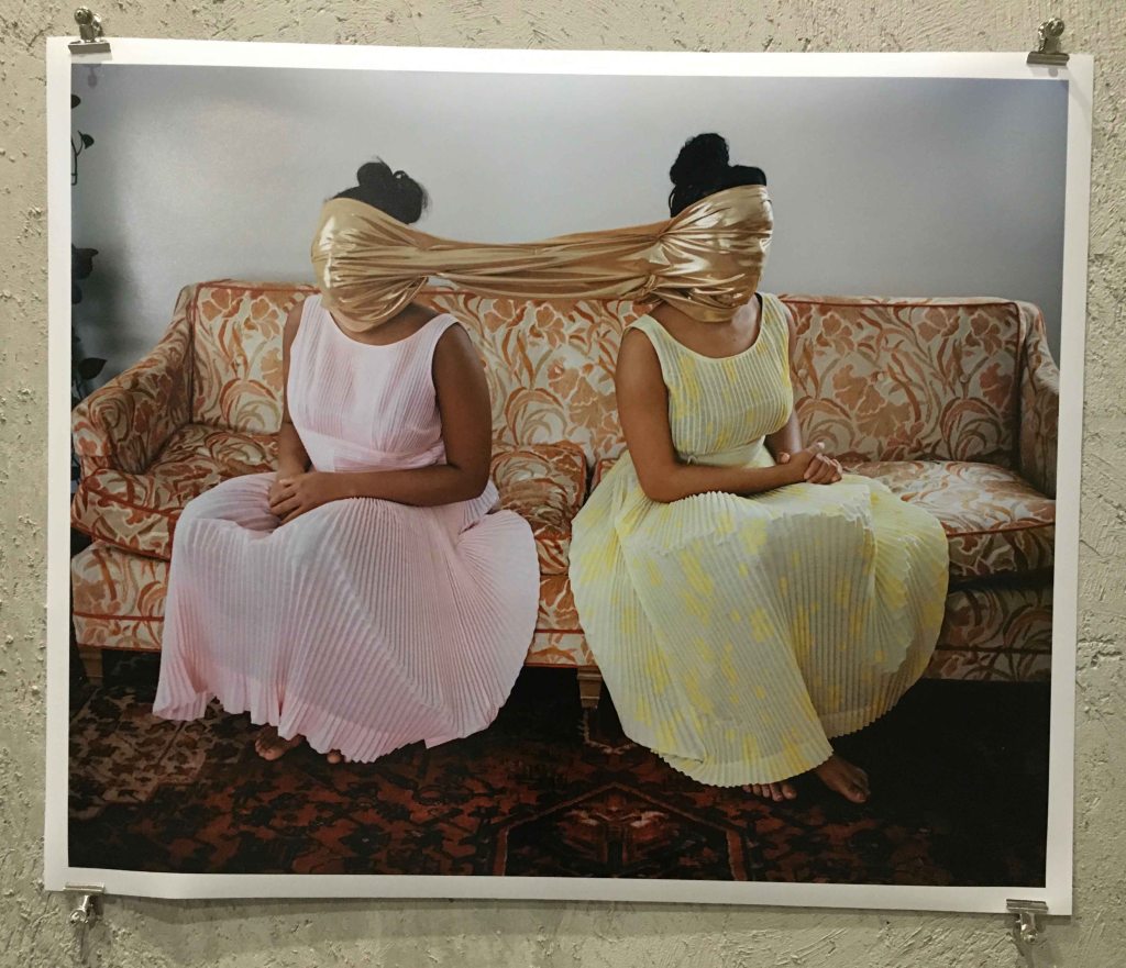
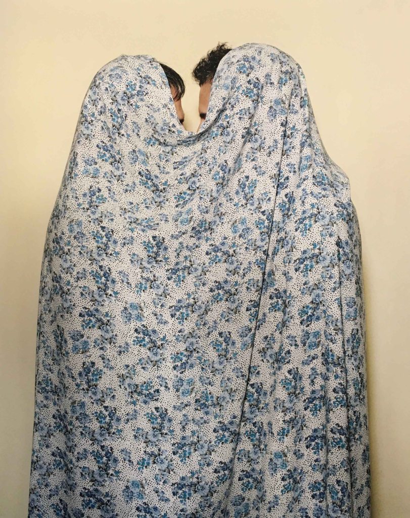
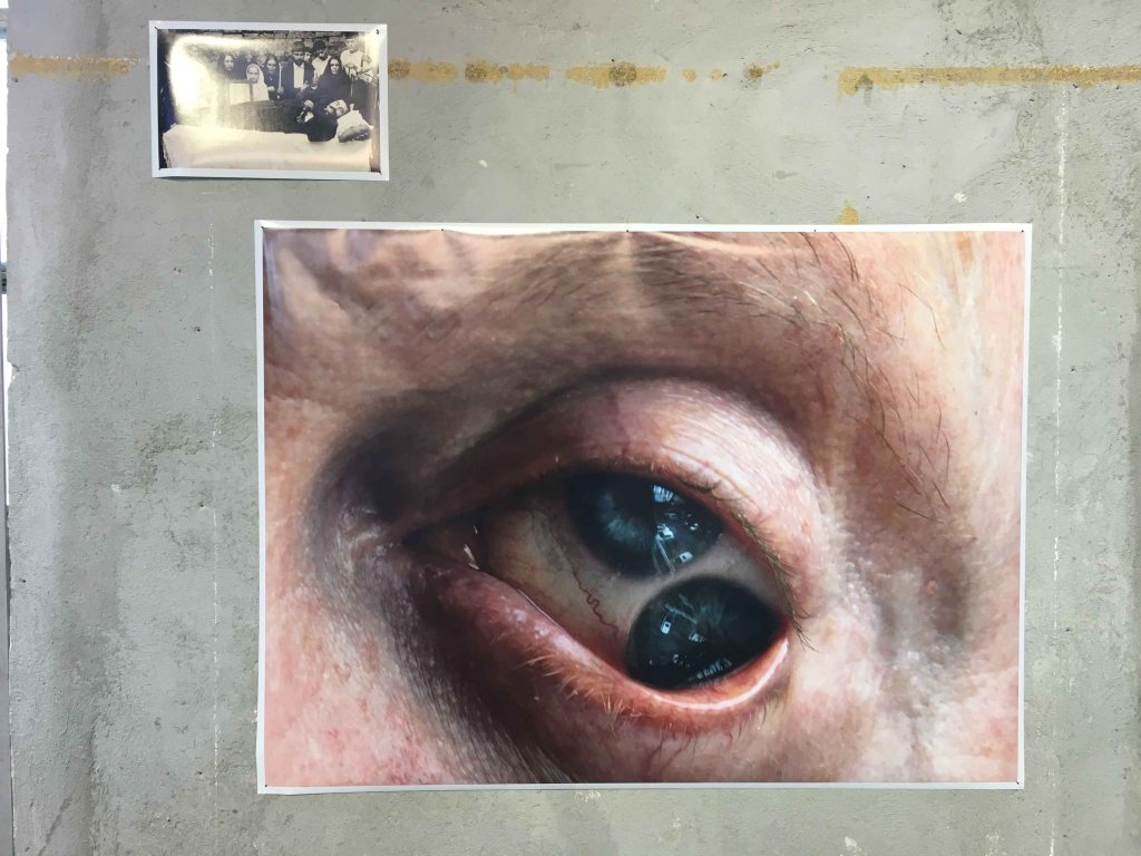
In “there are no Homosexuals in Iran”, by Laurence Rasti, the photographer hides the gay couples in imaginative ways.
I was shocked to read that homosexuality is punishable by death in Iran and these images acquired a haunting quality. As an image, I especially like the left one, where the two bodies melt into a new form, a new creature, under the bed sheet, which also reminds me of the burka- another form of repression existing here.
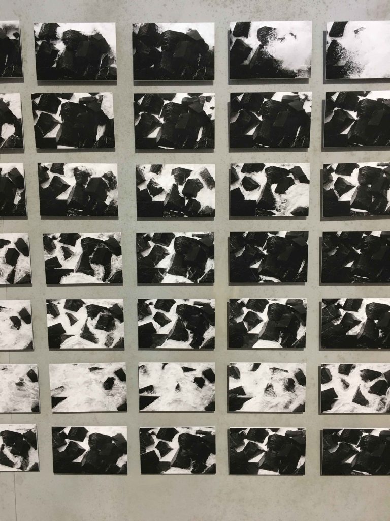
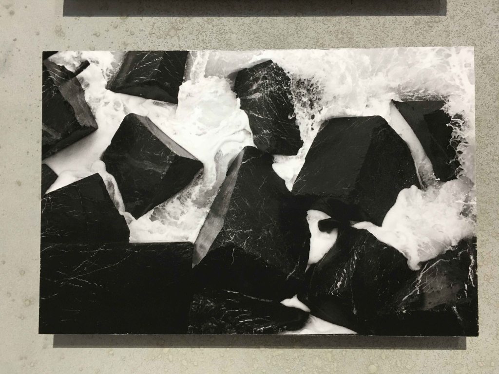
The photographic mosaic “Ur Aitz” by Jon Cazenave is a landscape from the Basque country. Cazenave photographed a wave crashing on the rocks during the short time of five minutes.
Presented like a mosaic occupying a whole wall in this way, the images have a visual rhythm like a wave and a strong impact, like the crashing on the rocks. Every line is composed of 30 images, a nod to the lunar cycles that define the strength of the tides.
Close up, the images were graphically appealing, but did not have the impact of the whole. This work definitely worked by the scale and the strength of the rhythmic whole.
“The rage of devotion” by Mexican photographer Liza Ambrossio left a disturbing feeling.
She combines old family photos and manipulated portraits on the subject of witchcraft and madness.
She started photographing after being cursed by her mother, and develops her work as the history of her own madness. On another scale, the work also reflects the madness of her country. These images have a lingering dark and uneasy feel. I can not imagine anyone walking past them completely unmoved.
“The Komi diary” by Filippo Zambon is a more traditional photojournalistic series about Syktyvkar, the capital of a small Komi republic so far up Northern Russia that it is unheard of for most.
As a photographer, I lived and worked in Lithuania in the beginning of the 90’s, just after the country’s independence, so the block built houses and lace curtains feel familiar. I appreciate the graphic compositions here, and the personal approach to the people pictured. You can feel that the author has a tender and personal link to this special place.
GALLERY CRISTINA GUERRA
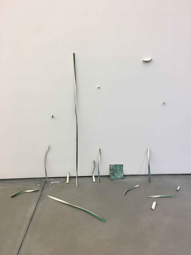
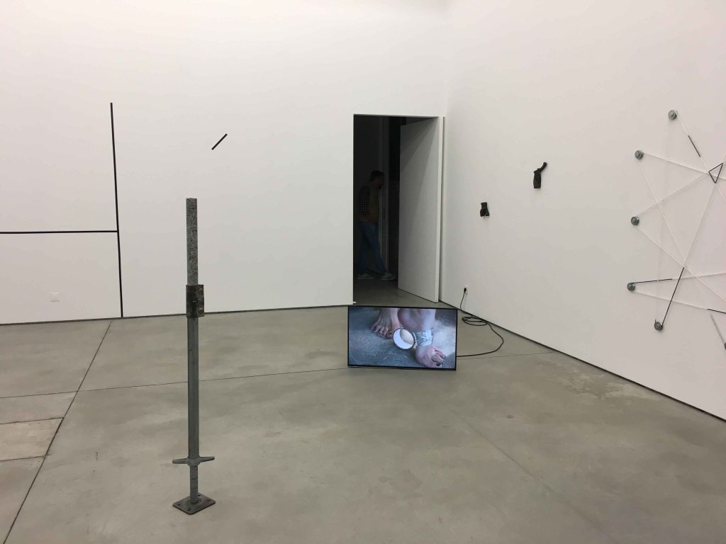
I continued my gallery day by visiting Galleria Cristina Guerra which displayed mainly sculptures in an exhibition called “Form and Volume” by 60 (!) international artists.
I am really glad that I caught a guided tour here, as part of the Lisbon Art weekend, as I must confess that I found many of the works incomprehensible, especially the many “ready- mades”.
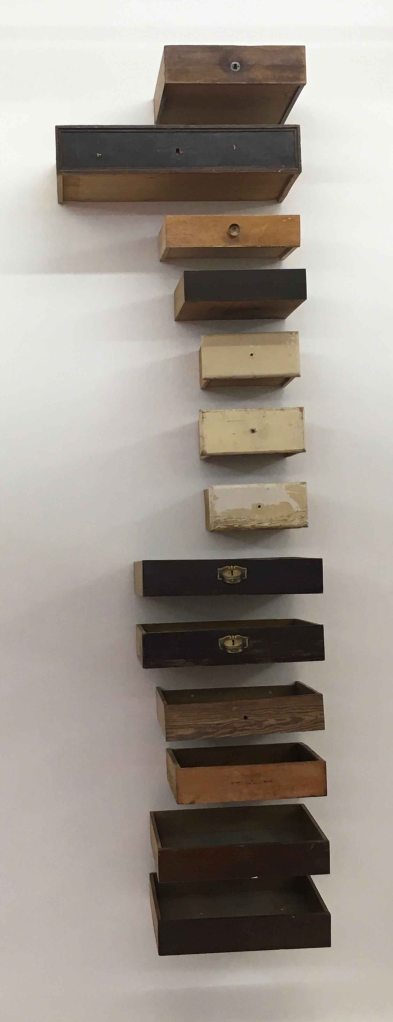
Here we are looking at the work “Schubladen” (Drawers) by Danilo Duenas.
This sculpture is composed by 13 found drawers, symbolizing the ascension, so it is a sculpture with a spiritual component. Using these old found drawers places it in the Arte Povora category. I am not sure I would have felt the spiritual aspect without the tour, but I like the rhythm created by the different drawers and find that they awaken a certain curiosity in me.
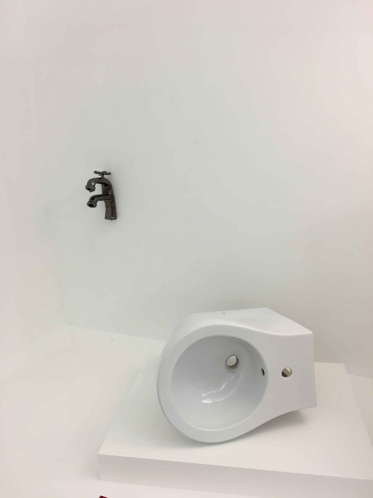
I had a much harder time understanding the purpose of Claire Fontaine’s sculpture “Untitled (My ass)”, a readymade bidet and of course a hommage to Marcel Duchamps.
As much as I find Marcel Duchamp’s step to present the first ever ready made sculpture absolutely brilliant, I can not understand the brilliance in repeating that gesture.
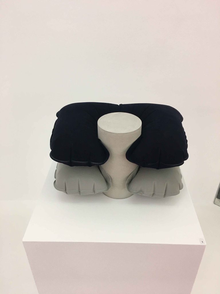
Similarly, I was not really impressed by Pablo Accinelli’s “Duracion Interna” – two travelpillows.
Lawrence Wiener exhibited statements in “Lost and found and lost again”, his material being the language. If you purchase this piece, you buy the idea and the right to reproduce these words as long as you keep these proportions, a brilliant idea.
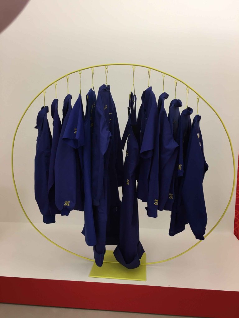
I found Adriana Martinez piece interesting both visually and conceptually- a critique of the European Union called ” The stars are blind”- a clothes rack with 12 items of clothing representing the member countries through uniforms.
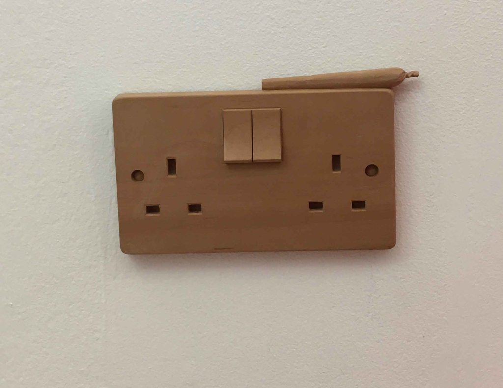
I almost oversaw the small wooden sculpture of Ryan Gander called “The way things collide”, an electric plug with a joint on top.
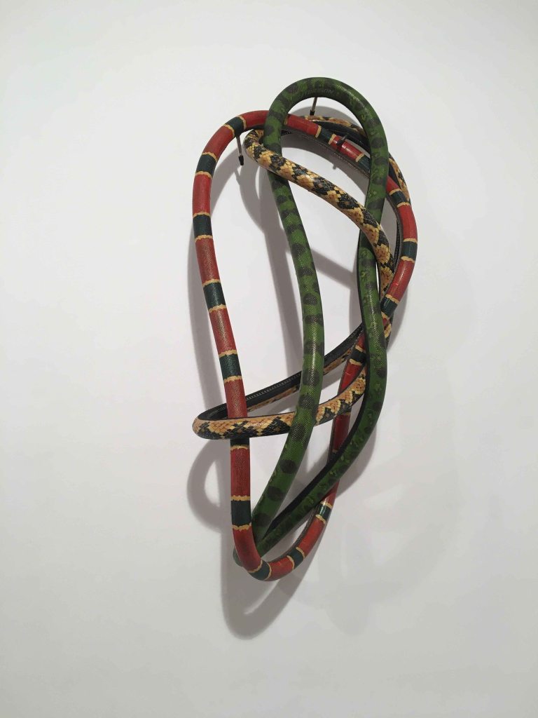
I found the piece “Gente Serpiente”, the snakepeople, by Mazenett Quiroga playful and at the same time aesthetically interesting. It is made by bicycle tires slung together and then painted with acrylics.
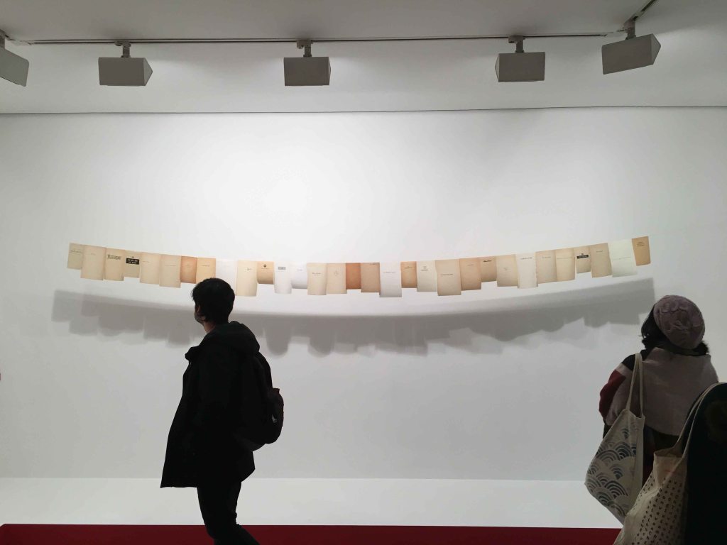
I also really liked a conceptual poetry work by Valeska Soares composed of hanging sheets of poetry books:
The rhythm and the shape of the light hanging pages, and also of the shadow cast on the wall create a visual wave that I can see as a visual poetry.
As a whole, the exhibition is overwhelmingly abundant, with very different sculptures of all sizes packed extremely close together and would need further visits to even begin to appreciate.
Gallery PEDRO CERA
The last visit of the day was the individual exhibition ” And the rest should be squandered” by German artist Tobias Rehberger at the gallery Pedro Cera.
The entrance was lit up by a large neon sign- the first exhibit:
According to the exhibition catalogue, this piece explores the border between what you can consider a finished or unfinished artwork, between functional and dysfunctional, perfect or corrupt. It definitely attracts attention with its violent complementary letters and the message is also reflecting modern questions of physical borders and illegal crossings as much as the borders of what can be art.
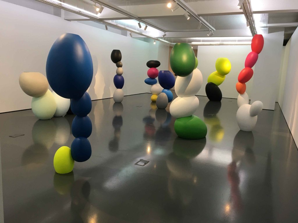
The main hall of the gallery was occupied by the colourful sculptures “Mother without child”. I was more familiar with Rehberger’s black and white very harshly graphical and completely covered rooms, so these felt like very soft, friendly, yes- motherly shapes in comparison. They are large like persons, or even larger, so they have a strong presence, or I would almost say personality, when you stand in front of them.
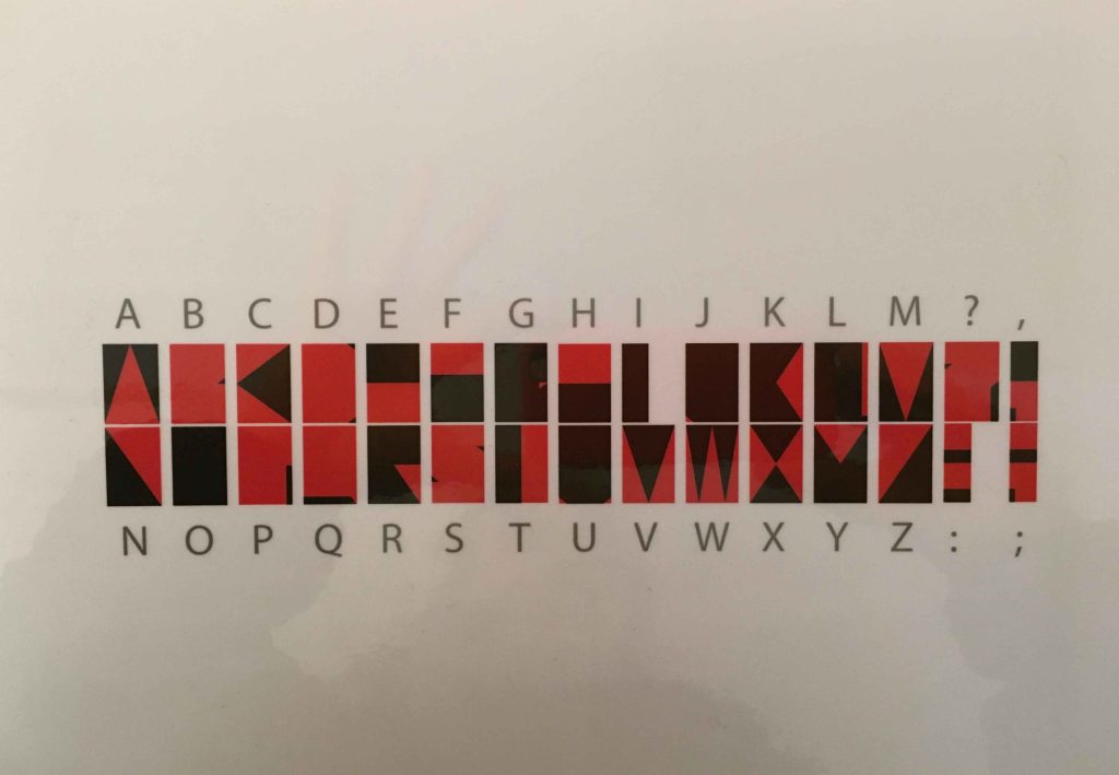
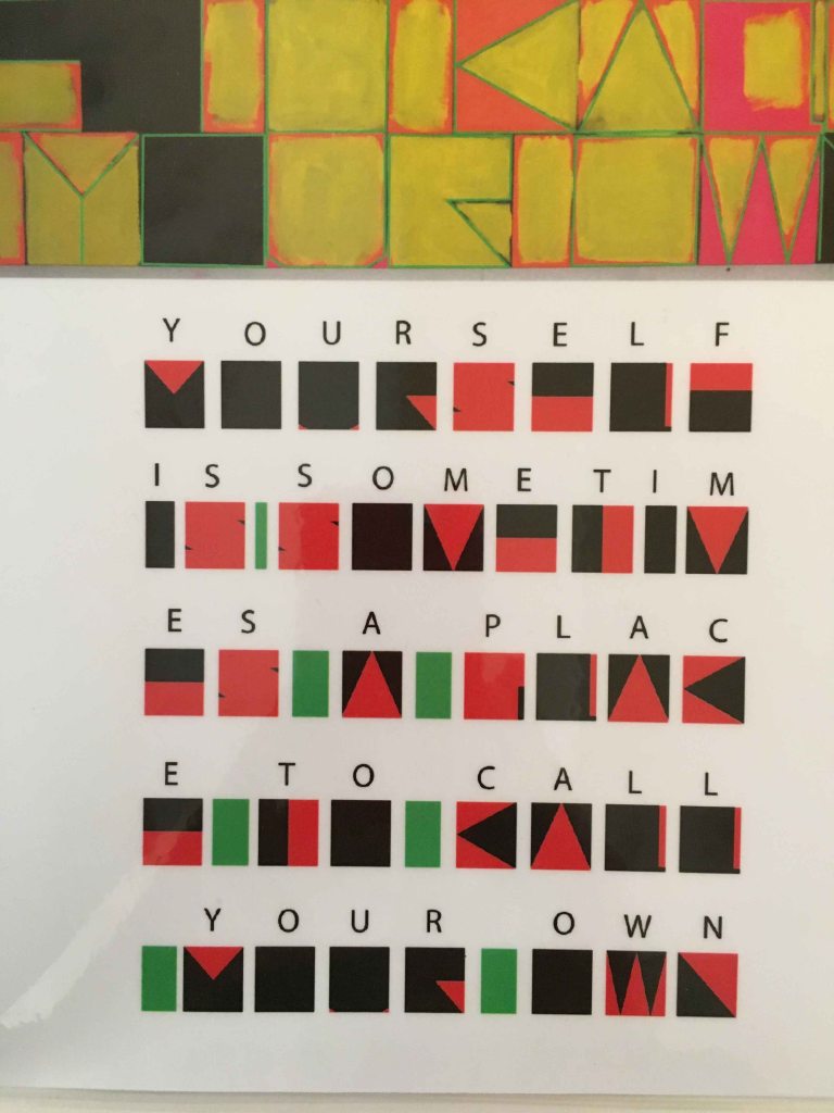
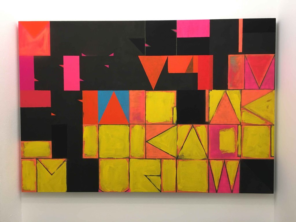
Then followed a series of paintings of letters of an invented alphabet.
These letters were then used to write words and the results became paintings that defy the limits between abstract and representational. With the right code, we can read the meaning of the paintings.
I was fascinated by the way these words emerged and altered my perception of the paintings.
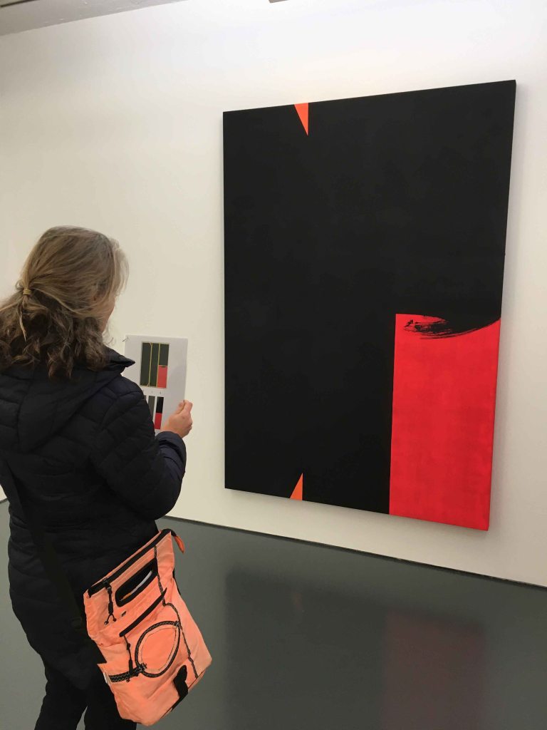
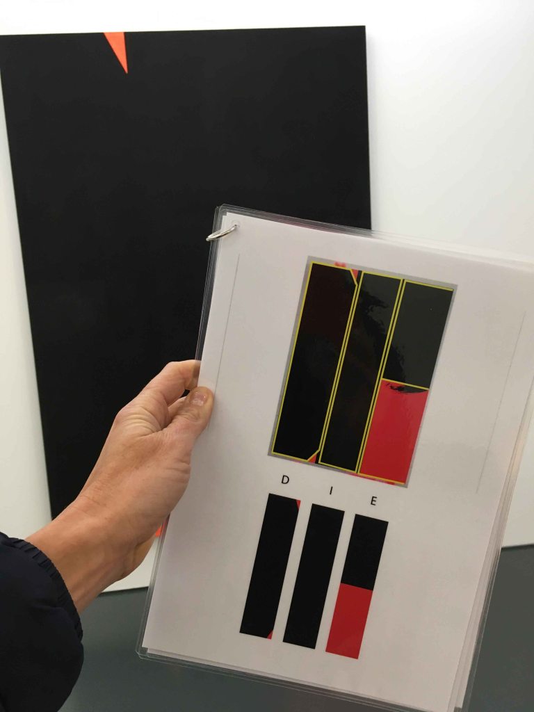
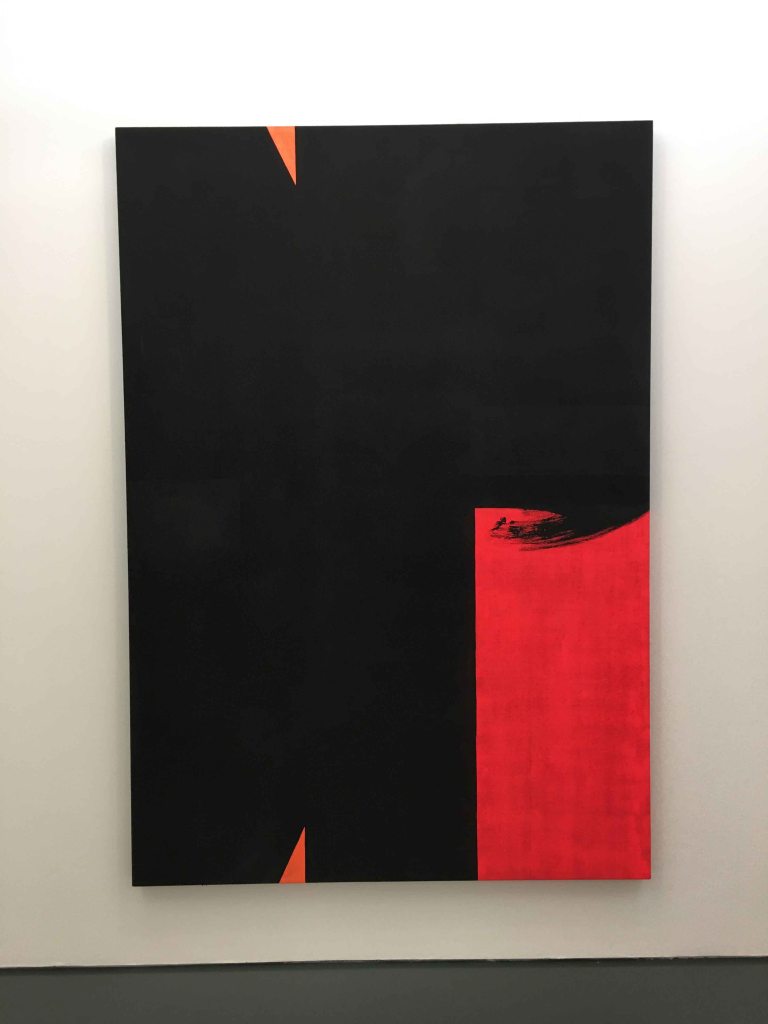
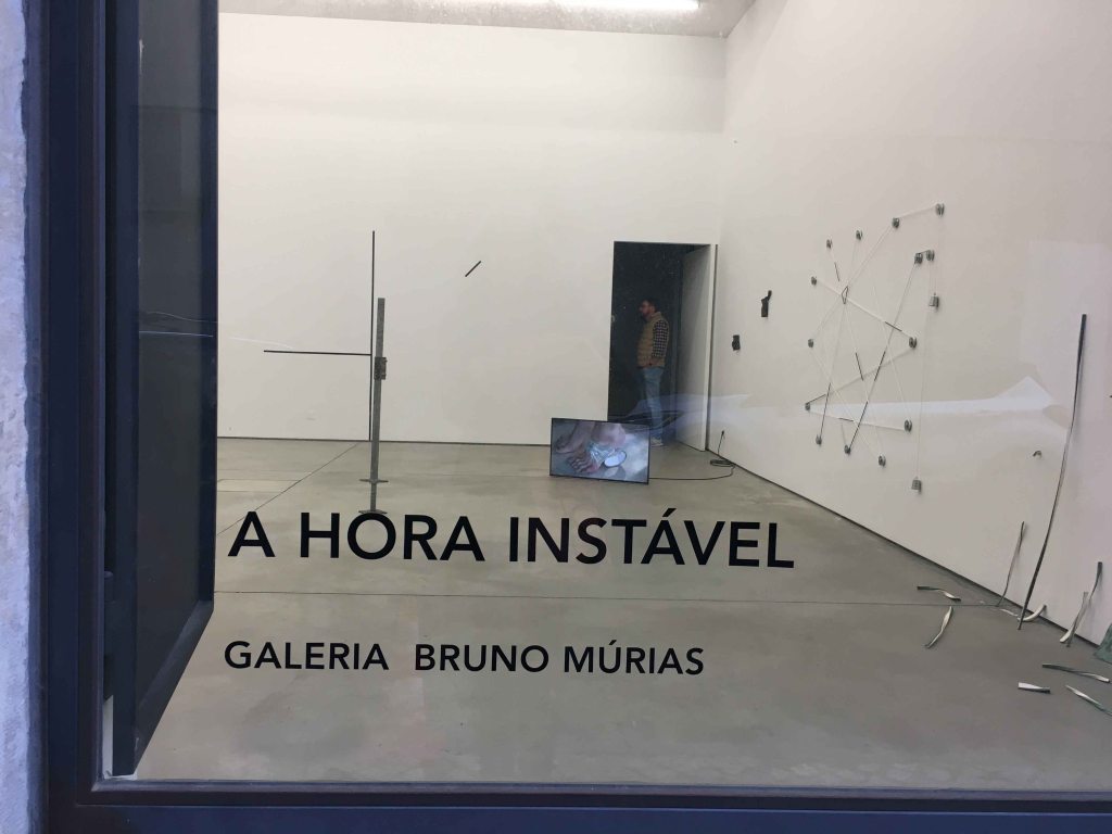
Galeria BRUNO MURIAS
Sunday started with a visit to Galeria Bruno Murias with the exhibition “The unstable hour” by Bruno Cidra.
Cidra is working somewhere in between sculpture and drawing. His sculptures feel like very delicate drawings that have taken a three-dimensional form. I did not really feel attracted to these works aesthetically, but I loved this idea of the line taking off into space- something to give further thought while embarking upon this Drawing 2 course!
GALLERY FRANCISCO FINO
The visit to the gallery Fransisco Fino was definitely the highlight of today. The exhibition here was called “Serendipity or the art of interpreting signals” and dedicated to artists that defend rivers, seas and oceans at this crucial point of history.
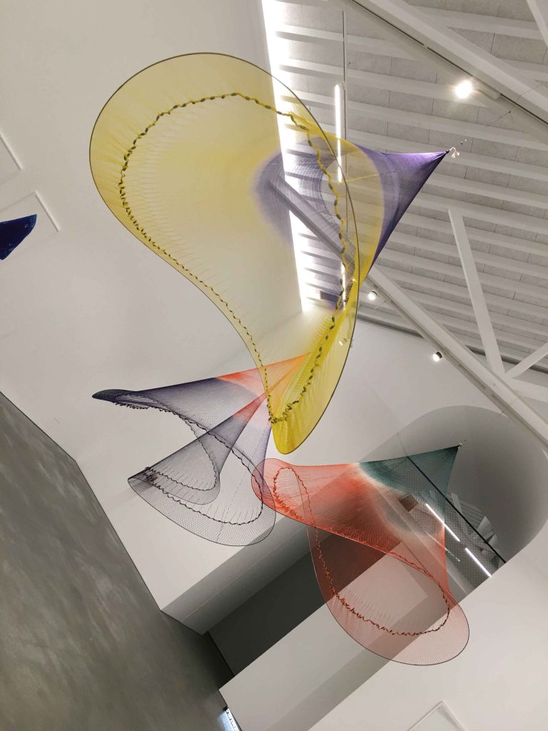
The impressive sculptural forms made of suspended, coloured fishing nets by Carolina Caycedo occupied the main space of the gallery.
They remind me of the colourful net sculptures by Janet Echelman. These sculptures, so large and yet so light really create a special feeling for space and form. It is quite eerie to stand under them. At the same time, they are a direct reminder of the oceans and of the very contemporary problems our oceans face.
A second work that made an impression on me here was an engraving by Rosa Barba, called “Language Infinity Sphere”. The rings of a tree are created through a pattern of letters, reflecting upon the memory of language.
Rosa Barba is also the author of a magically beautiful video with images of very barren winter landscapes conveying a sense of deep longing in me, and a sadness in the desolate, rough surroundings at the same time.
I usually have a very hard time appreciating video art, and have simply omitted writing about other artists videos throughout these gallery visits, but this piece really struck something in me. It was recorded on a 16mm film and later transferred to video, and this fluttering, old way of filming also gives it a special character.
The last piece I will mention from this visit is a cigarette butt and an empty lighter thrown on the concrete floor – because this is an artform I still don’t understand at all. I would have taken it for litter, if I hadn’t seen the descriptive catalogue on the wall…
UNDERDOGS GALLERY
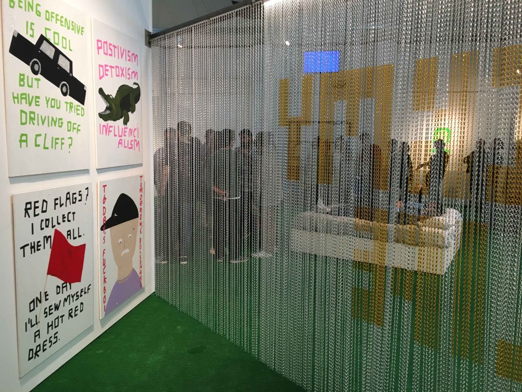
I ended this very full weekend with the finissage of Wasted Rita’s exhibition “And now for something completely different: a show that features at least one female artist” at the Underdogs Gallery.
I was already here for the opening of the show a month ago and completely chocked at the popularity of the event. I have been to some other exhibition openings in this gallery before, that were always comfortably moderately visited, but for this exhibition a queue of hundreds of people snaked through the street. And I didn’t even understand the exhibition….so I needed to come back now for a second look.
Wasted Rita’s work centers around short texts, humorous and provocative.
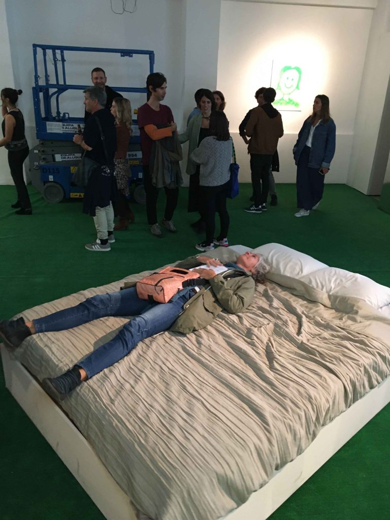
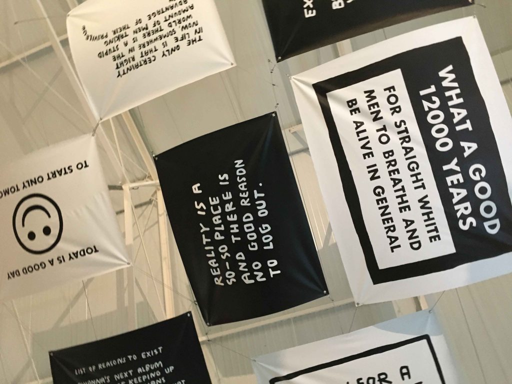
The middle of the room was occupied by a bed turning around and when lying on it you could read posters glued to the ceiling.
This is me turning around and reading:
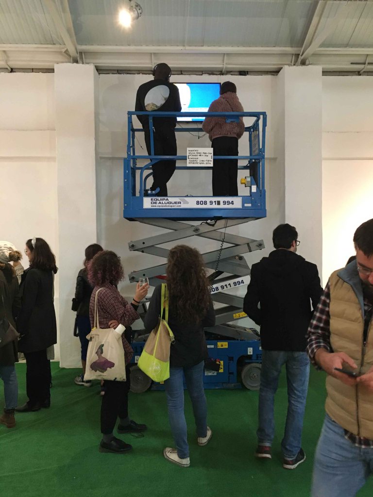
You could also drive up and down on a noisy construction platform for a multimedia experience.
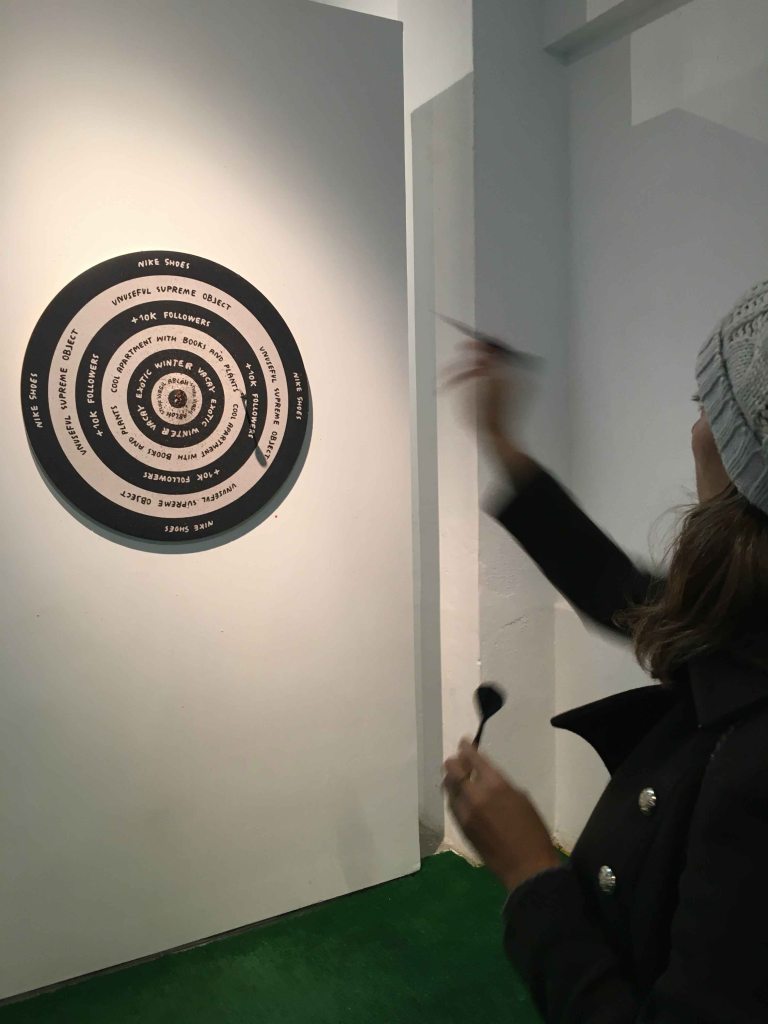
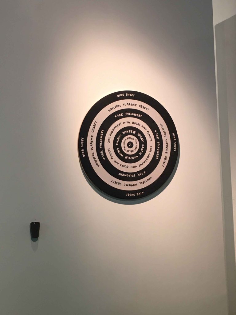
Or throw darts aiming at different goals like 10k followers, new Nike shoes or an exotic vacation:
I appreciate the biting humor and provocative tone of the artist and I see how she has created some sort of absurd environment where the visitor can engage and participate, but I am still baffled that this is the most visited exhibition of the weekend.
LISBON ART WEEKEND
As a painter, I would have loved to see less installation and more painting and drawing presented of course, but this is a situation I find in most art events.
I loved the vibrancy of this art weekend though, of finding the galleries alive end full of visitors and seeing a lot of inspiring work.