Category Archives: Part 2

Contextual focus point: Cornelia Parker


Research the work of Cornelia Parker. Make notes in your own words in response to the following:

  • What do you think Parker is trying to do in her piece Poison and Antidote Drawing (2010)?
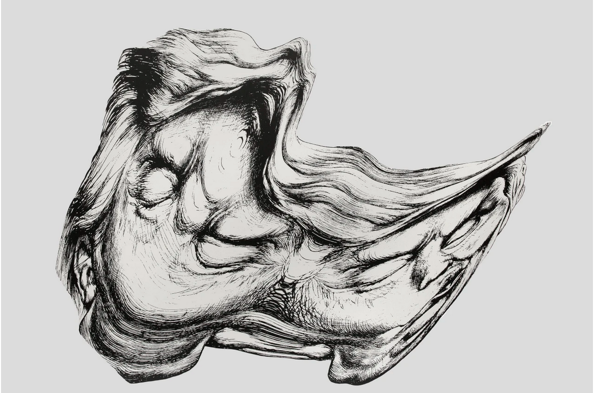
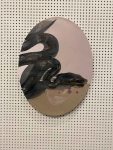
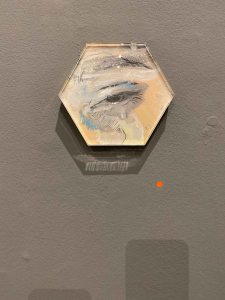
  • Poison and Antidote Drawing is created using rattlesnake venom and black ink, anti-venom and white ink. Parker often uses bits of her subject to make her artwork. Why do you think she does this?
  • How do you think it feels to stand in the presence of artworks that are constructed from original objects of great cultural significance? How does that differ from, say, standing in front of a painting of the same object?


By researching the work of Cornelia Parker and understanding the connection between her subjects and the materials she is using, I have gained a whole new appreciation for her work.

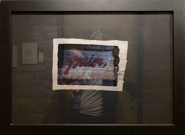
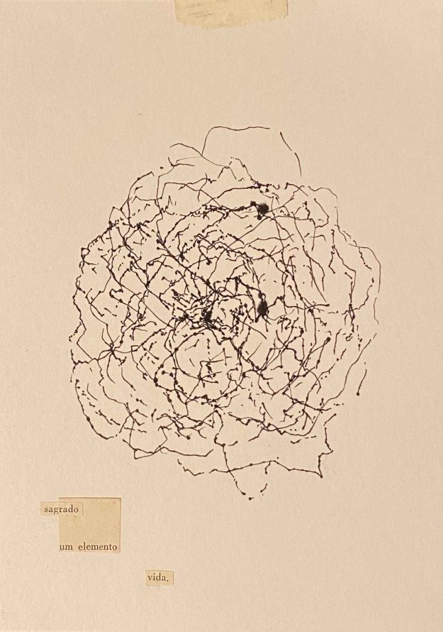
In her piece “Poison and Antidote Drawing” mentioned in the course manual, she used rattle snake poison in black ink and an antidote in white ink in a drawing that was folded in the middle in order to create identical impression of abstract shapes on either side of the crease.
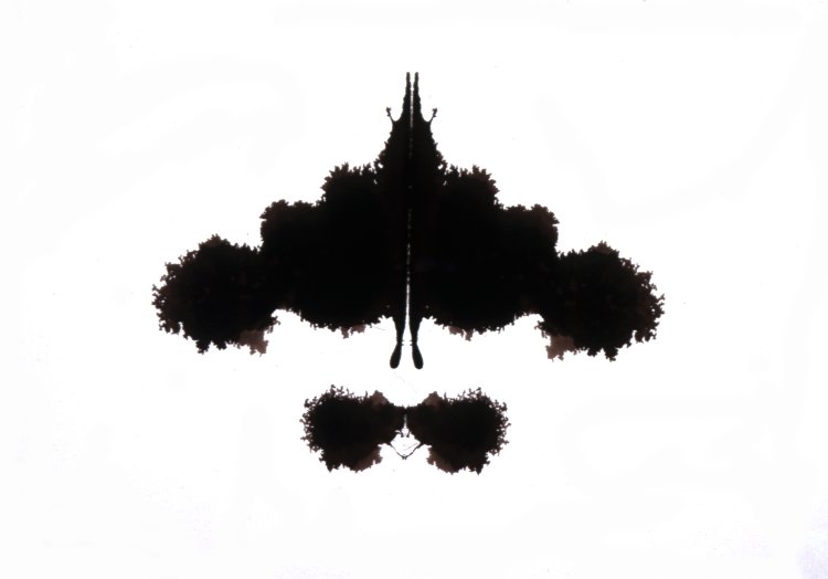
AN00454763_001_l

(Image from: Trustees of the british museum. 2019. British Museum Image Gallery. [Online]. [30 March 2020]. Available from: https://research.britishmuseum.org/research/collection_online/collection_object_details/collection_image_gallery.aspx?assetId=454763001&objectId=691360&partId=1)

This mirror drawing is an image of duality, and it pushes the duality of concepts like black and white, poison or antidote to literally a question of life and death by the qualities of the materials.

So the materials used and the process become the work- this is what characterizes Cornelia Parker’s art.

In the movie ” Cornelia Parker – What Do Artists Do All Day ?”, available on Youtube (https://www.youtube.com/watch?v=cuAF55BN-Ak), Parker said “The material is important, the process is important- the combination of those two things together make the work”.

Rattlesnake venom is maybe not the most common commodity, but often Parker uses familiar every day objects that she transforms into her work. In the above movie, we see Parker driving around London and photographing a withered road sign and cracks in the pavement.

She took rubber molds of the pavement cracks and then had them cast in bronze- elevating them to something really extraordinary.

In Cornelia Parker’s probably most well known work, “Cold dark matter” from 1991, she asked the British army to blow up a garden shed.

A shed is a very familiar thing, and a place where often very personal items are stored- items that are not in use but too good to get rid of. It seems to be incongruous with the violence of an explosion. Explosions are such a common sight in comics or news or at the time bombings in major cities, so this was a very unsettling way of bringing that violence close to home, to the familiar.
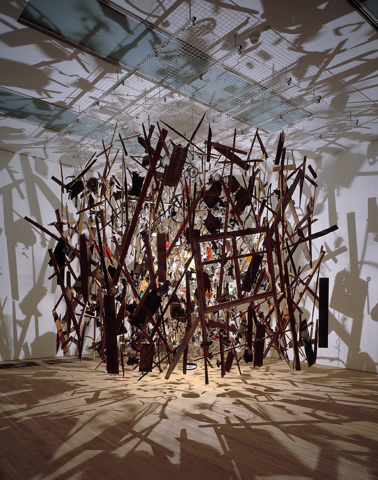
 

Cold Dark Matter: An Exploded View 1991 by Cornelia Parker born 1956

(Image from: Tate. 2020. Tateorguk. [Online]. [30 March 2020]. Available from: https://www.tate.org.uk/art/artworks/parker-cold-dark-matter-an-exploded-view-t06949/story-cold-dark-matter)

This work looks really impressive on photographs, the blown up pieces of the shed hanging on transparent strings from the ceiling and lit up so they are casting strong shadows around. I can imagine the impact being even stronger in the flesh. By hanging the pieces instead of laying them on the floor, it seems like they are suspended in time and space- still in the middle of the explosion.  This hanging of objects in different groups is recurring in Parker’s work. It creates an interesting tension in the space around the objects too, and for someone seeing the installation in the flesh, an interesting blurring of the line between work and spectator.

In another body of work, Parker is “drawing” by puncturing holes in the grids used as targets while shooting and then stitching with a wire made of melted down bullets literally drawn into a wire. Like this, she uses bullets, with their violent energy and potential for death, to draw something formal and considered.

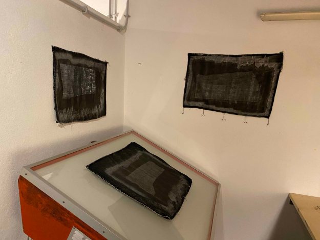
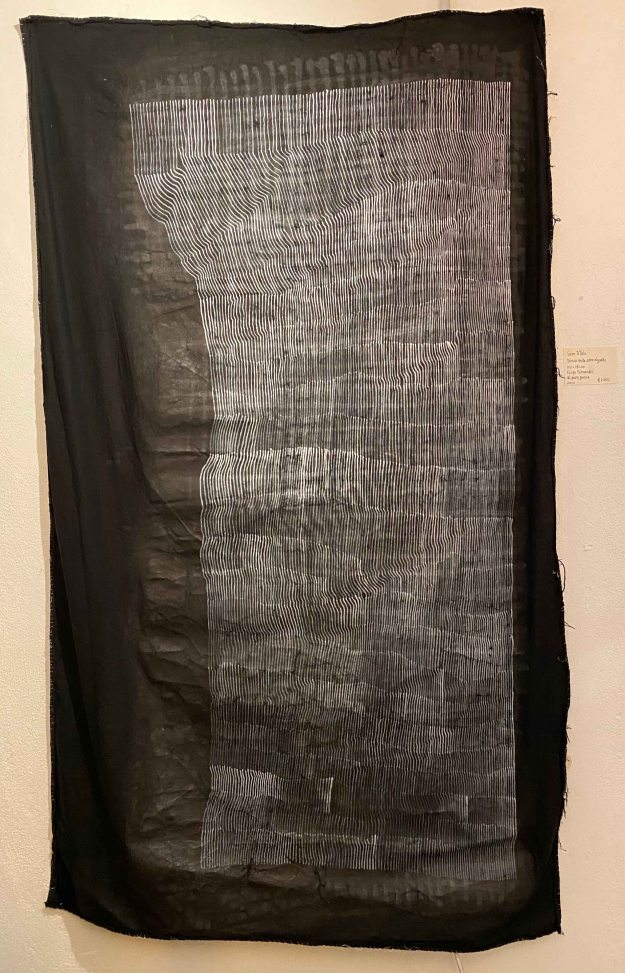
I am fascinated by how Parker uses bits of her subject to make her artwork. This is not an aspect I have considered in my own making before and it will be interesting to consider for the upcoming assignment.


Research point Part 2


The artists below all make work which both creates and denies three dimensions at the same time. Take a look at their websites then make notes in your learning log about these artists, your response to their work and how their work relates to what you’ve been attempting in this project.

Angela Eames: http://www.angelaeames.com/

Angela Eames is a drawer, and uses the computer to draw. In a video interview with Miles Corley available on You tube (https://www.youtube.com/watch?v=mDriWgY9Gd0) she states:

“Manipulating virtual lines in space- for me that is drawing, it is a constructed approach to drawing. And a virtual approach to drawing. And a head approach.”

On my first approach, I find Eames’ art difficult to engage with. I see grids and objects manipulated in space and find it very organized and intellectual. I do not have an emotional response to it. Eames works in series, here are excerpts from the series “Red Skyripper” and “Green Skyripper”:

It seems very mathematical, and I can find a certain pleasure in the rhythm of the images.

In the series “Spoon”, I can recognize a red spoon being manipulated in the gridlike structure:

I find it more interesting with this recognizable object.

Maybe it is because of the familiarity of the view that I also like the series “Sand” exploring the waves created in the sand in different shades, like here “Black sand”:

Angela Eames , black sand

This feels like a view that I have seen and photographed myself.

I understand why we are asked to look at Angela Eames’ work in relationship to “work which both creates and denies three dimensions at the same time“.

When working in the computer, the work does not have a size or a shape. Eames works within the computer, a 3D space, using photographs she has taken in the past- which adds an element of time and 2D elements to the work, then she wants to see it in physical space and prints it on canvas, where it becomes 2 D again, and receives a size and a surface.

In the video mentioned above, she speaks about her series “Puddles”: “The puddles are constructs in 3D space, they reflect something that comes from 2D imagery that I have taken in the past, and then you bring it out flat- on canvas, a soft absorptive surface that has nothing to do with that screen space.”

Eames’ is often using grids or tiles, and bend them in space so that there is a 3D illusion. She names that her work is about the inbetween of 2D and 3D.

Looking at this aspect of the work has made it more interesting and accessible to me than it was when I was looking for an emotional response.

(All images from: Eames , A. 2017. Angela Eames. [Online]. [19 March 2020]. Available from: https://www.angelaeames.com/)

Michael Borremans:  http://www.zeno-x.com/artists/MB/michael_borremans.html

Michael Borreman’s art feels like the opposite of Angela Eames’s- it goes straight to the gut. At a first glimpse, his drawings might look like from some historical archive, like part of some research maybe, but very quickly it becomes strange and exciting, often scary. There is a mysterious narrative in the work. It always contains figures that are performing some sort of ritual that remains unclear. I find Borreman’s work fascinating!

“Fire from the sun” below is probably the most macabre series of paintings, with children gathered, blood spilled, the story unclear:

MB2017_29

It does not deny that it is set up as a sort of stage, so in that sense removed from reality.

I am also fascinated by the many paintings where the faces or sometimes whole bodies of the figures are covered in some sack like masks, like “Amy” or “Melon” from 2017:


I particularly like the “The Angel” from 2013, where the blackened covered face and defeated posture contrasts to the pretty pink dress and also to the title. There is a fascinating tension in this contrast.

MB2013_18

I really enjoy watching movies about the artists as it often shows their method of working and their spaces. Here I watched the documentary “Michaël Borremans: A Knife in the Eye” from 2011, available on Youtube: https://www.youtube.com/watch?v=dhhUmwmlMtc&t=2191s.

Borreman’s method is to create his scenarios with models and take pictures, that he then paints. He said in this movie, that painting is rather fast, although he is incredibly skilled at painting in a very classical manner. The idea, and the time between the photo session and knowing how he wants to paint it, in what scale and tones, is what takes the longest time.

He often introduces different planes in his imagery- like a model biting into a glass plate, or the model being cut off at the waist by a box created. I think here there is an interesting play between 2D and 3 D, because in a way Borreman creates dimensions that do not exist, or that we are not used to seeing.

The hidden parts becomes mysteriously absent, exciting our imagination.

Borreman’s first passion is drawing though. He sais in the above movie that he has always drawn- it is a “literary function”. His drawings are full of narrative too, and I particularly like how freely Borreman is combining elements of different scale.

Here in “The House of opportunity-Vodoo” the house becomes small enough for the person to manipulate.

TMB2005_11

In many drawings there is a lot of “unfinished” space, something that always catches my attention, but then I go on filling up my own drawings.

Here in “Square of despair”, all the cattle are lying on their side with tiny persons walking around, and I like how the drawing is becoming less finished til the edges.

TMB2005_06

I found it interesting that Borreman always draws on found paper, he never buys blocks of paper. He likes when the paper is imperfect, with some spots or grease. Similarly he never starts a painting on a white canvas. He always puts down a beige or grey foundation. That way he can leave parts open rather freely and they will still blend into the image. This is definitely something to remember!

Borreman also works with film, but they are special films that he calls “tableau vivant”- living paintings. There is no plot or no activity whatsoever in the film. A model is placed in a position and then he films it rotating around the model. This way the figure is reduced to an object maybe, it is a mysterious, unusual way of looking at a person. So if his paintings are very cinematographic, his movies are very much like paintings.

(All images from: Zeno , X. 2019. Zeno X Gallery, Antwerp. [Online]. [23 March 2020]. Available from: http://www.zeno-x.com/artists/MB/michael_borremans.html)


Jim Shaw: http://www.simonleegallery.com/Artists/Jim_Shaw/Selected_Works

Jim Shaw’s work plays with a very different spectrum of feelings than Michael Borreman’s. Here there is satire, a sharp commentary of especially American society and politics.

 “The Trump smear”, from 2018 is a brilliant really poignant and critical portrait of the American president, with a black and white line drawing on plywood.

Screen Shot 2020-03-23 at 10.46.31 PM


Shaw is often working in installations with these drawing cutouts. In that sense he is playing with a shift from 2D to 3D, as the figures appear as objects in space, while still remaining only 2D though.

These are installation views from “Issue of my loins ” 2019 and “The Wig museum” 2017, where you can see how Shaw is creating this interplay between 2D and 3D impressions.


Shaw mixes influences from art history, crackpot science, conspiracy theories and his own personal experiences into the work that then becomes an apocalyptic, end of the world narrative. He can be very meticulous and spend a decade researching his subjects.

One of his most famous subjects is the invented religion “Oism” with its mythical beasts and false history.

I find many of Jim Shaw’s pieces brilliant- his work is personal and at the same time closely bound to current events with  sharp humor and criticism.

(Images from: Shaw, J. 2020. Simon Lee. [Online]. [23 March 2020]. Available from: https://www.simonleegallery.com/artists/jim-shaw/)

ALL IMAGES REPRODUCED FOR EDUCATIONAL PURPOSE ONLY


Rebecca Fontaine- Wolf, Between Worlds

Yesterday I visited the exhibition “Between Worlds” by British painter Rebecca Fontaine Wolf in the Espacoexhibitionista Gallery in Lisbon.

I already loved the diversity of formats, surfaces and shapes that the artist used- smaller works behind perplex glass, ovals, large format linen canvases or very small canvases.

It was also a combination of figurative works and some abstract. I feel how I immediately relate to these works with the female figure. The title “Between worlds” relates to the artist being between different stages of her life, and also to being a woman and experiencing different cycles of life.

Several of the paintings contained self portraits of the artist, like here “Blood Moon”, combined with an abstract painting, which also had some triangles symbolizing womanhood.

The second self portrait  ” Milk Moon” was hanging on the opposite wall.

Together these two portraits captured two different sides of the artist, two different phases or moods.

Another portrait that spoke to me strongly had a smear over the eyes that pulled in my attention. A quick effect, but I felt how it really worked here, in combination with the squares and lines behind the head.

I am quite fascinated by this combination recurring in all the paintings, of figure and some abstract colour fields and lines. I especially like how the artist knows exactly when to stop- and leave parts of the linen canvas untouched.

The oval painting of a serpent seems a little more illustrative and different from the rest, but the title ” Moon Serpent” ties it to the other “Moon Paintings”.

The largest and more monochrome painting contained several female figures, intertwined into impossible postures.

There is a lot of confusion and pain in this painting, some anxiety in the hands grabbing or even digging into the flesh. I can relate to the feelings that this painting expresses for me.

I also really liked this little series of close ups of the expressions in the faces painted on wood and then covered by a dark sheet of perplex- a technical idea to remember!

The artist used wood and perplex for some other smaller paintings too, in interesting different shapes, like the oval eye beside her name on the top image by the entrance, or like here in a hexagonal.

I am definitely fascinated by the way Rebecca Fontaine Wolf applies paint. First thing to remember is to leave parts uncovered. Then she combines acrylics with oil paints and boldly leaves parts in charcoal drawings:

I am intrigued by the way the paint pearls- is she applying acrylics on top of oil paints or what is happening here? Something to explore…

This was a wonderful art visit for me- I felt inspired by the subject and by the many technical new ideas I carried away. I heard that the artist is staying in Portugal for art residencies and hope to catch more of her work soon.

Teresa Murta at NAVE Gallery, Lisbon

Last week, I visited the opening of Teresa Murta’s individual exhibition “Absurdo” at the NAVE Gallery, Lisbon.

Teresa Murta paints in acrylics on canvas and the motives are absurd, almost abstract but with some elements that are seemingly recognizable.

The shapes seem organic, or some sorts of containers, and sometimes look like some species of creatures.

The painting below looks like some sort of box, but becomes absurd melting as well upon closer inspection and it remains unclear what it really is:

I found myself trying to make out shapes and put some sense to them, rather than just enjoying the forms.

Some elements, like the egg, keeps recurring like a surrealist symbol in several of the paintings.

There is a feeling of being in a world after some catastrophe in several of the paintings, like surreal abandoned machines scattered.

I have difficulty relating to these absurd machine or organic worlds, except maybe with a certain unease.

The paintings below, especially the one on the right were probably my favorites because they felt more like imaginary creatures with a certain expression on them, that could spark my imagination.

According to the exhibition catalogue, the paintings “go beyond reality and caress our sensitivity”. “Facing Teresa Murta’s work is a plunge into a world where the reality of simple and pure things is contaminated by the though that lives in our eyes.” (exhibition catalogue)

I had a conversation with the artist, asking her if the recurring elements, like the egg or sponge, have a specific meaning. She replied that the works are all totally process based. She never has an idea or sketch before she starts, she just starts with abstract shapes and colours, and then sees if her brain can recognize some of the forms, that she then develops into something more readable.

I am not very attracted to this type of absurd art, but had a wonderful evening and learned a lot just from talking to a passionate artist who works in a very different way.


Artist days at Esquina Atelier, Lisbon

Esquina Atelier is a small artist driven artist residency and gallery space in Lisbon. February 6-8 they created an event called ” Come exhibit with me” where all four residents decided on artist friends to create a group exhibition. I was lucky enough to be invited to show some paintings here in this small, cozy and fun event.

Felipe Fernandes is a graffiti artist whose name “Pura poesia” is to be seen all over Lisbon. Because of this, he is the most well known artist of the group. In this exhibition, he showed “visual poetry” which is always consisting of lines or words on dark backgrounds.

“Pain” and “poesia” are the most recurring words. I enjoyed the versatility of the supports Filipe used and the different ways he exposed the pieces- some on paper, some on textiles, some large and some very small strung together in series.

Most of all, I liked one corner where he displayed a row of artists books:

The books are made out of drawings in different sizes and papers and although the motive of the lines and words on dark were quite similar, the juxtaposition of the different papers and textures and slight variation in lines made the subtle differences clear.

The lines themselves become a coded language and the few words we can read, like “rehab notes” or “pain” sets the context. I found this an exciting inspiration for the format of the artists book I will make later in the course. It was interesting to note how important the tactile experience became with the different qualities of paper.

Marta Simoes showed some colourful landscapes in oil:

More interesting were her drawings of clouds in liquid graphite:

I believe these rather quick works could have benefited from a more careful presentation maybe.

Fransisco Marques is a more classical painter. I really loved his very dark portrait “The Old man” (with horns) painted in many layers of oil over a long period of time:

This photo really does not do the painting justice. It is alive from the incredibly richness of different tones of black.

His graphite drawing also has an incredible amount of small detail and different layers of narrative:

I was surprised by the very different feel of Francisco’s other oil painting of a sort of clay figure with a crudely drawn face:

I really liked the body of work of Constanca Sardinha, which is very different from any of my own drawings. She sits on various buses through the city of Lisbon with a pen poised over a piece of paper and lets the movements of the bus create a random drawing. I was quite captivated by the method and the delicate drawings that resulted from it. Back in the studio, Constanca interprets what she sees and feels when looking at the drawing and collages fitting words that she cuts out from old magazines or school books.

It was interesting to discover how different I felt about the drawings before and after knowing about her method. The fact of the marks being random increased their attractiveness with a strange fascination. They also had a very different impact depending on the size and the presentation alone or in small groups.

The next artist wanted to remain anonymous and presented only as “the friend of Francisco”. Apparently he always exposes his work without revealing his name to avoid being caught up in becoming popular. Possibly he is also a graffiti artist. I am not even sure he was present at the opening.

I enjoyed his rather delicate ink drawings, mainly of patterns that looked like shavings of wood in different shapes. I also really liked the way they were framed behind glass without any background.

I also really liked this portrait in subtle tones that looked like done with rubbing of charcoal, a way of drawing that I am exploring right now for part 2 of the course.

I showed some mono prints in oil that looked very different on the patterned tiles of the room:

I also showed an oilpainting of my pregnant daughter on cardboard presented on an easel:

Here I am posing with my granddaughter in front of a painting in acrylics on paper:

And at last a small painting in oil on aluminium:

It was a very fun evening and we all received so much encouraging, positive feedback. It felt really good to co-create a small event like this with other artists. This is all very, very new for me. It was only three months ago that I dared upload some of my paintings on Instagram and to actually show something live felt like a leap. This first experience was so positive though, it is definitely worth to dare and to invest some time and energy in communicating and connecting.

Gabriel Garcia at Espaco exhibitionista

I recently visited the beautiful exhibition of Portuguese painter Gabriel Garcia in the Espaco Exhibitionista gallery in Lisbon.

The title of the exhibition is “Who throws the First Rock”, which was presented in golden letters on a wooden table, with stones around- a beautiful moment in itself. I liked how this added a three-dimensional piece to the exhibition who was otherwise only paintings on the walls.

Two walls presented really large paintings of men hiding their faces in hoodies or ties in a rather desperate move, hiding or maybe punishing themselves in some ways.

The stones were present on the ground of the paintings.

I was even more affected by another series of mid size paintings showing a disrupted narrative, hands washing themselves in a sink for example. A very simple gesture, but given the title of the exhibition and the dark tone of the paintings, they seem to be washing off a sin.

The whole back wall was occupied by a double row of very small oil paintings.

They seemed to be painted from very different snapshots, of domestic scenes, of terrorist attacks, of someone longingly looking through a window. At first glance they were rather usual scenes from images I would feel frequently confronted with. Looking longer, I was taken by a very dark feeling though. All the paintings have a heavy, desperate, given up or aggressive tone.

I liked that the stories here remain so unclear, that we as viewers have to add our own imagination to complete the narrative. There is a certain despair in the paintings that I felt uncomfortable feeling, at the same time as I admire how Garcia manages to make me feel so strongly.

As an artist I was pleased to see the red dots of “sold” on almost all the paintings, which felt encouraging.